Homepages are focused on drawing visitors into the marketing funnel. Your campaign landing pages also do the same—convert visitors for specific offers to move them through the marketing funnel. So, how are the two pages different?
So, what is a landing page, and what factors distinguish it from your homepage?
Let’s find out.
Website homepage vs. landing page: The significance of the page goal
On your homepage, that goal is impossible to predict for every visitor. New prospects or returning leads might want to know the story behind your business, while others will head straight for plans and pricing information. That’s why homepages’ anatomy is different than the anatomy of the landing pages, the former includes navigation bars and multiple outbound links that offer visitors easy access to any content they might want.
Landing page vs. homepage examples
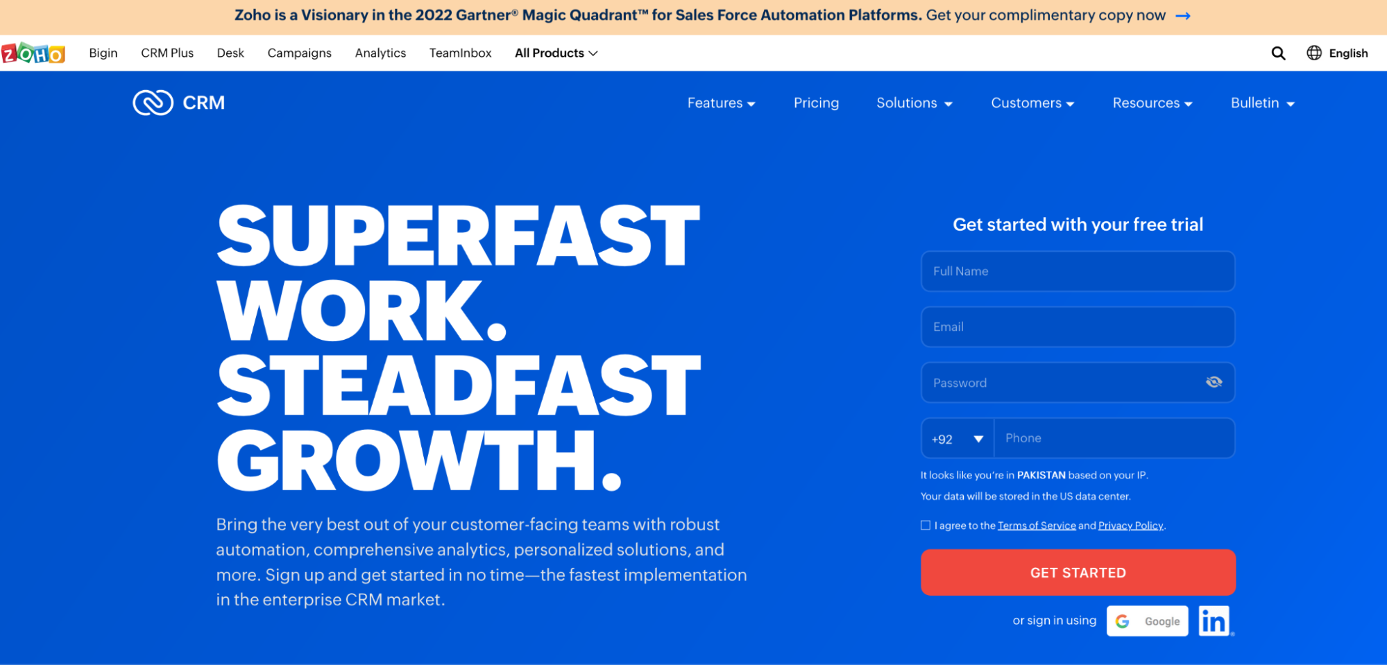
Let’s take the Zoho CRM product homepage, for example, on which navigation allows customers, developers, and prospects to learn every little detail about the tool:
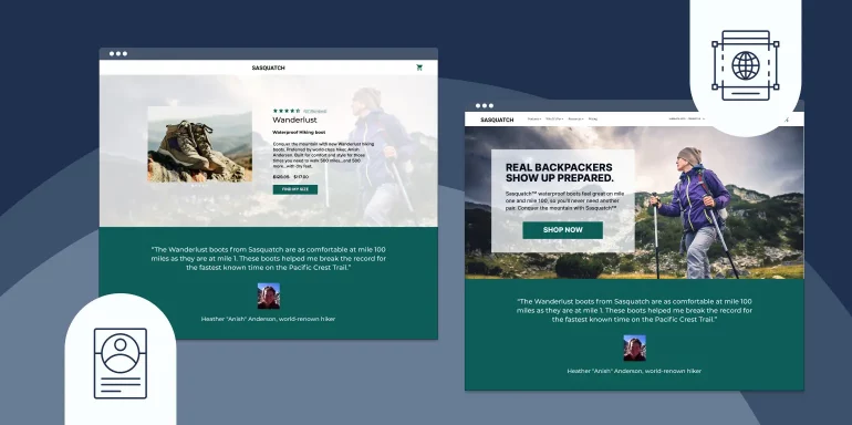
Landing pages, though, have only one goal: to convert a visitor on an offer. When users navigate to your landing page from a promotional link, it’s because they’re considering claiming the offer you advertised. That’s why, on your landing page, it’s your job to include only the information your visitor will need to determine whether that offer is worth claiming.
Here’s a landing page built by the same company:
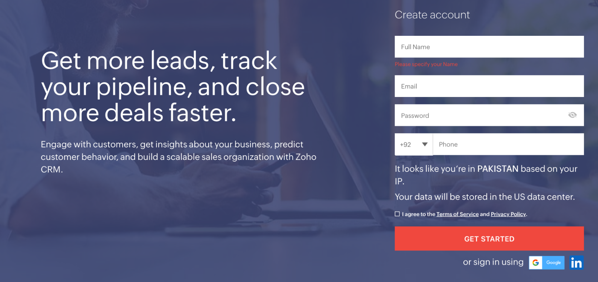
Major design differences can be seen above the fold, even at a glance. The lack of navigation on this page keeps visitors focused on the offer they clicked through to evaluate. The headline on the landing page is far more benefit-oriented than the one on the homepage.
Below the fold, the homepage features screenshots from the app:
While the landing page features specific numbers to prove the effectiveness of the tool.
Landing page:
Scroll even lower and you’ll see the Zoho homepage uses small paragraphs of text that drive visitors to feature pages of the website.
Homepage:

While the landing page substitutes that for social proof:

On the homepage, there were more than 80 links to other pages that weren’t CTAs. On the landing page, there were two. Still, two is too many. The ratio of links to CTA buttons (aka your “conversion ratio”) on your landing page should always be 1:1.
Here’s another example from FreshBooks. First, their homepage, above the fold:

Now, one of the company’s landing pages, above the fold:

The landing page is focused on the “Try it Free” offer—the navigation menu has been removed to keep visitors focused on evaluating the offer. While the homepage and landing page both feature social proof and benefits of the accounting software—the landing page is focused on just getting visitors to sign up, the homepage also features the pricing plans, FAQs, and additional product details, and of course, lots of exit links.
Don’t let the paradox of choice kick in
Remember the paradox of choice: The more options you have, the harder it becomes to make a decision. That’s why it always takes longer to order in restaurants with more extensive menus.
In the restaurant that is your landing page, CTAs are your menu items. Only offer your visitors one to choose from.
FreshBooks does that with the “Try It Free” call-to-action throughout the page.
On their homepage, FreshBooks offers visitors multiple CTAs, which is okay. These “secondary CTAs” like “Learn more” help prospects find the answers to their questions, and if they’re designed right, they won’t even divert too much attention from the primary CTA.
Can you spot the primary call-to-action and the secondary call-to-action on this page?

See how “Try It Free” pops more than the colorless “Learn More” buttons below? This is to draw the visitor to the “Try It Free” button, but they’re still giving prospects the opportunity to learn if they’re not ready to try. And that’s the most significant difference between a website homepage and a landing page.
The homepage focuses more on informing and empowering the visitor, while the landing page focuses on persuading the visitor.
The goal of every homepage visitor we can’t know for sure. The goal of the landing page visitor, though? It’s to make a decision. Build an anatomically correct landing page to help them do it.
Both landing pages and website homepages must guide visitors with a visual hierarchy
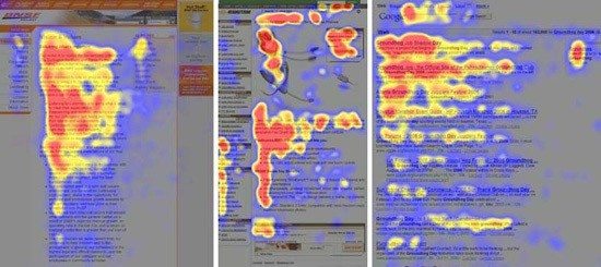
Even since before the internet, people have been viewing pages the same way. Early eye-tracking studies showed that readers first enter a page through an image or headline on a written page, then glance down the left side to look for bulleted or italicized text. Body copy was read last.
On the web, this has become known as the F-shape pattern:
To get readers to view your most important content, you’ll need to create what’s called a “visual hierarchy” based on the way people like to read. It should look something like this:
- Use attention-grabbing images and a big headline to grab your readers.
- Divide your page’s content with subheadings.
- Use bullet points to draw attention to elements in a list, like features and benefits.
- Use body copy within those subheadings and bullets to elaborate briefly.
The hierarchy should also be based on familiar web design principles. For example, logos are always in the upper left of a web page. Links are either underlined or a different color from the rest of the text. Don’t try to reinvent the way people read on the web. An MIT study once showed that people prefer page layouts that are familiar to ones that attempt to stray from longstanding best practices.
Example
Here’s an example of a good visual hierarchy from Oracle:
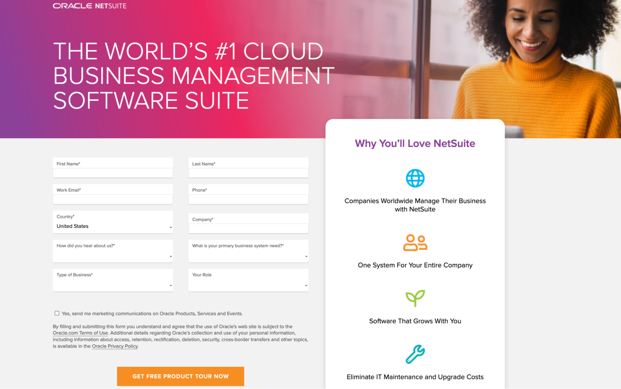
The image and headline catch the reader’s eye. Below that, bullet points convey important information about the software. To the right, a form collects prospect information, and a brightly colored button completes the conversion.
Here’s a homepage that creates a good visual hierarchy (click here to see the full homepage):

Website homepages and landing pages have more in common than you think
All this talk about website homepages vs. landing pages might have you thinking they’re two completely different webpages. In some ways, they certainly are. But at the core, they’re the same.
When creating landing pages, Instapage is the optimal choice.
Instapage makes it easy to create personalized, relevant landing pages for every ad group and audience. Sign up for a 14-day trial and start increasing your conversion rates today.

Try the world's most advanced landing page platform with a risk-free trial.
