The travel industry is one of the largest and fastest-growing economic sectors in the world, which supports over 284 million jobs — more than the automotive manufacturing, mining, and financial industries combined! And by 2020, it is predicted that 1.5 billion international trips will be taken.
In a business sector as expansive as the travel industry, competition is colossal. So it’s critical for travel brands to have a fantastic digital presence and make incredible, lasting first impressions. The most efficient way to accomplish this: post-click landing pages.
What is a post-click landing page?
A post-click landing page is a standalone web page, disconnected from a website’s main navigation, designed to elicit a specific action from its visitors. This action could be to download, register, sign up, receive a quote, and many other things. To convince visitors to take action, post-click landing pages feature persuasive elements like benefit-oriented headlines, authority badges, social proof, visual cues, and strong CTAs.
How the travel industry uses post-click landing pages
Whether it’s to entice prospects to book a once-in-a-lifetime trip to Disney, or to prepare them for their upcoming cross-country vacation by purchasing travel insurance, travel post-click landing pages are the best digital marketing asset to get the job done.
There is no universal travel post-click landing page template because the industry is so diverse. The following examples, however, provide guidance on how to create an optimized page to drive action from potential customers.
Please note that for shorter travel post-click landing page examples, we’ve shown the entire page. However, for longer pages, we’ve only displayed above the fold. You may need to click through to each post-click landing page to see some of the points we discuss. Also, keep in mind that some of the companies listed may be A/B testing their page with an alternate version than the one displayed below.
1. To find flight deals
All too often, travelers hold out on buying their plane tickets, only to find themselves scrambling to find some affordable airfare at the last minute. Companies like GoLastMinute are meant to help with this common habit. Let’s see if their travel post-click landing page design is effective in conveying that message:
GoLastMinute
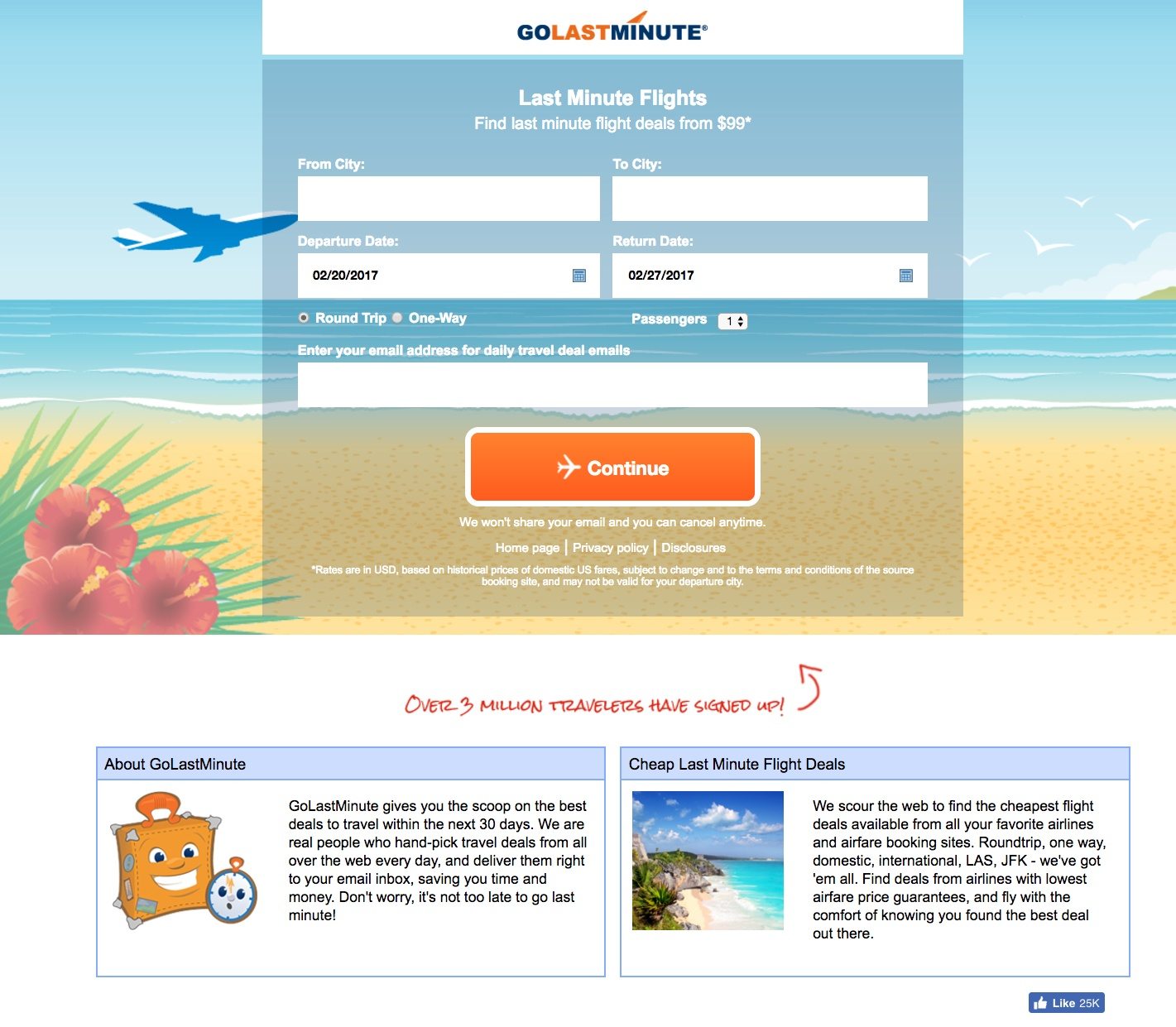
Starting at the top, the company logo isn’t linked to the homepage, which helps ensure that visitors stay and don’t bounce right away. It may not be long enough to convert, though, as there are other ways off the page — like the homepage link under the CTA button and the “GraphicBomb” link in the footer.
The headline is specific and direct, and the compelling, benefit-focused subheadline does an excellent job of supporting the headline. Also, making the email field required is a good way for GoLastMinute to capture as many email addresses as possible from travelers.
There are three explicit visual cues that direct attention to essential elements on the page:
- The blue airplane points toward the form
- The white airplane on the CTA button guides prospects to continue to the next page
- The red arrow points up at the form, reminding visitors to submit their email and request flight deals
Moving onto the CTA button, “Continue” is too boring and could easily be replaced with something less vague like, “Find me the best flight deals now!”
Overall, the style of the page is very mixed. The beach setting behind the form looks similar to Clipart whereas the suitcase and stopwatch below the fold are cartoons — and then the bottom-right box appears to be a professional photo. This type of inconsistency reduces the page’s trust value and may deter people from converting.
2. To promote contests
Since travel costs can stack up pretty quickly, contests are a great option for companies to generate leads and build a relationship with travelers. This travel post-click landing page design from ShermansTravel promotes a cruise as the grand prize:
ShermansTravel
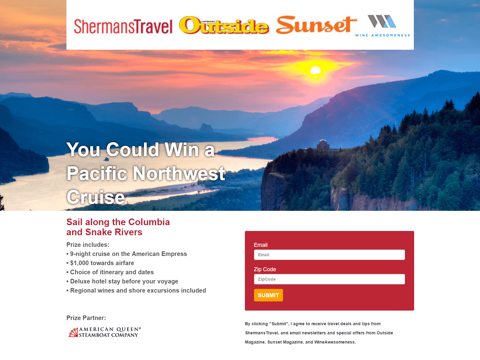
Company logos at the top of the page capture visitors’ attention first, but unfortunately, they’re not aesthetically pleasing. The fact that they’re so pixelated could make people question the credibility of this company and turn away from the offer.
The image is beautiful, although it’s a bit strange that the cruise ship isn’t pictured. Is it even a cruise ship, or is it a steamboat since the prize partner is “American Queen Steamboat Company?” An explanation or an image to clarify may increase the trust value here and drive more conversions.
The headline and subheadline are okay, but they could be improved. Rather than stating, “You Could Win a Pacific Northwest Cruise” in such an unenthusiastic way, the company may want to A/B test something more descriptive and compelling like, “Enter to win a 9-day Pacific Northwest cruise!”
Listing the prize perks was a great idea and will likely convince visitors to enter. In the last bullet point, though, “Regional wines and shore excursions included” doesn’t need to have “included” because the section leads with, “Prize includes.” It’s a minor detail, but it may decrease the company’s credibility for the people who do notice.
The 2-field form is straightforward as only asking for email address and zip code won’t intimidate too many people. The CTA button altogether needs to be improved. It’s too small for the width of the form, orange doesn’t contrast with the background as much as it could, and “Submit” is one of the worst word choices to include on a button.
Furthermore, several exit links can distract from the page goal, including the logo banner at the top of the page, the American Queen Steamboat Company logo, and the sweepstakes rules. Privacy policy and terms and conditions are acceptable links because they help add a level of trust to ShermansTravel and this promotion. However, instead of opening the rules in a different page, they could have a pop-up lightbox explaining the rules.
3. To offer information on timeshare vacations
While many people feel that timeshares are overly expensive and not worth all of the extra fees, timeshare promoters must convince prospects otherwise. post-click landing pages can be a great tool to assure prospects that investing is worth the investment:
Sheraton Vacation Club
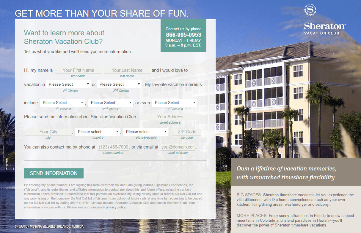
The most notable aspect of this post-click landing page is the lead capture form with an abundance of vacationing options to choose from. Since timeshare vacations are unique and versatile, constructing the form to give prospects more personalized options was a great idea.
One element of the form that Sheraton may want to A/B test is the CTA button. “Send Information” is vague and the green button doesn’t jump off the page as much as it could. Testing it with benefit-oriented copy such as, “Send me offers for my next vacation!” and a contrasting color like orange, would make it stand out more and entice visitors to convert.
A second feature of the form that may be worth A/B testing is removing the fine print underneath the CTA button. The same goes for the small print at the bottom of the page. Is all of this necessary or could it be moved to the Privacy Policy or Terms and Conditions pages?
The slideshow of resort images and vacationers enjoying themselves at resorts provides prospects with a relatable and compelling look into the timeshare experience. The box of copy positioned in the bottom right of the image does a great job of selling the benefits of Sheraton timeshare vacations as well.
Finally, the hyperlinked partner logos near the bottom act as distractions, providing visitors an easy exit route before they convert on the offer.
4. To book vacations
Many travelers don’t like the stress of planning, budgeting, and booking their vacations on their own, so they look to travel agencies for assistance. Let’s take a look at this Liberty Travel post-click landing page designed to provide prospects with vacation cost quotes:
Liberty Travel
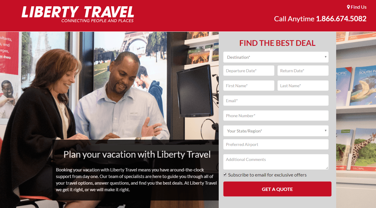
First, the company name is linked to the homepage. This hyperlink should be removed because right from the start, there is a chance that visitors will leave the page without getting a quote. Other exit links include the “Find Us” feature in the top right corner and the entire footer of the page.
The image gives prospects the idea that Liberty Travel employees are friendly and helpful, likely persuading them to work with the company. Plus, the click-to-call phone number is a nice feature, making it quick and easy for prospects to contact the travel agency.
The form headline, “Find the best deal,” is vague. Find the best deal on what and compared to who? Also, the form is rather long, which could intimidate prospects and scare them away. The “Subscribe to email” checkbox is already checked and is a sneaky way for Liberty to send promotional material to prospects without them actually opting in for that content. The “Get a quote” CTA is uninspiring, and the red doesn’t “pop” off the page since red is already used multiple times.
Adding a few positive customer testimonials may increase prospects’ desire to work with Liberty Travel and lead to better results. Something along the lines of “Liberty Travel helped me save 25% on my trip to Mexico!” may convince prospects that Liberty is the travel agency they want to book their next vacation with.
5. To generate travel report downloads
Whether it’s for some vacation inspiration or to learn about recent trends, travelers are often interested in reading various travel reports. Here is a post-click landing page from Skift created to generate downloads of one of their latest reports for Mexico:
Skift
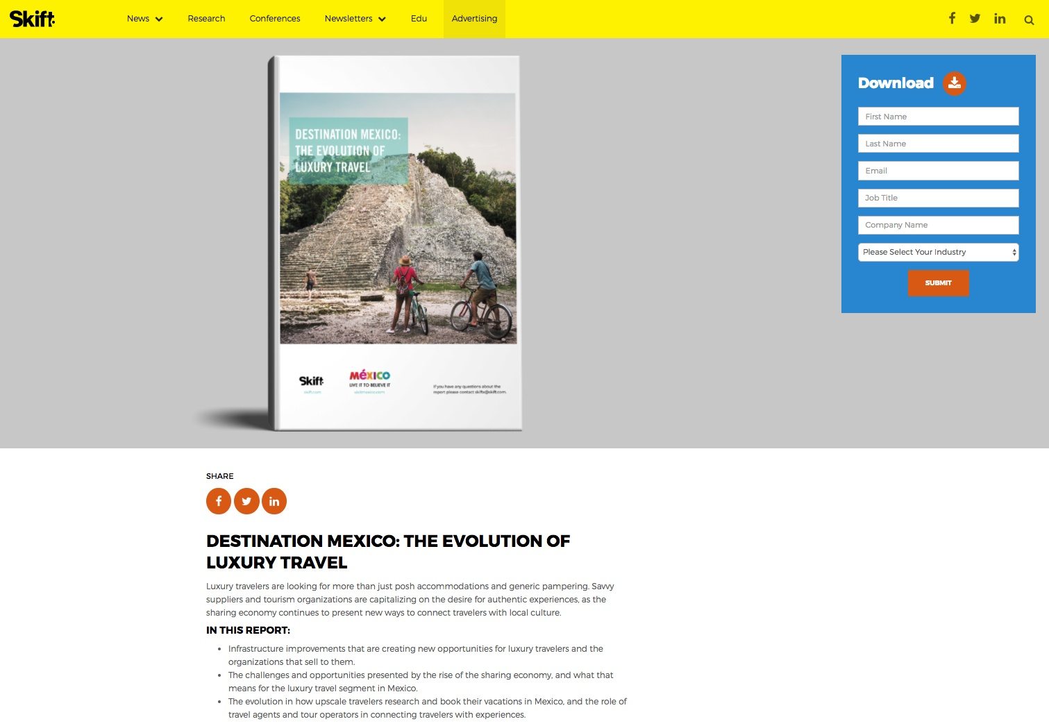
Let’s start with the exit links that can be removed:
- The navigation in the header and footer
- The social share buttons above and below the fold
- The podcast links in the bottom-right
Why are the podcast links included at all? If this page is supposed to focus on the report of luxury travel in Mexico, then these podcast links only add confusion. By including other clickable elements, Skift is just asking visitors to get distracted and leave the page without downloading the report.
On the upside, the image shows visitors what they’ll receive by inserting their information. Plus, there’s sufficient white space on the page — drawing attention to the most important elements, like the image of the report, its description, and the lead capture form.
The lead capture form that moves with visitors as they scroll is a very nice touch because it keeps the CTA button always visible. This feature makes is super easy and convenient for prospects to convert at any point during their time on the page.
The form itself, though, needs an overhaul. “Download” and “Submit” are incredibly bland and aren’t persuasive at all. Also, the form is a bit lengthy given the content download. Requesting name and email address is standard practice, but are job title, company name, and industry necessary to download the report? Skift may want to consider A/B testing a shorter form to see if that produces more leads.
Finally, listing the three main takeaways in bullet form is smart, but the large chunks of text beneath them make reading this page more of a chore than it needs to be.
6. To search for rental cars
Rental cars are one of the staples of the travel industry. And with many rental car companies to choose from, these companies need to do whatever they can to continue the flow of customers.
Here is a click-through travel post-click landing page created by Airport Rental Cars, intended to convince visitors to search for and rent a car:
Airport Rental Cars
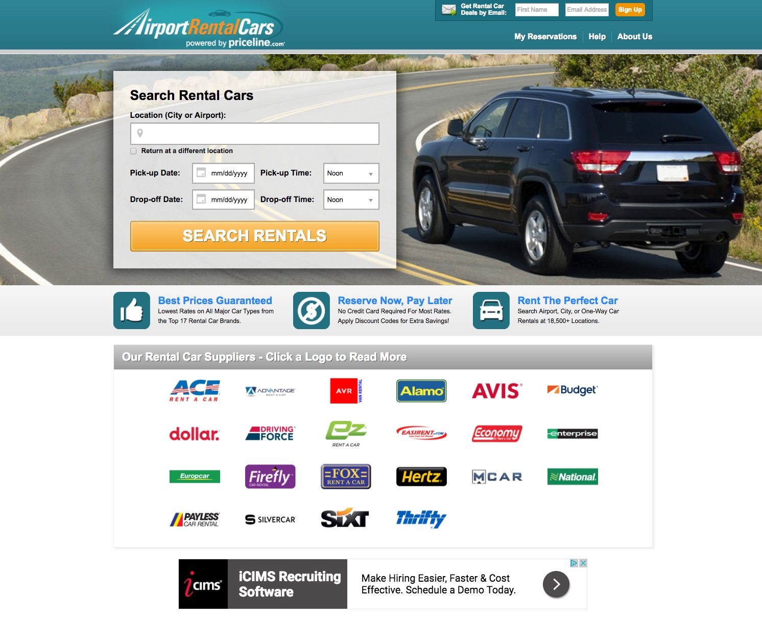
Once again, exit links galore! The company logo, header and footer navigation, and the suppliers’ logos all provide prospects a way off the page before converting. Plus, they offer ad space beneath those supplier logos, which is an exit link off the page.
The form is short and easy for prospects to complete. Also, the orange CTA button contrasts with the rest of the page, likely grabbing visitors’ attention quickly. Conversely, the button copy and the form headline, are weak. There is nothing unique or persuasive about them, so visitors may not even bother filling out the form. A/B testing some descriptive, benefit-focused copy may result in more searches and leads for the company.
The image of the SUV acts as a visual cue, even though the vehicle is driving away from the visitor. By pointing toward the form, it’s subtly directing visitors’ attention to focus on the form and search for a rental car.
The three iconography sections with blue text explain the offer in more detail. However, adding white space to the whole page would help draw more attention to the most important elements, and may even produce better results.
Listing all of the rental car suppliers is a good idea since they serve as trust indicators, but the company should A/B test another version of the page in which the logos don’t link to other pages. Furthermore, adding a few testimonials from happy customers (with a detailed quote and head shot) would add even more trust and help convince visitors that Airport Rental Cars is the best choice for their need.
7. To drive amusement park ticket sales
This travel post-click landing page from Universal Studios Hollywood is similar to Airport Rental Cars’ example in that it’s a click-through post-click landing page. The theme park encourages people to purchase tickets online and save up to $10. Let’s see how well the page convinces visitors to do that:
Universal Studios Hollywood
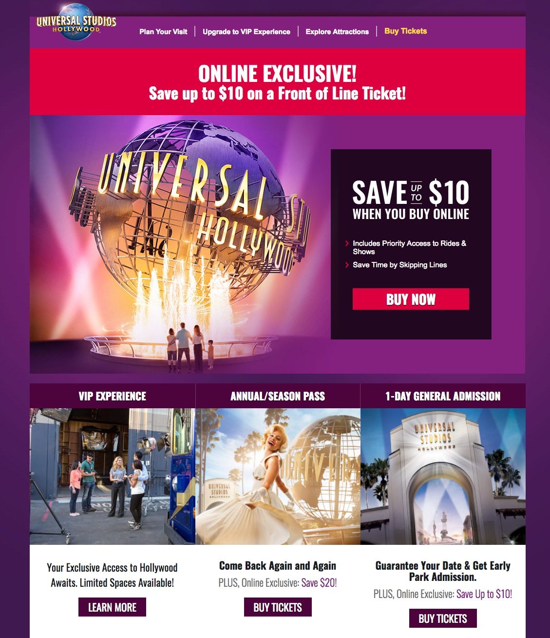
The most aesthetically pleasing element is the image with all of the bright colors, and overall the page is well-balanced providing a more enjoyable user experience.
Aside from the beautiful image, the copy is persuasive and benefit-oriented, expressing to prospects that they can save money and avoid lines by purchasing tickets online. Plus, multiple cooperative CTA buttons (even the “Online Exclusive” banner) give prospects a few chances to click-through as they explore the page.
But again, a multitude of exit links (the brand logo, header and footer navigations, the “Learn More” CTA button, social links, etc.) may result in fewer click-throughs.
A few elements missing are any form of social proof or customer testimonial. Demonstrating that previous customers have taken advantage of this offer and found it valuable may compel others to purchase online tickets as well.
8. To sell travel insurance
Traveling can be expensive; then you tack on the cost of travel insurance — an added fee many may think unnecessary after spending so much on tickets, they opt not to purchase it. As an insurance provider, it’s your job to convince travelers why it’s worth buying.
Let’s see how AardvarkCompare uses a post-click landing page to deliver the message:
AardvarkCompare
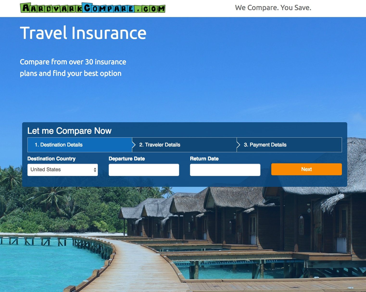
We nearly made it through an entire travel post-click landing page without finding an exit link, except the McAfee security badge in the footer navigates away from the page. Although, this particular example isn’t as bad as previous examples because it provides exact details on how secure AardvarkCompare.com is.
The headline, “Travel Insurance,” is extremely broad and needs to be rewritten, but at least the subheadline does a nice job of elaborating.
By using a multi-step form, AardvarkCompare only captures genuinely interested leads and lets prospects know how long the process is. Each step provides section titles for previewing what is required next (destination, traveler, and payment information).
The orange CTA buttons stand out prominently on the blue page, but they could be A/B tested with copy that’s stronger than, “Next,” and, “Start Comparing.”
The list of insurance partners helps instill a sense of trust with visitors — making them feel more comfortable purchasing insurance from AardvarkCompare. Furthermore, the “How it works” section helps inform visitors what they can expect when they purchase from this company.
Design your next travel post-click landing page with confidence
The travel industry is continuously expanding and shows no signs of slowing down. No matter your goal, the most effective way to generate leads and establish brand awareness is to create and promote post-click landing pages that are welcoming, trustworthy, and make a lasting impression.
Which page above inspired you most? What can you take from these travel post-click landing page examples to create your own high-converting page? Sign up for an Instapage Enterprise demo today.

See the Instapage Enterprise Plan in Action.
Demo includes AdMap™, Personalization, AMP,
Global Blocks, heatmaps & more.
