
It’s projected that by 2020, the world will generate 50 times the amount of data, and 75 times the number of information sources, as in 2011. With numbers like that, there’s no question that organizations need companies like Tableau to better see and understand their data.
Tableau transforms the way people use data to solve problems, which wouldn’t be possible without the use of landing pages. Let’s quickly review the landing page definition, and then take a look at five persuasive Tableau landing pages.
What is a landing page?
A landing page is a standalone web page that uses persuasive elements such as compelling headlines, engaging images, social proof, and attention-grabbing CTA buttons to convince visitors to take action on a specific offer. That action could be to download an ebook, register for an event or webinar, sign up for a free trial or demo, and more.
5 Tableau landing page examples
(Keep in mind, for shorter pages, we’ve displayed the entire page. For longer pages, we’ve only shown above the fold, so you’ll need to click through to the page to see some of the points we discuss. Also, some of these pages may be undergoing A/B testing with an alternate version than is displayed below.)
1. To offer prospects a free trial
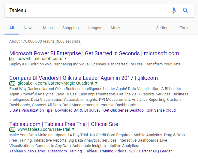
A Google search for “Tableau” produced these search results:
Upon clicking the main Tableau headline, prospects land on this page to download a free trial:
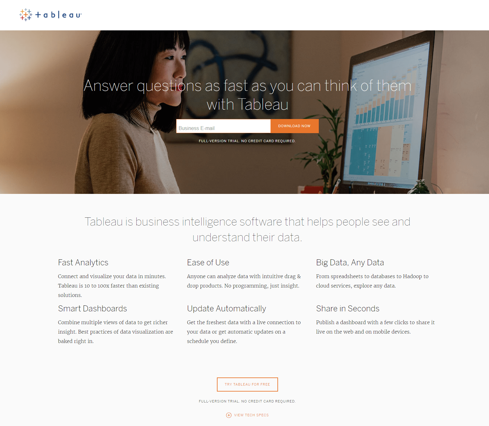
What the page does well:
- Message match between the Google ad description and the Tableau landing page copy lets visitors know they’re in the right place to download a free trial.
- The image provides a preview of the software, and showing it in context makes it more relatable for prospects.
- Only one form field makes it quick and easy for visitors to submit their information and download the free trial.
- The orange CTA button is attention grabbing because the only other orange elements on the page are also calls-to-action.
- “No credit card required” underneath the form field assures visitors that this offer really is free.
- The second CTA button is an anchor tag that takes prospects up to the lead capture form for an improved user experience and encourages them to insert their email address.
- Several expandable sections allow visitors to see additional useful information without overwhelming them with excessive copy upon first glance.
- The customer testimonial — complete with full name, employment title, and affiliation — serves as social proof, providing a strong, positive influence on prospects. Adding a headshot of Raphael Stein would make it even more persuasive.
- The Customer Story, Visualization, and Product Video provide visitors with useful information on Tableau marketing and Tableau analytics, in an engaging, interactive way.
- Brand logos at the bottom of the page serve as trust signals, letting prospects know that Tableau has been featured on many credible and authoritative websites.
What could be changed and A/B tested:
- The hyperlinked logo in the top-left is an exit link, which could cause visitors to immediately leave the Tableau landing page before converting.
- The CTA copy is vague, and should be changed to something more personalized and compelling to convince more prospects to click. “Start My Free Trial” is more persuasive than “Download Now.”
- Footer navigation links also serve as exit links, providing easy ways to leave the page before converting.
2. To show a video demo
When prospects click the first site link in the Google ad above, they’re brought to this landing page that offers a Tableau software demo:

What the page does well:
- The eye gaze of the people in the image is directed toward the CTA button, making it a directional cue that subconsciously encourages visitors to look at it and watch the demo.
- A personalized, benefit-oriented headline is likely to encourage prospects to keep scrolling to learn more about the offer.
- The orange CTA button stands out because there no other orange on the page (aside from the other CTA link).
- The two-step opt-in form breaks down the conversion process into two parts, as to not intimidate visitors with a lengthy lead capture form.
- White space around each section of the page makes it both aesthetically pleasing and easy to comprehend.
- Bullet points with minimal copy convey the features and benefits of Tableau’s software without overwhelming visitors with excessive text. Boldening the bulleted copy would make it stand out even more.
- A second CTA makes it easier for prospects to watch the demo; but designing it as a CTA button, instead of just hyperlinked copy, would likely result in more conversions.
- The arrow next to the second CTA acts as a directional cue, letting prospects know that there’s more valuable content to see beyond this page.
- Clicking the video also displays lead capture form, just like the CTAs do.
- The customer testimonial tells a positive story about Tableau, helping persuade prospects to convert on the offer. Including Richard Rothschild’s full name, affiliation, and title are effective, but adding a headshot would make it even more trustworthy.
- Company logos at the bottom of the page are trust signals that let prospects know Tableau has been featured on several credible authoritative websites.
What could be changed and A/B tested:
- The company logo in the top-left corner is an exit link, potentially causing visitors to immediately leave the page.
- The CTA copy could be improved. Although it’s more specific than the previous example, it could still be more personalized and benefit-oriented to increase conversions. “Show Me the Demo” is more personalized and worth testing.
- Links in the footer (footer navigation and social media buttons) could also distract visitors and cause them to leave the page without converting.
3. To generate report downloads
The last site link in the Google ad example above takes prospects to this landing page where they can download the 2017 Gartner Magic Quadrant Report:
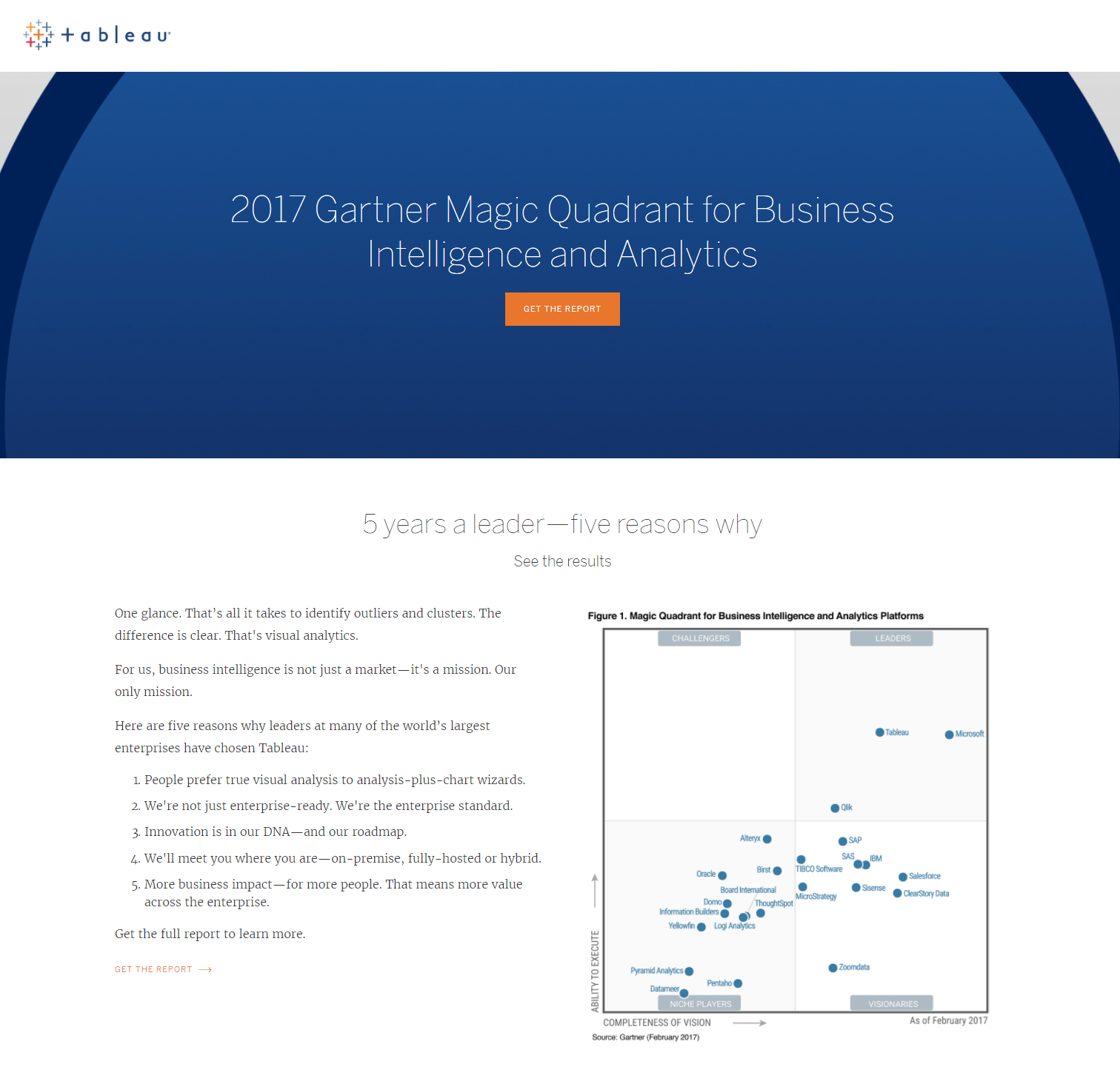
What the page does well:
- The headline tells prospects exactly what they’re getting by converting.
- The orange CTA button “pops” against the blue background, immediately grabbing visitors’ attention.
- The two-step opt-in form reduces intimidation and friction, because it breaks down the conversion process into two separate parts.
- The numbered list is easy to spot, and highlights the main reasons large enterprises choose Tableau.
- Clicking the second “Get the report” CTA and the graph image serve as additional ways to display the lead capture form.
- The graph serves three purposes: a great visual page element, a comparison of how Tableau is rated against the competition, and another way to display the lead capture form.
- Arrows next to the calls-to-action are directional cues, letting prospects know that there’s more valuable content to see beyond this page.
- Steven John’s testimonial — complete with full name, affiliation, and title — serve as social proof, positively influencing visitors to work with Tableau. Adding a headshot would make the quote more trustworthy.
- Company logos in the “Featured In” section are trust signals to let prospects know that Tableau has been publicly recognized by many credible brands.
- Sufficient white space around each page section makes the page aesthetically pleasing and easy to navigate.
What could be changed and A/B tested:
- Multiple exit links — the Tableau logo, links in the “Additional Resources” section, “Read more Tableau reviews…”, and links in the footer — could increase the page bounce rate.
- The Gartner Peer Insights review from 2016 should be updated because it’s a bit outdated and isn’t very descriptive.
4. To encourage white paper downloads
Comparable to the Google search, a Bing search for “Tableau software” generated these similar PPC results:

Before we analyze the Tableau landing page, let’s look at Bing ad the company created. Notice how the Top 10 BI Trends for 2017 site link says “Just Released” and promotes top trends that will shape 2017 — but it’s now 2018. This campaign needs to be updated with a new, more current promotion.
When users click the link, they land on this white paper landing page:
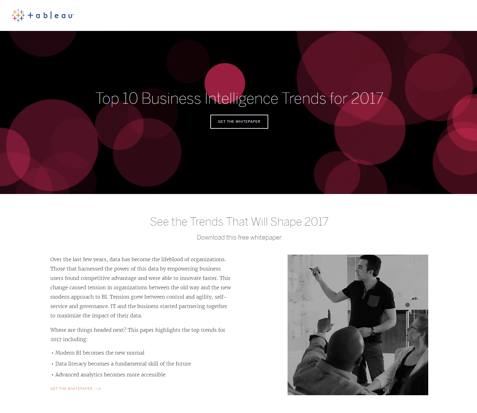
What the page does well:
- Message match between the Bing ad and landing page provide consistency and reinforcement of the message, and let prospects know that the landing page is relevant when they arrive.
- Multiple ways to expose the lead capture form increase the chances of visitors seeing it and converting.
- Bullet points in the landing page copy make it easy for visitors to quickly scan the page and pull out important information.
- Arrows indicate to visitors that there is additional content to view beyond this page.
- The image of the people adds a human element, and is likely to make visitors feel more connected to the offer.
- The customer testimonial (below the fold) shows prospects how Tableau has helped other professionals find success.
- Brand logos at the bottom of the page let visitors know that Tableau has been featured on multiple well-known websites.
What could be changed and A/B tested:
- The CTA button copy isn’t persuasive. Adding second-person copy, or mentioning that it’s free, would make it much more compelling. Something like, “Show Me the Whitepaper” is more descriptive and worth A/B testing.
- The black CTA button doesn’t stand out from the black background as much as it could. Testing it in a more contrasting color, like yellow, would make it more attention-grabbing. A quick look at the color wheel to choose a color opposite from black would make it more eye-catching.
- Multiple exit links — the Tableau logo, “Discover how”, “Learn more”, and links in the footer — could all increase the page bounce rate and decrease conversions.
5. To increase conference registrations
Tableau created this Facebook post to promote their 2018 conference and to offer a discount to anyone who registers by 1/19:

When prospects click the link in the post description, they’re directed to this Tableau event landing page:

What the page does well:
- The click-through design removes friction from the conversion process because it allows visitors to learn all about the offer without being intimidated by a lead capture form upon first arrival.
- The multi-step form also removes landing page friction by breaking up the long form into shorter, less daunting steps.
- Date, location, and price highlighted above the fold immediately let visitors know the most important event details before exploring the rest of the page.
- The video of the 2017 Conference provides prospects with a good idea of what the 2018 Conference will be like.
- The price-drop promotion is mentioned multiple times throughout the page, ensuring prospects know they’re getting the best deal by registering sooner, rather than later.
What could be changed and A/B tested:
- The blue CTA buttons should be tested in another color, like yellow, because there’s blue elsewhere on the page.
- The CTA button copy could be improved. Changing it to something more personalized and compelling, like “Save My Spot!” would likely generate more conversions.
- Exit links — the “Access TCL” and “TC18 Sponsorship Prospectus” buttons, links in the “What is the conference cancellation policy?” section, and footer links — could distract visitors and remove them from the page without registering for the event.
Take a cue from these Tableau landing pages
From the examples above, we can see that Tableau’s advertising and marketing strategy relies heavily on post-click landing pages to promote a variety of offers. It’s clear the company knows that dedicated post-click landing pages are fundamental for increasing multiple aspects of business success.
Expand your business by creating 100% customizable landing pages using the Instapage optimization platform. Sign up for an Instapage 14-day free trial today.

Try the world's most advanced landing page platform with a risk-free trial.
