With more than three-quarters of Fortune 100 companies using Slack, there’s no doubt that the brand is enjoying incredible success. In fact, Slack’s growth rate is “unheard of,” according to TechCrunch. In just one year, the company experienced 3.5x its amount of daily users (now 5 million) and paid accounts (now 1.5 million).
While this impressive expansion is certainly, in part, due to new technologies and capabilities – open communication channels, direct messaging, voice calls, video chats, etc. – that’s not all that’s contributed. Another factor that has played a substantial role in Slack’s massive growth is the company’s use of post-click landing pages to drive conversions and nurture prospects into paying customers.
Before we look at how Slack uses post-click landing pages, let’s start with a definition.
What is a post-click landing page?
A post-click landing page is a standalone web page that uses persuasive elements such as compelling headlines, engaging media, visual cues, and social proof to persuade visitors to convert on an offer. post-click landing page offers can be anything from account signups, live demos, webinar or event registrations, ebook or white paper downloads, and much more.
Knowing this, let’s begin with an example of how Slack is missing out on an opportunity to use post-click landing pages to gather email addresses.
Slack has an entire page of useful guides, from beginner guides to tricks and tips guides to department-specific guides:
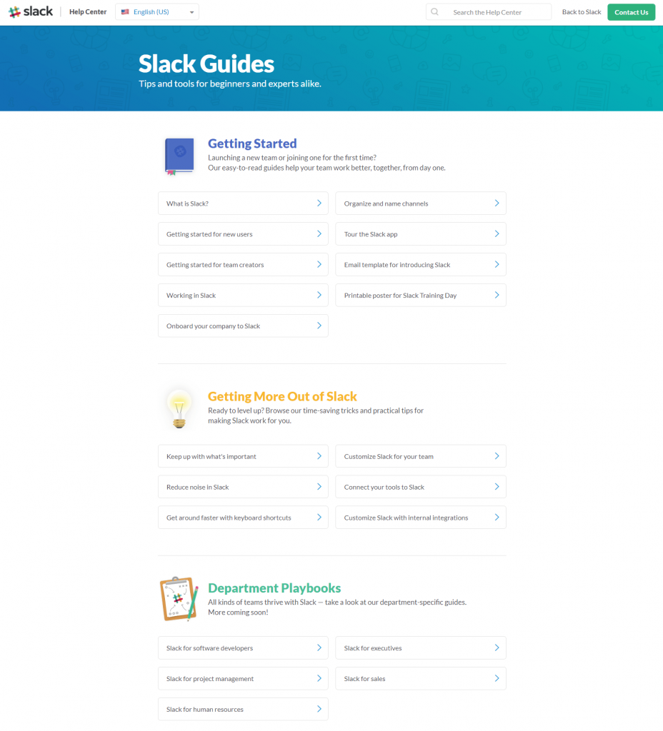
Unfortunately, since none of these guides are gated behind post-click landing pages, the company passes up the chance to collect prospects’ valuable contact information with them.
But that’s not to say that Slack completely missed the post-click landing page memo. Remember, that’s part of the reason they’ve seen such great success since their launch in 2013.
So how does Slack use post-click landing pages to drive conversions? Here are a few ways:
Slack post-click landing page examples
(Keep in mind for shorter pages, we’ve shown the entire page, but for longer pages, we only displayed above the fold. You may need to click through to the page to see some of the points we discuss. Also, note that some pages may be undergoing A/B testing with an alternate version than is displayed below.)
1. To generate free account signups
Most companies that make use of post-click landing pages have created at least one page for generating account signups — and Slack is no different.
Here’s a Bing ad (after searching “slack trial”) that promotes Slack software and encourages visitors to sign up for a free account:

When users click the ad’s primary headline, they’re directed to this Slack post-click landing page that persuades visitors to sign up for a free account:
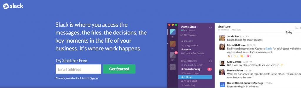
What the page does well:
- Only 1 form field makes it incredibly easy for visitors to sign up.
- “Free” is stressed in several locations, which is an effective tactic since free offers are difficult to pass up.
- The dashboard screenshot shows prospects exactly what they can expect should they choose to sign up for an account.
- Customer badges add trust value to the page, making prospects think, “If these big-name brands trust Slack, then why shouldn’t I?”
- The encapsulated form at the bottom of the page is attention-grabbing and provides prospects one more chance to convert on the offer.
What could be A/B tested:
- The logo in the top left corner is linked to Slack’s homepage, acting as an exit away from the page.
- The headline is longer than a headline should be — more like a subheadline. Adding a shorter, UVP-focused headline above this might better grab visitors’ attention.
- The CTA button color would “pop” more if it were tested in a color that contrasts better with blue, like yellow or orange.
- The first CTA button copy is not as specific and persuasive as it could be. Changing it to something more specific, benefit-oriented, and in first-person — like “Start my free account!” — would likely generate more clicks.
- The “Sign in” and “How Slack works” buttons are exit links that could take visitors away from the page without converting.
- No privacy policy may make prospects wary of submitting their email address.
2. To encourage event registrations
In addition to running PPC ads on Google and Bing, Slack also promotes their offers on social media.
Take a look at this Tweet which Slack created to introduce their upcoming event, Frontiers — a two-day conference in San Francisco:
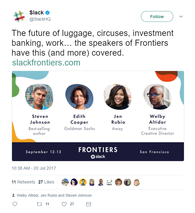
When users click the link in the post description, they are brought to this sales post-click landing page where they can learn about the event, and then click through to a registration page:

What the page does well:
- The tweet and page use message match, so prospects won’t be disappointed when they land on the page after clicking the Tweet.
- The navigation menu is filled with anchor tags that take visitors to various sections of the page, providing a more convenient and enjoyable user experience. It also follows visitors as they scroll.
- Speaker previews – complete with full name, affiliation, and headshot show prospects exactly who they’ll be hearing from at the conference.
- The detailed and descriptive agenda shows prospects exactly what they can expect if they attend the event.
- Scarcity and urgency are both leveraged in the pricing section. They inform prospects that they’re getting the best deal if they register early and there is only a limited supply of early registrations available.
- Customer testimonials from Twitter add social proof to the page, letting prospects know that other people are satisfied with Slack.
What could be A/B tested:
- Several exit links toward the bottom of the page (throughout the FAQ section, in the Twitter feed section, and the social media buttons) provide visitors with a potential way to leave the page before having a chance to register for the event.
- The CTA button copy could be improved. “Save my seat!” or “Reserve my spot!” is a lot more compelling than “Register” and “Register Now.”
3. To offer investment funding
Slack partnered with several other well-known companies, like Accel and Spark Capital, to create The Slack Fund: an investment fund to support teams building products that enable more simple, pleasant, and productive workplaces. They promoted The Slack Fund at the bottom of several of their blog articles, like this:

When readers click “Apply to the Slack Fund” in the example above, they’re brought to this click-through page to apply for funding:
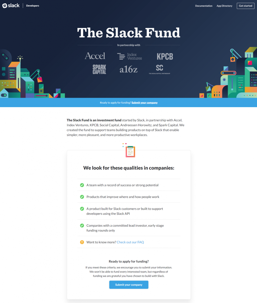
What the page does well:
- Partnerships displayed at the top of the page let visitors know who the company is working with to deliver this offer, which provides a sense of trust and assurance.
- Bullet points with minimal copy allow visitors to scan the page and extrapolate the most important information.
- Logos of other companies Slack has funded help persuade visitors to apply for funding for themselves.
- Click-through pages like this one help reduce visitors’ feelings of anxiety and intimidation because there is no visible form for them to complete until they’ve read through the entire offer and clicked through to the next page.
What could be A/B tested:
- Header and footer navigation links are distracting and could lead visitors away from the page before viewing the entire offer.
- The “Get Started” CTA button should take prospects to a form where they can apply for funding. Instead, it’s just another exit link that opens a Slack API page.
- Additional exit links of company logos, “Looking for more?” links, and social media buttons, also serve as distractions, potentially taking visitors off the page without converting.
- The “Submit your company” link above the fold should be changed to an attention-grabbing CTA button. The small, hyperlinked copy blends in and isn’t likely to persuade anyone to click it.
- The CTA button copy could be improved. The copy could be more compelling such as “Submit your company for funding” and might produce better results.
- The blue CTA button color is used elsewhere on the page, so it doesn’t stand out as well as it could. Changing the color to a brighter color like orange and enlarging the button would likely capture more visitors’ attention.
Did these Slack post-click landing pages inspire you?
Although Slack may not use as many post-click landing pages as some of the other companies we’ve discussed in the past, it’s clear that they still understand the importance of post-click landing pages for obtaining email addresses and converting prospects into leads and even paying customers.
Which of these Slack post-click landing page examples inspired your next post-click landing page design? Take what you learned and get started building your page with Instapage. Sign up for an Instapage Enterprise demo today.

See the Instapage Enterprise Plan in Action.
Demo includes AdMap™, Personalization, AMP,
Global Blocks, heatmaps & more.
