For sign-up landing pages, the single goal you want prospects to complete is to register for your service. You must then ensure that every design element helps you achieve that goal.
After a quick landing page definition, we’ll then critique 10 sign-up page examples, what they do well to generate sign-ups, and what could be A/B tested for potentially better conversion results.
What is a signup landing page?
A typical landing page is a standalone web page that uses persuasive elements — a compelling headline, engaging media, valuable social proof, attention-grabbing CTA buttons, etc. — to convince visitors to take action on a specific offer. That action could be to set up an account, download a guide, register for a webinar, schedule a demo, and more.
A sign-up landing page has only one very specific conversion goal: to generate sign-ups for a service.
Since signing up is usually the last step in the conversion funnel, sign-up landing pages don’t focus as much on persuading the prospect to convert. Rather, this page type is more about minimizing the friction involved in conversion. This means that the more traditional landing page elements (social proof, testimonials, engaging media, etc.) aren’t quite as necessary for sign-up pages.
10 signup landing page examples
(For shorter sign-up page examples, we’ve shown the entire page. However, for longer pages, we only displayed them above the fold. You may need to click through to each page to see some of the points we discuss. Also, keep in mind that some brands may be A/B testing their page with an alternate version than is displayed below.)
1. LifeLock
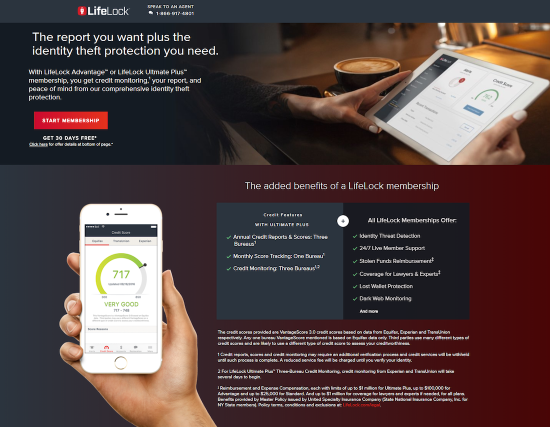
What the page does well:
- “What are you waiting for?” and the statistic underneath serve as elements of urgency, encouraging the visitor to sign up now.
- “Enroll in minutes” and “It only takes minutes to sign up” let prospects know that the signup process is quick and easy.
- The red CTA buttons are attention-grabbing because they contrast well with the rest of the page.
- The top and bottom CTA buttons are anchor tags that automatically take prospects to the middle CTA buttons to click through to the lead capture form.
- The click-through design reduces landing page friction because visitors aren’t immediately intimidated by a form.
- A multi-step form makes the signup process less overwhelming by breaking up the long form into shorter, less daunting steps.
- Images throughout the page show prospects what the different software features look like on multiple devices.
- The bulleted checklists show prospects the top benefits of LifeLock, instead of just the generic features.
- Star ratings and customer testimonials remind prospects that they made the right decision choosing LifeLock, further encouraging them to sign up for a membership.
A/B tests to run:
- A click-to-call phone number would make it easier for prospects to contact customer service.
- Many exit links (the LifeLock logo, legal information, reviews, membership cancellation, refund policy) allow visitors to leave the page before converting.
- Fine print throughout the page could make prospects hesitant to sign up.
- A second offer (for a free Identity Theft Protection Handbook) could distract visitors from the main offer (signing up for a LifeLock membership).
- Adding first-person copy would likely compel more prospects to click the CTA button.
- Adding more white space around the CTA buttons would help them stand out more. The last CTA button is surrounded by more white space and includes a visual cue arrow, but it’s at the very bottom of the page.
2. Movies Anywhere

What the page does well:
- The click-through format allows visitors to absorb the information on the landing page before having to complete the form.
- Brand logos throughout the page show visitors the well-known companies that use Movies Anywhere.
- Minimal copy makes it quick and easy for visitors to navigate the page and sign up for an account.
A/B tests to run:
- Multiple exit links (Skip, login, mobile device download buttons, movie covers, footer navigation) make it too easy for visitors to leave the page before converting.
- The blue CTA buttons would stand out more if they were a more contrasting color, like orange.
- The CTA button copy would likely persuade more prospects to click if it was personalized and compelling like, “Create my free account!”
- Highlighting that the account is free (in the headline or CTA buttons) would likely generate more conversions.
3. Qlik

What the page does well:
- The woman’s eye gaze toward the form is a directional cue that’s likely to make prospects look there as well.
- Encapsulation with color contrast is a visual cue that helps draw attention to the form.
- The unchecked opt-in box means prospects have read Qliks terms and conditions and are certain about signing up.
- Highlighting “today” in multiple places (the body copy and form header) stresses a sense of urgency.
- The software image shows visitors that the software is compatible with a variety of devices.
- A live chat feature makes it fast and easy for prospects to contact customer service, providing a better user experience.
- The benefits checklist reminds prospects why they chose Qlik as their self-service data visualization software.
- Brand logos serve as social proof, letting visitors know that other reputable companies trust Qlik.
A/B tests to run:
- 11 form fields could overwhelm prospects. Breaking up the form into a multi-step process could reduce friction and generate more conversions.
- “Submit” on the CTA button is vague. The button would likely get more clicks if the copy was compelling, such as “Sign up for my free Qlik account.”
- Emphasizing the account is free would likely generate more signups.
- The hyperlinked Qlik logo could immediately remove visitors from the page without converting.
4. D&B Hoovers

What the page does well:
- The live chat and click-to-call phone number (in two locations) allow visitors to easily contact D&B Hoovers customer service if necessary.
- The headline and subheadline clearly convey the company’s unique value proposition.
- The asterisks in the form fields indicate that all fields are required so prospects are not surprised during the signup process.
A/B tests to run:
- Exit links — the D&B logo, footer navigation, and social buttons — give visitors an escape route from the page without signing up.
- Less copy would be better at this stage of the buyer’s journey. Removing the blocks of text near the statistics would likely help with the page’s skimability.
- 8 form fields could be too much friction to encourage people to sign up. Reducing the form fields could increase conversions.
- The turquoise CTA button color doesn’t stand out as much as it could. Red or orange would draw more attention on this page.
- The CTA button copy should be more personalized and persuasive. Something like, “Start my free trial!” would likely compel more people to click.
5. BirdEye

What the page does well:
- Minimal copy is great since the prospect has likely already made their decision to sign up with BirdEye.
- 7 form fields are perfect for a signup landing page in the decision stage of the funnel.
- The CTA button copy is personalized and compelling. However, enlarging the text would make the button more attention-grabbing.
- The live chat provides an optimal user experience for visitors who want to contact customer service.
- The software images show prospects that the software can be used on multiple devices.
- Company logos and customer reviews assure prospects that they’re making the right decision by signing up for a BirdEye free trial. Full names, affiliations, and headshots add credibility to the reviews.
A/B tests to run:
- The image at the top of the page could distract visitors from the lead capture form because it’s very close (overlapping, actually) and contains a lot of copy.
- Adding white space around the form and CTA button would draw more attention to it.
- The blue CTA button would pop off the page more if it were a contrasting color, like orange.
- The exit links on the customer testimonials (“Read more”) could distract visitors from signing up because they would be redirected to an external page.
6. Ryte
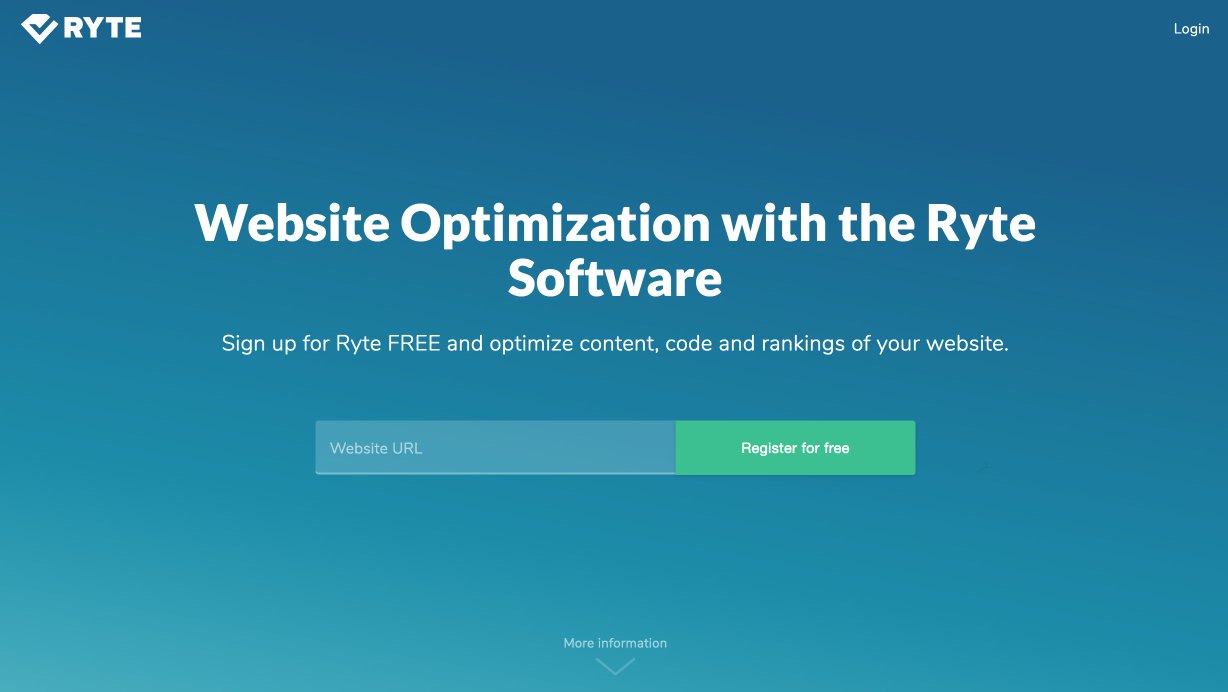
What the page does well:
- The CTA button copy is direct and persuasive, helping generate more conversions.
- Multiple cooperative CTA buttons (which are also anchor tags) give prospects many chances to sign up.
- Only one form field makes it fast and easy for prospects to complete.
- Sufficient white space above the fold helps draw attention to the headline, form, and CTA buttons.
- The arrow beneath the form field acts as a visual cue and an anchor tag, letting visitors know there’s more to see below and taking them there automatically upon clicking.
- Brand logos show visitors the other reputable customers Ryte has acquired.
- The “With Ryte you can” section is very personalized with first-person copy and specific benefits, which could help persuade visitors to sign up.
A/B tests to run:
- The green CTA button doesn’t stand out as much as it could because blue and green are analogous colors on the color wheel.
- Exit links (Ryte logo, login link, contact email address, and footer links) could distract and remove visitors from the page.
- The long page design isn’t necessary for a decision stage landing page, because prospects should have most of the information they need by this point.
- A 3+ minute video may be pushing the limits with limited attention spans. Cutting down the video may increase time on page, and, ultimately conversions.
7. Media Shower

What the page does well:
- Encapsulating the form with color contrast helps it stand out.
- 5 basic form fields are great for enticing prospects to complete the form.
- “Free” in multiple places is effective and more persuasive than if “free” wasn’t mentioned.
- Minimal copy (with short paragraphs and bold font) makes the page easy to scan and quickly pull out important information.
- Iconography and bold copy draw attention to the 3 main benefits of signing up for a Media Shower account.
- The orange arrows above the customer logos act as a directional cue, pointing toward the form.
- Trusted brand logos serve as social proof, encouraging prospects’ decision to sign up with Media Shower.
A/B tests to run:
- “Submit” is not persuasive for CTA copy. “Sign Me Up for Media Shower” is more personalized and descriptive.
- The orange CTA button doesn’t pop as much as it could because there’s another orange on the page. Another contrasting color like purple or blue might draw more attention.
- Adding white space throughout the page would make it easier to navigate and comprehend.
- Exit links (the Media Shower logo, the login button, and footer links) violate the 1:1 conversion ratio and could prevent visitors from converting.
8. Paychex
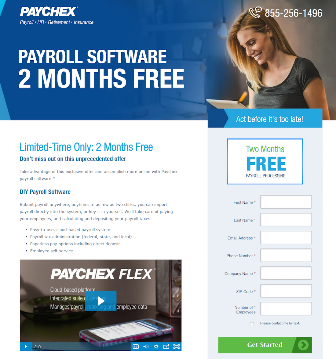
What the page does well:
- A sense of urgency (“Limited-time only”, “Act before it’s too late”, “Don’t miss out”, “exclusive offer”) makes prospects feel compelled to sign up quickly.
- The woman’s eye gaze toward the form subconsciously makes visitors look there too and entices them to get started.
- Encapsulation makes the form stand out on the page.
- The unchecked opt-in box ensures Paychex will only send text messages to highly interested customers.
- The CTA button arrow indicates that there’s more value beyond this page, once they click.
- A click-to-call phone number provides an optimal user experience.
- “2 months free” is a great selling point because everyone loves free (and many offers only include one month free).
- Highlighting certain copy with section headers, bulleted lists, bold formatting, and iconography makes it easy for visitors to find the most important details.
- Industry awards serve as a reminder as to why prospects should sign up for a Paychex trial.
A/B tests to run:
- The green CTA button would really pop if it was a more contrasting color like orange.
- 7 form fields could be limiting the total number of conversions, and removing a few input fields could increase conversions.
- The Paychex logo, hyperlinked asterisk, and footer links are exit links that could distract visitors and take them away from the page without converting.
- The amount of copy could be overwhelming for prospects. If they’re on this landing page to sign up for a free trial, a great amount of copy isn’t necessary.
- Two videos may also be too much for a signup page in the decision stage, since prospects should already have most of the information they need.
9. Zen Planner

What the page does well:
- Encapsulating the form draws attention to it and likely encourages more people to take notice and complete it.
- 4 form fields asking for very basic information is great for enticing prospects to complete it.
- The green CTA button stands out because there’s no other green on the page.
- “Free” on the CTA button is persuasive; however, adding first-person copy would make it more personalized and compelling.
- Very minimal copy allows visitors to focus on the primary elements: the form and CTA buttons.
- Iconography and red/bold font make the benefits of Zen Planner section easy to find by scanning the page due.
- Social proof (a customer testimonial, Trustpilot reviews, and industry awards) remind prospects that there are others satisfied with Zen Planner.
A/B tests to run:
- The contact us link is in a poor location because web users are used to seeing company logos in the top-left of a page. With the link here, it makes for a very easy exit route off this page.
- Multiple exit links (the Contact Us link, Zen Planner logo, and award logos) serve as an escape route and could decrease conversions.
- No privacy policy might deter prospects from submitting their personal information.
10. Emma

What the page does well:
- 4 form fields requesting basic information makes it fast and easy for a prospect to complete.
- The click-to-call phone number allows visitors to easily contact Emma reps if needed.
- Minimal copy enables prospects to focus solely on completing the form and signing up for Emma.
- The CTA button copy demands action but might generate more conversions with personalized copy (“I’m ready to make the switch!,” for example).
- A customer testimonial gives prospects one last push of encouragement before signing up.
A/B tests to run:
- A second offer for a demo takes focus away from the main conversion goal of signing up for an account.
- The hyperlinked Emma logo could immediately remove visitors from the page without converting.
- The blue CTA button would stand out more if if were a different color, like orange, because blue is frequently used on the page.
- No privacy policy might worry prospects and prevent them from signing up.
Sign-up landing pages can make all the difference
By the time prospects get to the decision stage of the buyer’s journey, they know they have a problem, they’ve considered their options, and you’ve convinced them to select your product or service. The next logical step is to design a sign-up landing page they can’t leave without converting.
Turn ad clicks into conversions, and create dedicated, fast-loading landing pages for every offer. See how you can provide audiences with unique landing pages by signing up for an Instapage 14-day free trial today.

Try the world's most advanced landing page platform with a risk-free trial.
