Fortune 500 companies have come to love Microsoft SharePoint with 80% of those companies using it. The platform was initially launched as a document management system, but today SharePoint users can build websites and run other Microsoft apps on the platform.
The Microsoft subsidiary’s modern user experience and intuitive interface makes mundane tasks easier to process and comprehend. Companies of all sizes have a need for document management, and SharePoint has become one of the world’s leading platforms in this area.
How has SharePoint experienced such massive growth since its launch in 2001? Microsoft’s investment in new technologies certainly helped. But it was the investment in marketing that truly allows the platform to thrive. Microsoft and SharePoint both use post-click landing pages to increase engagement and to nurture prospects into paying customers.
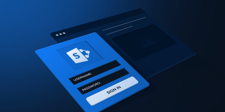
What is a post-click landing page?
post-click landing pages are standalone pages that use persuasive elements such as compelling headlines, visual cues, social proof, and trust seals to persuade visitors to convert on an offer. The post-click landing page offer can be a live demo, registration for a webinar, an ebook download, and much more.
Let’s evaluate some SharePoint post-click landing pages to see how they convince prospects to convert.
5 SharePoint post-click landing page examples
(For shorter pages, we’ve shown the entire page. For longer pages, we only displayed above the fold. You may need to click through to the page to see some of the points we discuss and some pages may be undergoing A/B testing with an alternate version than is displayed below.)
1. Generate downloads for their file storage ebook
SharePoint’s Facebook page links visitors to a variety of different post-click landing page offers. This Facebook post takes prospects to the post-click landing page below:

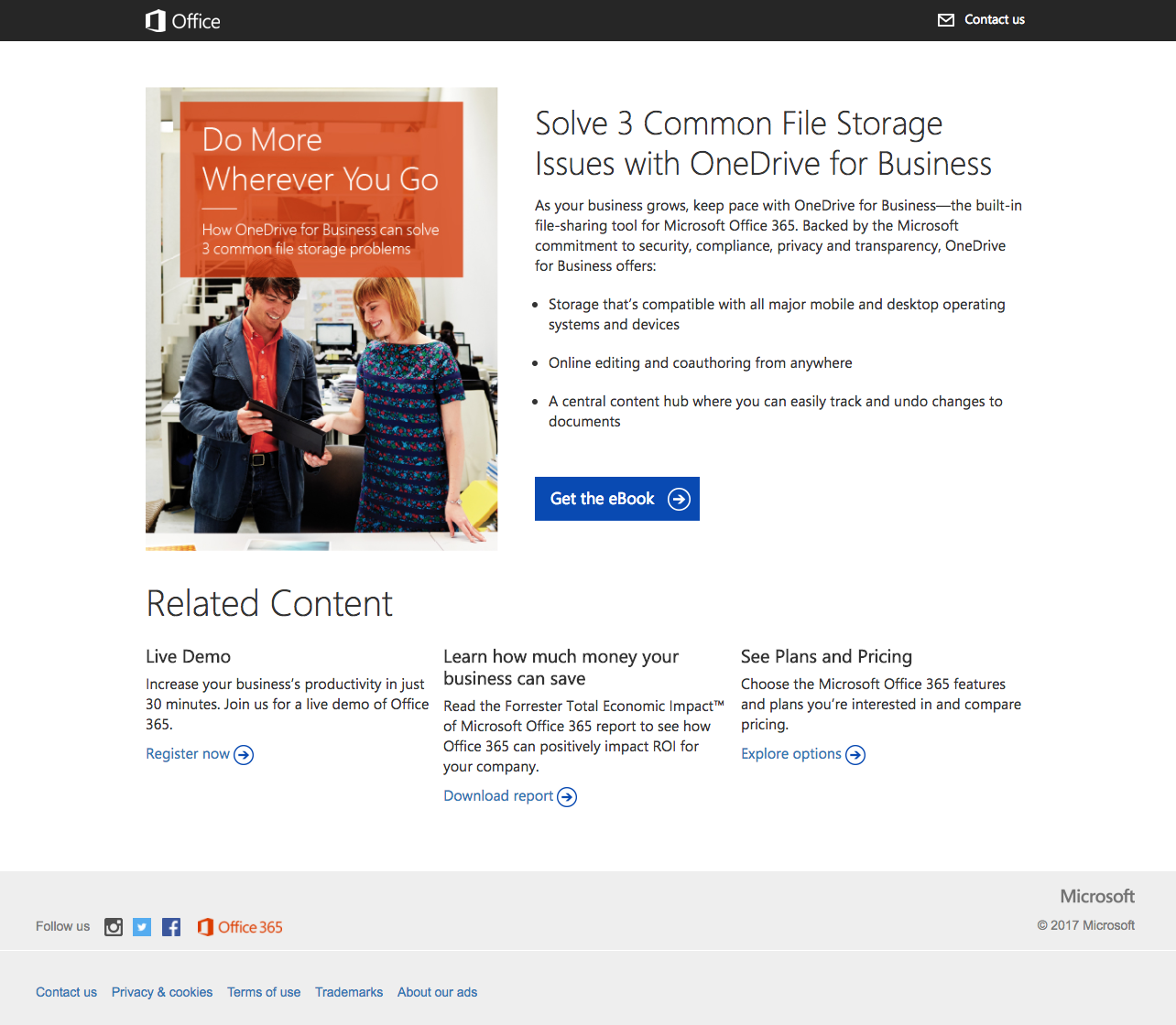
Who the page is created for:
Prospects interested in solving file storage problems.
Why the page was built:
Establish Microsoft as an authority in file storage and to generate ebook downloads.
What the page does well:
- Message matching is used from the Facebook post to the post-click landing page (in this case the headline and image). This helps prospects make the connection from the post to the post-click landing page offer because they expect to see and read the same message.
- No menu navigation keeps visitors on the page and focused on the offer.
- The ebook cover image shows visitors what they can expect when they download the ebook.
- The bulleted copy allows visitors to quickly scan the page and determine whether the contents of the ebook are worth a download.
- The blue CTA button stands out from other elements on the page. The blue CTA catches the eye of prospects and increases the chances of conversion.
- The arrow on the CTA button is a visual cue implying that visitors should click the button and proceed to the ebook.
- The 2017 copyright in the footer is current so that prospects won’t be confused about the timing or relevancy of the offer.
What the page could change or A/B test:
- The image and the CTA button are both hyperlinked to the PDF download, so there is no way for SharePoint to generate leads from this page. Removing the links on both elements would prevent visitors from accessing the ebook without first entering their contact details.
- The logo and the “Contact Us” text in the header are linked. Both links give visitors an opportunity to leave the page without considering the offer.
- The copy could test leveraging a sense of urgency by using “limited-time offer” or “only X number of copies available” which may lead to additional conversions.
- The “Related Content” section is unnecessary because it takes visitors off of the post-click landing page and away from this ebook. Remember, your post-click landing page should focus on one thing and one thing only, not give options for visitors to click away.
- Social media links in the footer take the focus off of the file storage ebook offer. These links should be removed from the page.
2. To persuade visitors to download a collaboration ebook
Facebook is one of SharePoint’s major social media platforms for generating traffic. As in the previous example, SharePoint’s Facebook post takes prospects to the post-click landing page:
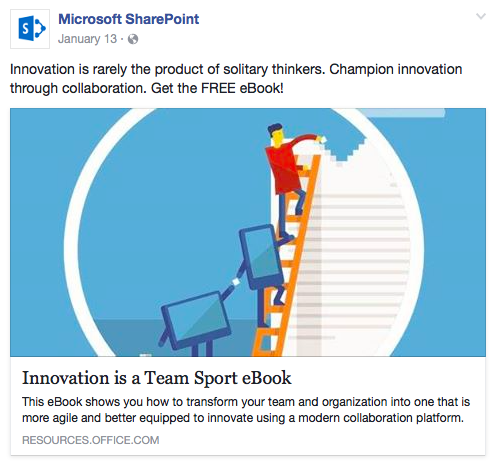
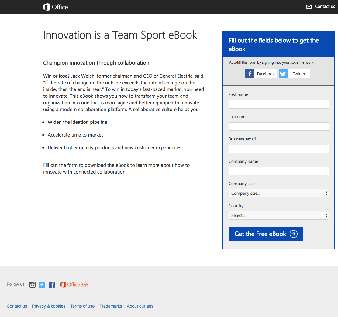
Who the page is created for:
Microsoft prospects who are interested in building a collaborative culture inside their own companies.
Why the page was built:
To generate interest in Microsoft brands and establish Microsoft as a leader in collaboration.
What the page does well:
- The Facebook post and post-click landing page headline both use message matching, which confirms that prospects are in the right place for the ebook.
- Minimal copy with bullets helps visitors quickly determine if the ebook is worth downloading.
- The form’s auto-fill option allows visitors to fill it out with just a few clicks, which simplifies the process and will likely increase conversions.
- The form is encapsulated so it draws attention as soon as someone arrives on the page.
- “Free” is used on the CTA button, which lets visitors know they don’t have to pay anything to redeem the offer.
What the page could change or A/B test:
- The “Contact us” link acts as an easy exit route off the page.
- The hyperlinked logo in the header does the same. Removing this link will help keep visitors focused on the page and the ebook offer.
- The CTA color is used several times on the page, which limits the CTA button’s ability to stand out.
- The social media links in the footer take visitors away from the offer. Eliminating these icons will help optimize this post-click landing page.
- Social proof could enhance this page. A case study, testimonial, or customer logos could show visitors that other businesses had success using the service.
3. To register visitors for a privacy webinar
SharePoint links to post-click landing pages from the company Twitter account. Clicking the link in this Twitter post takes us to the post-click landing page below:


Who the page is created for:
Prospects interested in how Microsoft can enhance compliance and protect individual privacy rights.
Why the page was built:
To generate interest in Microsoft applications.
What the page does well:
- No menu navigation keeps visitors on the post-click landing page, focused on the offer.
- The short form lets visitors fill out the fields quickly, reducing friction and increasing conversions.
- Bulleted copy allows prospects to process the information quickly and make a faster decision on whether they should convert and register for the webinar.
- The form draws maximum attention because the solid blue color acts as a visual cue.
- Webinar hosts have their name, title, and headshot. This helps instill trust with visitors because they can see that representatives from the legal department are presenting.
What the page could change or A/B test:
- The image is not relevant to the offer. Choosing an image that relates more to privacy could have more of an impact here.
- The headline on the image is repetitive with the headline above the copy. A more persuasive main headline could be “How Will the New GDPR Affect You?”
- “Register” appears out of context because the webinar has already passed. “Register is more appropriate for live presentations where seats may be limited. However, since the webinar is now recorded, there is no maximum capacity so these instances should be replaced with a different verb. For example, improved CTA copy could be “I Want the Recording.”
- The CTA color is the same as the form. This makes it very difficult for visitors to see exactly where the CTA begins. Choosing a different color, such as green, would help the CTA stand out.
- Excessive white space under the form makes the page seem unbalanced, especially with an abundance of copy on the other side. Adding a testimonial, trust seals, or customer logos to this section could be a great way to fill in this empty space.
4. Entice prospects to watch their on-demand virtual summit
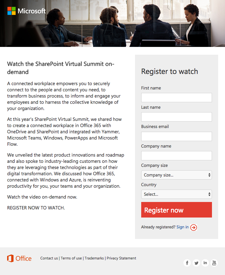
Who the page is created for:
Prospects interested in watching the SharePoint Virtual Summit.
Why the page was built:
To get more people interested in SharePoint.
What the page does well:
- No menu navigation keeps visitors on the page and focused on the offer.
- The Microsoft logo is not hyperlinked, which is a common mistake companies often make with post-click landing page design. Without it linked, visitors can’t leave the page through the logo.
- The headline focuses on the offer as soon as visitors land on the page. By reading the headline they instantly understand what the offer is about.
- The red CTA button stands out immediately so there is no chance visitors can miss it.
What the page could change or A/B test:
- The image doesn’t seem relevant to the offer. SharePoint could have used an image of employees using the SharePoint platform, or even a smartphone or tablet with SharePoint displayed on the screen.
- The red CTA button is similar to other elements on the page. Choosing a different color, such as orange, would help the CTA stand out and increase conversions.
- The CTA copy isn’t personalized. “Register Now” would be more appropriate if it was a live presentation. But since the summit is recorded, “register” isn’t accurate. “Send Me the Video” would be more appropriate in this case.
- Social media links in the footer give visitors a chance to leave the page without converting. Besides, the links are just the profiles on the respective social networks. A better place for these social media links would be on the thank you page — after they’ve converted.
- Modifying the copy with bullet points could help visitors skim the article and learn the key takeaways. This may not seem like a big idea but three paragraphs of text can seem overwhelming when you consider people’s attention span is very, very short.
- A lack of social proof stops this page from reaching its full potential. When 84% of users trust online reviews as much as a personal recommendation, a testimonial from a company who attended the SharePoint Virtual Summit and improved their business, as a result, would make a positive impact on this post-click landing page.
5. Download their connected workplace ebook
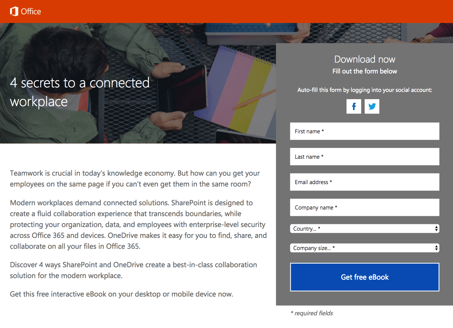
Who the page is created for:
Prospects interested in using SharePoint or OneDrive as collaborative tools.
Why the page was built:
To generate interest in SharePoint and OneDrive.
What the page does well:
- The absence of a navigation keeps the page clean and simple at the top.
- The form is encapsulated, which serves as a visual cue to the visitor to pay attention to the form (and ultimately submit their information).
- The auto-fill option above the form allows visitors to finish the form with a few clicks. Simplifying the form will likely increase conversions. This technique helps reduce form friction.
- The blue CTA color doesn’t show up in any of the surrounding elements, helping the button to stand out and draw eyes toward it.
- “Free is used” in the copy and the CTA button, which tells visitors the ebook does not cost anything.
- The privacy policy link in the footer helps build trust with prospects. Prospects can feel more comfortable with sharing their personal data after reading the policy.
- The copy describes the topics found in the ebook: new changes in collaboration, adapting to the modern workplace, and enterprise-level security solutions. Prospects know what to expect when downloading this ebook.
What the page could change or A/B test:
- The SharePoint logo hyperlink in the header takes visitors to the Office 365 product page. Removing this link could increase conversions.
- The headline isn’t descriptive enough of the offer. It could do more to let readers know that an ebook is up for grabs. Adding “Free Ebook” to the headline could make the headline extra clear immediately.
- An image of the book cover or preview of what is inside would help prospects understand what they can expect to receive upon converting.
- The form title, “Download now” isn’t personable or compelling. A title more connected to the offer would be more effective.
- The tablet is a blank screen. We know it’s a stock photo but at least put something on the screen!
Which SharePoint post-click landing page was most influential to you?
SharePoint knows how to use post-click landing pages to expand its reach and grow its lead database. Prospects can register for webinars, live demos, and download ebooks, with offers that are designed to build SharePoint’s authority as a brand and nurture prospects into paying customers down the line.
Review the examples above and the critiques before creating your next post-click landing page. Then, once you’re ready, design your own personalized post-click landing pages with Instapage. Sign up for an Instapage Enterprise demo today.

See the Instapage Enterprise Plan in Action.
Demo includes AdMap™, Personalization, AMP,
Global Blocks, heatmaps & more.