No matter the industry, niche, audience, or offer, every marketer’s most coveted conversion is the sale. All of those squeeze pages, splash pages, and lead capture pages you created throughout the buyer’s journey — they all have one ultimate goal: the sale.
You know that you must create dedicated post-click landing pages to offer your prospects free ebooks, webinars, reports, guides, demos, and trials, but how do you finally secure the big sale at the end of the marketing funnel? It’s a bit more difficult than obtaining an email address since now prospects must hand over their hard-earned money for your product or service.
This is where the sales page comes in.
What is a sales page?
A sales page is a standalone web page at the end of the marketing funnel, created with one specific purpose in mind — to secure sales for your product or service. While the offer on your sales post-click landing page will differ depending on your industry, the goal of your page remains constant — to get visitors to convert into customers.
Sales post-click landing pages differ from other post-click landing pages because they are often click-through pages that ask for payment. Generally, the CTA button copy on them reads something money-related like “buy”, “order”, or “purchase”, and sends prospects through to an order form when clicked.
Since you’re asking for people’s money instead of just requesting their email address, a sales page must be extra convincing and persuasive — even more so than your typical post-click landing pages. This means creating pages that leverage compelling sales language and persuasive sales techniques.
We’ve compiled some of the best sales page examples to demonstrate how other marketers promote their services, but it’s also worth noting that there is no perfect sales post-click landing page template. However, the examples below demonstrate some effective techniques to help you design your own pages.
Sales techniques to use on sales post-click landing pages
Urgency
Since humans have such short attention spans — shorter than a goldfish — it’s imperative that you immediately stress a sense of urgency on your sales page to hold your visitors’ focus. An effective way to do this, and to encourage them to make a decision quickly, is to utilize a countdown timer.
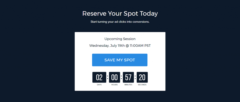
Whether you’re looking for webinar registrations, event sign ups, coupon downloads, or product sales, incorporating a countdown timer allows you to make your offer time-based, which increases urgency and inspires action.
Our very own webinar post-click landing page uses a countdown timer to encourage webinar registrations:
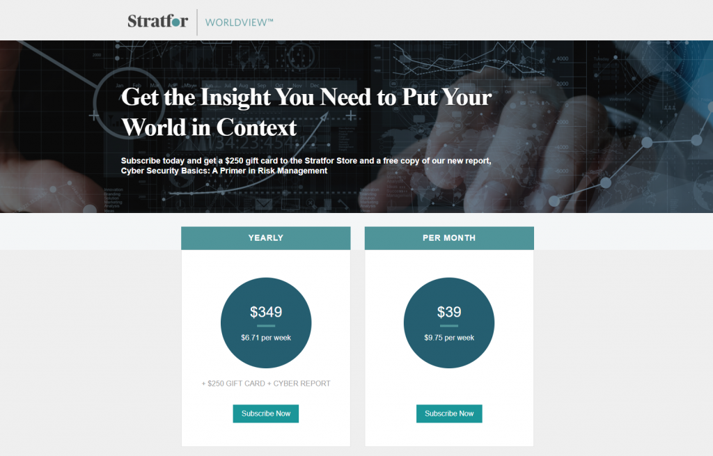
Here’s another example — this time a sales post-click landing page — from Stratfor. There is no countdown timer, but the subheadline lets visitors know that they should act today to receive a $250 gift card:
Scarcity
It’s human tendency to want what we can’t have. That’s why perceived scarcity on your sales page — using copy like “only X seats left” or “only X copies remaining” — is a persuasive sales technique for influencing your visitors’ decisions and driving action.
AppSumo is promoting their “How To Make a $1,000 a Month Business” course with this sales post-click landing page:
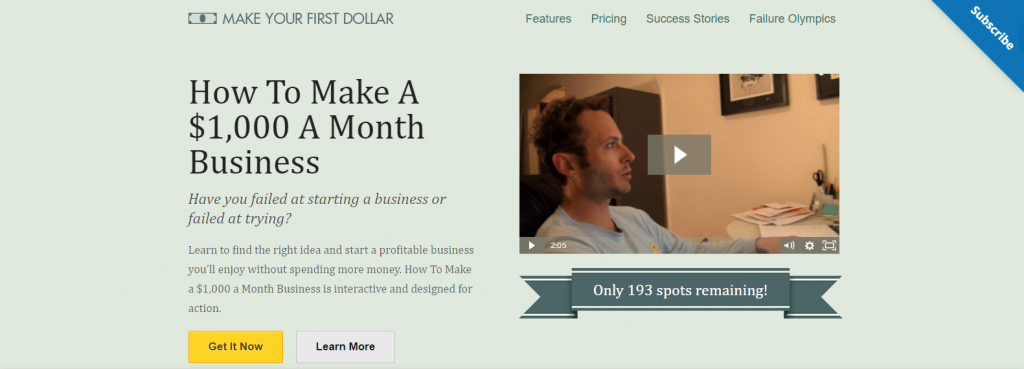
On this page, they assert that only 193 spots remain. They promote this in two different places — under the video as seen in the image above, and at the bottom of the page in the payment plan section. Visitors are made aware of the scarcity as soon as they arrive on the page, and reminded again once they’ve viewed almost the entire page.
Flattery
Because emotion is innate, powerful, and unconscious, most human decisions are driven by emotions. According to Harvard Business School professor, Gerald Zaltman, 95% of purchase decisions take place unconsciously.
So when it comes to the selling process, it makes sense to appeal to human emotion. By getting in touch with their emotions, you are more likely to convince prospects to buy your product or service
One common way to do this provides visitors with flattery when they arrive on your sales page. Make your visitors feel special and even privileged.
The American Motorcyclist Association makes excellent use of flattery on their sales post-click landing page:
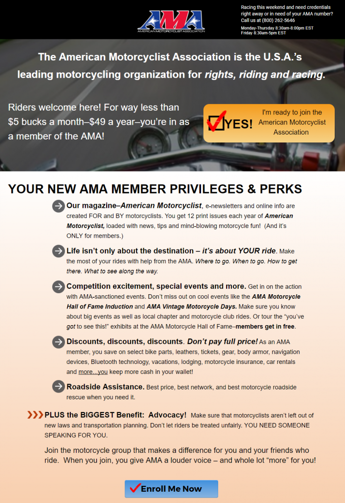
They make visitors feel welcome by exhibiting flattery in several different places:
- In the subheader, they let prospects know that for just $5 per month, they’re “in” as an AMA member.
- In the bulleted copy, “It’s about YOUR ride” and “You need someone speaking for you.”
- Finally, before the last CTA button, “The AMA is on your side. The AMA STANDS UP for our right to ride. Don’t wait any longer to join!” (notice the use of urgency, as well.)
Special offer
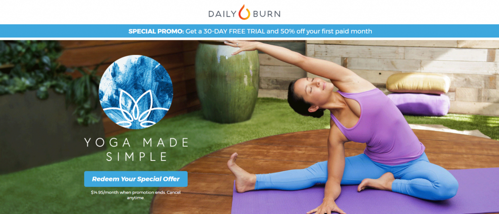
When a company offers a special deal or promotion, it’s similar to the urgency sales technique. Visitors likely know that this deal won’t last forever, so they are more likely to take advantage of it immediately. This type of deal is typically advertised differently. Rather than using phrases like “Buy now”, “Act fast”, or “Don’t wait”, the copy specifically reads “Special promo” or “Special offer.”
Look at how Daily Burn advertises their special offer for a 30-day free trial and 50% off an initial paid month:
“Limited time offer”
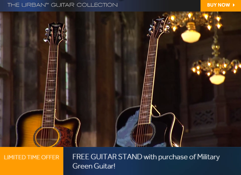
This technique is comparable to the “Special offer” or “Special promo”, but it uses the exact phrase, “Limited time offer” to persuade visitors to buy. It can incorporate some of the other sales techniques, like scarcity, by mentioning the quantity you have left to sell. You can also offer “Limited time offer” discount coupons to entice those who may be hesitant to make a purchase.
“Limited time offer” is highlighted on this sales post-click landing page as soon as visitors land on it. Since it’s located above the fold and placed on a yellow background, it’s likely to grab many visitors’ attention:
Money-back guarantee
In today’s society, many people are afraid of being scammed, oversold, and taken advantage of — especially on the internet. Many prospects are wary of what you say in your sales promotions and hesitate to convert on your offer because they simply don’t believe you and need your offer to be backed up.
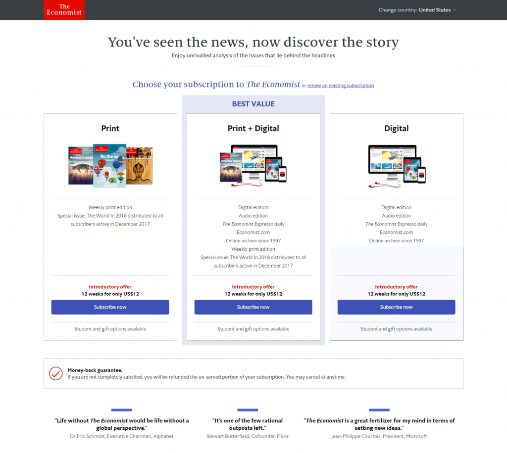
To negate their worry, make them feel at ease, and convince them that you’re a trustworthy company, you can use risk reversal — a technique that includes offering a money-back guarantee, or 100% satisfaction guarantee, to build trust. If customers are unsatisfied with your product or service within a certain time frame (usually 30 or 60 days), allow them to get their money back, hassle-free.
The Economist offers a money-back guarantee below the subscription options on their sales page, in which customers will be refunded the unserved portion if they aren’t 100% satisfied:
Here’s another sales post-click landing page from Nerd Fitness Academy demonstrating the same technique:
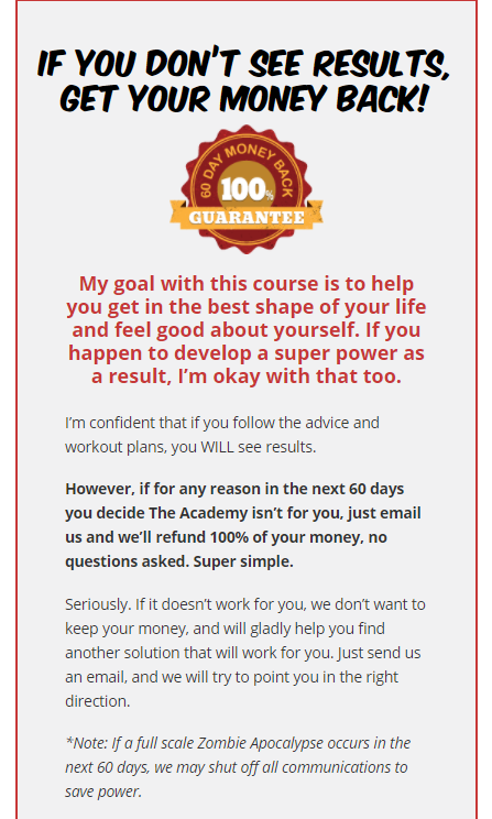
Toward the bottom of the page, they offer a 60-day money-back guarantee if customers don’t see results from the Nerd Fitness Academy, or if they are simply unhappy with their purchase. They also make it clear that the refund is “super simple,” provided in-full, with “no questions asked.”
UVP-focused headline
Without a captivating headline to demand attention from your visitors, they may not stick around to view the rest of your page. Your headline is typically the first thing they see on your page, so it’s critical that it satisfies their wants and needs, and promises them desired results.
The best way to do this is by highlighting your Unique Value Position, or UVP.
Your UVP allows you to highlight that one quality that sets you apart from your competition. So rather than overwhelming visitors with an entire list of provided benefits (that they’re likely to forget), highlight your one UVP in the headline, and use the rest of your page to support it.
Check out the headline on this sales page from Double Your Freelancing:
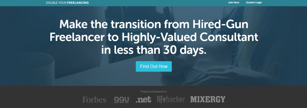
It’s extremely compelling because it paints a clear “before and after” picture (from hired-gun freelancer to highly-valued consultant), and provides a specific timeframe in which that transformation will occur.
Social proof
Social proof is the online version of word-of-mouth — like positive peer pressure, influencing people to make certain decisions and take action.
It’s crucial to include social proof on your sales pages because people are much more likely to trust their peers than they are companies with sales motives. In fact, visitors are 12 times more likely to trust third-party product reviews than product descriptions from the companies themselves.
So rather than explaining the impressive results your company can deliver, you’re better off showing proof of the results that you have provided to current satisfied customers. Displaying visible social proof on your sales pages is a powerful way for brands to build trust with their prospects, and there are a number of ways it can be done.
Home Chef chose to include a CBS News story about their meal delivery service to increase their credibility:
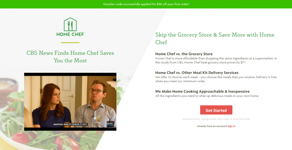
The video explains that Home Chef saves customers the most money in comparison to three other meal kit delivery services, which is a huge deal considering how popular this type of service has become.
GetResponse uses two customer testimonials on their pricing page. Notice how each testimonial is complete with the customer’s full name, affiliation, and headshot:
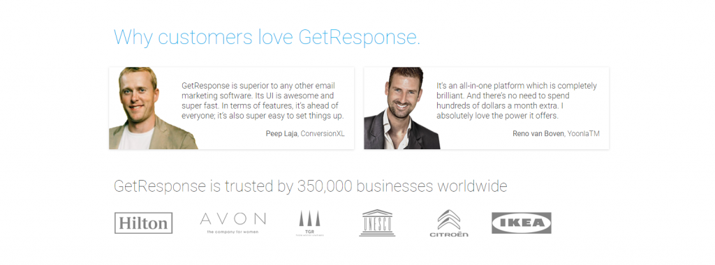
Below them are several of badges of well-known businesses who trust GetResponse. Both of these inclusions help add credibility to the page.
Create your own sales pages using these sales techniques
Sales pages provide you with an opportunity to promote your products to your audience in the most effective way possible. By using a long-form sales page and incorporating the appropriate sales techniques, you can thoroughly explain your offer, build trust with visitors, and win more customers.
Using the techniques above, start creating your own professional, high-converting sales pages with Instapage and our designer-friendly platform. Your conversion rates will thank you.
