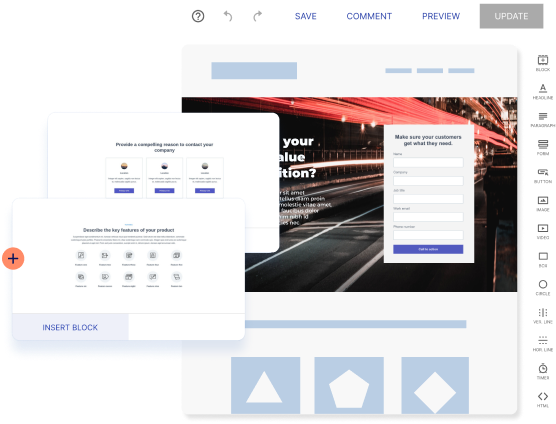
Landing page templates and layouts really help you streamline your page creation process. They give you a starting point for how you want your landing page to look so you don’t have to stare at an empty page for hours and suffer through the anxiety of the blank page syndrome.
Conversion-optimized and fully customizable templates categorized by industry help you reach your final page version even faster than simple skeletal page templates.
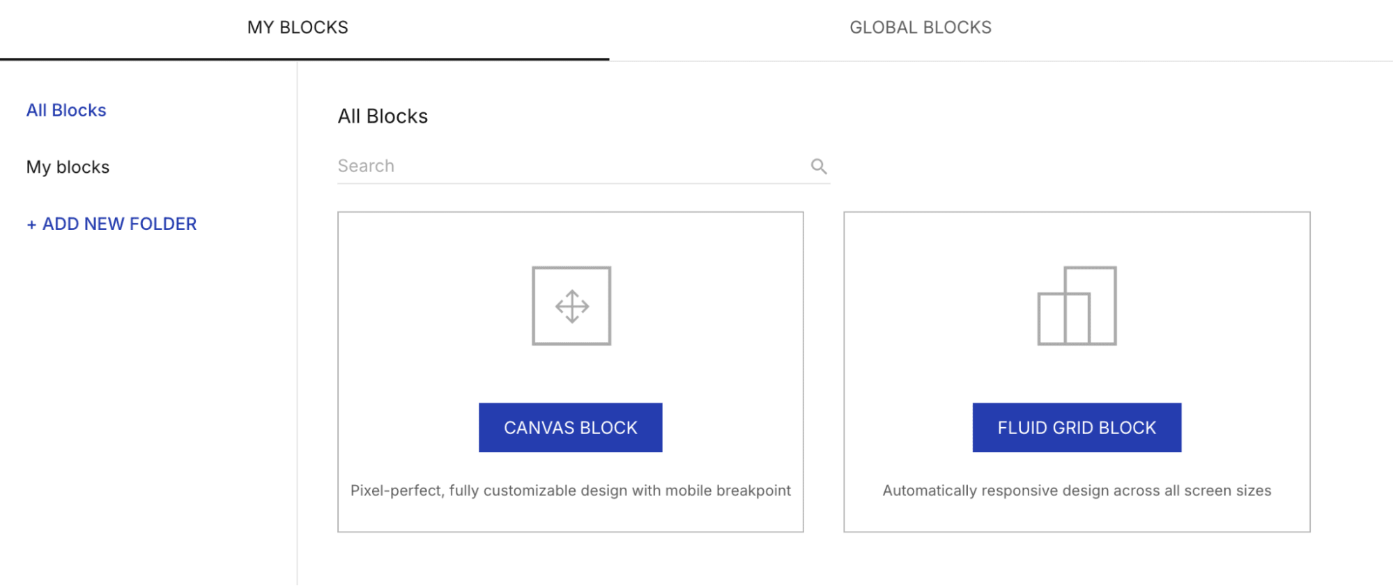
And now, with Instapage’s newest feature, Fluid Grid Blocks, you can quickly and precisely organize and structure your content using predefined grid layouts to meet your design needs across all devices.
What are Fluid Grid Blocks?
Fluid Grid Blocks are a new block type that uses customizable, container-based grids to create landing pages that automatically adapt and scale to any screen size. 
With the new feature, you get to:
- Quickly create automatically responsive landing pages
- Maintain consistent designs that adapt and scale across all devices
- Avoid manual mobile layout adjustments
- Update content and have the layout auto-adjust
- Easily organize designs exactly as needed
With Fluid Grid Blocks, you are in full control of your automatically responsive landing page blocks
The customizable container-based grids automatically adapt and scale to any screen size, and let you choose from a range of predefined grid options with varying rows, columns, and widths.
The Blocks allow you to be very precise about organizing and structuring your landing page elements across all devices and screen sizes.
So, if you’re designing a landing page with multiple products, images, descriptions, pricing, and more, Grid Blocks will help you align them neatly across all screen sizes, while still allowing you to make edits if you want.
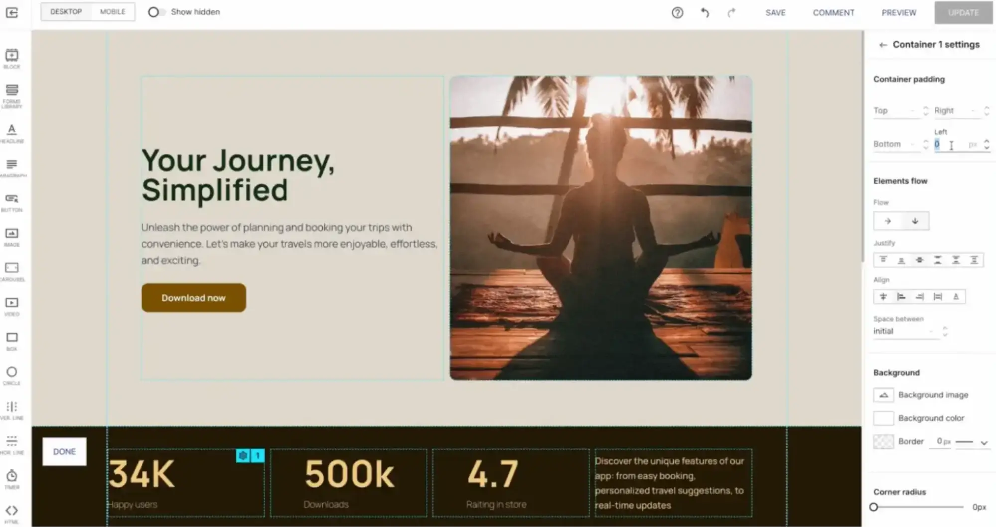
Once you’ve selected your Grid Block, you can easily drag and drop headlines, paragraphs, images, and buttons into each container. When you add more elements in one container, the rest of the elements auto-adjust, so you don’t have to spend time being finicky with getting things to look straight.
The containers are also numbered to stack in ascending order when transitioning to mobile, making it effortless to create responsive landing pages.
This feature is useful for any business, such as e-commerce sites looking to create a consistent, adaptable layout for all their click-through landing pages, or agencies and consultancy businesses wanting to build a proven, scalable pattern that delivers high-conversions for all their clients.
See the power of Fluid Grid Blocks in the walkthrough video below.
Build auto-adjusting layouts with powerful format settings
With Fluid Grid Blocks, you are in complete control of how you want your landing page elements to adapt and appear.
Each container has settings to help you quickly adjust padding and customize the orientation, alignment, and spacing of elements. These settings automatically apply to any screen size, including the mobile view, with the ability to adjust them as necessary. Any updates are effortless, where your layout auto-adjusts to any changes based on your container settings.

Launch more landing pages and campaigns faster with Fluid Grid Blocks
The new Fluid Grid Blocks are designed to help you create automatically responsive landing pages in minutes. With predefined grids and powerful container settings, you have everything you need to quickly build layouts that adjust perfectly across devices, delivering engaging, high-converting experiences every time.
Want to create responsive landing pages faster than ever before? You need to sign up for the 14-day free trial and try Instapage’s new features today. Your landing pages and conversion rates will thank you.

Try the world's most advanced landing page platform with a risk-free trial.
