Online lending has expanded dramatically over the last few years — and it’s no wonder since customers are now able to refinance auto loans, consolidate student loans, pay off credit card debt, and even apply for personal loans with just a few clicks of their mouse.
In just two years, U.S. online lenders grew their loan volume 9 times, from a total market size of $4.5 billion in 2013 to $36.5 billion in 2015.
As you can imagine, this explosion of online lending has caused a detrimental disruption to banks. According to former U.S. Secretary of the Treasury, Lawrence Summers, and Harvard PhD candidate, Natasha Sarin, “a substantial part of the reason banks have become riskier and efficiently more leveraged is a decline in their franchise value.,” In fact, since 2009, financial services have lost more than $100 billion in revenue.
One of the major companies disrupting banks with online loan opportunities is LendingClub — a brand that has helped more than 1.5 million customers with their finances, lending out over $28 billion total.
One of the primary ways LendingClub has been able to reach so many people and substantially increase their customer base is with a finely-tuned marketing strategy. This, of course, includes post-click landing pages.
What is a post-click landing page?
A post-click landing page is a standalone page that a visitor lands on after clicking an ad or search result (PPC ads, social media ads, display banners, etc.). post-click landing pages use persuasive elements such as compelling headlines, hero shots, social proof, and CTA buttons to convince visitors to take action on a specific offer. That action could be to download an ebook, register for an event or webinar, sign up for a free trial or demo, and more.
Now let’s analyze four LendingClub post-click landing pages to see how well each one is optimized for conversions.
How LendingClub uses post-click landing pages
(Keep in mind, for shorter pages, we’ve displayed the entire page. For longer pages, we’ve only shown above the fold, so you may need to click through to the page to see some of the points we discuss. Also, remember that some of these pages may be undergoing A/B testing with an alternate version than is displayed below.)
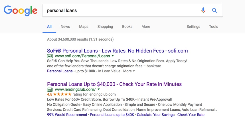
1. To offer consumers a great personal loan rate
A Google search for “personal loans,” results in these Google search ads:
When consumers click the LendingClub link, they’re brought to this post-click landing page where they can complete the form to receive their personal loan rate:
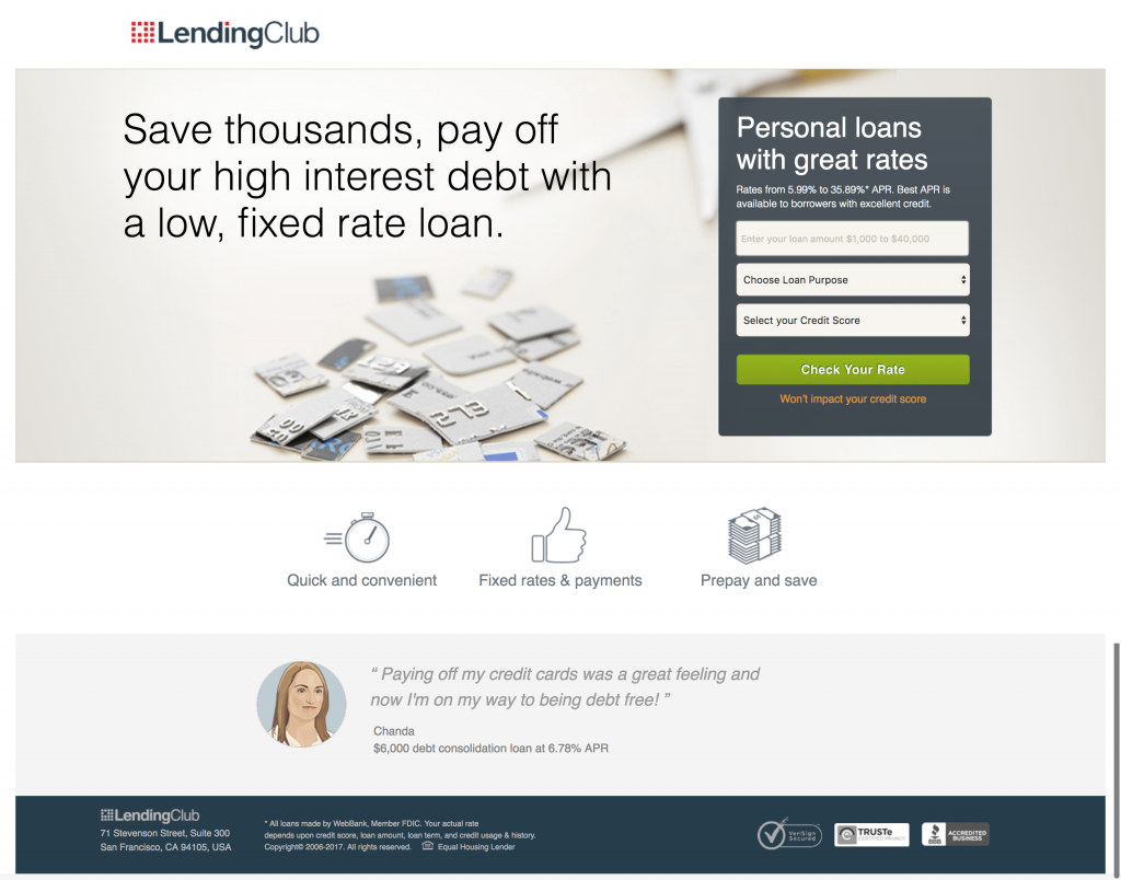
What the page does well:
- The company logo in the top left corner immediately makes visitors aware of where they are.
- The page headline is benefit-oriented and contains a strong, unique value proposition to win prospects over.
- The credit card image is likely to create an emotional connection with prospects, making them feel they too can become debt free with LendingClub.
- Encapsulating the form makes it more attention-grabbing and enticing to complete.
- The form headline tells prospects exactly what they’re doing on this page — finding high rates for their personal loan.
- The 3-field form is quick and easy for visitors to complete, making it more likely that they’ll do so.
- The CTA button color contrasts well with the rest of the page, making it stand out and compel visitors to click.
- The small orange copy on the form assures people that their credit score won’t be affected, which could make or break some people’s decision to check their rate.
- Three icons with minimal copy in the middle of the page inform prospects of the benefits of LendingClub without making them read through large blocks of text.
- Trust seals help visitors feel trustworthy of the company and comfortable with submitting their information.
What could be A/B tested:
- Message match between the Google ad and the post-click landing page could be improved. Currently, the only similarities that stand out are the phrases “personal loans” and “check your rate.” None of the other information on the ad is included on the post-click landing page.
- The small white fine print on the form might deter people with lower credit scores from completing it because they know they’ll be stuck with a higher APR.
- The CTA button copy could be improved. For example, if it’s free to check your rate, that should be indicated.
- The customer testimonial looks fake — the quote itself is very general, Chanda doesn’t have a last name, and the headshot isn’t a real person.
2. To convince prospects to apply for a personal loan
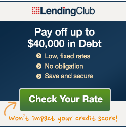
Here is a display ad that links to a LendingClub post-click landing page:
And here’s the page it links to, where visitors can begin applying for a fixed-rate personal loan:
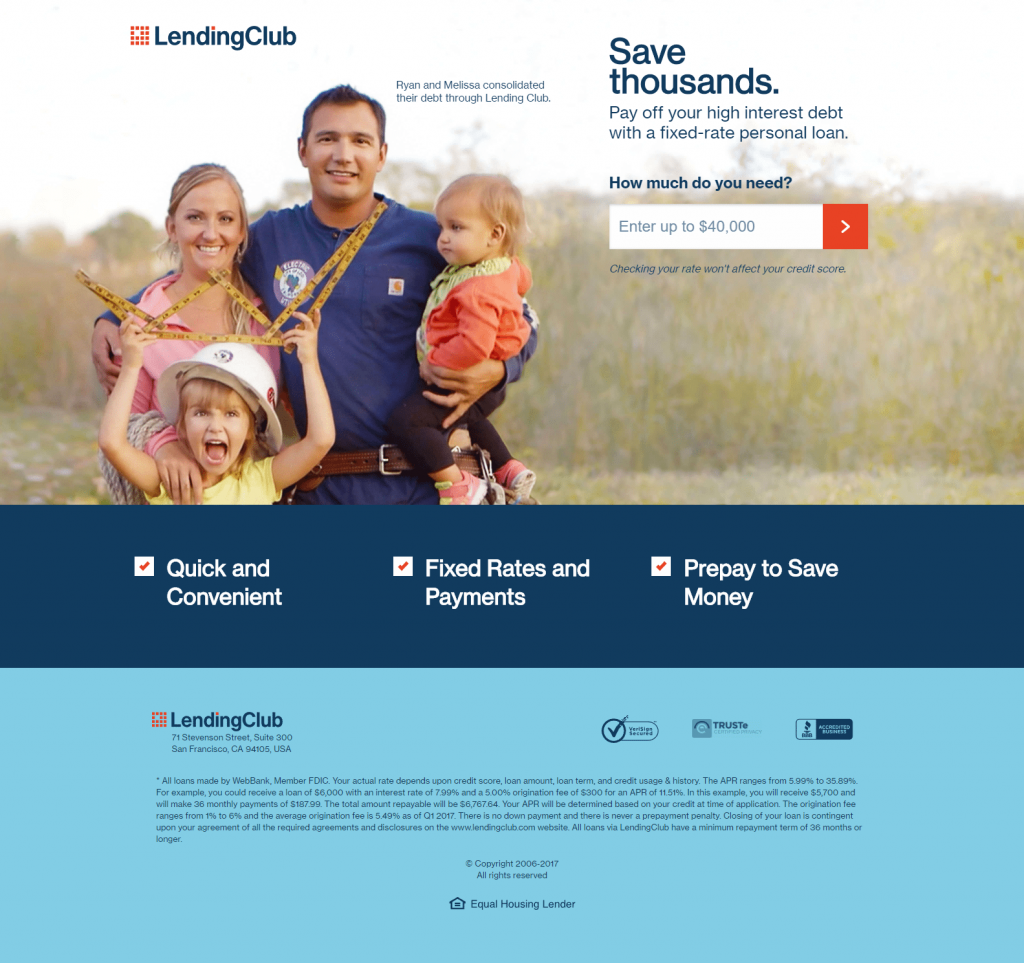
What the page does well:
- The headline is simple and straightforward, yet still benefit-oriented and compelling.
- The subheadline is equally as benefit-oriented and convincing and contains more detail to explain the headline further.
- The hero image helps prospects envision what it would be like to become debt-free like Ryan and Melissa.
- “How much do you need” provides a sense of empathy, letting prospects know that LendingClub is here to help.
- A multi-step form is likely to reduce some of the intimidation that comes with handing over personal information. Including only one form-field on this page increases the likelihood that visitors will convert.
- The directional cue arrow on the CTA button lets people know that there is something waiting for them beyond this page.
- Assuring visitors that their credit won’t be affected likely helps them feel more comfortable with this process.
- The main benefits of borrowing from LendingClub are provided without filling the page with overwhelming copy.
- Trust badges demonstrate that LendingClub is legitimate, credible, and safe to do business with.
What could be A/B tested:
- The hyperlinked LendingClub logo acts as an exit link, potentially taking visitors away from the page before converting on the offer.
- The CTA button doesn’t contain a CTA. Adding copy like, “Check my loan rate,” might generate better results.
- A considerable amount of small print at the bottom of the page might intimidate visitors and deter them from converting on the offer. Including this on another page of the multi-step form could help improve conversions.
- Adding a testimonial from Ryan and/or Melissa about their personal experience with LendingClub, and how the company helped them many big-name brands recognize LendingClub, could further instill increased trust in prospects.
3. To persuade lenders to invest with LendingClub
LendingClub created this banner ad to capture prospective investors’ attention and send them to a dedicated post-click landing page:

Once it’s clicked, prospects land on this page:
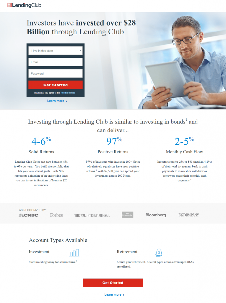
What the page does well:
- The headline uses bold formatting to draw attention to the value proposition.
- Encapsulating the form with color contrast helps it stand out.
- The red CTA buttons strike a good contrast with the rest of the page colors and attention-grabbing, likely increasing conversions.
- The “Investing through LendingClub” section provides the main benefits of investing with the company, without filling the page with an overwhelming copy. The specific percentages also serve as social proof.
- Company logos act as even more social proof, showing prospects that LendingClub is recognized by many big-name brands.
- Multiple CTA buttons give prospects several chances to convert on the offer.
What could be A/B tested:
- Multiple exit links — the LendingClub logo, “terms of use”, “Learn more,” several words in the small print, and the footer navigation — could potentially remove visitors from the page without converting.
- Directing the photo of the man’s eyes to look at the lead capture form might encourage more visitors to complete it.
- The CTA button copy, “Get Started”, is vague and not very compelling. Changing it to something more engaging and encouraging like, “Start investing and earn solid returns!” may earn better conversion results.
- The excessive amount of fine print at the bottom of the page is intimidating and could make prospects wonder if the company has a hidden agenda.
4. To entice investors to sign up for a United MileagePlus account
Here’s another display ad that LendingClub created to target investors. This one is focused on encouraging prospects to become United MileagePlus members:

When potential members click the ad, they are brought to this click-through post-click landing page:
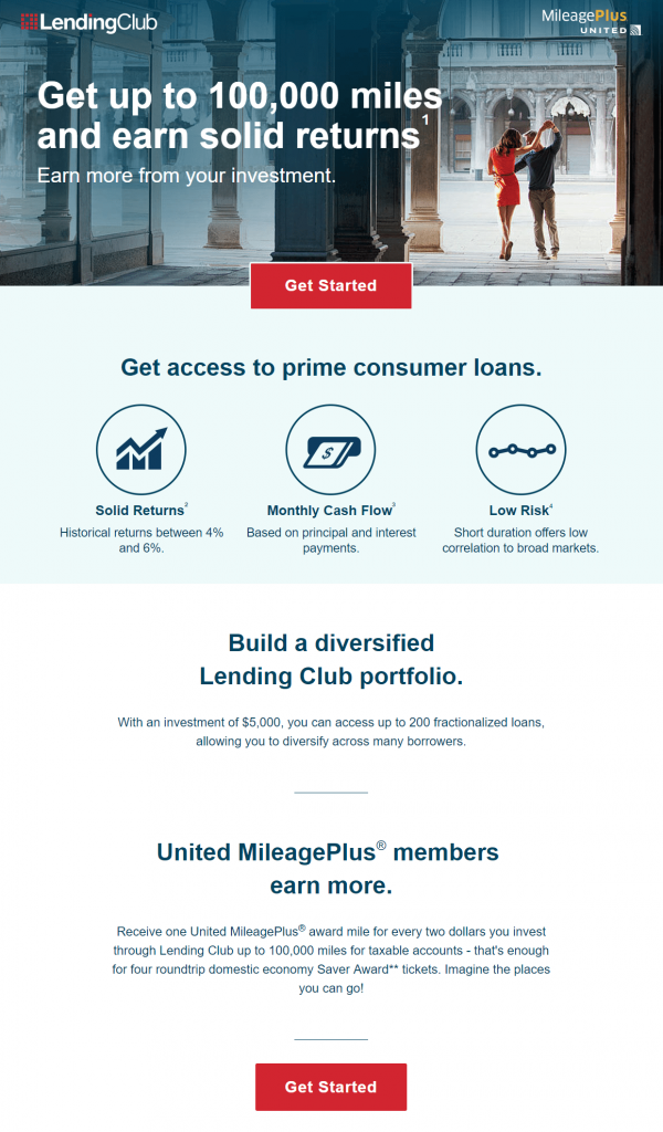
What the page does well:
- Message match between the ad and the post-click landing page (similar colors, logos, and copy) likely creates many satisfied prospects.
- The headline and subheadline are specific and benefit-oriented, providing visitors with a persuasive first impression of the page offer.
- The CTA buttons are attention-grabbing because they’re large and red, making them contrast well with the rest of the page.
- Multiple CTA buttons provide prospects with several chances to click-through to the next page to complete the multi-step form.
- Font variation and iconography help highlight the most important information about the offer without overwhelming visitors with excess copy.
What could be A/B tested:
- The CTA button copy could be improved to something more enticing and personal such as “Start earning more with your investments!”
- Changing the phone number to a click-to-call would make it easier for visitors to contact the company and improve the user experience.
- The “Terms and Conditions” section at the bottom of the page is distracting and likely overwhelming for many visitors.
Create high-converting post-click landing pages
By promoting their offers with dedicated post-click landing pages, LendingClub has seen growth and success over the years. They continue to be one of the top online lending companies, helping countless customers with their finances.
You also can grow your business by building professionally optimized post-click landing pages to generate interest for your promotions. Sign up for an Instapage Enterprise demo today.

See the Instapage Enterprise Plan in Action.
Demo includes AdMap™, Personalization, AMP,
Global Blocks, heatmaps & more.
