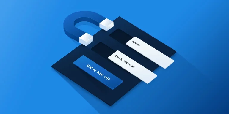
Simply asking people for their email address won’t provide stellar results. Understandably so. Why should they willingly give up personal information without receiving anything in return? Instead, marketers are increasingly turning to lead magnet landing pages as part of their inbound and content marketing strategy.
What is a lead magnet?
A lead magnet is a valuable offer that you provide to your prospects in exchange for contact information such as name and email. The best way to promote that offer is with a landing page. Therefore, a lead magnet landing page encourages a reciprocal relationship between a company and prospect. They provide their personal information in exchange for what is behind the form.
There are plenty of lead magnet ideas to draw inspiration from on the web, and it’s important to note they do not have to be a content download (PDF file or otherwise). We’ve compiled 15 lead magnet examples that demonstrate the various ways marketers use gated offers to maximize leads and drive sales.
(For shorter pages, we’ve displayed the entire page. However, for longer pages, we’ve only shown above the fold, so you may need to click through on some examples to see some of the points we discuss. Also, keep in mind that some pages may be undergoing A/B testing with an alternate version than is displayed below.)
15 lead magnet landing pages critiqued
1. Blog subscription
A blog subscription is a common lead magnet to promote at the beginning of the buyer’s journey when the target persona is starting to become aware of your company. By subscribing to the blog, they can stay up to date on new products and services, announcements, industry best practices, and more.
Salesforce created this landing page to grow their blog subscriber list:
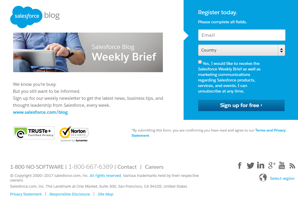
What the page does well:
- Minimal copy won’t overwhelm anyone visiting this page. People can quickly determine if they want to subscribe based on “latest news, business tips, and thought leadership from Salesforce, every week.”
- The 2-field form eliminates friction and makes it as easy as possible for prospects to complete, which likely results in many conversions.
- The two arrows serve as visual cues. The arrow cut out of the form draws attention to the email form field, and the arrow on the CTA button implies that there is more to see beyond this page.
- Leaving the opt-in box unchecked is smart since pre-selecting could deter prospects from converting. Including that prospects can unsubscribe at any time also probably makes them feel more comfortable with subscribing.
- Security badges from TRUSTe and Norton instill trust in prospects, letting them know that their information is safe, private, and secure.
What to A/B test:
- Multiple exit links (company logo, blog link, security badges, social links, footer navigation) likely distract visitors, take them away from the page, and limit conversions.
- The blue CTA button doesn’t contrast with the form or the page, making it blend in and easy to miss.
- The CTA button copy is vague and doesn’t say much about the offer. Changing it to something like “Subscribe Me to the Blog!” would likely convince more visitors to sign up.
- Creating a visual hierarchy would also make the page more enjoyable to look at and easier to process. Currently, nothing stands out — all fonts are the same style and size. There are no bullet points or numbered lists, etc.
- Adding click-to-call to the phone number would make it easier for prospects to contact Salesforce, improving the user experience.
2. Gated blog article
Gated blog articles are rare to find because most companies provide blog content for SEO and thought leadership purposes. This offer is similar to a blog subscription except that only one specific article requires prospects to submit their information. Pursuing a gated blog article offer is one step beyond subscribing to an entire blog because if a prospect wants to trade their information for one piece of content, it likely means that they’re even more serious about your product or service.
Frost & Sullivan created the landing page below for their five-point checklist article. Since it includes vital information on how to drive returns with content marketing, they placed the article behind a form:

What the page does well:
- The headline is persuasive because it is written in second-person and let’s prospects know how they will benefit from reading the article.
- The image of the article cover is a nice inclusion because it allows prospects to preview what they’ll be downloading.
- The red CTA button stands out against the form’s contrasting blue background.
What to A/B test:
- The background stock photo is too busy with people and graphics, which steals attention away from the cover image. Changing the photo to something more basic (or even just a solid color) would help keep attention on the cover image.
- A/B test the headline in larger, more attention-grabbing font. This would help establish a better visual hierarchy, too.
- Their hyperlinked brand name in the footer is an exit link that could potentially take visitors away from the page before converting on the offer.
- Minimal information about the offer could leave people wondering what exactly the article includes and how it can benefit them.
- The 11-field form is too long — especially for a lead magnet landing page in the awareness stage of the marketing funnel and may deter people from converting.
- The “email” fieldtop of lead capture form. Changing the order of these fields would improve the user’s experience with the form.
- The CTA button copy, “Download now,” is as boring as it gets. Changing it to something more exciting, specific, and benefit-oriented would likely convince more prospects to convert, such as “Send Me the Article.”
- The outdated copyright might make people question the validity of the offer and the credibility of the company. If the article is about content marketing strategy in 2017, why is the copyright 2016?
- The page is not balanced. Adding more content below the image would balance it out, making it look more professional.
- No trust signals could reduce conversion rates. Adding security badges or a privacy policy would make people feel more confident in their decision to download the article.
3. Toolkit
Still in the awareness stage of the funnel, toolkits make great lead magnets. They provide prospects with the necessary tools, resources, and best practices that people need to solve a problem and succeed in their industry.
Industrial Strength Marketing promotes their free B2B Digital Marketing Toolkit with this landing page:
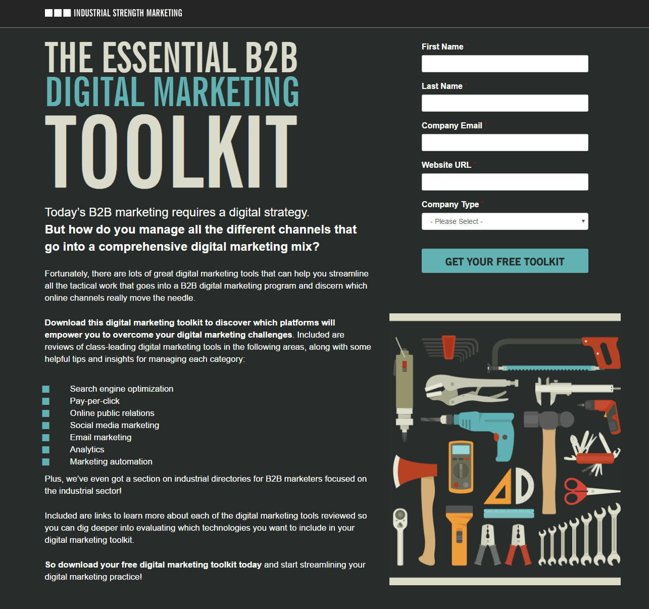
What the page does well:
- The headline is large, attention-grabbing, and tells prospects exactly what the offer is for. The subheadline supports it well by empathizing with prospects and implying that the toolkit will help solve their problems.
- Bullet points highlight the various areas the toolkit provides helpful tips and insights.
- The CTA button copy uses “free” which adds to the page’s persuasiveness.
- Short descriptions below the fold (marked with iconography) let’s prospects know what they can expect to learn from the toolkit.
- Including a customer testimonial with full name, company, and position is great because it adds credibility to the company. Increasing the font size and adding Randy Breaux’s headshot to the testimonial would be even more effective.
- Making the phone number click-to-call would provide a better user experience for those prospects who want to contact Industrial Strength Marketing via phone.
What to A/B test:
- The company logo is hyperlinked and takes visitors away from the page before they’ve even had a chance to fully evaluate the offer.
- Encapsulating the form in a contrasting color such as yellow would make it more attention-grabbing. Additionally, the red asterisks indicating required form fields would stand out more. As the form is now, they are barely noticeable.
- Indenting the bullet points would draw even more attention to them so visitors could quickly skim and determine if the takeaways are worth submitting their information.
- The bold copy doesn’t stand out like it’s supposed to. Instead, all of the white text against the dark background looks the same.
4. Ebook
Ebooks make great lead magnets because they’re comprehensive and provide people with content more in depth than a simple checklist or cheat sheet. Since they’re more lengthy than other resources and take more time to read, it’s important that you promote it by highlighting a powerful benefit — one that’s worth taking the time to read the book.
Let’s see if this Mixpanel ebook lead magnet does that:

What the page does well:
- The company logo let’s visitors know exactly where they are when they land on the page. The fact that it’s not hyperlinked likely decreases the bounce rate and increases conversions.
- The ebook cover image helps prospects get a feel for the offer. The other devices behind the ebook are a nice touch as well because prospects can envision it on their preferred medium.
- Minimal copy on the page makes it quick and easy for visitors to scan the page and find what they’re looking for (the highlights of the offer).
- The 4-field form doesn’t ask for very much personal information, making it more likely that prospects will complete it.
- The opt-in boxes are unchecked. This is a smart move, as prospects tend to lose trust in companies that pre-select their opt-in boxes.
- The CTA button copy uses first-person to make prospects feel like this ebook is specifically for them.
- The “What’s Inside Your eBook” section highlights the most important points contained in the ebook.
- No exit links make it impossible to escape the page without converting, because the only way to leave is to click the “X” in the browser tab or complete the form.
What to A/B test:
- The headline could be more captivating. “The paradigm shift in analytics” doesn’t convey any benefit to visitors.
- The form headline is misleading. It implies that the only piece of required information is an email address, but a first name, last name, and phone number are also mandatory for redeeming the ebook.
- The CTA button color doesn’t stand out as much as it would if it were tested in a more contrasting color, like orange. A quick look at Adobe’s Color Wheel and selecting the opposite color of the page’s dominant color can help solve this issue.
- The CTA button size is too small, especially when compared to the form fields directly above it. The CTA is the most important element on the page so why not make it incredibly obvious where people should click to redeem your offer?
- No trust signals — not even a privacy policy — might make visitors weary of giving up their information. Adding security badges, company logos, etc. would likely increase conversions.
5. Guide/report
Moving into the consideration stage of the buyer’s journey, guides and reports are some of the most commonly utilized types of lead magnets for educating prospects on why they should choose you as the solution to their problem.
Here’s a report lead magnet example from Lithium:
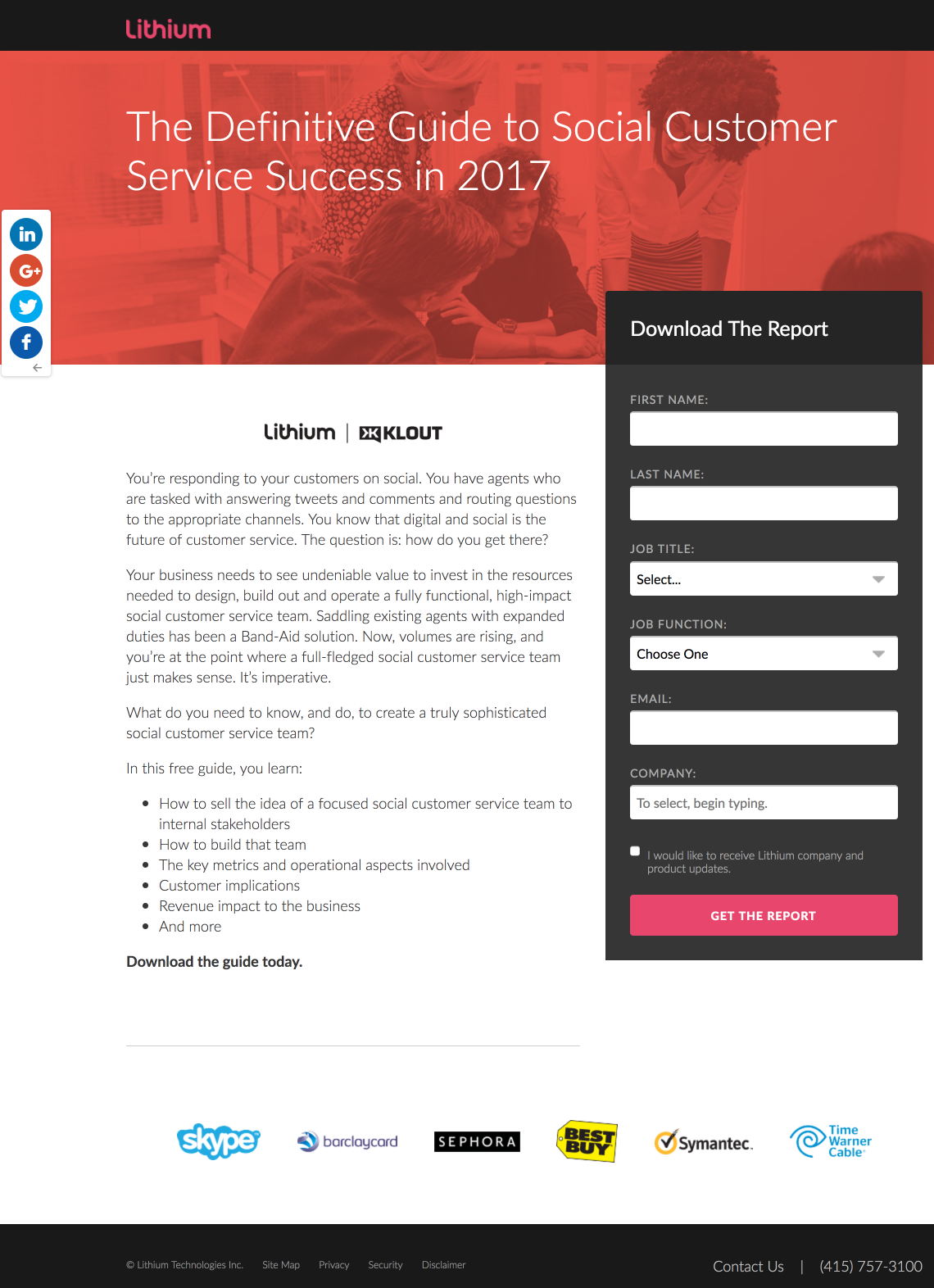
What the page does well:
- The Deictic Gaze technique is used to make visitors look at the form. Since most of the people in the image are looking toward the form, that’s automatically where visitors will direct their attention as well.
- The body copy speaks directly to prospects, as it is written in second-person, using words like “you” and “your.”
- Bullet points highlight the key points that prospects will learn from the guide, so they don’t have to read through an overwhelming amount of text to find out.
- The form is encapsulated with a dark color against the white background so visitors notice it immediately.
- Leaving the opt-in box unchecked helps prospects feel like they have more control over the situation. They get to choose whether or not to receive updates; the decision isn’t already made for them.
- Company logos serve as social proof and add trust value to the offer, making prospects think, “If these reputable brands used Lithium, then I can trust them too.”
What to A/B test:
- Exit links (the Lithium logo, social share buttons, and footer navigation) all allow prospects to escape the page without downloading the guide first.
- The headline could be more compelling. Although it does imply that the guide contributes to customer service success, highlighting a specific UVP (how much success, why types of success, etc.) would likely convince more prospects to download the guide.
- The CTA button copy could be improved. A/B testing copy such as “I Want the Report” could help maximize conversions.
- The CTA button color doesn’t stand out as much as it would if it were a different color than the header.
- Adding an image of the guide, and allowing prospects to see a preview of what they’re being offered, might convince more visitors to download it.
- Including a testimonial that speaks to the report’s contents would make the page more persuasive.
6. Live webinar
Webinars serve as great lead magnets for several reasons. Online users often find it easier and more enjoyable to watch and listen to content than to read through it. Webinars allow prospects to see and hear you, providing a sense of comfort, familiarity, and security. It’s like giving each of your prospects their own personal invitation to attend your video presentation.
An additional benefit with live webinars is that they only occur at specific times, so prospects are faced with a sense of urgency and irresistibility when it comes to registering for them.
Take a look how this GCE Solutions lead magnet page plays off of that sense of urgency:

What the page does well:
- The speaker information — full name, position, and headshot — let prospects know exactly who will be presenting during the webinar.
- The CTA button copy is persuasive because it is written in first-person and “Claim My Seat” is urgent and compelling.
- Bullet points make it easy for visitors to quickly learn the key takeaways of the webinar.
- A sense of urgency is presented throughout the page — “Claim My Seat” on the CTA button, the “limited number of webinar seats” disclaimer at the bottom of the page, and the italicized “register now” in the disclaimer.
- The email notification mention containing a recording of the webinar after it airs is likely to convince prospects to register. They know that even if they can’t attend the live event, they will still be able to watch it at a later time.
- No exit links prevent visitors from leaving the page easily. The only way to leave the page is to click the “X” in the browser tab or click the CTA button and complete the lead capture form.
What to A/B test:
- Adding white space would help each element draw more attention and ultimately help them convert easier.
- Multiple acronyms in the copy (EMA, CSRs, LS) might be difficult for some prospects to understand. Instead, to avoid any confusion, full words should be written out.
- The CTA button color is used in two other places on the page so it doesn’t stand out as much as it should.
- The image of the chart seems out of place. Why is it there and what is it even showing?
- Adding a countdown timer would increase the sense of urgency even more, showing visitors exactly how much time they have left to reserve their spot.
- No privacy policy (or any other trust signals) might decrease the trust value, and deter visitors from registering.
7. On-demand webinar
Live webinars are frequently offered as on-demand webinars once they’ve ended, and these make for effective lead magnets as well.
Socedo offers this on-demand webinar to assist marketers with developing an effective social media strategy:

What the page does well:
- The headline is strong and compelling. It’s specific, benefit-oriented, and speaks directly to visitors with second-person copy.
- Minimal copy with bullet points highlight what will be discussed in the webinar is great for improving user experience.
- The image also provides some insight into what is the topic of the webinar.
- Encapsulation of the form helps it stand out.
- The number of form fields is reasonable, especially in the consideration stage of the buyer’s journey.
- The CTA button color is vibrant and attention-grabbing although, it would probably generate more clicks if it were larger.
What to A/B test:
- Navigation links in the header and footer provide visitors with easy exit routes before gaining to the access to the offer.
- The “Watch Me” CTA button copy can be more compelling like “Send Me the Webinar” would likely convince more people to click and watch it.
- The lack of white space around the image looks unprofessional.
- Adding social proof — company badges, customer testimonials, etc. — would likely instill trust in prospects, making them more likely to convert.
- The outdated copyright might cause prospects to wonder how accurate the webinar’s information will be.
8. Survey
Surveys are valuable for providing useful information and market research to prospects who are interested. Since they typically include industry statistics and exact data, they typically make for good lead generation assets.
Here’s a survey lead magnet that Digital Marketing Depot offers:

What the page does well:
- The headline font is large, attention-grabbing, and straight to the point.
- The subheadline includes a statistic from the survey to entice prospects to learn more.
- Including social proof (stating that Gartner works with, and is trusted by, over 10,000 companies around the world) helps instill trust in prospects. But the company might want to draw more attention to this fact by changing the font, formatting, or even separating it from the rest of the copy.
What to A/B test:
- Multiple exit links (company logo, website link in the body copy, content agreement, and footer navigation) make it easy for visitors to get distracted and leave the page without downloading the survey.
- Adding an image of the survey could make the page more engaging and aesthetically pleasing. It would also be something to tease prospects with, making them eager to see more.
- Incorporating visual cues, like an arrow pointing to the CTA button, encapsulating the form, or increasing the white space would help to draw attention to those essential elements and entice visitors to convert.
- The CTA button is tiny, the color doesn’t contrast with the rest of the page, and the copy is vague. All of these factors make it so the button doesn’t stand out or compel prospects to click.
- Including a quote from the survey on the page could persuade people to get the survey. Adding this to the empty space at the bottom would help fill that hole and make the page more balanced.
9. White paper
A white paper is a short report or guide that help prospects better understand a certain topic. Since white papers are typically longer than most of the other assets mentioned in this article, they contain a lot of in-depth research and thought leadership. Thus, are great content pieces for marketing teams to use for lead generation.
Tableau’s white paper is their gated asset with this landing page:

What the page does well:
- The header image is good because it portrays a man who is very satisfied by transitioning his data to the cloud (presumably with Tableau).
- The CTA button color stands out because orange contrasts well with the rest of the page, and there isn’t much orange elsewhere.
- The two-step opt-in slide-in form reduces clutter on the page.
- Bullet points minimize the amount of copy on the page, while highlighting the most important information.
- The language selector in the bottom-left is a great addition because visitors can choose between 8 different languages to evaluate the page.
- Social proof (the customer testimonial and the “Featured In” company logos) give the company credibility which instills trust in prospects.
What to A/B test:
- The headline doesn’t match the header image very well because it simply states the name of the white paper. Instead, it should be more compelling with benefit-oriented copy, explaining to prospects how this white paper can help them.
- The CTA button copy can be more compelling like, “Send Me the Whitepaper” would be more specific and personalized to the visitor.
- Adding anchor tags could improve user experience since this page is a bit longer than some other examples. Adding a tag above the fold would take prospects further down the page to learn more about the offer, and adding one toward the bottom of the page would send prospects back up to the CTA button to convert.
- Removing the additional resources would keep visitors focused on the white paper exclusively. Keeping them on the page (along with other exit links) violates the 1:1 conversion ratio that landing pages should aim for to maximize the conversion rate.
- Multiple exit links throughout the page (company logo, footer navigation, and social media buttons), make it very likely that visitors will become distracted and exit the page before downloading the white paper.
10. Case study
When prospects are considering your brand as one of the potential solutions to their problem, an excellent way to win them over is to demonstrate how other people have benefited from using your product or service. A case study is one of the best lead magnet examples to do just that.
Tapad understands the power of case studies as a lead gen tool. Let’s see how their lead magnet landing page stacks up:

What the page does well:
- The subheadline “Learn How To…” does a great job of explaining the offer, uses customer-oriented copy to speak to visitors, and let’s prospects know how the company can help them.
- Bullet-pointed copy doesn’t overwhelm prospects and teases them with just enough information to consider downloading the case study.
- The airplane is a directional cue pointing at the form so visitors pay attention to it and eventually convert.
- Statistical proof highlights how Tapad was successful in helping Monarch Airlines increase their display ad ROI.
What to A/B test:
- Tapad’s logo links to another page, which gives visitors an easy option to leave the page immediately after landing on it.
- The header image doesn’t seem to have any relevance to the case study.
- Adding white space throughout the page would make the page easier for people to scan and evaluate the offer.
- The enclosed “Read Case Study” copy on the image looks like a button, but it’s not clickable, so what’s the point of including it?
- The CTA button doesn’t stand out as much as it could. Making it bigger and changing the color to red would draw more eyes to it.
- The 2016 copyright date could confuse prospects because they may question how credible Tapad really is at optimizing display advertising.
11. Demo
Once the prospect has reached the decision stage of your marketing funnel, offering a demo is a great sales assistant tool. If they’ve made it this far, you know they’re truly interested in what your brand has to offer, so why not show them what you can do for them, instead of just telling them?
Grow uses this demo landing page to promote their service:

What the page does well:
- The click-to-call phone number improves user experience, making it very easy for visitors to contact the company.
- The headline and subheadline are complementary of each other. They are both descriptive, empathize with the prospect, and use second-person copy to speak directly to them.
- The green arrow acts as a visual cue, making visitor’s eyes focus directly on the lead capture form.
- Encapsulating the form with color contrast also helps to draw attention to it.
- 5-form fields (that doesn’t ask for very personal information) is quick and easy for prospects to complete.
- The product image gives prospects a great preview of what the software looks like, and shows that it can be used on multiple devices.
- Lots of social proof (company logos, testimonials, and award badges) all add to the persuasiveness of the page.
- Small chunks of copy throughout the page make it so that the content is easily digestible and visitors are less likely to become overwhelmed. They’re also separated into sections with titles, which makes it easy for visitors to find exactly what they’re look for.
- Multiple cooperative CTA buttons (the green “Give Me a Demo” buttons) are all anchor tags that, when clicked, take them back up to the lead capture form.
What to A/B test:
- The company logos in the header and footer go to other pages acting as exit links and likely increasing the bounce rate on the page.
- The CTA button blends in with the form. To help it stand out, Grow should at least put a box around it, or better yet change the color to orange or yellow.
- Moving the gif up the page could help get more people to see it because people may not scroll down far enough to see where it is currently.
- Adding headshots to the customer testimonials would help increase the prospect’s trust in the company.
12. Consultation/evaluation
Consultations or evaluations are another common gated offer at the bottom of the marketing funnel because anybody requesting one is close to purchasing.
SalesX helps marketers increase their ROI, and offers free evaluations to get started. Here is their free evaluation landing page:
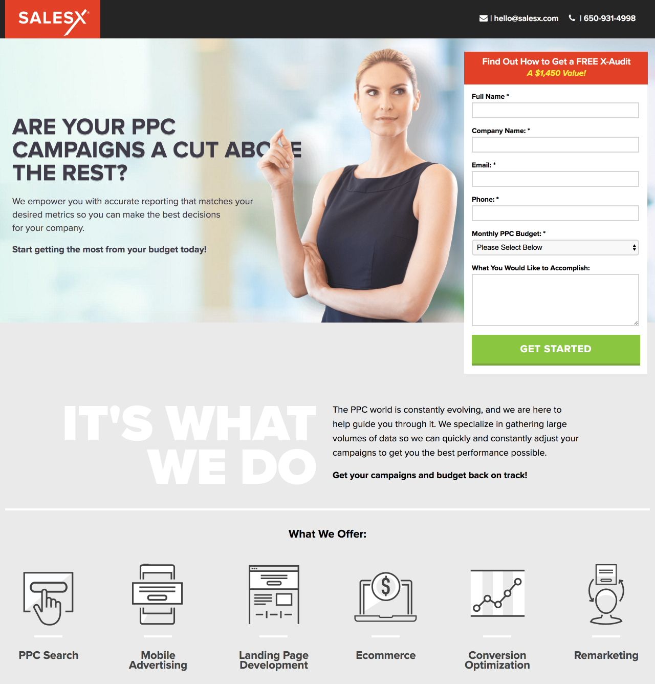
What the page does well:
- The company logo is not hyperlinked and lets visitors know where they are and who they’re working with when they land on the page.
- Click-to-call/email features give visitors a quick and easy way to contact the company.
- The headline and subheadline are descriptive, benefit-oriented, and use the word “your” to make prospects feel like this offer is specifically for them.
- The software screenshot helps make the page more engaging.
- The copy is legible and easily comprehensible because it is breaks down into small chunks. Variation in font (bold, large, red, bullet points, etc.) helps draw attention to important information as well.
- The green CTA button “pops” off the page because it contrasts well.
- Company logos show prospects that SalesX is successfully helping other brands with their ROI.
- No exit links mean visitors can only leave by clicking the “X” in the browser tab or completing the form.
What to A/B test:
- The CTA button copy should be more persuasive such as, “Get my FREE evaluation,” because first-person copy and specificity would make them more enticing.
- Adding an arrow above the fold would serve as a directional cue, letting prospects know that there is more important content to see below the fold.
- Including an anchor tag at the bottom of the page that takes prospects back up to the form would improve the user experience and likely increase conversions.
- Customer testimonials would instill even more trust in visitors, than just the company logos and award seals alone.
13. Free trial
Similar to consultations and evaluations, free trials are one of the best lead magnet examples to use at the bottom of the funnel — especially for software companies. In fact, many software companies will even include a large CTA on their homepage to encourage visitors to sign up for a free trial of their software.
Instead of including a CTA button on their homepage, Sendible created this lead magnet landing page to offer a free 30-day trial of their social media marketing software:
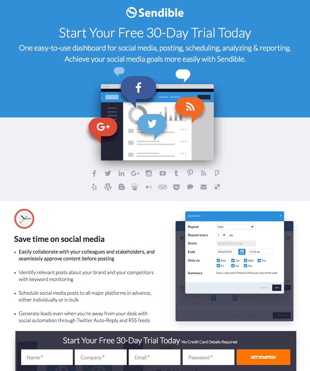
What the page does well:
- The headline and subheadline complement each other well. The headline is precise, stating that the trial is free and lasts 30 days. The subheadline then explains what prospects will receive with their free trial: an easy-to-use social media dashboard to help easily achieve their goals.
- The “sticky” lead capture form moves with prospects as they scroll, so they can complete it at any time without having to search for it again. This technique can irritate online users because it blocks content as they scroll down the page, so it’s a good thing to A/B test.
- The orange CTA button contrasts well with the rest of the page, making it stand out and grab visitor’s attention immediately.
- The software’s three main benefits (save time, build brand awareness, and prove ROI) explain with bullet points. Minimal copy makes it easy for prospects to learn about what the software can do for them — without having to read all of the text on the page.
- Software images in each of these sections give visitors a preview of how the different software features function.
- The customer testimonial (complete with headshot, full name, company, and position) is as persuasive as it gets with testimonials.
- No exit links reduce the chances of visitors leaving the page before signing up for a free trial.
What to A/B test:
- The “Get Started” CTA button copy could be larger and more engaging. “Start My Free Trial” is more specific and is personalized to the prospect.
- Increasing white space throughout the page would help each element breathe more and draw maximum attention.
- Adding other visual cues (such as arrows pointing down the page or at the form) would help draw attention to important elements.
- Including a privacy policy would let prospects know that their personal information is safe and secure with the company.
- The page is not secure as evidenced by the “not secure” text near the URL. People may not notice this text, but if they do, there’s very little chance they will request a free trial.
14. Subscription
Subscriptions make great offers because prospects are expecting to receive something, digitally or through the mail, and know that they will need to submit their contact information to receive the content. By capturing an email or mailing address, companies can continue their communication with the customer and develop a stronger relationship.
Entrepreneur offers a subscription to their newspaper in digital and/or print format. Let’s see how their page fares when up to the test:
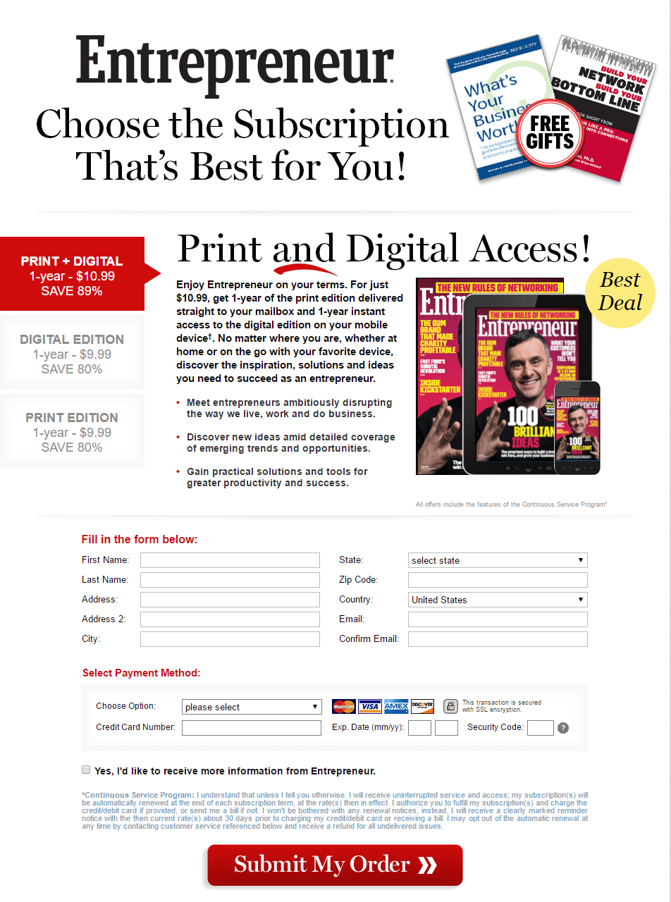
What the page does well:
- The headline is personalized to make visitors feel that this offer is specifically for them and that they have full control over their decision-making.
- Including free gifts is a great tactic because it provides even more value than just a 1-year subscription to Entrepreneur.
- The decoy effect is used to convince prospects that the “print + digital” option is the best out of the three. It was wise to highlight this option in red so that visitors immediately see it upon arrival.
- The images of the newspaper is great for supplementing the text, as it shows visitors the different forms.
- The unchecked opt-in button to receive more information helps prospects feel more in-control of the situation.
- The red CTA button stands out because it contrasts with the page and is very large. Plus, the arrows act as a directional cue to proceed with the transaction.
What to A/B test:
- Adding the bullet points from the “digital edition” option to the “print + digital” option would make sense, as it would show prospects that the combination option has the most benefits and is the best of both worlds.
- An abundance of fine print might make prospects feel skeptical that the offer is too good to be true and deter them from subscribing.
- Exit links in the footer enable prospects to leave the page without signing up for a subscription.
- Increasing white space throughout the page increase the overall user experience .
15. Sales page
Similar to a subscription offer, a sales page is at the very bottom of the funnel since prospects are paying for what is behind the form. For that reason, sales pages need to be extra convincing since they require payment for access.
In this last example, Jon Loomer offers two different membership options for the Power Hitters Club:
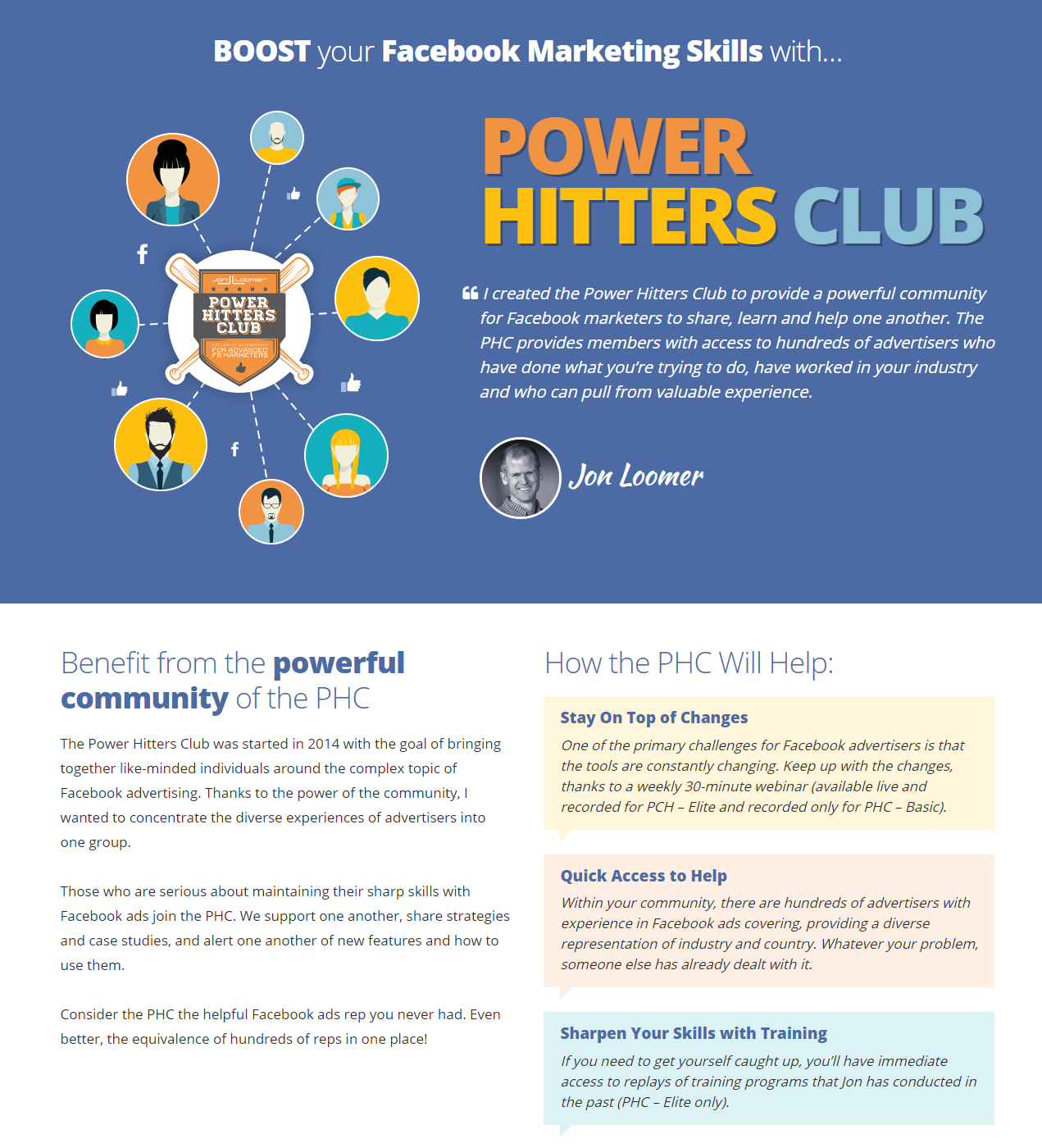
What the page does well:
- The headline conveys the benefits of the Power Hitters Club, and uses “your” to make visitors feel like this offer is for them.
- Jon Loomer’s quote and headshot make visitors feel more connected and comfortable with him.
- The “How the PHC Will Help” section does a great job of explaining the club’s benefits in a clear, attention-grabbing, and easy-to-comprehend way.
- The membership options with a brief explanation (with bold print), popup windows to describe the various features (marked by iconography),
- Arrows on the CTA buttons are directional cues, letting prospects know that there is more to see beyond this page.
- Customer testimonials add trust value to the company. Seeing all of these people satisfied with the PHC likely makes others want to join as well.
- Zero exit links make it impossible for visitors to leave. The only ways off this page are to completely close out of the page, or click through to the form.
What to A/B test:
- The center of the image (on the left side of the page, above the fold) is tiny, and the text is difficult to read. Enlarging this would allow more visitors to read the copy, likely making a greater impact.
- Adding information to the customer testimonials (like a full name, company, position, and even headshot) would make them seem more real and credible. Who’s to say that “Lauren C.” is even a real person?
- Adding social proof such as how many marketers are currently in the club could convince visitors to join the club.
- No privacy policy also decreases the trust level of the page.
Create your own lead magnet landing page
The modern digital marketer knows that to grow an email list and nurture leads to sale requires a variety of content and a dedicated lead magnet page for each offer. The examples above are not all-inclusive, but they demonstrate how brands can use content to maximize leads throughout the funnel.
The next time you create a landing page for your marketing campaigns, use the most professional platform available in Instapage. Sign up for an Instapage 14-day free trial today.

Try the world's most advanced landing page platform with a risk-free trial.
