
Imagine your product is tested and ready to ship, you’re all set to start curating leads and sign-ups for your service, and your course videos are prepped and set to empower audiences. One thing is missing: the platform you can use to promote your product, service, or course.
Google wisdom dictates you need to create a website.
And it won’t be wrong—the only problem is: creating a website involves a lot of moving parts. You need a designer, a back-end and front-end developer, a conversion copywriter, and a hosting service. This means you must have a substantial budget and a large chunk of time to get everything live.
Don’t have the time and resources to get all that done? Create a landing page instead.
What is a landing page?
A landing page is a standalone page focused on one goal, it is disconnected from a website’s navigation, which means you can create it even if you don’t have a website.
Landing pages are created to convince visitors to act—to sign up for a free trial, buy a product, subscribe to a newsletter, or purchase a course.
Unlike a website, a landing page is a single webpage. You don’t need to create a bunch of sub-pages (About Us, FAQs, Services, Contact)—all you need is one page with optimized elements to complete your conversion goal.
How is a landing page different from a website?
While homepages showcase multiple offers and are created for a browsing experience, a landing page is created for a singular conversion goal. You can also differentiate the pages based on the following characteristics:
| Feature | Websites | Landing Pages |
| Purpose | Made for browsing, has multiple goals, promotes various offers | Focused, designed for a specific marketing goal |
| Navigation | Extensive navigation options | Simplified navigation, often with a single CTA |
| Call-to-Action (CTA) | Multiple CTAs for different conversion goals | Singular and prominent CTA, aligned with one goal |
| Design Complexity | Can be complex, reflecting overall branding | Simple and tailored, emphasizing message match between ads |
| Audience Focus | General audience or specific target groups | Targeted audience for a specific marketing effort |
| Conversion Goals | Various goals such as sales, sign-ups, engagement | Specific conversion goals aligned with the campaign |
| User Interaction | Extensive interaction across multiple pages | Streamlined interaction, often leading to conversion |
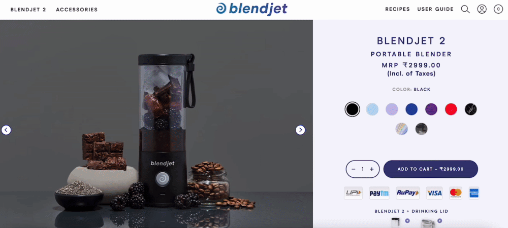
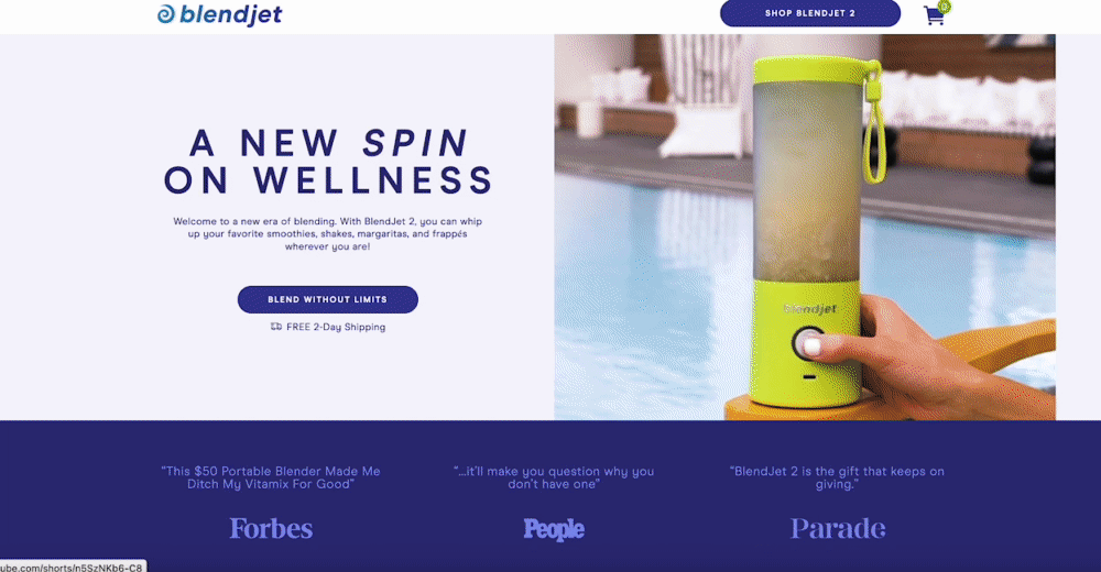
Let’s look at Blendjet’s website homepage vs. their landing page for a visual comparison.
The first thing you see when you land on the homepage is the header, which leads you to different pages on the website. The page is lengthy, with all of the portable blender options listed. It also has a substantial footer with links to other products, user guides, etc.
On the other hand, the landing page is short and focuses on what makes Blendjet a good choice for customers. The user-generated content, FAQs, customer testimonials, and comparison chart are all featured on the one-pager. The landing page isn’t cluttered and is distraction-free.
The elements that go on your landing page and the order you put them in are what differentiates it from any other page on your website.
How to optimize your landing page elements
Copy
Copy makes up most of your page, from the headline down to the competitor comparison chart, this element needs to create a narrative about why your visitors need what you’re offering to alleviate their pain and live more seamlessly.
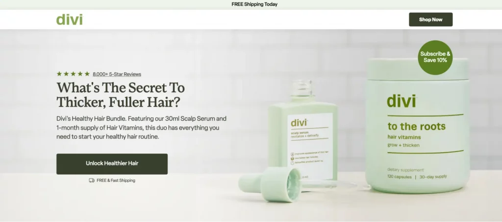
Headline and subhead
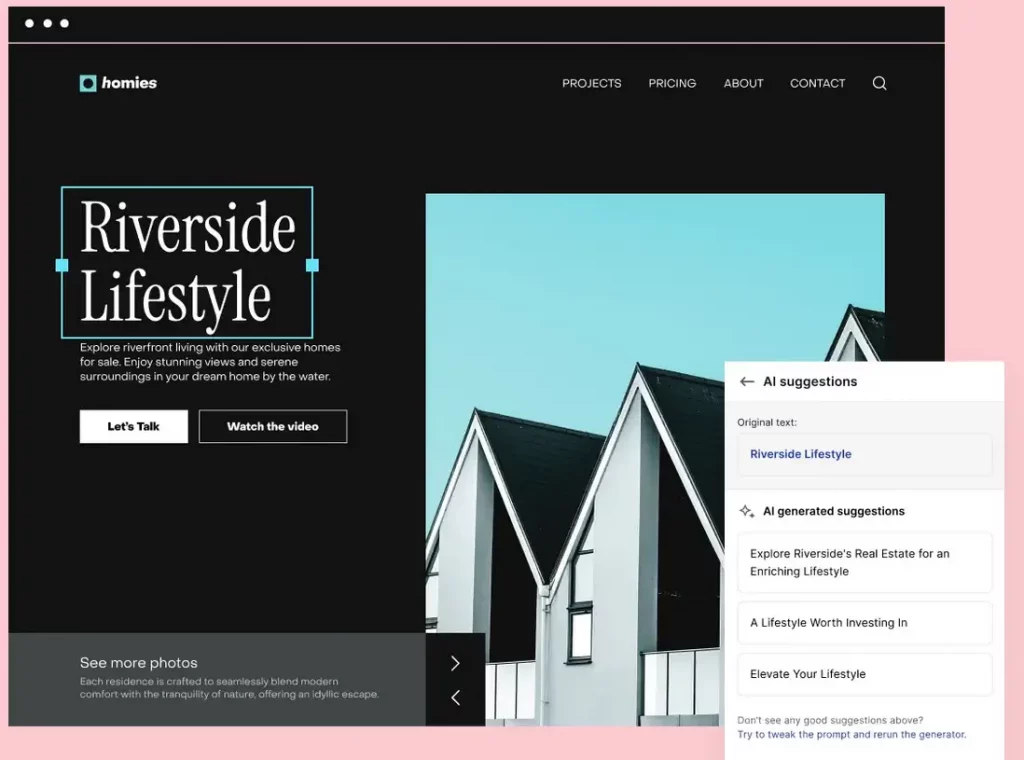
The headline is arguably the most essential part of your landing page, as it’s the element they see first. Make sure your headlines feature your unique value proposition and highlight the benefits visitors will get with your product/service.
The sub-headline expands what the headline says and gives more insight into why visitors need to click the CTA button.
Divi’s headline asks a question that the sub-headline answers with product details.
User benefits and product features
User benefits talk about your product/service’s value from the customers’ point of view. They showcase why they should buy the product or sign up for the service.
Pet Honesty’s landing page lists all the benefits the soft chews have on your dog’s immune system and gut.

Product features list what makes the product or service special. Chamberlain Coffee’s features are presented on the page succinctly with relevant icons to reel the visitor in:
![]()
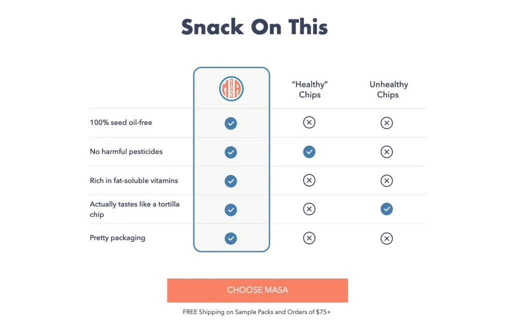
Competitor comparison chart
The competitor comparison chart helps showcase with copy and visuals why you are better than others in the space.
The comparison between Masa Chips and other healthy and unhealthy chips makes it clear why visitors should choose the snack.
CTA button copy
There are two primary jobs your CTA button copy must do: clearly state what visitors will get when they click the button and make the copy relevant to the page offer.
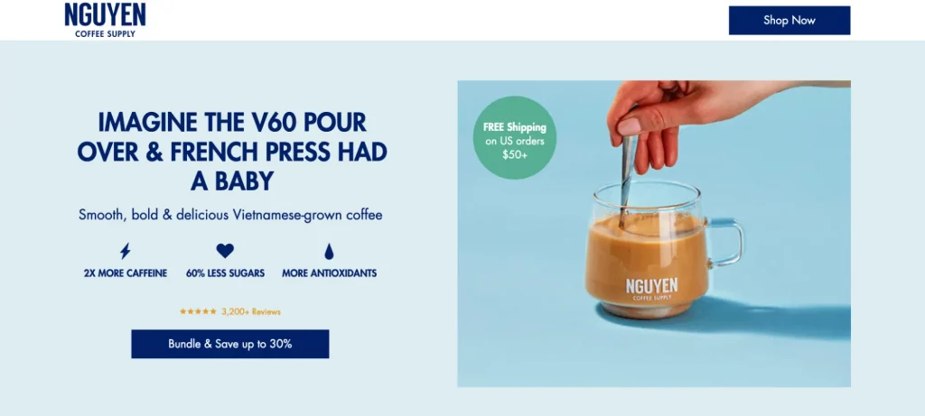
NGYYEN’s CTA copy lets visitors know that they can save up to 30% on their order if they bundle up—it’s clear and relevant.
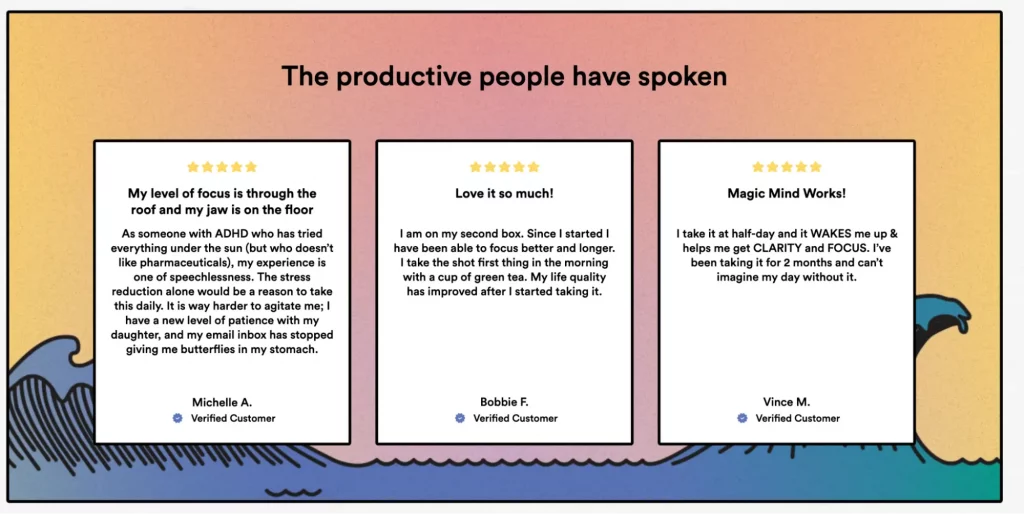
Credibility elements (customer testimonials, UGC videos)
Customer testimonials help kick in social proof and show visitors why customers decided to choose the service.
Magic Mind does this very effectively on their page:
Design (CTA button, hero image)
Design elements, like images, videos, typography, and brand colors, capture visitor attention and ultimately drive conversions.
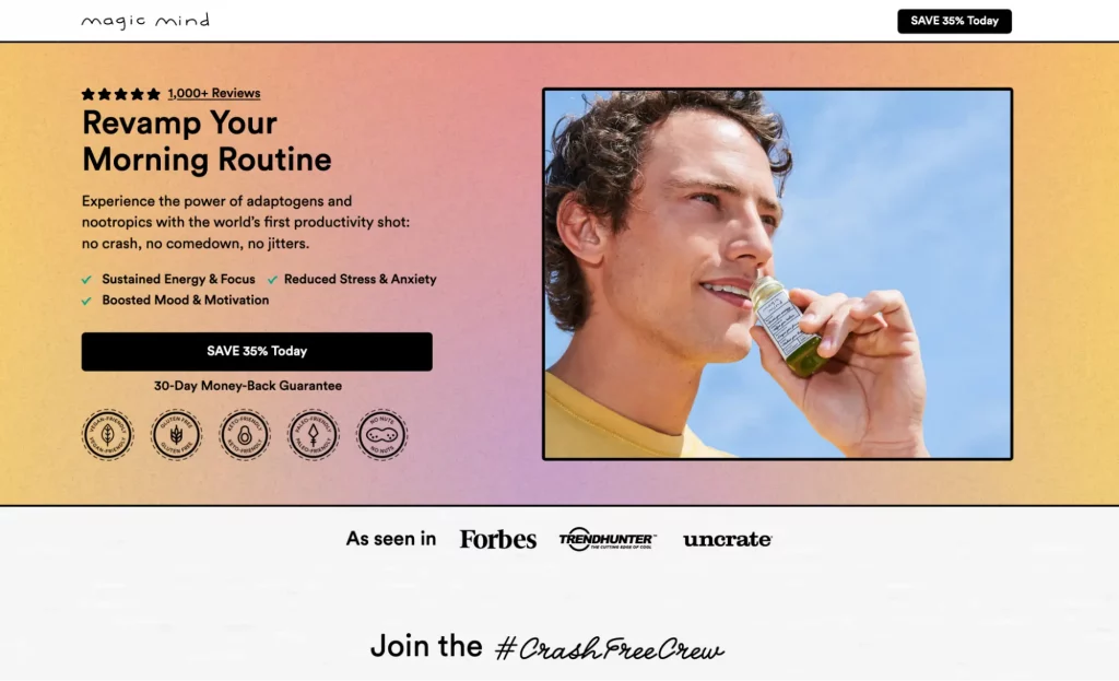
Hero section
Your hero section should give visitors a complete picture of what to expect from the rest of the page. It should include an image or video that conveys the essence of the offer. Magic Mind’s hero section does everything right.
Easy-to-read typography
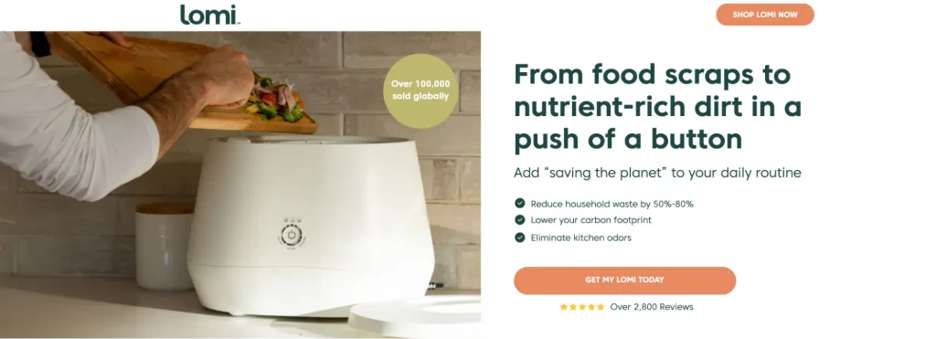
Choose font styles and sizes that enhance readability and maintain a consistent brand identity. Lomi’s font and style vary in the hero section, but they maintain their readability.
Big CTA
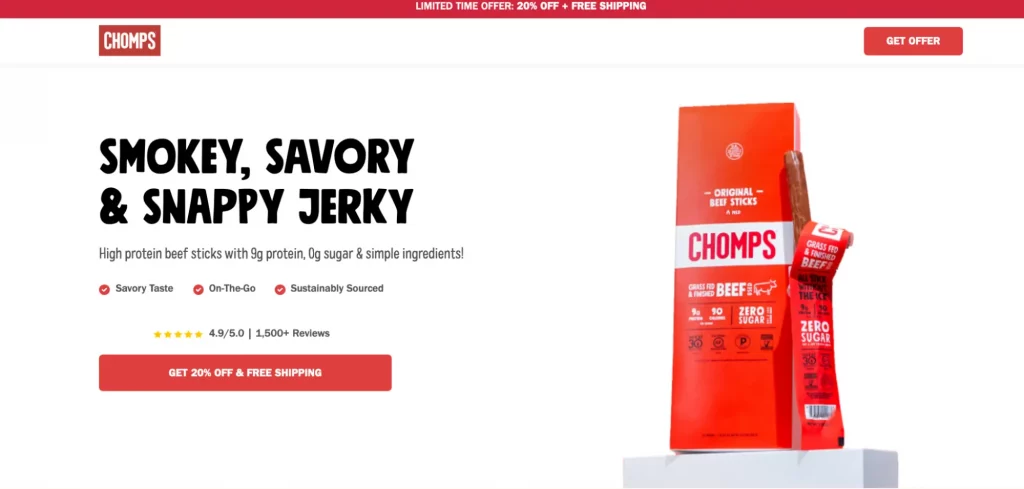
A prominent, attention-grabbing call-to-action button helps attract visitor attention. Chomps’ CTA button does an excellent job of standing out.
Whitespace
Remove unnecessary clutter and distractions to focus on the offer and the call to action. Add elements that make sense for your offer and don’t weigh your page down.
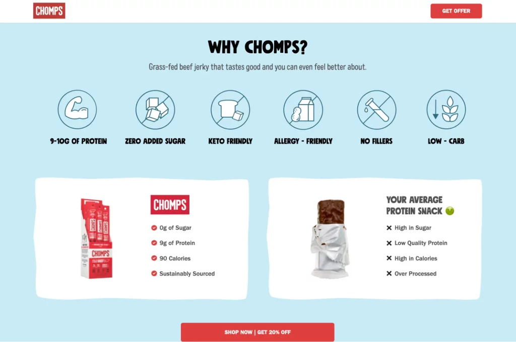
The Why Chomps section on the landing page says a lot in an aesthetically pleasing and clutter-free way.
Fast load times
If your landing pages are slow, it doesn’t matter how compelling your offer is or how well-designed your pages are. If a user bounces because a page takes too long to load, they don’t convert. It’s important to optimize images and code to minimize load times and prevent visitors from bouncing.
Form
The form is where visitors enter their personal details and are welcomed into your marketing funnel. The landing page element also has the potential for conversion friction if they aren’t optimized properly.
Only add necessary form fields
Each additional field can decrease the likelihood of form completion. Start with basics like name and email address, and only add more fields if they are critical for your conversion process.
Use inline validation
Give immediate feedback if a user enters invalid information. For example, highlight the field in red and provide a clear error message. Consider also using positive reinforcement for correctly filled fields, such as a check mark next to the field.
Reduce friction
When asking for sensitive information (like a phone number), explain why it’s necessary. This can be done with a tooltip or a small text blurb near the field. Include trust signals like security badges or testimonials near the form to reassure users their data is safe.
Leverage autofill
Enable autofill to speed up the form completion process. This is especially helpful for returning visitors or users filling out forms on mobile devices.
Privacy policy
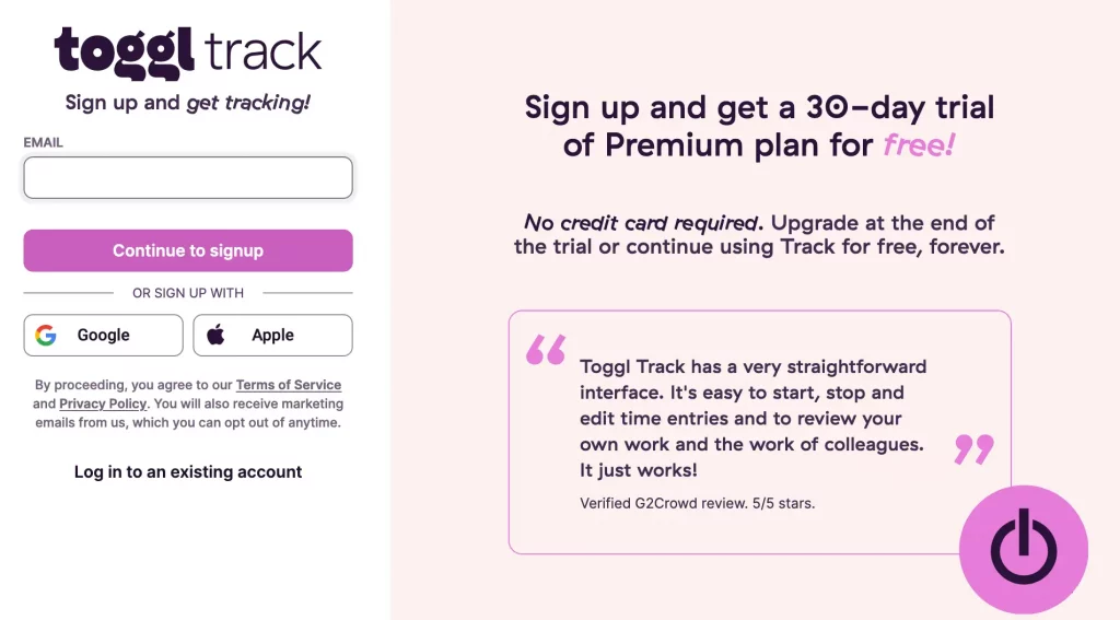
Include a link to your privacy policy or a brief note on how you handle data privacy to build trust with your users. Togl includes links to their privacy policy and Terms of Service next to the form.
Why you need a landing page software
With the right landing page software, you can create a landing page with optimized elements in minutes. You don’t need to hire a designer, a developer, or a hosting service, just choose the perfect landing page platform.
Instapage is the only platform that lets you power your campaigns and turn more ad clicks into customers with all the intuitive experimentation, optimization, reporting, and growth tools you need—all in one place.
With Instapage’s intuitive drag-and-drop page builder with diverse design features, over 5,000 fonts, and 33 million images, anyone can easily create professional-looking, top-performing landing pages without technical or design skills.
When you create a landing page with Instapge, you reduce bounce rates and increase engagement with lightning-fast landing pages. Our Thor Render Engine™, back-end technology delivers 3x faster-loading landing pages so you won’t lose a single lead.
How to create a landing page: Step-by-step process using Instapage’s landing page builder
Instapage makes the process of creating a landing page, even if you don’t have a website, super simple.
- Sign up for an Instapage account
- In your Dashboard, click Create Page > Select the page type.
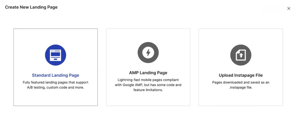
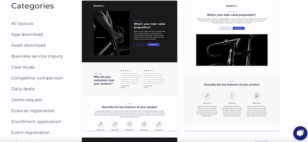
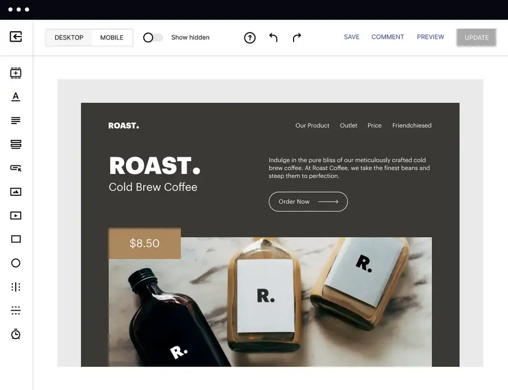
3. Hit the blank type option to set up your page from the ground up or choose from hundreds of templates if you need a place to start.
4. Give a name to your page > hit Edit Design and customize the design and elements using a website builder. Add catchy graphics and text.
5. Design and add different forms for your objectives. Set up lead notifications, routing, and post-submission confirmations.
6. Set up and run A/B testing to identify the most effective design and win more leads. Improve page performance fast with an AI-powered experimentation tool. It tracks your ongoing experiments and directs traffic to top-performing page variations, no matter how many versions you have. Achieve faster optimization insights without sacrificing the quality of your results.
7. Preview the landing page for final checks. Publish it to your desired domain or platform for user access.
You can also watch this video to get started:
Excited to get started on your landing page and gather those leads, product orders, and signups? Sign up for an Instapage 14-day Free Trial today.
