
Whether it happens in professional sports, business, or any other arena, success often goes unappreciated. It’s like an iceberg: Everybody sees the top — your awards and accolades — but nobody realizes what’s under the surface. They don’t see the work it took to get there.

The same goes for post-click landing page design. Sensational blog headlines like “One simple color change skyrocketed revenue by 50%” often highlight success without fully explaining the reason for it.
They don’t tell you that color choice was carefully picked by an entire team, based on company data and knowledge of design theory. They don’t share that the idea came from the foundation of Gestalt Psychology.
Designing a post-click landing page takes lots of knowledge, practice, processes, and people. Often, it looks something like this:
What the design process looks like
Part 1: Planning
Depending on the size of your business, the planning stage can involve several different key staffers. A creative director, data analyst, sales reps, copywriters, designers, developers — they’re all part of planning the foundation of your campaign, together, in the following steps:
1. Determine the goal of your page
You’re building a page, but why? What’s its purpose? Yes, it’s to convert visitors, but what is its ultimate goal?
Many creators mistakenly believe that conversion rate is the “be all end all” post-click landing page metric. It’s not. Ultimately, you want to boost revenue.
Take this page, from Server Density for example:
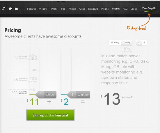
The former pricing structure resulted in many free trial signups, but few upgrades to paid customers. So, Server Density teamed up with VWO to build a new page. Its goal was to boost revenue despite conversion rate with a new packaged pricing model:
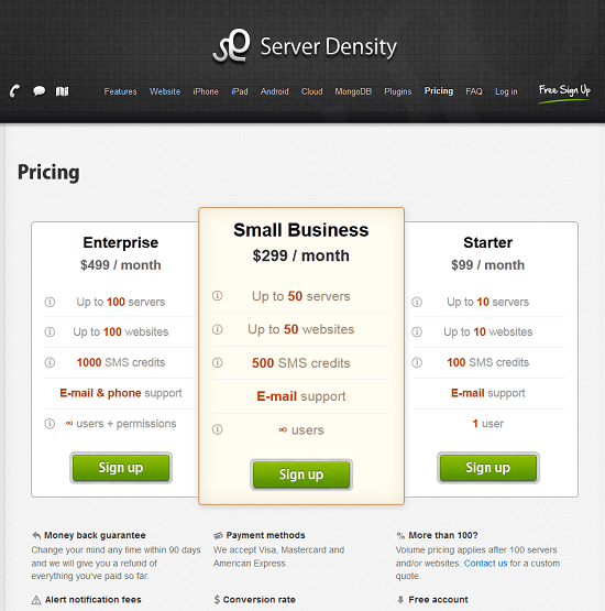
This page actually decreased free trial conversions and paid signup upgrades. At the same time, though, it boosted revenue by 114% by increasing the value per conversion:
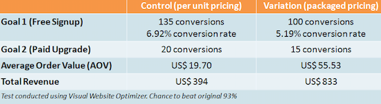
If these post-click landing page creators evaluated performance based on conversion rate alone, the second page would’ve been scrapped in favor of the original. However, the ultimate goal was not to amass conversions, but boost revenue. And that should be your ultimate goal, too.
When you sit down together as a team to plan out the campaign, make sure you determine which key performance metrics are central to improving your bottom line. Then, work backward to figure out the “how.”
In this case, the ultimate goal was to boost revenue, and then the “how” was by introducing a new pricing post-click landing page that would increase the value per conversion.
2. Pin down your audience
Next, it’s crucial your team determines the audience of your post-click landing page. This is where market researchers and data analysts will chime in to answer questions like:
Which buyer personas are expected to arrive at this page? What channel will you draw them from? Google Ads? Email? LinkedIn? Facebook?
What marketing messages do they best respond to? What language do they use when they talk about your product? What part of the buyer’s journey are they in?
Without answers to these, your creatives (designers, copywriters, developers), can’t create a page that resonates with the specific subset of your audience.
Remember, the right traffic is the most important ingredient for high conversion rate. Without internet users who have a need for your offer, your post-click landing page is a waste of cyberspace.
3. Pick your offer
Now that you have your audience pinned down, you should ask yourself, “What do they want, and how can I make them need it?”
Data analysts and marketing managers may chime in here with insights into what offers work best at this stage of the funnel:
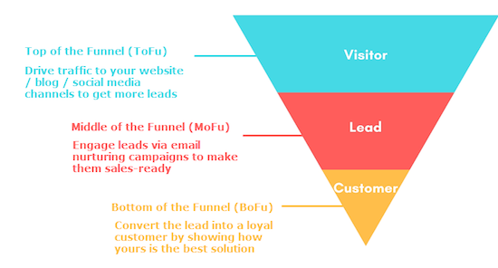
In many cases…
- Blog posts, articles, website content, social media posts, and webinars work best at the top of the funnel.
- Ebooks, tip sheets, white papers, webinars, and case studies work well in the middle of the funnel.
- Demos, consultations, free trials, webinars, and quotes work best at the bottom of the funnel.
Keep in mind, these offers as they relate to the marketing funnel aren’t set in stone. You may find that, for your business, webinars work better at the bottom of the funnel than at the top. You may find that ebooks don’t work at all. But if you don’t have the data to prove otherwise, these are a good starting point.
4. Identify your elements
Now, how will you make your audience need your offer? What persuasive argument will you make, and what collateral will you use to do it?
They say a picture is worth 1,000 words. Visuals like infographics, videos, and hero shots can communicate the value of your offer in an easy-to-understand way. However, sometimes 1,000 words can tell a more compelling story.
If your offer is expensive, new, complicated, or high-commitment, it will be met with more scrutiny. And the more scrutiny your offer is likely to be met with, the more persuasive your collateral will need to be.
That can mean more text, more images, more testimonials, more authority badges, etc. Overall, your page will likely be longer if you’re selling a $500 course than if you’re offering a free tip sheet.
Though, “more” isn’t always the answer. Many times it’s “different” that gets the job done. Experts like Rand Fishkin from Moz and Alex Birkett from CXL recommend creating several vastly different post-click landing pages complete with alternative arguments and collateral to determine which is closest to the global maximum.
Come together with your team to determine which pages will feature videos and which will use text with infographics, or hero shots, or whatever combination of elements you feel will speak to the audience.
Part 2: Assembling the argument
This is where each team member breaks off to prepare support for the message your team has agreed on. Designers will dig into tools like Adobe Photoshop and Premier, while copywriters will scribble down mind maps and headlines on notepads. At this stage, here’s what to expect.
Designers
At this stage of the creation process, designers will work on crafting visual content to support the persuasive argument of the page. That may include:
post-click landing page videos
Studies have shown that video can improve post-click landing page conversion rates by 80% — but, they have to be produced correctly to do so.
Case study videos and video testimonials are perfect for high-cost and high-commitment offers. You’ll see them often on service-based post-click landing pages, like in the legal industry and the digital marketing space.
In yours, make sure you feature your most enthusiastic advocates for whom your business has improved life the most. If they’re well-known, even better.
As you produce, remember the strengths of case study videos and video testimonials, and use effects to enhance them. Text overlay can draw attention to the speaker’s full name and position to boost authority, as well as highlight specific ROI achieved with your business’s help.
Most importantly, remember to keep it short and to tell a story. Let visitors know how problematic your customers’ life was before your business intervened, then share specifically how you worked together, and what that partnership did to help the customer.
Explainer videos and introductory videos are better for when your offer is complicated or new.
You’ll see many software businesses using short explainer videos to quickly demonstrate to visitors what a tool or platform can do. If you create one, make sure to keep it short and simple. Many of the best explainer videos on the web are under two minutes long.
Similar to case study videos, an explainer video should tell a short story of the prospect’s problem, how the business solves it, and what the outcome will look like. They’ll also likely take the coordination of a designer and copywriter to create a script.
Introductory videos, on the other hand, are helpful when your offer centers around a specific person. Think expensive courses taught by professionals that are lesser-known.
An introductory video that explains who they are and why they’re qualified to conduct a webinar or teach a course can be exactly what prospects need to sooth their doubts about converting.
post-click landing page images
The ability of images to convey information instantly is unrivaled. Videos can be more compelling, but they require more commitment on the part of the visitor to watch. Images, on the other hand, can be interpreted in a snap. A few common post-click landing page images designers may find themselves creating:
- Product images are seen mostly on ecommerce post-click landing pages. Think clothing or jewelry for example. Visitors can’t try it on, so it’s your job to show them what it will look like from all angles. If your product is new or complicated, diagrams can showcase how it works.
Product images aren’t strictly limited to physical items, though. They can give visitors a valuable preview of what the interface of your software looks like, or the content your ebook contains.
- Hero shots can help prospects imagine what your product will turn them into after they claim it. A cleaning service may show an image of a spotless house, while a car insurance provider may display an image of a happy teen waving to his parents as he backs his car out of the driveway. Think of this as the “after” photo of a “before” and “after” sequence.
Here’s a hero shot from an Infusionsoft post-click landing page that shows the prospect what they’ll become with the software — an organized, agile small businessperson. Notice that it’s not just a photo of the mobile interface; it’s a photo of a hand grasping the mobile phone, which helps the prospect envision themselves using the software:

- Infographics are ideal for when you need to display data in a non-intimidating, easy-to-understand way. Bar graphs, pie charts, and line graphs are great for comparing and contrasting, like the difference between you and your competitor, for example.
If you’re building several different pages, try radically different approaches on each. Include an explainer video in one, and some diagrams on another. Later, testing can prove which is more effective.
Copywriters
While designers create the visual portion of the post-click landing page, copywriters will craft its written content. Their responsibilities include putting together:
A headline that communicates your USP
The page’s headline should immediately convey the unique selling proposition of the offer. It should invoke curiosity, share news, appeal to self-interest, and match the message of the ad it came from to establish trust.
The most important words on your post-click landing page are in your headline. If they don’t convince your visitor to stick around, he won’t bother looking for your body copy or call-to-action. Here’s an excellent example from AWAI:

Benefit-oriented body copy
The page’s body copy is the biggest variable as far as written content goes. Word count usually depends on the offer, and usually, the further down the audience is in the marketing funnel, the longer and more persuasive it will need to be.
Squeeze pages, for example, often contain less than 20 words total. Pages that go after the sale, though, can grow to be thousands of words in length.
Regardless of word count, the copywriter should optimize pages for legibility, readability, and comprehension, because people don’t read. Instead, they skim in an F-pattern or Z-pattern:

To accommodate that pattern, the benefits of your offer should be formatted to stand out from the rest of your body copy, using effects like bold or a bulleted list.
Testimonials collected from customers
Quotations from happy customers should be collected and written about on your post-click landing page in detail. These testimonials should come complete with full name, position, and should focus on a specific positive outcome. Here’s an example from Directive Consulting of what a stellar testimonial looks like.

A compelling call-to-action
The call-to-action should be a few words that get your visitors excited about claiming your offer. Traditionally, it’s an action-oriented phrase that emphasizes what your visitor needs to do to claim an offer. Today, it’s evolved into a phrase that emphasizes, like all other elements on the post-click landing page, what the benefits of claiming the offer is. Learn more about finding the right CTA here.
Once these elements have been created by each branch of the creative team, they’ll be passed off to the creative director for approval.
Part 3: Putting it all together
Once the creative director gives the “OK,” a designer will be tasked with creating mockups as discussed in the initial planning stage. They’ll bring all the elements together to form one or more anatomically correct post-click landing pages with:
No outbound links in the navigation, footer, or body
post-click landing pages focus on getting a visitor to take one action, which is why they should not feature any outbound links that distract from that goal. Those links shouldn’t be in the navigation menu, the footer, or anywhere in the body of the page. Every post-click landing page should have a conversion ratio of 1:1, meaning there should only be one place for visitors to click: your CTA button.
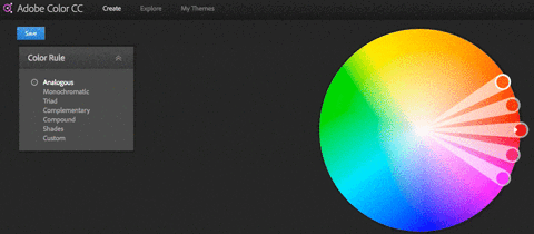
A branded color scheme
The colors on your page should be tailored to your business. Based on your branded hues, tints, and shades, you should pick a scheme that makes your form and CTA button most noticeable.
Engaging media
It’s time to embed the video, infographic, or product shot you designed in part 2. Invodo recommends placing media above the fold, but studies have shown that if your page is compelling, people will scroll past the fold.
The placement of your media also depends on its purpose. If you’re displaying screenshots of your software, like Autopilot does on their post-click landing page, it should be aligned with its corresponding copy:

A simple form
Not all your post-click landing pages will feature forms, but when they do, those forms should be as simple as possible. Request only the information you need, and make sure the offer is equal to the ask. Prospects will be willing to hand over much more information for a free trial of your software than they will for a short tip sheet.
Readable branded fonts
Decorative fonts can work for headlines, but for in-depth reading, basic type works best. Make sure your fonts are in-line with your brand’s design guidelines. Creating a consistent and familiar user experience is crucial for establishing trust with your visitors.
Trust badges: Authority, social proof, security
Badges come in all shapes and types. Three types have the potential to make your post-click landing page much more persuasive.
- Authority badges prove your expertise by highlighting awards you’ve won or publications you’ve been featured in. Here’s an example from a Foxtail Marketing post-click landing page:
![]()
- Social proof icons show that other people have found your product or service valuable. Logos of well-known clients and tickers that count your social following can boost the chances you get a conversion.
- Security badges indicate to visitors that your business will keep them safe. Icons from companies like McAfee and Norton Security can let them know their personal information is secure, while money-back-guarantee badges and a Better Business Bureau logo can let visitors know their money is safe with you. Here’s an example from a Beach Body post-click landing page:
![]()
Locatable contact information
In case you’ve forgotten to include anything about your offer that visitors might want to know, you should always include locatable contact information with which they can reach your team. Many businesses add it in the upper right-hand corner of the page. Make yours click-to-call to make reaching your team from a mobile device even easier.
A visual hierarchy
Not all post-click landing page elements are equally important. That’s why colors and elements and visual cues need to be arranged in a way that guides the visitor from the headline to the call-to-action in a natural way.
Online, that “natural way” is in an F, E, upside down L, or Z-pattern, research has shown. By taking that reading pattern into account and using design practices based on a psychological theory formulated over 100 years ago, you can create a logical visual path to your call-to-action button with something called a “visual hierarchy.”
Part 4: The design review process
This is where things can get messy. Once individual elements have been combined on the post-click landing page, the whole team will submit feedback. Many times the process involves word documents filled with screenshots, messy arrows, highlights, and red text.
Those docs and their comments get sent back and forth in a long email chain that eventually wears more on your patience than it does your inbox storage capacity.
For more streamlined design review without all the messy back-and-forth, the Instapage Collaboration Solution allows team members to comment on page elements and share those comments with one another.
It makes long email chains and wasteful meetings obsolete by allowing designers, writers, and developers to make adjustments at their leisure. And they can make those adjustments themselves, instead of having to send them to the designer charged with building mockups of the page.
Find out more about the Collaboration Solution here.
Part 5: Publishing
Once the team has decided on design, designers and developers will work together to make sure the page looks and works the way it should on the web.
Things like buttons, when clicked, need to pass information through the form to a CRM and pass visitors onto a “Thank You” page. When form information is input incorrectly, error messages need to let the visitor know.
JavaScript code from third-party analytics tools need to be input correctly so that visitor behavior can be tracked, and so those who don’t convert can be retargeted with advertisements. Designs need to be optimized for mobile and for quick load times, otherwise visitors will bounce.
To make sure you don’t forget any steps before you publish your post-click landing page, download the Instapage publishing checklist here:
What does your design process look like?
Does your business’s design process look like the one above? Is it more efficient? Is it more of a headache?
Create professional post-click landing pages in minutes, sign up for an Instapage Enterprise demo today.

See the Instapage Enterprise Plan in Action.
Demo includes AdMap™, Personalization, AMP,
Global Blocks, heatmaps & more.
