There’s one resource, which is offered at the top of your marketing funnel and gets prospects interested in your business and it’s promoted with an ebook landing page.
Yes, the all-powerful ebook. When created correctly, it can communicate valuable knowledge to your fans, and position you as a resource to return to when they need further assistance.
But, giving away free ebooks isn’t easy these days. Internet users have been duped into reading so many useless ones that they’re more cautious than ever when it comes to trading their information for a download.
On the flip side, brands have learned the value of ebooks as a lead generation tool, and now, there are more floating around in cyberspace than there ever have been.
So, what separates those unsuccessful at soliciting ebook downloads from the businesses who are? Ask Sujan Patel, co-founder at Right Inbox and he’ll tell you that, at least partly, it’s knowing how to create a compelling landing page.
In only 30 days, he and a partner wrote an ebook titled 100 Days Of Growth, and with an Instapage landing page, they generated 10,000 downloads in just six months.
But don’t take our word for it. Check out his post here, his landing page here, and then continue on to learn what you should and shouldn’t do on an ebook landing page to persuade visitors to download.
20 Ebook landing page critiques to learn from
(Keep in mind, for shorter ebook landing pages, we’ve shown the entire page. However, for longer pages, we only displayed above the fold. You may need to click through to each ebook landing page to see some of the points we discuss. Additionally, some of the brands listed may be A/B testing their page with an alternate version than the one displayed below.)
1. Microsoft
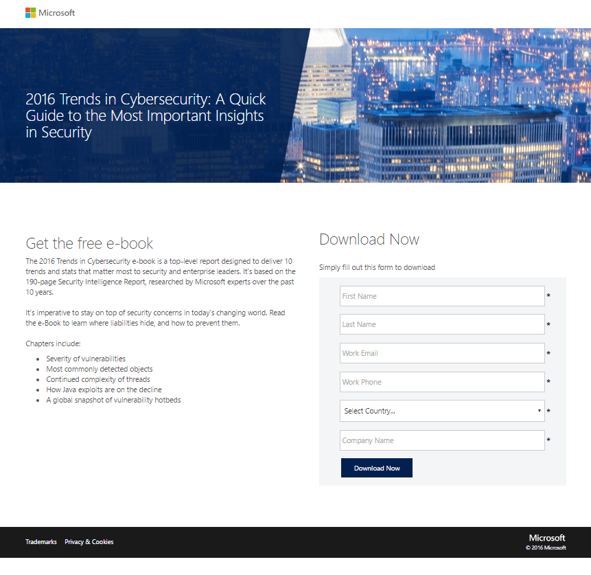
What they did well:
- The headline emphasizes that the guide will be “quick,” as in, easy to get through, and filled with 2016’s “most important insights in security.”
- A subheadline uses the word “free” to entice visitors to claim the resource at no cost.
- Minimal copy makes this page easy to digest.
- Bulleted text gives readers a sneak preview into the content of the book.
- Text above the form lets prospects know that they need to fill out the form to get the ebook, and it uses the word “now” to communicate that the resource will be available immediately.
What to A/B test:
- A logo linked to the homepage gives visitors the opportunity to escape without hitting the CTA button.
- This CTA button color could be more attention-grabbing.
- Every form field is required. Does Microsoft really need to know all that information?
2. Salesforce
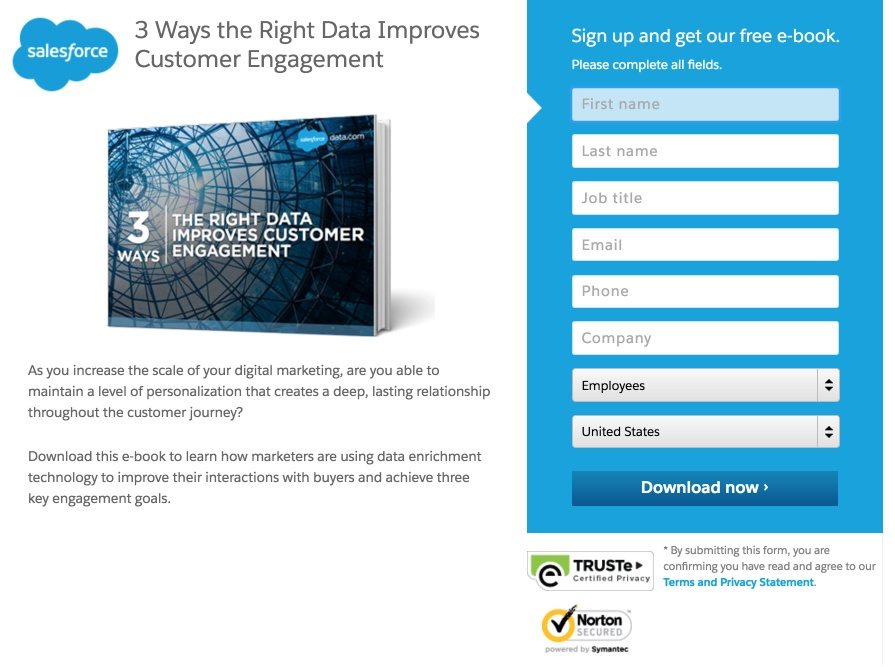
What they did well:
- The word “free” written on the form conveys the no-cost nature of the offer.
- Trust badges let visitors know their information is secure.
- A minimal amount of text on this page makes it easy to get through.
- The image shows prospects what they’ll get by converting.
What to A/B test:
- A logo linked to the homepage lets users escape without hitting that CTA button.
- A poorly chosen CTA button color makes this button easy to miss.
- This headline doesn’t convey a benefit. The copy does, but if the headline doesn’t grab the reader, they’ll never make it to the body copy. Here’s a better way to write it “3 Ways To Improve Customer Engagement WIth The Right Data,” or “3 Ways You Can Boost Customer Engagement With Technology.”
- This long form might intimidate prospects into abandoning the page before they submit their information.
3. HubSpot
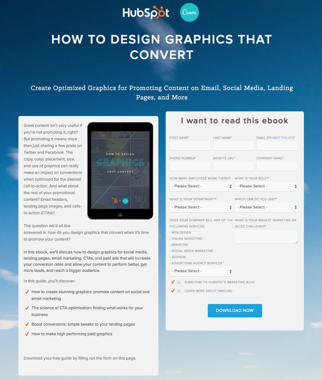
What they did well:
- Non-hyperlinked logos give prospects no visible way off the page.
- The “How To” headline conveys a benefit.
- Bulleted copy communicates the benefits of downloading quickly.
- A first-person statement at the top of the form adds to the persuasiveness of the page.
- Unchecked opt-in boxes keep HubSpot’s email lists from filling up with uninterested subscribers. They’re not opt-in boxes if they’re pre-checked. In that case, they’re opt-out.
- A minimalistic footer keeps visitors from abandoning the page via links below.
What to A/B test:
- A long form featuring 11 required fields might scare visitors away.
- A bland CTA button color makes this button less attention-grabbing than it could be.
4. Flywheel
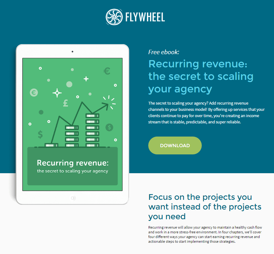
What they did well:
- The word “free” lets visitors know they won’t have to pay for the ebook.
- Text broken up into chunks makes this content easily readable.
- Cooperating CTAs work together to compel the visitor to download.
- A short preview of the chapters lets prospects know what they’re getting in exchange for their personal information.
What to A/B test:
- A logo linked to the homepage gives prospects an easy out.
- A link in the footer serves as an escape route off the page.
5. Upwork
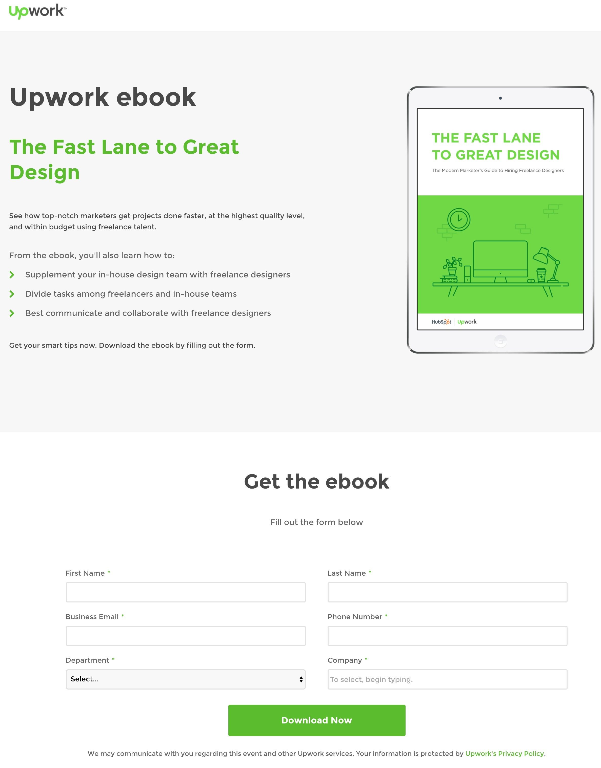
What they did well:
- Minimal text means prospects won’t have to read much.
- Bulleted copy quickly communicates what they prospect will learn by reading this ebook.
- Text below the bulleted copy lets visitors know exactly what they need to do to get the ebook — as does copy above the form.
- This image shows prospects what they’ll get by converting.
What to A/B test:
- A logo hyperlinked to the homepage allows visitors to abandon the page before converting.
- This headline could communicate the benefit more clearly. Does “The Fast Lane to Great Design” mean the same as “The Modern Marketer’s Guide To Hiring Freelance Designers”? Not to us. Something like “How To Identify, Hire, and Retain Top Freelance Designers” sounds much clearer.
- The logos on the bottom of the ebook image show Upwork and HubSpot. If this ebook is coauthored by HubSpot, mentioning that would certainly add to the persuasiveness of the page, as the Cambridge-based marketing company is an industry leader.
- Social media links in the footer let prospects escape before filling out the form.
6. Firebrand Group
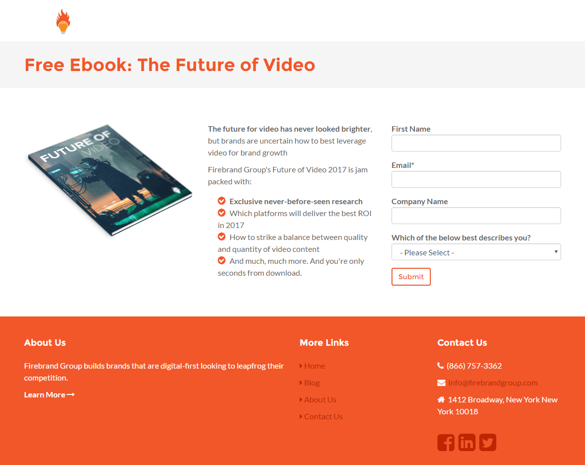
What they did well:
- The headline offers up a resource at no cost.
- An image shows the visitors what they’ll get when they input their information and hit the CTA button.
- Bulleted copy conveys the benefits of reading the ebook.
- A short form makes converting a breeze.
What to A/B test:
- This CTA button is easy to miss.
- The CTA “Submit” won’t get prospects excited to convert.
- A busy footer gives visitors too many escape routes.
7. Foundr
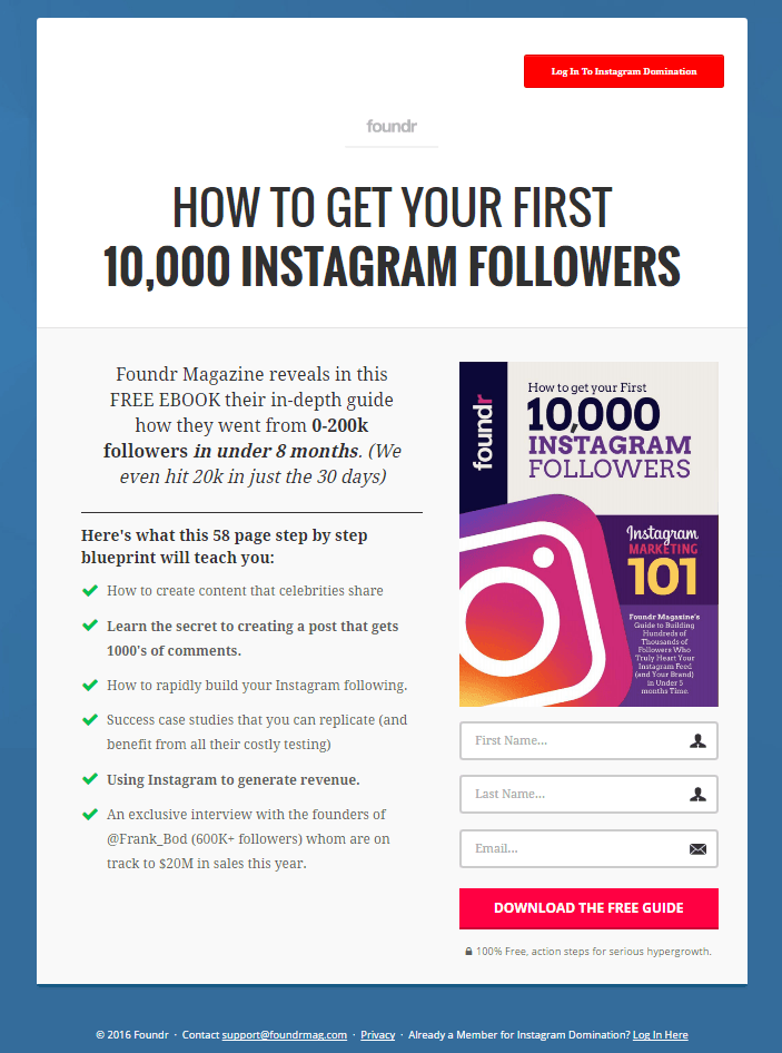
What they did well:
- A specific, case study headline lets users learn by example, step by step.
- This image showcases the content up for grabs.
- This short form makes converting simple.
- Bulleted copy quickly communicates the benefit of the offer.
- Minimal text makes getting through this page easy.
- This CTA button is easy to spot.
- The call-to-action uses the word “free.”
- A minimalistic footer keeps prospects focused on converting.
What to A/B test:
- Links at the top of the page make it easy for visitors to escape.
8. Atomic Reach
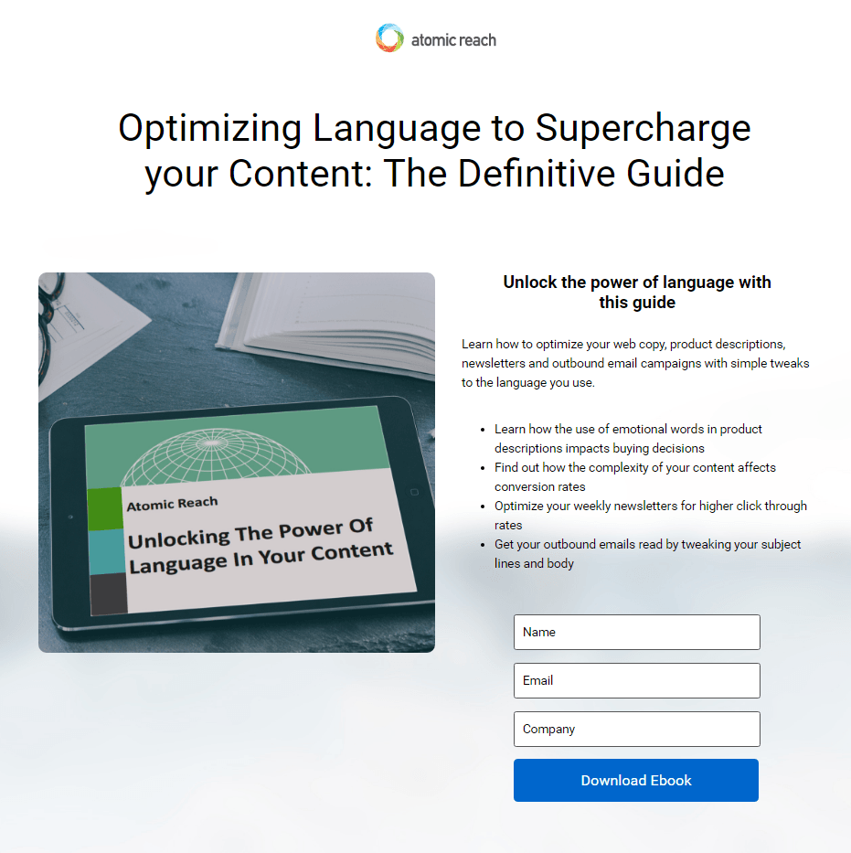
What they did well:
- A non-hyperlinked logo doesn’t let prospects escape through it.
- Bulleted copy quickly communicates the benefits of downloading.
- This image shows visitors what they’ll get when they fill out the form on the page.
- A three-field form makes converting friction-free.
- Minimal text makes getting through this page easy.
What to A/B test:
- A confusing headline leaves readers scratching their head. Optimizing language? “Supercharge your content”? What does that even mean?
- Labels within form fields have the potential to confuse and frustrate visitors when they disappear and the people filling them out don’t remember what they were typing.
9. Just Position It
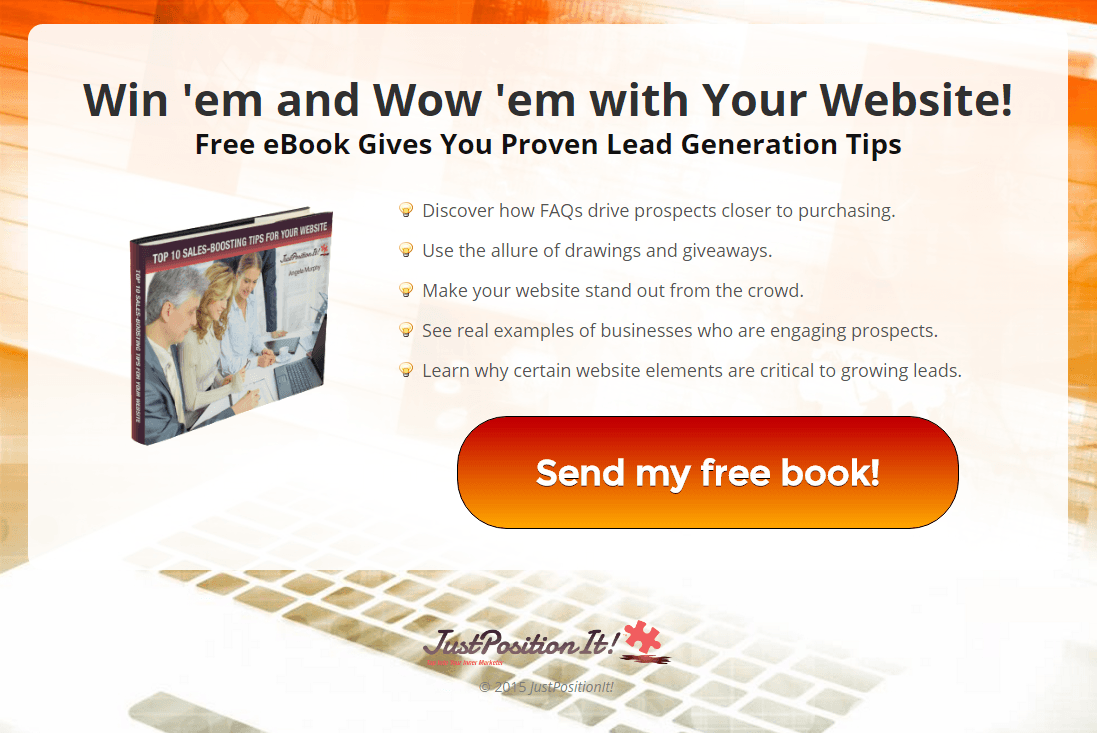
What they did well:
- This headline and subheadline combo convey a benefit.
- Minimal text makes getting through this page friction-free.
- Bulleted copy allows visitors to skim the benefits of the offer.
- This CTA button is impossible to miss.
- The call-to-action is written in first person.
- Non-existent navigation and footer means there’s no visible way off this landing page.
What to A/B test:
- More white space would make this page easier on the eyes.
- The keyboard image doesn’t seem to fit the context of the offer.
- A logo hyperlinked to the homepageallows visitors to abandon the page before converting.
10. GaggleAMP
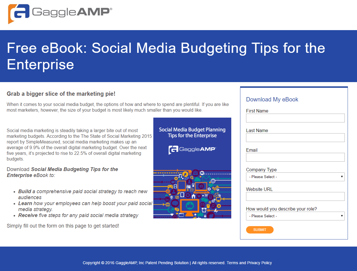
What they did well:
- A non-hyperlinked logo keeps prospects from escaping to the homepage.
- An image shows the visitors what they’ll get by converting.
- Bulleted copy conveys the benefits of reading the ebook.
- Copy at the top of the form is written in first person.
What to A/B test:
- Lack of white space on this page makes it look cluttered.
- Block text looks overwhelming to read.
- This CTA button is tiny and difficult to find, even if its color is attention-grabbing.
- The CTA “Submit” is as basic and boring as they get.
11. BandV
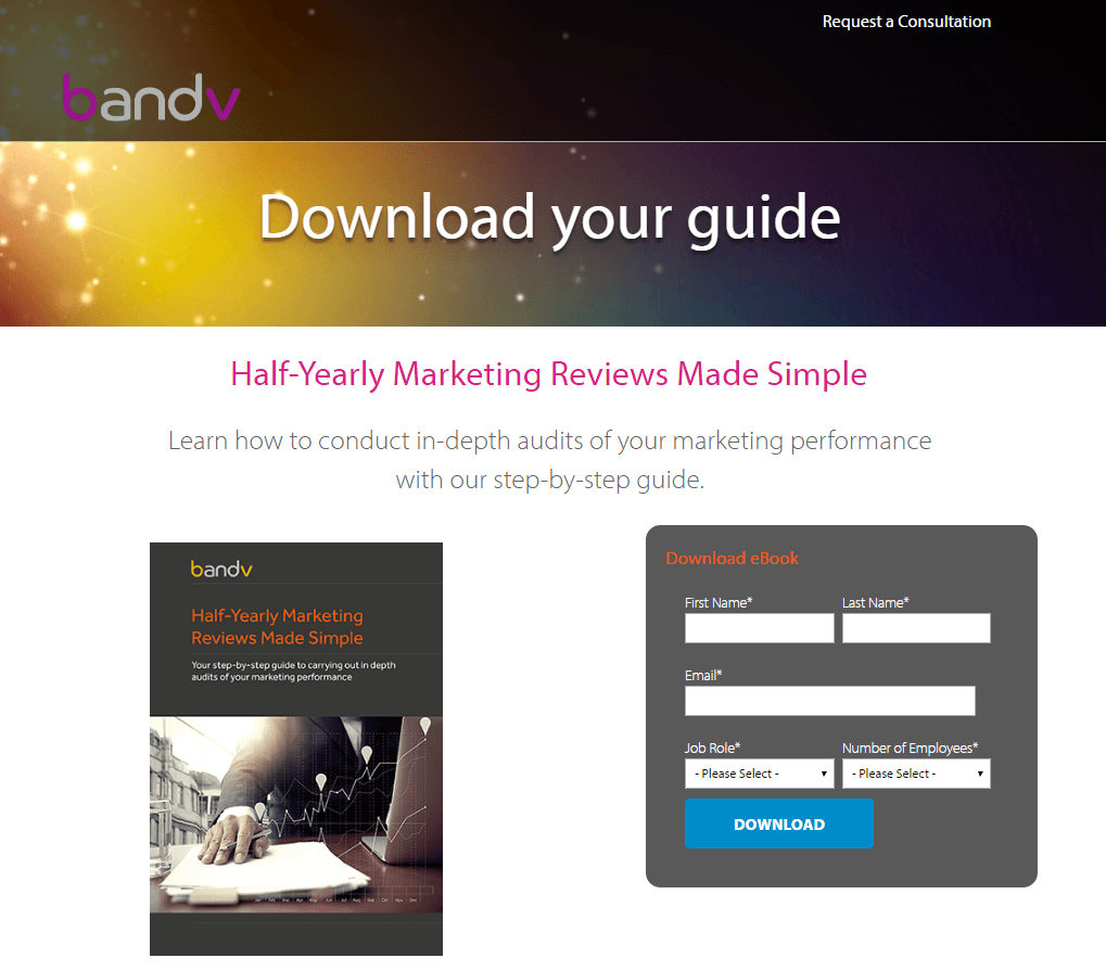
What they did well:
- The headline uses a variation of the most compelling word in copywriting – “you.”
- This image gives visitors an idea of what they’ll get by converting.
- Minimal text makes getting through this page easy.
What to A/B test:
- A poor visual hierarchy makes this page look unorganized. The big, bold letters should convey the benefit, not the copy below it. “Download your guide” should be switched with the text below.
- Bulleted copy has the potential to emphasize the benefits of downloading. Where is it? There’s little content to get through on this page, which is usually a benefit, but it might not be enough.
- A logo linked to the homepage makes escape easy for prospects.
- Two different conversion goals — “request a consultation” in the upper right corner and “download” on the form — compete for conversions and detract from each other.
- This CTA button color doesn’t draw attention like it should.
- The CTA “Download” doesn’t compel us to download. Does it you?
12. Upward Enterprises
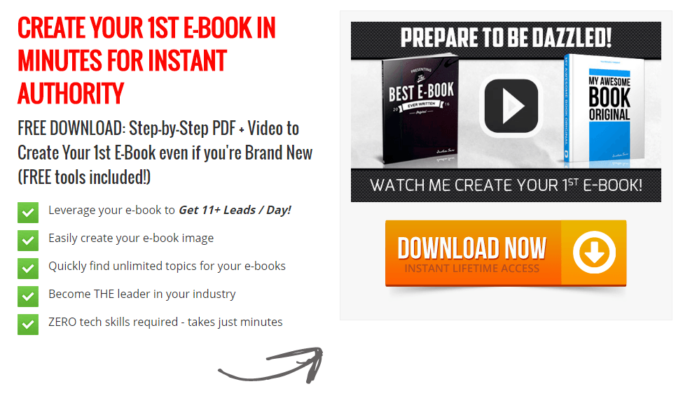
What they did well:
- This headline communicates a strong benefit.
- The subheadline emphasizes the guide is free, and offers a step-by-step solution to boosting authority with an ebook.
- Minimal text makes this landing page easy to digest.
- Bulleted copy quickly conveys the benefits of the offer.
- An arrow serves as a visual cue, guiding the prospect toward the CTA button.
- The CTA button draws attention with its bright orange color.
What to A/B test:
- An all-caps headline gives the impression that the writer is yelling at the reader.
- These benefits are easy to spot, but they’re awfully sensationalized. Become “THE industry leader”? Get “11+ leads per day”? There’s nothing wrong with guaranteeing results, as long as they’re realistic and attainable by everyone who reads the ebook.
13. PhotoWorkout
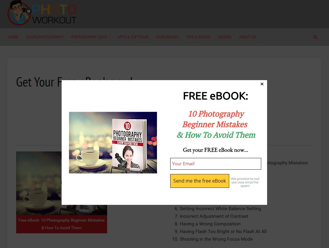
What they did well:
- This headline uses the word “free.” Who doesn’t like free stuff?
- The subheadline takes advantage of a psychological trick that we’re all susceptible to. That is, we’re afraid to make mistakes. Instead of positioning this ebook as a reference used to improve, this copywriter positioned it as a resource to prevent photographers from becoming worse.
- A super short, one-field form makes converting easy.
- The CTA relates to the offer by using “ebook” in it, and it’s written in first-person.
- A message next to the CTA button lets prospects know they won’t be spammed.
- The CTA button color draws the eyes of the visitor.
- The image shows users what they’ll get when they convert.
What to A/B test:
- The “email” label within the form field goes against usability best practices because it disappears when the visitor begins typing. This has the potential to cognitively strain and frustrate users.
14. Impressa Solutions
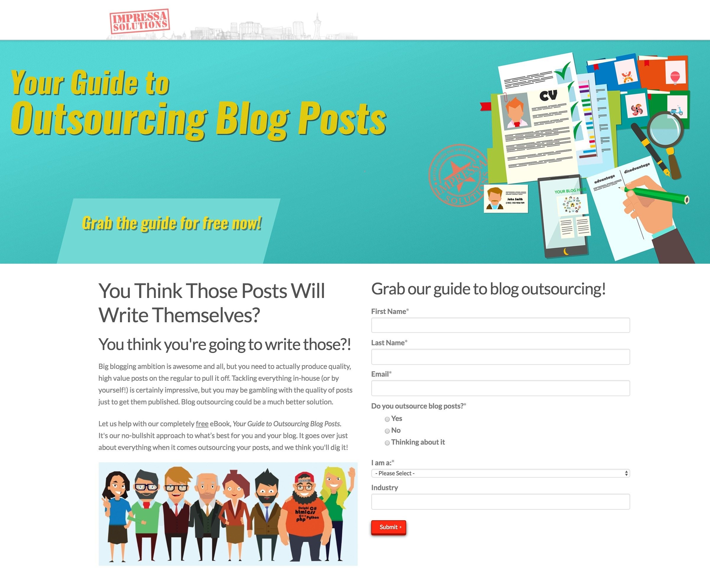
What they did well:
- This headline uses a variation of the word “you,” the most compelling word in copywriting.
- The subheadline emphasizes the guide is free.
- The CTA button color pops visually off this page’s white background.
What to A/B test:
- This stock photo doesn’t add value to the page.
- A logo linked to the homepage gives visitors the opportunity to escape without converting.
- This CTA button is microscopic.
- The CTA “Submit” is as basic and boring as they get.
- A busy footer distracts prospects from converting.
- Two more offers at the bottom of the page work against the page’s main conversion goals.
15. Campaign Jobs

What they did well:
- No navigation menu means no visible way off the page.
- The word “free” lets visitors know they don’t have to pay for this resource.
- Minimal text makes getting through this page easy.
- The privacy policy and terms & conditions offer more information to skeptical prospects.
What to A/B test:
- A logo linked to the homepage lets users escape without converting.
- A poor visual hierarchy makes us wonder what’s most important on this page.
- A lack of benefits doesn’t convince us that we should hand over our personal information in return for the download.
- This CTA button camouflages completely into the background. Can you spot it quickly?
16. Optimizely
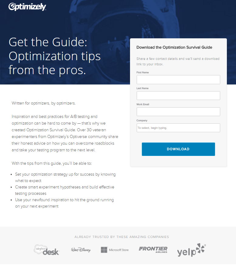
What they did well:
- No navigation menu translates to no readily available route off this page.
- The headline offers up a valuable resource: tips from experts.
- Minimal text broken up into readable chunks makes getting through this page easy.
- Bulleted copy communicates the benefits of the offer quickly.
- A short form makes converting easy for the prospect.
- Company badges boost Optimizely’s authority by showcasing well-known brands they’ve worked with.
What to A/B test:
- Logos in the header and the footer, both linked to the homepage, let users escape without converting.
- This CTA button could be more color contrasting to draw more attention.
- Social links in the footer give prospects yet more easy ways off the page.
- Share buttons in the footer make it easy to send this landing page with social contacts, but they also direct the visitor off the page. Share buttons make more sense on a “Thank you” page, where visitors have the opportunity to circulate the ebook after they’ve read it and deemed it valuable.
17. Vertical Measures
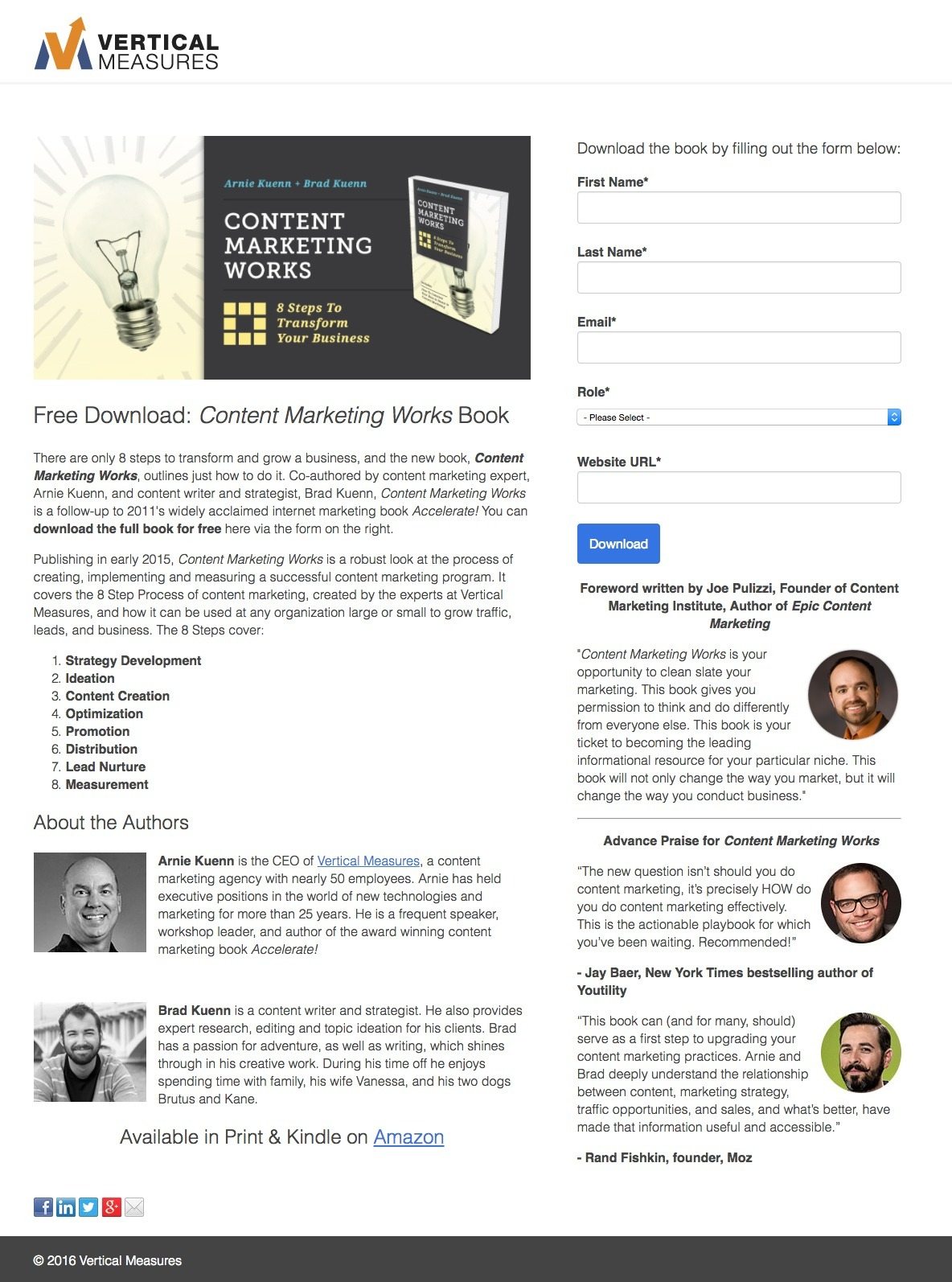
What they did well:
- The image serves as a visual representation of the offer.
- Minimal copy makes this page easy to digest.
- Bulleted text gives readers a sneak peek into the content of the book.
- Text above the form describes exactly what users have to do to claim the resource.
- Social proof in the form of testimonials shows visitors that authorities in the space find the book useful.
What to A/B test:
- A logo linked to the homepage gives visitors the opportunity to escape without converting.
- The headline could contain a better benefit. Why should visitors want to claim a “Content Marketing Works” book? The emphasis of the download should be put more on the “Transform Your Business In 8 Steps” message.
- A vast amount of text makes this page too overwhelming to read completely.
- A lack of white space and dividers makes this page look jumbled and unorganized.
- This CTA button color makes it easily missable.
18. IMPACT Branding & Design
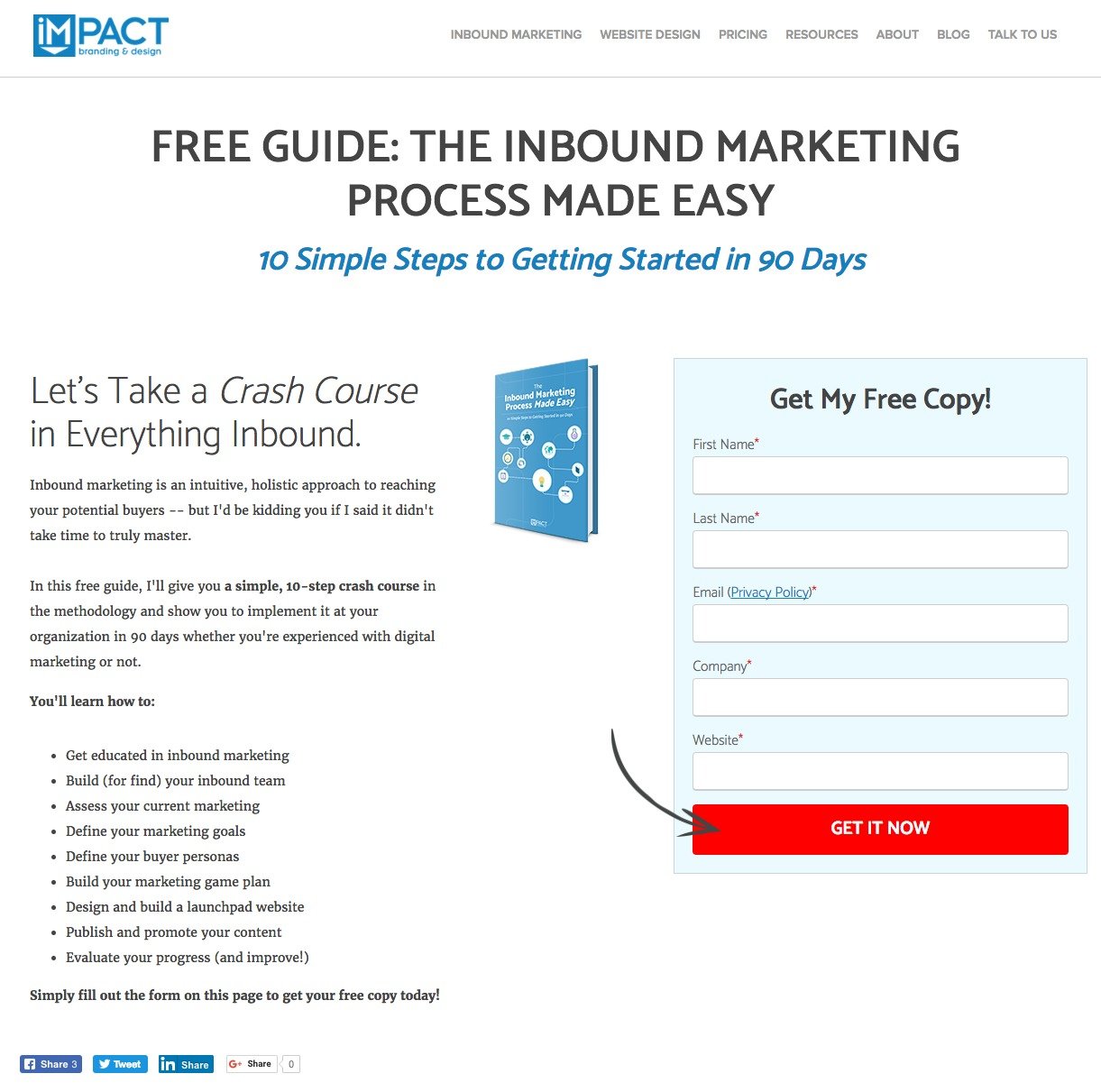
What they did well:
- This headline indicates that the ebook is completely free.
- The subheadline uses the word “simple” to make inbound marketing sound easy.
- The image serves as a visual representation of the offer, showing visitors what they’ll get when they convert.
- Bulleted copy stresses the benefits of downloading the ebook.
- Text on the form is written in first person, which studies have shown has the potential to boost conversions.
- Minimal text makes this landing page easy to get through.
- A bright CTA button color draws prospects’ eyes to it.
- An arrow serves as a visual cue, guiding visitors toward the CTA button.
- The word “now” in the CTA lets prospects know that they’ll get the ebook as soon as they hit the button.
What to A/B test:
- A logo linked to the homepage gives visitors the opportunity to escape without converting.
- Links in the navigation menu serve as exit routes off the page.
- A busy footer distracts prospects from the page’s goal.
19. Workamajig
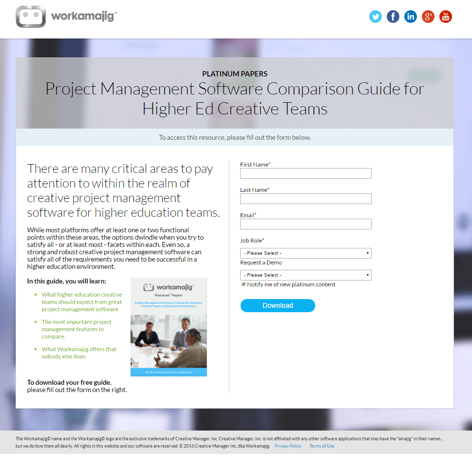
What they did well:
- Text above the form lets prospects know what they need to do to download.
- An image shows the visitor what they’ll get if they convert.
- Bulleted copy conveys the benefits of downloading the ebook.
What to A/B test:
- This headline could be stronger. Instead of telling the visitors what the guide is, tell them what they can do with it. How about “Pick The Perfect Project Management Software For Your Higher Ed Creative Team”? Or maybe, “Quickly Compare the Best Project Management Software On the Market”.
- A logo linked to the homepage gives visitors the opportunity to escape without converting.
- Links to social pages lead prospects off the page.
- The green bullets look out of place. If the purpose is to draw attention to the benefits of the offer, a different textual effect like underline, italics, or bold would fit better.
20. LeadSquared
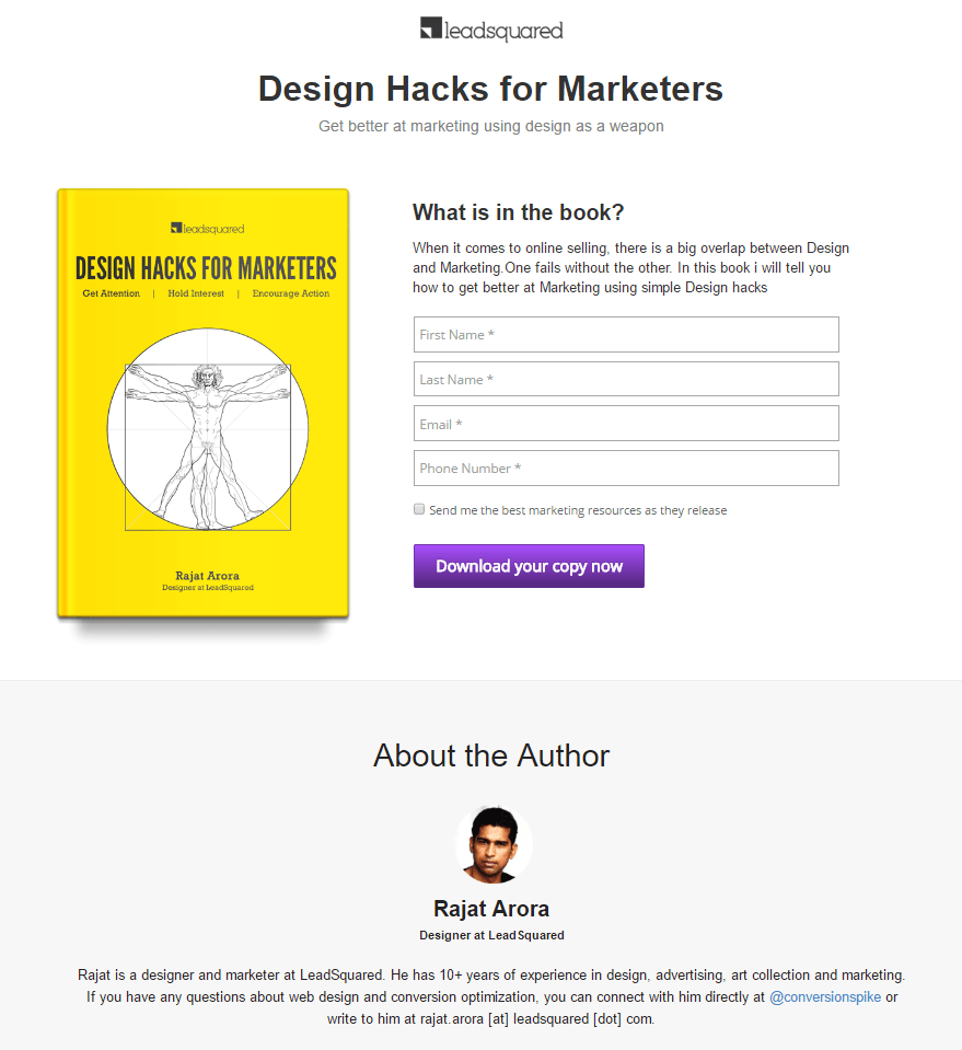
What they did well:
- A non-hyperlinked logo makes escaping through it impossible.
- This headline and subheadline convey a benefit. The word “hacks” implies tips that are simple to implement, but powerful at the same time.
- The color purple makes this CTA button difficult to miss.
- An “About the Author” section touts the authority of the writer.
- An image of Rajat helps to humanize him to the visitor.
- Minimal text makes getting through this page a breeze.
- An opt-in box that’s not already pre-checked means that only visitors who want to be on the company’s email list will opt in.
What could to A/B test:
- Disappearing labels within each form field may frustrate and confuse prospects who begin typing and don’t remember what the field is for. Best practices state permanent labels above each field work more effectively.
- A link to the blog in the footer entices prospects to abandon this landing page to read more of the company’s content.
Create your own ebook landing page
With these critiques, start creating and optimizing your own ebook landing page today. Your prospects and lead gen funnel will thank you. Instapage 14-day free trial today.

Try the world's most advanced landing page platform with a risk-free trial.
