All your landing page elements have designated jobs to do—the headline is meant to grab visitor attention with your UVP, the form collects lead information, and your CTA button converts visitors into leads and leads into customers.
How does one button perform such an important task? Let’s find out.
What is a CTA button?
A CTA or call to action button is a clickable button on your landing page, email, website, display ad, social media post, and blog post that prompts users to take a desired action.
Depending on what the campaign goal is, the CTA button action can range from requesting a demo to signing up for a webinar, to putting down a $5 reservation on a pre-order.
Have you ever clicked a button that said ‘Learn more’ or ‘Sign up here’ or ‘Download now’? If so, you’ve interacted with a CTA button.
Why is a call to action button important?
As marketers, we want to capture audience attention for as long as possible, and a CTA button is what helps turn your visitors into leads and leads into customers.
For example, if you send an email to a targeted list of users hoping to convince them to sign up for a free trial, you need to include a CTA button that would lead them to your free trial landing page, where a free trial page button will take your email subscribers to your sign-up page.
Your CTA button connects your marketing funnel touchpoints with each other so you can move visitors down your funnel.
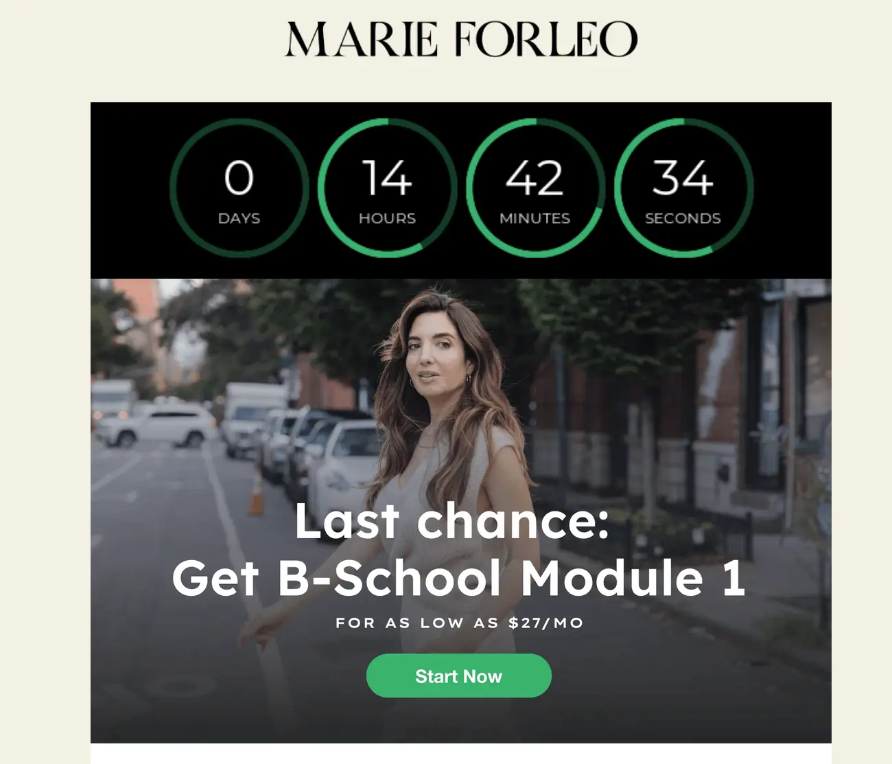
For example, this Marie Forleo email encourages subscribers to sign up for B-School at a discounted price of $27/month. The email CTA button leads visitors to the B-School landing page. The landing page CTA button takes visitors to the Check-Out section.

In addition to connecting your marketing funnel, CTA buttons also let users know what the logical next step is without them having to think about it or having to search for that information on their own.
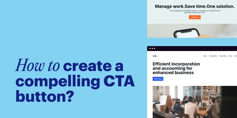
How to create a compelling CTA button?
It is clear that a CTA button is a must-have in any marketing campaign or piece of content. Now, how can you ensure that you are creating the most captivating call-to-action possible? There are several considerations you must make:
Placement
True or false: A CTA must always go at the bottom of your page. The answer: It depends. Some experiments have shown that call-to-actions that are placed at the bottom or towards the right of content perform better than buttons placed elsewhere.
However, the important thing to consider is that your CTA should follow a logical sequence. It should appear after copy that is relevant to the desired action you want your user to take and after they’ve had a chance to read all the important information you’d like them to.
You never want a user to have to backtrack to find the CTA button they need.
As a best practice, you can include your CTA button in the hero section after the headline and sub-headline and once after your product benefits and social proof section. Like Peleton does with its email offer.
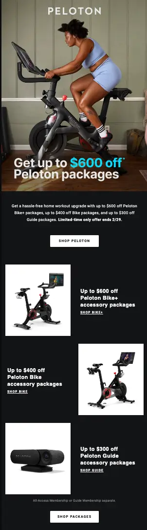
Peloton includes two CTAs in a promotional email offering a discount on their packages. This gives the reader two opportunities to take action. The first CTA is placed immediately under a short, but clear paragraph describing the offer. If the reader chooses to keep scrolling, they will be given various options for packages to buy, with another chance to click the CTA following those details.
This ensures that a conversion opportunity is available whether or not the user reads the entire email.
Copy
Coming up with short, enticing copy for your CTA button can be a challenge. CTA button copy is limited to just a few words, and these words need to be relevant to your offer and let visitors know what to expect next—i.e., download, read, learn, apply, etc. Remember to be direct, make it exciting, and be selective about the words you choose.
The Salesforce pricing page has multiple CTAs. Each conveys a specific and obvious action the user can take and does it in a way that is not overwhelming. It’s worth noting that Salesforce has the luxury of including so many CTAs on their page because they are such a well-known brand, and they have enough insights to know the popular actions users on their page are typically looking to take.
For lesser-known or new brands, it’s wise to limit the number of CTA buttons on your page.
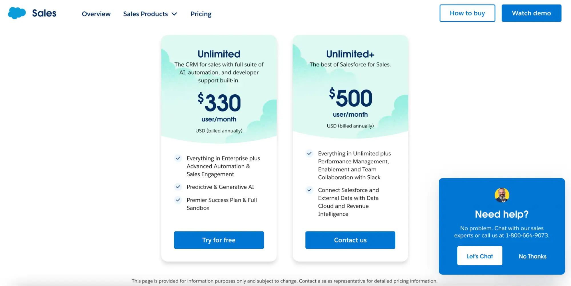
Source: Salesforce
Size
You want your CTA to be noticeably different from other copy on your page, but not obnoxiously so. The size of your call-to-action should make sense with the other elements of your page and will also depend on whether it is appearing in an email, a landing page, a display ad, and so on.
Make your text large and easy to read, but no need to overdo it.
Color
The color of your CTA button matters. Again, just like with size, you want your CTA button to be noticeable and attention-grabbing but not in an off-putting way. You want the color of your call-to-action button to be on-brand, and in contrast with the rest of the colors on your page Plenty of people have studied whether or not certain colors drive better results, and there’s not a clear answer. Green tends to be a popular choice, but it’s not guaranteed to perform better. That’s because there are so many variables at play, including your brand colors, the gender of the person looking at your page, and even culture.
Many brands use color psychology to influence their choice. We know that orange is often used to convey cheerfulness, green evokes health and nature, and blue is associated with dependability and trust. However, it is worth repeating that there can be no one-size-fits-all approach to the color of your CTA button.
The best thing you can do after you’ve chosen something that’s on-brand and contrasting is perform A/B tests. This way, you can get deep insights into what resonates with your target audience, and you can make a data-driven decision that will make your campaigns more successful.
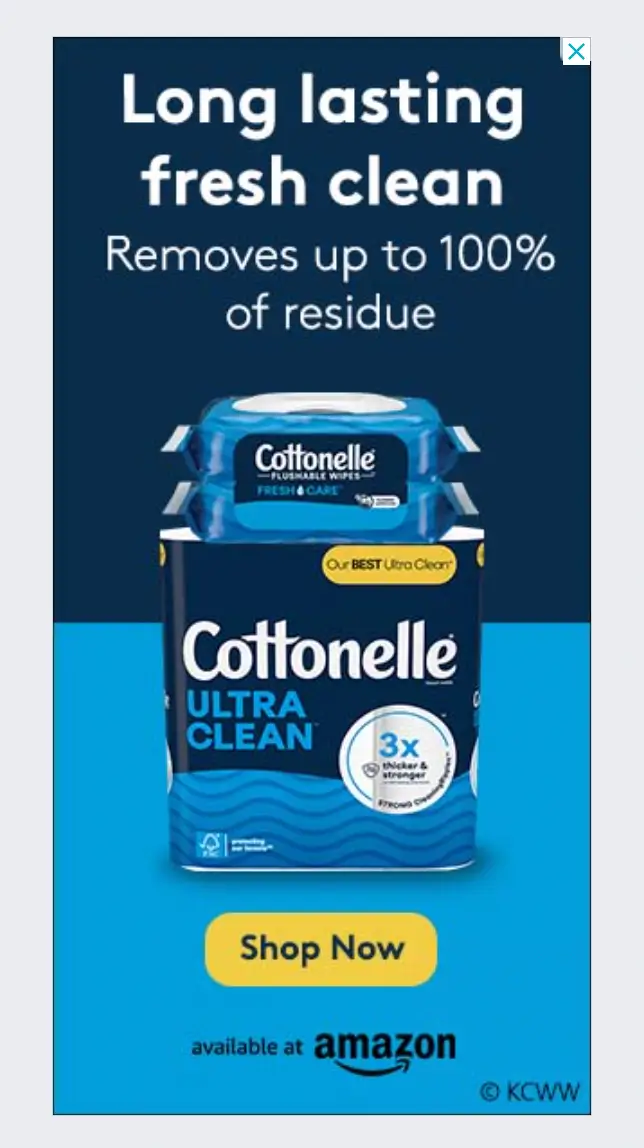
Cottonelle is successful at remaining consistent across two different ads displayed in different locations on the same page. Although the ads themselves use varying color schemes, they share the same yellow color CTA buttons that contrast with the page background. And even though the copy within the two yellow CTAs also varies, the user is able to recall the consistent elements quickly and be enticed to take action.

Examples of CTA Buttons
Popular types of CTA buttons include:
Lead Generation
Think of this as introducing yourself to your target audience. This type of CTA button encourages users to explore. It gives the marketer the opportunity to cookie the user for retargeting or even capture some of their information via a form. Use these on exit overlays, banner ads, display ads, social ads, or landing pages.
Read More
These are highly popular for driving traffic to a site or landing page and for keeping users on the site for longer periods of time. For marketers who are promoting a blog post, an eBook, or a report, showcasing a snippet of content with a CTA to read more is a powerful way to entice users and get them to engage with your content.
Demo Request
Brands who are selling their product or services to users often want to give a sneak peek of what their product can do before expecting a user to commit fully. This is why it is popular to see CTA buttons that offer a demo request. Many IT or software companies do this on landing pages, in social posts, on banner ads, and in emails.
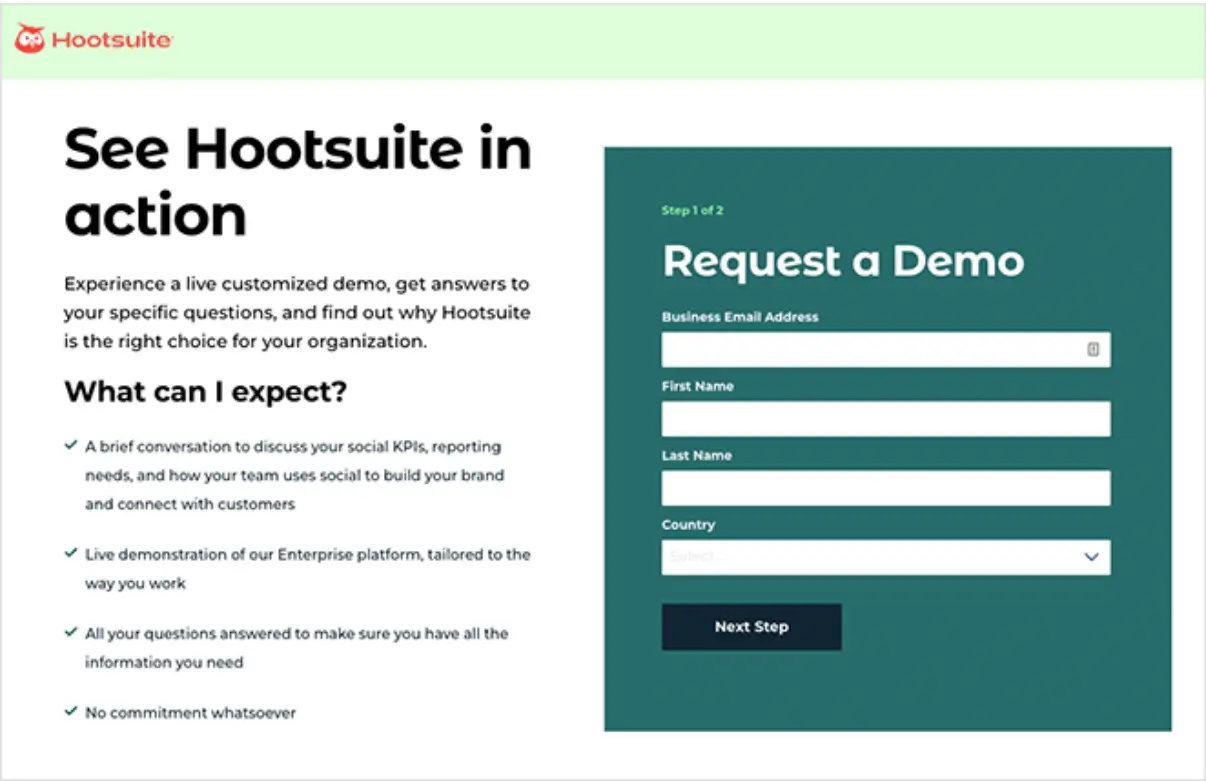
Hootsuite uses a landing page to direct users to their demo requests. They let readers know what they can expect from a demo request before filling out a form, and the CTA button is clearly labeled ‘Next Step’, implying that further action will occur.
Social Request
You can find this on almost every company’s website, usually in the form of icons that lead to a company’s social media page on popular platforms like Instagram, Twitter, Facebook, YouTube, and LinkedIn. Brands like to invite users to follow them on social media to engage with their content and get to know their personality.
On our homepage, we have our social media CTA buttons displayed at the bottom of our page below our footer, which is a common placement for these icons.
Lead Nurturing
The work does not end once a lead has been captured. That lead must be nurtured and taken through the funnel, to the point where they become a customer. For that reason, lead nurturing calls-to-action are used to prompt leads to take further action that will bring them further down the funnel, such as signing up for a trial or contacting a sales team member.
Convert to Customer
When a marketer has leads who have reached the decision phase of the funnel, CTA buttons are used as a motivator for leads to take that final action of becoming a customer.
This may look like a ‘BUY NOW’ button to initiate a subscription to a product or a “contact sales”’ button that’ll get the lead on the phone with a representative who will help them move forward.
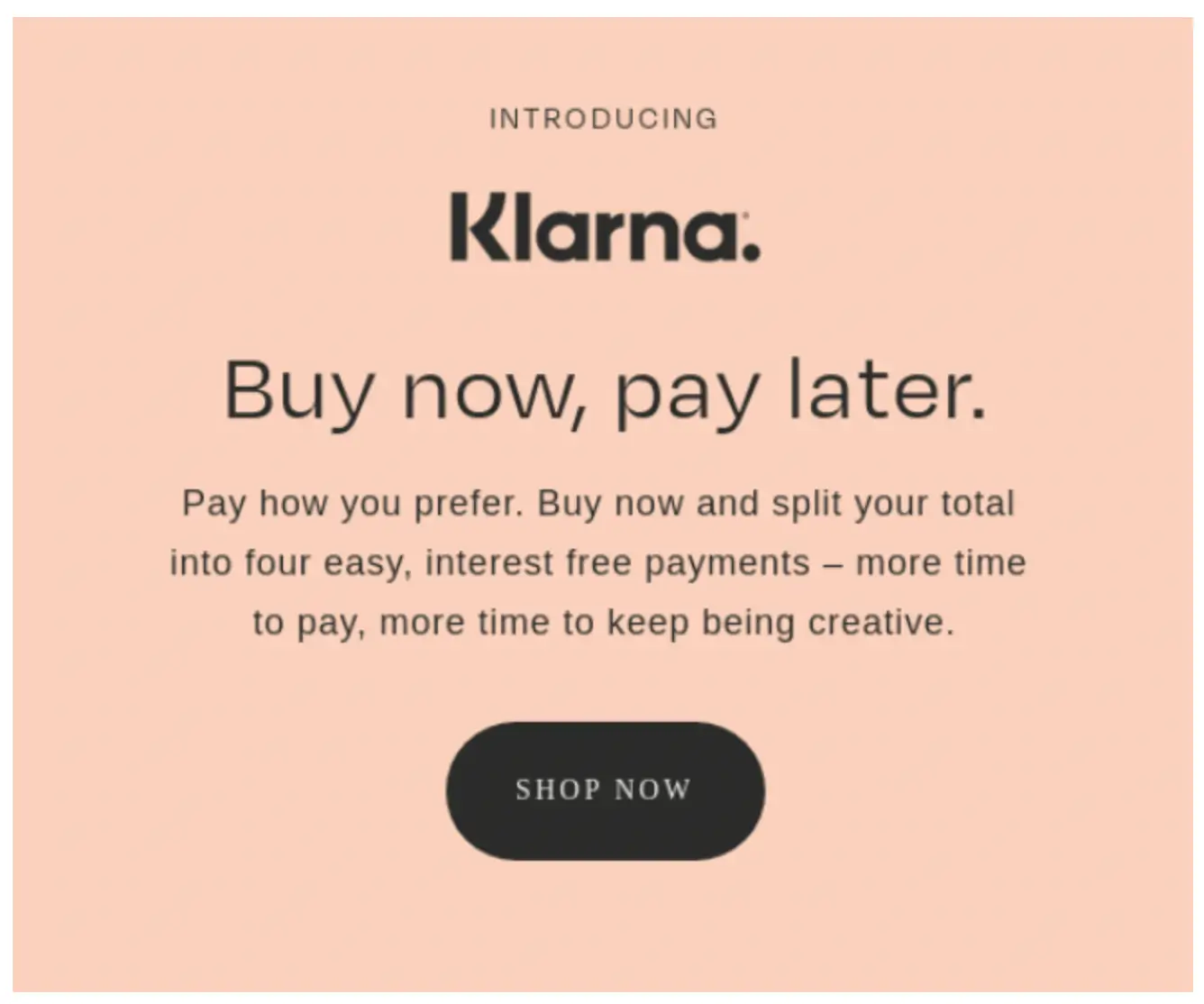
Fintech company Klarna hopes to convert leads to customers instantly with their ad that quickly describes how their service works and prompts readers to get started right away.
Event Promo
Some companies will host annual events as a value-add for existing customers and/or as a way to promote their services and deliver valuable insights to prospects in the industry.
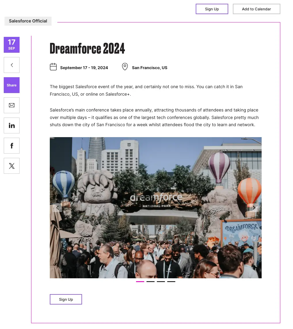
Salesforce hosts a popular conference called Dreamforce every year. On their Dreamforce landing page, they use two ‘Sign up’ CTA buttons to give interested parties the opportunity to register for the event. Anyone visiting the page knows exactly where to click if they want to be a part of Dreamforce.
Related Content
Many companies use their blog as a way to draw potential customers in and keep them scrolling through their pages for a period of time. Blogs present a great opportunity to showcase thought-leadership content, industry best practices, product use cases, customer testimonials, and so on.
Well-written, engaging, and valuable content can be a powerful way to hook leads and reel them in. Once you’ve interacted with a company’s blog content, you may notice an offer to read related content on the site, even after you’ve left their page.
Depending on a lead’s funnel stage, retargeting ads or follow-up emails may be deployed to draw their attention back to their site with a ‘read more’ CTA leading to content similar to what they’ve already viewed.
6 Call-to-Action button best practices to get the click
To create the most compelling call-to-action buttons, remember to follow these six best practices:
Avoid friction words
You want your CTA to inspire action and to use positive language. You don’t want to lead with a negative or turn your lead away. Avoid restrictive language and words like “Don’t” or “No”. Focus always on the exact action you want your audience to take and make it personal whenever possible (i.e., Book My Demo).
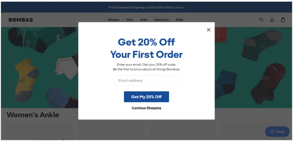
Sock and apparel company Bombas wants to give first-time customers a discount on their first purchase. They clearly convey this with an overlay window and a personalized CTA that reads ‘Get My 20% Off’. The reader knows exactly what’s in store for them if they click that button.
Use sticky CTAs with relevant copy in each section
Be direct and stick to the offer at hand. Although you may have an idea of a specific path you’d want your audience to go down, just take it one step at a time.
Your CTA should be relevant to the immediate next step the lead will take and should relate to the content that came before it. For example, let’s say an accounting software company is creating a landing page to promote a financial industry trends report.
It would not make sense for the CTA on that page to be about signing up for a free trial of the software. Instead, the CTA should focus on accessing the report to get insights.
Be logical and to the point.
Create urgency and scarcity when necessary
You want your potential customers to take action now, so use language that inspires them to do just that. Create a sense of urgency and/or scarcity around your offer by using words like ‘Now’ ‘Limited Time Only’ or ‘Just for Today”.
You may even entice potential customers by offering something extra for the first group of people to opt in (like 10% off for the first 100 customers, for example). This tactic is often used for event registrations, with incentives given for people who sign up early or urgency created by using language like ‘limited spots available’.
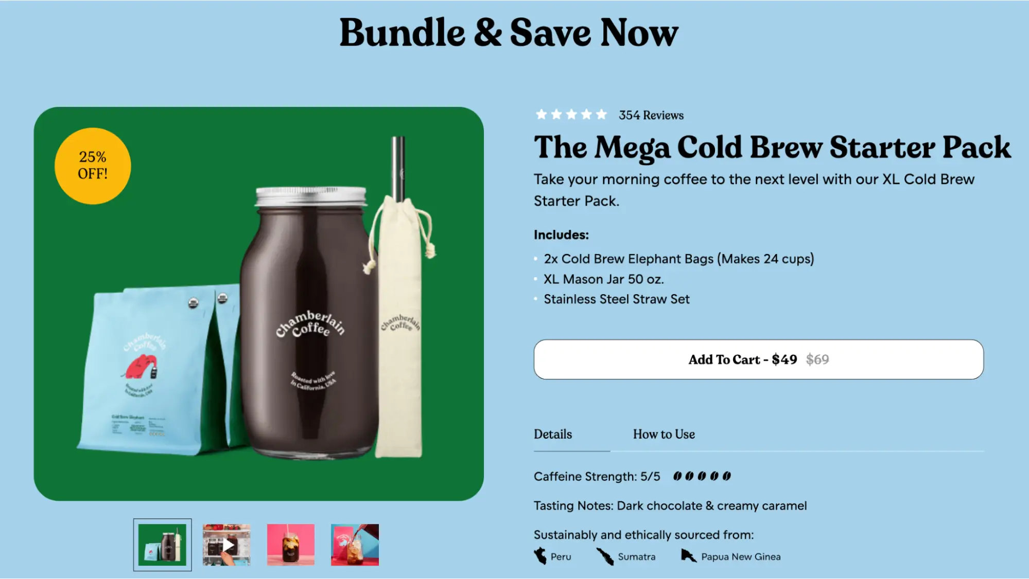
The Chamberlain Coffee CTA button features the price decrease.
Add your value prop on the button
What exactly are you offering your potential customers? Why should they be interested in and excited about your product? Let them know in your CTA. For example, if they’ll be receiving a discount or a free trial, let them know upfront. You can and should convey your value proposition anytime you’re able to.
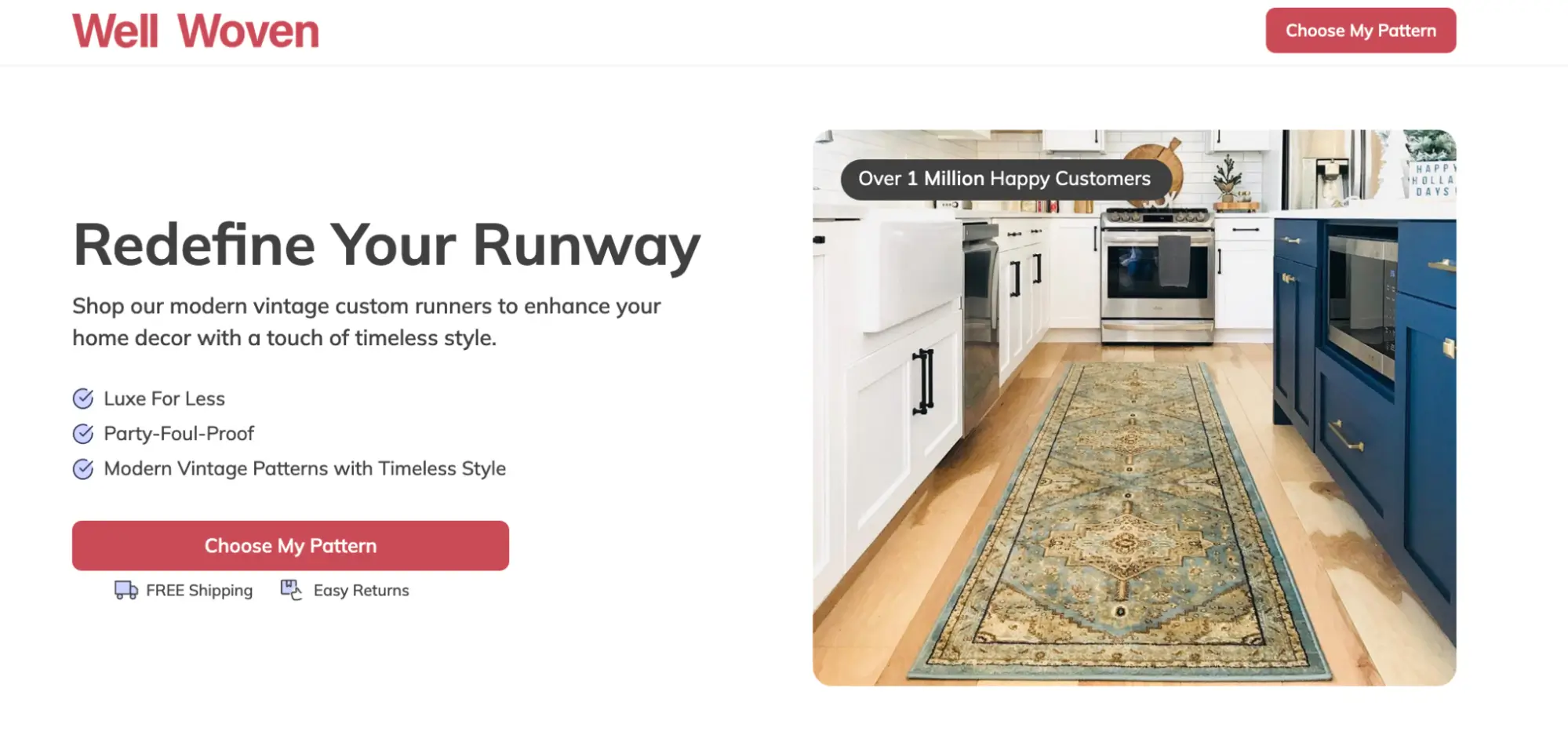
The Well Woven CTA button encourages visitors to choose their runner patterns.
Use ample white space
We mentioned this earlier, but you want your CTA button to stand out and grab attention. In addition to using the right size and color, you want to use ample white space around your CTA button so that a user’s eye goes directly to that space, and so the button doesn’t get lost amongst your other content. Don’t make it an awkward amount of space, but make sure it gets the focus it deserves.
Test your button
Can’t emphasize this enough. Test, test, test always in all ways. Make sure your CTA button works (we know this is like asking if you tried turning your computer off and restarting, but it needs to be said). Does it go where you want it to go? Does it work on mobile and on desktop? How responsive is it? Then, A/B test the heck out of it. Try different copy, colors, sizes, and placement. Find the sweet spot and optimize your CTA button to deliver the results you’re looking for.
What do different CTA buttons look like in your marketing funnel
A big reason CTA buttons are so important and popular is that they help move leads through a marketing funnel. Remember, conversions don’t solely refer to a person making a purchase. A conversion could be signing up for a newsletter, downloading a report, or simply following a social media channel.
For marketers to be able to nurture their leads, they need to understand where in the journey they are and what can be done to move them along into the next phase. This is a critical part of a CTA strategy and will inform what kind of CTA is used and where.
It’s likely that a marketing team already has a strategy for what kind of marketing materials to deploy at different stages of a funnel.
For example, emails may be used for prospecting and nurturing, homepages may be used in the top of the funnel for building awareness, landing pages may be used in the middle of the funnel when a lead is in the consideration stage, and display ads may be used in the bottom of the funnel when a lead is ready to make a decision.
Being armed with this type of information will help a marketer match their CTA to their funnel strategy. If they know that display ads are mainly used for bottom-of-the-funnel campaigns, then they can design those ads to have a more urgent ‘BUY NOW’ message.
If emails are used for nurturing, they may include CTAs that entice the reader to download a report or sign up for a free trial.
If thank you pages are used after a conversion event, then a marketer might take that opportunity to present related content to their customer with ‘READ MORE’ messaging.
To get the best results from your CTA buttons, it’s important to be intentional about the time, place, and manner in which you serve them.
Add relevant, action-packed CTA buttons on your pages
CTA buttons take up such little real estate that it’s easy to overlook them. However, the buttons are complex and require a well-thought-out strategy.
Did you know that in addition to helping marketers create amazing, results-oriented landing pages, Instapage can also make adding CTA buttons to pages a breeze?
Instapage customers can add Shopify or PayPal buy buttons to drive their audience to make purchases, add a click-to-call, email, or text button for instant access to support team members, add customizable form options for easy lead capturing, and much more.
![]()
Sign up for a free 14-day trial of Instapage today and start building incredible landing pages with insanely good CTA buttons now.

Try the world's most advanced landing page platform with a risk-free trial.
