Color psychology is more than a trend, when used correctly, it’s a powerful marketing tool that helps you increase user engagement and conversions.
Thoughtful color choices also play a pivotal role in helping customers distinguish your brand from competitors. Psychological effects of color also have an impact on moods and feelings both positively and negatively—and influence user attitudes toward brands. According to research, 90% of customers make product decisions based on color alone, proving that it is crucial for marketers to understand the psychology of color in marketing and use it to their advantage.
Today’s post will help you understand what color psychology is, why different colors have varying impacts on people, how to use it to get prospects to engage and convert on your landing pages, and examples of brands using the right colors to their advantage.
What is color psychology?
Color psychology is the study of how different colors affect our moods, choices, and behavior. It might sound pretty straightforward at first glance, but there’s more to it than you might think. There’s a whole world behind why certain hues make us decide one thing over another.
So, if you’ve ever wondered why you feel a certain way when you walk into a room painted yellow or why you’re more likely to hit the buy on a red sale button, dive into the world of color psychology with us.
Exploring the psychological effects of color
Sir Isaac Newton took us from using colors based on gut feeling to understanding them scientifically. He figured out that white light is a blend of various colors. How? By splitting light with a prism, he showed us that each color has its unique wavelength.
This discovery started the scientific journey into the psychology of color. It highlighted that every hue isn’t just a pretty shade. Each one has its own unique identity and meaning.
Understanding color theory
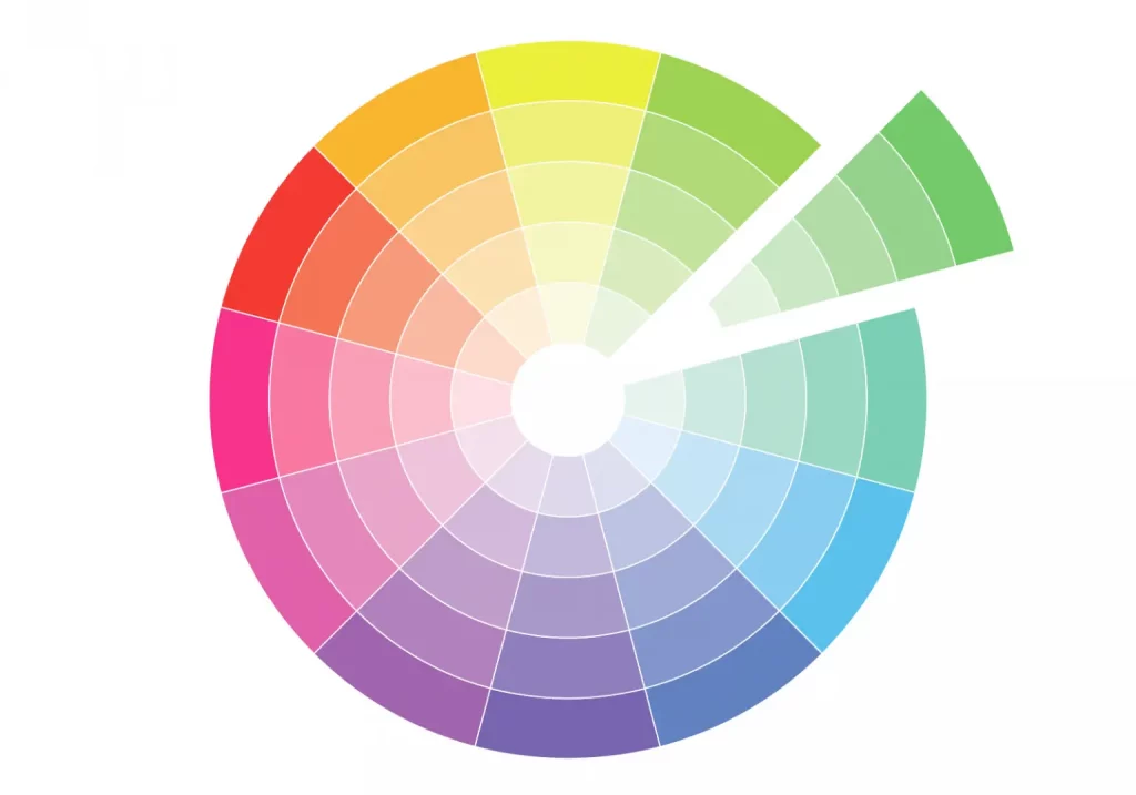
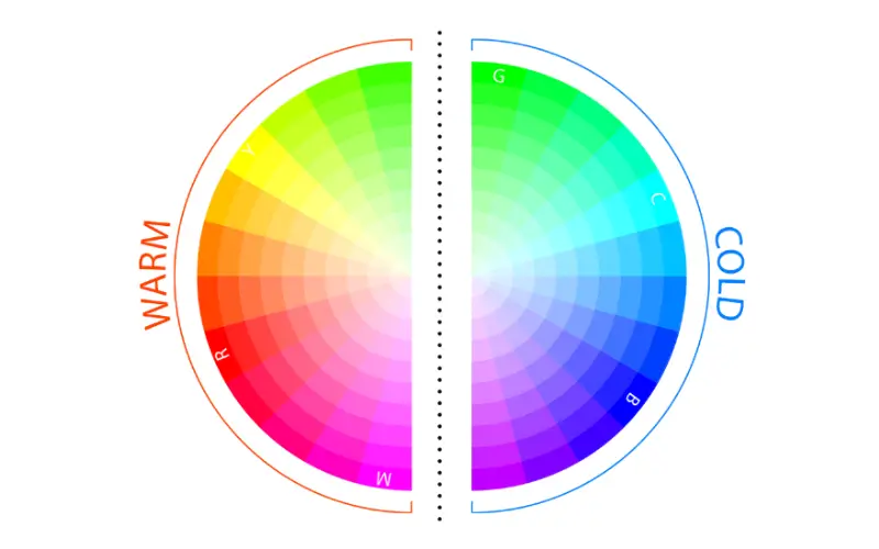
Newton’s work with the prism was the groundwork for what we now call the color wheel. The circle maps out the spectrum of colors, showing us how different hues connect and play off each other.
What is a color wheel?
A color wheel is a circular diagram that displays the arrangement of colors, typically organized by their chromatic relationship, making it a visual tool for understanding color theory and combinations.
It exists in two primary forms:
- RYB: a traditional wheel that includes primary colors Red, Yellow, and Blue
- RGB: tailored for digital applications with its Red, Green, and Blue hues
These are primary hues. They are unique and cannot be created by blending other colors.
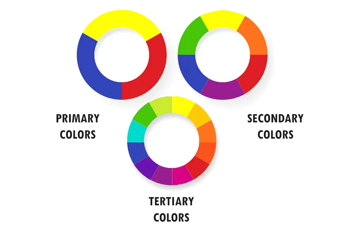
As we delve deeper into the color wheel’s mysteries, we find that when these primary colors are combined, they give rise to secondary hues such as orange (red & yellow), green (blue & yellow), and purple (red & blue). Furthermore, tertiary hues emerge from the fusion of a primary and an adjacent secondary color.
Color harmony in action: What is a color combination?
Our brain naturally rejects information that is too dull or overwhelming, highlighting the need for a balanced visual approach. Excess visual elements can result in chaos, while a lack of them can lead to disinterest. This principle also applies to color psychology.
Understanding how colors combine and work together makes it easier to achieve color harmony:
Complementary and analogous colors
Complementary colors, found opposite each other on the color wheel, like blue and orange or red and green, create a striking, high-contrast look that draws the eye. In contrast, an analogous color palette, which utilizes three adjacent colors on the wheel, such as red, orange, and yellow, provides a harmonious appearance but requires careful selection to avoid overwhelming the viewer.

Monochromatic color schemes
Designers often use monochromatic colors to create a more subtle and sophisticated effect. This approach uses different shades, tints, and tones of a single color, creating a unified and elegant look.
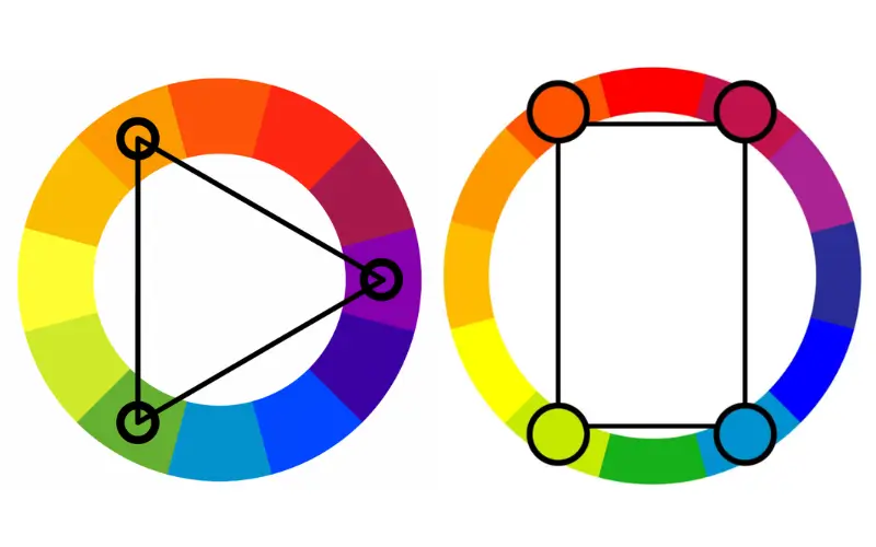
Triadic and tetradic color schemes
Triadic and tetradic color schemes allow for achieving a bold and dynamic effect. A triadic scheme uses three evenly spaced colors on the wheel, like red, yellow, and blue, providing a vibrant and lively feel while maintaining balance. On the other hand, a tetradic scheme uses four colors, typically two complementary pairs, such as blue and orange, with red and green. This results in a rich, complex visual experience of contrast and energy, ideal for attractive designs.
Warm and cold colors
Color temperature also plays a significant role in setting a design’s mood and atmosphere. Warm colors, like reds, oranges, and yellows, are often associated with energy, passion, and warmth, reminiscent of the sun and fire. They can create a sense of comfort and excitement. Cool color tones, such as blues, greens, and purples, make you feel calm, and evoke feelings of tranquility and freshness, similar to water and the sky. They are frequently used to create a serene and professional atmosphere.
Loud and quiet colors
Loud colors, like bright red, are highly saturated and often mixed with black or white to catch the eye and raise excitement. Quiet colors like soft blue are calming pastel shades with low saturation, creating a peaceful atmosphere. For a harmonious and effective use of color, it’s advisable to balance loud and quiet colors.

Finally, the individual character of a color in a design depends on its hue (the pure color), saturation (the intensity or purity of the color), and luminance (the brightness or darkness of the color). A highly saturated bright red may create a sense of urgency, while a less saturated, darker red might convey elegance and subtlety.
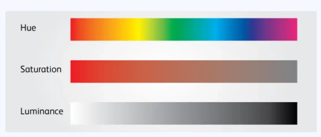
Adjusting these elements allows designers to fine-tune their work’s emotional and visual impact and create compelling, emotionally resonant designs that effectively convey their intended message and aesthetic.
How color palette impacts consumer behavior
Did you know that our DNA might determine how we see colors? This idea gets some backing from a study called “Color Compatibility From Large Datasets,” suggesting that most people prefer warm, bright colors and cyan hues and dislike monochromatic schemes.
But there’s a twist. Our individual backgrounds and cultural contexts greatly influence how we perceive colors. Aspects like gender, where we’re from, the climate we’re used to, and even our language shape our different color preferences. Take red, for example. In North America and Europe, it’s the color of passion and strong emotions (love or anger). Meanwhile, in Asian countries, particularly in China, red stands for prosperity, luck, and honor, and it’s the chosen color for wedding dresses, symbolizing fertility and a lasting union.
Understanding color-related cultural differences is critical in retail and e-commerce. Tapping into color psychology is the key to influencing customer behavior and amplifying the shopping experience. In retail and e-commerce, the clever use of color can:
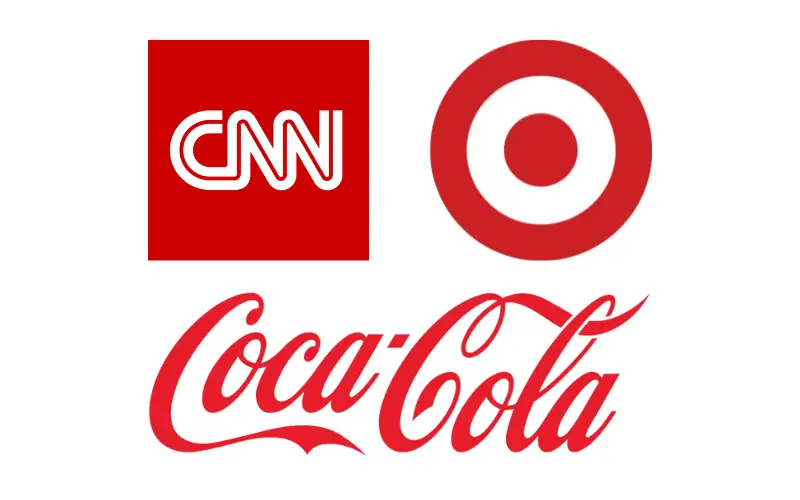
- Encourage purchases. Certain colors can stimulate or dampen purchasing behavior. For example, red is often used in sale signs because it creates a sense of urgency and excitement. It’s also believed to convert better on buttons than other colors.
- Set the mood. Different colors evoke different emotions. For instance, blue can create a sense of trust and reliability, while yellow might create a feeling of happiness and optimism.
- Assign a specific connotation to a product. The color chosen for branding can often communicate its identity subconsciously to consumers. For instance, the combination of color black and gold conveys exceptional elegance. So, if a high-end watch manufacturer aims to communicate sophistication and premium value, these colors are its best bet.
- Craft brand identity. Consistent use of specific colors can reinforce brand identity and boost brand recognition.
What are the psychological effects of specific colors?
The use of color in marketing and branding isn’t a random choice—it’s a strategic decision based on the knowledge of how colors impact human behavior. That’s why advertisers use the color white to convey the idea of healthiness and sterility while promoting medical products and services. Similarly, eco products often come in green packaging, as green is associated with nature and health.
While there is no rule of thumb for selecting colors in marketing strategies, and many beliefs about color psychology don’t have strong evidence to back them up, people associate certain hues with specific qualities. Understanding color associations is crucial in how consumers perceive brands and products. Let’s review the primary colors and meanings we usually assign them:
Blue
-
This color gives off the feeling of credibility, trust, and communication. On the flip side, blue can carry negative implications. The scarcity of the color blue in natural foods leads to its appetite-suppressing effect. Using the wrong shade of blue can make your brand look aloof and unfriendly.

Red
-
This color is a vital color in nature, serving as a signal for warnings and ripe fruit due to its evolutionary importance for primates. It also accelerates breathing, boosts heart rate, and stimulates appetite, explaining why many fast-food chains choose this color for their branding.
Yellow
-
Yellow is associated with something cheerful and embodies optimism, sunshine, and warmth. Businesses use yellow when they want to grab people’s attention, as it does the job better than any other color.

Orange
Orange is a warm and stimulating color known for its energetic qualities. It’s eye-catching and often used in significant contexts, like traffic signage, due to its ability to draw attention. Along with red and yellow, orange is the color children prefer the most.

Green
-
Green is commonly associated with nature and the environment, as well as with wealth and good fortune. It shares the soothing qualities of blue shades, offering a sense of tranquility. Intriguingly, green’s association with positive attributes like nature and calmness is a relatively recent development, as historically, its dyes contained lethal arsenic, but this hazardous aspect has faded, allowing for its current, more favorable symbolism.

Purple
-
This color tied to wisdom, creativity, and the mystical. It also represents royalty and luxury; many brands use it to convey exclusivity in their products. Inclusive and energizing, digital lavender—another variety of color purple—is now one of the most popular colors among Gen-Zers.
White
-
White color of optimism in color psychology. When it comes to branding, white suggests simplicity in high-tech products, hygiene in healthcare and beauty products, and freshness and purity in food-related items. When paired with black, white is often used to create a look of contrast and balance. This combination is classic and timeless, conveying a sense of sophistication, elegance, and modernity.

How to choose the right colors for your brand
Visual branding is essential for making your company stand out. Remember when KFC launched that funny campaign in 2019? They poked fun at all the chicken shops in the UK that were copying their style. It was a great way to show the importance of having your unique look and colors.
So, if you’re considering picking colors for your brand, here’s what you must remember.
Engage with your audience through color choices
Understanding your audience’s perception of your brand colors is a crucial marketing strategy. Take Pepsi as a prime example: after listening to customer feedback, they underwent their most significant logo revamp in 15 years, reverting to older designs and colors that resonated more with their customers. This move highlights the importance of tuning into customer preferences and its impact on brand appeal.
Embrace trends while maintaining uniqueness
-
Understanding your audience’s perception of your brand colors is a crucial marketing strategy. Take Pepsi as a prime example: after listening to customer feedback, they underwent their most significant logo revamp in 15 years, reverting to older designs and colors that resonated more with their customers. This move highlights the importance of tuning into customer preferences and its impact on brand appeal.
Embrace trends while maintaining uniqueness
While general color preferences evolve, it’s vital to maintain a unique brand identity. Each era had its trend, from the cool pastels symbolizing prosperity in the 1950s to the bright pastels of early 2000s techno-optimism. However, the trick is to stay updated with trends, like the latest Pantone releases, without losing your brand’s unique voice in a sea of similar aesthetics.
Stay consistent across your marketing assets
Consistent use of brand colors across all platforms is crucial for establishing a solid brand identity. Consistency not only bolsters brand recognition but also helps companies build trust. Despite most organizations having branding guidelines, only a quarter enforce them consistently. Interestingly, organizations with consistent branding have seen an average revenue increase of 23%.
Know your competitors
Researching your competitors’ brand colors is crucial before finalizing your own. This color research helps you understand industry trends and avoid colors heavily associated with competitors. Distinctive color choices ensure your brand stands out and is not mistaken for another.
Avoid potential legal pitfalls
Trademark laws can protect brand colors, making it vital to avoid shades too similar to those used by competition. Consulting an intellectual property attorney is essential to ensure your brand’s color palette doesn’t infringe on the rights of others, safeguarding your brand’s unique identity.
Test and experiment
Testing your brand colors across various platforms ensures consistency and visual appeal in different contexts. Please don’t overlook the importance of A/B testing techniques to evaluate their effectiveness across multiple platforms. This method involves comparing two versions of a color scheme to see which performs better in terms of engagement and brand recognition. This method ensures consistency and visual appeal and guides you in making data-driven decisions, potentially leading your brand to stand out in a crowded market.
How to design your page with color psychology?
Harnessing the power of color psychology isn’t just about knowing the facts—it’s about applying them in ways that make an impact. When it comes to your landing page, the right color choices can significantly tip the scales in favor of better engagement and higher conversions. Let’s go over some general strategies for selecting and applying colors that can transform your landing page from good to great:
- Stay mindful of the emotion you want to stir. Align the color and emotions it creates with the feeling your product/service is trying to convey. For example, green can be a good choice if you sell eco-friendly products.
- Limit the number of colors. Too many colors can distract or disorient landing page visitors. Using primary, secondary, and accent colors is a good rule of thumb.
- Follow the 60-30-10 rule. This interior design principle can also apply to web design. Use your dominant color for 60% of the space (usually the background), a secondary color for 30% (headers, footers, menus), and an accent color for 10% (CTAs, icons).
- Maintain brand consistency. Your landing page colors should align with your brand’s existing color palette to ensure consistency and brand recognition.
- Use whitespace effectively. White space helps focus attention and can lead the viewer’s eye toward important information or CTAs.
- Highlight calls-to-action (CTAs). Use colors for your CTA buttons that contrast sharply with the background to make them stand out. They should draw the user’s attention immediately.
- Make your page accessible. Ensure your color choices are accessible to all users, including those with color vision deficiencies.
- Run A/B Tests. Always test different color schemes to see what works best for your audience because what works for one audience segment might not work for another.
Examples of landing pages using color psychology the right way
Now that we know what color psychology is and what impact it has on marketing, let’s explore a few standout examples where the intelligent use of color on landing pages truly shines:
Klarna
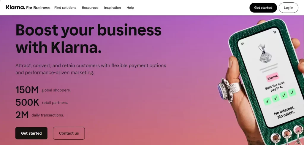
How they use color psychology
: The purple-pink gradient creates a vibrant, dynamic background.
Purple often signifies creativity, luxury, and wisdom, while pink is associated with playfulness and warmth. The gradient blend suggests innovation and a modern approach, inviting a sense of inclusivity and friendliness. This color combination exudes trustworthiness and calmness due to the use of cooler shades, which can positively influence a visitor’s decision to engage with the brand. The text stands out on the darker purple background, ensuring readability and focus.
The black button adds a sense of sophistication and simplicity, making the CTA bold and straightforward. The white CTA contrasts less with the background, suggesting it is a secondary option.
Blue Apron
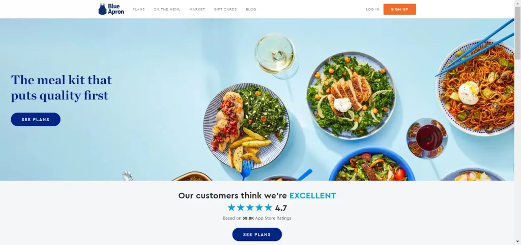
How they use color psychology
: The landing page uses a light blue background that sets a calm and trustworthy tone, aligning with the brand’s message of quality and reliability. Text colors in dark blue or black against the light background enhance readability and add a touch of cleanliness and simplicity to the design. Moreover, the vivid imagery of the food set against the blue backdrop draws the eye and encourages users to explore the meal plans further.
The CTA button in navy blue offers a subtle yet effective contrast, maintaining the page’s professional look while ensuring the CTA stands out.
Petcube
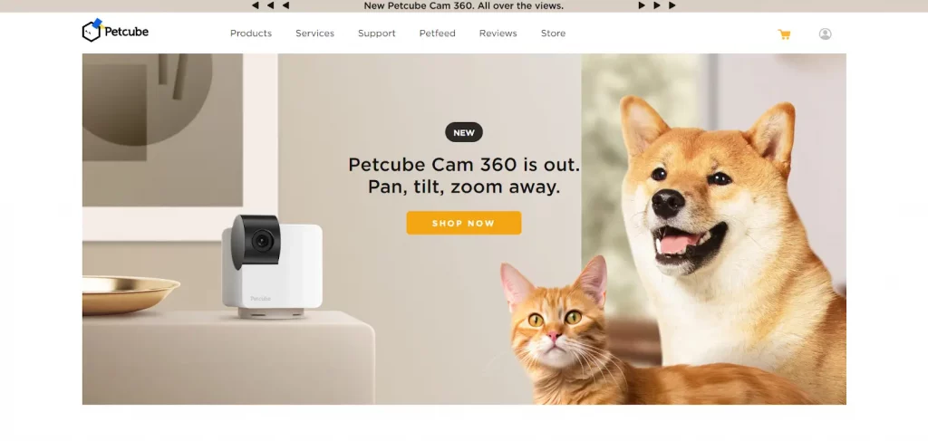
How they use color psychology
: The landing page presents a welcoming and energetic atmosphere through its color choices. The pastel beige and cream background conveys warmth and simplicity, setting a calm stage for the more lively elements. The pops of orange bring in a sense of playfulness and energy, which is well-suited for a brand centered around pets and their dynamic nature.
The images of the pets provide a burst of life and color, drawing the visitor’s eye and creating an emotional connection. The pet images come together with the orange CTA, which draws attention and resonates with the vibrant energy pet owners often appreciate.
Notion
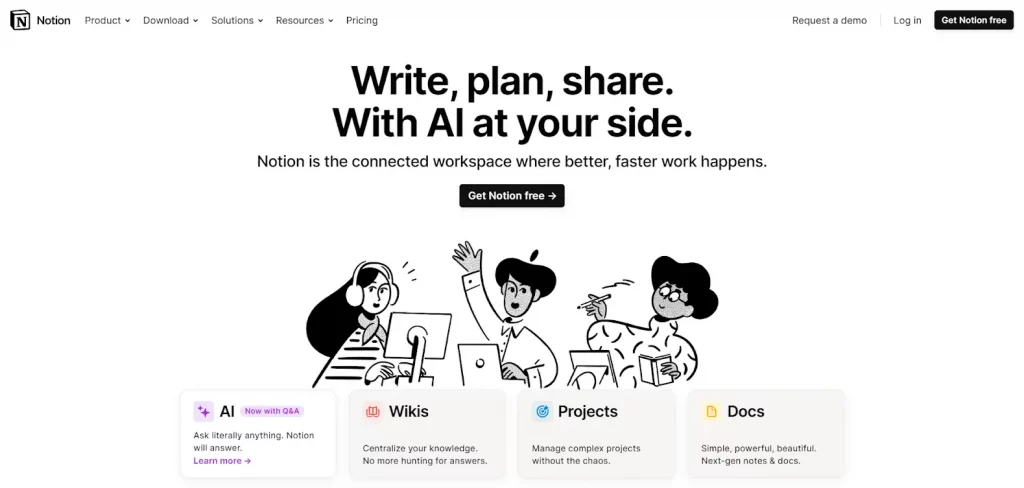
How they use color psychology
: The landing page presents a minimalist design with a clean, white background paired with black text and monochromatic illustrations. This contrast creates a modern and professional look, suggesting clarity and efficiency, which could resonate with users looking for a productivity tool.
Using black text and black-and-white illustrations against the white space highlights the platform’s ease of use and organized nature. The color choice for the CTA button is likely selected to evoke feelings of trust and calm, inviting users to try the service without feeling pressured.
Understanding color psychology in web design is about honing your aesthetic instincts and drawing inspiration from expertly designed landing pages. Check out these additional examples of landing page trends if you want inspiration or need a better sense of what works best.
Use the best colors on your landing pages to make the most conversion impact
Remember that the colors on your landing page—from headers to CTA buttons—are silent ambassadors of your brand message. They can quietly influence decisions and stir emotions in ways words alone cannot.
Want to discover more insights into the secrets of a highly convertible landing page or need a head-start creating one? With Instapage, you can launch campaigns faster with professionally designed landing page layouts built to increase conversions for many industry-based use cases. Sign up for a free 14-day trial with Instapage.

Try the world's most advanced landing page platform with a risk-free trial.
