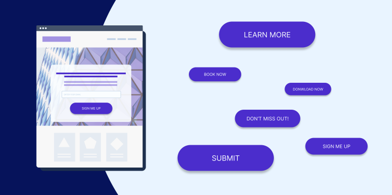
A call to action (CTA) button is a primary element without which your a href=”https://instapage.com/what-is-a-landing-page/” rel=”noopener” target=”_blank”>landing page cannot exist. No CTA button means no way to convert.
The call to action definition is self-explanatory—it’s a button that calls landing page visitors to perform a certain action depending on the page offer. If you’re not taking the time to create effective CTAs and you’re using generic CTAs like “Submit” or “Download,” this is very likely negatively impacting your conversion rate.
This post discusses the 6 simple tips you need to implement to create high-converting CTA buttons for your landing pages with the help of CTA button examples.
1. Write your call to action button in first person
In copywriting, we’re taught that the most powerful word you can include in your writing is “you,” because of its ability to make the reader feel as though they’re being spoken to directly. Writing this way helps your prospect visualize the action they’re about to take.
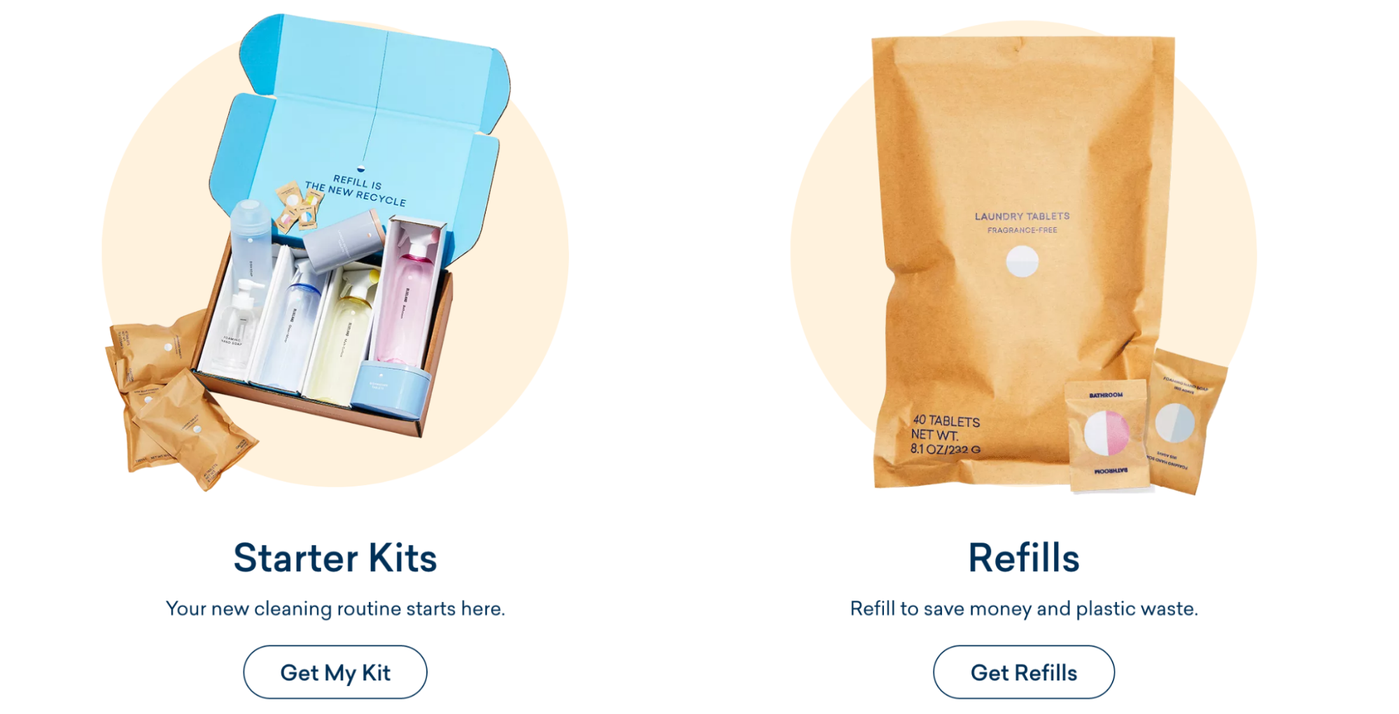
When writing copy for your landing page, it’s still important to address the reader as “you.” However, research shows that in your button copy, it’s helpful to give landing page visitors a gentle nudge toward conversion by using “me” or “my” instead.
The Blueland CTA features “Get My Kit” copy to help users envision what they’ll be getting once they click the button.
2. Find the perfect CTA button color
It’s a never-ending debate: Which button color produces the highest conversion rate?
The truth is there is no single “best” color for buttons. Ott Niggulis put together a really entertaining post about the color debate. Ultimately, here’s the takeaway:
“Color usage does matter, sometimes a lot. But…What works on one site, doesn’t necessarily work on another. Visual hierarchy matters and making your call to action stand out matters. So “green vs red” is not so much about the color, but “does the important stuff stand out enough” and if not, how can we improve the situation.”
When deciding on a button color, think less about getting inside your user’s head using color psychology mind tricks, and more about making your button stand out so visitors know exactly where they need to click to convert—and why.
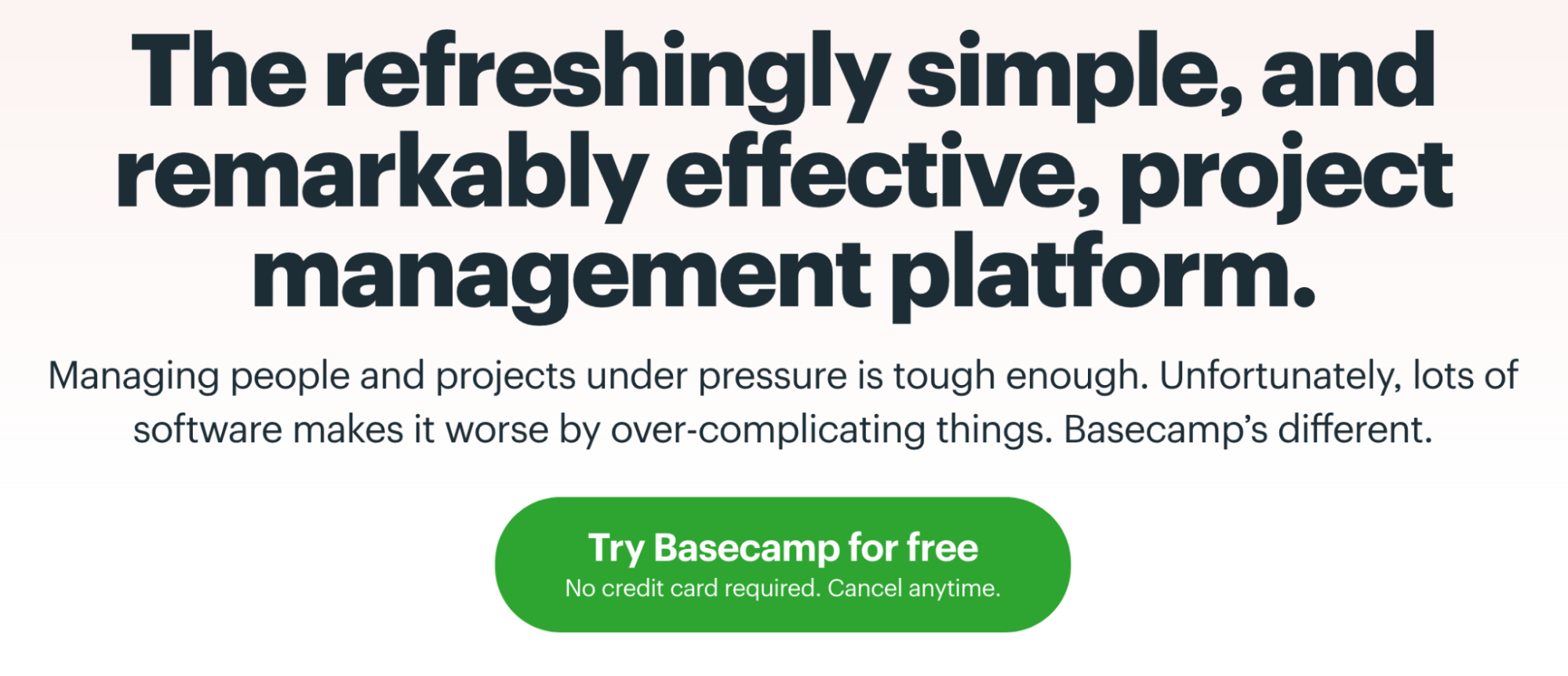
Here’s a good example from Basecamp:
Since there’s no universal “best” button color, the best way to figure out which color you should use on your landing page is to test.
3. Make your CTA copy results-oriented
CTAs that begin with Buy, Order, Click, Sign-up, etc. inherently focus on what website visitors have to part with—their money, their information. Alternatives that start with “Get” refocus the message on answering the prospects’ number one question, “What’s in it for me?”
So, don’t focus on what the prospect has to do to claim your offer, focus on what they’re going to get out of it when they do.
The Cadence page CTA tells visitors they can start building their capsule system after they click the call to action button. They use “build” instead of “buy,” which relates to the visitor being able to create and engage with the product in a personal way—instead of just spending money.
4. Leverage powerful words
Humans are often greedy, lazy, and cheap. Whether or not we want to admit it, most humans want to be richer, better looking, and healthier—and we want these things now, for free. It’s important to keep this in mind when writing CTA button copy.
Appeal to laziness:
- Emphasize words that convey a quick result like: Now, today, quickly, swiftly, easily, simply, effortlessly
- Example: “End my struggle with exhaustion now”
Appeal to greed:
- What will pressing this CTA button help your prospect become? Use words that convey an elevated status: Wealthier, smarter, better looking, happier, stronger
- Example: “Send me the kit for a whiter smile!”
Appeal to frugality:
- Use words like: Free, affordable, at no cost, inexpensive, for the low price of
- Example: “Show me how to stop hair loss, for free”
Whenever you’re tempted to use a boring, everyday word or phrase as a CTA (e.g., “Learn how to invest”), substitute it with an action verb and appeal to the three things mentioned above. In this new approach, “Learn how to invest” becomes “Discover the secret to unlimited wealth.”
Which CTA would you rather click?
5. Forget about “the fold”
You’ve got your whole CTA button designed–compelling copy, a beautiful color—and you’re ready to place it on your landing page.
But where?
Below the headline? Next to the form? Above the fold?
Too many people fear that if their CTA button isn’t immediately within view, it won’t get clicked. And that assumption couldn’t be more incorrect.
If your product or service is complicated, and it necessitates a longer, more comprehensive page, don’t stress about cutting down copy. If it’s well-written, visitors will read it.
In the words of legendary advertiser Howard Luck Gossage, “The real fact of the matter is that nobody reads ads. People read what interests them, and sometimes it’s an ad.”
6. Make the CTA look like an actual button
As the saying goes “if it looks like a duck, swims like a duck, and quacks like a duck, then it probably is a duck.”
But that’s not always the case when it comes to call to action buttons.
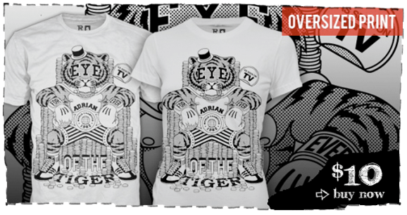
Sometimes images that look like buttons aren’t buttons. And sometimes designers use links, photos, and words with no borders instead of buttons. Does that big black blob in the lower right-hand corner of this image look like a button to you?
Here are some tips to make sure your buttons always look the part:
- Use a border that surrounds the button so you don’t end up with a blob like in the photo above
- Try creating a 3D effect—such as a shadow—that makes your button look like it’s jumping off the page, ready to be pressed
- Shade the top and the edges of your buttons to give it dimension
Build a CTA button that’s better than ever
Remember, without a properly designed button, your landing page is doomed to fail.
Use these six best practices to start creating better call to action buttons than ever before, and drop them on your landing page in just minutes with Instapage, the best landing page platform for marketers. You can also save your buttons and content blocks to easily reuse across multiple pages with Instablocks®.
Find out how Instapage helps you increase advertising conversions by booking a demo today.
