When marketers want to improve conversion rates, they do not start with guesses. They study what is already working. Landing pages are no exception. Real-world examples reveal patterns in messaging, layout, and user flow that influence whether visitors convert or drop off.
Landing pages are standalone, goal-focused pages built to drive a single action, such as a signup, trial, demo, purchase, or lead capture. Unlike homepages, they are not designed for exploration. They exist to reduce friction, clarify value, and guide visitors toward a measurable outcome.
Landing page performance comes down to alignment. When messaging, layout, and intent work together, conversions follow. When they do not, testing becomes essential. The examples below highlight both.
Use these 30 landing page examples to identify proven CRO patterns, avoid common mistakes, and apply practical optimization ideas to your own landing pages.
30 landing page examples
1. Calm
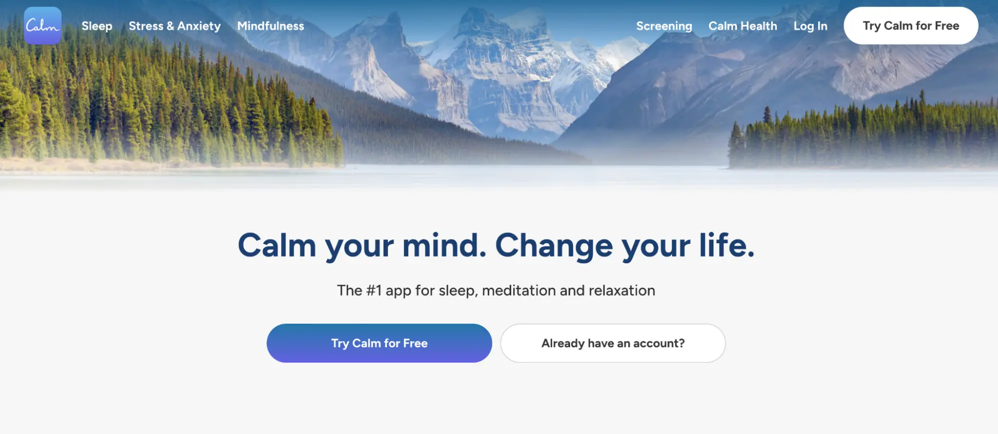
What they did well:
- The headline clearly communicates the emotional benefit of the product rather than listing features.
- The subheadline immediately establishes authority by positioning Calm as the #1 app for sleep, meditation, and relaxation.
- The calming nature imagery visually reinforces the promise of reduced stress and mental clarity.
- The primary CTA, “Try Calm for Free,” removes risk and lowers the conversion barrier.
- The simple navigation keeps visitors focused on taking action instead of exploring unnecessary options.
- The overall layout minimizes cognitive load, making the page feel calm, approachable, and easy to engage with.
What to A/B test:
- Adding quantified outcomes to the headline (e.g., “Sleep better in 7 days”) versus emotional-only messaging.
- Introducing social proof above the fold (app store ratings, number of users, or press logos) versus keeping the hero minimal.
- Showing a product preview (app UI or content thumbnails) instead of lifestyle imagery to reduce uncertainty.
- Adding a secondary trust signal near the CTA (free trial length, cancel anytime, no credit card) to reduce friction.
- Testing a single CTA button versus paired CTAs to measure focus and decision clarity.
2. Datadash
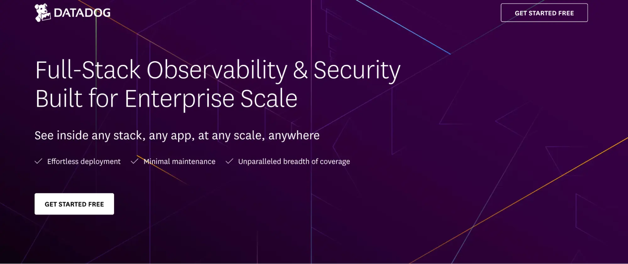
What they did well:
- The headline clearly communicates the core value proposition: full-stack observability in a single platform.
- The subheadline reinforces breadth and credibility by listing multiple use cases (infrastructure, logs, APM, security, etc.).
- The form placement above the fold makes the conversion action immediately visible without requiring scrolling.
- The clean, product-led layout focuses attention on the trial signup instead of secondary distractions.
- Trust signals and enterprise-friendly language reduce perceived risk for technical buyers.
- The overall page structure aligns well with high-intent users who are already solution-aware.
What to A/B test:
- Benefit-driven headlines (e.g., “Resolve incidents faster with full-stack visibility”) versus platform-centric messaging.
- Shorter forms versus current field count to reduce friction and improve completion rates.
- Adding quantified outcomes (e.g., faster detection, reduced downtime) near the headline.
- Including a lightweight product preview or dashboard visual to reduce uncertainty.
- Reinforcing the CTA with risk reducers (no credit card, instant access, cancel anytime).

3. Shopify
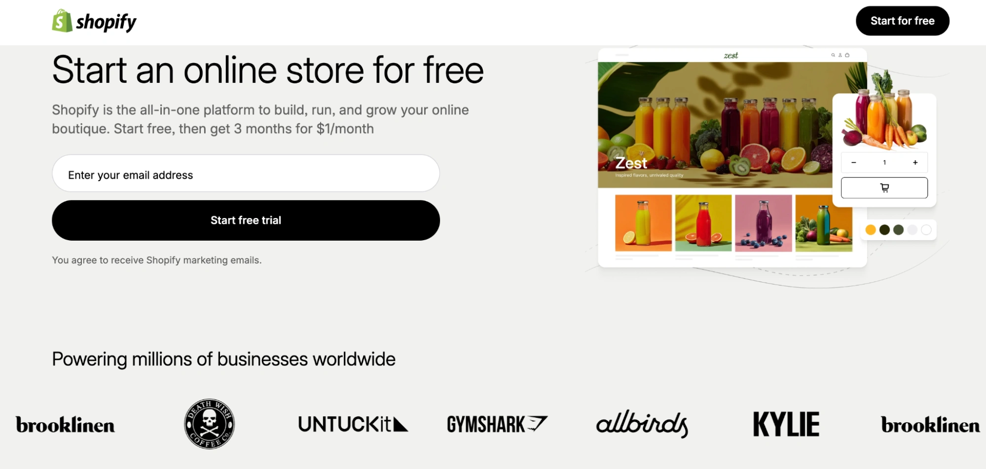
What they did well:
- The headline is highly outcome-driven, clearly promising the ability to create and launch an online store.
- The subheadline quickly removes complexity by emphasizing ease of use and speed.
- The hero design balances simplicity with strong visual hierarchy, guiding users directly to the CTA.
- The primary CTA is clear, action-oriented, and low-friction.
- Brand authority and familiarity instantly establish trust, especially for first-time entrepreneurs.
- The copy speaks directly to beginner pain points, reducing intimidation and perceived effort.
What to A/B test:
- Adding specific outcomes (e.g., “Launch in under 30 minutes”) versus general ease-of-use claims.
- Testing entrepreneur-focused messaging versus revenue-focused messaging.
- Introducing social proof above the fold (merchant count, revenue processed, testimonials).
- Highlighting key differentiators (themes, payments, shipping, integrations) versus keeping the hero minimal.
- CTA variations that emphasize speed (“Start selling today”) versus exploration (“Build your store”).
4. Zoom
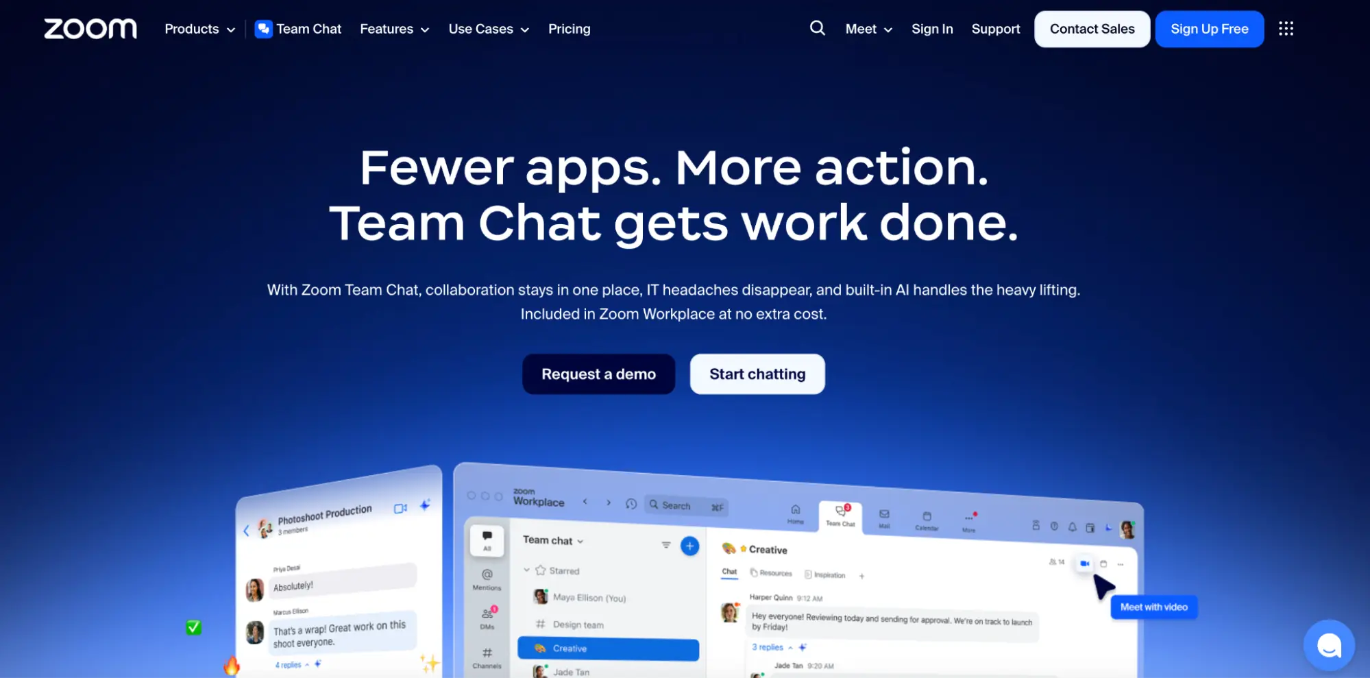
What they did well:
- The headline clearly positions Team Chat as a modern replacement for fragmented communication tools.
- The page quickly communicates product context by anchoring Team Chat within the broader Zoom ecosystem.
- The layout uses clean spacing and modular sections to keep the experience scannable.
- Visuals reinforce the collaboration use case and help users quickly grasp functionality.
- The CTA is consistent with Zoom’s broader product flow, reducing friction for existing users.
- The messaging emphasizes simplicity, speed, and reliability—core expectations for collaboration tools.
What to A/B test:
- Pain-focused headlines (e.g., “End missed messages and tool switching”) versus product-forward messaging.
- Showing real interface previews instead of abstract collaboration imagery.
- Introducing competitive positioning (vs Slack or Teams) versus neutral category framing.
- Adding customer logos or testimonials above the fold for faster trust-building.
- Testing single-product CTAs versus ecosystem-oriented CTAs (“Use with Zoom Meetings”).
5. Snowflake
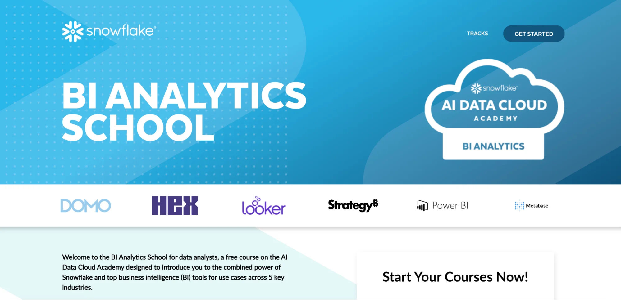
What they did well:
- The headline clearly defines the learning outcome and target audience.
- The educational framing lowers the barrier to entry and positions Snowflake as a trusted authority.
- The modular layout makes it easy to scan course topics, benefits, and next steps.
- The page does a strong job of aligning learning goals with business impact.
- The design reinforces credibility and professionalism expected from an enterprise data platform.
- The CTA feels low-risk and aligned with skill-building rather than product selling.
What to A/B test:
- Career-outcome-driven headlines (e.g., “Advance your analytics career”) versus platform-focused messaging.
- Highlighting certifications, completion badges, or career benefits more prominently.
- Adding learner testimonials or success stories to build emotional motivation.
- Emphasizing time-to-completion or skill speed (e.g., “Learn in under 2 hours”).
- Testing a more benefit-oriented CTA (“Start learning today”) versus neutral enrollment language.
6. Hellofresh
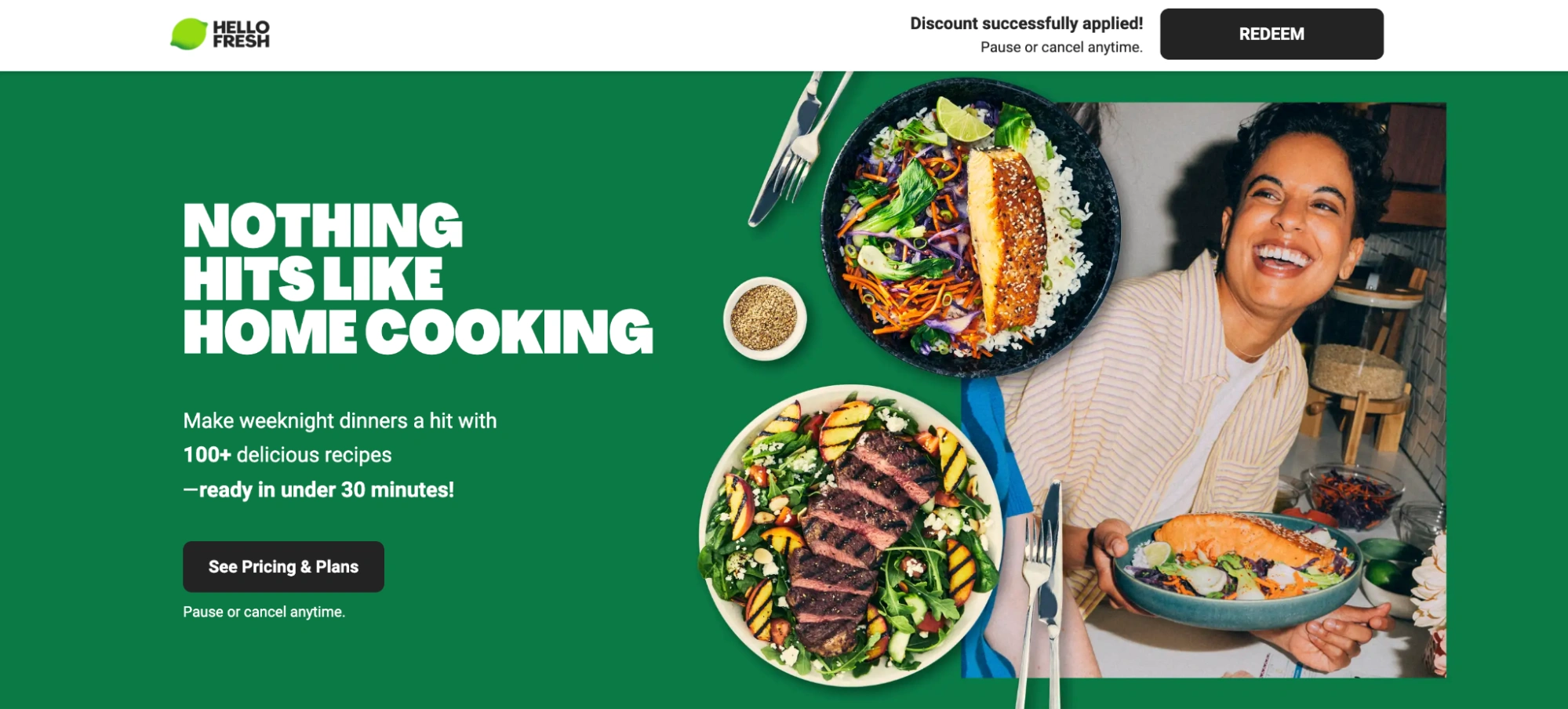
What they did well:
- The headline focuses on convenience and lifestyle improvement rather than just food delivery.
- High-quality food imagery immediately creates appetite appeal and emotional engagement.
- The value proposition is clear: fresh ingredients, easy recipes, and time savings.
- The pricing and discount messaging strongly encourage trial and reduce purchase hesitation.
- The CTA placement and repetition guide users smoothly toward conversion.
- The page structure effectively balances emotional appeal with practical information.
What to A/B test:
- Time-saving versus cost-saving headline angles to see which drives stronger intent.
- Showing cooked meals versus ingredient kits in the hero image.
- Leading with subscription flexibility (“Skip anytime”) versus promotional discounts.
- Adding quick social proof (number of meals delivered, customer ratings) above the fold.
- Testing a shorter checkout path versus the current flow to reduce abandonment.
7. Dropbox
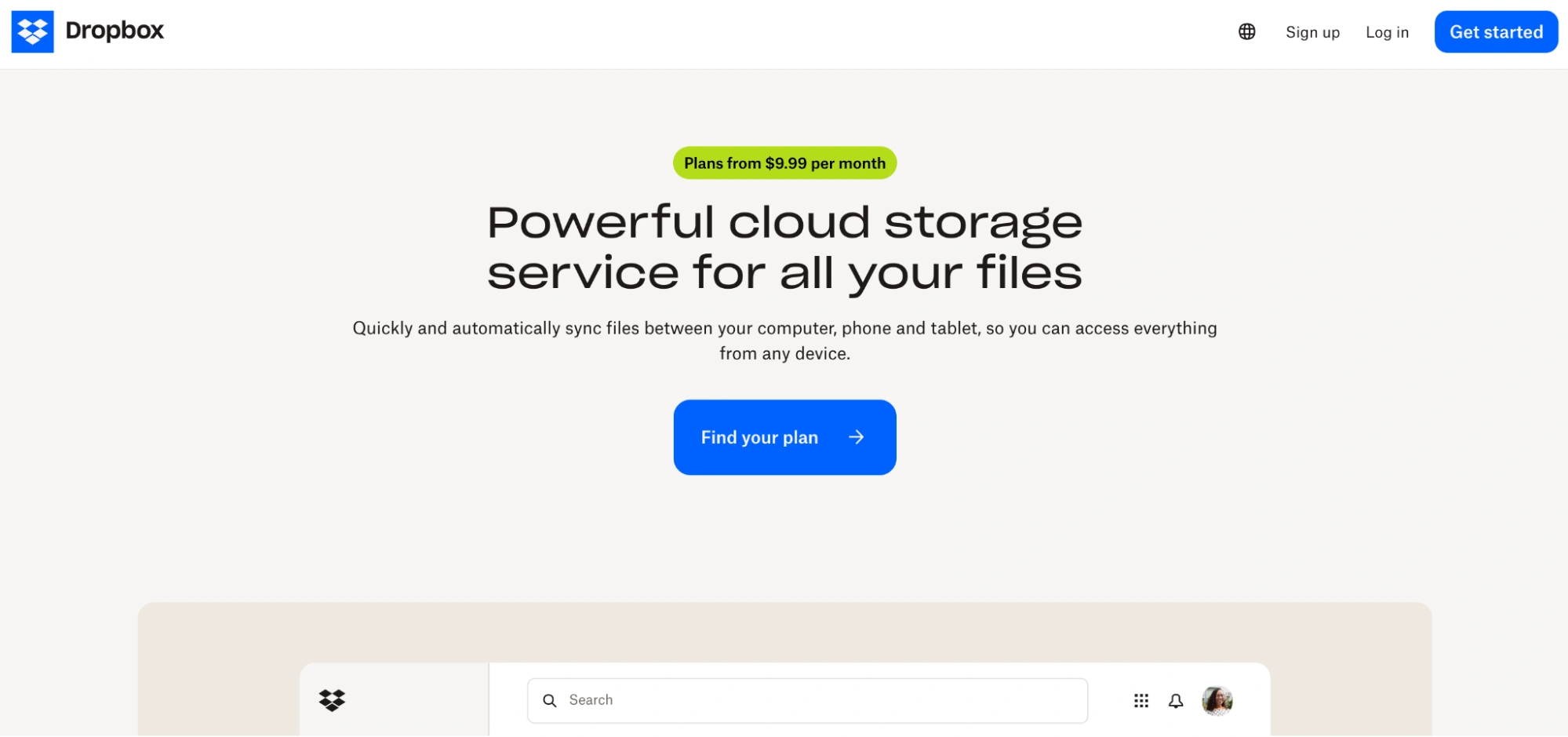
What they did well:
- The headline clearly communicates the core benefit: simple, secure cloud file storage.
- The subheadline expands on everyday use cases, helping users quickly visualize value.
- The layout prioritizes clarity and scannability, making it easy to understand the product at a glance.
- The CTA is straightforward and low-friction, encouraging immediate trial.
- Visual hierarchy effectively guides attention from value proposition to action.
- Trust-building elements (security, reliability, brand recognition) reduce hesitation for first-time users.
What to A/B test:
- More outcome-driven headlines (e.g., “Access your files anywhere, instantly”) versus feature-led messaging.
- Showing real product UI previews instead of abstract visuals to reduce uncertainty.
- Highlighting security and compliance benefits more prominently above the fold.
- Testing different CTA phrasing (“Start storing files,” “Try Dropbox free”) for motivation clarity.
- Introducing lightweight social proof (logos, user counts) earlier in the page flow.
8. Quickbooks
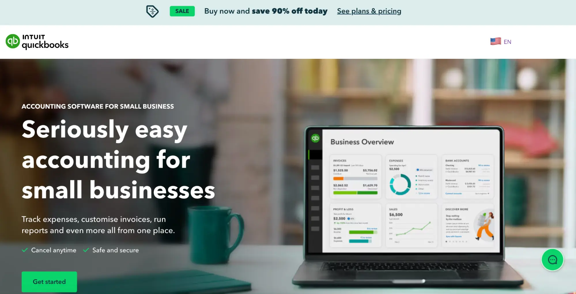
What they did well:
- The headline directly targets a high-intent audience: small business owners seeking accounting software.
- The subheadline reinforces ease of use and automation, reducing perceived complexity.
- The layout breaks down benefits into digestible chunks, supporting quick scanning.
- Feature explanations are framed around real business outcomes, not just functionality.
- Strong brand trust and credibility signals reassure users about reliability and security.
- The CTA is action-oriented and aligned with buyer readiness.
What to A/B test:
- Outcome-based headlines (e.g., “Save hours every week on bookkeeping”) versus product positioning.
- Showing dashboard previews to reduce uncertainty about usability.
- Leading with automation benefits versus financial reporting features.
- Adding short testimonials from small business owners near the hero section.
- Testing pricing transparency earlier versus after engagement.
9. Capella University
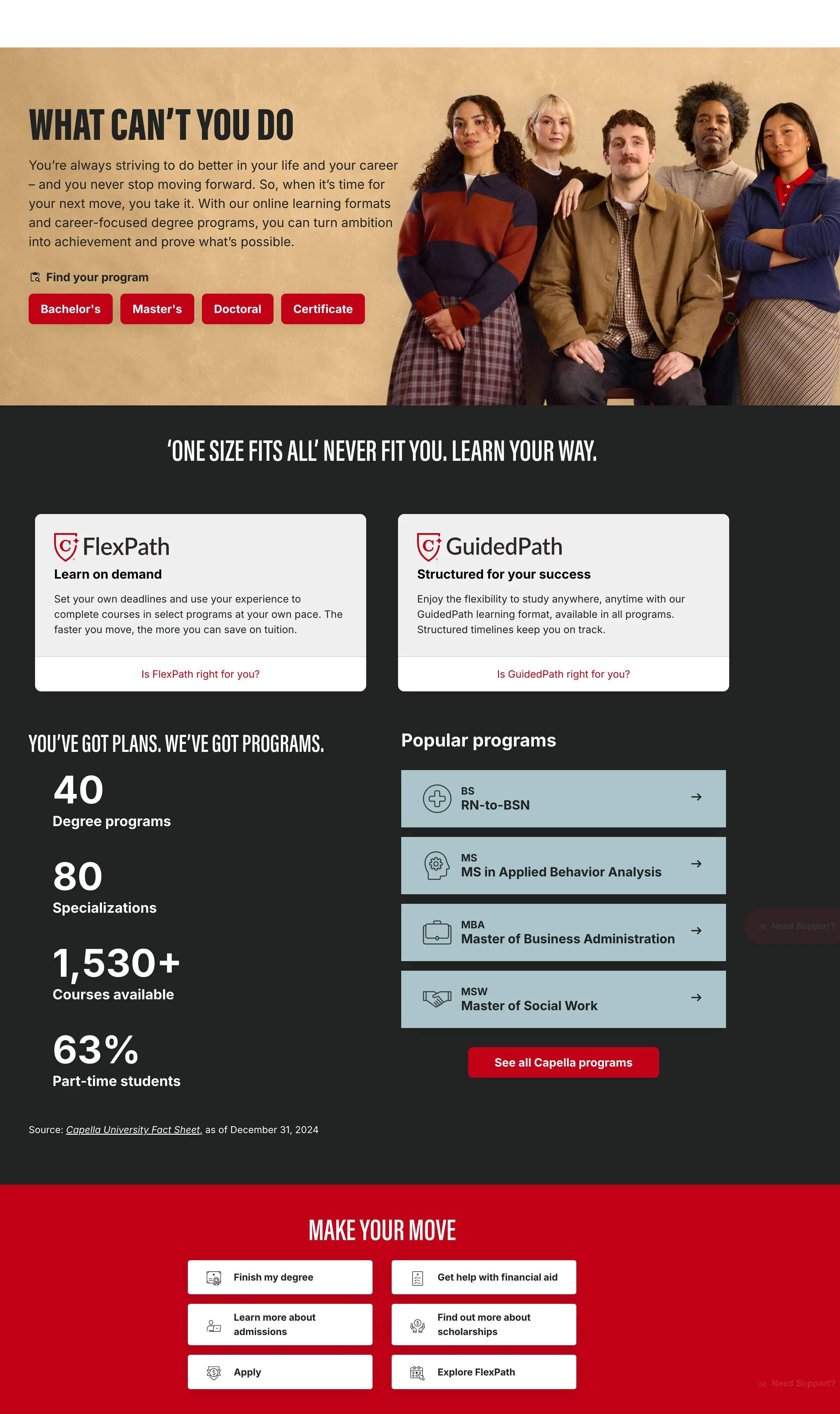
What they did well:
- The headline focuses on career advancement and flexibility, directly addressing the motivations of adult learners.
- Messaging emphasizes outcomes such as career growth, credibility, and skill development.
- The layout guides users toward key decision paths: programs, admissions, and enrollment.
- The CTA placement supports both early exploration and high-intent enrollment.
- Visual design and tone reinforce trust, credibility, and academic authority.
- The content structure supports longer consideration cycles typical in education decisions.
What to A/B test:
- Career-outcome-led headlines versus education-focused messaging.
- Featuring alumni success stories more prominently above the fold.
- Highlighting time-to-degree or flexible scheduling earlier in the flow.
- Testing “Request info” versus “Explore programs” CTAs for lead quality.
- Introducing cost, funding, or ROI messaging sooner to address pricing anxiety.
10. VWO
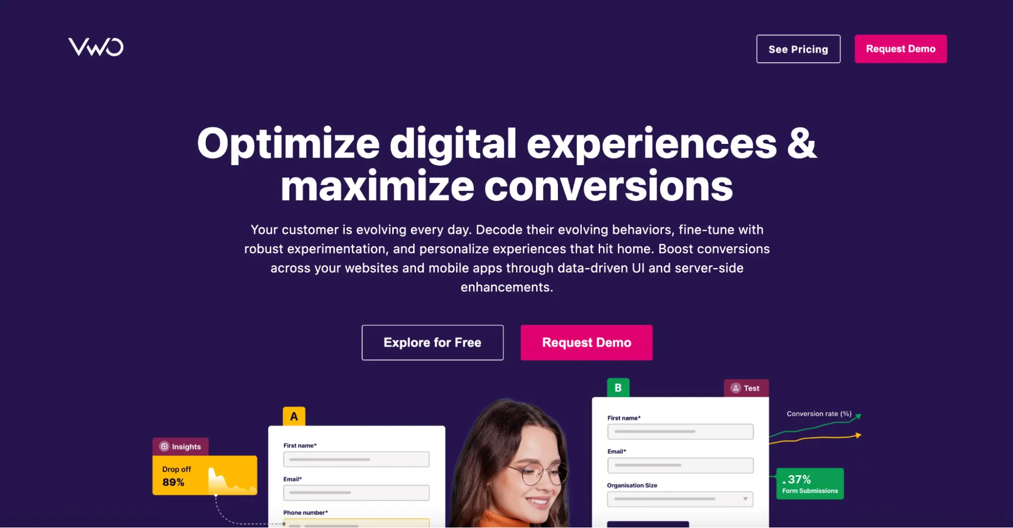
What they did well:
- The headline clearly positions VWO as an experimentation and conversion-optimization platform.
- The subheadline reinforces value for growth-focused marketers and product teams.
- The form-first layout aligns well with high-intent visitors ready to test the platform.
- Clean visual design reduces distractions and keeps focus on conversion.
- Copy clearly communicates business impact rather than just technical features.
- The CTA is direct and action-oriented.
What to A/B test:
- Outcome-driven headlines (e.g., “Increase conversions without guessing”) versus product framing.
- Reducing form friction by minimizing required fields.
- Introducing quantified results or customer metrics above the fold.
- Showing product UI previews to reduce uncertainty.
- Adding trust signals (logos, case studies) closer to the CTA.
11. Optimizely
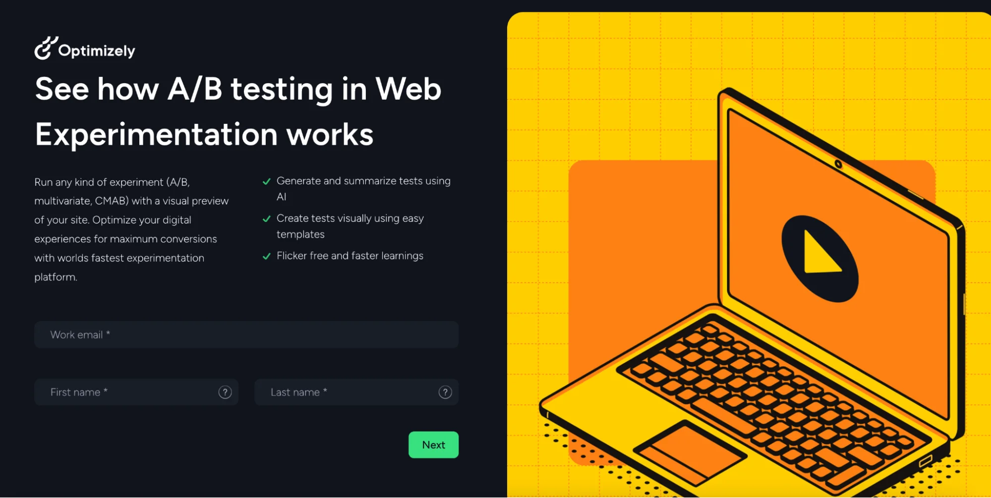
What they did well:
- The headline clearly communicates the learning goal: understanding web experimentation.
- Video-led storytelling helps simplify a complex concept for non-technical audiences.
- The step-based content flow creates momentum and encourages continued engagement.
- Customer examples add credibility and contextual relevance.
- The page aligns well with users in the education and consideration phase.
What to A/B test:
- Benefit-driven framing (“Increase revenue through experimentation”) versus educational framing.
- Short-form demo previews versus long-form video content.
- Featuring customer outcomes earlier to build urgency.
- Testing immediate demo CTAs versus progressive learning flows.
- Highlighting the ease of implementation more clearly for non-technical users.
12. Zendesk
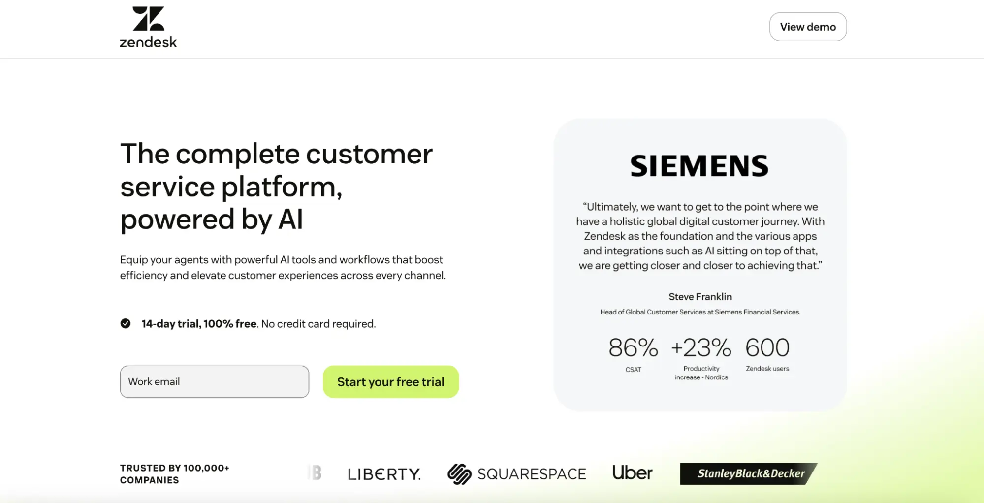
What they did well:
- The headline strongly reinforces Zendesk’s brand positioning around customer experience.
- The page uses emotional storytelling to differentiate beyond functional features.
- Visuals and design elevate brand perception and reinforce trust.
- Messaging consistently aligns product value with business outcomes.
- The flow supports both brand awareness and consideration-stage visitors.
What to A/B test:
- More product-led messaging versus brand-led storytelling.
- Introducing customer metrics or quantified results earlier.
- Testing benefit-driven headlines against emotional brand framing.
- Featuring use-case-specific CTAs for different audience segments.
- Adding interactive product previews to balance brand and functionality.
13. Monday CRM
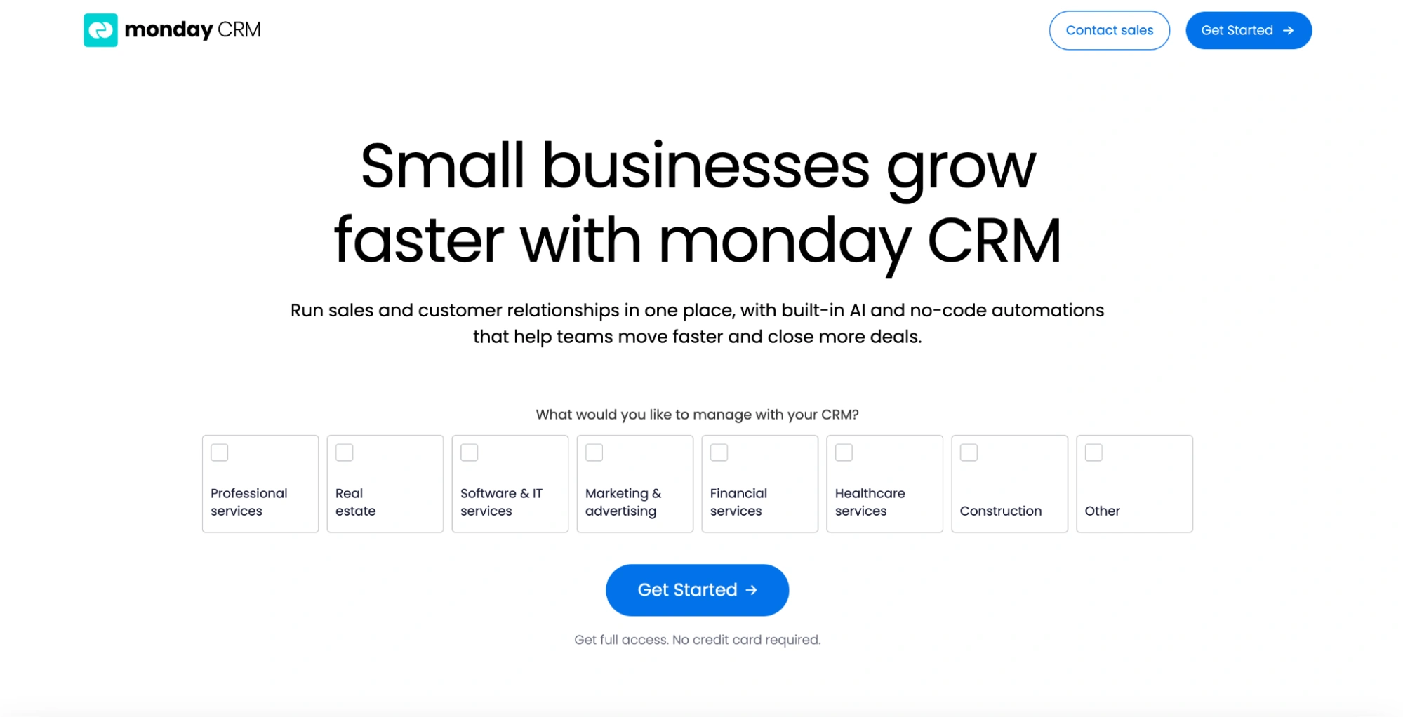
What they did well:
- The headline clearly positions monday.com as a flexible CRM solution for SMBs.
- Messaging emphasizes simplicity, customization, and speed to value.
- The layout guides users through benefits, features, and outcomes in a logical flow.
- Visuals effectively demonstrate real product usage
- The CTA is aligned with exploration and onboarding intent.
What to A/B test:
- Outcome-focused headlines (“Close deals faster”) versus platform positioning.
- Showing sales pipeline examples instead of general dashboards.
- Highlighting setup speed and time-to-value earlier.
- Adding SMB-specific testimonials above the fold.
- Testing “Try free” versus “Get a demo” CTA emphasis.
14. Clickup
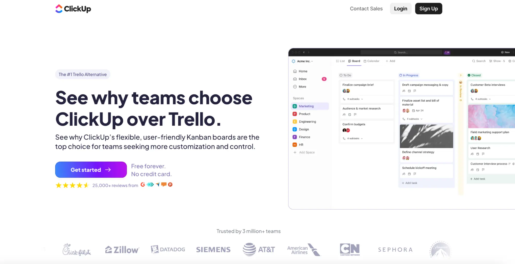
What they did well:
- The headline immediately establishes competitive differentiation.
- The comparison format clearly communicates superior value and functionality.
- Feature tables simplify complex buying decisions.
- The tone is confident, bold, and conversion-oriented.
- Social proof and ratings reinforce trust and credibility.
- The CTA strongly supports bottom-funnel intent.
What to A/B test:
- Softer, benefit-led comparison headlines versus aggressive competitive framing.
- Showing workflow outcomes instead of pure feature comparisons.
- Highlighting switching ease and migration support more prominently.
- Introducing short customer quotes from ex-Trello users.
- Testing educational framing (“Why teams switch”) versus direct competitive framing.
15. Buffer
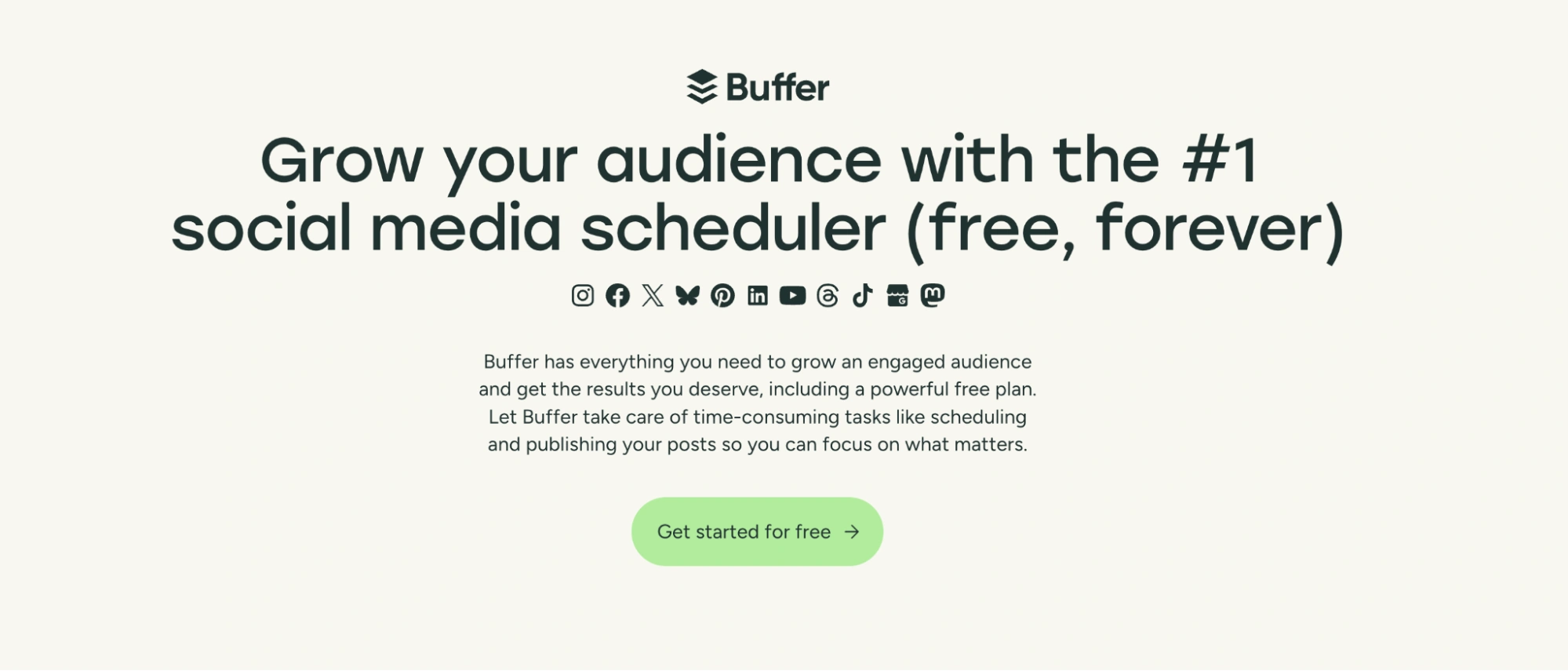
What they did well:
- The headline clearly communicates the primary outcome: scheduling social content faster and more easily.
- The subheadline reinforces simplicity and approachability, aligning with Buffer’s brand positioning.
- The clean layout and generous whitespace reduce cognitive load and make the page feel welcoming.
- The CTA is low-friction and clearly aligned with trial intent.
- Product visuals help users quickly understand what they’ll be getting.
What to A/B test:
- Outcome-led headlines (e.g., “Save hours every week scheduling posts”) versus feature framing.
- Showing performance results or user growth metrics to increase urgency.
- Adding light social proof above the fold (user count, brand logos).
- Testing a single-step signup versus progressive onboarding to reduce friction.
15. Asana
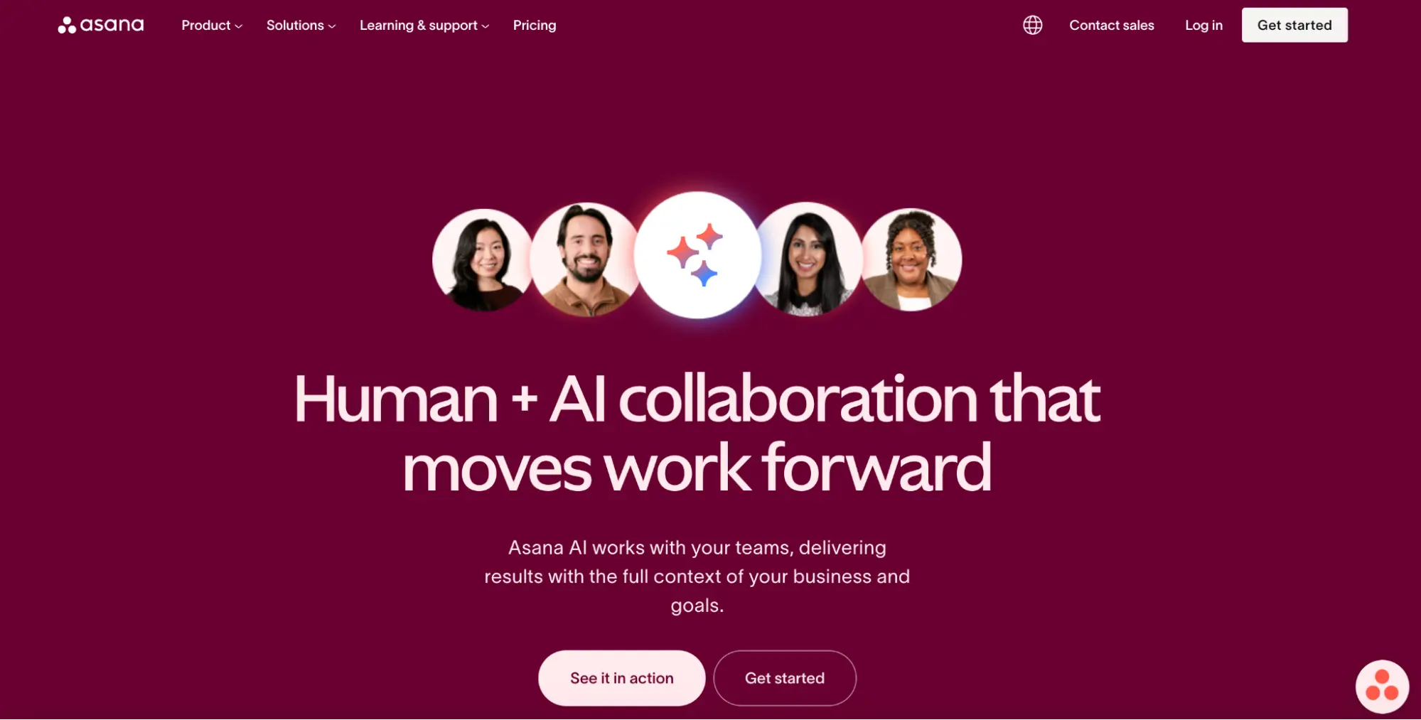
What they did well:
- The headline clearly positions AI as a productivity multiplier rather than a novelty feature.
- The messaging emphasizes real business impact, not just automation.
- Visual storytelling helps demystify AI use cases for non-technical users.
- The layout guides users through problems → solutions → outcomes in a logical flow.
- The CTA is well aligned with exploration and adoption intent.
What to A/B test:
- Task-based headlines (“Automate project updates instantly”) versus strategic AI framing.
- Showing concrete workflow examples above the fold.
- Highlighting time savings or efficiency gains more prominently.
- Introducing customer proof earlier to reduce skepticism around AI claims.
16. Dropbox
What they did well:
- The headline clearly addresses a specific user need: reducing file size quickly.
- The page removes friction by positioning compression as simple and effortless.
- The layout minimizes distractions, keeping users focused on the task.
- The CTA is direct and action-driven.
- The experience feels utility-first, which aligns with high-intent user behavior.
What to A/B test:
- Speed-focused messaging (“Compress files in seconds”) versus simplicity framing.
- Demonstrating before-and-after compression examples visually.
- Testing inline upload CTAs versus navigation-based flows.
- Adding lightweight trust signals around file security and privacy.
17. Teamwork
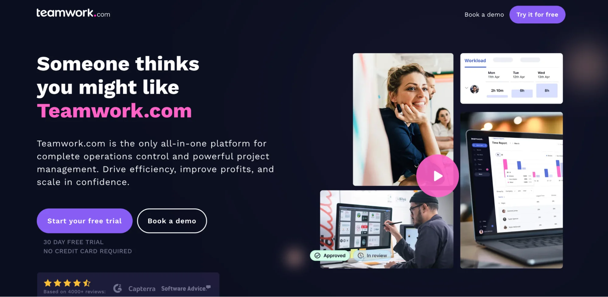
What they did well:
- The page is optimized for high-intent users arriving via referrals.
- The minimal layout removes distractions and focuses entirely on signup.
- Messaging feels personal and contextual, aligning with the trust that comes from referrals.
- The CTA is clear, direct, and conversion-oriented.
- The frictionless flow supports fast decision-making.
What to A/B test:
- Reinforcing referral trust (“Invited by a teammate”) versus neutral onboarding language.
- Adding a brief value recap for users unfamiliar with Teamwork.
- Testing a single-step signup versus guided onboarding for activation quality.
- Introducing subtle reassurance (privacy, no spam, quick setup).
18. Tableau
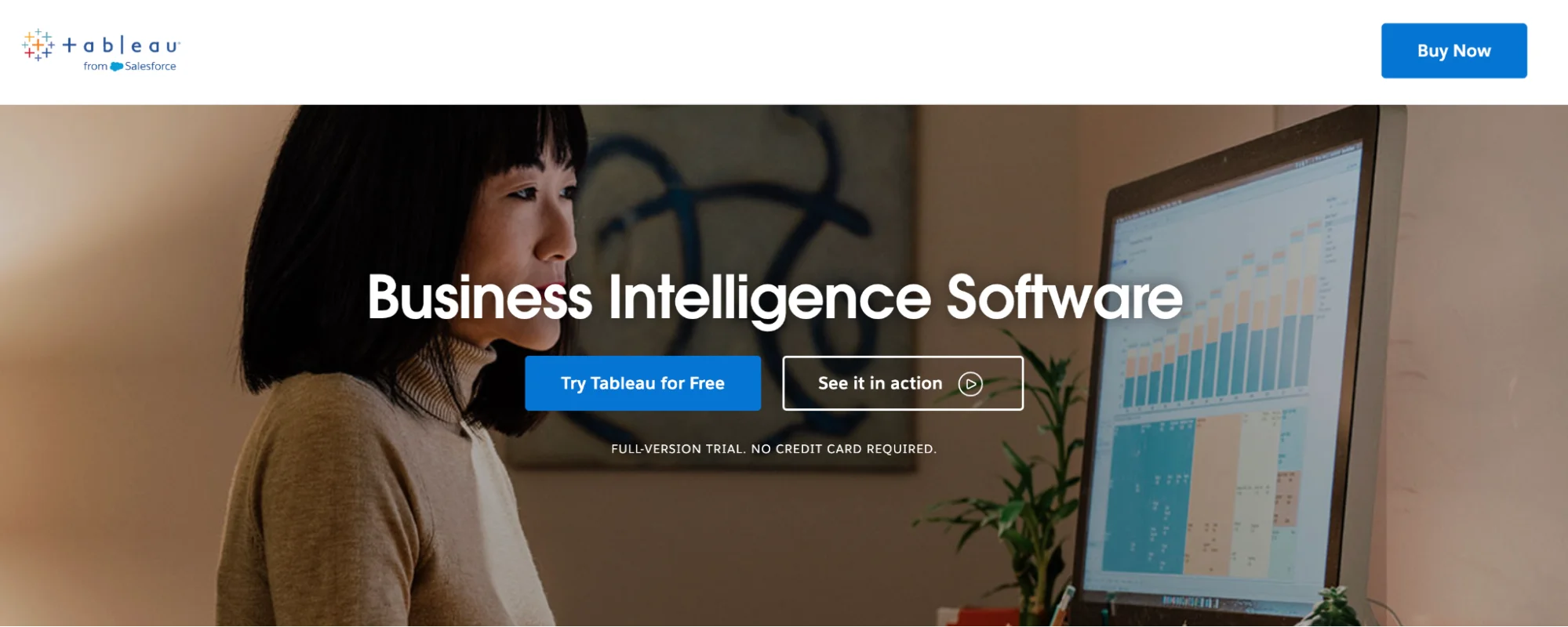
What they did well:
- The headline clearly communicates the core value: powerful business intelligence and analytics.
- Visual examples reinforce the product’s analytical depth and capabilities.
- The page effectively balances inspiration with technical credibility.
- The CTA placement aligns with high-intent users ready to evaluate the platform.
- Enterprise-grade design reinforces trust and authority.
What to A/B test:
- Outcome-based framing (“Make faster, smarter decisions”) versus product-led positioning.
- Simplifying the initial experience for non-technical users.
- Introducing beginner use cases above the fold.
- Testing demo-first flows versus trial-first flows for enterprise leads.
19. Hootsuit
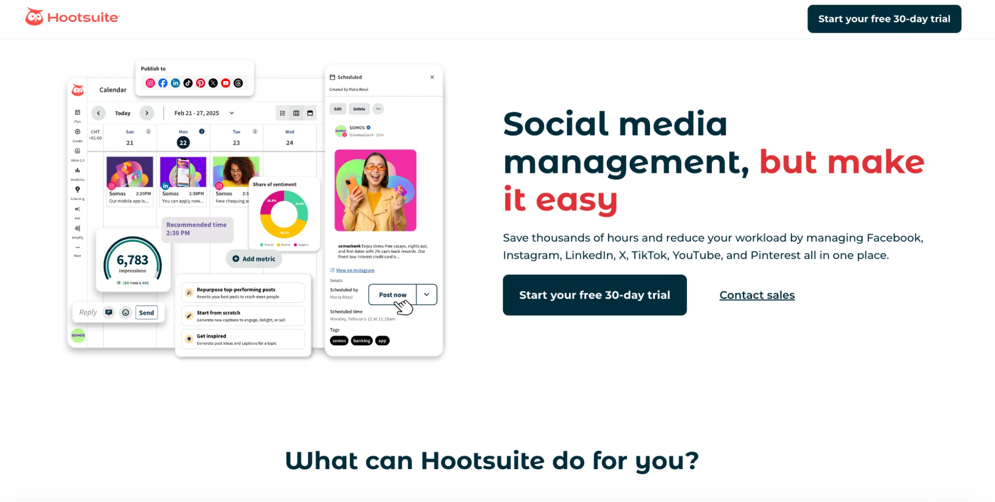
What they did well:
- The headline clearly positions Hootsuite as an all-in-one social media platform.
- The value proposition emphasizes efficiency, control, and scale.
- The layout supports scannability despite dense feature coverage.
- Visuals help demonstrate platform breadth and usability.
- The CTA aligns well with evaluation-stage visitors.
What to A/B test:
- Outcome-led headlines (“Manage all your social in half the time”) versus platform framing.
- Highlighting automation and AI features earlier.
- Showing real workflow scenarios instead of generic dashboards.
- Introducing customer proof closer to the hero.
20. Gusto
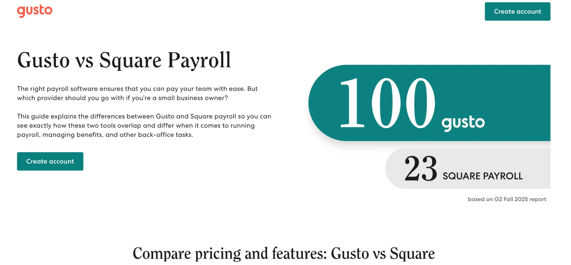
What they did well:
- The headline clearly establishes competitive positioning and intent.
- The comparison table simplifies complex decision-making.
- The page uses confidence-driven copy to reinforce category leadership.
- Trust signals and clarity around pricing help reduce risk perception.
- The CTA is aligned with bottom-funnel decision behavior.
What to A/B test:
- Softer benefit-led framing versus aggressive competitive positioning.
- Leading with payroll simplicity instead of feature superiority.
- Highlighting switching ease more prominently.
- Adding short testimonials from former Square users.
21. Freshworks
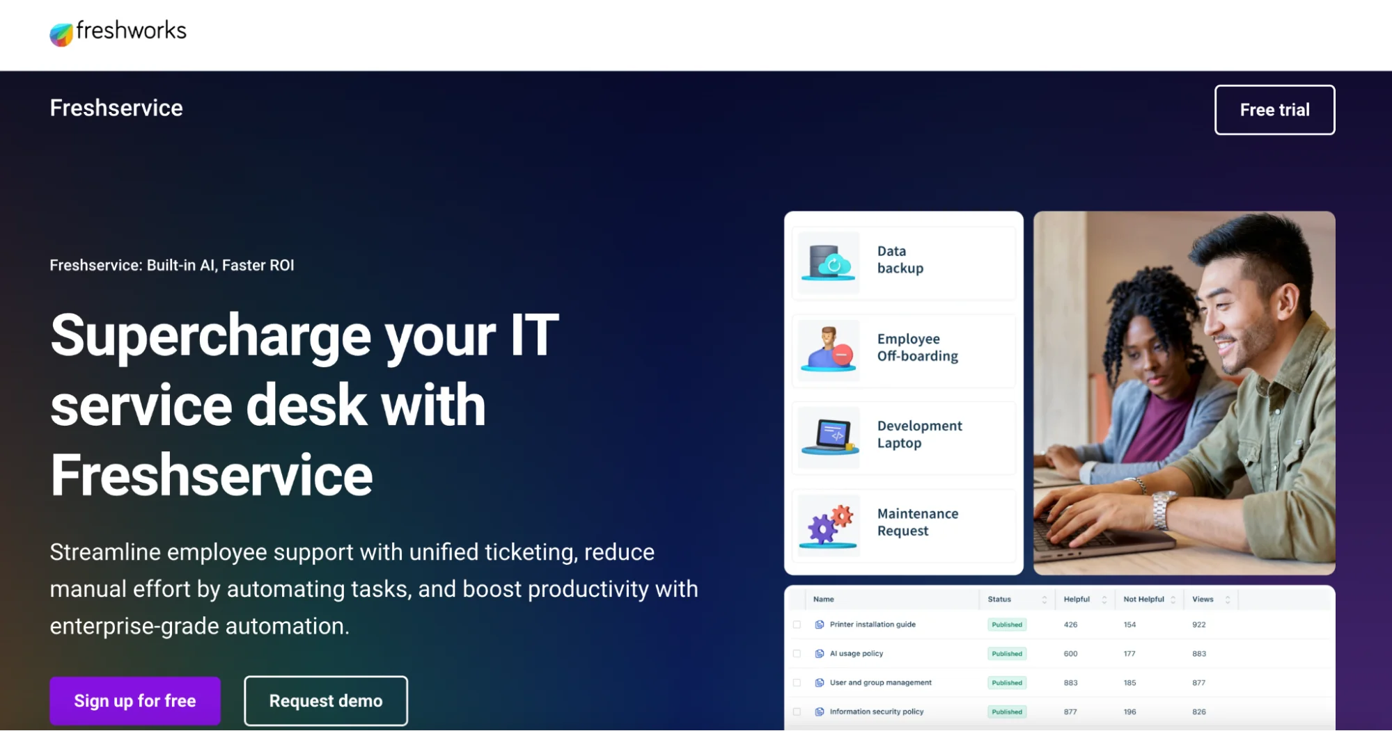
What they did well:
- The headline immediately communicates business impact, not just functionality.
- The subheadline reinforces speed, simplicity, and AI-powered automation.
- The page structure supports both technical and business stakeholders.
- Visual hierarchy guides attention from benefits to action.
- The CTA is well placed for both demos and trials.
What to A/B test:
- Operational outcome framing (“Reduce ticket resolution time”) versus platform messaging.
- Highlighting implementation speed and onboarding simplicity earlier.
- Introducing quantified performance metrics above the fold.
- Testing trial-first versus demo-first flows.
22. Xero
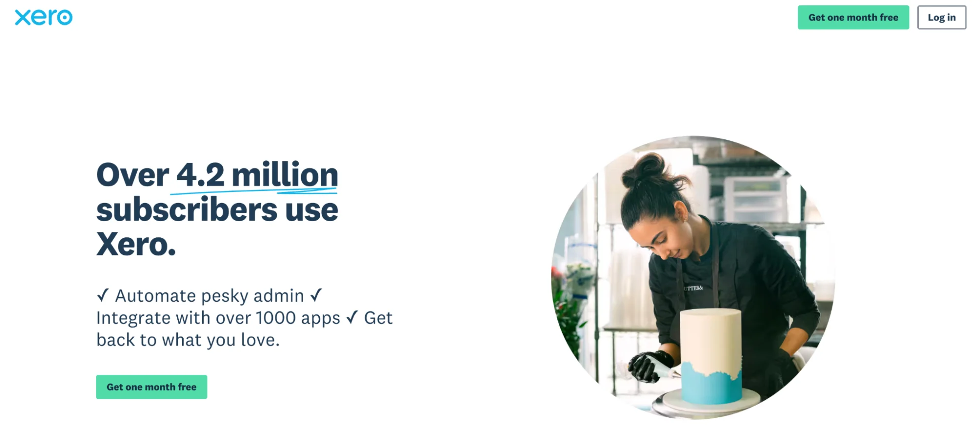
What they did well:
- The headline clearly targets small business owners seeking accounting simplicity.
- Messaging reduces complexity by emphasizing automation and ease of use.
- Visual design supports trust, clarity, and professionalism.
- The CTA is aligned with trial-stage intent.
- The page balances credibility with approachability.
What to A/B test:
- Time-saving outcomes (“Reconcile accounts in minutes”) versus general ease framing.
- Showing real dashboard previews instead of conceptual visuals.
- Highlighting switching support for users migrating from competitors.
- Introducing pricing transparency earlier in the flow.
23. Deel
What they did well:
- The headline clearly differentiates Deel with a unique, logistics-driven use case.
- The value proposition focuses on solving a complex global operational problem.
- The layout breaks down a complicated process into simple steps.
- Visual storytelling reinforces clarity and ease of execution.
- The CTA aligns with enterprise and operations-driven intent.
What to A/B test:
- Cost-reduction versus speed-to-deployment messaging.
- Showing real customer use cases above the fold.
- Highlighting compliance and security benefits more prominently.
- Testing demo-led versus consultation-led CTAs.
24. Ramp
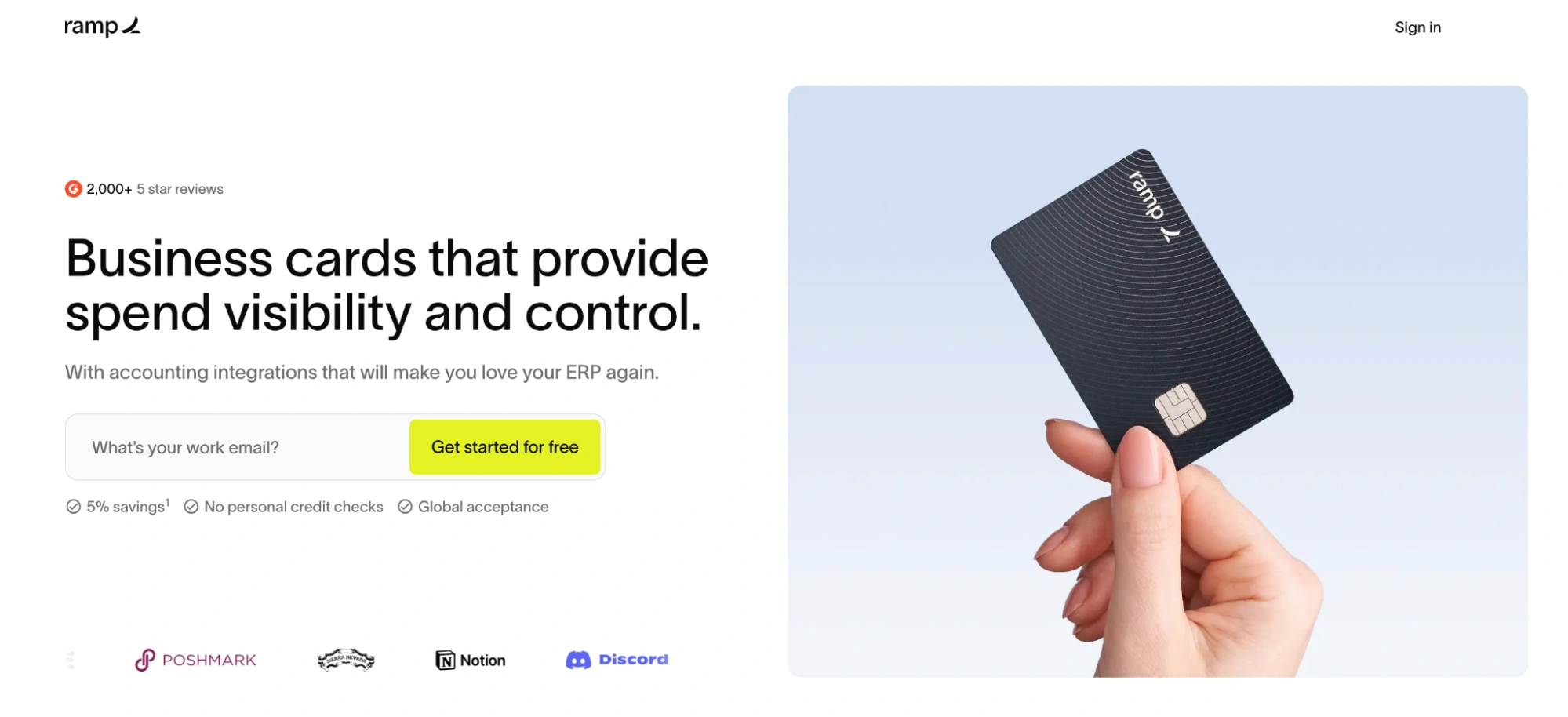
What they did well:
- The headline clearly communicates the primary value: smarter control over business spending.
- The subheadline reinforces speed, flexibility, and automation—key motivators for finance teams.
- The layout immediately communicates the product’s capabilities through benefit-led sections.
- Visual hierarchy guides users smoothly from value proposition to action.
- The CTA is direct, low-friction, and aligned with high-intent evaluation behavior.
What to A/B test:
- Outcome-driven framing (“Cut company spend by X%”) versus operational control messaging.
- Introducing quantified savings metrics above the fold.
- Highlighting fraud prevention more prominently for risk-conscious buyers.
- Testing CFO-focused versus founder-focused messaging angles.
25. Intercom
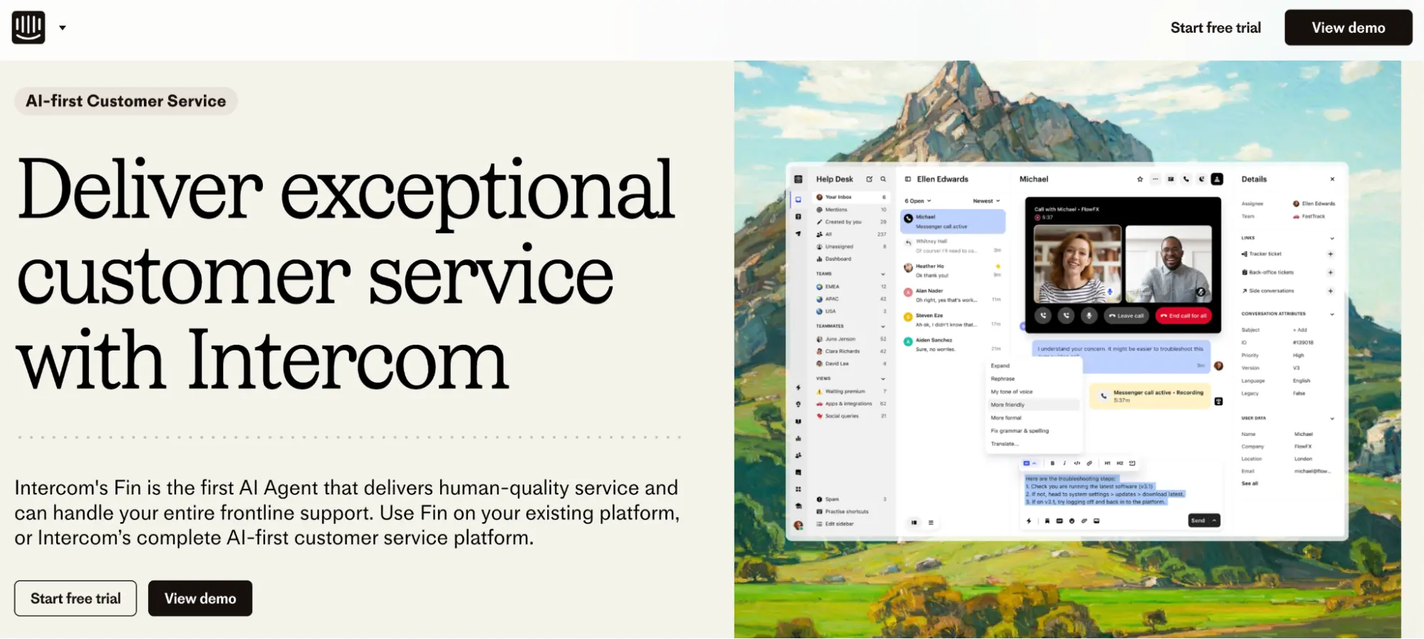
What they did well:
- The headline clearly positions AI as a transformational support tool, not just automation.
- The messaging emphasizes real business outcomes like speed, resolution quality, and efficiency.
- Strong visual storytelling helps demystify AI for non-technical buyers.
- Trust signals and brand authority reduce skepticism around AI claims.
- The CTA aligns well with exploration and demo intent.
What to A/B test:
- More problem-focused headlines (“Reduce support backlog instantly”) versus innovation framing.
- Showing concrete before/after performance metrics above the fold.
- Adding short customer proof snippets near the hero.
- Testing demo-first versus trial-first conversion flows.
26. Stripe
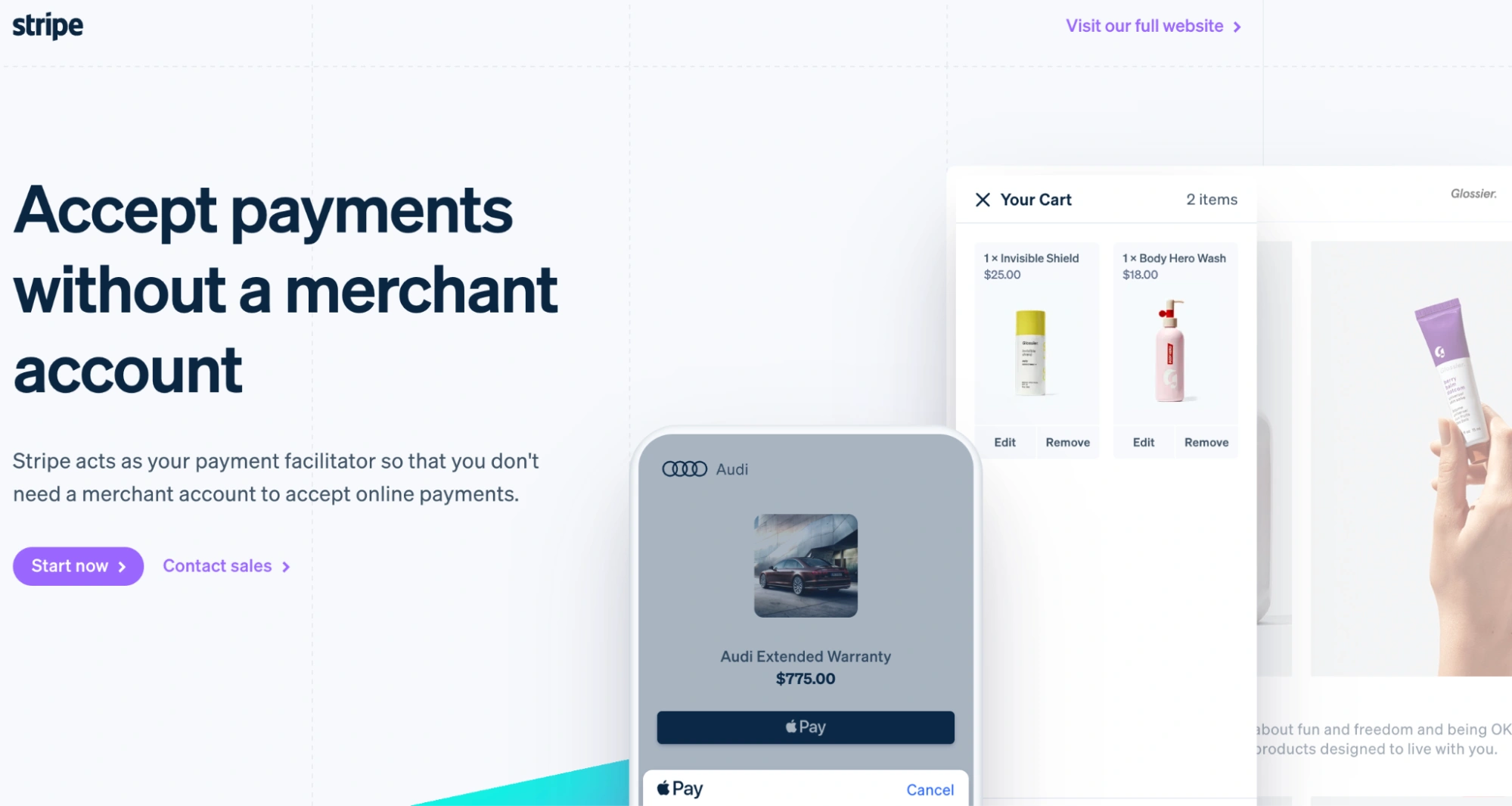
What they did well:
- The headline removes a major friction point by clearly addressing setup complexity.
- The messaging emphasizes speed, simplicity, and developer-friendly implementation.
- The layout balances technical credibility with business clarity.
- Visual hierarchy guides users directly toward activation.
- The page effectively speaks to both technical and business decision-makers.
What to A/B test:
- Speed-to-launch framing (“Start accepting payments in minutes”) versus setup simplicity.
- Highlighting developer experience benefits more prominently.
- Adding quick implementation visuals or code previews above the fold.
- Testing trust-led CTAs versus action-led CTAs.
27. BoldReports
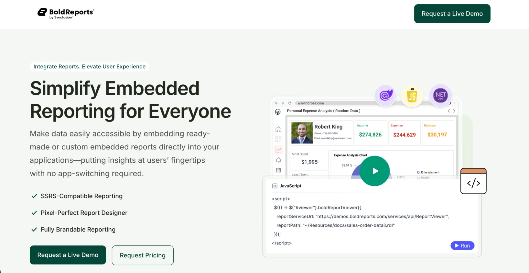
What they did well:
- The headline immediately communicates a clear technical outcome: embedded analytics made simple.
- The subheadline reinforces ease of integration, reducing perceived implementation risk.
- Modular layout makes complex functionality feel approachable.
- Feature explanations are benefit-led rather than purely technical.
- The CTA is well aligned with demo and trial intent.
What to A/B test:
- Outcome-based messaging (“Deliver in-app analytics without engineering overhead”) versus product framing.
- Showing real embedded UI examples above the fold.
- Highlighting developer time savings more prominently.
- Testing demo-first versus trial-first conversion strategies.
28. Heap
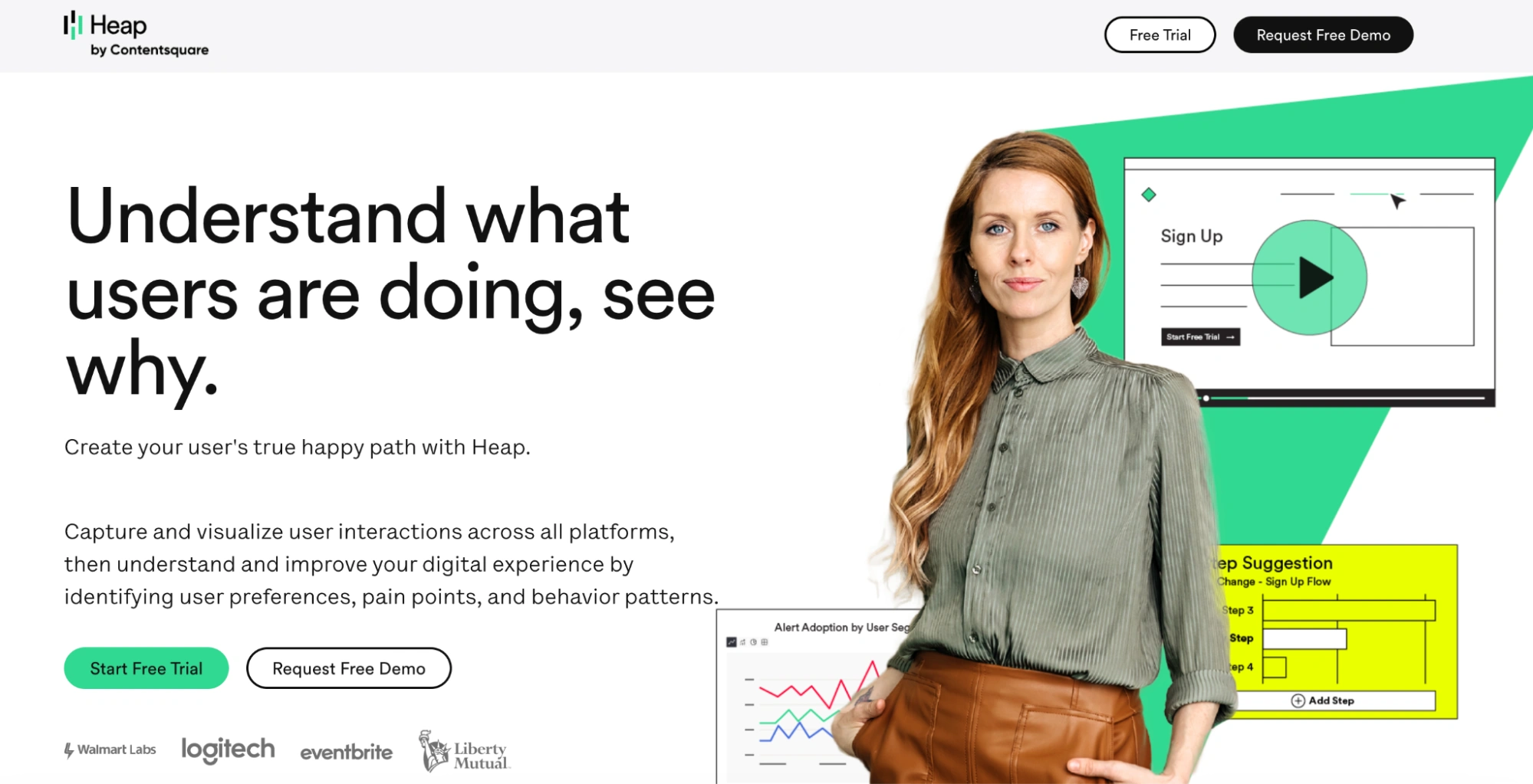
What they did well:
- The headline clearly positions Heap as a product analytics platform built for ease and speed.
- Messaging emphasizes frictionless data capture, addressing a major analytics pain point.
- Visual hierarchy guides users naturally toward signup.
- The layout supports fast comprehension for first-time visitors.
- The CTA is clean, direct, and aligned with evaluation-stage users.
What to A/B test:
- Problem-first framing (“Stop missing critical user data”) versus product-led messaging.
- Highlighting setup speed and implementation simplicity earlier.
- Adding quantified insights or customer metrics above the fold.
- Testing minimal forms versus multi-step onboarding for activation quality.
29. Uber
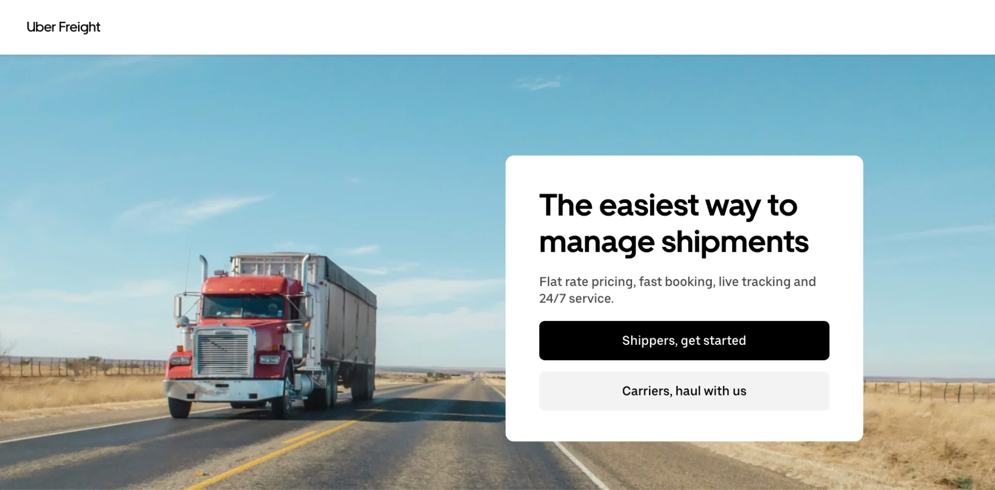
What they did well:
- The headline immediately emphasizes simplicity and efficiency in freight management.
- Clear segmentation for shippers and carriers improves relevance and personalization.
- The layout supports fast scanning while still communicating operational depth.
- Trust signals and operational credibility reinforce confidence in a high-risk category.
- The CTA placement aligns well with onboarding intent.
What to A/B test:
- Cost-reduction versus speed-to-delivery headline framing.
- Showing real logistics workflows instead of abstract visuals.
- Highlighting reliability metrics more prominently.
- Testing personalized landing paths for shippers vs carriers.
30. Cadence
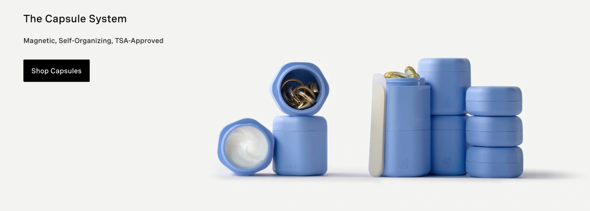
What they did well:
- The headline clearly targets a specific sales pain point: workflow efficiency and productivity.
- The messaging emphasizes automation and consistency, aligning with sales team’s needs.
- Visual storytelling helps clarify product workflows.
- The layout balances feature depth with clarity.
- The CTA aligns well with demo-driven buying journeys.
What to A/B test:
- Revenue-focused framing (“Close more deals faster”) versus productivity messaging.
- Highlighting real sales workflow examples above the fold.
- Introducing social proof earlier for trust acceleration.
- Testing demo-first versus trial-first CTA strategies.
Takeaways for high-converting landing pages in 2026
High-performing landing pages are built through intentional choices and continuous testing. The examples in this guide show how small decisions in copy, layout, visuals, and calls to action can either remove friction or create it.
Each example shows how real brands approach conversion problems differently. Some get the basics right. Others reveal gaps worth testing. Use these pages to spot patterns you can apply and ideas you can test on your own.
Landing pages are never finished. The teams that see the best results keep learning, testing, and optimizing long after a page goes live.
See what better conversions feel like. Start your Instapage 14-day free trial today.
Try the world's most advanced landing page platform with a risk-free trial.
