Zoho may be well-known for its best selling CRM application, but they offer a variety of cloud software in their platform. The company understands that for continued growth, they must continue to provide value across their entire suite of services and all stages of the marketing funnel. Part of that value relies on creating a great first impression so that the company can convert prospects into leads, and nurture those leads to a sale.
To do that, Zoho offers its audience a variety of content gated behind landing pages:
What is a landing page?
A landing page is a standalone page used to get visitors to take a particular action, such as downloading an ebook, registering for a webinar, starting a free trial, etc. To convince visitors to take action, a landing page uses a variety of persuasive elements like engaging headlines, compelling copy, personalized CTAs, and more.
Occasionally, brands provide content that is not gated behind a landing page form. Take these Zoho ebooks and recorded webinars, for example. Each CTA on their respective pages allows visitors to download or watch the content without providing any contact details. And while we think that is a missed opportunity to capture and nurture leads, Zoho decided to offer the content free of charge, so to speak.
In contrast, Zoho does take advantage of landing pages for other offers. Let’s see how well these Zoho landing pages persuade visitors to take action.
(This is not a case study. Our purpose is to show how Zoho uses landing pages to generate leads. Keep in mind, for shorter pages, we’ve shown the entire page. However, for longer Zoho landing pages, we only displayed above the fold. You may need to click through to the page to see some of the points we discuss and some pages may be A/B testing with an alternate version than is displayed below.)
1. To persuade competitor’s customers to switch to Zoho
Performing a search for “Zoho database,” first you’re presented with this Google ad. Then, once you click on “Compare Zoho CRM Editions,” you’re sent to the landing page below:
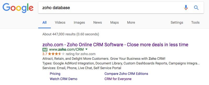

Why the page was built:
To get Salesforce, SugarCRM, and Microsoft users to migrate to Zoho.
What the page does well:
- Zero navigation links keep visitors focused on the headline and evaluating the savings and comparison chart.
- The chart shows Salesforce, SugarCRM, and Microsoft users how much they can expect to save by using Zoho.
- The copy explains how Zoho offers more flexible solutions for less and why users of other CRM providers should switch.
- Both CTA buttons are two-step opt-in, which helps reduce page clutter and keeps visitors focused on the offer’s savings in the chart. Only those really interested in signing up for Zoho will see the form pop up.
- The word “free” is used on the CTA, which helps persuade visitors to click and take the next step in converting.
- Bulleted copy below the fold summarizes the main benefits of Zoho CRM.
What the page could change or A/B test:
- The CTA color is a similar shade of blue as the chart banners so the buttons don’t jump off the page as much as they could..
- A testimonial from someone who switched from Salesforce, SugarCRM, or Microsoft and had a great experience with Zoho could enhance the page.
- Footer links to Zoho’s homepage and Zoho Corporation act as exit links and work against the conversion goal.
- The 2015 copyright could make visitors think, “what else is out of date?” Is the Zoho savings still accurate?
2. To start a free plan with Zoho
Going back to the previous Google ad, if you click on “CRM for Everyone” you’re sent to this landing page:

Why the page was built:
To encourage visitors to sign up for a free Zoho plan.
What the page does well:
- The header explains two benefits immediately: Build better customer relationships and Zoho will provide new users with 10 free users.
- “Free” is used in the headline and is written with big, bold letters to emphasize one of the key benefits of signing up for Zoho CRM.
- The list of features available helps detail everything that Zoho CRM provides.. Listing the most important features to the least important in declining font size is a nice touch, too.
- The red CTA button is a distinct color from everything else on the page so it draws maximum attention.
- The 3-field form — only requiring full name, email, and password reduces friction.
- The Zoho newsletter checkbox is unchecked, so only truly interested people in receiving the content will manually check the box.
What the page could change or A/B test:
- The handshake image in the header is relevant to the offer, but it could be improved by using a photo of two people smiling and interacting rather than simply a graphic of two hands.
- The CTA above the fold is more engaging than the CTA found at the bottom of the page. “Get started for free” is more welcoming than “sign up.”
- Twitter and LinkedIn logos in the footer are a distracting yellow and could drive visitors off the page without first converting.
- The outdated copyright could make visitors pause to think, “is the 10 free users offer still available?”
3. To register people for webinars
Zoho Motivator

Why the page was built:
To get visitors to register for the Zoho Motivator webinar.
What the page does well:
- The absence of a navigation bar or footer prevents visitors from leaving this page to visit other sections of Zoho’s site.
- The yellow CTA button contrasts with the rest of the page.
- The presenter section gives more detailed information about who will be presenting, along with their relevant experience and a head shot.
- An abundance of white space draws viewer attention to the headline and CTA button.
What the page could change or A/B test:
- Zoho’s logo in the top-left is linked to their homepage — providing an easy route off the page and away from the webinar sign up.
- Adding a countdown timer could add urgency and inspire more visitors to complete the conversion goal. Listing the date and time is required for a live webinar, but if Zoho were to include more urgency, people would feel more need to sign up.
- The CTA copy is not personalized. Instead of “register,” the CTA copy could say something like, “Help me boost my sales.”
Zoho Checkout
Why the page was built:
To get visitors to sign up for the Zoho Checkout webinar.
What the page does well:
- The image in the header is relevant to the offer.
- The copy does a good job at explaining the value of what is being offered.
- The bullet points explain the main takeaways of the webinar.
- The red CTA color stands out from the rest of the page and attracts visitors’ eyes.
- White space helps the CTA draw attention, a little more couldn’t hurt either.
- The presenter’s headshot and title provides a snapshot of who viewers will be listening to in the webinar.
What the page could change or A/B test:
- The headline could be more descriptive and persuasive such as, “Introducing Your Next Online Payment Solution.”
- The CTA copy could be personalized to the visitor and the offer. Instead of “Click To Register” it could read “Save My Webinar Spot.””
- Large blocks of copy make this page more difficult for people to scan quickly. Reducing the copy and highlighting the main benefits of Zoho Checkout (coupled with the bullet points) could improve readability and conversions.
4. To join the Zoho Connect beta list
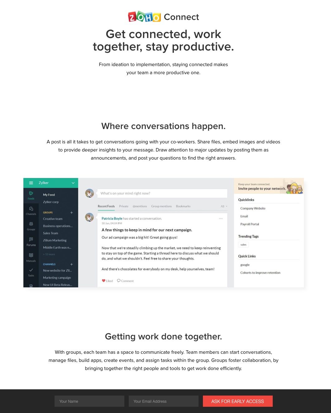
Why the page was built:
To persuade visitors to request early access to the Zoho Connect beta list.
What the page does well:
- A navigation-free header keeps visitors from exiting the landing page.
- The headline conveys three benefits right off the bat that prospects receive with Zoho Connect.
- The sticky CTA in the footer allows visitors to scroll through the landing page while always having the chance to convert on the CTA button.
- The CTA copy is personalized and specific. “Ask For Early Access” is more inviting than “submit” or “request.”
- The red CTA color “pops” off the page, which encourages more clicks.
- Software screenshots show visitors exactly what they can expect from Zoho Connect.
- The 2-field form is nearly frictionless because it only requests name and email address.
- Plenty of white space keeps the page organized and increases readability.
What the page could change or A/B test:
- The CTA could be larger to draw even more attention.
- Lots of copy make scanning this page a little more challenging than it needs to be. Reducing the amount of copy could increase readability even more.
- Adding video could help streamline the content. There is a lot of copy on the page, and a short video could tie things together.
5. To generate more CRM accounts

Why the page was built:
To get visitors to create a Zoho CRM account.
What the page does well:
- The headline is benefit-oriented and is intriguing for visitors to continue evaluating the free account offer.
- The red CTA color is distinct from the surrounding elements and is just begging to be clicked.
- The statistics below the form draw attention and help persuade people to sign up for a free account.
- The upward-trending line behind the statistics implies that marketers’ campaign performance will increase with Zoho CRM.
- The Zoho CRM graphic explains that all of Zoho’s products sync with Zoho CRM.
- Software screenshots help preview the Zoho CRM software for landing page visitors.
- Detailed testimonials include the person’s name, headshot, title, and give insight into the Zoho CRM service — such as customization.
- Significant white space throughout the page allow all elements to breathe more and increases the page’s readability overall.
What the page could change or A/B test:
- The “Create Account” CTA copy at the top of the page is not personalized. Revised CTA copy, such as“Optimize My Sales Process” could produce more conversions.
- The 2016 copyright is outdated. It’s small and not as noticeable as other page elements, but should be updated.
- Adding a video could summarize the content and help the visitor make a decision faster.
6. To acquire more free trial users

Why the page was built:
To persuade visitors to sign up for a free trial of Zoho CRM.
What the page does well:
- The testimonial is complete with a name and headshot, plus the content provides valuable insights about the service.
- The red CTA button contrasts with the rest of the page and it’s very big — both of which help it stand out.
- The Google and LinkedIn sign in options allow visitors to complete the form using social media credentials.
- The privacy policy and terms of service links increase confidence that user data will be kept safe.
- Lots of white space help both the testimonial and form attract maximum attention.
What the page could change or A/B test:
- Zoho’s logo is linked to their homepage providing an easy escape route from the free trial offer.
- The “Sign Up” CTA copy could be more descriptive and inspiring. “Start My Free Trial” is more relevant and would likely generate more conversions.
Which Zoho landing pages would persuade you to act?
The examples above are not an exhaustive list, but the variety in page design shows how Zoho attempts to capture leads to then nurture to sale. Although each landing page has varying levels of optimization, each example pushes visitors towards a specific action.
Regardless of your offer, craft your next professional landing page with Instapage. Sign up for an Instapage Enterprise demo today.

See the Instapage Enterprise Plan in Action.
Demo includes AdMap™, Personalization, AMP,
Global Blocks, heatmaps & more.