Marketers, salespeople, and professionals everywhere agree, one of the simplest ways to boost landing page conversion rate also happens to be the most effective.
That’s why businesses everywhere are increasingly allocating more of their budget to the powerful and relatively pain-free method of optimization known as split testing.
What is split testing?
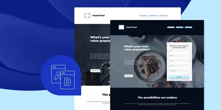
Split testing, commonly referred to as A/B testing, allows marketers to compare two different versions of a web page — a control (the original) and variation — to determine which performs better, with the goal of boosting conversions.
Ideally, there will be only one difference between the two pages so the tester can understand the reason behind the change in performance. For example…
The pinpoint accuracy of split testing
Let’s say you want to see if a different headline would bring a lift in conversion rate on your landing page. The original headline reads “How To Generate More Leads For Your Business,” and the variation headline reads, “Learn The One Secret Method The Experts Use To Generate More Leads.”
After generating traffic to both, you find that the variation produces more conversions than the original. Since there’s only one difference between the two pages, you can be confident that the headline was the reason for the lift.
Now, this is how all split tests would be performed in an ideal world — one change at a time. Unfortunately, we don’t live in an ideal world.
The practical way to split test
The major problem with the ideal way to split test — only changing one element per test — is that each test requires, many times, tens (sometimes hundreds) of thousands of visits worth of traffic before it can be concluded (more on why that is, later).
So, there’s also a more practical way to do it. Consider this…
You want to boost conversions on your landing page, so you make the following changes:
- Headline from “How To Generate More Leads For Your Business” to “Learn The One Secret Method The Experts Use To Generate More Leads.”
- Call-to-action from “Submit” to “Show Me the Secret.”
- A form with four fields (name, email address, phone number, company name) to a form with two fields (name, email address).
After running traffic to both, you find that your new variation, with the changes implemented above, generates 8% more conversions than the original. Hooray! Success!
But… wait a minute… you don’t know why that conversion lift occurred. If you had conducted a multivariate test, or tested one element at a time, you could confidently give a reason. Drats…
On second thought, do you really care?
Many businesses don’t. They’re interested in boosting conversions, and they don’t care why or how it happens. When you don’t have lots of time, traffic, and staff at your disposal, or you’re doing a major redesign, “change only one element per test” isn’t practical advice.
Keep in mind, though, running a split test isn’t as easy as “make a change and drive equal traffic to each page.” There’s a whole lot more to it, regardless of which method — practical or pinpoint-accurate — you choose to use.
What you should be wary of before you start split testing
Every marketer is seeking ways to boost conversions, and so, they hear about split testing’s ability to do that for web pages, and they dive right in. Only, their hastiness leads them to make some common mistakes:
They test without a reason to
If you search “Split testing case study” and you’ll find endless blog posts claiming a particular button color produces the most conversions and that there’s one ideal number of fields to use on your form. And so, it’s only natural you’d try to implement these changes on your landing page, because, if it worked for them, it could probably work for you.
Except, there’s a problem. Their business, landing page, offer, and audience are not the same as yours. So, if you’re thinking of trying something that worked for someone else, do yourself a favor and stop. Stop it right now.
Instead, you should be coming up with your own things to test using your own data. Heat mapping tools, analytics software, and customer interviews are all great for identifying where your web page is falling short. From those, you can form a hypothesis about tests that have the potential to boost conversions.
They blindly follow best practices
For every one article you find about the perfect button color, or the ideal number of form fields, you’ll find two refuting it.
“Wrong!” the marketer will proclaim. “Orange can’t stand up to red!”
“Silly!” another will say. “Clearly green beats both!”
And the funny thing is, everybody’s so busy arguing about who’s wrong that they fail to miss the the fact that, well, they’re all right (that is, barring some methodological mistake in testing).
If marketer 1 tested a red button against an orange one on her landing page, and found the red one to produce more conversions, then she’s correct about red being the right choice for her landing page.
If marketer 2 tested a green button vs. a red one on his landing page, and he found green to beat red, then green is the right choice for him.
Does marketer 2’s test results prove that green is a better button color than red?
Absolutely not. Marketer 1 could very well test green against red and find that red still produces more conversions on her landing page. The impact of button color on conversions is heavily dependent on a number of things — like your audience and the color of the rest of the page, for instance — all of which vary from business to business.
What works for someone else may not work for you. That’s why all your tests should be rooted in your own data.
They don’t follow best practices at all
While you shouldn’t blindly follow best practices, ignoring them all can be just as harmful. There are some universal truths that apply to all landing pages.
For example, it’d be a waste of time to test versions of your landing page with and without navigation, because we already know that navigation kills conversion rate by giving prospects numerous exits off your page. Similarly, you wouldn’t test a blue call-to-action button on a page with a blue background because it wouldn’t grab as much attention as a contrasting color would.
These are commonly accepted design best practices that, 99 times out of 100, aren’t worth your time and effort to test — which brings us to the next mistake…
They test things that aren’t likely to bring a lift
Once, Google tested 41 different shades of blue to determine which had the biggest impact on conversions. Could you, too?
Absolutely. But would you?
We’d hope not. You see, businesses like Google have entire departments dedicated to testing like this, and the revenue to support it, but, on the whole, most businesses don’t.
In fact, CXL’s 2016 State Of The Industry Report found that 53% of businesses that use conversion rate optimization don’t even have a dedicated budget for it. Additionally, most conversion optimizers work at a business with an annual revenue below $100,000.
Unless you’re working with resources similar to Google’s, frivolous tests that attempt to determine the best shade of a color are a waste of your company’s time and money. Instead, you should be focusing on big changes that have the potential to make a big impact on your conversion rate — which, brings us to the next big mistake.
They assume that split testing will bring the biggest lift in campaign conversions
We’re big advocates of split testing here at Instapage (it’s helped us boost conversions time and again), but we’re even bigger advocates of optimization methods that make the biggest impact on your bottom line.
Split testing is actually only one part of your conversion equation, and sometimes, it’s not the optimization method that will bring the biggest lift. Derek Halpern does a great job of explaining exactly what we mean:
“If I get 100 people to my site, and I have a 20% conversion rate, that means I get 20 people to convert... I can try to get that conversion rate to 35% and get 35 people to convert, or, I could just figure out how to get 1,000 new visitors, maintain that 20% conversion, and you’ll see that 20% of 1,000 (200), is much higher than 35% of 100 (35).”
Sometimes, fiddling with your landing page isn’t what’s going to bring you the biggest boost in conversions. Sometimes boosting your traffic will. Other times, improving your advertisements will.
What we’re saying is, before you begin split testing, make sure there aren’t any other holes in your campaign that could use some fixing.
Okay, now that you’re aware of some common pitfalls, be honest with yourself about your readiness to split test. Is everything else in your campaign looking right?
Great, let’s talk about how to start conducting a split test.
How to split test landing pages
From start to finish, here are the steps you should take when conducting a split test.
1. Start with a reason to test
As we mentioned before, your reason for split testing should be data-driven. Did Google Analytics data show that your visitors are only spending an average of 5 seconds on your page before abandoning it? Maybe your headline and feature image need to do a better job of capturing their attention. Or, maybe they feel misled. Maybe you need to do a better job of creating message match between your ad and landing page.
2. Create a hypothesis
From that reason, develop a hypothesis. Ask yourself, “What am I trying to improve?”
In this case, you might say, “After observing that the average landing page user session is only 5 seconds, we believe that creating a more compelling headline will get them to read the body copy and spend more time on the page, which will ultimately lead to more conversions.”
Through testing, you’ll be able to accept or reject that hypothesis.
3. Calculate your sample size
Before you can conclude your test, you’ll need to reach something called “statistical significance.” The term refers to the number of visits each of your pages (control and variation) will need to get before you can be confident about your results.
In most fields, including conversion optimization, the commonly accepted level of significance is 95%. Essentially this means, at the conclusion of your test, there’s only a 5% chance that your results are due to chance. At a 95% level of significance, you can be 95% sure that the change in your conversion rate is the result of the changes you made on your landing page.
Now, there’s a way to calculate sample size manually, but it involves some serious math. Fortunately, there are tools that make it easier for those of us who don’t have the statistical chops, or the time to do it the old-fashioned way.
Optimizely’s calculator is great for this. Here’s what you’ll have to input for it to spit out an accurate sample size:
Baseline conversion rate: What’s the conversion rate of your original (control) page? The higher it is, the fewer visits you’ll need before you can conclude a test.
Minimum detectable effect: The minimum relative change in conversion rate you want to be able detect. A 20% minimum detectable effect means that, at the end of the test, you can only be confident that a lift or drop in conversion rate higher than 20% is a result of your adjustments. The lower your minimum detectable effect is, the more visits you’ll need before you can conclude your test.
Statistical significance: Optimizely’s calculator allows you to raise or lower this, but it’s not recommended you use anything under 95%. If you want to make accurate business decisions based on your results, you can’t afford to bank on unreliable data. The higher your level of significance is, the more visits you’ll need before you can call your test.
Once you’ve got your sample size…
4. Make your adjustments
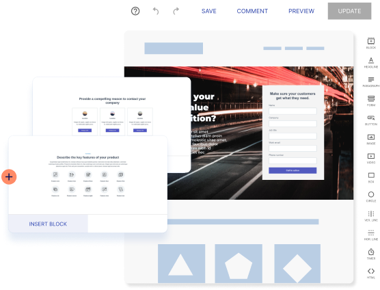
If it’s the headline you’re changing, update it. If your hypothesis involved switching the featured image, do that. Platforms like Instapage make it easy to adjust your page elements for split testing in just a few seconds, without the help of IT.
Make sure your original post-click landing page remains the same. Otherwise, your baseline for testing won’t be accurate.
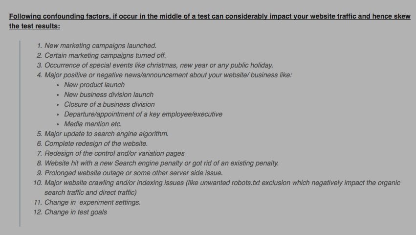
5. Eliminate confounding variables
Unfortunately, your tests aren’t being conducted in a vacuum. That means there’s the potential for one small outside factor to affect your test in a big way, which could result in a misleading outcome.
Make sure that things like traffic sources and referring ads are the same for both pages and that other variables that could affect your test are eliminated to the best of your ability. Here are some things you’ll want to consider accounting for:

Keep in mind, while it’s best to address these in the beginning, you’ll have to watch for them throughout. Obstacles to accurate results can pop up when you least expect them.
6. Make sure everything is working
Examine everything before your test goes live. Does your landing page look the same in every browser? Is your CTA button working? Are all the links in your ads correct?
Before you start running anything, it’s important to QA every aspect of your campaign to ensure nothing threatens the accuracy of your results.
7. Drive traffic to your pages
Now it’s time to drive traffic to your pages. Make sure, as we mentioned before, the traffic is coming from the same place (unless, of course, you’re split-testing your traffic sources or ads). And be careful where that traffic is coming from. Something called the “selection effect” describes the source of the traffic and how it can skew the results of your test. Peep Laja from CXL elaborates:
“Example: you send promotional traffic from your email list to a page that you’re running a test on. People who subscribe to your list like you way more than your average visitor. So now you optimize the page (e.g. landing page, product page, etc.) to work with your loyal traffic, thinking they represent the total traffic. But that’s rarely the case!”
Once you’ve picked your traffic sources, keep running your test until you’ve hit the sample size you identified in your pre-testing calculations for both pages (original and control). And, if you hit that number in less than a week, keep the test running.
Why?
Because days of the week have a significant impact on conversions. There are some days your visitors will be more receptive to your marketing messages than others.
If you’ve hit your sample size and run your test for at least a full week, all the while accounting for confounding variables that might poison your data, it’s time to look at the results.
8. Analyze and optimize
How did your variation fare? Did you produce a big lift? A small one?
Remember that if you set your minimum detectable effect to 20% and you produced a lift smaller than that, you can’t be confident that lift was a result of your adjustments.
If you did produce a lift bigger than that, congrats! You’re done optimizing now…
Not.
Just because your landing page is better than it was before, doesn’t mean it’s the best it could be. There’s always something to test. No campaign is perfect.
If you didn’t produce lift, or actually created a worse variation, don’t stress. You didn’t fail. You just discovered something that doesn’t impact conversions on your page. Move on and keep testing.
Have you tried split testing?
We might’ve just turned something seemingly easy into a method of optimization that sounds way more complicated than it really is. Luckily, with split testing tools like Instapage, you can quickly create variations of your landing pages to test without IT, and analyze them all in one place with the industry’s most advanced analytics dashboard.
So what are you waiting for? Sign up for an Instapage 14-day free trial today.

Try the world's most advanced landing page platform with a risk-free trial.
