
It’s not uncommon for web users to click away from a landing page because it’s too long or the lead capture form asks for too much information. While a multi-step form is essential to collecting visitor information, many marketers fail to design them correctly and end up losing valuable leads. That’s why it’s imperative you design your landing page to ensure visitors stay engaged and are not intimidated by lengthy forms.
One way to do this is with a multi-step form.
What is a multi-step form?
A multi-step form is a longer form broken up into shorter, less daunting steps. From the marketer’s point of view, it’s great for any situation in which you want to collect detailed prospect information because it does so in small chunks. From the prospect’s point of view, multi-step forms allow them to demonstrate their interest by completing a short form, then proceeding to additional form fields to share more about themselves and/or their businesses.
Since requests for additional information only appear after the user submits baseline information. Multi-step forms can reduce friction on your landing page. Designing your form this way can increase the visitor’s time on page, generate more leads, and help you gain insight about higher qualified leads. Which, of course, you can then nurture through the marketing funnel to sale.
Multi-step forms vs. two-step opt-in forms
Both multi-step forms and two-step opt-in forms help engage and qualify leads. Where they differ is how they appear on the page. Multi-step forms have stages, with each succeeding stage only appearing after the preceding stage is complete. Conversely, two-step opt-in forms appear when a visitor clicks a CTA button, and a pop-up box shows the form.
Using multi-step forms instead of on-page or two-step opt-in forms can avoid what we call “Goldilocks Syndrome.” Too long and it may deter prospects from completing it; too short and you’ll end up with unusable leads, or leads that are more suitable for marketing than sales. By optimizing your landing page forms based on the offer and stage of the marketing funnel where your prospects currently reside, you can request more appropriate information and, in turn, generate better conversion rates.
There may not be a “one size fits all” template per se, but the multi-step form examples below are a great starting point for you to emulate in your next design. Let’s see how some of the world’s biggest brands use multi-step forms to engage visitors and maximize leads.
Multi-step form examples
Uber
Uber uses this landing page to entice people to drive for them as a side job:

They use a multi-step form on the page to create a smooth conversion process for visitors. Notice how the CTA button reads, “Next,” with an arrow directing traffic to the second step of the form. Both of these indicate there is at least one additional step in the process.
Who’s Who of Executives & Professionals
This selective networking forum placed a multi-step form on their homepage to encourage visitors to apply for eligibility to the network:

The form is well designed with a step indicator (each in the shape of an arrow — which are visual cues) to imply the visitor should continue to each succeeding step. The CTA button contains an arrow as well, to show prospects that they aren’t finished with the application process yet.
On-page forms don’t always allow for large fonts, long fields, or even field labels because of the limited space on the page. Conversely, multi-step forms create more space since they appear in sections, therefore, allowing more variation and visual cues. Often, they even include a progress bar so users can track how far along they are in the signup process.
University of Phoenix
See how University of Phoenix graduate school uses a progress bar near the top?
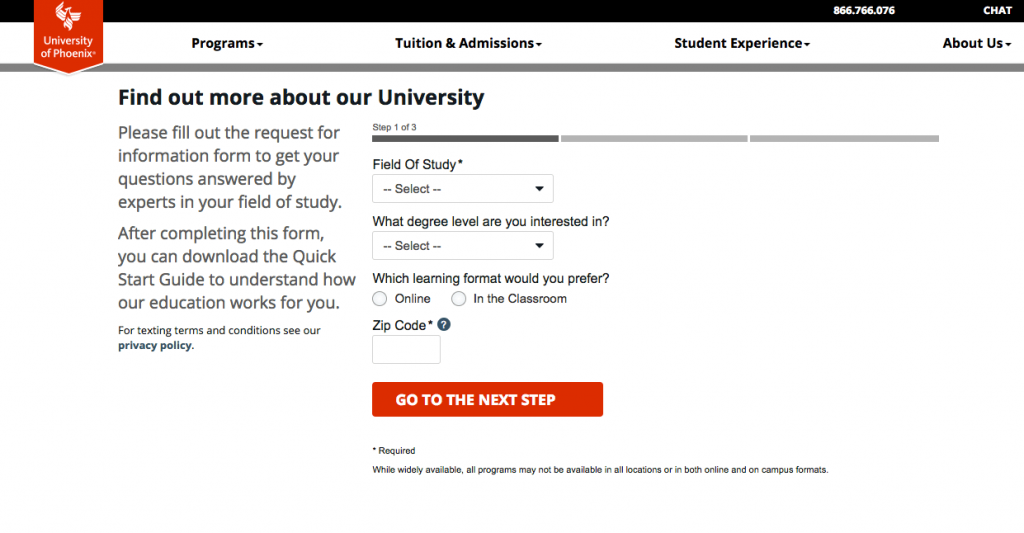
The form begins asking for noninvasive information from the visitor — field of study, degree level, learning format, and zip code. The progress bar is a nice touch because it gives visitors a clear idea how long the form is before they can download the Quick Start Guide.
Connecting with social media is another effective tactic when it comes to designing your multi-step form. In fact, conversion rates can increase by as much as 189% with social media auto fill. By implementing this feature, users’ relevant social information automatically inserted into the form.
Also in regards to user experience, placeholder text can irritate and confuse visitors, as they might mistake it for fields that have already been auto-filled by their social accounts. Instead, label each field above the box to reduce friction and smoothly guide your users through the form.
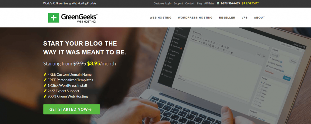
GreenGeeks
GreenGeeks created this landing page to include a multi-step form. First, the landing page makes the offer:
Once the visitor clicks the “Get Started Now” CTA button, this page appears with step one of the form:
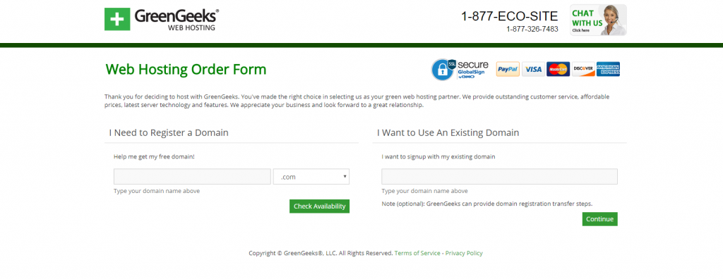
At this point, users aren’t asked for any identifying information — just a domain (new or pre-existing) — so users who aren’t all the way down the funnel aren’t deterred by a long, complex form. Once visitors are ready to continue signing up, they’re directed to this page, which is step two of the form:
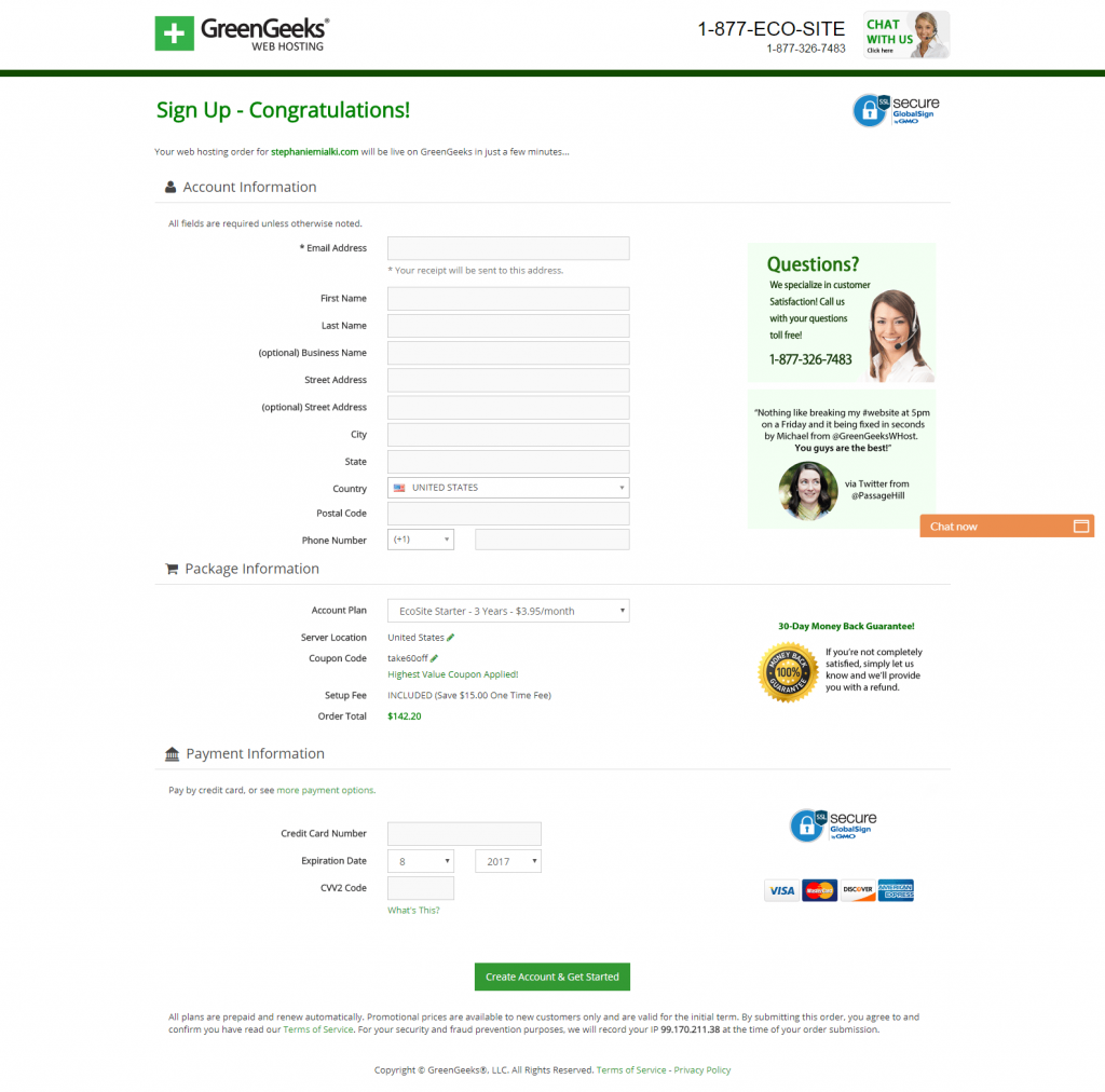
This is another multi-step form that has each section and individual field clearly labeled, providing a seamless signup process for customers.
Cirius Marketing
Here’s an example from Cirius Marketing. They use a two-step opt-in page with a multi-step form on the pop-up box. This is the landing page with the CTA button immediately visible above the fold:

And here’s the multi-step form in the pop-up box:
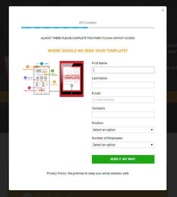
Notice the progress bar that indicates 50% complete at the top of the window to let prospects know this isn’t the only information they’ll need to provide.
Sprout Social
Sprout Social designed this multi-step form for their prospects to complete:
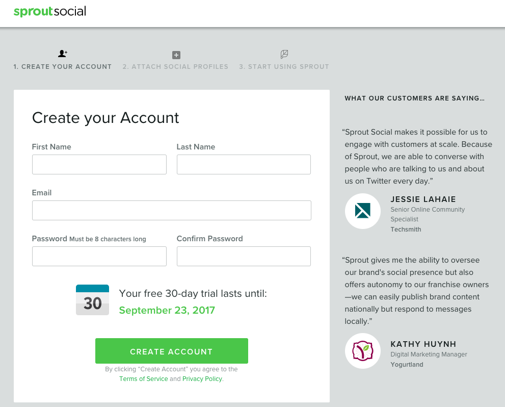
This first step is where they create their account; they’re then brought to the second step where they can attach their social profiles; and finally, in step three, they can finish the signup process and begin using Sprout.
Quick Base
The Quick Base landing page below offers employee training services:

When prospects are ready to start their free trial, they click any of the cooperative CTA buttons (three total on the page), and arrive to step one of this multi-step registration form:
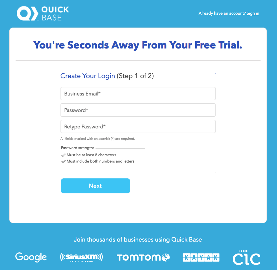
Notice how this part of the form is specifically labeled “Step 1 of 2”. Informing prospects that they’re “seconds away” from their free trial is an indicator that completing the form won’t take long.
Hootsuite
Hootsuite guides prospects through their account sign up process with clearly defined steps:
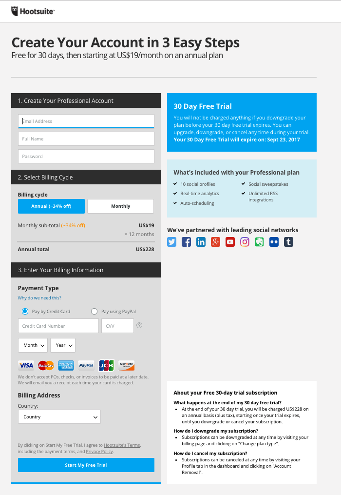
The headline states how many steps there are to signing up, so prospects know immediately what it entails. Then, each of the steps is clearly labeled with a section header to easily guide visitors through to completion.
Increase on page engagement with multi-step forms
If your best conversion scenario requires a lot of information from prospects and you don’t want to come off as intimidating. Using a multi-step form to simplify the situation can help alleviate these issues. These multi-step form examples reduce friction, persuade customers to trust you with their information, and ultimately, help lead to the conversions you’re looking for.
Always connect all your ads to personalized landing pages to lower your cost per customer acquisition. Start creating your dedicated post-click pages by signing up for an Instapage 14-day free trial today.

Try the world's most advanced landing page platform with a risk-free trial.
