Remember a show called the Power Rangers?
Yes, yes, the show where a couple of teens transformed into superheroes after donning skin-tight, color-coded spandex costumes and opaque visor helmets.
Yep, those were the days. The Power Rangers are a fond memory of my childhood, but part of what I loved about them was their ability to transform themselves from teenagers into superheroes possessing superhuman powers – strengths that helped them fulfill their goal to beat the bad guy with their zords.
The possibility of transformation changes everything because it gives us hope.
After reading the aforementioned analogy, you probably can’t help but think, “If a bunch of rebellious teens could transform to fight for the greater good, my landing page can transform itself into a one that actually gets conversions!”
… Okay, maybe that was a jump.
But go with me here! Of course, there is hope for your landing page.
Breathe a sigh of relief, and let’s begin with the details of the morphing process. Because we’ll be talking about webinar landing pages specifically, the transformation will lead to the birth of a lean mean registration machine – a landing page that possesses super strength and has the power to defeat the no-conversion monster.
All landing pages are different
Every power ranger has a different color, different identity, and different strengths, right? Similarly, every landing page should be built for a different purpose, and hence, should have a different identity.
A click-through landing page design will probably not get you more webinar registrations. You need to create a specific landing page for your webinar.
Getting a webinar together is hard work. There are slide decks to make, guests to feature, and finally visitors to invite. However, if you screw up that last step of getting people through your virtual door, your first two steps go to waste.
According to ON24’s report the conversion rate of a webinar’s registrants turning into live attendees is just 42.9%:

This stat is important because the purpose of doing webinars is to get the maximum number of attendees to see your webinar – and hopefully convert these attendees into your customers. And if only 42.9% of registrants show up for your webinar, it means you need to get as many registrants possible so that you have an increased chance of getting more customers.
So, how do you increase the number of registrants for your webinar?
By creating a perfectly optimized webinar landing page!
The anatomy of a perfectly optimized webinar landing page
Great landing pages are no accident. They are the result of testing, optimizing, and proving which elements below on a page. Below, you’ll find the six components that will help you convince your visitors they need to sign up for your webinar.
1. Your Unique Selling Proposition
The headline of your landing page should include your webinar’s USP. What will your visitors get from investing an hour of their time watching your webinar? Tell them this in a straightforward way, and you’ll increase the number of registrants almost instantly.
For example, if you are hosting a webinar on landing pages (we do this weekly), your headline shouldn’t be generic. Instead, you should let your visitors know the exact details of what they’re going to learn from the video, like “The 5 elements that turn landing pages into conversion machines.”
The more specific your headline, the more interested your visitor becomes in signing up.
2. Your Selfie
A selfie on a landing page? Yeah, I see the look of horror on your face. Go with me for a second.
When creating a landing page for your webinar, the most important and relevant image that you can use is that of your host and speakers. Don’t include pictures of serene beaches or animated ducks. Just add individual images of your host and guest speakers, and that should be enough.
You should do some branding on the landing page, too. Make sure you include your company logo.
Finally, your landing page must also have a short bio of your host and your guest speakers. Share their credentials. Let the visitor know why they should take time out from their schedule to listen in.
3. The Benefits
The product you’re highlighting on the landing page is your webinar; therefore, the main copy of your page should comprise of the benefits that your visitors will get when they show up to watch it. The benefits should be arranged in bullet points or in the form of a list so that it is easier for your visitors to go through it quickly.
Pro tip: You need to mention the date and time of your webinar prominently on your landing page. Really. Make it stupid obvious.
4. Testimonials
Testimonials are a crucial part of your landing page. Include a few lines of what past registrants of your webinars have said about them. You can even include quotes from the guest speakers on how much they have enjoyed doing the webinar or what they have learned from it.
Add social media widgets as well to ensure that your page is shared across all channels and has more visibility.
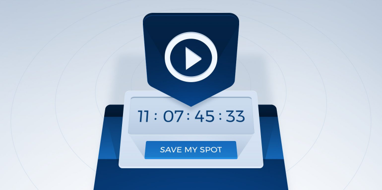
5. The call to action button
As is true for all other landing pages, the CTA plays a vital role on your webinar landing page. Make your CTA contrasting and big, yes, but also think long and hard about the text that you’re going to put on your button.
A simple “Register” button would do, but something personalized will be much better. For example for the hypothetical landing page webinar mentioned above, the CTA button could read “See the 5 elements in action”.
6. The lead capture form
The lead capture form on your landing page should have minimum friction because the chances of a visitor running away simply by looking at the length of your form are quite high. I know you need to get good quality leads from your webinar landing pages, so your form can be long if necessary, but it should be arranged correctly.
Don’t make the form intimidating.
Examples of webinar landing pages
Just knowing what to include on your landing page helps, but seeing a landing page in action helps much more. Here are two examples of webinar landing pages let’s see what these pages have and what they don’t have.
Free Weekly Mini Webinar – Jon Loomer
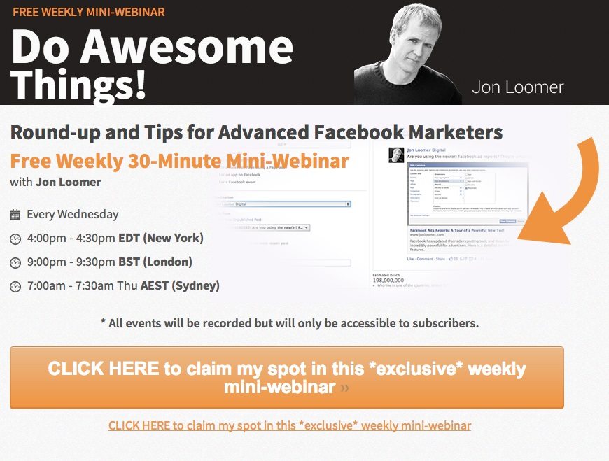
I like the overall color scheme of the landing page. There’s an image of the speaker which is good, but there’s no bio, so I can’t help but think, “Who is this Jon Loomer guy and why should I listen to what he has to say about Facebook marketing?”
The headline “Do Awesome Things” is not relevant at all. The topic of the webinar should be focused on more than a generic phrase.
There are no benefits of the webinar mentioned on the page, just time. That is not going to be enough to convince someone to register. Then there’s the call to action button, which is big enough, but what’s with the copy, “CLICK HERE to claim my spot in the *exclusive* weekly mini-webinar” – exclusive? Uh huh.
The button copy is confusing and arranged in a strange way.
HubSpot

The headline is good. The USP clearly mentioned. The copy focuses less on the benefits of the webinar and more on the success of the previous webinar. There are pictures of guest speakers accompanied by their bios, but the latter are so long that I really wouldn’t go through all of them.
I like the CTA button and the copy on it. The lead capture form, however, is too long. It’s arranged properly but still too long.
Don’t just use a cookie cutter design for all your landing pages. If you want to get the most number of registrants for your webinar, make sure your landing page doesn’t make the mistakes that these pages made. Sign up for an Instapage Enterprise demo today.

See the Instapage Enterprise Plan in Action.
Demo includes AdMap™, Personalization, AMP,
Global Blocks, heatmaps & more.
