
Whether you’re a realtor, a home seller, or a real estate technology business, you need to start creating targeted real estate landing pages for your audiences — to move them closer to the point of purchase.
Let’s talk more about how they work.
What is a real estate landing page?
Have you put together the real estate squeeze pages (aka real estate landing pages) for your business? Here’s how to tell:
1. Is your page disconnected from your website’s navigation?
Your squeeze page should be a part of your website, but it should be inaccessible via your main navigation. To be a true landing page, prospects should only be able to land on it after clicking a link that you send out through one of your communication channels — like email, pay-per-click ads, or social media.
2. Does your page exist solely to convert visitors?
Some people will tell you that all your page needs to have is a form or a call-to-action (CTA) to be considered a landing page.
That’s not the case.
What you create must have one goal and one goal only: conversion.
Take this Fundera page for example:
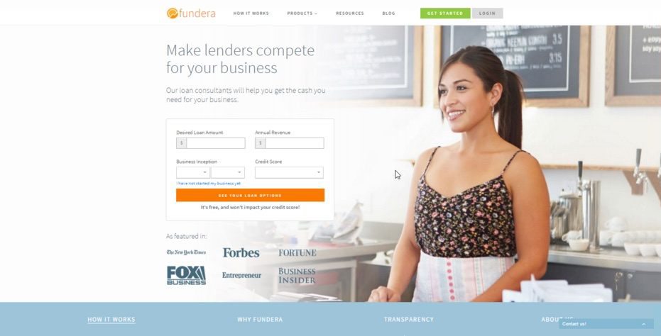
It has a call-to-action and a form to complete. But many wouldn’t consider it a landing page. And that’s because it doesn’t exist solely to convert.
It serves as a jumping off point to other pages, like “Products,” “Resources,” “Login,” and the blog.
- Is it related to the real estate industry?
Whether its goal is to book a showing or generate a home report, your page needs to be related to the real estate industry in some fashion.
Why do you need real estate landing pages?
According to REALTOR.org, 43% of all home searches start on the internet.
And even when those searches don’t start online, they eventually end up there — with 94% of millennials and 84% of baby boomers saying they use the internet during the home buying process.
That means if you’re in the real estate industry, you should have a presence online — regardless of your niche- this means creating real estate landing pages
And since every sound internet marketing strategy includes some combination of social media, email, and, PPC advertising; you’ll need somewhere for your subscribers to land after they click the link for your promotion. That place is a landing page built to move your prospects to the next step in your marketing funnel.
Who uses real estate landing pages?
Don’t make the mistake of thinking that you have to be a real estate agent to create the real estate landing pages. In addition to agents, they can be useful to a lot of different types of people and businesses, like:
- Consumers with property to sell
- Tech start-ups connecting people to the housing market
- Brokerages educating their employees
As you’ll see, real estate landing pages come in all shapes and sizes. Let’s take a look at some created using Instapage software to determine best practices.
ReStart Home Report
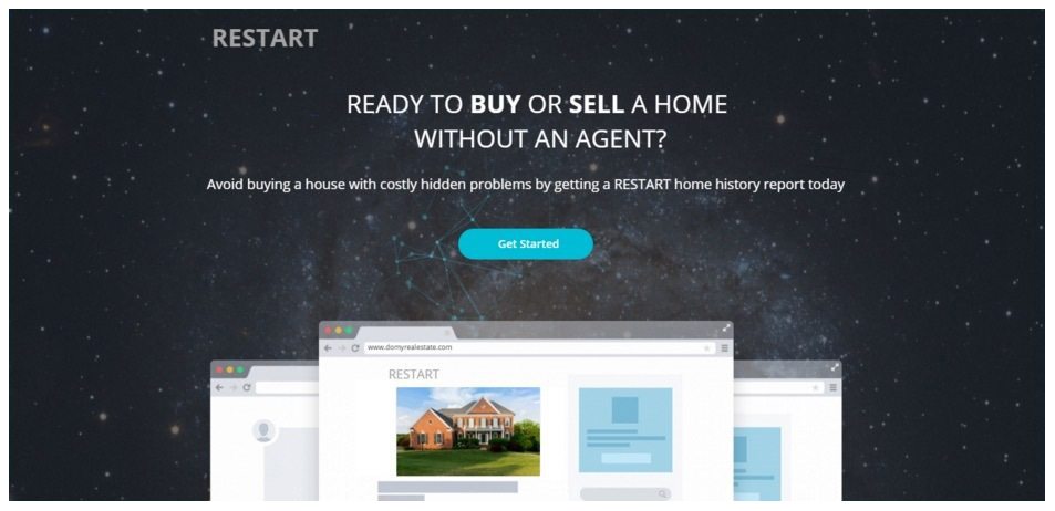
Target: Consumers who want to buy or sell a home without the help of an agent.
Goal: To get the prospect to request a ReStart home report by filling out a form and clicking a CTA button.
The good:
1. The headline and unique selling proposition are clear
Why should I get a ReStart home report? Because it will help me “avoid buying a house with costly hidden problems.”
A prospect should always be able to look at your headline and figure out why she should buy your product or use your service. It sounds simple, but you’d be amazed at how many landing pages don’t include an attention-grabbing, benefit-packed headline.
2. Optimized form
To get a full report on your home’s history, you’ll probably need to give up more information than just what you see on the form here.
However, ReStart only requires you enter some very basic and low-level information to start, making it more likely you convert. After you do, they can ask for more personal information later on in their sales funnel.
3. No points of exit
There are only two ways off this landing page. The first is by clicking one of the two CTA buttons, and the second is by canceling out of the page altogether. That’s exactly how it should be. Don’t give your prospects an “out” by including your navigation or any other links that direct them off the page. Force them to ‘X’ out their window or move further down your conversion funnel.
(*Bonus: Move your cursor around the header image and see what the stars do in the sky to see the fancy HTML code added to the page.)
The bad:
1. More showing, less telling
It’s one thing to tell me that I should request a ReStart report, but it’s a whole other thing to show me why I should.
What do I stand to gain by avoiding hidden problems? What does the average homeowner pay in repairs their first few years after buying? Do you have any relevant research to support the need for your product?
Present the same argument, but use facts and statistics to back it up. For example, what sounds more convincing to you?
“Avoid buying a house with costly hidden problems…”
Or this:
“The average homeowner spends about $8,000 repairing home problems they inherited from the previous owner. Avoid purchasing a home with costly hidden problems…”
Show me why I need your product, don’t tell me that I do.
2. Inconsistent branding
Why does the report name appear as “RESTART” in some places, but as “ReStart” in others? It may seem like a small issue, but even little branding inconsistencies like this one have the potential to create mistrust in the mind of your prospect.
3. The call-to-action button copy is boring
Why settle for cookie-cutter copy like “Get Started” when you could use something like “Learn the truth about your home” or “Identify my home’s problem areas”? Your call-to-action is arguably the most important element on your real estate landing page, so take the time to make it insanely good.
Zocchi Real Estate Landing Page
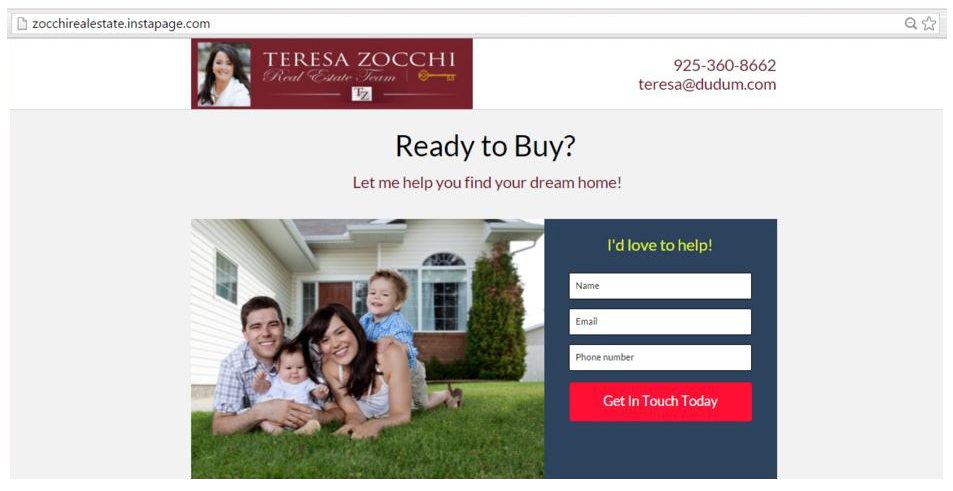
Target: Consumers searching for a new home
Goal: To generate real estate leads by getting users to fill out their name, email address, and phone number on a form.
The good:
1. No points of exit
Either submit your information or open a new browser window, because that’s the only way you’re getting off this landing page. No ads, no links, no navigation means the chances that people abandon this page are lower than most.
2. Button text
This landing page gets points for not using boring CTA button text like “Submit,” but it could be better. Instead of “Get In Touch Today,” what about something more in line with Teresa’s brand, like “Locate My Dream Home”? It’s far more imaginative and stands out much more than what’s currently on the button.
3. Button color
The red button contrasts the background color of the form nicely, making it really pop. There’s no question where the user has to click to convert. Take your button optimization a step further by figuring out which colors your target audience is most receptive to, and working them into your landing page.
4. Bullet points
Teresa shows a comprehensive list of bullet points showcasing what she will do for her clients. Not only will she search for and show potential properties, but she will also provide clients a list of licensed inspection companies and offer continued service beyond the close of escrow. That kind of service is invaluable, and she makes it a point to tell people upfront on her landing page.
The bad:
1. Stock photo
When you haphazardly drop a stock photo right in the middle of your page like this, it comes off as lazy, impersonal, and even a little untrustworthy.
Research has proven that photos of real people outperform stock photos time and time again in marketing. So make it a point to get high-quality pictures of the people you’ve helped find a home, and use the best ones for your marketing collateral.
2. Website logo is too cluttered
While the upper-left-hand corner of a website is the universally accepted spot for a company’s logo, there’s way too much going on in that little red box.
I count three different logo variations in that one box: one image, one text, and one shorthand. Choose one from the text that says “Teresa Zocchi Real Estate Team,” the image of the key, or the abbreviation “TZ.” Don’t stuff them all into one small red box and place it awkwardly on a white background.
Not only that, but the headshot is out of place in the header — and it’s repetitive — since you’ll see it below the fold as well.
My theory is that whoever created this landing page wasn’t the most adept at graphic design; so when it came time to upload a logo, the designer uploaded the only one he or she had.
The better way to go about it would’ve been to head over to Fiverr and pay five dollars to have an actual graphic designer put together three different logo variations on a clear background, then choosing one of them to upload. It will blend better with the page that way.
3. No unique selling proposition
There are almost 2 million active real estate licensees in the United States. Why should I choose the team of Teresa Zocchi? What can her team offer me that another agency can’t?
Be sure to display your unique selling proposition in your headline or sub-headline.
4. Poor testimonial photos
Why are the testimonial photos tiny thumbnails of rooms in a house, instead of photos of the actual people who have provided the quote? As we mentioned before, studies have shown that photos of real people out-perform stock photos, so do your best to solicit pictures of your satisfied customers.
5. The headline is weak and doesn’t make sense at this stage
“Ready to buy?” What’s that about? Aside from the fact that this headline is just plain weak, we already know that the people landing on this page aren’t ready to buy. If they were, they wouldn’t be seeking out a realtor to help them find a home.
The sub-headline would be a better headline in this case: “Let me help you find your dream home”… but it’s still not great. Remember: showing is better than telling. Back up your message with facts.
Have you served a lot of clients? Do you place customers in homes faster than the industry average? Say so in your headline.
With a little research, I was able to find out that Teresa offers all of her clients a “Buyer’s Handbook.” Why not offer that as a downloadable asset in exchange for prospects’ information?
Use a headline like “Claim your FREE Buyer’s Handbook,” and explain to people all the valuable information they’ll find inside it.
6. Too much “me” and not enough “you”
I see a lot of “me” and “I” all over this landing page.
The most powerful word in marketing is “you” – and it’s not used nearly enough on this page. Stop talking about yourself and start telling me why I should hire you.
Frankly I don’t care if you want to help, if you’d love to help, or if would be a total chore to help me. I want to find a home fast, and I want it to be in my price range. Tell me you’ll do that and I’m on the hook. Everything beyond that is gravy.
7. No badges or certifications
To be a real estate agent, you need to have at least your license. There’s a good chance you have other industry certifications as well. Display them prominently on your landing page to show your authority.
8. No custom URL
A custom URL would add a more professional feel to this landing page. It’s easy to do, too. Just follow these steps to remove the “.instapage” from it, and display a URL with your custom branding.
HomeSpot Media real estate landing page
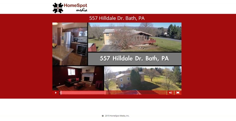
Target: Potential home buyers looking at a property on 557 Hilldale Drive in Bath, PA
Goal: There doesn’t seem to be a visible call-to-action (only a verbal CTA at the end of the video), so my guess is that the only goal here is to give people a video tour of the property.
The good:
1. There’s no navigation
No navigation on this landing page means fewer ways to escape, which increases the chances prospects will convert. But seeing as how there’s no way to convert, that’s not going to happen anyway.
2. It leverages video
Video has emerged as one of the most engaging forms of media in digital marketing, producing seriously high ROI. This is especially true in real estate, with almost half of all home buyers saying they found video tours of homes very useful in their search.
The bad:
1. No call-to-action
This is bad. Really bad. And it’s surprisingly not the first time we’ve seen this mistake on a real estate landing page.
Without a call-to-action, there’s a good chance that nothing will come of this page at all. Sure, it’s helpful to people who want to get a look inside 557 Hilldale Drive.
But, what if I want to schedule a visit? What if I want to contact the realtor who represents the seller of this property? I’m sure if I looked hard on the website, I would be able to find it, but I shouldn’t have to search.
Your landing page should make converting as easy as possible for the prospect.
Maxavenue
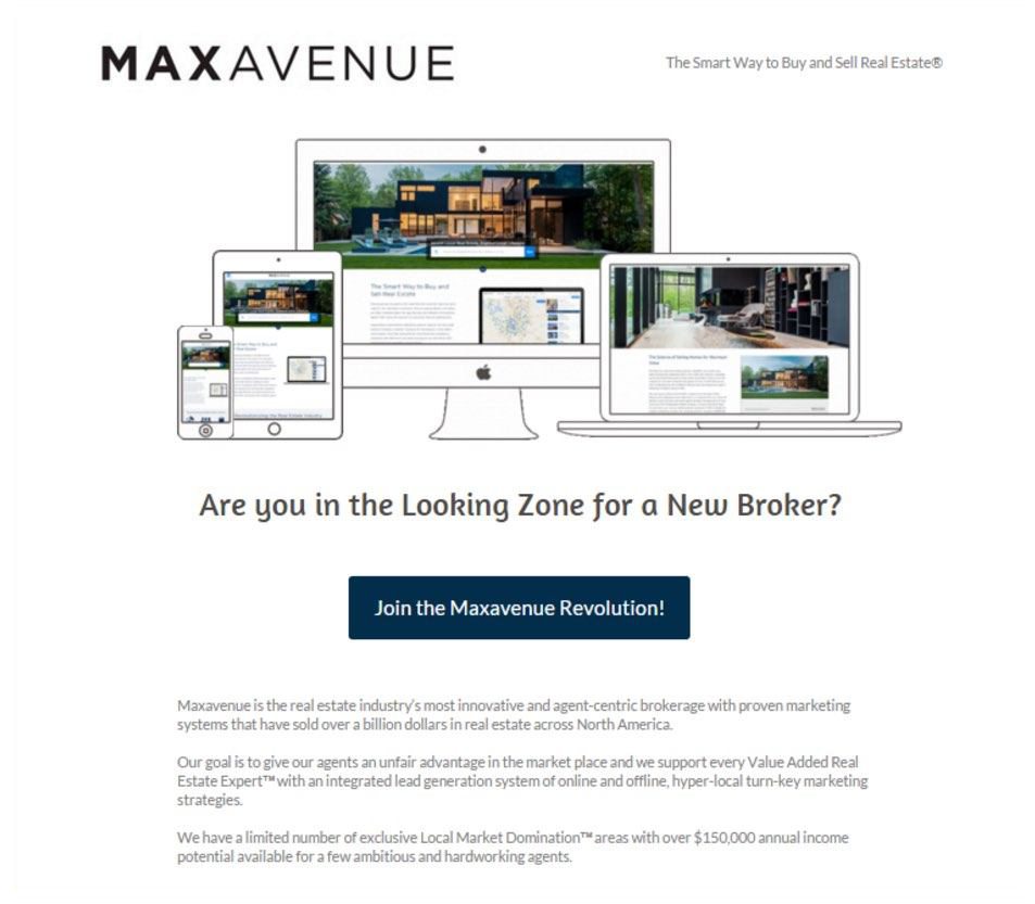
Target: Real estate agents in the market for a new brokerage
Goal: To get agents to schedule an appointment with their brokerage
The good:
1. Compelling CTAs
“Join the Maxavenue Revolution!” is a compelling branded CTA that’s sure to outperform any standard “Submit” button. But if it were me, I’d make it even better by using one of the claims found later in the body copy, which states that you can make up to 26x more income. I’d be willing to bet that call-to-action like “Show me how to boost my income by up to 26x” would drive some serious clicks.
2. Well-written copy
The body copy of this landing page is chock-full of benefits and trust indicators. By reading it I know that:
– Maxavenue brokerage systems have sold over a billion dollars’ worth of real estate, so they must be good at what they do
– They’ve sold all over North America, so they have experience in different markets
– Maxavenue have a offer a lead generation system and targeted local marketing strategies, so I’ll have multiple tools available to me
– They have control over exclusive markets that have the potential to net you $150,000 in income
– The service has offer individualized coaching
– Maxavenue send me free educational newsletters
– The main offer is a 100-course training program
– They give me opportunities to earn industry-specific certifications
3. Skimmable text
You won’t find any long-winded block text here. Everything is bulleted, easy to digest, and the longest paragraph is only three sentences.
The bad:
1. Awkward headline
The biggest negative we found on this landing page was the headline. I thought maybe “Looking Zone” was a phrase used by real estate agents that I didn’t recognize because I wasn’t in the industry. So I Googled it and didn’t find anything relevant to real estate. Even if I had, it would still be a bad headline because it doesn’t convey any benefit or unique selling proposition.
Remember: the most important job of a headline is to get the visitor to read the body copy. It would be a shame if this well-written landing page never got read because the headline didn’t do its job.
2. Wrong favicon and copyright information
If you’re not familiar what a “favicon” is, it’s the icon listed in the browser tab. Maxavenue’s favicon is… Instapage’s logo! While we admit, the brand exposure is great, but not what Maxavenue would want. Instapage customers can insert their own favicon by following the quick instructions here.
Furthermore, when you scroll to the bottom of the page, the copyright information is… Instapage! Why wouldn’t Maxavenue replace us with their company name?
Both of these may sound like we’re nitpicking, but it’s the little details that can create uncertainty with prospects. This goes back to the “message matching” and something you can’t afford to miss.
Create your best real estate landing page
Businesses, realtors, and home sellers can all benefit from using real estate landing pages. And the best part is, with Instapage it will only take you a few minutes to get it live on the web.
You don’t need loads of time, money, or technical experience to build your real estate landing pages either. Instapage integrates with a lot of the most commonly-used marketing software on the internet — like WordPress (for websites), MailChimp and Constant Contact (for email marketing), Salesforce (for customer relationship management) and Google Analytics (for web analytics).
Take a few minutes to see why it’s the simplest and most powerful landing page tool available. Sign up for an Instapage Enterprise demo today.

See the Instapage Enterprise Plan in Action.
Demo includes AdMap™, Personalization, AMP,
Global Blocks, heatmaps & more.
