
When you work in a competitive niche, you can’t afford to blend in.
Your competitors are all trying to go after the same clientele as you, and chances are, everyone is using the same tactics.
The real estate niche is a great example of this. It’s insanely competitive, thanks to the low barrier to entry and a recovering economic climate.
The thing with the real estate market, though, is it is seriously old school.
Think about it. How do most realtors advertise? Flyers, newspaper ads, and otherwise unmeasurable media. Even the realtors who bother to have a website are generally ineffective.
However, if you’re reading this, chances are you’re not like those guys (and if you are, you’re ready to admit the error of your ways and jump into modern marketing). You are ready to learn how to blast ahead of your competition so prospects choose you over the other guy.
What’s the best way to do this?
By creating an optimized post-click landing page.
Do real estate agents actually do this?
By the looks of most of the post-click landing pages I’ve seen, definitely not.
I went on an adventure last week. I ventured online to find the best real estate post-click landing pages of 2015, but the more I searched for the pages… the more it became apparent that like pixie dust, these pages simply don’t exist.
All I found were poorly designed, cluttered post-click landing pages – pages that don’t do anything for conversions and frustrated the hell out of visitors. Now, I know being a realtor is tough, but you aren’t improving your chances of getting leads if you’re directing your visitors to a website that doesn’t quickly and easily get them the information they want.
This is a huge opportunity for you, so today we’re going to showcase a couple of real real estate landing pages, showing you what’s right and what’s wrong with these pages, so that you don’t make the same mistakes on your post-click landing page.
15.6 percent increase from 2021
P.S. These are all technically post-click landing pages… even if they don’t look like it.
Manhattan House
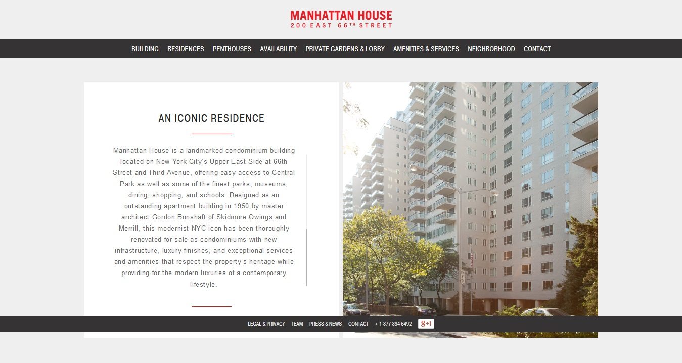
The first thing that entered my mind when I looked at this post-click landing page was a big fat question mark. I clicked on an ad for apartments in New York City, and this is where I was brought.
The page makes no sense. Is the headline “An Iconic Residence” suppose to do something for me?
Where’s the call to action button? Where’s the lead capture form? And most importantly, where’s the actionable copy?
All I get from this page is a history of the Manhattan House condominium building, nothing about how to actually inquire if I’m interested in viewing it or talking with the realtor. This is an example of design taking way too much precedence over what gets conversions.
Action Tip: Make sure your post-click landing page has a headline that states your unique value proposition. The page should also have a lead capture form that helps you collect user information and a call to action button.
Mike’s Realty Group
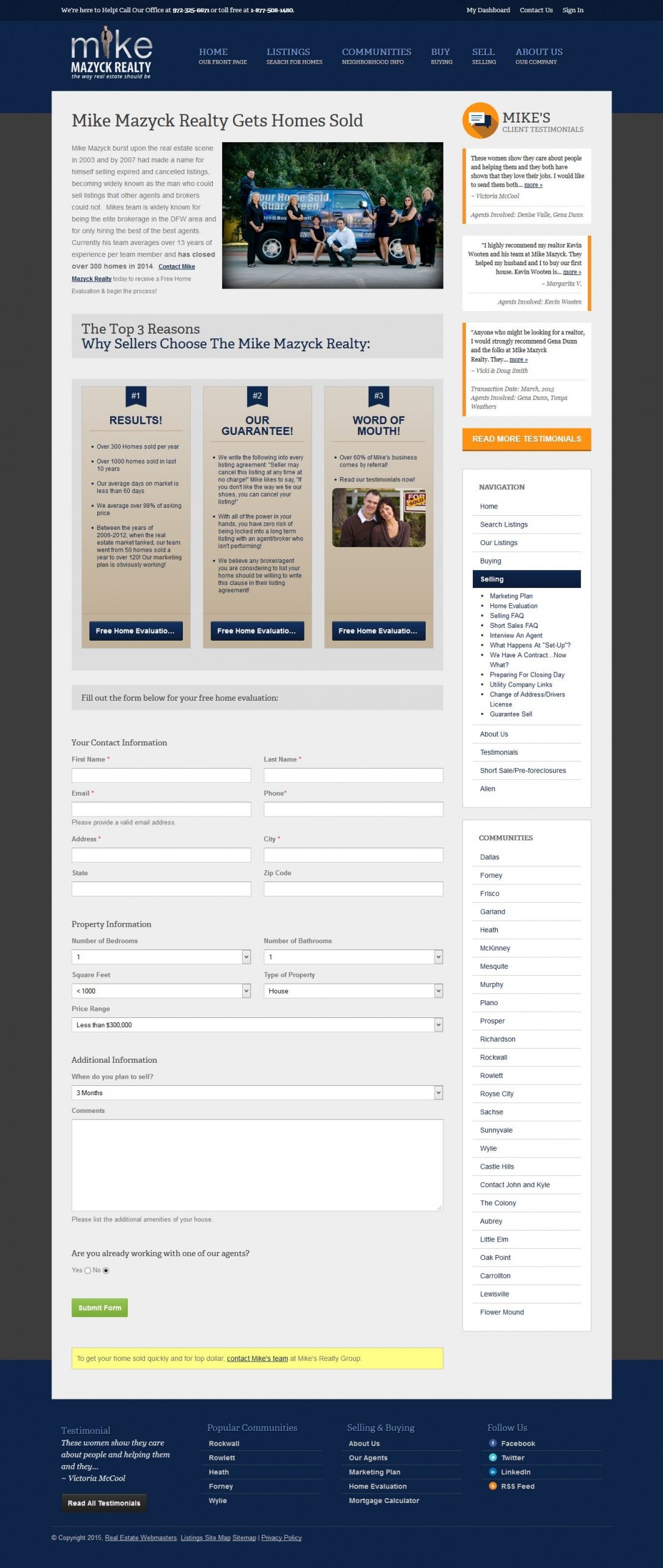
Okay, let’s get real here. That’s a bad headline. “Mike Mazyck Realty Gets Homes Sold”- uh huh, that’s nice – but how?
The copy consists of a long paragraph praising Mike. The paragraph discusses his accomplishments and that of his team. What it fails to mention is why any of this matters to the visitor. (Also, notice the abundance of typos in the copy, That’s a fast way to kill your credibility)
The “Top 3 reasons why sellers choose The Mike Mazyck Realty” section adds some value to the page, but the call to action button at the bottom is hideous. It reads “Free Home Evaluatio…”
*headdesk* Did they really expect to get leads with that button?
The form is a hot mess. The fields need to be optimized. And besides, do they really need so much information from a first-time visitor?
The testimonials add nothing to the page. There’s no picture of the client. There’s no social proof that the testimonial is even real.
Action Tip: Make sure to keep your lead capture forms to the point. Moreover, understand that testimonials only add to your conversion goal when you prove their authenticity. You can do this by adding an image of the client.
Dave Ramsey
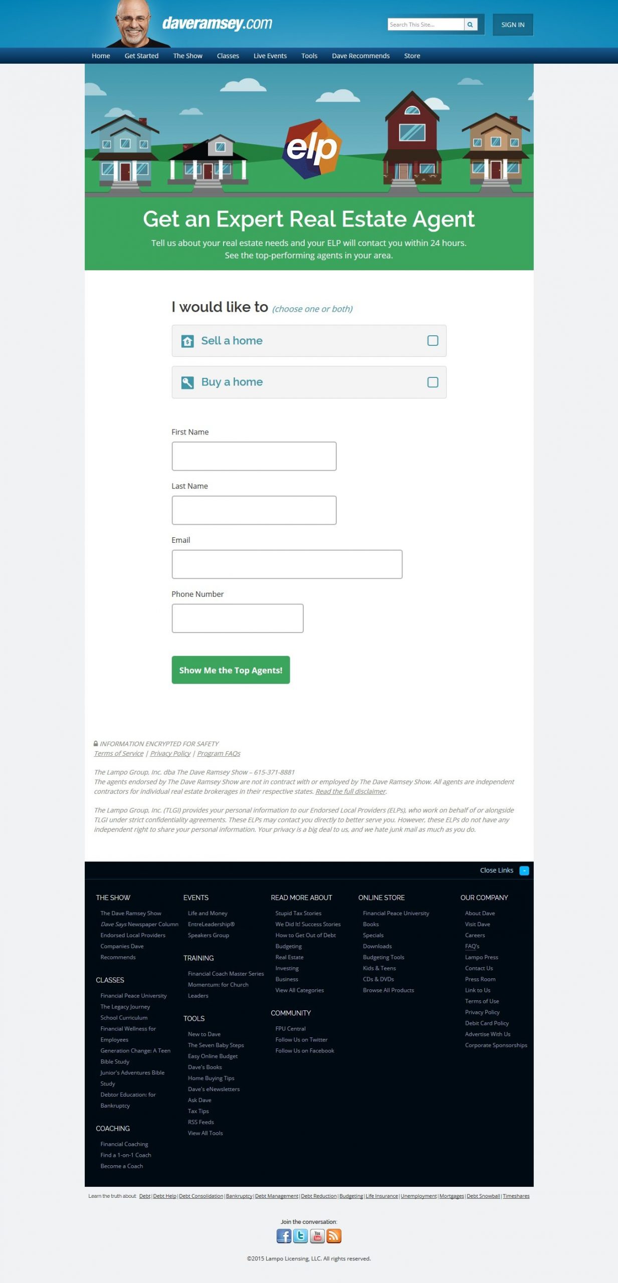
The headline doesn’t suck! It makes sense and communicates something to the visitor. The only problem is that I don’t know what ELP is. Is it part of the logo? There’s no clarification here for it being right in the center of the page,
The form is fine, but there isn’t any reason for it to be so gigantic. The form could have easily fit into a nice, cozy box like a standard lead capture form.
The image with the houses is relevant. Overall, this page is one of the better ones I found.
(But don’t even get me started on the copious amounts of navigation links at the bottom of the page).
Action Tip: Never use jargon on your post-click landing page, even if it is something really common. Assume your visitor knows nothing. Why risk using jargon on your post-click landing page when it could cost you the conversion?
Top Agents Ranked
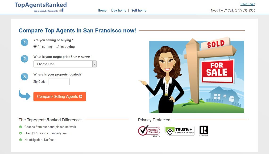
What first caught my attention was how different this page was from most real estate post-click landing pages floating around the internet. There’s no long paragraph about how great the agents are, no long lead capture form, and no invisible call to action button.
This page has a good headline, so a visitor knows what they are getting from the page. The form is broken down into a numbered list, and there’s a visual cue pointing to the contrasting and personalized CTA button.
The graphic of the animated realtor pointing to the form is relevant and eye catching, plus it serves as another directional cue. For the copy, the page has a list of benefits of the service, a recommendation for high converting pages.
Finally, the trust seals on the page tell the visitors that they can trust the service.
Actionable Tip: Trust seals do wonders for your post-click landing page credibility. Make sure to use them where you can.
Real
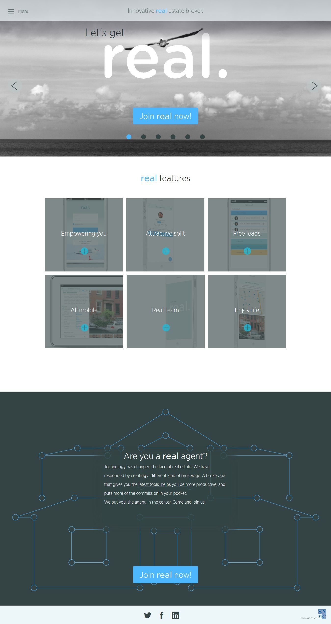
The headline reads, “Let’s get real.” Okay, let’s, but about what?
The headline is clever but not clear. The image of the flying bird doesn’t make any sense. There’s not even a flying metaphor in the mix, so why the bird?
The call to action button is big and contrasting, but again, I don’t know what “real” is referring to.
The banner on the top tells me the page has something to do with innovative real estate brokers, but the headline and button don’t reinforce this message.
Below the fold, we have “real features” which I have to click to really understand what they mean. The copy is clear, but it needs to move above the fold.
Action Tip: When making the choice between being clever and being clear on your post-click landing page, always choose clarity. Your post-click landing page should tell your visitors about your service right from the headline. Don’t make them scroll just to find out what you do because most of them won’t.
We know it takes a lot to get yourself noticed in the real estate niche. And this is why you need to make your post-click landing page count. Sign up for an Instapage Enterprise demo today.

See the Instapage Enterprise Plan in Action.
Demo includes AdMap™, Personalization, AMP,
Global Blocks, heatmaps & more.
