Every click on a paid ad costs money. What happens after the click determines whether that money turns into revenue or evaporates. Most marketing teams spend heavily on targeting and creative, then send traffic to a generic product page that wasn’t built to convert.
The gap between a compelling ad and a distraction-filled product page is where most paid budgets quietly leak.
Product landing pages close that gap. This guide covers what a product landing page is, how it differs from a standard product page, the design principles that drive conversions, and 15+ categorized examples analyzed for what actually makes them work.
It then walks through how to build and measure your own, using Instapage: the platform enterprise teams use to create, test, and scale product landing pages without developer dependencies.
Key takeaways
- A product landing page is a standalone, campaign-specific page designed to drive one conversion action. It removes navigation and distractions to maintain a 1:1 conversion ratio.
- Product landing pages outperform product detail pages for paid traffic because they eliminate every exit that isn’t the CTA.
- Message match between your ad copy and landing page headline is one of the most direct levers for improving conversion rates from paid campaigns.
- Above-the-fold content carries disproportionate weight. Your value proposition and CTA need to land before the visitor scrolls.
- Different campaign goals call for different page types: single-product pages for focused offers, multi-product pages for category campaigns, and launch pages for pre-orders and new releases.
A product landing page is a type of landing page built for a specific campaign to drive one conversion action related to a product. Unlike product pages on your website, it is not part of your site navigation, does not link to other products or categories, and exists for a single purpose: to persuade the visitor to take one specific action.
The critical difference between a product landing page and an ordinary landing page is that the former is explicitly built around a product offer. Its defining characteristic is the 1:1 conversion ratio: one page, one goal, one CTA. Every element on the page exists to support that action and nothing else.
Product landing pages can be used across a wide range of product categories:
- Digital products: Online courses, eBooks, software, membership programs
- Physical products: Clothing, accessories, home goods, electronics, beauty products
- SaaS and B2B products: Data management tools, productivity platforms, analytics software
- Product variants, bundles, limited-edition releases
- Subscription services: Meal delivery, subscription boxes, recurring memberships
Product landing page vs. product page
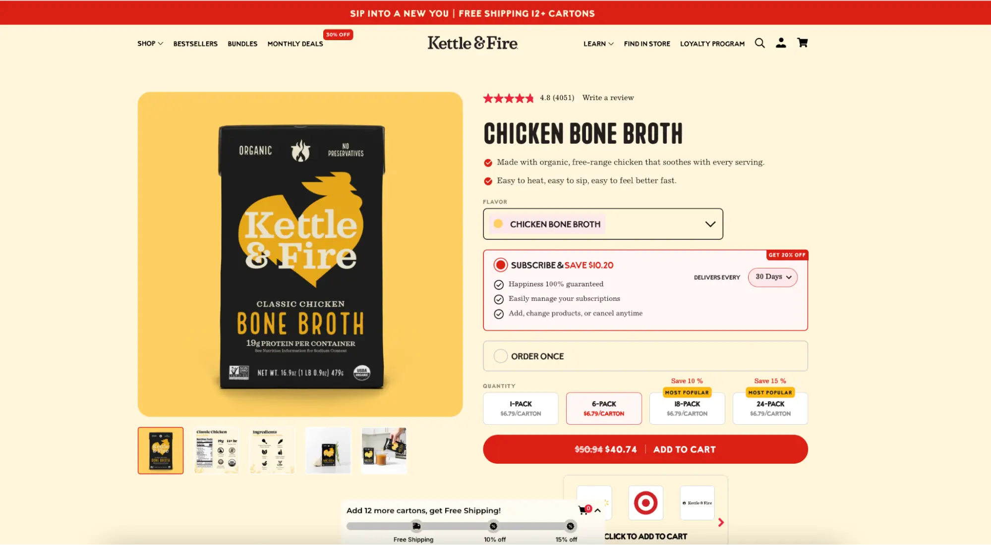
Product detail pages and product landing pages can look similar at a glance, but they serve fundamentally different purposes. Kettle & Fire, the bone broth brand, runs both simultaneously and the contrast is stark.
The Kettle & Fire product page has a full navigation bar, a dropdown linking to 12 product variants, a “More Kettle & Fire” section with additional products and bundles, a footer with four link columns, and a social media follow bar. It is a well-designed page. But someone who clicks a Facebook ad and lands here has more than 30 different ways to leave without buying. That is a problem.
The Kettle & Fire landing page for the same product lives on a completely separate subdomain and looks like a different page. There are no links to other products, no footer, and no social icons. Every link on the page either scrolls to a section below or goes directly to checkout.
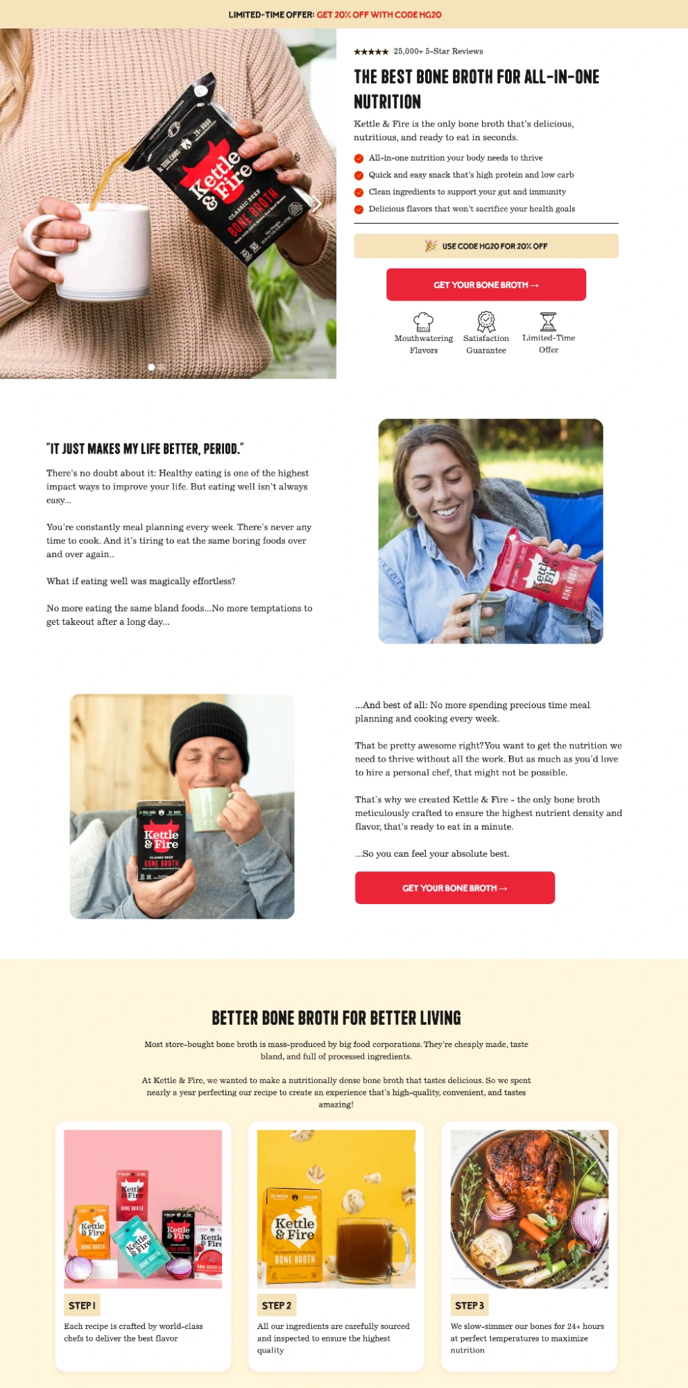
The page uses a limited-time discount code for urgency, expert quotes from recognisable health figures for credibility, and a 100% satisfaction guarantee to remove purchase risk. The only way off the page is to buy or close the tab. That is the 1:1 conversion ratio in practice.
| Criteria | Product Landing Page | Product Page |
|---|---|---|
| Purpose | Drive one campaign conversion action | Inform and assist browsing visitors |
| Navigation | Removed | Full site navigation is present |
| Conversion ratio | 1:1 (one CTA) | Many links, many possible exits |
| Primary traffic source | Paid ads, email, direct campaigns | Organic search, site navigation |
| Personalization potential | High: tailored per ad group or audience | Low: serves all visitors equally |
| Testing capability | Designed for A/B testing | Changes affect all organic traffic |
| Lifespan | Campaign-specific or evergreen by offer | Permanent site asset |
When the goal is to convert paid traffic efficiently, a dedicated product landing page is the right tool. A product page serves a different audience with a different intent.
So, what makes product landing pages convert
Design aesthetics matter less than conversion mechanics. The most visually striking pages still fail if they violate the fundamental principles that drive visitor action. These are research-backed, not opinions.
Above-the-fold value proposition
Research from Nielsen Norman Group consistently shows that the content above the fold (visible without scrolling) receives significantly more attention than content below it.
Your headline, primary benefit, and CTA need to deliver a complete enough picture that a ready-to-buy visitor can convert without scrolling. Visitors who need more information will scroll.
Message match
When a visitor clicks an ad that says “Award-winning wallets built to last,” and the landing page headline says “Discover our full product range,” the disconnect registers immediately. Conversion rates drop. The strongest product landing pages maintain message match between the language, offer, and visual tone of the ad that drove the click. This is also a Quality Score signal Google directly measures and rewards.
Page speed and mobile experience
Slow pages cost conversions. For every second of mobile load delay, conversion rates can drop measurably: a pattern documented consistently consistently across Google’s own ad performance data. Core Web Vitals (LCP, INP, CLS) are now confirmed ranking signals, but their impact on conversion rates is at least as significant as their impact on rankings.
💡 Pro tip: A slow product landing page is a paid traffic problem, not just a technical one. Instapage’s Thor Render Engine® handles page performance at the infrastructure level so your product pages load fast without you having to optimise anything manually.
Scannable layout and visual hierarchy
Eye-tracking research shows that visitors scan pages in predictable patterns before committing to read. A clear visual hierarchy: large headline, supporting subheadline, benefit list, CTA, and social proof.
This guides the eye through the conversion argument in order. Pages that bury the CTA or use uniform text sizes without contrast make visitors work harder than they should.
Minimal form friction
Baymard Institute’s checkout research shows that 18% of users abandon due to checkout complexity, and that reducing form fields is one of the highest-impact fixes available. The same principle applies to landing page forms: every field you add that isn’t strictly necessary is a reason to leave. However, product landing pages should ask for the minimum information needed to complete the conversion action, nothing more.
Social proof placement
Testimonials, review counts, logos, and awards are more effective when placed near the CTA, where the visitor is making their decision, than when buried below the fold. The goal is to resolve doubt at the moment of action.
Optimized elements to include on your product landing page
Problem-focused headline
The headline is the first thing a visitor reads and the primary signal for whether they are in the right place. The strongest product landing page headlines connect the visitor’s problem to your solution in one line.
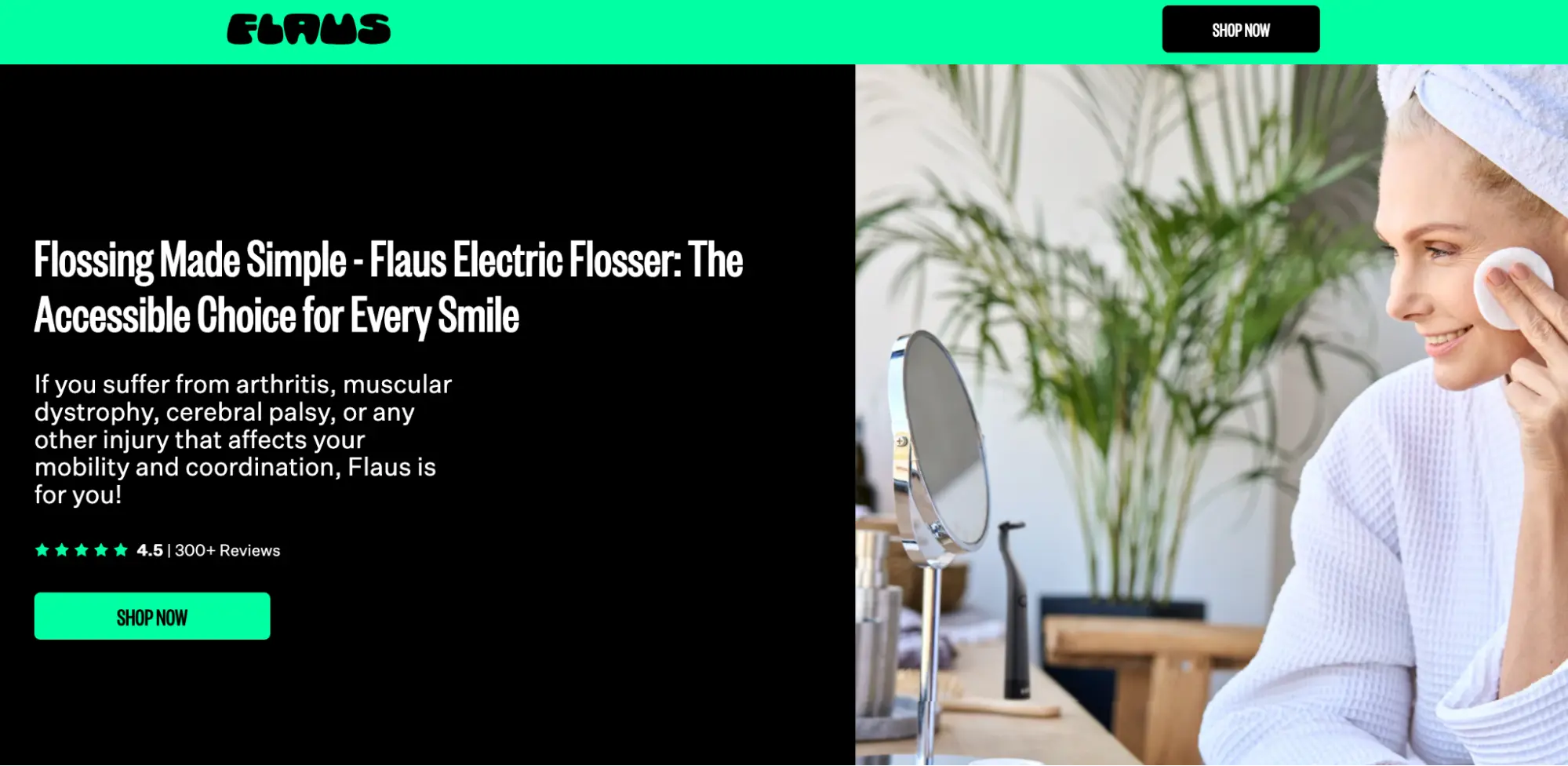
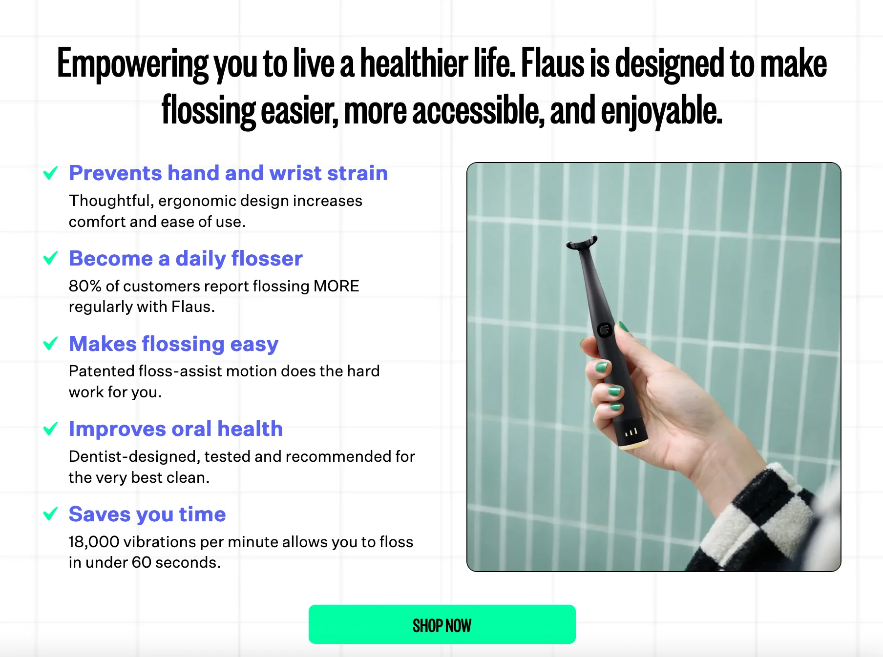
The Flaus electric flosser page does this precisely: “Flossing Made Simple” states the problem (flossing isn’t simple) and positions the product as the fix before the visitor reads another word.
Solution-focused sub-headline and hero section
The sub-headline expands on the headline and explains specifically how the product solves the problem. The hero section should include a lifestyle or product-in-use shot that makes the product tangible.
Flaus’s sub-headline does something most brands don’t: it names the audience directly. “If you suffer from arthritis, muscular dystrophy, cerebral palsy, or any other injury that affects your mobility and coordination, Flaus is for you.”
The benefit list below reinforces it: “Prevents hand and wrist strain,” “Become a daily flosser,” “Makes flossing easy.” Each benefit connects back to the same audience’s specific pain point rather than describing the product in generic terms.
Testimonials and trust indicators
Social proof converts skeptical visitors. Customer quotes, review star ratings, award logos, and recognizable client logos all reduce purchase anxiety. User-generated content: customer photos and video reviews. These can be particularly effective because it demonstrates real-world use.
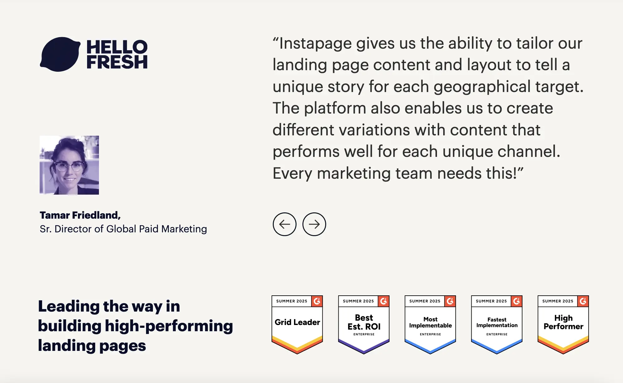
This Instapage credibility section shows two trust mechanisms working together: a named quote from a recognisable brand paired with five G2 Summer 2025 award badges.
Product images and screenshots
For physical products, lifestyle photography showing the product in use is more persuasive than isolated product shots on a white background. For SaaS products, UI screenshots that show the actual interface help visitors visualize the experience before they sign up.
Figma’s product page uses an interactive, animated presentation of the product in action: the visitor sees exactly what they are getting before any commitment.
Pricing and packages
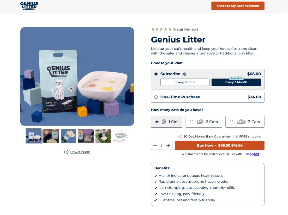
When pricing is available, displaying it on the landing page filters out visitors who won’t convert at that price point and builds trust with visitors who will.
The Genius Litter page shows clear pricing tiers so visitors can choose without having to click away to find out what they will pay. Avoid hiding fees or making visitors calculate the real cost.
Single, prominent CTA
CTA buttons should be visually distinct (contrasting color, sufficient size), placed above the fold, and repeated at logical points below the fold for visitors who scroll before acting.
The copy should state the specific action: “Start free trial,” “Shop now,” “Get your kit”, not the generic “Submit” or “Click here.”
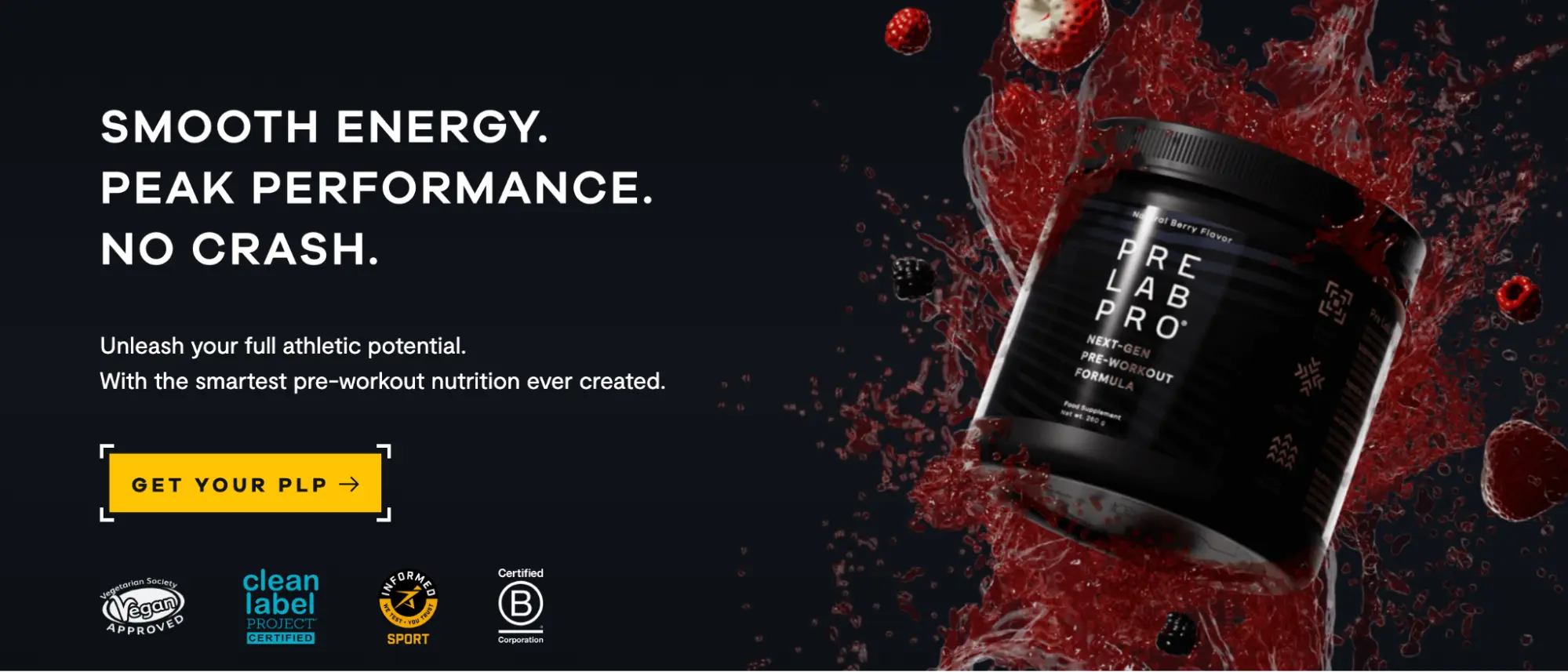
Pre Lab Pro’s CTA button does exactly that: yellow on black creates an unmissable contrast point, the bracket frame draws the eye directly to the button, and “Get your PLP” is specific enough to feel personal without requiring a second read.
Types of product landing pages
Before entering the gallery, it helps to know which type of page you are looking at: which type you need to build. Remember, different campaign objectives require different page architectures.
Single-product landing page
Built around one specific SKU, variant, or offer. Best used when your ad targets a specific product and you need tight message match. The visitor arrives knowing what they clicked for, and the page gives them exactly that. Examples: Recess, Oura Ring, and J’adore by Dior.
Multi-product landing page
Showcases a product family, category, or range. Useful when your ad targets a broader category or brand keyword rather than a specific item. The page helps visitors navigate to the right product within the family. Examples: Ridge, Beardbrand, Adidas, Medik8, Copper Cow Coffee.
Product launch landing page
Built specifically for a new release, pre-order, or waitlist campaign. Emphasizes availability, urgency, and risk reversal. The goal is to capture intent before the product is fully available or during a launch window. Examples: Airbnb host acquisition.
💡 Pro tip: Instapage Collections is designed for teams that need to scale across multiple page types: a single template can generate dozens of single-product, multi-product, or launch pages simultaneously, each with unique content.
15+ product landing page examples
Single-product landing page examples
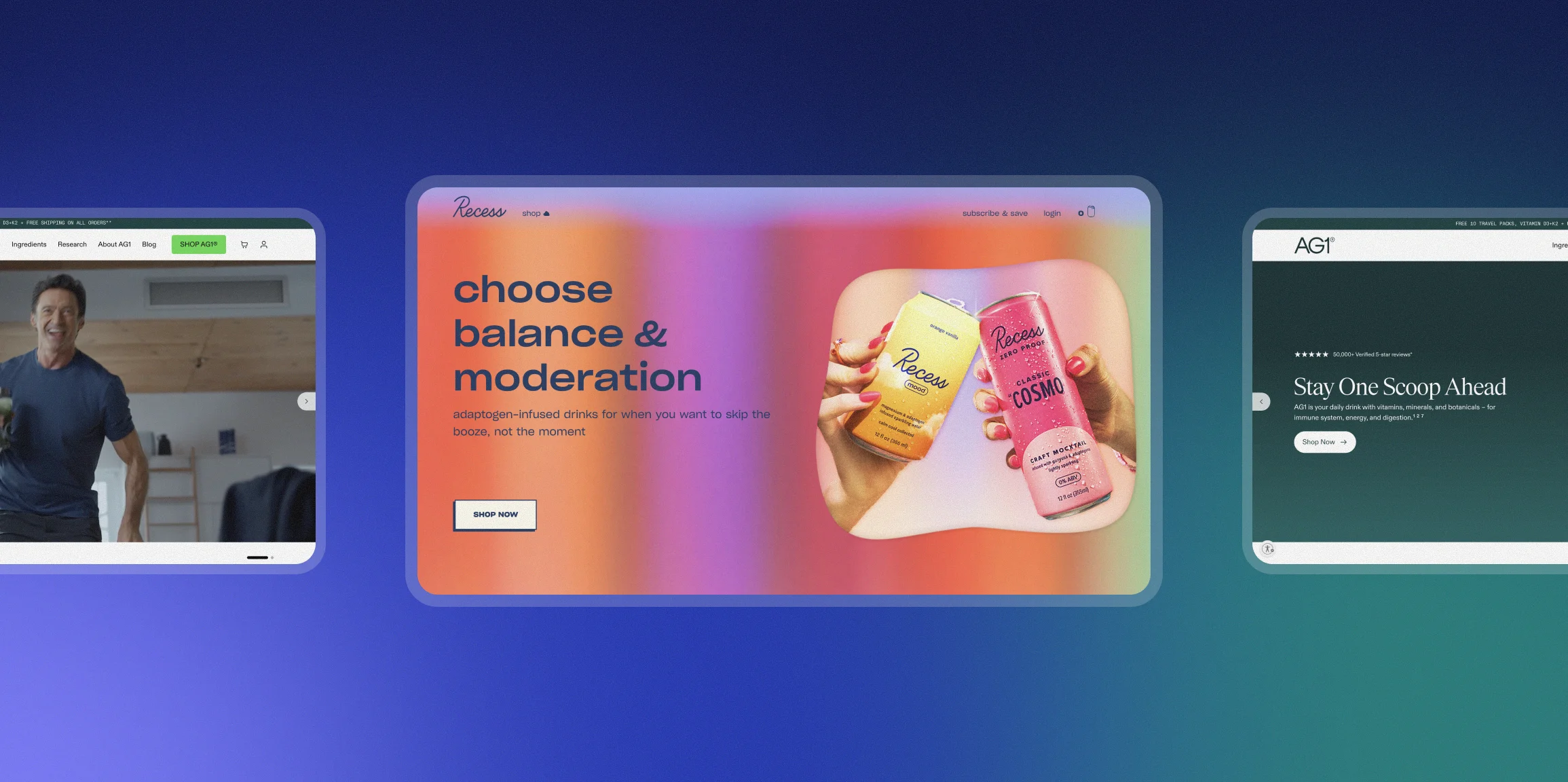
1. Recess
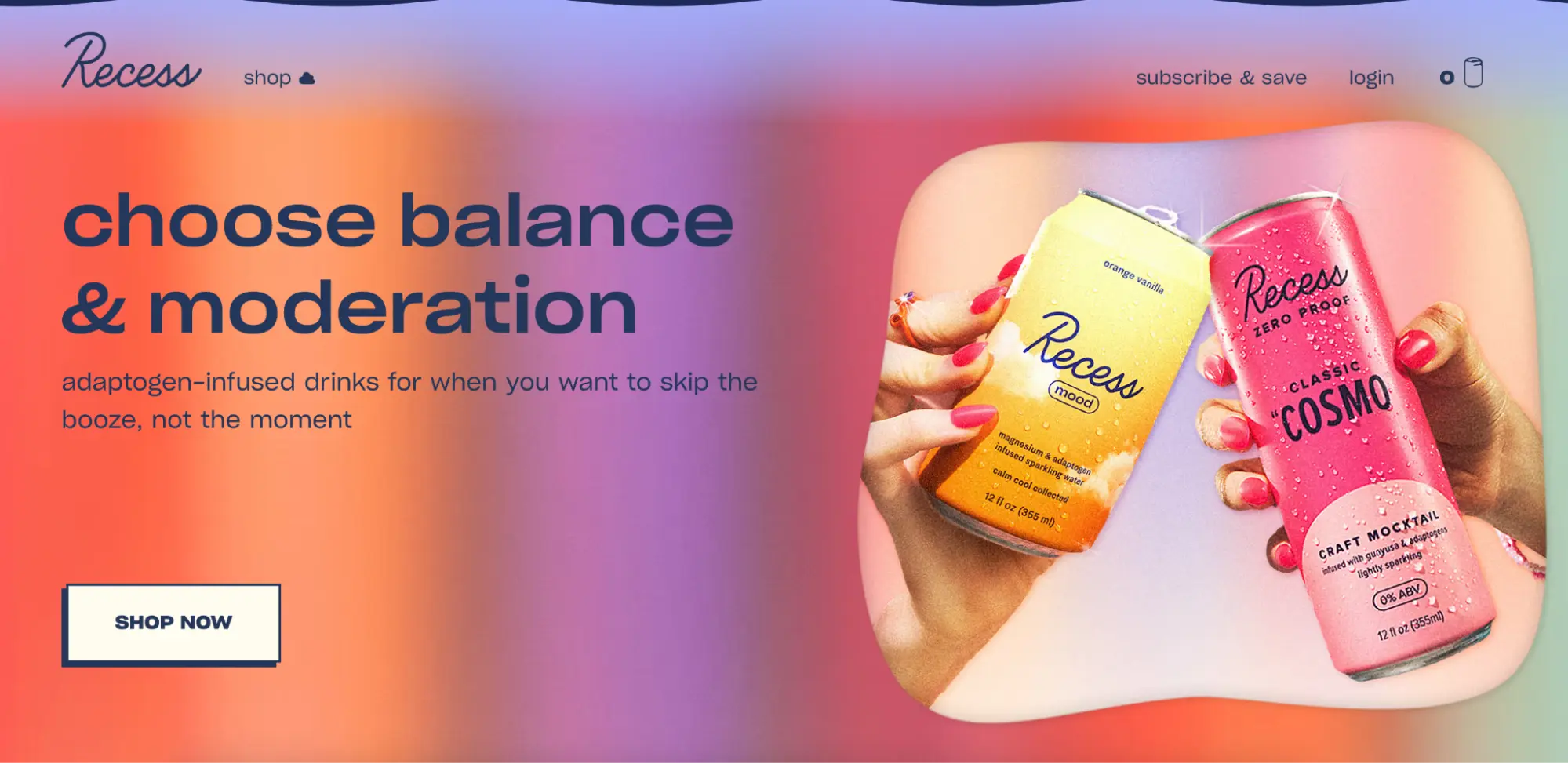
Recess sells sparkling water infused with hemp and adaptogens for stress relief. The hero section immediately establishes the target audience (people who want to relax without alcohol) and the primary benefit (helps them unwind). The page covers flavors, social proof, and a brand origin story: everything a visitor needs to convert someone who arrived curious.
Why it works: The headline and hero section complete a specific conversion argument above the fold. The audience self-selects immediately. Visitors who identify with “I want to unwind without drinking” are primed to convert before they scroll.
2. J’adore by Dior
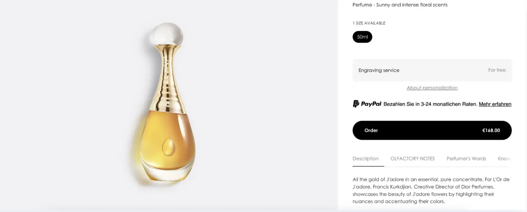
Dior’s J’adore page focuses exclusively on a single product. It uses cinematic video and imagery to communicate the scent’s identity rather than relying on copy alone. The history of the fragrance and the story of perfumer Francis Kurkdjian adds depth and brand authority without cluttering the page.
Why it works: For a luxury product, emotional resonance outweighs functional benefit copy. The page uses visual storytelling to justify the price before the visitor reaches a purchase decision, which reduces friction for high-consideration buyers.
3. Oura Ring
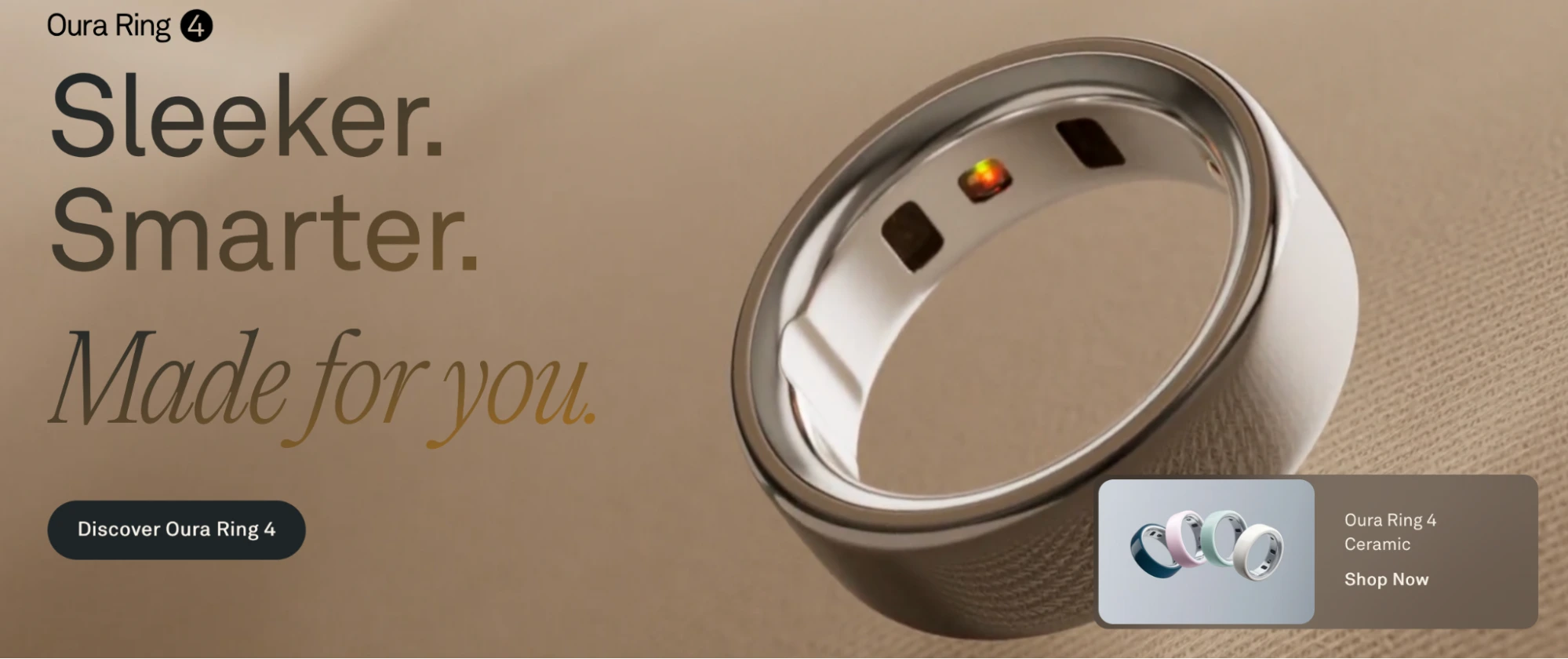
The Oura Ring page uses a clean, minimalist layout to communicate the health tracker’s benefits across multiple use cases (sleep, fitness, illness detection) without overwhelming the visitor. The ring itself is the hero image, and the benefit list is brief and scannable.
Why it works: Minimalist design reduces cognitive load. When a product is premium-priced and category-defining, restraint in copy and design signals confidence. The page lets the product carry the argument rather than over-explaining it.
4. Cowboy 4
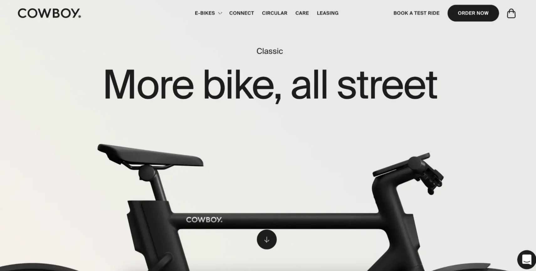
Cowboy’s e-bike page explains how the bike works, lists design details, and makes a direct case for why urban riders should choose a bike that adapts to their pedaling force. The 360-degree product view allows visitors to examine the bike from every angle before purchase, which is a critical feature for a high-consideration physical product.
Why it works: For premium physical products, the page must overcome the objection that the visitor can’t touch or test the product. The interactive view and detailed feature explanation reduce that uncertainty enough to support an online purchase decision.
5. Elegant Strand
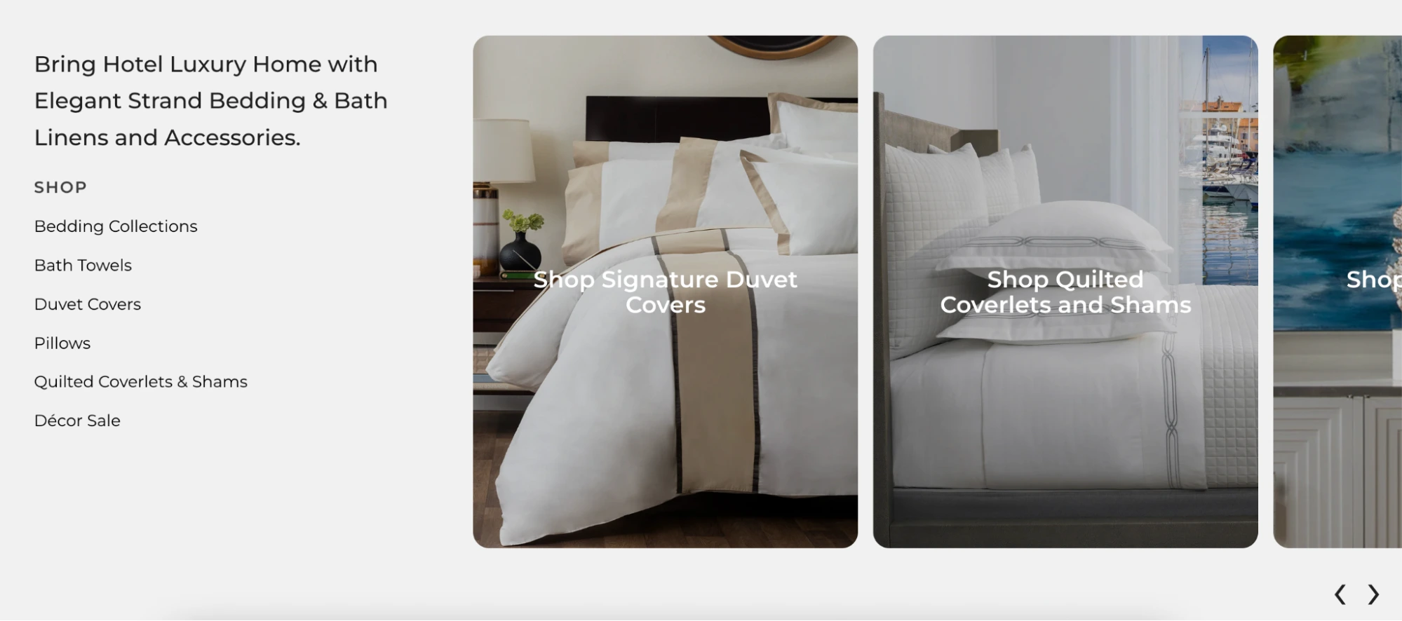
Elegant Strand sells luxury bedding and bath linen. The image slider shows how the products look in real home interiors: lifestyle photography that connects the product to aspiration rather than specification. The entire page is designed for its target audience: buyers who choose products based on how they fit a desired lifestyle.
Why it works: The page matches the visual sophistication of its audience. High-end buyers are not persuaded by price-first or feature-first arguments. Showing the product in aspirational contexts does the persuasion work that copy cannot.
Multi-product landing page examples
6. Hims
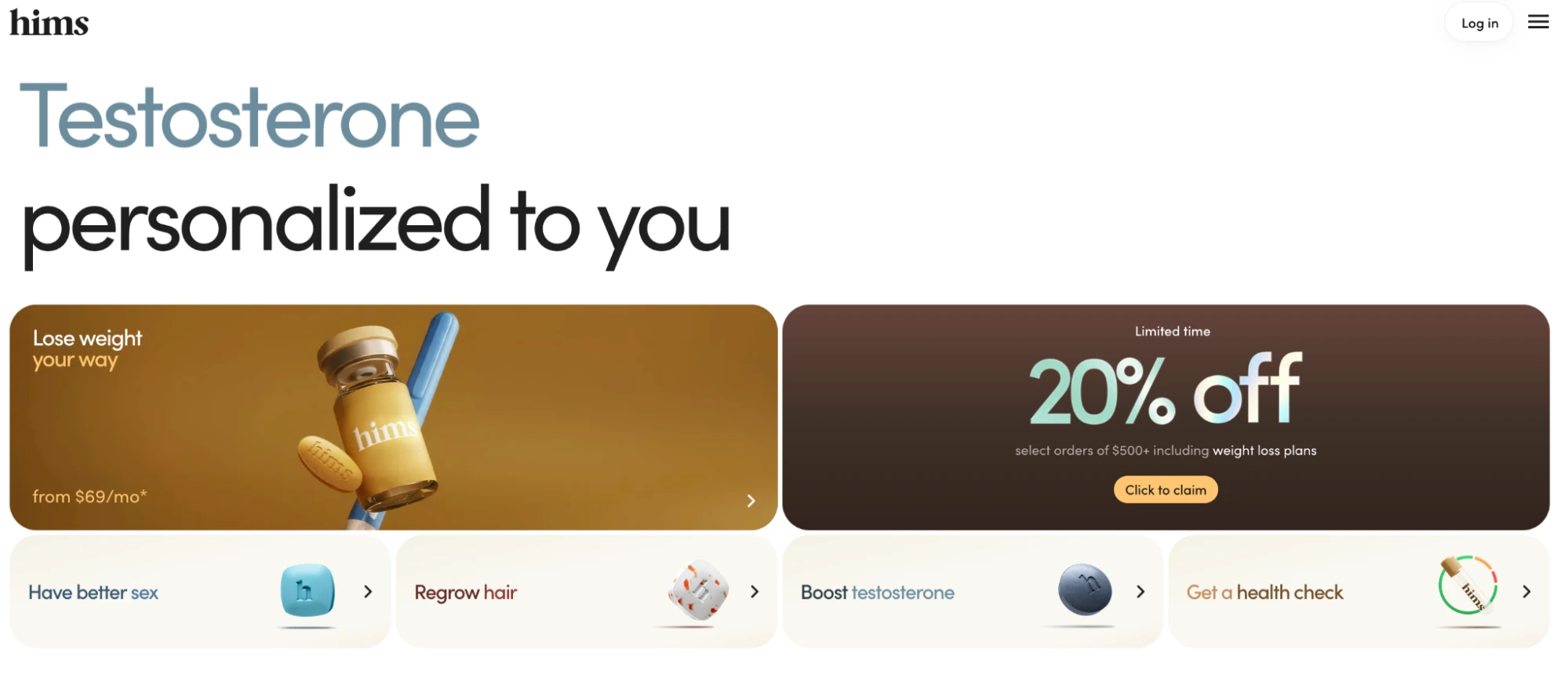
Hims uses a condition-targeted headline (“Testosterone personalized to you”) but serves it on a hub-style page that lets visitors self-select into their specific concern: weight loss, sexual health, hair regrowth, or a health check. A limited-time discount offer (20% off $500+ orders) sits persistently above the fold next to the hero product, creating urgency without interrupting the navigation flow. The page keeps navigation minimal (login and a hamburger menu only) to reduce exits while still giving visitors enough structure to find their condition.
Why it works: The headline targets a specific condition to match ad intent, but the self-selection tiles below handle the reality that different visitors arrive with different needs. The urgency offer is always visible without being the primary message, which drives action without cheapening the clinical positioning.
7. AG1 by Athletic Greens
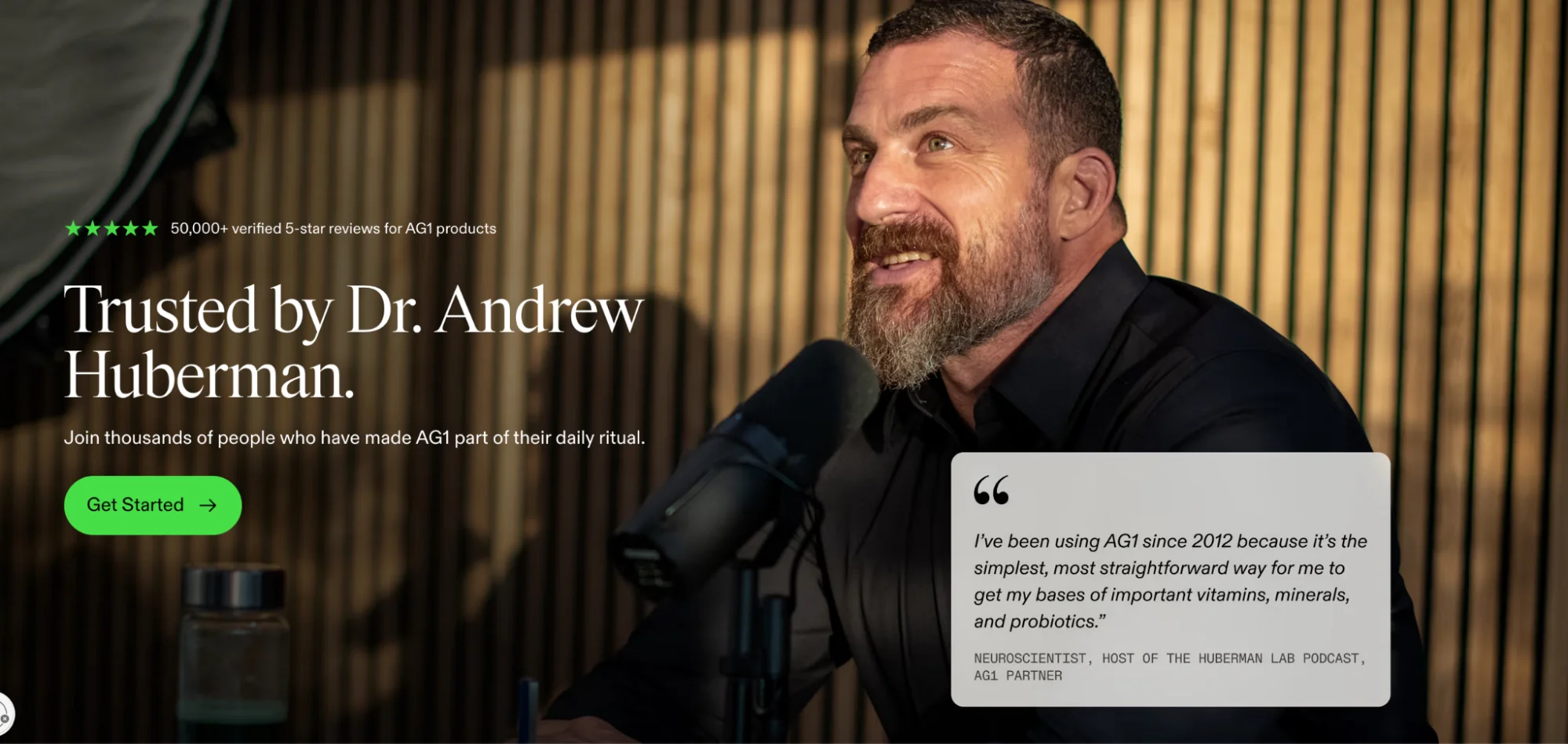
AG1 sells one product but runs dozens of landing page variations. Every significant traffic source gets its own page. Visitors arriving from the Huberman Lab podcast land on a page headlined “Trusted by Dr. Andrew Huberman”: his photo, his quote, and 50,000+ verified reviews above the fold before anything else. The underlying page structure is the same across influencer variants, but the hero is entirely personalised to the source. Below the fold, every variant converges on the same elements: clinical study results, an expert testimonial stack, and a subscription offer anchored by a welcome gift.
Why it works: Matching the landing page to the traffic source maintains message match for a channel where the “ad” is a podcast endorsement, not a visual creative. The influencer’s face and words above the fold borrow their credibility before the product makes any claims of its own.
Multi-product landing page examples
8. Ridge
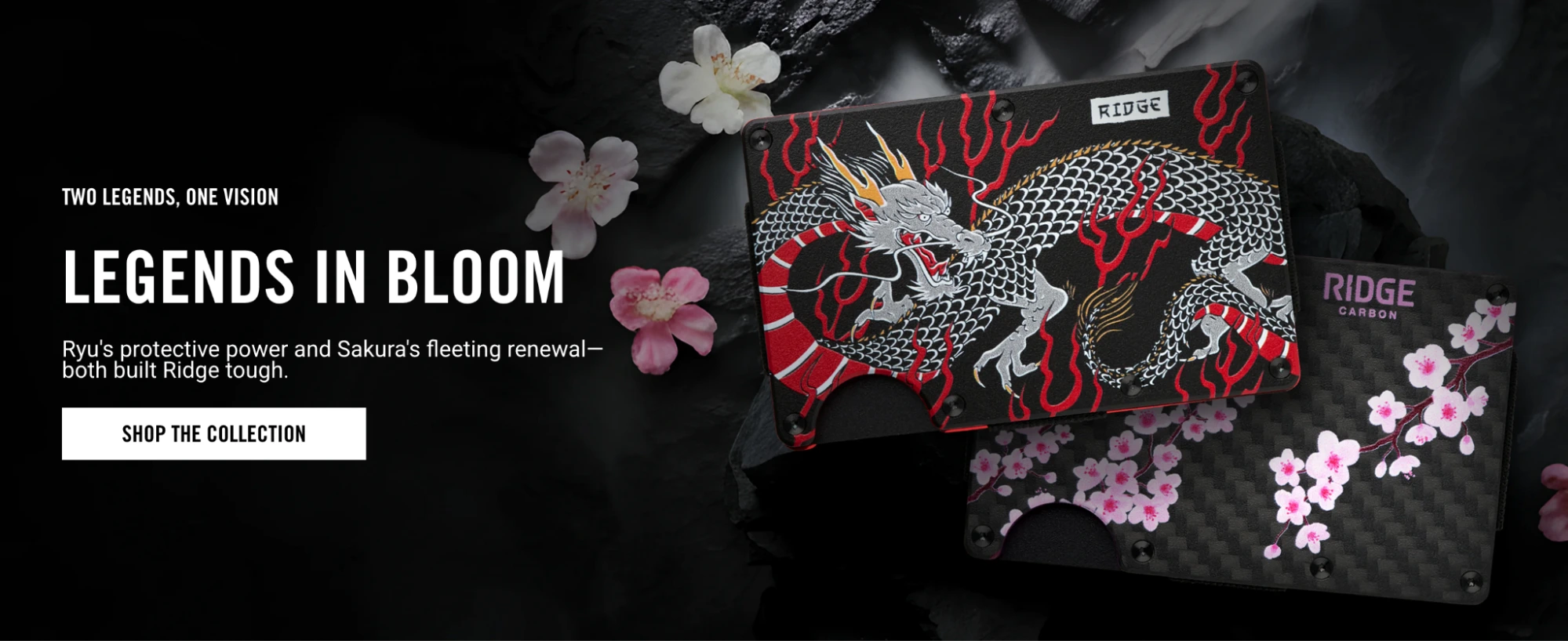
Ridge makes minimalist wallets, bags, rings, and accessories. The product landing page serves a brand keyword campaign: visitors who search “Ridge wallet” or click a brand ad arrive at a page designed to guide them to the right product within the family. Testimonials anchor credibility and the brand’s design philosophy is communicated consistently throughout.
Why it works: The page signals brand identity before product detail. For a direct-to-consumer brand, brand trust drives category-level purchase decisions more than individual product specs. The testimonials handle conversion anxiety at the page level rather than the product level.
9. Beardbrand
Beardbrand’s fragrances page presents multiple scents within a consistent visual and tonal identity: masculine, minimal, and lifestyle-driven. Natural imagery reinforces the product positioning and each fragrance is presented with enough description to differentiate without overwhelming.
Why it works: For fragrance: a product that cannot be smelled through a screen, so the page uses sensory language and natural imagery to approximate the experience. Presenting multiple options at the same quality tier lets visitors self-select rather than forcing a single product choice on a category-intent visitor.
10. Medik8
Medik8 serves visitors who are at the category level of search intent: “skincare products for my skin type.” The page organizes its range by category and provides guidance to help visitors identify the right product for their specific concern. The hero leads with a featured product while the navigation below handles discovery.
Why it works: Not all visitors arrive knowing which product they want. A multi-product page that serves category intent needs a filtering mechanism: whether by skin type, concern, or product type, so visitors can progress toward a purchase without leaving to search elsewhere.
11. Adidas

Adidas uses campaign landing pages to promote seasonal collections rather than individual products. The spring collection page leads with the campaign aesthetic: bold typography, 90s-influenced imagery, while surfacing new arrivals and trending items below. The design communicates the brand positioning as clearly as any product detail.
Why it works: For a brand campaign, the landing page needs to communicate an identity, not just a product. Visitors who respond to the creative will explore. The page supports that exploration while maintaining the campaign’s visual coherence from ad to landing.
12. Copper Cow Coffee
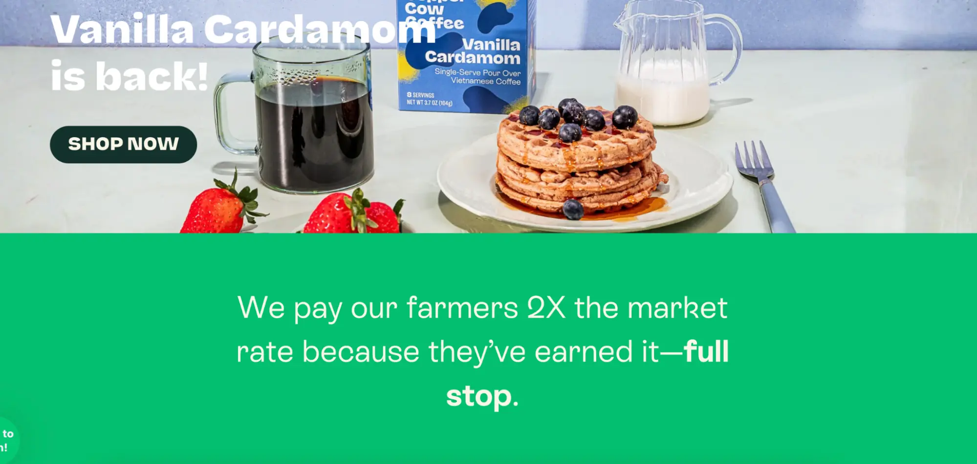
Copper Cow Coffee uses a multi-product page to showcase its range of pour-over coffees and latte creamers, all under a sustainability and authenticity brand narrative. The hero communicates the brand’s core differentiator (no preservatives, no artificial ingredients) before the visitor explores specific products.
Why it works: When a brand’s key differentiator applies across its entire range, establishing that differentiator at the page level before showing products filters in the audience most likely to buy. Visitors who care about clean ingredients are pre-qualified before they see the product list.
Product launch landing page examples
13. Nauto

Nauto offers AI-powered driver safety and fleet management products. The product page hero demonstrates the technology in action using video: showing collision prediction and avoidance rather than describing it. The use case focus makes a complex B2B product immediately tangible.
Why it works: For a new-category technology product, showing the product working is more persuasive than describing what it does. Video demonstration reduces the cognitive gap between “I don’t understand what this is” and “I can see why my fleet needs this.” For product launch pages, this principle matters even more: visitors have no existing mental model for the product.
14. Airbnb host acquisition
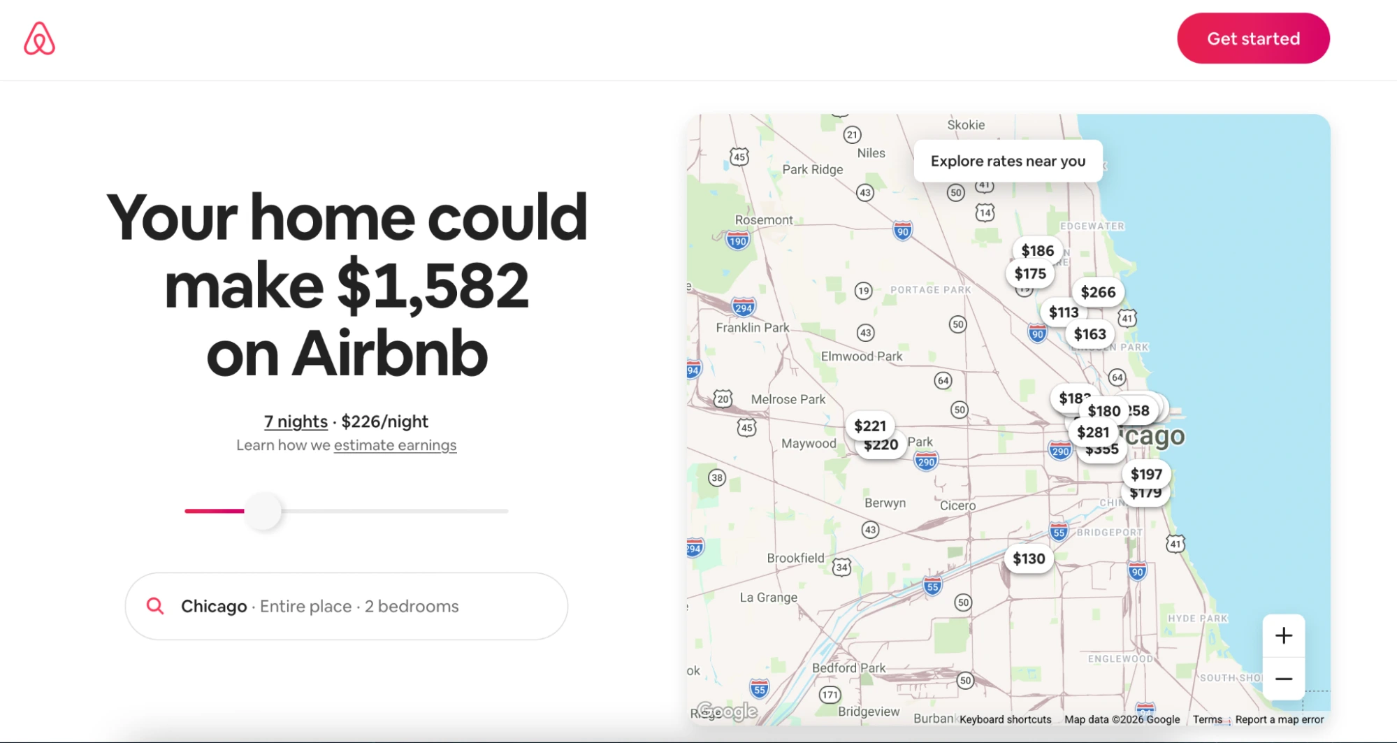
Airbnb’s host acquisition page targets a specific audience segment: people who have not yet listed a property, with a highly focused conversion argument. The hero section uses diverse portraits to immediately signal that hosting is accessible to many types of people, then builds the case with benefit-focused copy and social proof from existing hosts.
Every element on the page exists to resolve one of those objections. Navigation and irrelevant content are absent.
💡 Pro tip: Instapage Personalization enables this kind of audience-specific experience to be served at scale, so the same page delivers different messaging to different segments.
15. Turtle
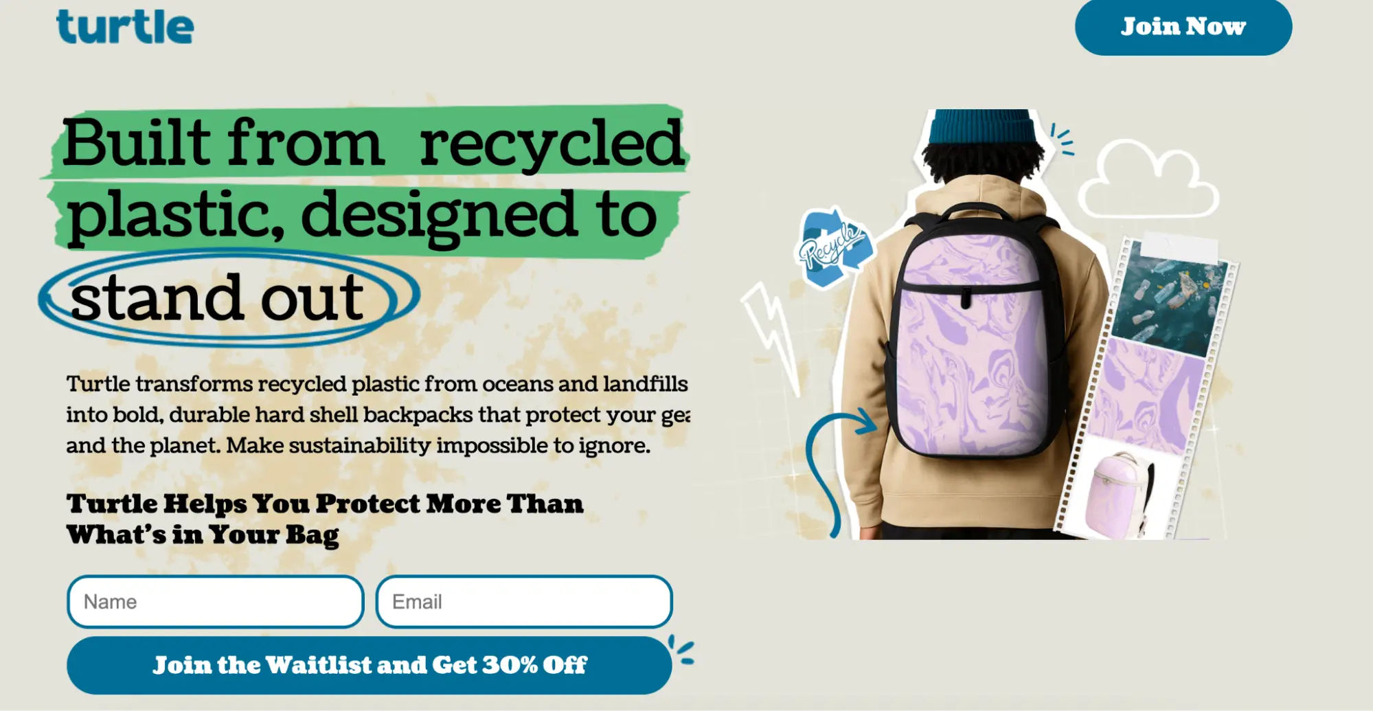
Tierra makes hard shell backpacks vacuum-formed from recycled ocean and landfill plastic, each with a unique colour pattern. The launch page leads with the product’s core tension: “Built from recycled plastic, designed to stand out.” No nav, no shop link — just a single waitlist CTA with a 30% off incentive. The founder story (a Tesla supply chain engineer who knew exactly how recycled materials are usually avoided) handles the sustainability credibility question without a testimonial section.
Why it works: Most eco brands bury the recycled materials angle. Tierra makes it the headline. The 30% off waitlist incentive converts pre-launch curiosity into a qualified list before the product ships.
16. Teenage Engineering
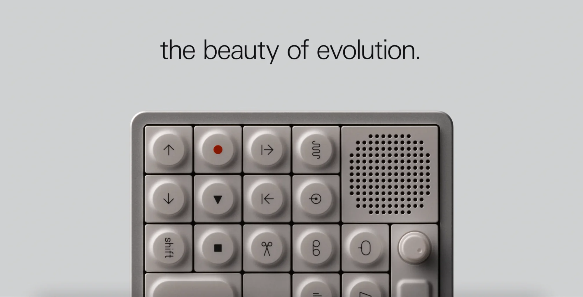
Teenage Engineering’s OP-1 Field page opens with a two-word tagline, “the beauty of evolution,” before any feature explanation. The copy leads with feel and identity rather than specs, then delivers a dense scrolling feature list with no endorsements and no urgency mechanics. Pricing lives on a separate store page.
Why it works: The page assumes the visitor already knows the brand and is looking for confirmation, not persuasion. The absence of countdown timers or discounts is itself a positioning statement that only works when community does the top-of-funnel work.
How to build a product landing page step by step
1. Define your conversion goal and match it to a page type
Before opening a builder, determine the single action you want the visitor to take: buy now, start a free trial, join a waitlist, request a demo.
That goal determines your page type. A waitlist page needs a different structure than a direct-purchase page. A category campaign needs a multi-product page; a specific ad group needs a single-product page.
2. Choose a template or start from a blank canvas
Instapage’s 200+ conversion-tested templates are organized by industry and use case, so you can start from a structure that has already been tested in your category rather than designing from first principles. Select the template that most closely matches your page type, then customize it to your offer and brand.
3. Build the page structure
The structure follows the design principles covered earlier: hero section (headline, value prop, CTA, trust signal) above the fold; benefits, social proof, FAQ, and secondary CTA below. Use Instapage’s drag-and-drop builder to arrange and adjust elements with pixel precision. No code required.
4. Generate and personalize copy with AI Content
Instapage AI Content generates headline, paragraph, and CTA variations directly inside the builder. AI is increasingly central to how marketing teams scale content production.
5. Collaborate, review, and publish
Use Instapage’s built-in collaboration tools to share the page with stakeholders and collect feedback without sending files back and forth. Once approved, publish to your custom domain.
6. Test and optimize
Publishing is not the end. It is the beginning of the optimization cycle. Instapage Experimentation supports server-side A/B testing so you can run headline tests, CTA copy tests, and layout tests on live indexed pages without slowing down load times or harming SEO signals.
Use heatmaps to identify where visitors engage or drop off, then use those insights to form the next test hypothesis. Conversion improvements compound over time when testing is systematic rather than occasional.
How to measure product landing page performance
A product landing page that looks good but isn’t measured is just decoration. How much your conversion rate improves depends on how consistently you test and what you do with the data. Here is a practical goal-to-KPI framework for evaluating performance at every stage of the funnel.
| Goal | KPI | What it tells you |
|---|---|---|
| Convert visitors | Conversion rate | The percentage of visitors completing the primary CTA |
| Reduce acquisition cost | Cost per conversion | What each lead or sale costs, accounting for ad spend |
| Assess traffic quality | Bounce rate, time on page | Whether the audience arriving matches the offer |
| Understand engagement | Heatmap click and scroll data | Which elements are driving or blocking conversion |
| Measure revenue impact | ROAS, blended CPA | Whether the page is improving overall ad return |
| Monitor page experience | LCP, INP, CLS scores | Whether the page meets Core Web Vitals thresholds |
Conversion rate is the primary metric. Track it by traffic source so you can distinguish between audience quality problems (the ad is bringing the wrong visitors) and page performance problems (the right visitors are arriving but not converting).
Cost per conversion is the metric that makes the business case for landing page investment. As conversion rates improve through testing, cost per conversion drops even if ad spend stays flat.
Heatmaps reveal the behavioral data that analytics dashboards can’t show. A page with a low conversion rate and a low scroll depth has a different problem than a page with a low conversion rate and a high scroll depth. Heatmaps tell you which.
Core Web Vitals scores matter for both paid and organic performance. In Search Console’s Core Web Vitals report, field data updates on a 28-day rolling window: changes take time to register.
Instapage provides built-in analytics with real-time reporting for visitors, conversions, conversion rate, cost-per-visitor, and cost-per-lead across devices, without requiring a separate analytics integration to get started.
Build product landing pages that earn the click
Product landing pages convert better than generic product pages because they do one thing: eliminate everything that isn’t the conversion path. The examples in this guide show how brands across physical products, ecommerce, SaaS, and enterprise technology apply that principle, each in a way that matches their audience, price point, and campaign type.
The common thread across every high-performing example is not aesthetics: it is discipline. One goal, one CTA, message match with the ad, social proof at the moment of decision, and a page that loads fast enough not to lose the visitor before they reach the fold.
If you are ready to build product landing pages that apply these principles, explore Instapage’s 200+ templates and start a 14-day trial to access the full suite of build, test, and optimization tools without writing a line of code.
Frequently asked questions
What is a product landing page?
A standalone web page built for a specific campaign to drive one conversion action related to a product. Unlike product detail pages, it removes navigation and distractions to maintain a 1:1 conversion ratio. Instapage offers 500+ templates designed for this purpose.
What is the difference between a product page and a product landing page?
A product page lives in your site’s navigation and serves browsing visitors with broad information. A product landing page is campaign-specific, distraction-free, and built for a single CTA. For paid traffic, a dedicated landing page consistently outperforms sending visitors to a product page.
What should I include on a product landing page?
At minimum: a problem-focused headline that matches your ad, a hero image or product visual, a clear benefit statement, social proof, and a single prominent CTA. Instapage lets you build all of these elements without code and run A/B tests to find what performs best for your specific audience.
How do I create a product landing page without a developer?
Use a no-code builder like Instapage. Choose a conversion-tested template, customize it with drag-and-drop, generate copy variations with built-in AI, and publish to your domain: no dev time required.
Can I use one landing page for multiple products?
You can, but it depends on your campaign goal. A multi-product page works when visitors are in category-level consideration and need to compare options. For paid campaigns targeting a specific product, a single-product page with tight message match will typically deliver stronger conversion rates.
How do I know if my product landing page is working?
Track conversion rate, cost per conversion, and bounce rate. Use heatmaps to identify where visitors engage or drop off. Run A/B tests on headlines, CTAs, and layouts. Instapage Experimentation provides built-in analytics and testing tools to support this workflow without leaving the platform.

Try the world's most advanced landing page platform with a risk-free trial.
