
Placeholder text can confuse your visitors. The wrong font can obscure the message of your page. When so many small details come together to form a successful post-click landing page design, overlooking just one can cost you conversions.
That’s why it’s necessary, before finalizing your post-click landing page, to conduct a preliminary design review.
The preliminary design review
Designing a post-click landing page takes the coordination of an entire team of creatives. UX designers, copywriters, project managers, and developers all have a part to play in the process. (Learn how the Instapage Collaboration Solution can speed up that process.)
Often, before even a low-fidelity wireframe is drawn out, design teams answer these questions about every page element.
1. Why are we doing this / What problem are we trying to solve?
Let’s say, for example, you’re designing media for your post-click landing page. At step one, you want to identify the “why” behind your decision. Look at your post-click landing page. Why have you added media?
Is it to show prospects what your product looks like? Is it to explain how your service works? Use the answer to determine what kind of media would best accomplish your objective.
A hero shot can help visitors imagine a better life with your product. If your problem is “Our service is new and people don’t understand it,” an explainer video can showcase exactly how it works.
Never forget: Nothing on your post-click landing page should be designed without a purpose. Every element contributes to conversion rate.
2. Who are we doing it for?
Your preference for a particular title font? Forget it. That stock image you think is “cutting-edge”? Throw it out. The core of your design should revolve around what your visitors prefer.
Who are you creating this page for? What message will resonate with them? A good step toward fully understanding your prospects is creating buyer personas.
These research-based representations of your target customer segments will give you an idea of demographics and behaviors (and more) that you can use to base your post-click landing page design on.
Build them with the help of qualitative data from customer surveys and quantitative data from analytics tools. Before you have an idea of who you’re selling to, you can’t begin to strategize how to sell to them.
3. How will we know we’ve been successful?
If you’re going to implement a particular design element, you should have a way of measuring whether that element has accomplished your objective.
If you think a page with longer copy will best describe your service, you can measure its success with scroll depth and conversion rate.
If you think a video would work better than long copy, you might use plays as a metric and conversion rate to determine its success compared to a text-heavy page.
Make sure you’ve identified, beforehand, a metric capable of accurately measuring the success of your design elements. Otherwise, you won’t know what’s contributing to your conversion rate. And if you don’t know what’s contributing to your conversion rate, you won’t be able to improve it.
Elements to assess in the preliminary design review
“Treat every component as if it could be presented to a design contest,” says Microsoft designer Claudio Guglieri. “If you pay attention to every component, the whole will be more than the sum of its parts.”
Could each of your landing page components take home a design award? Before you send your landing page wireframes to development, it’s important to make sure. Catching errors now is crucial to avoiding costly mistakes after publishing.
While the answers to the three preceding questions vary from business to business, best practices for post-click landing page elements don’t. Ensure your page won’t drain your conversion rate once it’s live by evaluating the following:
Layout
For thousands of years, we’ve read with the help of a grid system. Today, columns and rows guide our eyes on the web as they did before the dawn of the internet, in magazines, books, and newspapers.
“These are the systems that were more or less directly carried over onto the web, and they work,” says Alex Bigman. “Word to the wise: many a designer has attempted to avoid the grid in the name of ‘creativity’; many such websites go unread.”
Research confirms this. One study from Microsoft and MIT found that when two groups of subjects were presented with different page layouts, one traditional and the other non-traditional, their responses were as follows:
- The non-traditional group overestimated the time it took to read the piece, and at times displayed physical displeasure with the layout in the form of a frown.
- The traditional group underestimated the time it took them to read the piece and reported higher focus while reading.
The same way layout conventions shouldn’t be avoided; design conventions shouldn’t be either. Jakob Nielsen’s law of web user experience states that internet users spend most of their time on other websites. On those other websites is where they’ve formed their expectations of how the web works.
For example, users have come to recognize underlined text as a hyperlink. Logos are most often located in the upper-left corner of the page, and clicking them usually redirects a user to the homepage (though, it shouldn’t be on your post-click landing page). A system’s familiarity greatly impacts user satisfaction, says Nielsen:
The more users' expectations prove right, the more they will feel in control of the system and the more they will like it. And the more the system breaks users' expectations, the more they will feel insecure.
Beyond design conventions, visual hierarchy directs visitors’ gaze to the most important content on a page. By creating one with techniques rooted in Gestalt psychology, you can use formatting to make your most important information stand out.
- Size: The bigger it is, the more attention it will command.
- Position: People consume pages from top to bottom, left to right. Therefore, elements in the upper-left will be viewed more often than ones in the lower-right.
- Color: Colors that contrast the rest of the page will draw attention.
- Density: Adding several elements to a small space will increase the amount of attention that area draws.
- Value: A darker object will draw appear more noticeable than a lighter object. Bolded words are more attention-grabbing, for example.
Elements that convey your most important information — Headlines, benefits, informational media, and your CTA button — should be formatted with the above characteristics to command reader attention.
Type
The ability of your page to convert relies heavily on type and its formatting. A wisely chosen font can boost trust and readability, while a poorly picked one can negatively impact both. Make sure that:
Your post-click landing page font is consistent with your website font
Brand consistency is a strong influencer of purchasing decisions. If loyal visitors don’t recognize the post-click landing page as belonging to your business, they may not trust that it is. Stay on-brand with fonts from Adobe Typekit and Google Fonts.
Your font is readable at all sizes
Usability expert D Bnonn Tennant recommends 16px because it’s close to what we see in books (screen on the left, book page on the right):
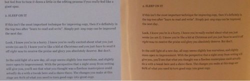
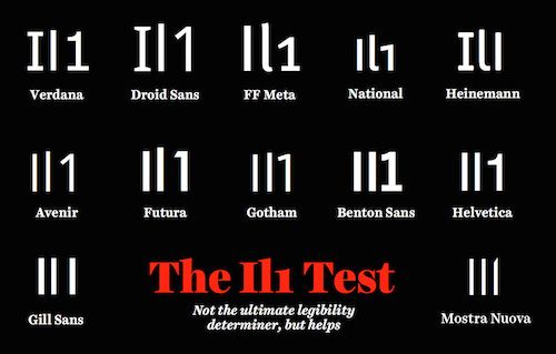
Use sans-serif text in body copy, as studies have shown serif is harder to read at smaller sizes online. A good way to ensure readability is by making sure your font can pass the “il1” test:
You keep different fonts to a minimum
Decorative fonts can draw attention and add a touch of personality to your post-click landing page. However, using too many will make your post-click landing page look like an online ransom letter:
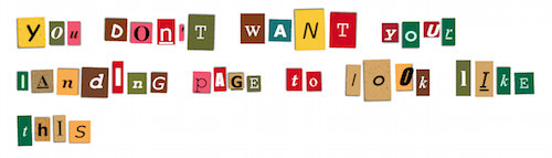
Stick to no more than two different fonts on your post-click landing page, otherwise you risk diluting the power of your brand, making your page appear disorganized, and hurting readability.
Your lines of text are a balanced length
Remember, people are used to reading with the help of a grid. If your lines of text disregard that grid and span the entire page, they’ll stretch the limits of visitors’ attention span. At the same time, if they’re too short, the reader’s eye will have to travel back too often, which will break their rhythm.
Subconsciously, jumping to a new line energizes the reader. But that energy wears off the longer a line gets. For that reason, the team at usability consultancy, the Baymard Institute, recommends a line length of between 50-75 characters.
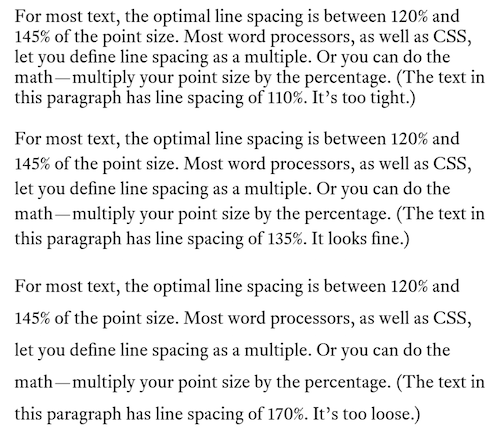
Your line spacing helps readability
The vertical space between your lines should find a balance between large and small. Too small and one line will start to blend with the one below it; too large and your visitor’s eye will get lost between one line and the next.
Font designer Matthew Butterick claims that, for maximum readability, spacing between each line should be a percentage of the font size — 120%-140% to be exact.
Text accommodates patterns of reading on the web
On text-heavy pages, readers tend to process a page in a pattern that resembles an “F.” On pages that feature images, that pattern looks more like a “Z.”
Make sure that, with the help of visual hierarchy, your text communicates your most valuable information in a way that accommodates visitors’ style of reading.
Headlines, subheadings, bullet points, and bolded letters all draw visitors’ eyes across the screen as they scan down the page.
You don’t break the left margin
When we read, the left margin is “home” for our eyes. Lines of text can end in many different spots, but the left margin is where our eyes bounce to after we complete it.
It’s for that reason you should always align your body copy left (headlines can be centered), and you should never break the left margin with elements like photos. Otherwise, you’ll make your post-click landing page much more difficult for your visitors to read.
Color
Picking the right colors for your post-click landing page has less to do with what colors mean psychologically, and more to do with how they draw the eye. With two to three colors (simple is better, studies show) chosen from the color wheel, you can create a scheme that directs attention to the elements involved in conversion: your form and CTA button.
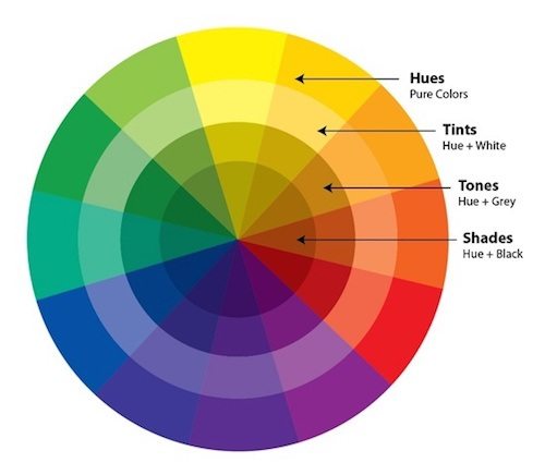
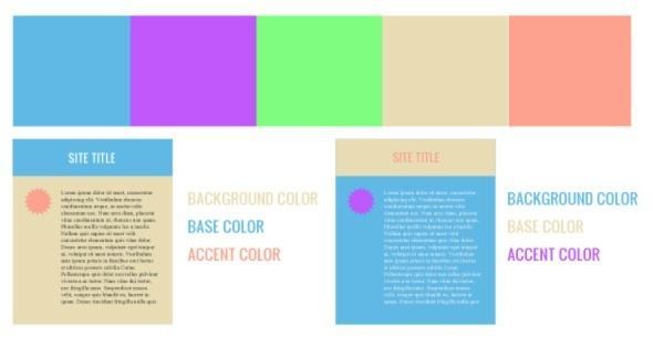
Complementary color scheme
Complementary schemes are created by choosing colors opposite each other on the color wheel. That opposition creates contrast between elements within this scheme.
Analogous color scheme
An analogous color scheme is created with neighbors on the color wheel. It won’t create the same level of contrast a complementary scheme will, but it’ll be visually easy to digest.
Monochromatic color schemes
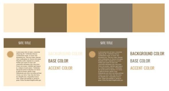
A monochromatic color scheme is created with tints, tones, and shades of the same hue on the color wheel. Because the differences between colors in a monochromatic scheme are subtle, they’re often paired with a single complementary color to make elements like the form and CTA button pop.
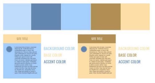
Does your color scheme reflect your brand?
Looking at those diagrams, you might be wondering how to pick a base, accent, and background color. The answer? Start with your brand’s colors.
- Use the colors in your logo as a starting point to create a color scheme that reinforces brand consistency.
- Then, create a base color by determining what your logo displays on.
- Lastly, pick a background and accent color (color of your CTA button) that contrast each other to draw maximum attention.
Learn more about whether you’ve chosen the right colors here.
Navigation menu, footer
These are perhaps the easiest design elements to check off your list. Look up at the top of your post-click landing page wireframe. Has someone drawn out a navigation menu? If so, scrap it.
Now, look down at the bottom. Has a footer with numerous sitelinks been sketched out? If so, remove them.
The conversion ratio of your post-click landing page should be 1:1, meaning there should only be one clickable element on your post-click landing page — your CTA button. Studies reinforce the idea that outbound links decrease conversion rate, so keep your visitors focused by excluding them.
Images
Media can be a powerful persuader on your post-click landing page when used the right way. Some images you’ll want to consider featuring:
- Product images that give your visitors an idea of what your offer looks like, or how it works.
- Infographics that convey information in a visually easy-to-digest way. Graphs and charts are great for helping people compare data sets.
- Hero shots that help the visitor imagine how their life would improve with your offer.
- Company logos that highlight trusted brands you’ve worked with or well-known publications you’ve been featured in.
- Security badges that let visitors know they’re safe on your page.
- Authority badges that highlight awards your business has won.
As you review your post-click landing page design, ensure these images make sense in your layout. Security badges are most effective next to a form. Hero shots should be awarded prime real estate on your page, as should authority badges. Where the image is located is just as important as what it’s communicating.
Form design
Since it’s often the primary source of friction on a post-click landing page, your form needs to be designed particularly carefully. When it’s not, poor labels can confuse visitors, and unnecessary fields can scare them away.
During your preliminary design review, consult the Nielsen Norman Group’s best practices for form design when evaluating your own:
Does it solicit only the information you absolutely need?
Your marketing and sales teams should be in agreement on the definition of a qualified lead at different stages of the buyer’s journey. That definition should include the information you need to capture from prospects at each stage.
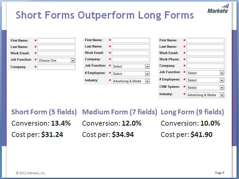
Make sure your form only requests information that you’ve deemed necessary to ensure prospects are a fit for your business. With each form field you remove, your chance of converting grows. Just ask the team at Marketo:
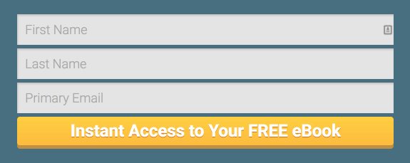
Are your fields presented in a single-column format?
Instead of laying them out horizontally or in a dual-column format, make sure your form fields are presented in a single column. Two columns will interrupt the downward progress of your visitor as they fill out each field (an exception can be made regarding related fields like city/zip code).
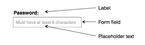
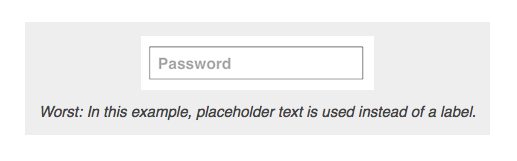
Are similar fields and labels grouped together?
Fields like first name and last name, city and zip code, credit card and CVV should be close to each other — as should identifying information like labels. Those labels should be above each field instead of within it, as research has shown disappearing placeholder text has the potential to frustrate and confuse visitors.
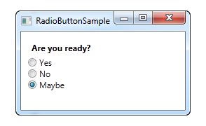
Can you combine or alter form fields to reduce friction?
If your form uses a drop-down with less than three options for response, consider converting it into something easier to complete, like a set of radio buttons:
If you’re designing a squeeze page form that asks for first name and last name, consider combining the fields or even removing last name (some pages don’t even ask for name at all).
To make things even easier, consider offering social autofill to allow visitors to convert with the click of a button.
Button design
Often, post-click landing page visitors take for granted they know exactly where they need to click to claim an offer. That’s the result of good button design — and it’s what you should aim for too.
Prospects are already thinking hard to determine your trustworthiness and the value of your offer. Don’t make them work harder to determine how to claim it. Avoid inadvertently hiding your button with the wrong design by checking the following:
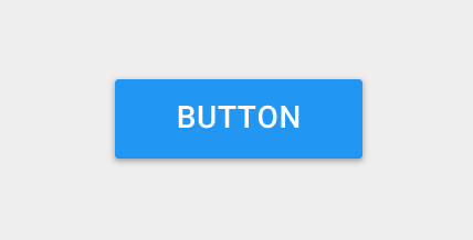
Does your button resemble a button?
Look down at the buttons on your keyboard. These are the ones your prospects are used to pushing in the real world. Yours should look similar.
How similar? It depends on your audience.
Skeuomorphic buttons
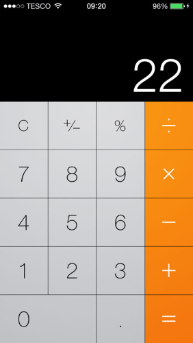
For audiences that aren’t as internet-savvy, skeuomorphic design techniques can help make a button identifiable. Skeuomorphism is a style of design that mimics the makeup of objects in the real-world. Here’s an example of a digital calculator created with skeuomorphic design:
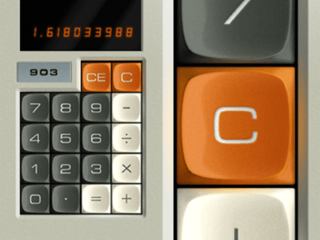
Three-dimensional effects like shading make the buttons appear pushable. They’re what we’ve been accustomed to since the early days of the internet:
So if, when creating your buyer personas, you discover that your audience doesn’t spend a lot of time online, this type of button could be the one you include on your post-click landing page. Here’s a highly stylized one:
If you expect your visitors to be more experienced internet users, though, they may not need cues like shadows to identify a button. You might be able to employ the use of…
Flat buttons
Flat design is a technique that doesn’t revolve around recreating objects in the digital world. It’s a more minimalistic approach.
Buttons created with this technique don’t rely on harsh shadows and highlights to make themselves identifiable. Here’s a calculator again, only designed with flat techniques:
Here’s a flat button on a squeeze page:
Research has shown, though, that this technique can confuse and frustrate even seasoned internet users by excluding clickability indicators like 3D effects. Kate Meyer explains:
Users are forced to explore pages to determine what’s clickable. They frequently pause in their activities to hover over elements hoping for dynamic clickability signifiers, or click experimentally to discover potential links.
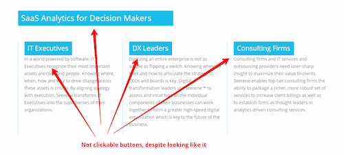
This behavior — clicking at random to find a button or link — is sometimes rewarding. Sometimes what visitors click is actually a clickable button, and sometimes it’s not. Meyer expands:
Even though users are mostly able to find their way through interfaces with this exploratory behavior, they’re still being forced to do extra work and are being distracted from their primary goals without gaining any tangible benefit.
As a result, many post-click landing page designers create buttons that achieve a balance between flat and skeuomorphic.
Flat 2.0
That balance is known as “Flat 2.0,” “semi-flat,” or “almost flat” design. Here’s a semi-flat button:
The technique uses shadows and highlights to indicate clickability, but in a much more subtle way. When choosing among flat, semi-flat, and skeuomorphic, always think of your user, says Meyer:
Don’t make design decisions that sacrifice usability for trendiness. Don’t forget that—unless you’re designing only for other designers—you are not the user. Your preferences and ability to interpret clickability signifiers aren’t the same as your users’ because you know what each element in your own design is intended to do.
Does your button draw attention?
To draw attention to your CTA button, fill it with a color that has been used sparingly (or not at all) on your post-click landing page. Because of this case study, red was once thought to outperform the color green:
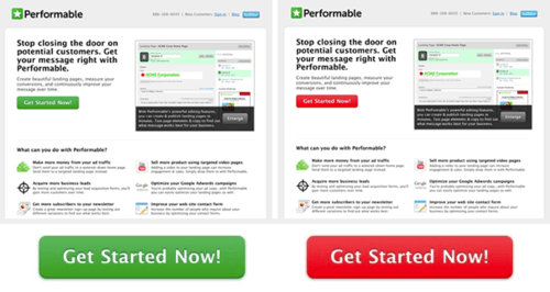
But when you take context into consideration, you realize that the red button probably beat green because it stood out among several other green elements on the page (the money icon, the logo, the photo).
If you’re creating a design scheme using color theory, your CTA button is your “accent” color. It’s most noticeable when contrasted with a hue on the opposite side of the color wheel (see “Color” above).
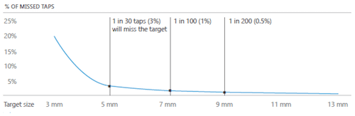
Is your button big enough?
Today, the internet is accessed primarily via mobile devices. That means people who reach your post-click landing page will need to be able to press your button with their finger. Is yours big enough?
A study by MIT shows that the average touchpad is between 10 and 14mm, which makes 10x10mm a good minimum button size:

Any smaller, data says, and you’ll boost the odds of user error:
Save conversions with a preliminary design review
Catching mistakes in the preliminary design review will save your team time and your business conversions after your post-click landing page is live. Before you finalize it, make sure you can answer all the above questions, and check off every box on the Instapage Publishing Checklist.
Always connect all your ads to personalized post-click landing pages to lower your cost per customer acquisition. Start creating your dedicated post-click pages by signing up for an Instapage Enterprise demo today.
See the Instapage Enterprise Plan in Action.
Demo includes AdMap™, Personalization, AMP,
Global Blocks, heatmaps & more.
