In a world where a few copy adjustments can earn a company $300,000,000, and an expertly written editorial print ad can birth an entirely new industry, logically we can only come to one conclusion about words in marketing:
They matter. A lot.
They can make your ebooks more interesting and your social media posts more entertaining; but there’s one place where they’re even more crucial: on post-click landing pages.
Why?
As you likely know, post-click landing pages are designed for just one purpose: conversion. So while you can get away with adding some fluff to an ebook or a clever pun to a Tweet, that won’t fly on a post-click landing page where your visitor wants to quickly determine the value of your offer.
It’s here that persuasiveness and brevity are essential — because your audience doesn’t read the way you hope they do.
How people actually read
While most copywriters like to imagine that every word they craft, every sentence they agonize over, will be read in great detail by their audience, that couldn’t be further from the truth.
For the most part, people don’t read that way. They skim.
And while focusing is something we’ve become worse at in recent years (our attention span has shortened to a mere 8 seconds), research has shown that we’ve been skimming for a long time.
Nearly 40 years ago, Siegfried Vögele, dean of Munich’s direct marketing association, used cameras to track people’s eyes as they saw a printed page for the first time.
What he found was that the sections of the page with the most ink attracted the most attention. Readers glanced to images and headlines first, then at brief, bolded text like subheaders, captions, and bulleted lists. Block text and long copy were digested last.
A decade later, a Poynter Institute study reinforced the dean’s original findings. Drs. Mario Garcia and Pegie Stark Adam found:
- Most people entered a page through the biggest illustration, then looked to big headlines, then captions, and lastly, block text.
- The parts of the page viewed the longest were photos, followed by headlines and advertisements, then bullets and captions. Readers spent the least amount of time reading long copy.
More recently, in 2013, Charbeat teamed up with Slate Magazine to find out how much content we read online. The result was this piece, titled “You won’t finish this article,” which claimed that internet readers only made it through about 50-60% of any given post.
Now, in-depth reading does take place, but mostly when we read for pleasure. Researcher Victor Nell found that we fall into somewhat of a effortless trance when reading text we’re interested in. We read more slowly, and pay closer attention.
However, most post-click landing pages are not going to be the subject of pleasure reading (although some sales pages can be pretty darn engaging). Your visitors are there to get information. As a result, you have to make every word on your post-click landing page count. Here’s how:
Make your post-click landing page content skimmable
To turn your copy into something people will actually absorb, Shanelle Mullin over at CXL suggests you optimize for three things:
- Legibility — how easily a reader can differentiate between different letters and characters in text. Does your font pass the “iI1” test?
- Readability — how easily someone can understand a text. Can your readers process the vocabulary you’re using? The syntax?
- Comprehension — how well your readers can understand your subject. Are you explaining concepts simply enough?
1. Legibility
Choose an appropriate font
If you read our articles on Adobe Typekit and Google Fonts, you know that some fonts are better suited to headlines, while others are better for longer copy. Here’s an example of a decorative one that would look okay in a logo, but awful in block text:
![]()
Test smaller copy using the “iI1” test. Are all of these characters easily discernable from each other in your chosen font? If not, it’s wise to choose another.
Make sure your font is big enough
There’s been all kinds of testing on the best font size for reading on the web. Years ago, Michael Bernard of Usability News found that people preferred different fonts at different sizes.
However, more recent evidence from D Bnonn Tennant suggests that 16px works best (below, left) because it’s closest to the font we see in written books (below, right):

Now, you don’t want your font to be gigantic. Not every word should look like it’s part of a headline. But when it comes to size, it’s better to go too big than too small, and risk your visitor be unable to read your post-click landing page body copy.
2. Readability
Get rid of filler words
For the sake of brevity, copywriters should cut down on verbose language wherever possible. Grammar expletives — literary constructions that start with the words “it,” “here,” or “there,” followed by a form of the verb “to be” — inherently make your writing wordier than it needs to be.
Shane Arthur from Smart Blogger explains:
“When ‘it,’ ‘here,’ and ‘there’ refer to nouns later in the sentence or – worse – to something unnamed, they weaken your writing by shifting emphasis away from the true drivers of your sentences. And they usually require other support words such as ‘who,’ ‘that,’ and’ when,’ which further dilute your writing.”
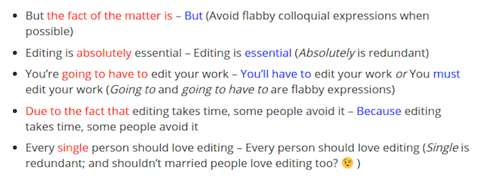
Some examples, and their better alternatives:

Filler words can also come in the form of repetitive adjectives. William Noble of Writer’s Digest suggests that many times, these additional descriptors are unnecessary:
“Many inexperienced writers throw in ‘pretty’ words to make their prose more dramatic and meaningful. But such cosmetic touch-up often turns out to be redundant or simply uninspiring.”
In a blog post for lifehacker, Buffer co-founder Leo Widrich expands on this, citing writer Kim Peres:
“Using single words to describe actions and objects quickly brings them to mind. When someone ‘stabs’ a straw into their drink we see it, but ‘pokes swiftly’ is not so clear. When a person ‘meanders’ it is more accurate than ‘walking slowly.’ A man whose foot is described as a “hoof” is much more vivid that having “gnarled toes and sole.”
Oftentimes copywriters are guilty of using two words where they could use one. Make sure that’s not you on your next post-click landing page. A good first step to avoiding that is reading the post-click landing page Copywriting for Maximum Conversion ebook.
Replace block text with bullet points and short paragraphs
As studies from Vögele and others show, we have a natural tendency to ignore long copy until we’ve read just about every other word on the page — ones in headlines, subheads, and bulleted lists.
The reason for this is simple: block text is intimidating.
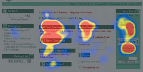
One heat map study, as Neil Patel describes, confirms the need for content to be organized into digestible chunks:

“Evidently, people look at chunks,” he says. “This page isn’t necessarily a great example of a successful layout design. It does, however, illustrate the idea that people look at the headings with strong visual elements — central positioning, strong colors, and well-thought-out spatial organization.”
Breaking long copy up into short, 2-3 sentence paragraphs, or into bold, bulleted lists will draw more attention from the people on your post-click landing page — and it’ll actually get read.
Avoid stock phrases
Fact of the matter is, stock phrases are ruining your writing.
“Sick and tired”
“Dead wrong”
“Any way, shape, or form”
These are cliche, overused phrases that society has beaten into our brains. When they creep into our marketing collateral, they expose us as unimaginative and boring writers. Shane Arthur lists some of the most common ones we’re guilty of using:

As tempted as I was to use the phrases “size matters” and “err on the side of caution” in the “legibility” section of the article, I caught myself and reworded.
Beginners use stock phrases as a crutch, while more experienced writers will find a better way to get their message across.
Create a visual hierarchy
Employ the use of underlines, italics, headlines and subheads to help your readers sort through important post-click landing page content at a quick glance.
Remember, even the earliest eye tracking studies showed that we gravitate toward the most “ink” on a page. We enter a page through an image or headline, then captions, along with bulleted lists and bolded characters. Block text was saved for last. More recent studies reinforce the importance of layout and visual hierarchy.
When researchers from Microsoft and MIT joined forces, they found that people presented with a more traditional article layout over a less recognizable one had a better reading experience overall.
The group that saw the traditional layout:
- Had higher focus and clarity when reading
- Underestimated the time it took them to read the piece
The group that read the non-traditional layout:
- Overestimated the time it took them to read the piece
- At times felt physically displeased while reading, at instances displaying a prominent frown
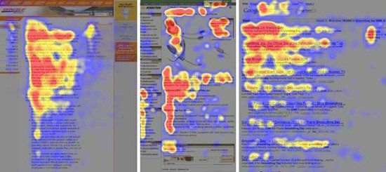
Make sure your text is presented in a format that we’ve become comfortable with. Today more than one study has shown that on the web we read in an F-shape pattern:

It’s consistent with findings from earlier, offline research from the Poynter Institute and Munich’s direct marketing association.
Again: we enter a page through the dominant headline (red heat line across the top), then scan down to find other bold and bulleted text (the red heat map line down the left side, and across the middle).
Write in a conversational style
Have you ever tried to read through an academic research paper? If so, you can relate to Natallie Nahal’s struggle:


Writing like this might get you places in academia, but it won’t in marketing. Using jargon will only confuse your post-click landing page visitors.
Instead, write your post-click landing page body copy in a simple, friendly, conversational manner. One study in the Journal of Educational Psychology showed that this technique made subject matter 20-46% more easily understood and retained by college students.
Remember: most people read at a 7th-8th grade level. If at any point you have to stop writing to consider whether or not you’re being too technical, you probably are.
3. Comprehension
Replace ambiguous words
How often do we see a product or service described as “quality” or “effective” on a post-click landing page? These two ambiguous words essentially mean “good,” and “does the job,” respectively.Why are they quality? Why are they effective?
A blog post on Printwand explains why using ambiguous words can be a risky practice:
“For some people, the word “good” is enough to make a positive connection, while other audiences might think that ‘good’ is step below ‘great’ or ‘excellent.’ It’s generally much better to choose words with vivid, clearly defined value, such as ‘inexpensive,’ ‘gorgeous,’ or ‘durable.’”
This includes meaningless buzzwords. Stop calling yourself “innovative” and find better descriptive phrases.
Stress benefits, not features
Your product may be new and improved, and it may have a turbo-charged, next generation thingamajig…but guess what?
Your prospect doesn’t care.
What they care about is how that thingamajig will improve their life. Will it make video conferencing easier? Will it save them time on their commute?
Explaining your product in terms of what it will do for them, as opposed to listing all its bells and whistles, will help your prospect understand it more clearly.
Tell a story
The tradition of storytelling dates back 27,000 years, to when Neanderthals first painted on cave walls.
Over generations it’s become such a commonly used form of communication that we’ve actually evolved to better understand things when they’re presented in a story. Leo Widrich explains:
“A story, if broken down into the simplest form, is a connection of cause and effect. And that is exactly how we think. We think in narratives all day long, no matter if it is about buying groceries, whether we think about work or our spouse at home. We make up (short) stories in our heads for every action and conversation.”
Not only that, but stories can actually activate numerous parts of our brain:
“If someone tells us about how delicious certain foods were, our sensory cortex lights up,” says Widrich. “ If it’s about motion, our motor cortex gets active”
Now, we know this goes against conventional post-click landing page best practices, sign up for an Instapage Enterprise demo today.

See the Instapage Enterprise Plan in Action.
Demo includes AdMap™, Personalization, AMP,
Global Blocks, heatmaps & more.
