We call it “traffic” as though an inanimate stream of nameless, faceless device users is what frequents our web pages. When we’re feeling particularly human, we marketers refer to the individual components of traffic as “visitors” or “prospects” — potential customers who have yet to buy.
As we redesign pages based on heat maps and build ad campaigns from demographic reports, it’s easy to forget there are people behind all that data. You won’t see them in your Google Analytics dashboard, but they’re there.
With lead capture post-click landing pages we may begin to understand their goals and challenges, but who they are can’t be summed up in a CRM. On a deeper level, within each lead are needs to be filled and motivations for behavior. There’s a reason for every click. The best marketers understand that, and they use marketing psychology to boost conversions.
Related: Results from 10 expert psychological studies that you can use to boost conversions (below):
Fulfill needs with marketing psychology
In 1943, the psychologist Abraham Maslow built a theoretical pyramid representing motivations for human behavior. Today it’s known as Maslow’s Hierarchy of Needs:
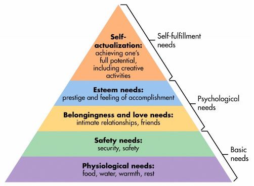
It’s composed of five tiers of needs arranged, from bottom to top, in order of importance. The lower it is, the higher its priority. For example, people need food and water before friends and prestige. When one stage is fulfilled, the needs in the next can be pursued.
A later version makes three more additions: cognitive needs, aesthetic needs, and transcendence needs. Together, along with the first five, they form an 8-tiered pyramid that looks like this:
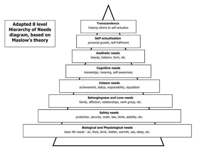
(For a more detailed explanation of the expanded pyramid, check out this video).
In 2011, researchers Louis Tay and Ed Diener tested the accuracy of Maslow’s hierarchy by collecting and analyzing data from 60,865 participants across 123 countries:
Respondents answered questions about six needs that closely resemble those in Maslow’s model: basic needs (food, shelter); safety; social needs (love, support); respect; mastery; and autonomy. They also rated their well-being across three discrete measures: life evaluation (a person’s view of his or her life as a whole), positive feelings (day-to-day instances of joy or pleasure), and negative feelings (everyday experiences of sorrow, anger, or stress).
What they found was that, largely, Maslow’s theory of motivation holds true even across cultures, which is why it has so many practical applications in management, education, research, and even marketing.
Whether it’s in an ad, on a post-click landing page, or on any other campaign material, filling your prospects’ needs can turn them into leads and eventually buyers.
How marketing and psychology work together
You always hear the advice “Make people feel something” from advertising influencers who claim people are emotional decision-makers. But that’s pretty broad advice. How?
Making people “feel something” involves appealing to specific needs. In most cases, the lower those needs are on Maslow’s pyramid, the stronger influence they have over your prospects. Here’s to use them to boost conversions:
Your offer
If your offer doesn’t fulfill one of these needs, it won’t be claimed. Nobody ever gave up their personal information without a reason to, which is why you’ll never see a post-click landing page that requests something without returning the favor.
Whether it’s an ebook, a webinar, or a consultation, your product or service has to improve the life of people who claim it. Will it make them more likable? Will it award them prestige? The benefit should be clear.
1. Appeal to safety needs
The world is an unstable place. Companies downsize, couples divorce, and money comes and goes. As a result, the need to feel some semblance of order is a powerful motivator.
Some offers, like insurance, inherently appeal to this need. But any product or service that offers to help us avoid losses or achieve stability can fill it too.
Consider this study, in which researchers gave participants 50 British pounds and asked them to choose from two options:
1. keep 30 pounds, or…
2. gamble with a 50/50 chance of keeping or losing all 50 pounds.
In this portion of the experiment, the majority of participants went with option 1. They chose not to gamble. In the second part of the experiment, researchers asked the same question, only this time they framed it differently:
1. lose 20 pounds, or…
2. gamble with a 50/50 chance of keeping or losing all 50 pounds.
Compared to the first part of the experiment, the number of people who chose to gamble increased by almost 20%.
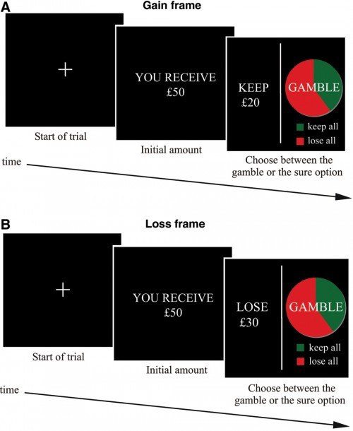
The reason is the majority of people are risk-averse. In both situations, the people in this experiment avoided the loss.
When they were given the option to keep 30 pounds, they worried about losing all of it by gambling. When they were told they would lose 20 pounds, they were hopeful that gambling would help them avoid that loss by winning 50 pounds.
That’s why you’ll often see post-click landing page designers offer stability in a loss-averse way. Instead of “Save $500 a month,” you’ll see, “Avoid losing $500 a month.” Here’s an example from Fisher Investments:
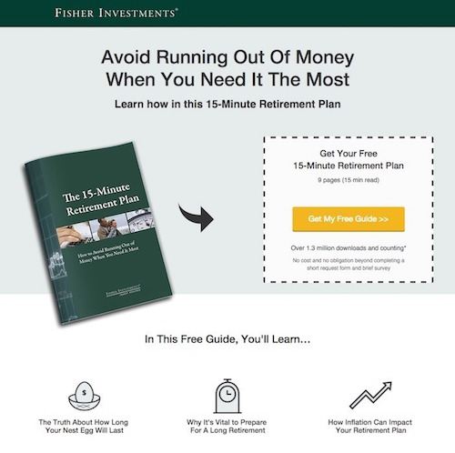
This isn’t a guide on how to build a retirement plan, but instead, one that helps visitors avoid losing money later in life.
2. Appeal to belongingness needs
Some offers relate directly to our need to belong. Personal grooming products help people fit in, and social networking apps bring them together. But what about things like credit cards, beer, diamonds, and search engines? Not so much, right?
De Beers — the business that, more or less, invented the diamond engagement ring — would disagree with you. More than half a century ago, the company created perceived value for its product (diamonds aren’t actually all that rare) with the tagline “A diamond is forever,” claiming the only suitable way to ask for a woman’s hand in marriage was by gifting her a diamond ring.
A series of ads reinforced that the size of the diamond was directly related to the strength of the relationship — even going so far as to say, basically, “If you love her, you’ll spend two months’ salary on her engagement ring.”:

Each ad played to our need to belong by turning a rock into a symbol of love and birthing a tradition we still follow today.
Guinness did something similar in 2016 with a heartwarming ad that transformed its beer into a symbol for unity, and who could forget Mastercard’s “Priceless” campaign?
Maybe the most impressive example of appealing to belonging with a “boring” offer is this one from Google — a Super Bowl ad that somehow turned a search engine into a love doctor. Watch an entire relationship unfold in 52 seconds:
3. Appeal to cognitive needs
Ever wonder why “ultimate” and “comprehensive” guides are so appealing? The reason is simple: They offer us more information than your standard ebook or white paper. This bundle from CoSchedule capitalizes on our need for more:
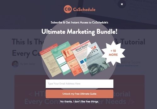
If you don’t have time to build an ultimate resource, consider bundling several to create one comprehensive offer. The more knowledge you can offer your prospects, the more valuable you become to them (as long as the knowledge is actually valuable).
4. Appeal to esteem needs
Most offers you’ll see are related to boosting esteem. For example, the above offer from CoSchedule is valuable not only because it’s comprehensive, but because it offers practical knowledge as well. The person who reads it will learn information they can use to become a better marketer.
If your offer provides information that prospects can use to boost their status, like course instruction for example, it should be brought to their attention. Here’s an example from DigitalMarketer:
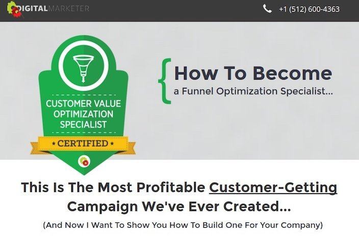
The words “become a funnel optimization specialist” let visitors know how they’ll improve by becoming certified, and the copy below elaborates on it.
Your headline
The headline is a key creative element. Its job is to get the reader to evaluate the rest of the content, and it does that job by describing how your product or service fulfills a need. As you’ll see, a well-written headline can turn boring offers into life-changing opportunities by teasing out a strong benefit. Here’s how to convey it:
1. Appeal to esteem needs
The two words “how to” have probably been used in more headlines than any other in the history of modern advertising, and that’s because they appeal to our basic need for esteem.
When you see the two words “how to,” you immediately know you’re going to learn something that you can apply to achieve success or status in a particular area. Here’s an example from WordStream:
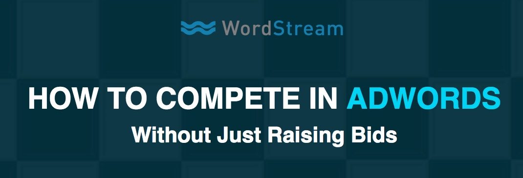
It implies to readers that they’ll become better Google Ads advertisers by learning uncommon bidding strategies.
2. Appeal to belongingness needs
The thing about secrets is that not everybody knows them, which is why people who do feel like they’re part of a special group of insiders.
Our need to belong, described in Maslow’s third stage, is why creating exclusivity is a powerful marketing technique. If you let people know they’ll join a special group by claiming your offer, the chances they do increase.
Joining Copyblogger’s Authority program, for example, gets you access to not only exclusive content, but a networking community that will help you build your career as a copywriter too:

3. Create a knowledge gap
In our quest for understanding in the cognitive stage, a barrier known as the “knowledge gap” can get in our way. When that happens, and we have a real interest in the information that’s on the other side of it, our curiosity is piqued — we want to learn more.
This famous headline, written by ad man John Caples, graced one of the most successful ads ever run:
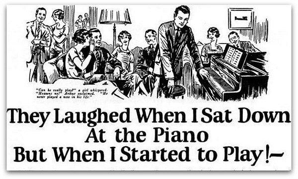
Doesn’t it make you want to read the rest of the advertisement? What happened to Arthur when he sat down to play the piano?
Of course, your mind can fill in the blanks — and when it does, it becomes clear why this headline is so compelling:
- The words “they laughed when I sat down at the piano” convey that the people in the ad think Arthur is about to embarrass himself. Everyone reading has been embarrassed before, and they can surely relate to how it hurts our esteem.
- The words “but when I started to play” imply that when he began playing everyone realized he actually could play the piano. This flips the concept of the headline by appealing to our esteem needs. We subconsciously put ourselves in Arthur’s place and imagine what it would be like to — with an “I’ll show them” attitude — impress all our clueless friends with a hidden talent like piano playing.
Remember, though, there has to be an interest in what’s on the other side of the curiosity gap for your visitors to want to bridge it. A CalTech study recorded participants’ brain activity while researchers asked trivia questions, and when those topics were of particular interest to the subjects, it activated a reward center of the brain.
This particular cognitive hurdle from John Caples appeals to our esteem needs. Make sure yours incorporates another tier in Maslow’s hierarchy if you want to pique curiosity with a knowledge gap.
4. Appeal to cognitive needs
Even when you’re offering something similar to your competitors, a well-written headline can make your business seem more valuable. While reputable news publications like the New York Times and the Wall Street Journal can offer in-depth information, this headline from The Economist claims it can offer more (even if that’s not true):
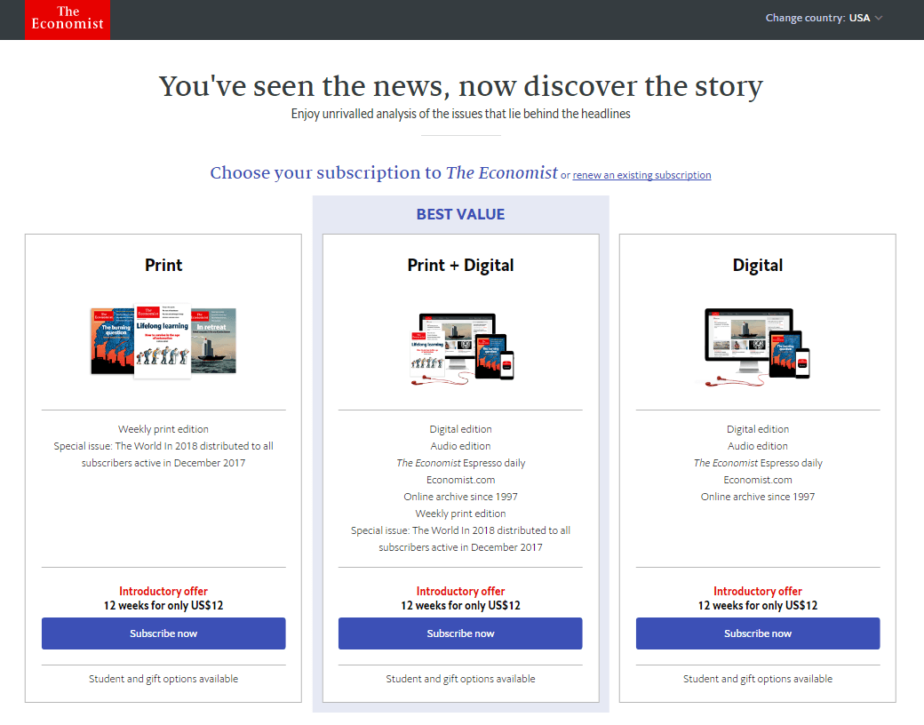
Essentially, it says “those other guys can offer you headlines and short write-ups, but we can give you the in-depth information behind them.”
Here’s another example from a different industry:
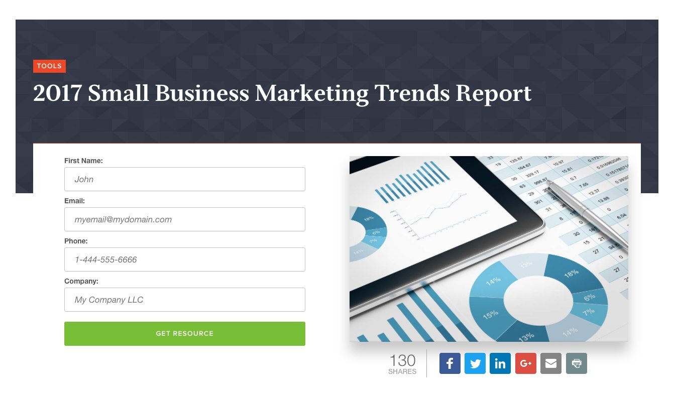
This straightforward Infusionsoft headline doesn’t offer the resource with a “how to” or “become.” While it indirectly appeals to our esteem (succeed in business by reading) and safety needs (earn more by being more successful), it’s focuses on the information in the report itself.
This strategy can work when you’re introducing new information (see “2017” in the headline). But if your information is more evergreen, it’s better to appeal to more basic needs, like this:

“How to design graphics that convert” is better than “Graphic design best practices guide.” This headline from HubSpot nails it.
5. Appeal to safety needs
As an offer, a writing course sounds fairly boring. But, with a headline that emphasizes what that writing course can offer in terms of stability, it turns into an exciting opportunity. Take this headline/subheadline example from AWAI:
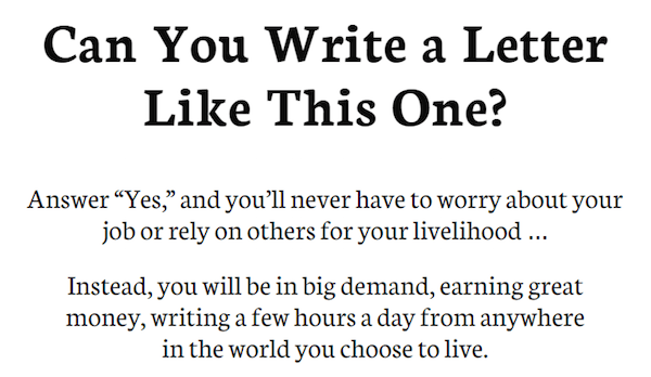
It tackles any fear of stability with an offer of independence and freedom. Here’s another example from Online Trading Academy:
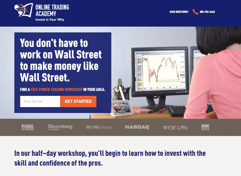
Remember: Your offer may seem boring, but the need it fulfills is not. Think beyond your product or service to what it enables your prospect to do or become.
Your copy
Your copy should elaborate on your offer in an easy-to-understand way that communicates its benefits over its features. If you appeal to one tier of Maslow’s hierarchy in your headline, try appealing to a different tier in your copy. The result is a complementary effect that will make your message even more persuasive. Here are some examples from the pros:
1. Appeal to esteem needs
For offers like courses, guides, or self-improvement products, appealing to esteem needs is perfect. These benefits focus on what readers can achieve with your offer — how they can improve their standing or status.
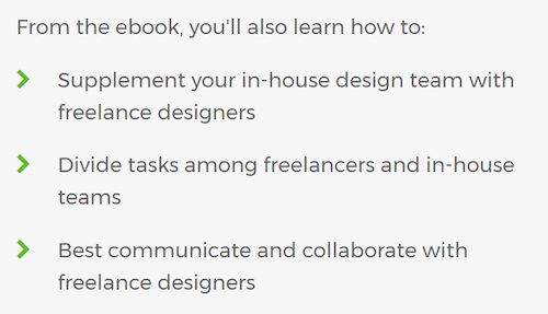
Like the headline that appeals to esteem needs, copy written for the same purpose often uses words like “how to” and “become.” Instead of letting readers infer how a product or service can bring success, this copy explains it specifically.
Here’s an example from an Upwork guide:
2. Appeal to safety needs
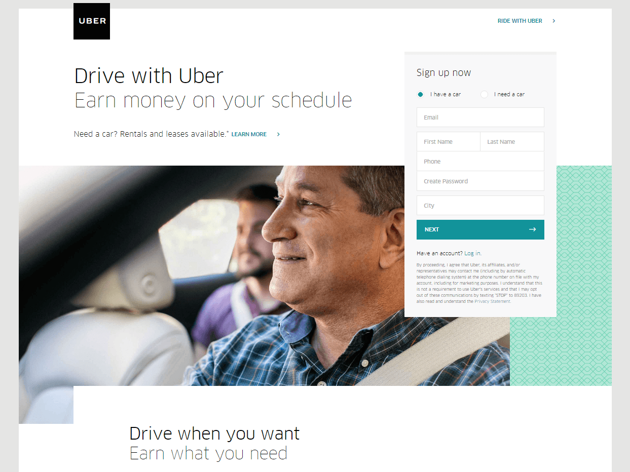
Can your offer somehow make your visitors’ lives more stable? Can you offer them more freedom? Gold is a precious ore, but to the copywriters that wrote this page, it’s protection from the next stock market crash:

Here’s another example from Uber. Signing up to drive for the company isn’t a job, but the freedom to earn what you want when you want:
3. Appeal to belongingness needs
While James Young successfully jump-started the deodorant industry by labeling those with body odor “societal outcasts,” we don’t recommend using scare tactics to sway visitors. Loss aversion works in some cases, and in others it comes across as inappropriate.
Today, Young’s “if you smell bad people won’t like you” message would be viewed as insensitive. Instead, copy like this from Gentleman’s Box appeals to belongingness in a similar but more positive way:

Media
It’s long been known that people can process visuals faster than words written on a page, and it makes sense if you think about it. For the most part, we interpret the world around us without the help of text. For that reason, in your marketing collateral, an image or video can potentially showcase the benefits of your much better than copy can. Here’s how:
1. Appeal to aesthetic needs
The expanded hierarchy of needs includes a desire for organization, symmetry, and overall aesthetic beauty. Ask yourself: “How can my offer beautify?”
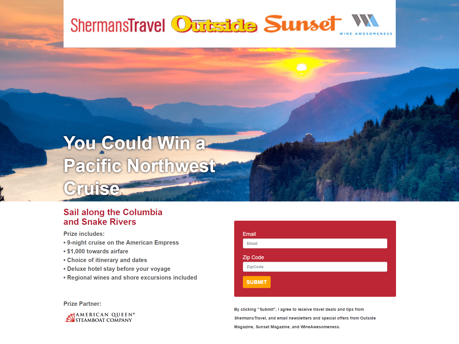
Take a look at these two travel agent post-click landing page photos. First, one from Sherman’s Travel:
Now another, from Liberty Travel:
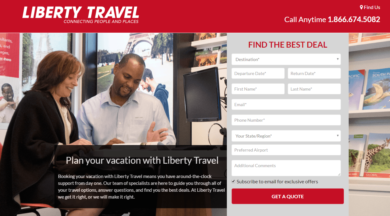
Which one makes you want to travel more?
Nobody cares about what your travel agents look like when they’re planning a trip. Visitors want to see the beautiful places those agents can help them go. The first image inspires wanderlust.
This works for more than just travel, too. A cleaning product, for example, should emphasize what it enables its owners to do instead of what it looks like. If your offer can beautify the car, home, or life of your visitors in any way, make sure they understand how.
2. Appeal to cognitive needs
Images can inspire us and videos can tug at our heartstrings, but some have a more functional purpose. Remember that people have a need to understand your offer. They want to know why they should claim it. Media, as well as copy, can help them do that.
Infographics, like graphs and charts, can help people compare and contrast data easily. Explainer videos can detail how your service solves their problem. Product shots can showcase the ins, outs, and angles of your offer. Answering the “why” by appealing to the rational, knowledge-seeking part of your audience’s brain is key to convincing them to convert.
3. Appeal to esteem needs
When light beer was introduced it had a major problem. Its target demographic, men of drinking age, didn’t find it appealing. After all, it’s not manly to care about the calories you consume. Real men don’t watch their waistline, right?
To combat that perception, Miller Lite ran an ad with former All-Pro lineman Bubba Smith that read “Lite tastes great and it’s less filling. I also like the easy-opening can.”
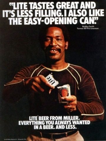
If there’s a manlier man out there — one who opens beers by tearing them in half — we can’t think of one. This, on top of the message that “light” meant “less filling” (which meant you could drink more beer), earned Miller the lion’s share of the light beer market.
For a similar effect, use a hero shot to show visitors what they can achieve with the help of your offer. Think of it as a “before and after” sequence, where the “before” is what they’re like without your product, and the “after” is what they are after it’s been introduced. In this case, that “after” is a masculine man who can drink more beer because it’s less filling.
Trust indicators
One of our most basic necessities, Maslow claims, is safety. We need security and protection. Some people choose to abandon your post-click landing page because they don’t feel safe, and there could be a few reasons why. Here’s how to correct them:
1. Appeal to belongingness needs
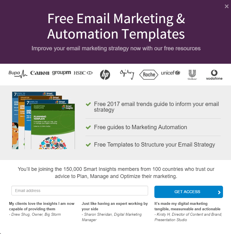
If your offer requires a high commitment from the visitor — like a large sum of money, for example — they’re going to fear they’ll waste it. If your exercise plan is four months long, or your freelance writing course costs $500, your prospects need to know that their time, effort, and money will be well-spent.
Because we have a tendency to base our decisions on the behavior of those around us (to fit in with the group), the following techniques can help prove that your offer is worth it:
- Add detailed reviews of happy customers. The more information (full name, job title, location, specific results) the better.
- Showcase logos of well-known publications your product or service has been featured in. This will make visitors think, “If the New York Times featured them, then they must be quality and trustworthy.”
- Use counters to let them know how many customers, social media followers, and email subscribers you have.
Here’s a great example from Smart Insights:
2. Appeal to safety needs
After they overcome worry about whether your offer is worth claiming, your prospects will worry whether your website is safe. They’ll be concerned their personal information will fall into the wrong hands. Here’s how to make them comfortable:
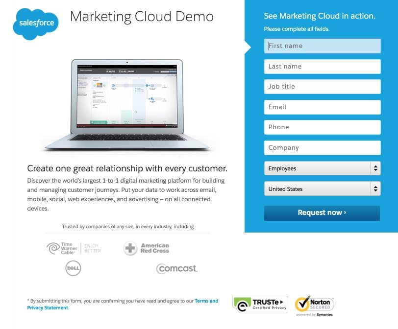
- Offer a link to your privacy policy, and if you don’t intend to sell their personal information to third parties, tell them on your page.
- Add photos of locks or logos from trusted companies like Norton and TRUSTe to let them know your website is secure.
Take a look at below the form on this page from Salesforce:
Your call-to-action button
If we advised using a traditional call-to-action, this section wouldn’t exist. But we don’t.
Instead of using “Submit” or “Register” or “Download,” a case study shows that emphasizing the benefits of your offer in the CTA can boost conversions. Here’s how to do it:
1. Appeal to cognitive needs
Is it information you’re offering? Make it clear what your visitors will be able to access once they claim your offer. Here’s an example from Owners.com:
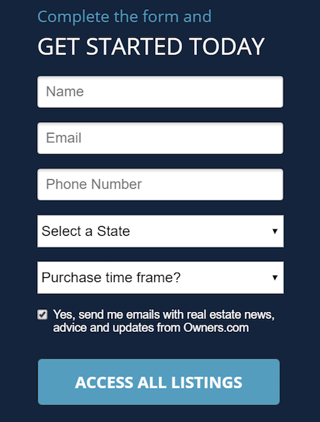
Though, as mentioned in earlier sections, do your best to turn this benefit into one that appeals to an esteem need or a safety need if possible. Here’s why…
2. Appeal to esteem needs
As much as people need knowledge, they need safety (money, shelter) more (remember: lower tier on the pyramid = higher priority). In the previous example, allowing access to information is good, but describing what visitors can do with it is better. Some thought reveals a better call-to-action for the real estate search engine: “Find your new home quickly.”
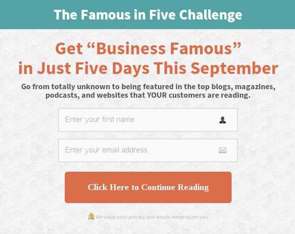
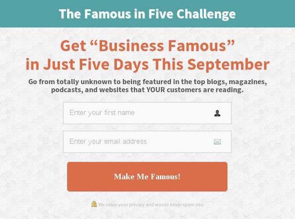
When Roader Studios changed their button’s focus from cognitive needs to esteem needs, they saw an 8% boost in conversions. The initial button copy centered around information with the words “Click Here to Continue Reading”:
But the new, better-performing copy focused on what prospects could achieve with the resource:
3. Appeal to belongingness
If the biggest benefit of your offer is the people it gives your prospects access to, or the relationships it enables them to build, appealing to belongingness in your CTA can work. Here’s a post-click landing page from Donald Trump’s campaign team that appeals to a forgotten subset of the American people:
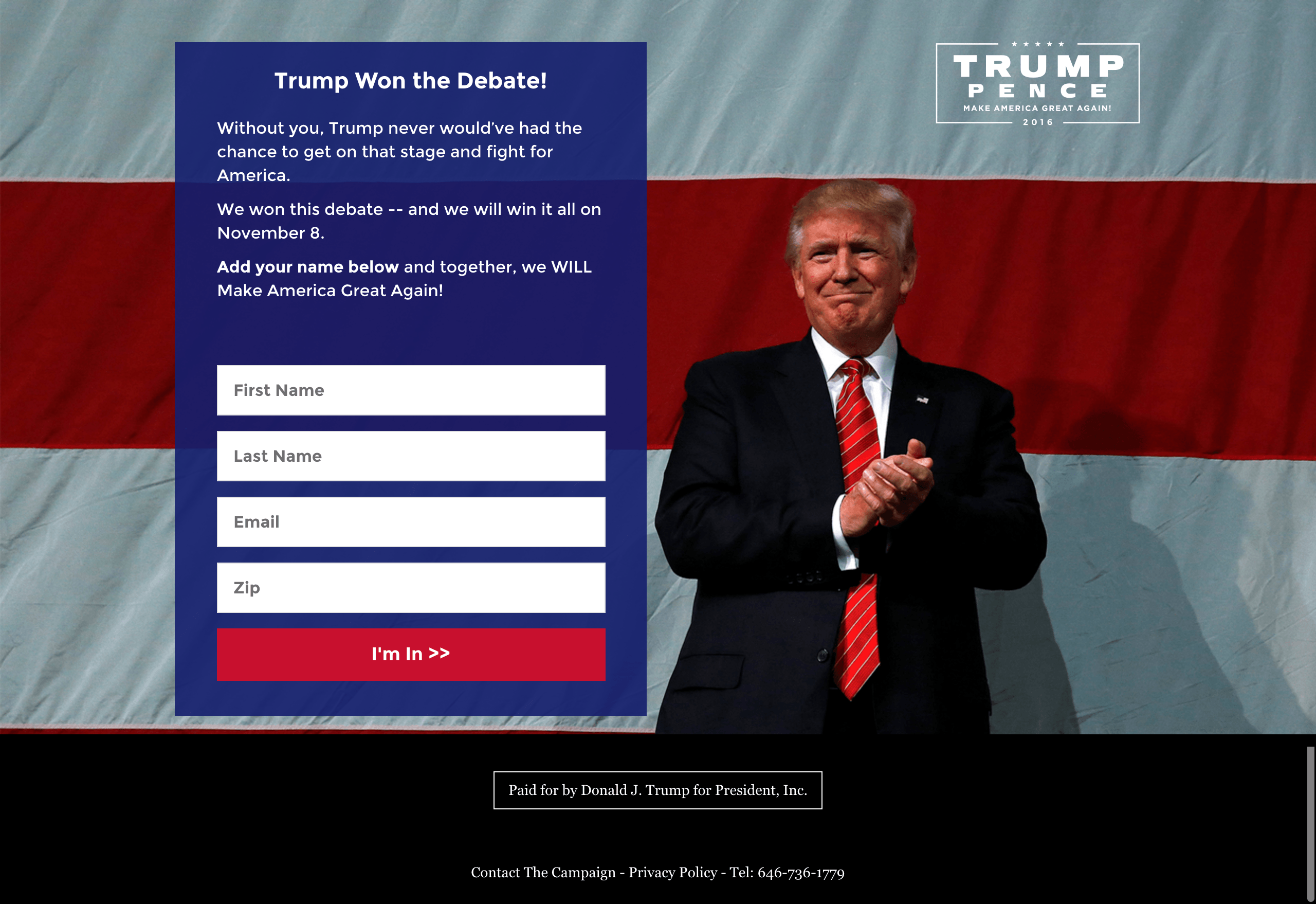
By using the words “we” often on the form, and “I’m In” on the CTA button, he makes visitors feel like an invaluable part of his movement and key members of his inner circle (and indirectly plays to esteem by making them feel important).
In most cases, though, designers mistakenly appeal to belongingness needs when appealing to safety or esteem needs would create a more persuasive effect. Here’s an example…
4. Appeal to safety needs
Many times you’ll see the words “Join us” or “Become a subscriber” on CTA buttons around the web. Most often, those buttons stop one step short of creating an even more persuasive version. Take this example from Empire Flippers…
First, the original button:

Then, the new button:
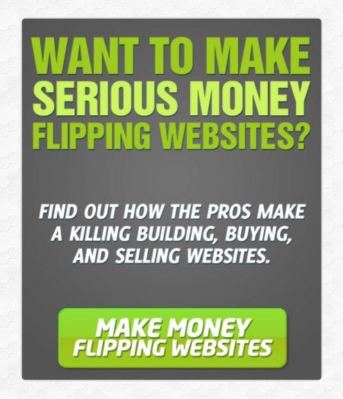
The creators of the variation asked themselves “But what does joining us enable the visitor to do?” The result was a button that appealed to safety needs, which boosted conversions by over 33%.
Keep in mind, this type of button, while powerful, can potentially confuse your visitor. Learn more about picking the best call-to-action for your offer here.
How do you use psychology in marketing and advertising?
Do you use marketing and advertising psychology to boost conversions? Did we miss any techniques?
Learn how to boost conversions from expert psychological research by downloading the new Instapage guide:
