A recent survey conducted by Zogby Analytics found that respondents born between 1982 and 2004 regularly use the ridesharing services Uber, Lyft, and Sidecar.
The leader of the pack is still Uber, which has over 8 million users in over 400 cities, but Lyft is increasingly becoming a serious ridesharing contender with over 630,000 users worldwide.
So what is Lyft’s strategy for driving company growth? Huge investments in technology infrastructure and marketing. Among the powerful marketing tools Lyft has to reach prospects online and generating more engagement with their application is, of course, post-click landing pages.
What is a post-click landing page?
post-click landing pages are standalone pages that use persuasive elements like benefit-oriented copy, testimonials, visual cues, and trust badges to convince visitors to convert on an offer. That offer could be to download an ebook or white paper, register for a webinar, sign up for a free trial, or request a free consultation.
Now let’s look at some Lyft post-click landing pages to see how they get visitors to take action.
How Lyft uses post-click landing pages
(For shorter pages, we’ve shown the entire page. However, for longer pages, we only displayed above the fold. You may need to click through to the page to see some of the points we discuss and some pages may be undergoing A/B testing with an alternate version than is displayed below.)
1. To sign up drivers
A quick Google search how to become a Lyft driver produces these two Google search ads. Once you click on Lyft’s ad, you’re sent to the post-click landing page below:

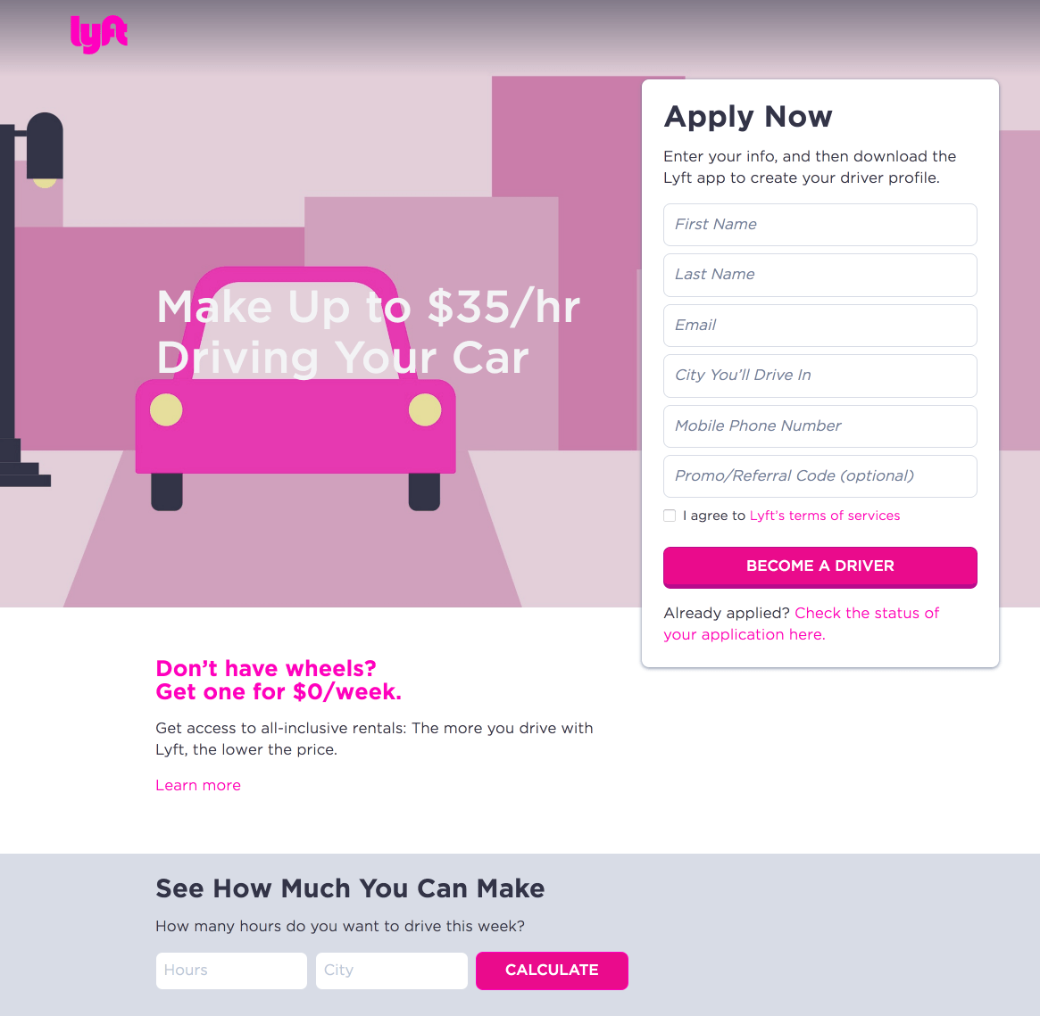
Who the page is created for:
People interested in becoming a Lyft driver.
Why the page was built:
To recruit and grow its driver user base so it can continue to compete with other ridesharing services.
What the page does well:
- No menu navigation means visitors can’t easily exit the page without focusing on the offer.
- The benefit-oriented headline draws visitors’ attention because visitors can earn up to $35/hour while driving their own car.
- The calculator feature allows visitors to determine how much money they could earn based on the amount of hours driving and the city they live.
- The “How Lyft Driving Works” slider explains how Lyft works using the mobile app.
- Lyft insurance protection provides drivers extra reassurance that they will be covered in the event of an accident.
- The FAQ section answers the most common questions applicants typically ask Lyft. These answers provide reassurance to drivers that Lyft will pay drivers on schedule, and that it’s a safe community for everyone involved.
What the page could change and A/B test:
- Lyft’s logo is hyperlinked to their homepage, which gives visitors an easy exit route off the page.
- The pink CTA button doesn’t stand out from anything on the page. We understand pink is Lyft’s signature color but the CTA button is the most important element on a post-click landing page so it must be noticeable quickly and easily. A better color choice would be green, yellow, or orange because they are the most color contrasting with the color pink. A quick glance at the color wheel will show you that.
- Several outbound links such as the help center, insurance policies page, more FAQ have the potential to send visitors away from this driver sign up page. A better option is to have these links as hidden dropdowns on the page. That way, visitors can still get more information about each one, but not leave the page.
- Adding social proof such as driver testimonials could increase conversions. Reading the personal stories of Lyft drivers could compel a visitor to apply to become a driver.
2. To sell gift cards
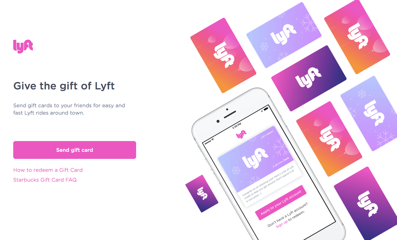
Who the page is created for:
People interested in sending a Lyft gift card to their family or friends.
Why the page was built:
To get more people riding Lyft.
What the page does well:
- Zero navigation links keep visitors on the page focused on the offer.
- Good use of white space allows persuasive elements like the CTA on the page stand out.
- The secondary headline clearly states the offer because visitors immediately recognize that this page is about sending friends and family a Lyft gift card.
- The graphic showcases what Lyft gift cards look like when sending them as a gift.
What the page could change and A/B test:
- The Lyft logo is hyperlinked to the main website giving visitors an easy way to leave without first sending a gift card.
- The pink CTA button doesn’t jump off the page as much as it could. A pink button on a white background is a significant improvement compared to example #1 above, but a green or orange button would still be better than pink.
- Both links underneath the CTA button take visitors away from the post-click landing page.
- The lack of copy hurts this page because some questions about Lyft gift cards could be answered. How many can be sent at one time? Are there any restrictions or limits or the gift cards?
- Adding social proof such as a video of someone who just received a Lyft gift card could persuade more visitors to convert..
3. To get drivers to request Amp
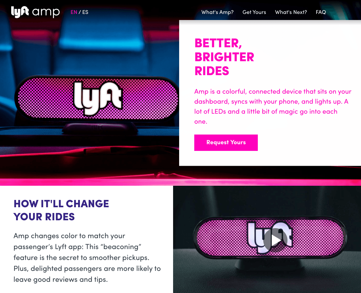
Who the page is created for:
Lyft drivers who are interested in the Amp technology and its beaconing feature.
Why the page was built:
To generate interest in Amp.
What the page does well:
- Anchor tags in the navigation menu send visitors to specified sections on the page instead of redirecting them to a different page.
- The sticky banner scrolls with the visitor and reminds them of the Amp offer.
- The language toggle in the top-left allows the post-click landing page to be understood by Spanish-speaking visitors.
- The Amp promotional video shows visitors how Amp works and how they can expect it to benefit them.
- “Everything You Need to Know” answers common questions in a dropdown format while keeping visitors on the page.
What the page could change and A/B test:
- The Lyft logo acts as an exit link and gives visitors an opportunity to leave the page without requesting Amp.
- The CTA doesn’t stand out because it is the same shade of pink as the copy and surrounding elements. To increase conversions Lyft should change the CTA color to something that draws more attention, like bright green.
- Adding arrow directional cues would encourage people to scroll and learn more about Amp and pay attention to the CTA button, especially since the button is the same color as much of the page.
- The footer contains multiple links that give visitors a chance to leave the page without converting.
4. To get Lyft customers to share invite links

Who the page is created for:
Lyft riders who want to share ride credit with others and get free rides.
Why the page was built:
To get current Lyft customers to share ride credits with their social networks and generate more interest in riding with Lyft.
What the page does well:
- The Lyft logo isn’t hyperlinked so visitors can’t easily exit the page.
- Zero navigation links keep visitors engaged on the page and focused on the offer.
- The headline and secondary headline clearly state the offer and its benefits. By sharing the link, visitors know exactly what they’ll get in return.
What the page could change and A/B test:
- Zero images make the page less engaging than it could be. Adding a picture of someone riding with Lyft could help convince visitors to share their ride credit.
- More white space would help each element breathe more and help visitors scan the page quicker to determine if they want to share their ride credit or not.
- All CTA buttons are the same color as the copy and the logo. Changing these buttons to a different color could increase conversions (e.g. dark blue for Facebook, light blue for Twitter, and orange for email).
- The link to the terms acts as an exit link. The better alternative for this would be to have a pop-up list the offer’s terms instead of taking visitors away from this page.
5. To get riders to claim ride credits

Who the page is created for:
Existing Lyft riders.
Why the page was built:
To generate more interest in riding with Lyft by giving away ride credit.
What the page does well:
- The absence of navigation means visitors can’t be as easily distracted.
- Minimal copy allows visitors to quickly consider the offer and decide if they want to redeem the offer.
- The $50 ride credit gives visitors an exact dollar amount that helps persuade people to convert.
- The short form only requests phone number, which likely increases total conversions.
- The CTA color isn’t repeated anywhere else on the page. Although it could be a brighter color to stand out more from the dark background.
What the page could change and A/B test:
- The terms of use link could open up in a pop-up instead of opening up a new tab.
- Adding an image makes the post-click landing page and the offer seem bland. An image of two people enjoying a Lyft ride with their ride credit could humanize the offer.
- Social proof showcasing testimonials of those who have received a ride credit can help compel visitors to take action.
Which Lyft post-click landing page was the most persuasive?
Lyft clearly understands the value of post-click landing pages and uses them to grow their user base in a variety of ways. Both riders and drivers can redeem offers, and each offer is designed to establish some brand loyalty with Lyft. Take a cue from Lyft and start creating your own personalized post-click landing pages.
With Instapage, you can design personalized post-click landing pages. Sign up for an Instapage Enterprise demo today.

See the Instapage Enterprise Plan in Action.
Demo includes AdMap™, Personalization, AMP,
Global Blocks, heatmaps & more.