
A post-click landing page is often one of the first impressions people see of your brand, so it’s important to make it exceptional. A post-click landing page wireframe can help with this by allowing you to visualize the arrangement of page elements before actually building the page.
What is a post-click landing page wireframe?
A wireframe is a basic design layout or skeleton of a post-click landing page to give stakeholders an idea how the page will be structured and what assets are needed to build it.
Rares Cimpean, a Visual Designer for Instapage, explains:
When putting together a post-click landing page wireframe you should focus on the flow, usability, and accessibility of the page, how fast can people get to the information they need, how accessible and recognizable is the CTA, etc. All of these factors are taken into consideration in the wireframing phase.
Here are some wireframe post-click landing page examples, both long and short:
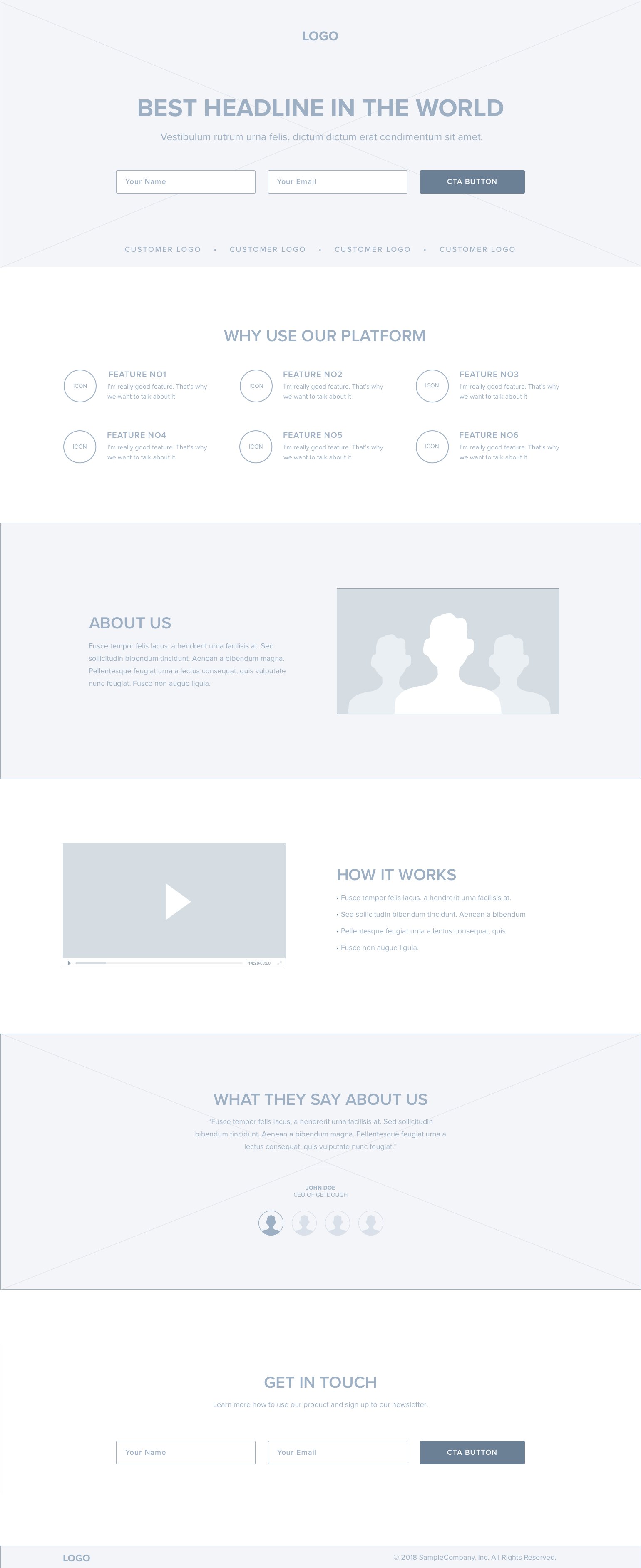
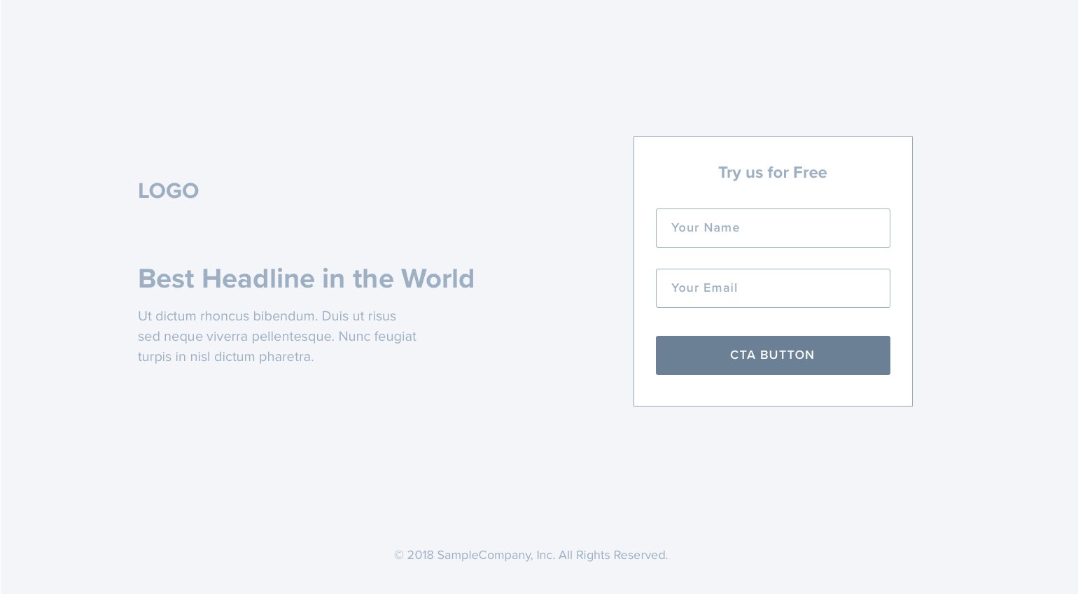
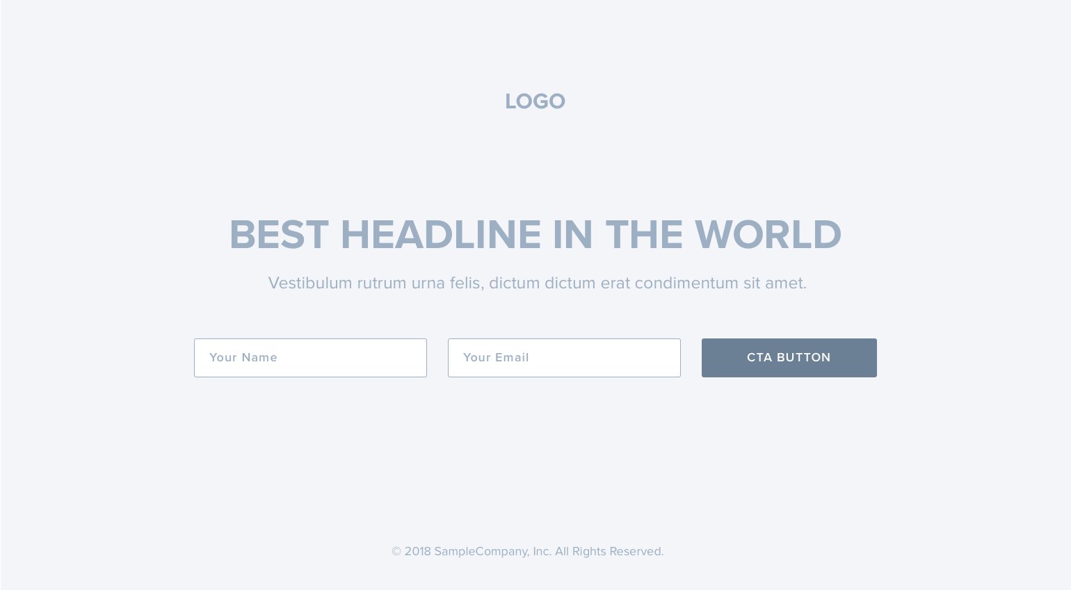
A post-click landing page wireframe template serves several main purposes:
- To act as a middle ground between your pen-and-paper sketch and first prototype
- To present an overview of the content that will be displayed on the page
- To provide a blueprint of the page structure
- To convey the overall direction of the user interface
Note: there is no single post-click landing page wireframe design that fits all campaigns. Some post-click landing pages may simply require a headline, bulleted copy, form, and CTA button, while others might need to highlight additional benefits and demonstrate social proof. Sales pages, for example, often require more detailed product descriptions and may need to be longer. (Keep in mind, you can always A/B test a short page vs. long page to see which produces better results.)
No matter what type of page you’re wireframing, our Graphics Design Manager, Rafal Bogdan, expresses the importance of keeping your wireframe very simple at first, so as to not overwhelm the stakeholders involved:
I don't want to focus too deeply on the elements that could be rejected by stakeholders in the next phase. The main idea of a wireframe is to show specific project features on a post-click landing page, and help them understand how those features will behave on the real page.
Once you have your wireframe, it’s time for design to make it shine. Below are the elements typically found on high-converting post-click landing pages.
How to wireframe a post-click landing page
No navigation
Since post-click landing pages are designed for conversion and a single purpose, there should be no navigation links that could distract users from your conversion goal. It’s either convert or leave — no other options.
Many companies have seen substantial changes in their conversion rates after removing their navigation bars:
- Career Point College saw a 336% increase in conversion rate after removing their top navigation bar and modifying their form layout.
- Yuppiechef witnessed a 100% increase in conversion rates (from 3% to 6%) by removing their navigation bar.
- SparkPage had a conversion rate increase, from 9.2% to 17.6%, during the month that they A/B tested removing their top navigation.
Comporium Media Services is another brand that understands the need for removing the navigation to maximize conversions. Not even their logo is linked, which keeps visitors on the page and focused on requesting a consultation:
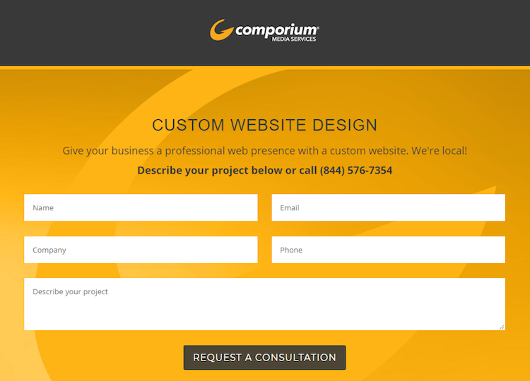
When following best practices, the only links that should be used are those that boost credibility (e.g. Terms of Use and/or a Privacy Policy), and links that enhance the user experience (such as anchor tags and a click-to-call phone number).
Headline and subheadline
Your headline is one of the most important elements because without a compelling one, visitors won’t be persuaded enough to continue evaluating your offer. Since this is the primary way to deliver your message, it must command attention, be clearly visible as soon as users land on the page, and above the fold.
Your subheadline is used to complement your primary headline, especially if the primary headline is long, or requires additional context (such as a statistic, for example).
The key to writing a good headline is to ensure it conveys your unique value proposition (UVP), or what sets your product or service apart from your competitors.
This Autopilot post-click landing page headline lets companies know that they can “Grow faster” on Autopilot compared to other marketing automation software. The subheadline then complements this idea by describing how they can grow faster:

In addition to including your UVP, there are four main types of compelling headlines:
- News: Introduce a new solution to prospects
- Self-interest: Appeal to prospects’ inherent self-interest<
- Quick and easy solution: Appeal to prospects’ desire for quick fixes
- Curiosity: Pique visitors’ interest and curiosity, enticing them to read more
You can use one or combine several for an even more powerful headline. The most compelling headlines use two or more.
You can use one or combine several for an even more powerful headline. The most compelling headlines use two or more.
Media
Since it’s easier for people to process visuals than text, engaging media (images, gifs, and video) helps to convey the value of an offer, even more than words can. However, visuals aren’t a one-size-fits-all solution. The type of media you choose for your post-click landing page depends on what you’re offering.
Types of post-click landing page images include:
- Hero shots: Provide visitors a glimpse of how your product or service would change their lives for the better
- Product images: Enable visitors to see the details of your offer, including its main features
- Infographics: Allow visitors to conceptualize data and statistics (charts, graphs, etc.) more easily
Take a look at the images iContact uses to show prospects several examples of the business emails they help create:

In addition to images, several types of post-click landing page videos exist:
- Explainer videos: Explain how your product works — especially if it’s new or complicated — with a focus on how it will benefit your prospects
- Introductory videos: Showcase new companies, announce new products, or highlight new product features
- Video testimonials and case studies: Serve as social proof by showing real, satisfied customers explaining their satisfaction and success with your product or service
If using images, stay away from stock photos unless they convey a realistic situation of your offer and are relevant to the topic. Anything less and you risk decreasing your brand perception and value.
If using images, stay away from stock photos unless they convey a realistic situation of your offer and are relevant to the topic. Anything less and you risk decreasing your brand perception and value.
Copy
However tempted you are to tell visitors everything about your offer — don’t. Attention span is only a few seconds at most, so your copy must be succinct and capture people’s attention immediately.
For example, bullet points (marked by iconography, checkmarks, arrows, etc.) is a common way to convey important information, allowing visitors to quickly scan the page, and identify the key takeaways of the offer.
Prospects can quickly learn about Highfive’s video conferencing solution with the help of bold section headers, minimal copy, and bullet points:

Social proof
Before converting, people need to trust that your company offers a reliable service. That is where social proof can convince them in a variety of ways:
- Customer testimonials: Show prospects that you live up to your promise, since it’s verified directly from your customers (via quotes with specific information, statistics, full names, professional affiliation and titles, and headshots).
- Customer logos (and counts): Display the well-known companies you’ve already worked with (and how many), letting visitors know, “Since our product or service was good enough for them, it will be for you too.”
- Industry awards: Demonstrate that you’ve been publicly recognized by industry leaders, reporters, news stations, websites, etc.
- Trust seals: Ensure prospects that their payment information is safe and secure from outside parties.
- Privacy Policy: Assures prospects that their email address will be used appropriately, and not shared with anyone else.
Looking back at the same Highfive post-click landing page earlier, check out all of the social proof they used to persuade visitors to convert — brand logos, a quoted testimonial, and industry star-ratings:

Here is another example, this time from Splash Omnimedia that includes all types of social proof — a customer count, brand logos, case study video, and quoted testimonial:

By combining all of this proof, you persuade prospects to convert by clicking your CTA button.
Lead capture form
Creating the perfect form isn’t that easy. Not enough form fields and you won’t collect all the information you need; too many fields and you risk scaring potential customers away. The length of your form depends on where your offer lies in the marketing funnel. As a general rule, the higher up, the shorter the form, and vice versa.
Justworks designed this post-click landing page to provide pricing information. Since this is a top-of-the-funnel offer, it makes sense that it only contains three from fields and requests very basic information:

In contrast, Autopilot’s free trial is further down the funnel, so asking for more information is acceptable:

Call-to-action
Your CTA button is where the post-click landing page conversion happens, so it must stand out and beg to be clicked. Here are the major aspects to optimize your CTA button:
- Color: Use color theory to find a hue, tone, tint, or shade that contrasts well and stands out from the rest of your page.
- Copy: “Submit” and “Download” are generic and uninspiring. Instead, craft specific, personalized copy and incorporate “you,” “your,” “me,” and “my” to generate more CTA button clicks.
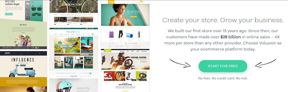
- Size: Don’t make people search for the button — make it noticeable. It can also feature visual cues — like the bouncing arrows in the Volusion post-click landing page
below — to draw even more attention:
Minimal footer
post-click landing page and website footers are not the same. post-click landing page footers shouldn’t contain sitemaps, product page links, or social media accounts. Every link you include creates another distraction and an additional way for them to leave your page without converting.
Look at all of these escape routes Infegy provides visitors:

If you choose to include a post-click landing page footer, be sure that it only displays up-to-date copyright information, terms of service, and a privacy policy, like Tapstone does:

White space
White space lets your page breathe so that all elements attract attention and visitors can navigate your page easier. Adding white space also:
- Decreases clutter
- Enhances readability
- Establishes visual hierarchy
- Makes your post-click landing page look more professional
Compare the following post-click landing pages from NASM and Acquisio:

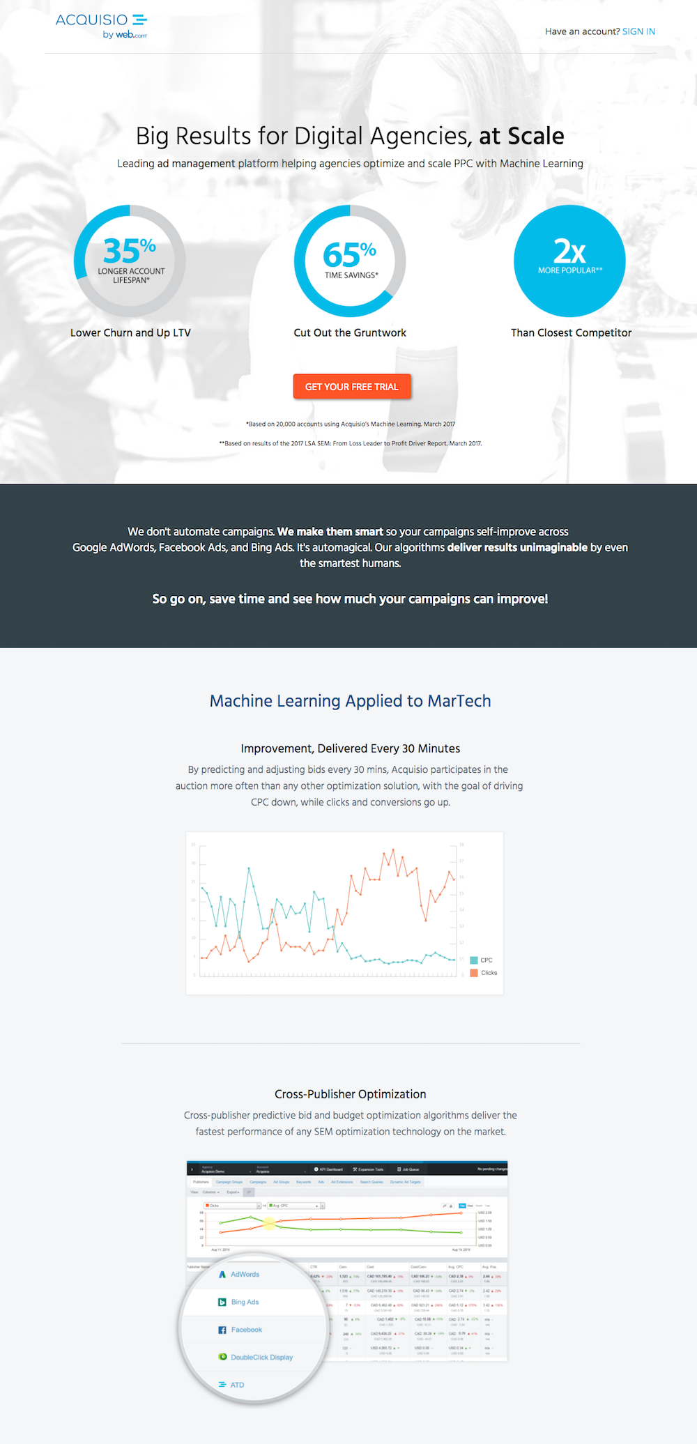
NASM’s page is crowded and could be overwhelming for some people because it’s difficult to decide where to look first, and how to navigate the page. Acquisio’s page has sufficient white space so it is easier to navigate from top to bottom and offers a better experience overall.
It all starts with a post-click landing page wireframe
Creating a wireframe allows your team to determine the overall page story, see what assets will be needed, and how much copy is required. From there, you can design an optimized post-click landing page with the suggestions above. But to build a personalized, 100% customizable post-click landing page you need a solution that is powerful enough for the job.
With Instapage, marketers can create pixel-perfect pages with our designer-friendly builder, CSS editor, alignment and grouping, hotkeys, and more. Then, use built-in heatmaps to A/B test for even higher conversions and scale your production with Instablocks™. No other solution can compare. Sign up for an Instapage Enterprise demo today.

See the Instapage Enterprise Plan in Action.
Demo includes AdMap™, Personalization, AMP,
Global Blocks, heatmaps & more.
