
- Reed Hastings started Netflix after incurring a $40 late fee on Apollo 13’s VHS copy.
- Google’s founders were willing to sell to Excite in 1999 for under $1 million, but didn’t do so because Excite turned them down.
- Creating an optimized post-click landing page is tricky.
What did you just read?
You read facts – Nuggets of truth that make a big impact on your marketing campaigns. While the first two are meant to serve as inspiration for your marketing efforts, it’s the last fact that’s actually going to affect your bottom line; your conversions. Keeping the last fact in mind is what’s going to make or break your post-click landing page.
It’s true, creating post-click landing pages is tiresome. Especially when you’re creating your first page, when you don’t really know how everything’s going to be done and where everything goes. And because I know the first time can be traumatic if you don’t possess the right tools I’m going to don my mask and cape, and I am going to help you create your post-click landing pages.
Who am I?
The Optimization man.
What am I going to do?
Enable you to create conversion worthy post-click landing pages by showing you some post-click landing page examples and then sharing with you my secret weapon – the power that makes me super.
Green Lantern may have his ring, and Batman may have his gadgets, what I have is the ability to turn drab ineffective post-click landing pages into optimization masterpieces – my post-click landing page optimization checklist (download it at the bottom of this page).
First, the inspiration
You can learn a lot by just looking at post-click landing pages – evaluate how others have handled products in your niche and then create something different.
But, with research comes great responsibility.
Once you understand what makes a great post-click landing page it’s your job then to spread this information to the rest of the world. This is the only way that you can defeat the marketer’s most notorious enemy; the ineffective post-click landing page.
Showcased below are some post-click landing pages examples that have achieved greatness, what we’ll do now is dissect the aspects that make them great and things that need to change.
Velaro
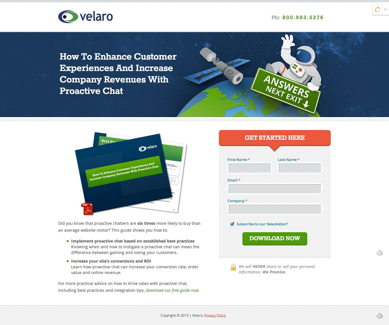
What struck me first about this post-click landing page was its simplicity. There is ample brand recognition on the page, in fact the service uses its logo’s colors in the images as well. The picture of the astronaut holding a banner saying, “Answers Next Exit” serves as a directional cue for the lead capture form and an announcement to what visitors will get when they click on the CTA button.
The form has a headline of its own which is another way of guiding the visitor about what he’s supposed to do on the post-click landing page. The image of the report has a pdf symbol on it which is a nice touch as the visitor is made aware that when he clicks on the CTA button he’s going to be downloading a pdf file.
The copy focuses on the visitor, it starts with the phrase “Did you know…” and talks about the visitor till the very end. The copy focuses on the benefits of the product and does so in points which is always a good thing.
Mentioned above were all the things that I like about the page, now let’s start with the things that I don’t particularly agree with. The headline states “How to Enhance Customer Experiences and Increase Company Revenues with Proactive Chat”. What product comes to mind when you first read this headline?
I couldn’t get that the product was a report; I thought maybe it was a proactive chat service or something.
In order to explain the product correctly the headline should have been “Learn How to…” or “Find Out How To”, something that makes it clear that the product is a report.
Another thing that I think they should change is their lead capture form, for a free report I think they’re asking too much information. For example why is there a need for a separate box for the last name, just a field “name” would be enough.
The CTA button is bold and contrasting but it’s a little unimaginative and generic and something that should be tested.
When writing the copy for your CTA button imagine your visitor thinking “I wish to ________” and fill in the blank with your copy. In this instance, the visitor thinks “I wish to Download” which is fine but not great.
Basecamp

Basecamp post-click landing pages are always creative, informative and unique. The post-click landing page is quite long, yes, but it explains the service effectively, and this is what visitors need to be convinced to click on the CTA button.
Let’s start with the headline – it mentions numerical proof of the success of the service. When a visitor finds out that 5, 667 companies signed up for the service in just a week, they’ll jump at the chance of getting whatever it is that Basecamp is offering. The visitor becomes half convinced, not to mention awed from the start.
Next in line is the copy that’s arranged in bullet points and indicates the pricing of the service, plus the requirements for the free trial. There’s no mention of the benefits of the actual service, which isn’t a good thing.
Then comes the image, the guy with a gigantic smile holding a clipboard pointing to the lead capture form serving as eye candy as well as a directional cue. I like the lead capture form because it’s easy to fill out, plus they have text fillers inside the form that tells visitors what they need to input.
The CTA button is contrasting and prominent – the copy of the button passes the I Wish test because the page is about Basecamp’s two-month free trial. Below the fold comes the pricing and some FAQs. At the bottom of the page, there are links to the newsletter, the blog and a lot of other destinations.
The only thing that needs testing on this page is the sheer amount of exits present on the page. The page is filled with navigation links and though I could tolerate the ones at the bottom of the page, what I don’t get is why they have a navigation link in the first point of their copy. This needs to be tested a.s.a.p.
Inspired? Great!
Now it’s time to fulfill my promise; the dissemination of my super power, The post-click landing page Checklist that can optimize every post-click landing page perfectly. When you sit down to create your post-click landing page open up this checklist and see just how well your post-click landing page does. Think of each point on the list as a tool that’ll get you closer to your conversion goals.

You can download the pdf version of The Only post-click landing page Checklist You’ll Ever Need Here.
Turn ad clicks into conversions, create dedicated, fast-loading post-click pages for every offer. See how you can provide audiences with unique post-click landing pages by signing up for an Instapage Enterprise Demo today.

See the Instapage Enterprise Plan in Action.
Demo includes AdMap™, Personalization, AMP,
Global Blocks, heatmaps & more.
