
Cormac Kinney’s software started as a tool to help Wall Street traders game the stock market. It turned financial data into “luminous mosaics of red and blue squares,” called “heat maps,” that signaled to traders when to buy or sell using color.
More than two decades later, it’s not just traders who benefit from heat maps and the insights they provide. Marketers (and now Instapage customers) are using them too. And by doing so, they’re learning exactly how prospects behave on their web pages.
What is a heat map?
A heat map is a data visualization that showcases how visitors interact with a web page using a color-coded system. Have a look, for example, at maybe the most well-known heat map of all-time (at least by digital marketers), which shows that people read in an F-shaped pattern on the web:
The red and yellow portions of the map indicate a highly viewed area. The blue is where visitors looked the least.
This particular data was gathered by the Nielsen Norman Group from a 2006 eye-tracking study that monitored visitors’ gaze as they encountered text on a web page. But tests like these aren’t the ones you’re likely to see circulated around the web.
Eye-tracking heat maps vs. mouse tracking heat maps
Heat maps from eye-tracking experiments are the most accurate, but they’re also the most costly and inconvenient to produce. Studies like the Nielsen Norman one above usually take place in a controlled setting (lab, in-house) with a research team or pricey hardware that observes your visitors’ eyes as they interact with your web page. These can cost upwards of several thousands of dollars to run.
Because hiring an entire team of researchers is out of the question for most businesses, many instead turn to mouse-tracking software. As opposed to monitoring actual eye movements, mouse-tracking software monitors visitor mouse movement, like clicks, scrolls, and hovers.
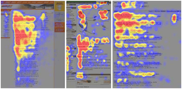
Since this method doesn’t require a formal laboratory setting or a hefty chunk of a business’s budget, it’s much more readily accessible. Today, you can install mouse-tracking software and begin monitoring visitors’ behavior immediately — and some research shows, nearly as accurately as formal eye-tracking studies do.
![]()
The heat map on the left was produced from a formal eye-tracking study, while the one on the right was generated with mouse-tracking. According to ClickTale, experiments in which both techniques were administered simultaneously have shown there’s an 84-88% correlation between their results.
Basically, in some cases, where people move their mouse and where they look tend to coincide (more on that later).
The different types of mouse-tracking heat maps available
When people refer to a “heat map,” they’re referring to a visualization that displays user behavior. But, that user behavior isn’t always the same. Some heat maps show how people scroll, while other types can identify where people hover with their mouse on a screen. The primary types of mouse-tracking heat maps are as follows:
Click heat maps
Click maps show where a visitor has clicked on your web page. They’re especially valuable for discovering popular links, or areas that visitors may think are links but aren’t.
Take this particular map, for example, which uncovered that the most clicked elements on a page were photos of the product:
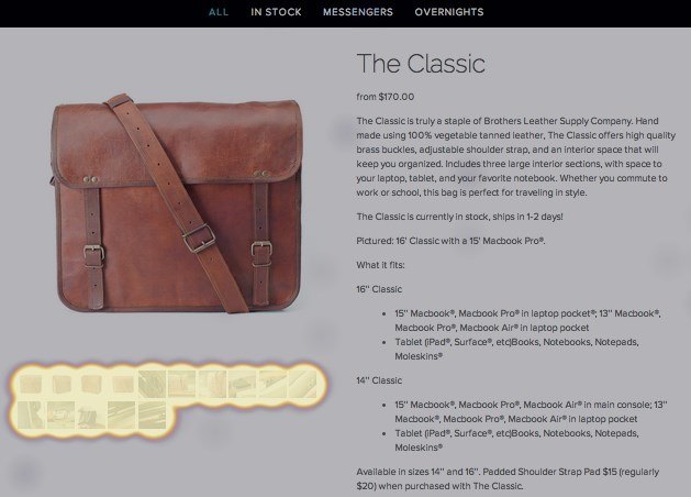
Founder of Brothers Leather Supply Company, Adam Kail, explains how this map changed the business’s focus when it came to product page design:
Heat maps have reinforced our need for great images on all of our product pages. We used to slave away over the right copy — but now we spend time getting images just right. Each image shows a different use or angle for our bags... Future customers want to know how the bag looks with a laptop inside when it’s full when someone is wearing it.
Ultimately, that’s the goal of heat map analysis — to discover real-life visitor behavior you can use to optimize the user experience. To illustrate, let’s take a look at another click map that comes from a cell phone landing page:
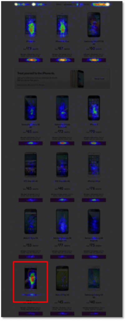
Outlined in red, you’ll notice that the most clicked phone is far below the fold, located under several lesser popular models. So, how can you use this map to improve the user experience?
Replace one of the lesser popular models above the fold with the one outlined in red. That way, people don’t have to hunt to find it.
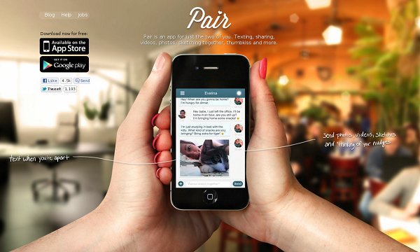
Maybe the most relevant heat map to landing page design comes from a case study by VWO on a client, Pair (now Couple).
Here’s the app’s original homepage:
And here’s what the click heat map of that homepage looked like:

Do you notice what Pair’s growth marketer, Lim Cheng Soon, did in this heat map? He says:
Turns out, I found out too many people click on the navigation bar on the top instead of clicking the conversion button (link to AppStore and Google Play). So I made up a theory that having too many “distractions” around the conversion button wasn’t such a good idea.
So I do a couple of A/B tests based on the theory of removing the “distractions” around the conversion button.
The results?
- Hiding the “download free” text above the button boosted conversion rate by 10%.
- Hiding the navigation menu boosted conversion rate by 12%
Soon’s theory of “too many distractions” isn’t made-up at all. As several other tests have shown, navigation links can drastically decrease conversion rate. On your landing page, it’s best to exclude them from your design.
Click maps like the ones above are particularly valuable because of a click signals intent — the action is more likely purposeful than random. When someone clicks, they do so because they want to learn more about a particular element, or the content it corresponds to (a CTA button, “about us” link, etc.).
Scroll heat maps
“You won’t finish this article” was the title of a piece published by Slate in 2013. In it, author Farhad Manjoo revealed findings from a joint heat map analysis between Chartbeat and the online magazine, which showed that very few people read all the way through articles.
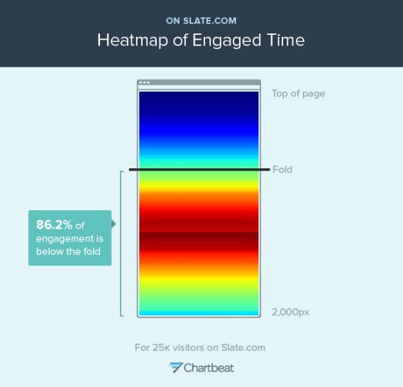
Even though an impressive 86.2% of engagement took place below the fold, only 25% of people scrolled past pixel number 1600 (most Slate articles are around 2,000 pixels long). Insights like these are what scroll maps are helpful for uncovering — particularly on longer pages.
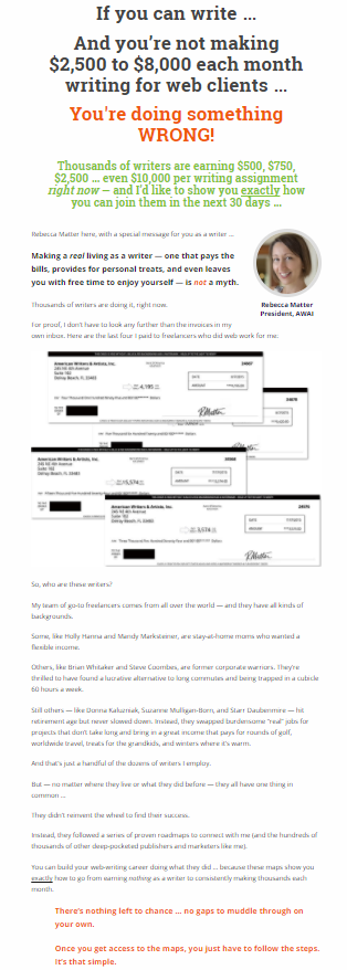
In landing page terms, that’s most likely to be a sales page. These expertly drafted persuasive pieces of marketing collateral can grow to behemoth proportions. This one, for example, is over 5,000 words long (click here for full page):
A scroll map on a page like this can tell its creators where people are dropping off in the reading process. With that data, creators can hypothesize reasons for the drop-off — lackluster copy, annoying advertisements, or even a change in background color, says Peep Laja:
If you have strong lines or color changes (e,g. white background becomes orange), those are called ‘logical ends’ – often people think that whatever follows is no longer connected to what came before.
From there, optimizers can test potential ways to get people to read the whole page — which one Nielsen Norman Group experiment shows is certainly possible:
![]()
It’s rare but possible.
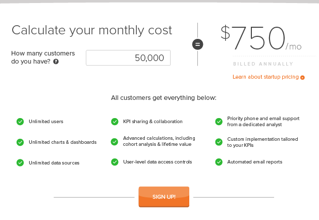
Keep in mind, the map above is of eye movements, not exclusively scroll depth. That means it’s more detailed than what you’ll see on a scroll map, which will only show how far your visitors progressed down the page. Here’s an example from a test done on RJMetrics’ website:
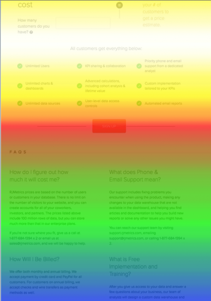
The most viewed areas on this web page, by color, are:
- White
- Red
- Yellow
- Green
- Blue
We know what you’re thinking: How could the very top of a page be viewed less than the middle?
Well, research from Chartbeat shows that many people tend to start scrolling before a page even loads, which means they’ll miss the very top.
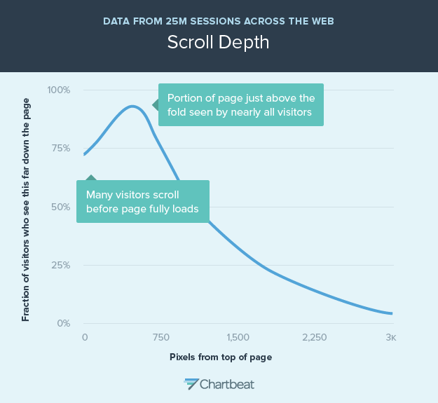
Their research also shows that engagement peaks just below the fold for many pages:
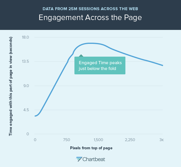
And that may explain why the area near the fold is red, while much of the area above it is yellow.
From this map, Stephanie Liu, a former front-end developer at RJMetrics, came up with the following hypothesis:
My hypothesis was that moving the button into the white hot scroll map area would cause the design to have a higher conversion rate as compared to the original pricing page. More people would pay attention to the button simply because their eyes would be lingering there longer.
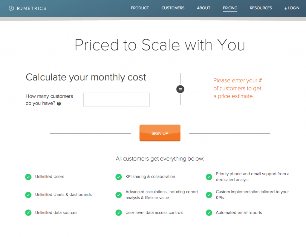
The original page looked like this:
The variation she created looked like this:
The result was a 310% boost in conversions.
The two important takeaways from this scroll map test are:
1. With a scroll map, you won’t know why people are scrolling as far as they are. You and your team will have to do some hypothesis testing to figure it out.
2. Sometimes you don’t necessarily need to know why people drop off where they do. The goal isn’t always to get people to scroll deeper. In Stephanie’s case, simply moving the CTA button to a more highly viewed area brought a big conversion lift for RJMetrics.
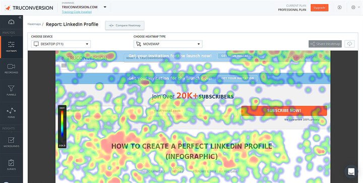
Hover heat maps (aka movement heat maps)
Your eyes move where your mouse cursor does — that’s the general assumption hover heat maps, also known as “movement” heat maps, are founded on.
The accuracy of these maps relies on the correlation between eye movement and mouse movement, which the study referenced earlier shows can be around 84-88%. Other sources, though, aren’t convinced it’s that high.
In 2010, Dr. Anne Aula of Google released her findings on the accuracy of hover heat maps:
- 6% of people showed a vertical correlation between mouse movement and eye movement.
- 19% of people showed a horizontal correlation between mouse movement and eye movement.
- 10% of people hovered over a particular page element while glancing at areas around it.
And yet another experiment from Google and Carnegie Mellon found a 64% correlation between mouse movement and eye movement.
Needless to say, research on movement heatmaps is all over the place. But what about real-life applications?
Well, that’s kind of all over the place too.
Here’s a hover heat map North Face used to optimize its checkout page:
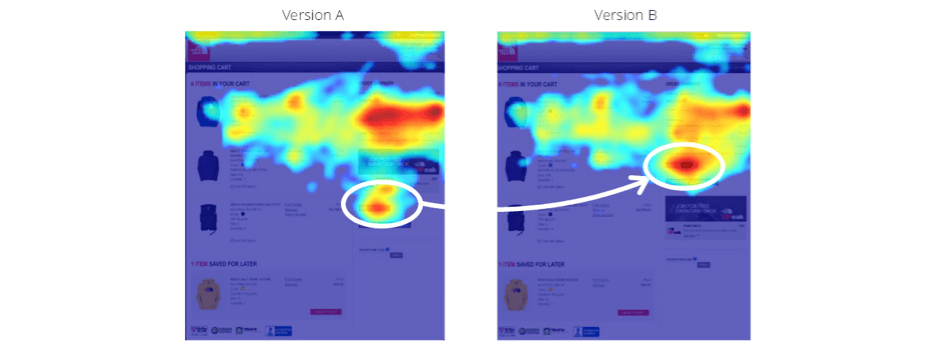
On the left, Version A seems to show a banner on the right sidebar is getting more attention than the CTA button (circled in white) below it. Version B takes that into account and switches the banner with the button (again, circled in white).
The result was a 62% boost in conversion rate.
Here’s another hover map that seems to show… Well… See for yourself:
There doesn’t seem to be a clear takeaway from this map. There’s lots of hovering. Everywhere.
Overall, the most important thing to take away from hover heat map research and its practical applications is this:
Use hover maps to inform your design, but in the words of EyeQuant’s Rory Gallagher, “don’t over-generalize.”
If your map looks like the one produced by North Face, you might have a valuable hypothesis for A/B testing, like this:
“We noticed from a hover heat map that the area above the checkout page CTA button seems to be earning more visitor attention. Therefore, we believe that by switching the button with the promotional banner above it, we can boost checkouts.”
If you develop a testing hypothesis from the second heat map, though, you’re probably guilty of confirmation bias — looking for a particular result from a test simply because it confirms your belief in something. A misinformed stretch might look something like this:
“We noticed from the hover heat map that the words ‘How To’ seem to attract more attention than anything else above the fold. Therefore, we believe that all blog post headlines should start with ‘How To’ in the future to draw readers in.”
“How to” is a great way to begin a headline, but this test doesn’t indicate that. Approach your heat map results with a skeptical mindset, and only test when you have a clear reason to.
Using heat maps responsibly
Heat maps are valuable for uncovering how people use your web page, but they should not be the only tool you use to do so. Alone, they paint an incomplete picture of your users, and relying on them as your sole indicator of prospect behavior has the potential to mislead you. The team at Optimizely offers an example:
When looking at a heatmap of a form, it may show that users are clicking on the first field and that there are fewer clicks on the subsequent fields.
This could suggest that users are dropping out of the process after filling out the first field. What heatmaps do not show, however, is if users have used their keyboard to tab through form fields, rather than their mouse.
For reasons like that one, combining your heat maps with insight from other tools like Google Analytics or Instapage Analytics will form a fuller image of how your prospects behave on your post-click landing page.
But, will that “fuller image” be worth anything? Not if you don’t collect enough user data, says Peep Laja:
You need enough sample size per page/screen before you can trust any results. A rough ballpark would be 2000-3000 pageviews per design screen. If the heat map is based off like 34 users, do not trust any of it.
At the end of the day, it’s important to remember that heat maps aren’t data; they simply organize data in an easily digestible way. They show clicks, scrolls, and hovers. What those mouse movements mean is up to you to determine.
Always connect all your ads to personalized post-click landing pages to lower your cost per customer acquisition. Start creating your dedicated post-click pages by signing up for an Instapage 14-day free trial today.

Try the world's most advanced landing page platform with a risk-free trial.