Landing pages are becoming more commonly used in digital marketing for the simple reason that they establish a great first impression with prospects and have the best chance at turning prospects into leads, and eventually converting those leads into lifelong customers.
But that first impression stage only holds true when landing pages are fully optimized, and creating an optimized page can be challenging if you’re new to the process.
What elements should your landing page include? What are some of the best design practices that will influence visitors to convert? Which one is the best landing page framework?
The “best framework” doesn’t exist because each offer and business are unique. There are, however, some necessary components that help you build a robust framework and keeps visitors engaged on the page so they can convert.
When you piece it all together, only then can you design an optimized page that will convert time and time again. This article will guide you through some of the key elements that compile a great landing page framework, with supporting examples that can easily be executed using the Instapage Platform.
Components of a great landing page framework
1. Compelling headline
You can’t afford to skimp on this one because the headline is the first thing visitors see when they land on your page. Writing a compelling headline will help prevent visitors from bouncing immediately and will encourage them to stick around long enough to consider your offer.
No matter what you’re promoting, your headline should always possess these three main characteristics:
Clarity
Get right to the point. Clearly explain your product or service so that there is no question or ambiguity about what is being offered.
Relevancy
Fulfill your ad’s promise. The ad that sends visitors to your page must have message match so visitors aren’t disappointed when they arrive at your page.
Empathy
Feel for the prospect. Address your visitor’s problem in an empathic way and be sure to provide a solution to that problem.
There are four primary ways you can create a strong, compelling headline:
- “How To” — Start your headline with “How To” and then finish by offering a solution to your visitors problem with your product or service.
- Ask a question — Present the question, then the answer in the subheadline and/or main copy.
- Use humor — While it may not always be appropriate, being funny can often win people over.
- Provide your unique value proposition (UVP) — Provide visitors with a compelling reason to choose your product or service over anyone else and how you set yourself apart from your competition.
Some landing pages also have subheadlines, which helps support and reinforce the claim made in the primary headline.
Here’s a great example from Hatchbuck making excellent use of a landing page headline and subheadline. Once you click their Google search ad, you continue to the landing page:
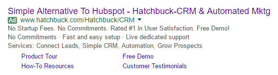
Notice how the brand uses all three characteristics of a compelling headline — clarity, relevancy, and empathy — to capture visitor’s attention and keep them on the page:
The ad and page headline match perfectly, both stating that Hatchbuck is a simple alternative to HubSpot.
The headline may not get directly to the point as best it could, but it teases the visitor enough to read the subheadline, which clears up any questions visitors may have about Hatchbuck’s services.
Empathy is expressed in both the headline and subheadline. Hatchbuck is speaking directly to small businesses who have experience with HubSpot but don’t want to pay a premium for features they don’t even use.
2. Effective copy
Good, persuasive copy is crucial because this is one of the primary methods to get your point across and convince prospects to convert — the benefits of your product, your UVP, etc. Among which the following should be considered.
Amount
The amount of copy could make or break the page. Too much and your visitors may feel overwhelmed and leave the page without reading any of it. Too little and they may feel uneasy about whether to pursue your offer. So the amount of copy on your landing page really depends on your offer.
If you’re offering an ebook, white paper, or guide you probably don’t need very much copy. Just the basics (what’s inside the resource, the benefits of downloading, etc.) should be enough to convince visitors to click the CTA button.
Conversely, if your offer is for something more extensive, (e.g. anything that requires payment, like a sales page for copywriting course) then it’s a good practice to provide all of the necessary details in your landing page copy. Nobody wants to pay for something they’re not entirely sure about, so it’s usually better to be safe than sorry.
Writing style
The most noteworthy point here is to make your copy customer-centric so that it speaks directly to your visitors. Using words like “you” and “your” instead of words like “we,” “us,” and “our” is a great way to show prospects that you’re focused on providing a solution to their problem.
Your copy should also convey why your product or service is better than the competition. When doing this, avoid buzzwords like “new and improved,” “cutting-edge,” and “innovative,” as these don’t mean as much to the reader. Instead, explain the benefits of your product or service — how it will specifically help them — rather than just the features.
Formatting
Since most online readers only scan web pages, using various formatting techniques, like bullet points, numerals, lists, bold copy, italics, etc. can ensure that the most important bits of information will stand out.
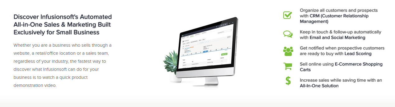
InfusionsoftSalesforce is one of many brands that uses these formatting techniques to provide compelling, persuasive copy to its viewers. Notice the bold print, the customer-centric wording, and the small chunks of information separated by bullet points:
3. Engaging media
Since we know a majority of online users don’t like to read web page copy, what better way to get your information across than some engaging media? Three main types of media can be incorporated:
Images
Landing page images shouldn’t just look pretty. They should also be attention-grabbing, relevant, and assist in the conversion process. Images on landing pages can be used to accomplish a number of tasks, including:
- Showcase products or product features
- Introduce employees or highlight customers
- Add human appeal and evoke emotion
- Tell a story about your brand
- To direct attention toward an important element, like a CTA button
Videos
Videos on landing pages are even more effective than images. That’s because research shows that:
- 96% of consumers find videos helpful when making online buying decisions
- 58% of those consumers consider brands that produce videos more trustworthy than those without
- The average visit to a web page containing video lasts almost 6 minutes, while the average visit to a site with just text and images lasts only 43 seconds.
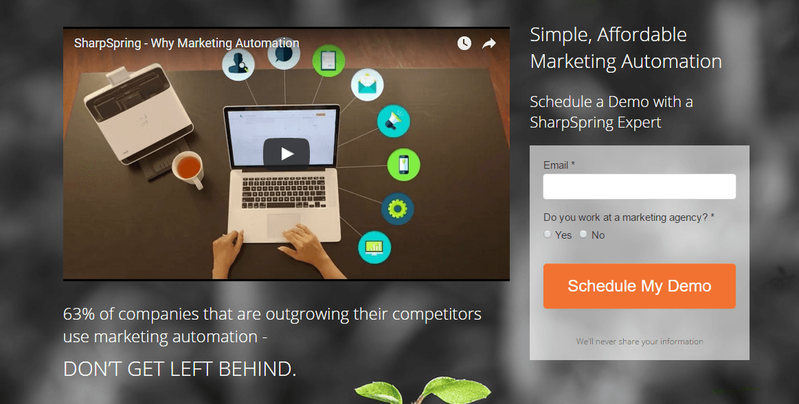
SharpSpring added a short video to its landing page below, telling visitors about the importance of using marketing automation in their marketing strategies, and why SharpSpring is the best solution to accomplish that:
Gifs
Gifs make a good substitute for videos on landing pages. These animated images are also great for explaining offers and are more interactive than images. For example, SaaS companies can show a short demonstration of their dashboard and how a typical customer uses the service.
4. Trust indicators
Potential customers should be able to trust your brand before they make the decision to convert on your offer. That’s why incorporating trust indicators to add credibility is essential to your landing page framework.
Here are five common ways to add trust indicators to landing pages:
Statistical evidence
Getting your visitors to convert often relies on providing statistical proof on how your service is the solution to their problem. The proof is best displayed in the headline, subheadline, or copy. When using this method, don’t forget to include the source that generated the proof.
Trust badges
Authority badges can include awards from other websites, customer logos, and more. By including authority badges, you’re saying to visitors, “Look at all these well-known companies we’ve successfully helped… We can help you too.”
Customer testimonials
A recommendation from a satisfied customer is one of the most powerful trust indicators that exists. Be sure that when you’re providing a review or a direct quote from somebody that you provide as much information as possible (full name, business, title, headshot), as this makes the testimonial much more credible to the visitor seeing it.
Third-party seals
Third-party seals let your visitors know that doing business with you is safe, and their information will not be shared or compromised. There are many seals of approval but one study found that the three most recognizable logos are Paypal, Verisign, and McAfee. These also help build trust and persuade visitors to convert. Blue Fountain Media learned that firsthand when they found that just by adding a third party seal, conversions increased by 42%.
Privacy policy
A privacy policy link is one of the very few exit links marketers can include on their landing page (along with terms of service). That’s because they help build trust by informing visitors how their information will be shared (if at all). This link is typically added either below the lead capture form or in the footer.
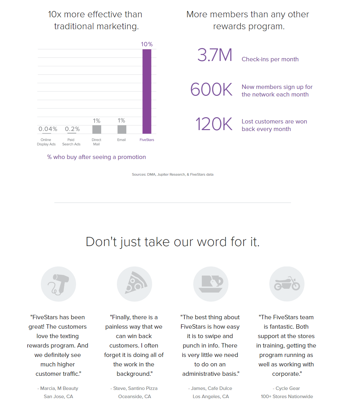
FiveStars does a great job providing trust indicators on the landing page below, as they deliver “proven results” (statistical evidence with cited sources), as well as customer testimonials with several bits of personal information about the person:
5. Lead capture form
Lead capture forms are your ticket for collecting visitors’ information, but forms only work well if they’re designed properly. To accomplish that, forms must:
- Only require essential information from prospects, as to not intimidate them (the amount of form fields depends on the marketing funnel stage your offer sits — the higher the funnel stage, the less information is typically requested, vice versa)
- Be properly organized so that it’s easy for visitors to complete
- Be placed strategically on the page (“above the fold” is no longer a requirement because everyone scrolls)
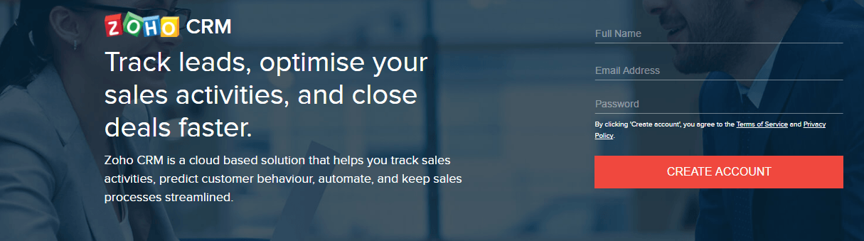
Zoho’s lead capture form below is very short and doesn’t request much personal information, which makes it more likely that prospects will create an account:
Another method to designing lead capture forms is the two-step opt-in. This technique allows you to simplify the page by removing the form and only including a CTA button. When visitors click that button, a pop-up box opens with the form. Breaking up the steps like this helps remove some of the intimidation that forms present.
6. Strong call-to-action
This landing page element should stand out above all the rest. There should be no confusion as to where prospects need to click to redeem your offer.
Consider the following factors when designing your CTA button:
Position
By placing your CTA button too prematurely on the page, you run the risk of losing conversions. When you place the CTA after you’ve introduced and explained your offer, it’s more likely that visitors will already be convinced to convert. White space can also help with positioning by isolating the button and drawing attention to it.
Plus, there is the F-Pattern and Z-Pattern to consider. Both of these web design techniques can help you influence where visitor’s eyes move (while leading them to your CTA button).
Of course, CTA positioning and the patterns are all things you can A/B test.
Size
Don’t disguise your CTA by making it too small. Make it obvious what you want visitors to do… convert!
Color
To really make your CTA button “pop,” it needs to contrast well with the rest of the page. That doesn’t necessarily mean bright colors, either. Consulting the color theory can help you find a hue, tint, shade, and tone that stands out from the rest of your page and draws maximum attention.
Copy
CTA copy can be a deciding factor in winning or losing a conversion. Stay away from boring, vague, and overused copy, like “Submit,” “Subscribe,” “Sign up,” or “Download.” Instead, be specific and use personalized, compelling words to increase conversions.
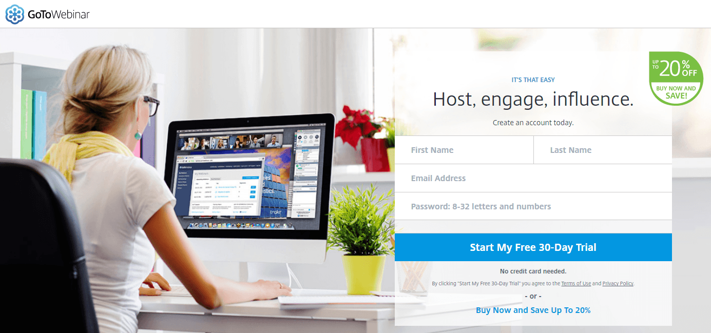
The CTA button copy on this GoToWebinar landing page is action-oriented (“start”), customer-centric (“my”), and uses one of the most convincing words (“free”):
7. No exit links
Landing pages are designed to be hyper-focused pages on a single offer so there shouldn’t be any external links (except privacy policy and terms of service, mentioned earlier). By including links to other pages, you’re inviting visitors to leave your page without first converting.
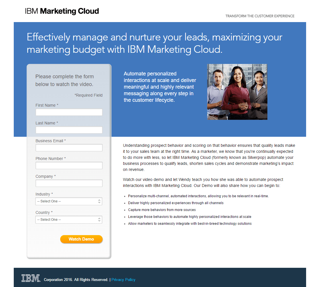
This also means no navigation at the top of the page and only including a minimal footer at the bottom.
No navigation
Landing pages don’t require a navigation because everything the visitor needs to convert should already be included on the page (all the main points in this article). There shouldn’t be a need to jump from page to page; it’s either convert on the offer or leave. If you absolutely must include a small navigation, a hamburger menu is best because this design does not distract attention as much as a full navigation can.
Minimalist footer
Your landing page footer should not be like your website footer — no product pages, no social media links, no sitemap. Keep it extremely simple with a privacy policy, terms of service, and copyright information.
IBM’s landing page demonstrates all these points:
8. Sufficient white space
White space (aka negative space) is the empty area on your landing page that helps to draw attention to specific elements on your page. It doesn’t have to be white per se, as long as it fulfills its purpose. White space is a valuable design technique because it helps create a visual hierarchy and reduce page clutter while improving readability and comprehension.
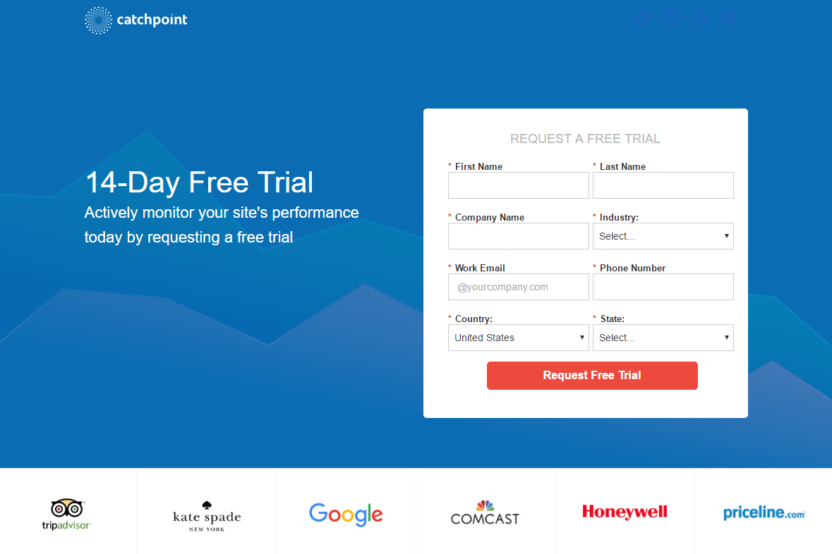
For example, Catchpoint makes great use of white space drawing maximum attention to the headline, subheadline, and lead capture form:
How will you design your landing page framework?
There is no single best landing page framework. The “best framework” is simply the one that results in the highest conversion rate because various combinations of the landing page elements will result in different outcomes for different businesses. That’s why it’s important to always A/B test your landing pages to determine which variation is more successful.
To create your own “best” landing page framework, sign up for an Instapage 14-day free trial today.

Try the world's most advanced landing page platform with a risk-free trial.
