
Are mobile app landing pages part of your campaign strategy?
If they aren’t, it’s time to dive into the world of crafting mobile-responsive post-click landing pages. If you haven’t yet embraced the art of catering to a mobile audience, it’s high time you do. And, we’ve got some compelling evidence to share that will make you a true believer in the power of mobile responsiveness:
- 58% of web traffic is now mobile
- 86% of the top landing pages are mobile-friendly
With a growing number of folks adopting mobile devices as their go-to for web browsing, overlooking mobile optimization is no longer an option. If the goal is to have your customers not just interested but eager to purchase your product, it’s imperative that your web pages shine on their smartphones.
Lately, we’ve seen a lot of companies using the term “responsive” in a less than accurate way, and we want you to know what a real responsive landing page looks like. That’s why we have gone through a massive number of mobile app landing pages and picked out the gems for you to learn from.
Before we get to the examples, let’s make sure we’re all on the same page about what mobile app landing pages are.
What are mobile app landing pages?
Mobile app landing pages are pages that are compatible with mobile devices. The compatibility ensures that your visitors have the best experience on your post-click landing page even on a small screen, which increases your conversions.
Not sure how to make your post-click landing pages mobile responsive? This checklist covers the most important aspects of mobile post-click landing pages.
- Quick load time
- Short, action-oriented titles
- Short, smart post-click landing page copy
- A CTA button that works well in touchscreen mode
- Keeps the most relevant information above the fold
- Looks good in landscape and portrait mode
- No unnecessary navigation links
- Asks for minimum information on forms
- Possibly uses a “click to call” button versus a CTA button.
Curious what this looks like in action? Here’s a showcase of five great mobile app landing pages.
Shopify
Here’s the desktop version:

Here’s the mobile version:

See the difference?
It’s subtle, but these changes make the mobile version much more readable and easy to convert on. The headline has the same wording, but it’s in a different format. On the desktop version, since there is more room, you see a teaser of the rest of the page in the hero section. On mobile, the Strat Free Trial CTA is much more prominent and there are no graphic elements, aside from the Shopify logo.
But, the landing page color palette and CTA button are the same – only the format is different. This keeps brand consistency across channels while respecting that the different mediums call for different approaches.
Pumble
Here’s the desktop version of the landing page:

Here’s the mobile version:

While the header and CTA remain consistent, building brand familiarity, the are some key differences between the desktop and mobile versions that really highlight that Pumble designed this page specifically for mobile. For example, in the desktop version, while there is a shortened navigation bar, there are still opportunities to click off the page. However, in the mobile version, these navigation options are behind a menu select icon, ensuring that the potential customer using mobile isn’t distracted and doesn’t click out of the browser.
Additionally, they have reformatted where the product image is from the desktop to the mobile. Doing this allows them to keep their product preview image without sacrificing precious space or stretching out the mobile version of their landing page. In fact, the preview of the image in the hero section may encourage those interested to keep scrolling.
Finally, while the CTA copy and design remain the same, the CTA on mobile takes up about 20% of the page and is much more prominent than in the desktop design.
This is a great example of simplicity that acknowledges the importance of mobile interaction from the get-go.
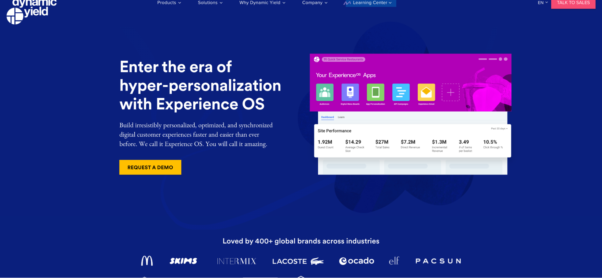
Dynamic Yield
Here’s the desktop version:
Here’s the mobile version:
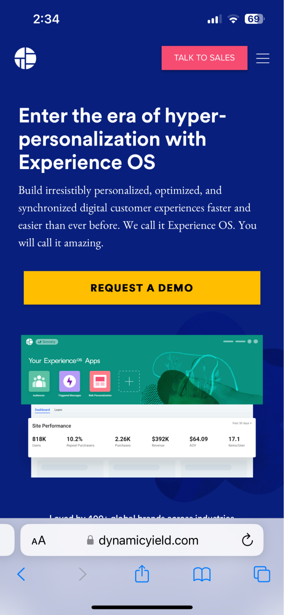
The headline is the same, but it works on both platforms because it is value-packed. The main differences are the lack of a Navigation Bar in the mobile version, as well as the CTA taking up much more space than it does in the desktop version. They manage to keep the same scrolling image previews, without sacrificing space or sizing above the fold, which is impressive!
Staffbase
Here’s the desktop version:

Here’s the mobile version:

While there is a full navigation bar in the desktop version, all navigation options are hidden behind a menu icon on the mobile version. The headline and sub-header are the same. However, the CTA is now not only larger, but it also spans the full width of the page and demands much more attention. They’ve also saved that great, brand and platform-forward image and scaled it down in size to fit mobile without losing clarity, which is a common problem on unresponsive mobile landing pages.
Squarespace
Here’s the desktop version:
Here’s the mobile version:

The mobile version has the same headline, the same copy, and the same images. Again, what it doesn’t have are the navigation links at the top of the page. Another thing the mobile version has is a better view of the picture, which may suggest that they optimized for mobile first and then made their desktop landing page. Interesting!
Conclusion
Mobile app landing pages aren’t just here to stay, they’re a necessity across verticals and audiences.
To turn ad clicks into conversions, create dedicated, fast-loading landing pages for every offer. See how to provide all of your audiences with unique landing pages by signing up for your 14-day free trial today.

Try the world's most advanced landing page platform with a risk-free trial.
