
In the past, the Instapage website team split tested the homepage with headlines, customer logos, testimonials, etc. Then, testing images versus mp4 animations. Each test revealed some interesting insights, no doubt. But A/B testing the homepage is one thing because it’s your online storefront and people can land there from a variety of places online.
The pricing page, however, requires a little more user searching — they have to click on a navigation header after they land on any other website page.
With that audience, we still want to see how people engage with the page and which variation generates more free trial signups and enterprise demo requests. Today’s article highlights those experiments.
Why did we A/B test the pricing page?
The pricing page generates the most interest from our site visitors. After all, a potential customer needs to share certain vital information, like pricing and features, to their company to start using a sophisticated product like Instapage.
Additionally, the pricing page is a critical part of the customer journey. It’s essential to test and experiment with the funnel to seek improvements that can raise conversion rates or improve the customer experience.
Experiment #1: Page layout
We tested a layout variation that displayed the feature comparisons between our self-service and enterprise plans. The original pricing page layout existed on the Instapage website since a recent redesign. The variation was an additional mockup created for the redesign.
We tested all visitors to the page with a 70/30 split (70% to the original, 30% to the variation) that would allow a significant number of visitors to interact with the variant page and produce statistically significant data. By tracking a goal that was tied to conversion actions, we could conclude whether the redesign impacted the goal.
Here is the original page design (notice the lengthy list of features side-by-side):

Here is the variation tested against the original (notice how the features are separated out by customer plan):
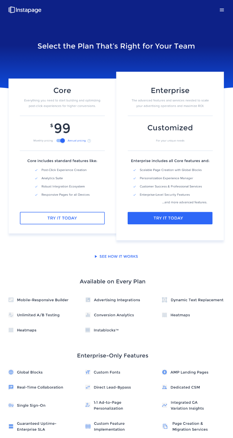
(Note: The above screenshot is from a previous test and is different from our current live pricing page. Content may not match and should not reflect Instapage’s current pricing and plan options.)
What was the initial hypothesis?
Our initial hypothesis was that a redesign would make it easier for visitors to see which features were available on each Instapage plan, along with a section dedicated to enterprise-only features. Naturally, the goal for the test was to increase free trial signups so that new users could evaluate the Instapage platform in its entirety. Furthermore, we were hoping for a conversion rate lift as well as more inquiries into the Enterprise plan.
What do the results show us?
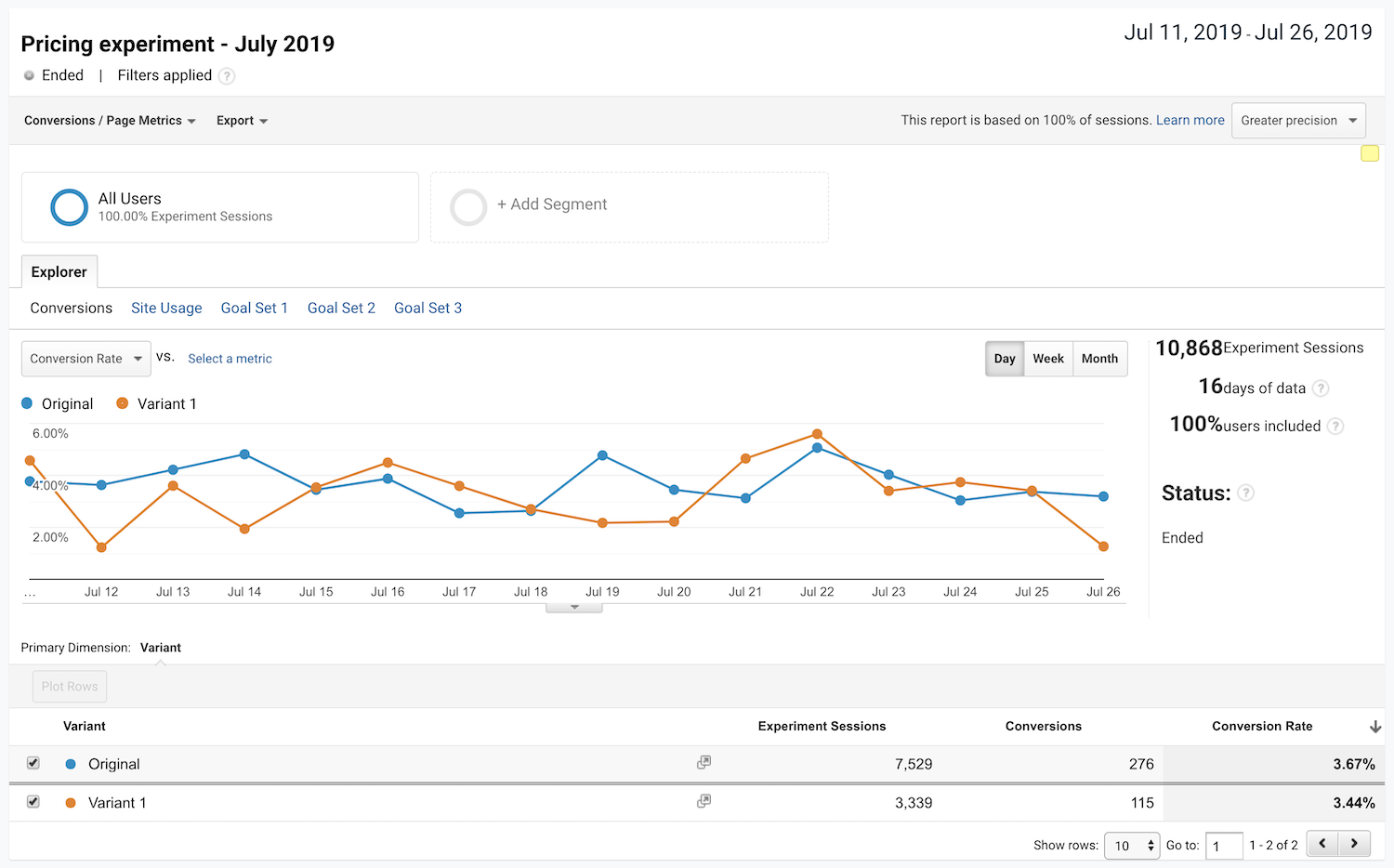
The results showed the original outperforming the variant for all user segments. We split our audience into four user segments (new users, returning users, organic traffic, and paid traffic) to determine if there is any notable difference in on-site behavior.
In addition to our free signups conversion goal, we also analyzed time spent on page, exits, and bounce rate:
Experiment #2: Feature comparison side-by-side
Our second pricing page experiment was a variation of how our original design displayed the side-by-side feature comparison.
Initially, the pricing page displayed the most popular or highest differentiating features towards the top of the page. However, most of the other features were hidden, but visitors could still click a button to reveal the entire list for a side-by-side comparison. The team decided to run a rest whether people had sufficient information to sign up for a free trial with just these top-level features revealed. Or, if seeing all features in a long list resulted in a higher conversion rate.
What exactly did we test?
We tested the original layout (from the redesign and experiment 1) with a variant that had all the features revealed on page load. Again, we ran a 70/30 audience split and waited for the pages to reveal enough data to be a significant indicator of performance. We also kept the same goal of free trial signups as the previous experiment.
What was the initial hypothesis?
Our initial hypothesis was that if we showed users a condensed version of the features list, we would provide enough information for a free trial sign up to occur without overwhelming visitors. We expected our original design to outperform the variant, but also wanted to challenge our assumptions and were interested in the user behavior of the four audience segments mentioned earlier. Furthermore, the team was curious to see if a fully expanded side-by-side feature comparison would influence the number of Enterprise demo requests we received.
What do the results show us?
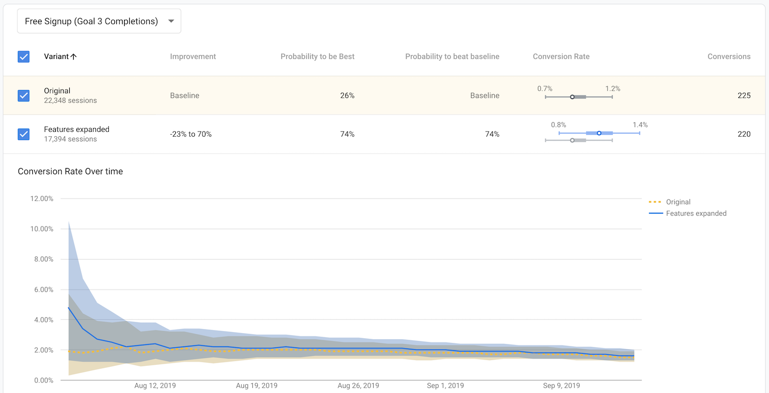
For this experiment, the initial results indicated the variant narrowly winning against the original. To confirm the test result, we analyzed additional performance metrics such as bounces, time spent on page, and conversion rate to be confident the variant as the winner over the original:
Conclusion
The current version of the pricing page is running the expanded view with all features listed in a side-by-side comparison. Without split testing the page, the Instapage team would not have come to that conclusion confidently.
You can visit the pricing page to see the full list of Instapage suite of features and request a demo. Or, get your own customized demo today.

See the Instapage Enterprise Plan in Action.
Demo includes AdMap™, Personalization, AMP,
Global Blocks, heatmaps & more.