
Today, as a real estate professional, if you want to reach potential homebuyers you have to start online. A recent report from the National Association of Realtors shows that 42% of people looking for a home started their search on the internet, and a joint study from Google and Realtor.org showed that at some point, 9 out of 10 home searchers used the web as a resource to help them find a new living space.
That means no matter what part you play in the real estate industry — whether you’re a mortgage lender, a real estate agent, an investor, or any other professional in the field — you should be using the internet to convince your prospects to use your services. How?
With web pages designed specifically to compel people to take action, called “landing pages.”
What is a landing page?
A landing page is a standalone web page designed specifically to elicit a particular action from its visitors. This could be to sign up, download, request a consultation, among others. This page is disconnected from a website’s main navigation, and it should contain persuasive elements like authority badges, benefit-oriented headlines, and hero shots to convince visitors to act.
Here’s how professionals in the real estate industry use them to drive action from potential customers.
1. Mortgage lending
As mortgage lenders, you’re who people come to when they’re ready to buy a home, but can’t afford it up front. In this industry, it’s important to focus on making your prospects feel secure because the decision to take out a loan of this size is a big one. Let’s see how these lenders make their prospects feel comfortable enough to convert:
Wells Fargo
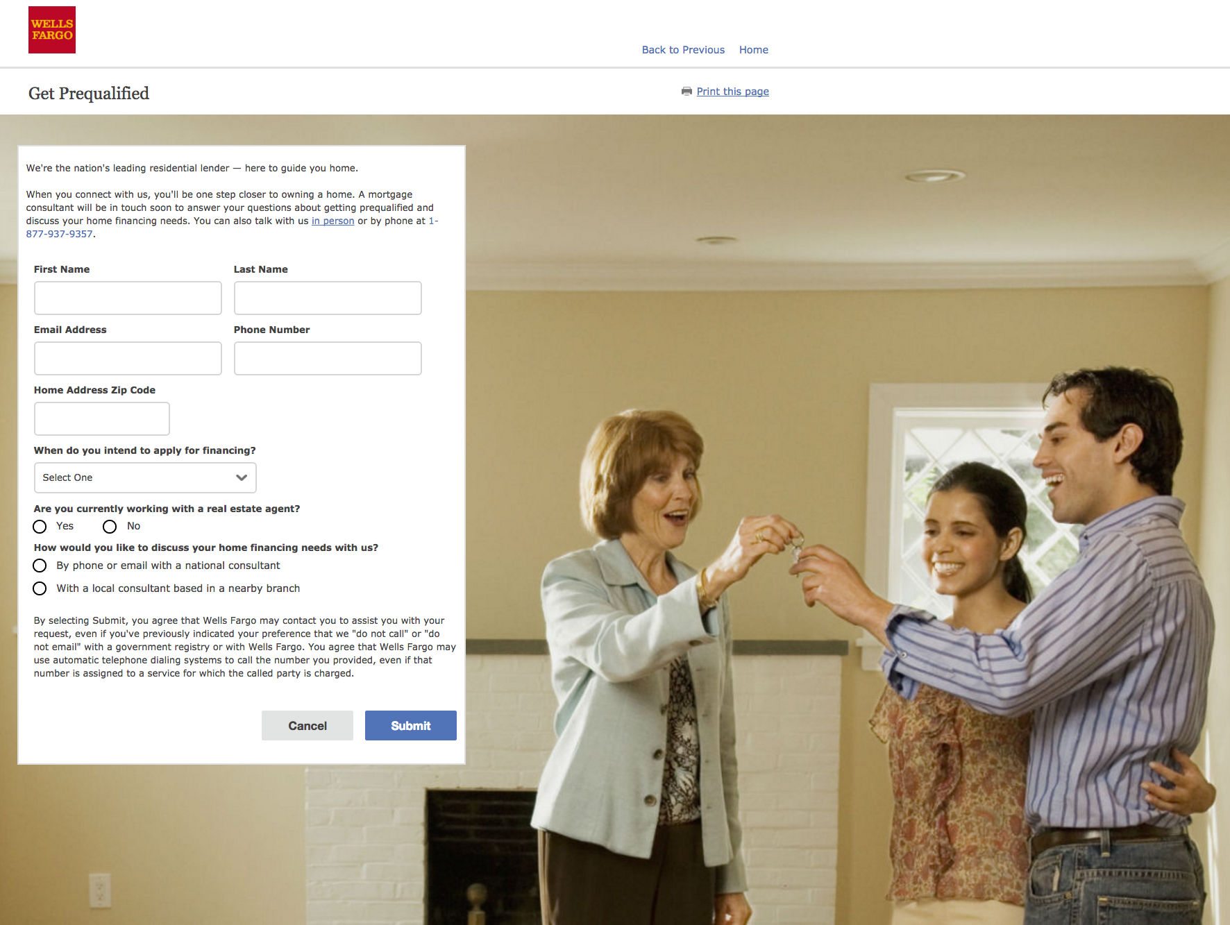
This Wells Fargo landing page falls short in too many ways. First, let’s talk about the navigation bar. Why is it there? This landing page should contain everything a visitor needs to make the decision to convert (in this case, fill out that form) — so they should never have to leave to go back to the Wells Fargo homepage to learn more. The hyperlinked logo along with the “back to previous” and “home” links allow them to do that. Additional links in the footer and throughout the page allow them to escape this landing page as well.
Second, what’s with this headline? “Get Prequalified” may seem like it conveys a benefit at first glance, but does it really? What’s the real benefit hidden behind this benefit? Why should the visitor want to get prequalified?
If prequalification helps visitors get their loan faster, or with less of a hassle, the headline should emphasize that. “Get Prequalified” likely doesn’t resonate that strongly with the prospect.
But it’s not all bad. They make good use of a hero shot – an image that displays the benefits of converting to the visitor. In this case, it’s a happy couple receiving the keys to their new home from a realtor.
The page also does an excellent job of showing the prospect how to get in touch with customer service if they have any questions, and of keeping the lead capture form frictionless by not asking for overly sensitive personal information. Here are more landing page examples from Wells Fargo.
Quicken Loans
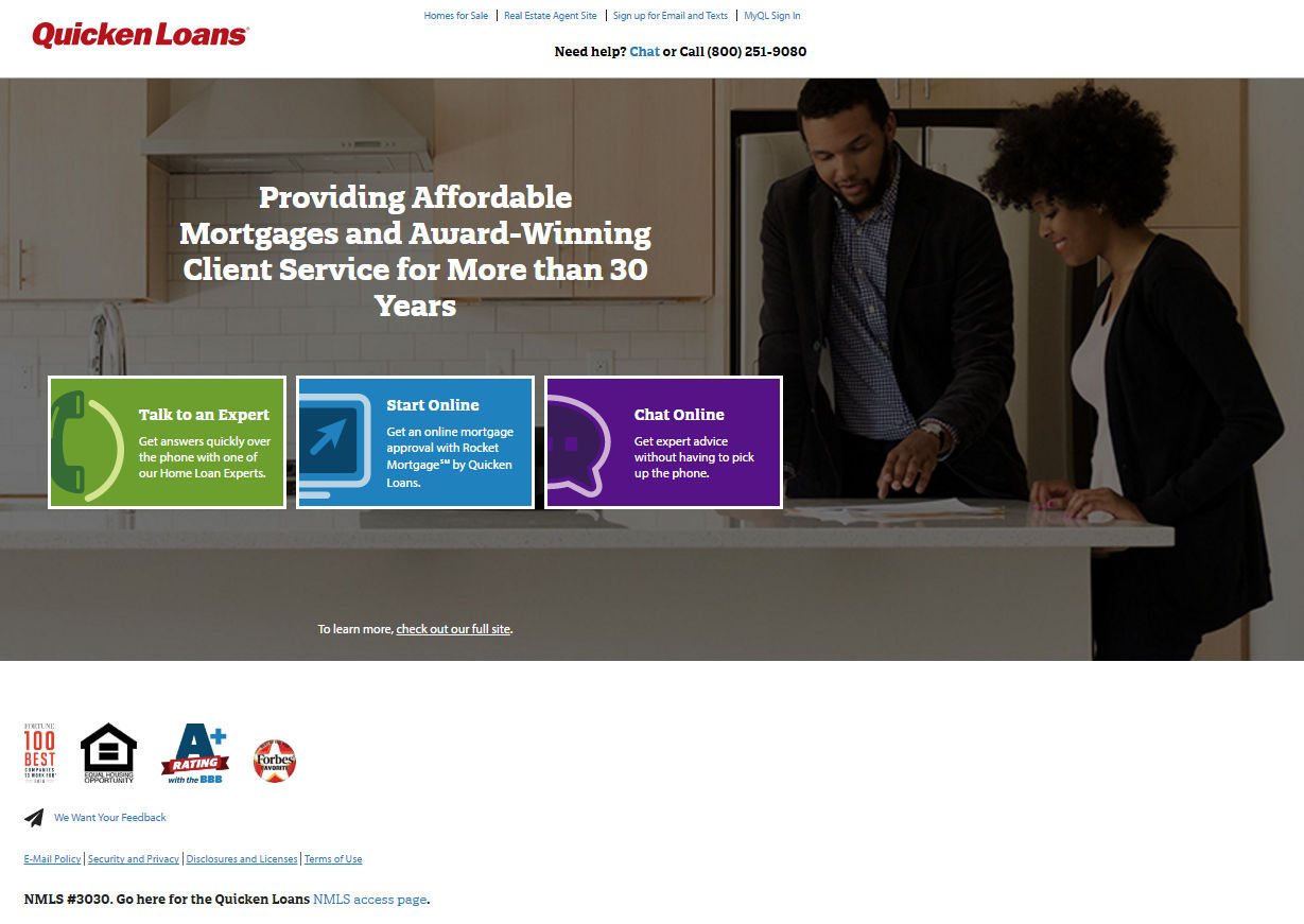
Unfortunately, at first glance, this Quicken Loans landing page isn’t off to a great start either. A hyperlinked logo, along with additional links in the navigation and footer, allow visitors to escape fairly easily.
In fact, one of those links reads “To learn more, check out our full site.” Again, your prospect should never have to leave your landing page to learn everything they need to know to be comfortable with converting.
Think of your landing page as a virtual elevator pitch. It should contain all the information prospects need to make a decision to either follow your call-to-action or abandon your page. What are the benefits of picking Quicken as a lender? Why should prospects choose them?
The closest thing to an answer we can find is in two places. First, in the headline: “Providing Affordable Mortgages and Award-Winning Service for More than 30 Years.” In simpler terms, this headline says “We’re experienced, and we provide outstanding customer service.” Both are important things to look for in a lender.
The second place is at the bottom of the page, in the left-hand corner. These badges position Quicken as a trustworthy brand, awarded by Fortune and Forbes, and accredited by the Better Business Bureau. But, will these two things be enough to convince prospects to click one of the three cooperative CTA buttons in the middle of the page?
Our guess is, sure, for some. But with more benefits, we’re willing to bet a lot more would convert.
2. Commercial real estate
Most of us are familiar with the kind of real estate agents who sell and rent out residential spaces. As a commercial real estate company, you operate a little differently. Stores, malls, industrial parks, offices — these are the properties you broker. Here’s how one commercial real estate company use post-click landing pages to get businesses to buy.
Ten-X
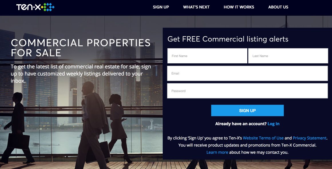
This landing page from Ten-X was made to help people find commercial properties by getting them to sign up for listing alerts. How effective is it at accomplishing that goal? Let’s dig in…
First thing’s first — navigation on any landing page is a no-no. It’s easy here for a prospect to get distracted and stray to another page, without the promise that they’ll be back to convert.
Below that navigation menu, the headline misses the mark. It would’ve been better written as the copy on the form, which is far less prominent than the lackluster headline to the left of it. Even the subheadline (again, far less noticeable) does a better job of teasing out the benefit of using Ten-X’s service. How’s this for a headline:
“Get the latest commercial real estate listings sent to your inbox every week, for free.” A lot stronger than “Commercial Properties For Sale,” right?
Next to that, the form does a good job of keeping friction to a minimum. With only four fields that require fairly basic information, signing up is a breeze.
Below the fold, sections labeled “What’s next” and “How it works” let prospects know step-by-step what to expect after converting.
Underneath that, testimonials complete with names, photos, and how each customer used the service (for example: “Dorsey Walter: Sold New York multifamily building”) adds social proof to strengthen this offer.
Finally, a short “About us” blurb along with a badge from Google and a list of partners, adds authority to Ten-X as a brand. How can you feel uncomfortable doing business with a brand that’s backed by Google, and has closed nearly $40 billion in online real estate transactions?
3. Property management
Property managers like you make the lives of property owners a lot easier. You deal directly with tenants, so owners don’t have to — collecting rent, addressing complaints, and filling repair requests. Here’s how one property management company uses landing pages to boost their authority:
San Diego Property Management
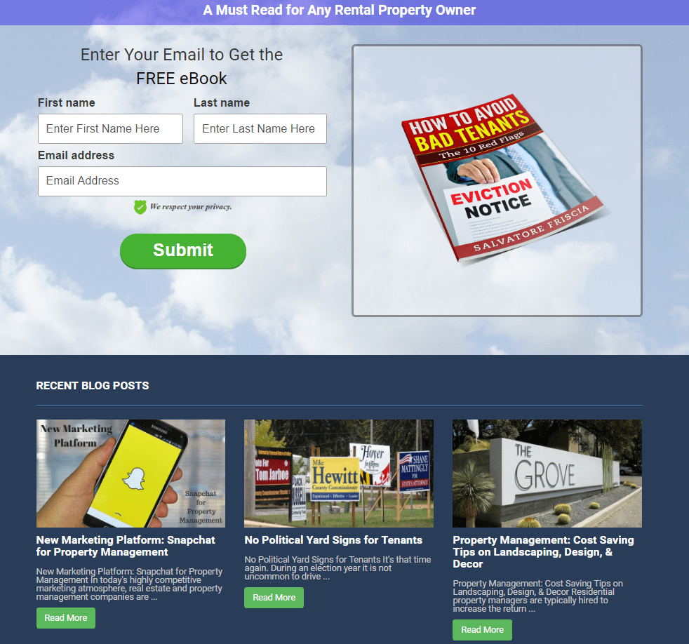
This landing page from San Diego Property Management offers up an ebook to property owners, with the goal of showing them how to avoid bad tenants. By doing so, they position themselves an authority — displaying that they know how to find model tenants.
At first glance, this landing page looks solid. The headline offers up a valuable free resource, the image of the ebook serves as a visual representation of the offer, and the CTA button stands out against the background. But there are a few issues here.
The most glaring problem is the “Recent Blog Posts” section at the bottom of the page. The three post previews are going to distract users from converting. These “Read More” buttons compete with the big “Submit” one above them. Speaking of…
“Submit” is maybe the most bland call-to-action you can use. Instead, try using something called a “give-the-payoff,” which emphasizes what the prospect will get from converting, rather than what they have to do to convert. Here, a GTP might read “Send me the FREE ebook,” or even better: “Show me how to find model tenants.”
After they change up the CTA copy and remove the “Recent Blog Posts” widget, San Diego Property Management will have a sound landing page.
4. Real estate software and search engines
Not everyone in the real estate industry buys and sells living spaces. Some, like you, assist in the process. That’s what real estate companies like Zurple and MyHomeFinder do, by offering services to both buyers, sellers, and agents, to make the home search run a little more smoothly. Here’s how they use landing pages to persuade prospects to take action:
Zurple
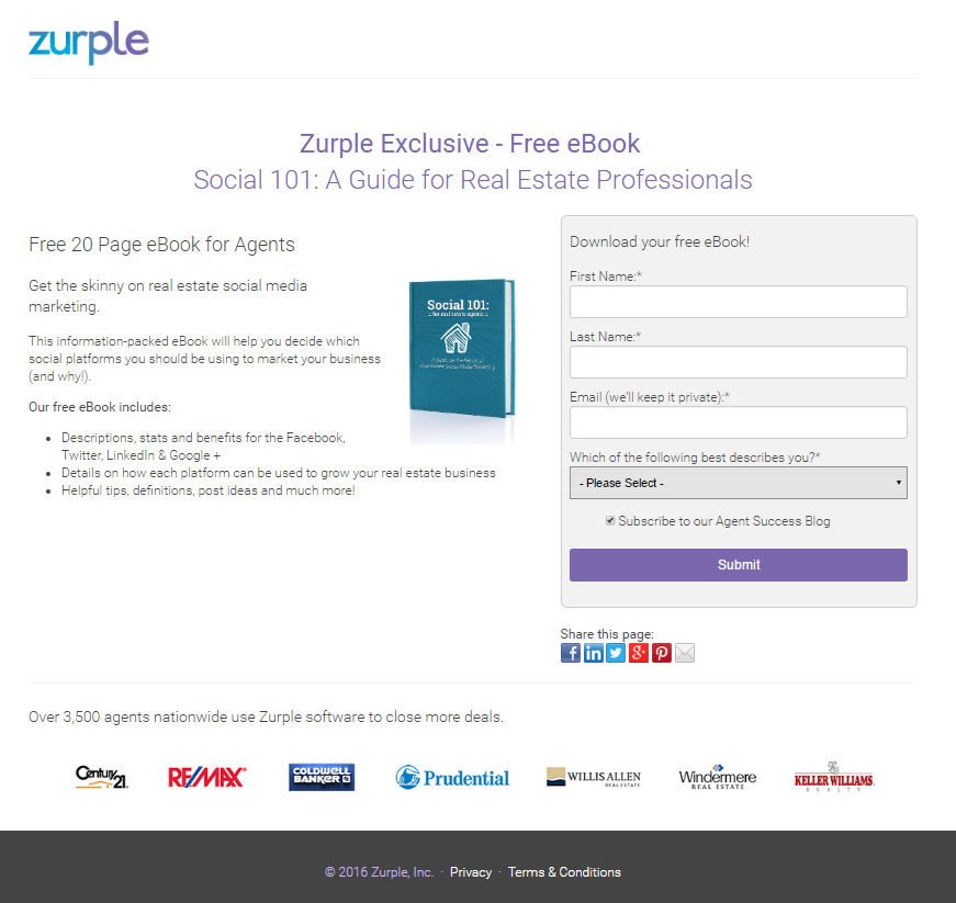
This landing page from real estate software company, Zurple, is one of the best we’ve seen so far. It’s short, concise, and persuasive. Here’s why…
First off, the headline offers an exclusive, free, 20-page guide for real estate professionals. Who wouldn’t want to claim that, especially after reading all the bulleted copy detailing what it includes?
Next, look over to the image, which serves as a great visual representation of what converters stand to gain, then to the form on the right. It’s short, asking only for name and email, and it explicitly states that the prospect’s personal information won’t be shared.
Below that form, you’ll see great examples of social proof. The text “Over 3,500 agents nationwide use Zurple software to close more deals,” emphasizes that the software is widely used by industry professionals, and authority badges align the brand with well-known companies like Century 21, Coldwell Banker, Prudential, and more. If it’s good enough for them, it’s good enough for you, too, right?
The only things we’d change on this landing page are the hyperlinked logo (an escape route to the homepage), the unremarkable “Submit” call-to-action, and the purple button color. It doesn’t stand out as well as it could on a page that already uses purple in multiple spots. But that’s up for debate, as purple serves as a solid choice for an accent color here.
MyAgentFinder
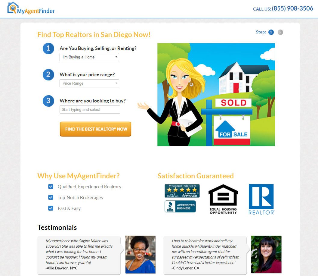
Here’s an example of a well-put-together landing page from MyAgentFinder. The headline communicates the benefit of using the service: “Find Top Realtors In San Diego Now.” In it, the word “Now” conveys that MyAgentFinder will provide its user with an immediate solution to their problem.
Below it, all it takes is completing three fields to convert, and they’re all drop-downs – which makes submitting information even easier. But if you’re not ready to hit the CTA button, (which uses decent language like “best” and “now”, but could be upgraded to the GTP we talked about earlier) you can look down at bulleted, benefit-oriented copy and social proof in the form of trust badges and testimonials.
If that doesn’t convince you, simply hit the click-to-call phone number in the upper right-hand corner to get more information from a customer service representative with the company.
Overall, a pretty sound landing page. The only changes we’d make would be to remove the “Articles” widget at the bottom along with the links in the footer and the logo, and to add some white space between the elements to make this page a little less cluttered.
HomeBay
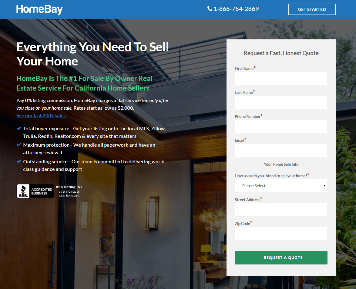
While MyAgentFinder and Zurple do what they can to assist agents in getting found, HomeBay’s looking to cut them out of the home buying process altogether.
On this landing page, they describe their service as “Everything You Need To Sell Your Home” in the headline. A one-stop shop for all homebuyers, this page will need to do everything it can to convince home sellers that the traditional way of selling a home is worth rethinking. So do they? Let’s see…
They start out well, by using bulleted copy to communicate the benefits of using their service over an agent: Pay a 0% listing commission, while getting a lot of the exposure you would normally through an agent. Legal protection isn’t an issue either – their on-hand attorney will review all your paperwork, and their customer support team will walk you through every step of the process. Not bad so far.
The form to the right is on the brink of being a little too long. With seven required fields, the team at HomeBay might consider breaking this registration process into two steps.
Below the fold, a short video from the founder emphasizes the company’s experience and mission humanizes HomeBay by putting a face to the name, and communicates how much the business has saved in commission for consumers: a staggering $2 million.
Next to the video and below, bulleted copy emphasizes all the things you’ll get when you use HomeBay: a professional “For Sale” sign and post, professional home photography, comparative market analysis…
Not so different from the things you’d get with a real estate agent, is it?
Underneath that, you’ll notice testimonials that could be a little bit stronger. First names don’t tend to resonate with readers as much as first and last do, but maybe the custom text that emphasizes how much each customer saved by using HomeBay will make up for that.
Finally, at the very bottom of the page, prospects are hit with one last message about how much they could save by using HomeBay, then, they’re called to action with multiple buttons that work together to get the prospect to convert. With a minimalistic footer, prospects won’t be distracted from hitting any of them.
Overall, we think this is a fairly well-done landing page. What do you think?
5. Home appraisers
Your prospects bought their house ten years ago, and since then, they’ve finished the basement, extended the deck, and installed a hot tub. So what’s it worth now? It’s your job to tell them. Here’s how one in particular is using a landing page to get into their prospects’ homes:
Trulia
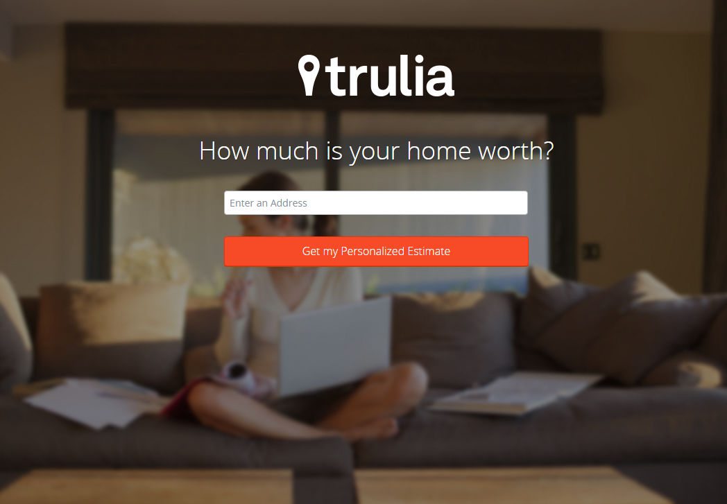
We’re all about keeping landing page design simple, but this click-through landing page might be a little too simple. That being said, Trulia is a trusted brand, so does it need to prove its authority? With only one form field, what do prospects have to lose by converting on their landing page?
When you convert on this landing page, you’re brought to another that requests a little more information from the prospect. By breaking up the registration process into steps, Trulia minimizes friction associated with the signup process.
So what do you think, would you click this first-person CTA?
6. Real estate lenders
When people are short on cash for real estate projects of all kinds, you’re who they come to for loans they can pay back on a manageable schedule. Let’s see how one company is using a post-click landing page to initiate start a conversation with prospects.
LowerMyBills
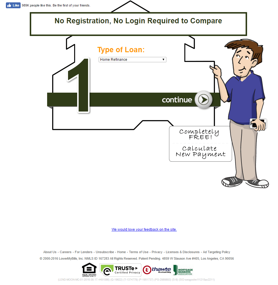
Here’s a PPC landing page from LowerMyBills that’s directed at people looking to take out a loan for a real estate project. What are your first impressions? Here’s ours:
First, the landing page design — font and graphics — has us feeling like we’ve gone back in time. Is this 2005?
Second, the headline misses the mark. It emphasizes that the prospect won’t need to login or register to get a quote, but it’s also not specifying what the quote is for. To find that, you need to look below the cartoon figure for the bubble that reads “Completely Free! Calculate New Payment.” Even then, it’s still not 100% clear what this page is for until you glance at the “Type of loan” drop-down.
One major thing it has working for it, though, is social proof. In the upper left-hand corner, you’ll notice a “like” counter that reads “989k people like this.” If nearly 1 million people find the service useful, there must be a reason. Still, that alone won’t be enough to produce maximum conversions.
All in all, this landing page could use an overhaul.
7. Home builders
You’re the people homebuyers seek out when they want to start from scratch. They describe their vision, and your team of architects and builders brings it to life. Here’s how one home builder uses a landing page to get prospective homeowners to take the first step toward getting their dream home built.
Smith Brothers Custom Homes
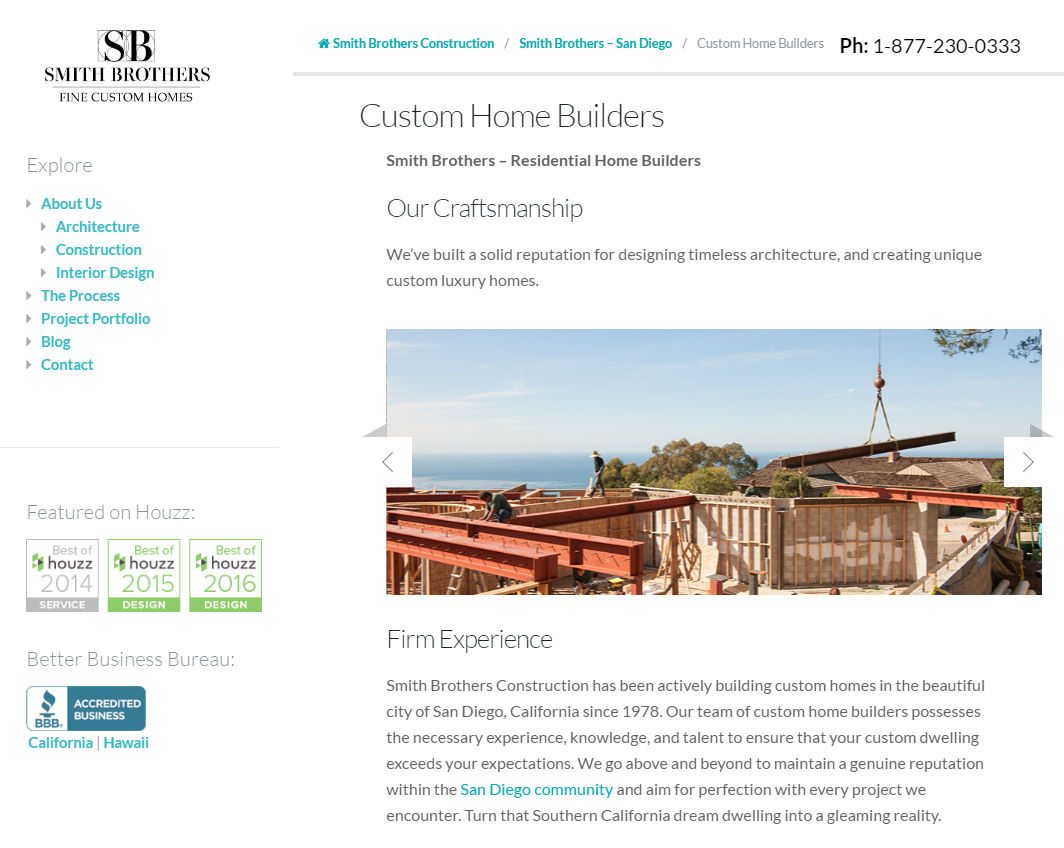
Unfortunately, while headed in the right direction, the Smith Brothers missed the mark with this landing page. Here’s why…
The headline “Custom Home Builders” doesn’t convey a benefit. Something along the lines of “Build The Home You’ve Been Dreaming Of” would be a lot stronger. After all, the biggest advantage to hiring someone to build a custom home is just that — they get to design it the way they want, from the ground up. Custom home builders bring a homebuyer’s vision to fruition.
The short paragraph below the slider, along with the three bolded lines of text next to the form, emphasizes the company’s experience, and the Houzz badges add authority while the one from the Better Business Bureau boosts trust – but together they’re not enough to drive maximum conversions.
Even with a short, mostly friction-free form and a call-to-action written in the first person, there are far too many links here to keep prospects focused on converting.
The Smith Brothers have a lot of great persuasive ingredients here; they just need to rearrange them to create a landing page that will get prospects clicking through one after the other.
How will you use real estate landing pages?
What action will you drive with a real estate landing page? Have you used one before? How did it perform?
Build a persuasive real estate landing page in minutes, sign up for an Instapage Enterprise demo today.

See the Instapage Enterprise Plan in Action.
Demo includes AdMap™, Personalization, AMP,
Global Blocks, heatmaps & more.
