Above all others, Google’s objective is to improve the user experience. Better search results, faster loading speeds, more effective ads — they’re just a few of the priorities of Google products.
Today we examine another area Google is increasingly prioritizing across products: The post-click landing page. Through these six examples, Google shows how they connect ads in the pre-click stage to landing pages in the post-click stage. Discover the elements that make seamless campaign below (and learn what to avoid, too).
Google Optimize post-click landing page
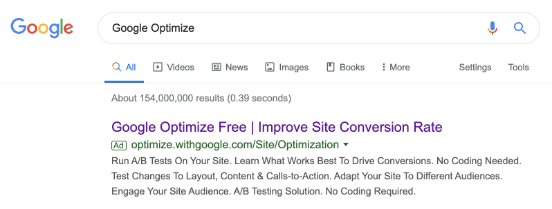
Searching for Google Optimize returned this ad from Google, which does a great job of using the copy to its advantage. The search term is in the headline, and so is the word “Free,” which is one of the most powerful words in advertising. The rest of the headline contains a benefit, too: Improve Site Conversion Rate.
Below, copy elaborates on the offer: You can run A/B tests with Google Optimize, learn what works best to drive conversions, and you don’t even need to know how to code.
Clicking the headline will take you to this page:
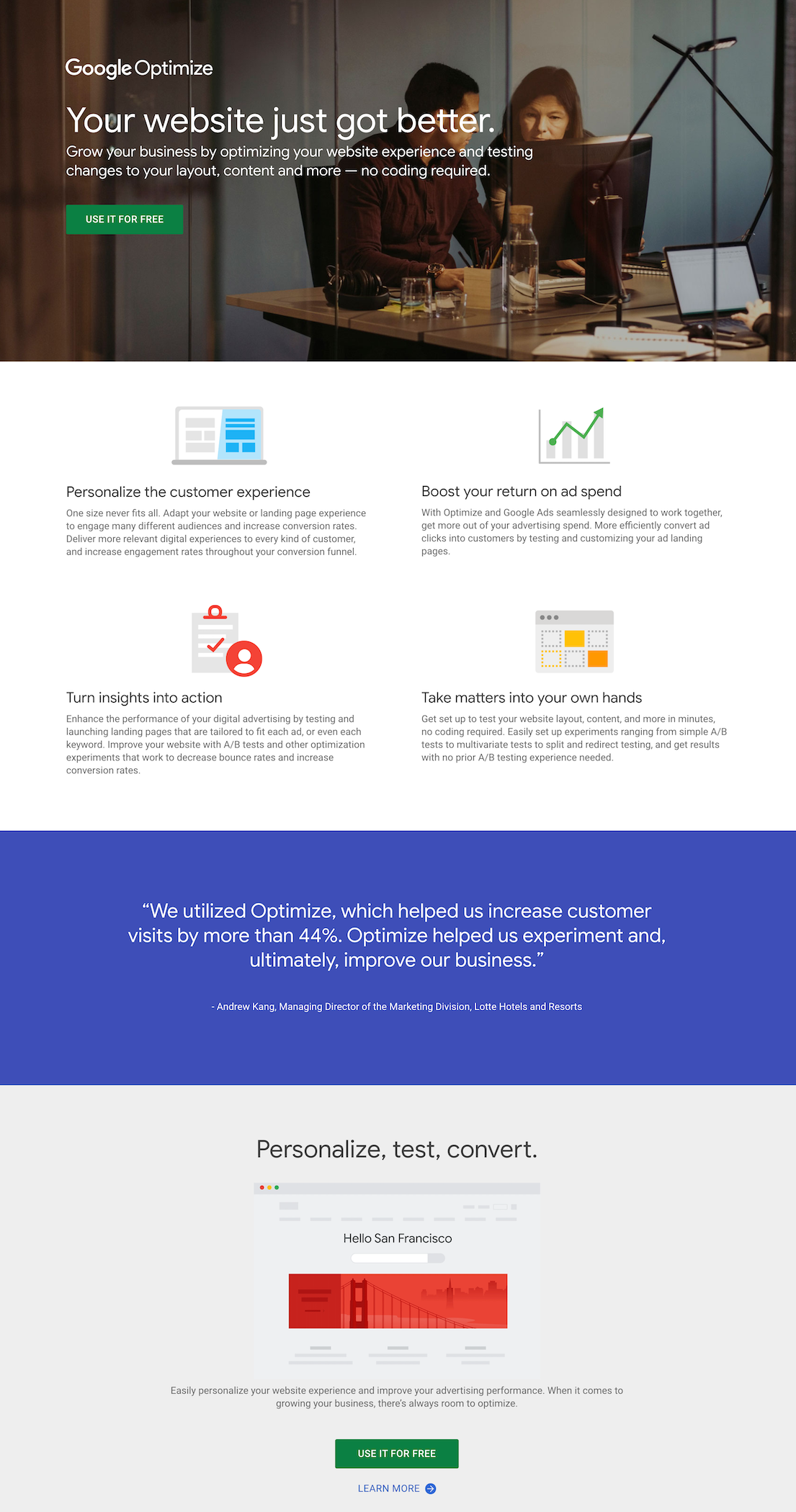
From top to bottom, the design is well-organized. And though the headline doesn’t match the message of the ad perfectly, there are other signals for the user that indicate they’ve landed in the right place: “Google Optimize” is written above the headline, and the copy below resembles the copy in the ad.
- What is the offer for? The offer is for free usage of Google Optimize, a software you can use to test different versions of your webpage to see which converts best.
- Why should you claim the offer? Effective landing page design guides the user through this page, presenting the benefits of Google Optimize in the process.
First, there’s the headline, which speaks directly to the user with the word “Your,” and presents a benefit that rewards the user for making a good decision by converting before they’ve even converted. By choosing to use Google Optimize, it communicates, you have already improved your website. This is as powerful a guarantee you can get without the word “guarantee.”
Below, copy reiterates that you can grow your business by testing content without even needing to code. Then, a CTA button compels the user to click with the word “Free.” This is a reminder to the user that converting brings no risk. Supporting the copy are four benefits below, in skimmable chunks of copy, followed by a glowing testimonial complete with convincing statistics about the effectiveness of Google Optimize. Lastly, another CTA reminds the user that converting is free and carries no risk.
- Is there a clear next step? Yes, two CTAs compel visitors to use the software for free. A header without a navigation menu and a minimal footer keep the visitor focused on converting. However, the “learn more” link below the final CTA could steal clicks from the CTA buttons.
Google Ads post-click landing page
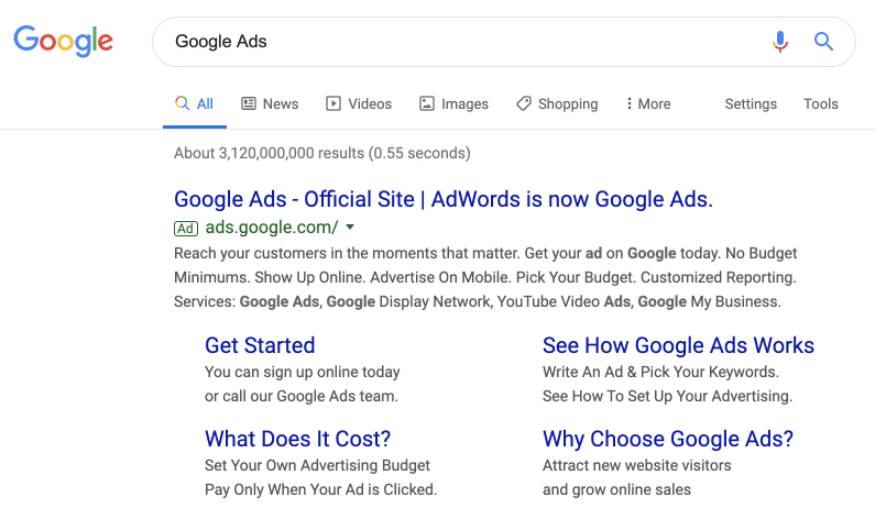
The headline of this ad relates to the search of the user, which in this case was “Google Ads.” “Official Site” communicates to the user that by clicking, they’ll arrive on a site operated by Google and not an affiliate. This boosts trust. The last part, “AdWords is now Google Ads,” is an attempt by Google to again to boost trust by aligning the new brand “Google Ads” with the older one advertisers have trusted for years. Clicking the headline will take you to this post-click page:

The first thing you’ll notice about this experience is it loads quickly. When even a few seconds can mean a major drop in traffic, this is a must for all post-click pages. As the page loads, you’ll notice the big, bold headline. It doesn’t match the message of the ad word for word, but it’s close, and it contains a benefit: Grow your business with Google Ads.
- What’s the offer? The offer is for $75 in Google Ads credit when you spend $25 advertising with the product today.
- Why should you claim the offer? $75 might be a drop in the bucket for Google, but for a small business owner testing the efficiency of Google Ads, it’s an offer worth serious consideration. The rest of the page does a good job of explaining the product, using a combination of visuals and text.
The example used above the fold — a search for dance classes — continues down as the user scrolls, switching from desktop to mobile in the process and showing the visitor how an ad for that search would look. Chunks of copy explain more benefits of using Google Ads, and then a video testimonial touts the product from a customer standpoint:

- Is there a clear next step? The clear next step for the user is in the email form field and the CTA button, “Start Now,” which you see in a few different places on the page. While there’s no navigation menu to distract the visitor, the footer filled with site links gives them many opportunities to leave the page without converting.
YouTube Ads

Searching “YouTube ads” in Google returned this ad, which, like the ad above it, uses “Official Site” to align the ad with a trusted brand. The rest of the headline doesn’t do much to sell the product. Below it, copy does a better job: “valuable audiences,” “the world’s largest video platform,” “reach the right customers,” “attract new customers,” and do it on a budget of your choosing.
Clicking the ad takes you to this page:
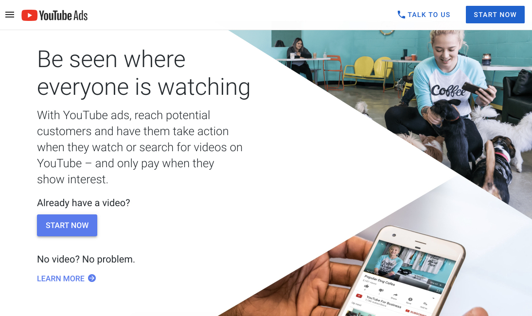
At first, it appears this page is free of distractions. However, a closer look reveals a hamburger menu next to the logo in the upper-left. The headline “Be seen where everyone is watching” takes some elements from the copy in the ad, but the headlines could be closer matched. Below it, the copy mentions YouTube ads and presents the benefit of ads on the platform: be seen, compel clicks, and only pay when audiences show interest.
- What is the offer? The main offer seems to be the chance to advertise on YouTube. However, it seems this page buries the lede by offering $100 in free advertising for people who spend $25, below the fold. This is great value and might be worth moving to better page real estate.
- Why should you claim it? Like the offer from Google Ads, this one from YouTube presents good value. Spend $25 on advertising and get $100. Below this offer, three powerful statistics about the viewership on YouTube circulate on a slider (bullets might be better, as sliders have been shown to frustrate visitors). And to further prove its value, YouTube shows a quick video testimonial, which shares highly positive results from advertising on the platform:
- Is there a clear next step? At first, it looks like there’s a clear next step through the CTA button reading “Start Now,” but that’s only for people who already have a video. If you don’t, you might click “Learn more,” and if you scroll even further down, you’ll see three more calls to action relating to segmentation, budgeting, and optimization.

Finally, three more calls-to-action, two of which are identical to the first, attempt to get visitors to create a video or start advertising. The third tries to get people to call support. A full footer below all these, combined with a navigation menu at the top of the page, is likely too distracting to visitors of the page.
Google AdSense

Searching “Google AdSense,” Google’s solution to help publishers maximize ad space, revealed the paid advertisement above. Unlike the others, this headline does not use “Official Site” but does include a ™ symbol to indicate the authenticity of the brand, accompanied by the official URL www.google.com below. The rest of the headline, “Make the most of your content,” is a little too vague. Even “Maximize your revenue” in the extension below is a more specific and appealing phrase.
Accompanying copy makes it clear that AdSense is about monetizing the space on your website. Continue, and you’ll notice other benefits, like ads that adapt to your users and their devices, revenue optimization, and full control over your campaign.
Clicking the headline will take you here:
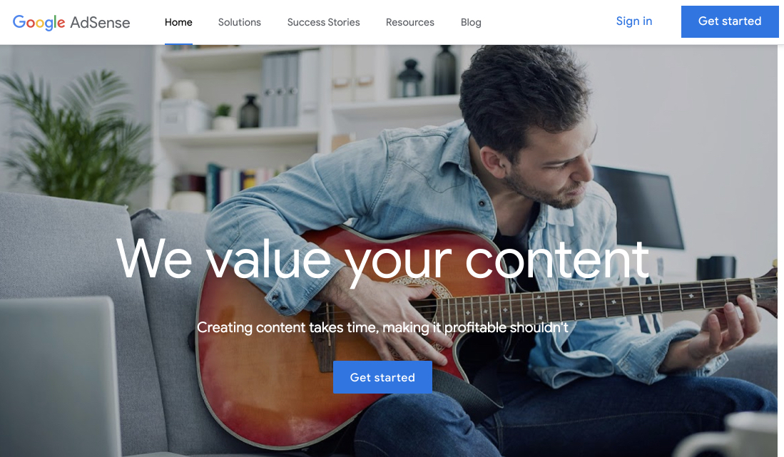
Immediately, it’s easy to see the message match between headlines of the ad and the post-click landing page don’t match up. However, other signals communicate to the user that they are where they’re supposed to be after clicking the ad, like the “Google AdSense” logo, and the official company URL (still, it’s best to match the message of your ad for trust and consistency).
Instead of anything related to monetizing your website, the headline reads, “We value your content.” Spun to be more customer-centric and less Google focused, it might read: “Your content is valuable.” Below, copy positions AdSense as the place to go to monetize existing content quickly.
- What’s the offer? The opportunity to monetize your content with Google AdSense.
- Why should you claim it? This Google page does a good job of making AdSense seem lucrative and easy to set up. It claims 2 million people use AdSense because all you need is to input one piece of code to start earning money from your site with ads that automatically adjust for your users. A calculator that accounts for region, pageviews, and industry, lets people see how much they could earn with their site.
Adding to their credibility, Google includes a brief testimonial from a happy customer, and, scrolling lower, you’ll see three more benefits to using AdSense before a final call-to-action to get started:

- How much can brands earn? The page allows visitors to select their geographic region and industry they operate in. Doing these two steps helps Google calculate the estimated earnings potential brands can expect to see:

- Is there a clear next step? Google does a great job of keeping this page clear of combating CTAs. All call-to-action buttons work together to accomplish the same goal. However, there are too many distractions in the navigation menu and the footer. These are likely to detract from clicks on the CTA buttons at the top and bottom of the page.
Start creating post-click landing pages like Google
No matter what the product is or who’s shopping for it, your post-click landing pages must match your ads. A personalized ad demands an equally personalized post-click page. Without one, you deliver a mismatched user experience.
In a time when every customer expects meaningful personalization, driving traffic to a homepage or a pricing page means leaving revenue on the table. Fortunately, you don’t need the manpower of a company like Google to create a dedicated page for every ad. Post-click automation can enable even the smallest teams to scale personalization. Find out how with an Instapage demo.

See the Instapage Enterprise Plan in Action.
Demo includes AdMap™, Personalization, AMP,
Global Blocks, heatmaps & more.
