The average person spends an average 4.1 hours checking their work email every day — that’s 20.5 hours per week! With that amount of time dedicated to email, it is easy to see why Gmail ads can be one of the best ways to target potential customers.
Although lead gen is one way to get inside a prospect’s inbox, it can be challenging for many businesses. Gmail ads provide a way around having to convince leads to hand over their personal information.
What are Gmail ads?
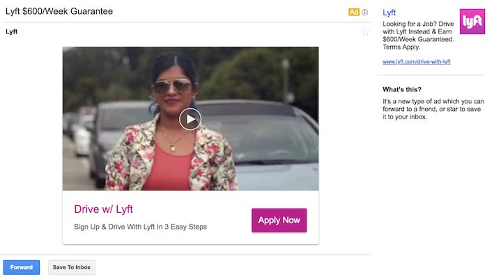
Gmail ads — also known as Gmail Sponsored Ads, Gmail Sponsored Promotions, and Gmail Sponsored Promotion Ads — are interactive, paid ads that advertisers can serve in their prospects’ email inboxes. Ads in Gmail are displayed at the top of a user’s inbox within the social or promotions tab:

Once any part of the ad is clicked, it opens the full email ad. Expanded, the Lyft ad above looks just like a typical email with a subject line, engaging media, the option to forward the message, save the message, and more. Also shown is the right-margin ad which contains the same link as the full ad:
How do Gmail ads work?
Similar to a Yahoo Mail Ad, ads in Gmail can be:
- Clicked-through for a potential conversion
- Saved to the user’s inbox (by clicking the star icon at the top of the email, or the “Save To Inbox” button at the bottom of the email)
- Forwarded to someone else (by clicking the blue “Forward” button at the bottom of the email)
- Closed without taking any action at all
Users can interact with your expanded Gmail ad in several different ways, depending on its elements and layout. Options include playing a video, completing a lead capture form, clicking through to your website or landing page, or on mobile, click-to-call or download an app.
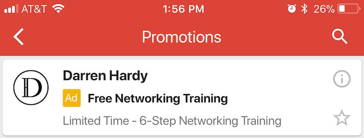
Google automatically optimizes Gmail ads to ensure they’re aesthetically pleasing wherever they’re shown: desktop, mobile, or the Gmail app. For example, here is the same ad shown on desktop and the Gmail mobile app:
First collapsed on desktop:
![]()
And collapsed on mobile:
Then expanded on desktop:
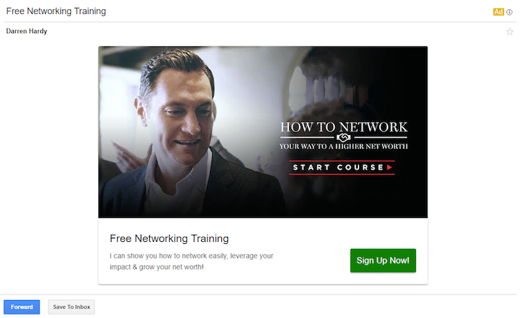
And expanded on mobile:
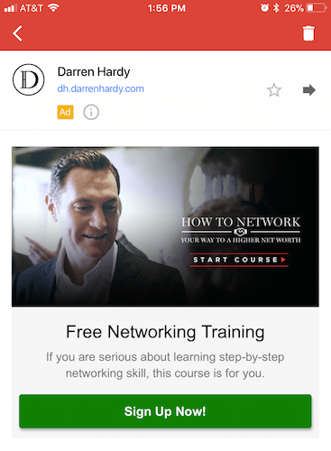
In both locations, the images are the correct dimensions; the copy is formatted appropriately, the CTA buttons are positioned to stand out, etc. to give viewers a good user experience.
How you get charged and targeting options available
It’s important to note that Gmail ads are pay-per-click ads, meaning you only pay for the click that expands your ad initially, rather than every time someone interacts with your expanded ad.
Ads in Gmail use typical display targeting options including audience keywords, in-market audiences, demographics, affinity audiences, automated targeting, remarketing, customer match, and life events.
Gmail ads best practices
1. Promote a top-of-the-funnel offer
Gmail users seeing your ads are typically towards the top of your marketing funnel — likely in the awareness or evaluation stage. To appeal to them, you must acknowledge that they probably have minimal familiarity with your brand and product. Furthermore, since they haven’t sought you out (as is the case with paid search ads), they likely have little to no intent to buy.
Since your prospects aren’t ready to make a purchase, your ad should instead focus on offering free content or collecting lead information, such as an email address to start sending them actual emails. An educational webinar with a registration form or a gated PDF is a great idea for nurturing prospects further down your funnel.
2. Take advantage of your competitors
One of the biggest challenges with Gmail advertising is knowing if you’re targeting the best audience. The competitor conquesting strategy — using your competitors’ domains as your targeting method — is great for fine-tuning your targeting. This allows your ads to show whenever a Gmail user receives an email from one of your competitors. Ultimately this helps attract an audience that’s likely to be highly interested in your product or service.
As an example, Hanapin Marketing uploaded a list of their closest-related competitor domains and saw click-through rates as high as 33%.
3. Design your expanded ad like a landing page
Those are Google’s exact words. To do that, you must focus on several key elements and design best practices:
- Copy: The copy from your collapsed ad should be featured prominently on your expanded ad. It should be direct and to the point but also highlight your unique value proposition so viewers know exactly what the benefits of your offer are, and what they gain by clicking through.
- CTA color: Your CTA must “pop” off the ad to capture user’s attention and persuade them to convert. This means your button should contrast with the rest of the ad.
- CTA copy: Instead of writing vague copy like “Submit”, “Sign Up”, or “Download”, use personalized, enticing copy, such as “Improve my ROI” or “I Want the Free Google Ads Tips.”
- Imagery: Avoid using cheesy stock photos, photos too small to understand context, or overly colorful photos. Instead, opt for hero shots or infographics, that will help visitors better understand the value of your offer. For more information, check out the guide to selecting the best stock photos.
Gmail ads examples
The examples below demonstrate the best practices listed above. Here is one from Walmart — first collapsed, then expanded:
![]()
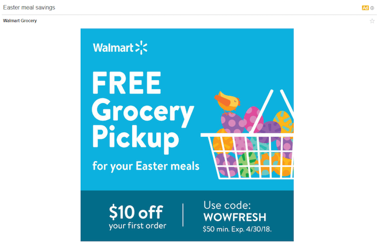
While most of the ad’s messaging is consistent, there is one critical piece that is quite different. The collapsed ad promotes a $35 minimum, while the expanded ad advertises a $50 minimum. Details like that could dissuade prospects from clicking through and redeeming your offer. Plus, there is no prominent CTA button on the expanded ad which could lower the click-through rate.
This Rule One Investing ad includes matching copy in both places:
![]()
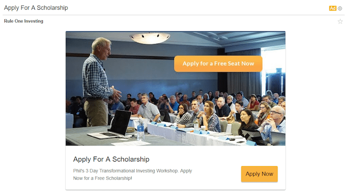
Both headlines and descriptions are the same. Also, all of the copy is direct and highlights the UVP, so recipients know exactly what they’ll gain by taking action: a chance for a free seat at the 3-Day Transformational Investing Workshop.
The CTA button color and copy are also optimized. The orange stands out against the background, and “Apply for a Free Seat Now” is descriptive and compelling. To top it off, instead of showing a generic stock photo, an image of the workshop is shown to give prospects an idea of what it will be like.
Martha Stewart’s meal kit delivery service, Martha & Marley Spoon, uses imagery superbly in their expanded ad:
![]()
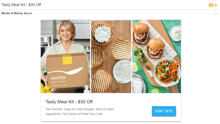
The first image shows what the package looks like when it’s delivered (although this might be more effective if a customer was holding it), the second shows the meal prep stage, and the third shows the final product.
The collapsed and expanded ad copy is the same, including an enticing promotion and a clearly defined UVP. The blue CTA button stands out since there is no other blue present; however, the copy could be more personalized and persuasive to encourage more clicks.
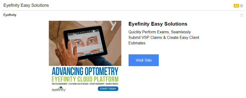
Here is another ad with a very clear UVP, offering prospects the opportunity to “quickly perform exams, seamlessly submit VSP claims, and create easy client estimates” both collapsed and expanded:
![]()
Lastly, this mobile ad example demonstrates the mobile click-to-call option:
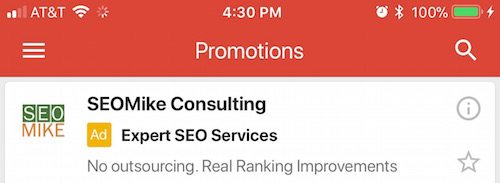

When prospects click the “Call” button at the bottom of the ad, it automatically allows them to contact customer service, providing an optimal user experience.
How to create Gmail ads
Gmail only allows ads to be created in the new Google Ads experience. Provided you have access, there are two ways to create Gmail ads:
- Create: Upload your text, image, and video assets. Then, Google will optimize your creative for you.
- Upload: Design a single-image ad, or fully customized HTML, and upload it via a zip file containing an html file, images, a collapsed ad image, and a teaser.txt file.
Create
- Sign in to your Google Ads account.
- Choose “Display campaigns” from the navigation.
- In the page menu on the left, click “Ads & extensions”.
- Click the blue plus button.
- Select “Gmail ad”.
- Provide the required information for Google to create your ad.
Upload
- Sign in to your Google Ads account.
- Choose “Display campaigns” from the navigation.
- In the page menu on the left, click “Ads & extensions”.
- Click the blue plus button.
- Select “Upload Gmail ads” or select Upload display ads then select a Gmail campaign.
- Provide the required information to create your ad.
Gmail ad specs
Collapsed ad specifications
All Gmail ads have the same collapsed ad specifications:
- Logo: Minimum size: 144px x 144px; Maximum size: 150KB; Aspect ratio 1:1
- Business name: Up to 20 characters (must be the recognized name of the advertiser)
- Headline: Up to 25 characters
- Description: Up to 90 characters
- Display URL: Up to 255 characters
- Final URL: No character limit
Expanded ad specifications
Expanded ad specifications differ depending on whether you’re creating or uploading an ad.
Creating
- Headline: Up to 25 characters
- Description: Up to 90 characters
- Business name: Up to 20 characters
- CTA button: Up to 15 characters
- Logo: Minimum size of 144px x 144px; Maximum size of 150KB (1MB for header image and marketing image); Aspect ratio of 1:1
- Images: Aspect ratio of 1:1; Minimum size of 300px x 300px; or YouTube video link with video thumbnail size of 324 x 183.
- Accepted image formats: JPEG, JPG, PNG, GIF (non-animated)
Uploading
- Image upload: [300px to 650px] x [300px to 1000px]
- Accepted image formats: JPEG, JPG, PNG, GIF (non-animated)
- Maximum image size: 1MB
Note: The Instapage digital advertising specs guide contains these ad specs and more. It includes everything you need in one place — dimensions, file formats, examples, and more.
Conclusion
Gmail ads are an extremely effective way to interact with a targeted audience beyond your traditional search efforts, because they allow you to reach prospects where they spend a huge amount of their time: their inbox.
To create the most optimized Gmail ad, refer to the Instapage digital advertising specs handbook for the most up to date ad specs and targeting options. Then be sure to complete your ad campaign by providing an optimal landing page from ad to landing page with Instapage — for more sign up for an Instapage 14-day free trial today.
