In today’s competitive b2b landscape, crafting landing pages that resonate with potential customers is crucial for driving conversions and your overall campaign success. Among the myriad of strategies, one powerful approach stands out: creating a landing page that highlights the value you bring to potential customers. But what does a value-driven landing page look like?
To help you optimize your landing pages and achieve higher ROAS, we have distilled some critical takeaways from Notifii’s successful approach. By incorporating these tactics into your B2B-focused campaigns, you can increase conversions and create a more impactful user experience.
Three of our favorite elements of the Notifii Landing Page (and why you should add these elements to your own pages!)
It speaks to their target audience’s biggest pain points
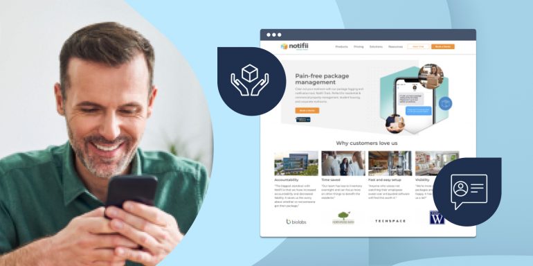
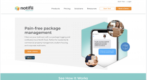
It may be your first instinct to jump right into your product and all the shiny bells and whistles that come along with it. But this may not be what hooks your visitors. For example, take Notifii’s headline: “Pain-free package management.” Instead of talking about a specific feature of the software or their brand, they speak directly to the customer and highlight that their solution will take the stress and pain surrounding package management away. This strategy is much more likely to turn a click into a conversion as compared to a headline like, “Notifii offers the #1 Packagement Management Solution.”
It uses videos and imagery that enhance the overall experience
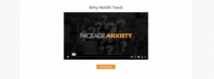
Adding enriching videos and platform imagery is a significant value-add to a B2B landing page for several compelling reasons. Enriching videos, like the one Notifii has added to their page, provide an opportunity to showcase the B2B solution in action, giving potential clients a visual and dynamic understanding of its functionalities and benefits. This level of interactivity and demonstration builds trust and confidence in the product, allowing visitors to envision how the platform can solve their specific challenges.
Moreover, use of platform imagery visually communicates the solution’s user interface and features, helping potential customers picture themselves using the software, thus fostering a deeper connection. On their landing page, Notifii accomplishes this in a Z-Pattern layout to keep readers’ attention. This value-add instills a sense of credibility, authenticity, and innovation, elevating the B2B landing page’s overall impact and driving higher engagement and conversion rates.
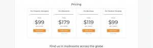
It includes pricing transparency
Adding pricing transparency to your B2B landing page is a value-driven piece of content that holds immense significance in the customer’s decision-making process. Not having that information gated behind a demo or follow-up email instantly builds trust. White it may seem small, this section of the landing page instills confidence in the service, leading to increased conversion rates and the cultivation of a loyal customer base.
What we would experiment with:
At Instapage, we believe that constant testing & experimentation is necessary to achieve the best landing page results. With that in mind, here are some elements we would test on the Notifii landing page:
Scroll depth: Notifii’s page is full of information and helpful sections of content, however when scrolling on mobile it can feel a bit long. That’s why we suggest A/B testing a shorter version of the landing page to see how it performs. Experimenting with the length of your pages allows you to optimize visitor engagement, and refine content strategies, ultimately leading to enhanced user experiences and improved conversion rates.
Consistent CTAs:
Notifii offers several places to convert on its landing page, which is wonderful! However, the language of the CTAs is varied a bit and includes, “Book a Demo”, “Free Trial”, and “Contact Us”. The variety may be confusing and visitors may not know which conversion button is right for them. To minimize confusion and ensure the conversion process is seamless, we would suggest A/B testing the current page with multiple CTA languages against one with a single CTA language to see which one performs best!
By incorporating the key takeaways we have drawn from Notifii’s landing page strategy, you can optimize your B2B landing pages and achieve better results!
If you’d like to explore ways you can easily implement these tactics on your own landing pages, sign up for an Instapage 14-day trial and see the impact a powerful landing page platform can have on your campaigns. You can also watch the full Notifii landing page review here.