
As a marketer in the education industry, you need to reach prospective students on the correct channel. In this context, the appropriate channel is an educational landing page.
What is an education landing page?
An education landing page (aka university landing page) is a standalone web page that is designed to get students to take a desired action. The action can range from requesting general information to class enrollment to student loan applications.
There is no shortage of educational institutions and all have goals to increase brand awareness, attendance rate, and generate new accounts (e.g. student loans). To meet those goals, many institutions create landing pages with educational landing page elements to convert prospects into leads.
Let’s see if these 12 education landing pages meet the landing page optimization mark.
(Keep in mind, for shorter education landing pages, we’ve shown the entire page. However, for longer pages, we only displayed above the fold. You may need to click through to each education landing page to see some of the points we discuss. Additionally, some of the brands listed may be A/B testing their page with an alternate version than the one displayed below.)
1. Oregon State University
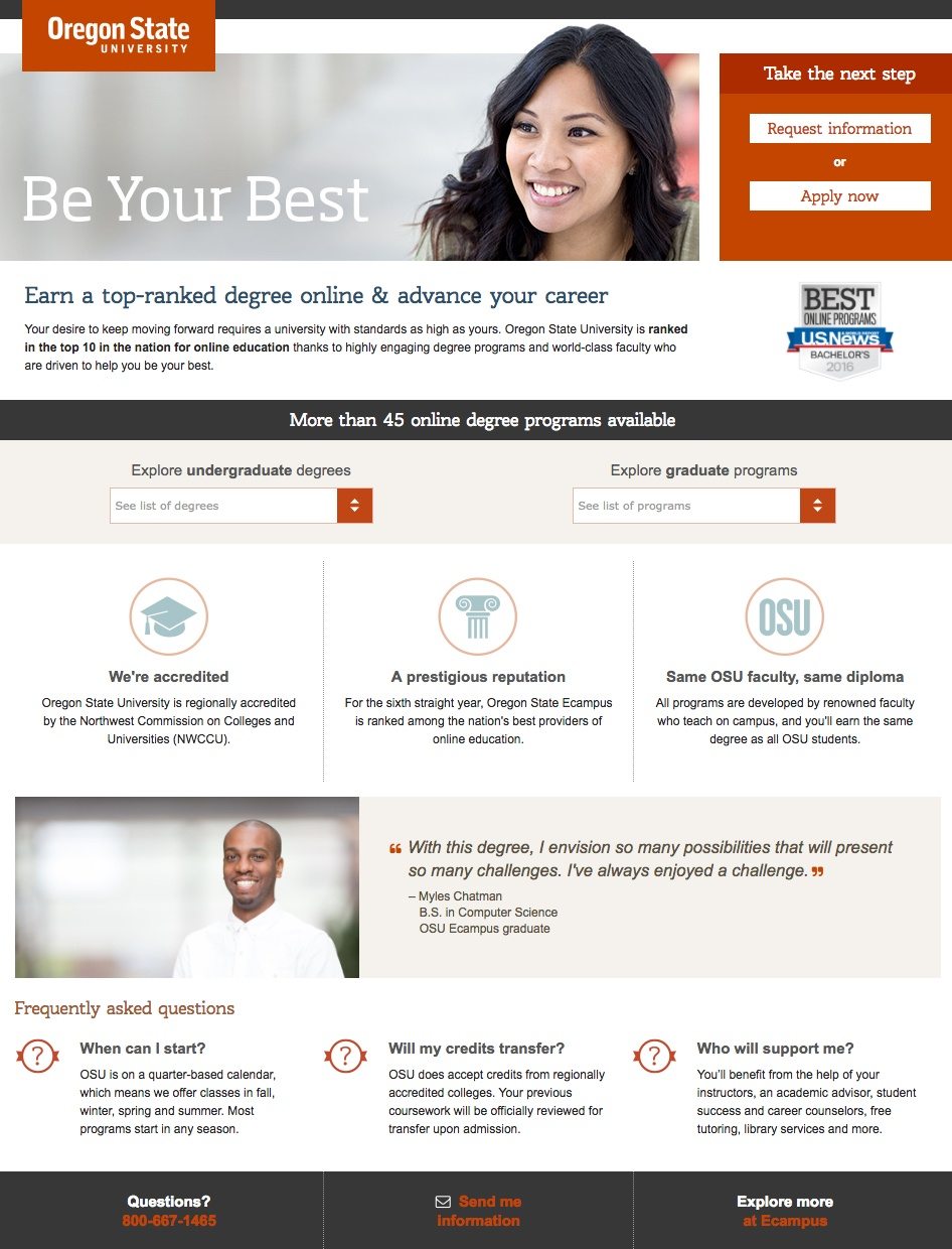
What they did well:
- The subheadline “Earn a top-ranked degree online and advance your career” is attention grabbing and increases engagement because it encourages you to read more of the page copy.
- The customer testimonial instills social proof because the visitor sees that other students have liked the university’s programs.
- The FAQ section answers any immediate questions and helps visitors reach a decision faster.
- The U.S News Badge increases the university’s trust factor because it supports the subheadline’s claim of being a top-ranked online degree program.
- More than 45 online degrees available makes it known that Oregon State University has many options available — and they’re sure one of their programs can fit your interests.
A/B tests to run:
- The headline isn’t very clear — “Be Your Best”, but at what?
- The CTA buttons don’t draw as much attention as they should because none of them look clickable or contrast with the page.
- The image isn’t relevant to the page, an image of a student studying online would be much more relevant.
- Letting all page elements breath more by adding white space would help the readability of this education landing page.
- Multiple links at the bottom are unnecessary and distract from the page goal.
2. Arizona State University
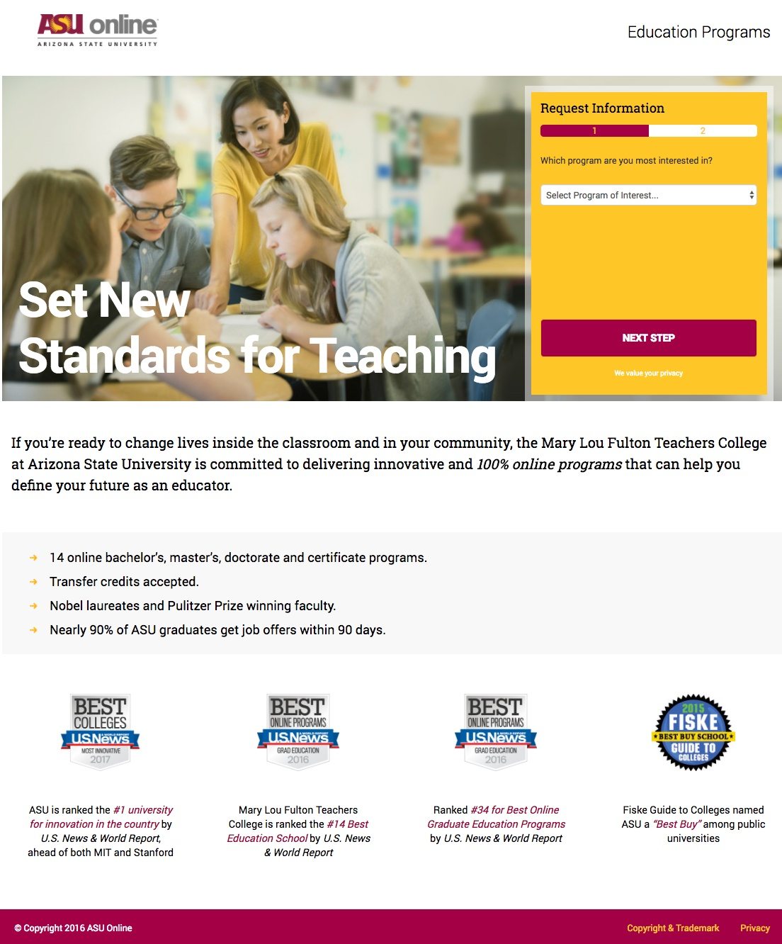
What they did well:
- The ASU logo is not hyperlinked, so the landing page doesn’t provide visitors an exit link to leave the page, this always bodes well for conversions.
- The headline clearly explains what the page is about — degrees that are going to make you a better educator.
- The image does not seem staged and it’s relevant to the offer of becoming a better teacher.
- Bulleted copy explains why you should choose ASU for an education program.
- The 90% statistic helps persuade visitors to fill out the 2 step form and apply for ASU’s online teaching program. Plus, it all but guarantees ASU online teaching graduates will receive a job offer within 3 months of graduating.
- The accreditation badges increase ASU’s online teaching programs as being one of best in the nation.
A/B tests to run:
- The yellow form color is not as attention grabbing as could be. When visitors land on your page, you want them to immediately notice your form and CTA. Having both the yellow form very similar to the teacher’s shirt won’t make the form “pop” off the page.
- Step 2’s CTA button copy is uninspiring, “Learn more” won’t get visitors excited to click the button.
- The phrase ‘Education Reforms’ in the top right corner doesn’t seem to serve any purpose.
3. Liberty University
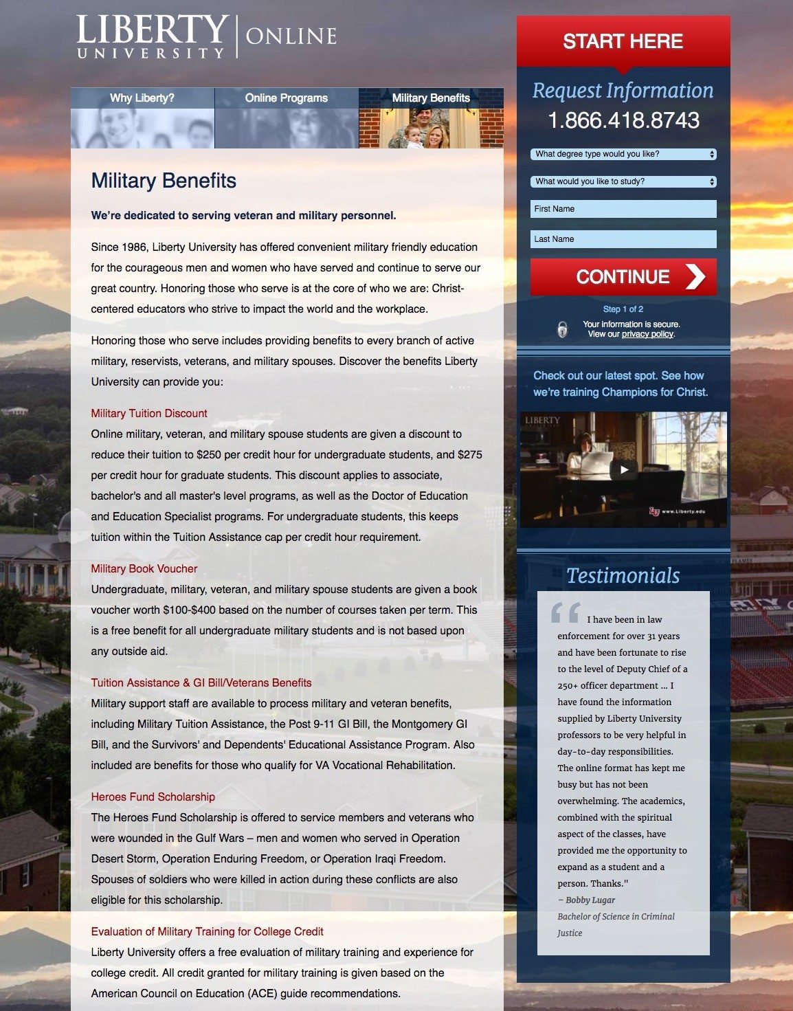
What they did well:
- The arrow visual cue points visitors in the right direction to the form so they can complete step 1 and proceed to the next step.
- The video is short (30 seconds) and takes visitors on a virtual tour of the university.
- The multi-step form is short and easy to fill out. Plus, they indicate how many steps are involved (Step 1 of 2) before the process is complete.
- The phone number is click-to-call, which means visitors stay on the page and get to ask any questions they might have.
- Privacy policy text shows students that their information is secure, they can click the link to read Liberty’s privacy policy.
A/B tests to run:
- The headline isn’t really a headline at all. It’s just a question and doesn’t provide Liberty’s USP.
- The CTA button copy isn’t personalized. As an alternative, “Take Me to Step 2” would inspire more engagement.
- The background image provides a good view of the campus and surroundings. But this landing page is promoting Liberty’s online programs so it doesn’t matter that much what the campus looks like — because students likely won’t be on campus or moving to the area.
- The testimonial doesn’t include a picture, which makes the testimonial lack human appeal and credibility.
- The navigation links at the bottom of the page provide visitors a way to exit the page without converting.
- Too much copy on the page makes this education landing page a chore to read.
4. Grand Canyon University

What they did well:
- The headline explains the UVP of the programs offered by GCU, i.e. programs that fit the students’ schedule.
- The copy talks about the benefits of enrolling in a technology program with the university.
- The program tabs allow visitors to look at different degree options by clicking their desired category. There’s no need to sift through a copy heavy page this way. And more importantly, they display different information without you having to leave the page.
- The form title, ”Get More Info acts as a call-to-action of sorts because to get more information, you need to complete the short form.
- The short form is not intimidating for prospective students to complete. Furthermore, the drop down form options makes filling out the form a breeze.
A/B tests to run:
- The CTA button color has already been used multiple locations on this landing page. Doesn’t Grand Canyon University want students to click next and proceed on the form? Then why make the button color blend in with the rest of the page?
- The white copy on the purple background isn’t easy on the eyes. It has an effect on readability, which could have a negative effect on your conversion rates.
- The CTA button copy is generic. Personalized CTA copy such as “I want more information” would be much better suited here.
- The image looks a little cryptic. Looks more like a hacker working in the dark, rather than a student studying for their degree.
5. Kaplan University
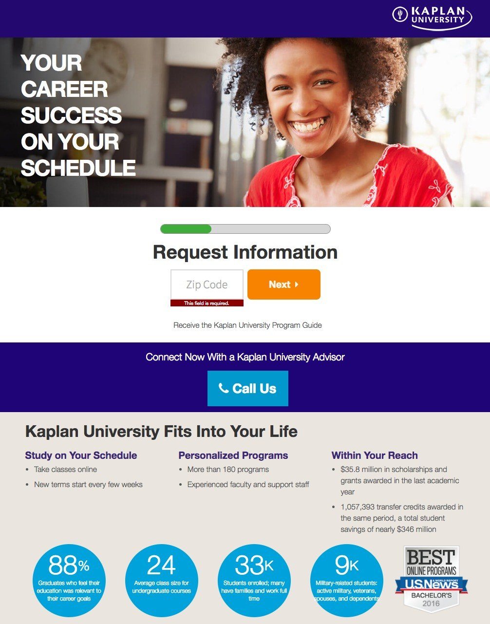
What they did well:
- The headline describes to the visitor what they can expect when they enroll in Kaplan University.
- The image features a smiling woman, which makes the visitor feel reassured and more at ease to click the call to action button.
- The page design features a card layout, that breaks up the copy in a readable and visually appealing sequence.
- The copy showcases statistical reasons of why visitors should join Kaplan University.
- The military friendly badges at the bottom reinforce Kaplan University as a recommended institution for military personnel.
A/B tests to run:
- Kaplan University’s log is linked to their homepage, which acts as an exit link away from the landing page’s goal.
- Request Information” is too vague. The text below the zip code field should be the form’s title (or a variation of it, such as “Send Me Kaplan’s Program Guide”).
- The CTA button copy “Request Info” is very generic, it should be personalized to increase conversions. They should consider replacing the button copy with “Yes, I Want to Know More” the phrase will resonate more with the visitor.
- Some CTA buttons like the “Enroll” button in the header take the visitor away from the page, which is not recommended for landing page optimization.
- The slider of testimonials is great, but if they displayed the student’s headshot, that would make the quote even more convincing.
6. Colorado Technical University
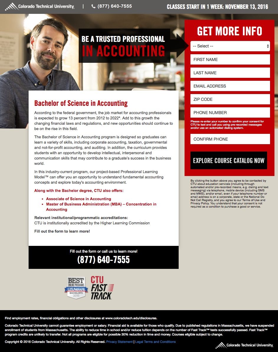
What they did well:
- The headline explains the visitor what they can get from the program, i.e. become a professional in accounting.
- The copy explains why studying Accounting is important and what the curriculum entails.
- The form fields are labeled properly which makes it easy to fill out.
- The arrow is a visual cue it points visitors toward the form, encouraging them to fill it out and click the CTA button.
- The U.S. News badge acts as a trustworthy symbol for Colorado Technical University because they have been featured as one of the best online programs in the country for 2016.
- The phone number is click-to-call and doesn’t take prospects off the page. If the visitors want to call, all they have to do is click.
A/B tests to run:
- The page structure looks odd and unbalanced. Adding more white space could help provide more visual hierarchy and a better user experience.
- The “select” dropdown provides many different degree types, but why? This page is about majoring in Accounting, which makes this form field irrelevant and unnecessary.
- The black CTA color has already been used on the page and doesn’t draw maximum attention on this university landing page.
7. Capella University
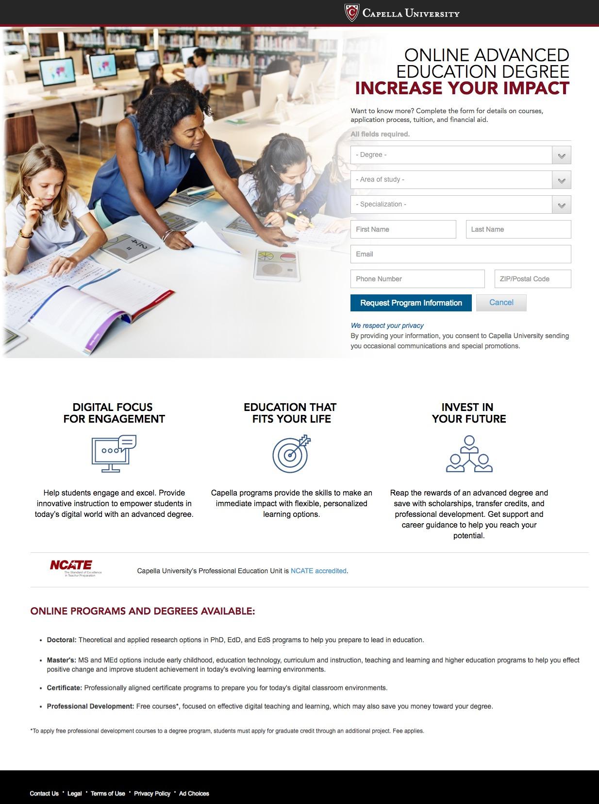
What they did well:
- The Capella logo is not hyperlinked to their homepage or elsewhere, keeping the visitor’s focus on the form and requesting more information about online education degrees.
- The image is relevant and shows the visitor their future once they’ve completed their education degree.
- The copy is displayed with icons and minimal text while giving additional information about the degrees and programs.
- Drop down menus in the form makes it easier to convert than having to manually type in your desired degree, field of study, and specialization.
A/B tests to run:
- The headline doesn’t make sense: “Online Advanced Education Degree Increase Your Impact.” Some simple grammar mistakes can make your headlines and/or copy seem confusing.
- CTA button copy is generic and could be personalized, something like “I want more program information” would be better at driving action.
- The “cancel’ button at the bottom of the form seems unclear, as the button has no functionality. Even when you click the “cancel” button before you’ve entered any of your information, nothing happens on the page.
- The navigation links at the bottom of the page give visitors a reason to leave the page.
8. Alliant International University
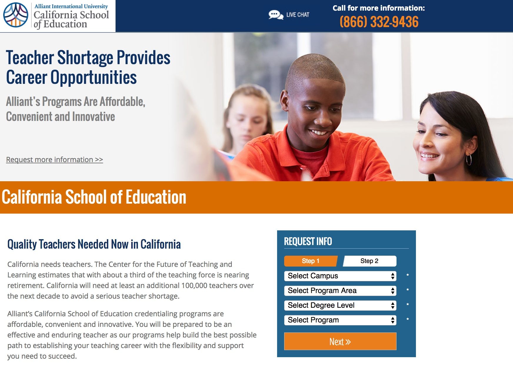
What they did well:
- The University logo is not hyperlinked to their homepage so it doesn’t take visitors away from the page before they have a chance to convert.
- The live chat option makes visitors feel at ease because they can get answers to any additional questions they might have about Alliant University and the California School of Education.
- The teacher testimonial helps visitors understand what studying at the university will involve.
- The form fields are drop down menus which makes the form easier to fill out.
- The page copy breaks down into paragraphs and answers common questions students may have about the program.
A/B tests to run:
- The headline doesn’t specify what the page is about or explain Alliant’s USP.
- The CTA button copy is not personalized. The copy should be written from the point of view of the visitor and should say something like “Send Me More Information.”
- The page design is left aligned, with most of the right side empty — which makes the “unity diversity” graphic seem out of place. Balancing the page with copy on both sides or limiting the copy with shorter bullet points would help make this page less of a chore to read.
- The phone number is not click-to-call. Listing a phone number, but not making it click-to-call, is a friction point and could potentially reduce conversions.
9. Maryville University
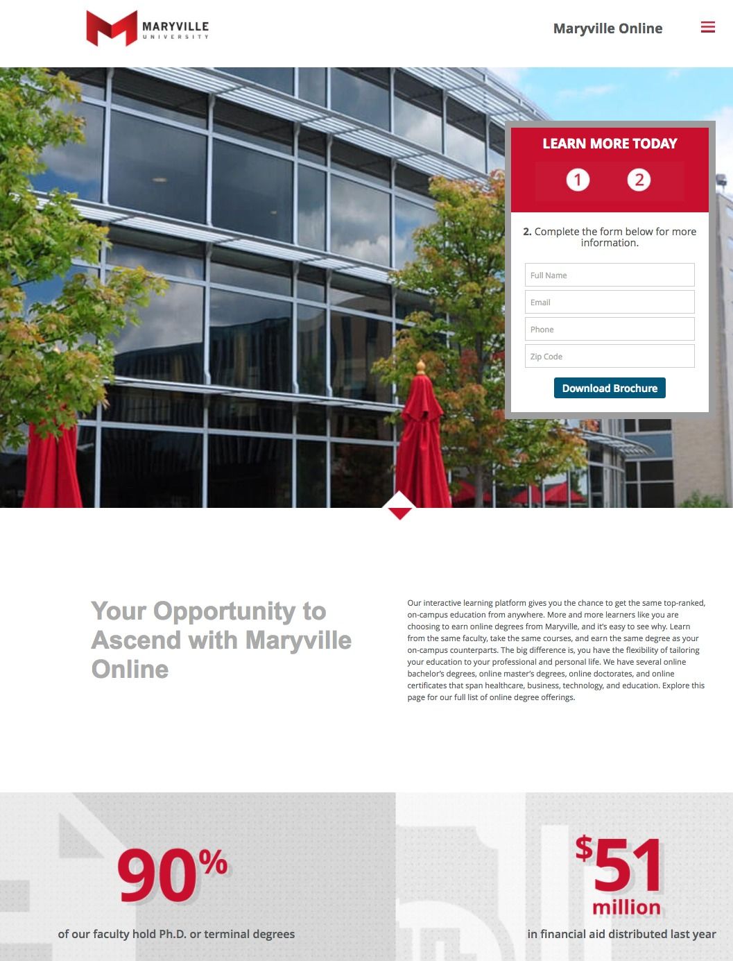
What they did well:
- The Maryville University logo does not direct the student to their homepage, so students can’t escape by clicking the logo.
- Bullet points make the copy easy to read.
- The multi-step form is easy to fill out.
- The row of statistics provide credibility, show that Maryville professors are qualified, the school provides financial assistance, and class sizes are small so students will get maximum attention.
- The Kiplinger & Forbes badges help establish trust and credibility for Maryville University.
- The hamburger menu in the top right provides more information for students. Normally, we don’t recommend brands use navigation on landing pages. However, if you must include a navigation, a hamburger icon is the way to go because it won’t be very distracting to visitors.
A/B tests to run:
- The image doesn’t make much sense on the page, it doesn’t even showcase a whole building, just a bunch of glass windows. It doesn’t look relevant to the page and neither does it add visual appeal.
- The navigation links in the page footer allow visitors to leave the landing page without converting.
- The CTA copy‘Download Brochure’ isn’t very personalized. “Send Me the Brochure” would likely entice students to convert on the form and click the CTA button.
10. American University

What they did well:
- American University’s logo does not send students off the page — because it’s not hyperlinked. They do a good job of including their logo for branding purposes but keep the focus of this page on generating leads for its International Relations program.
- The multi-step form is easy to complete and shows the visitor exactly how many steps remain until they can receive program information.
- The page is not unnecessarily long because everything the form and the video is above the fold.
A/B tests to run:
- The video is over 3 ½ minutes long, much longer than the average user’s attention span can handle. A shorter video would be much better for conversions, as visitors are more likely to watch and take in the whole thing.
- The page is out of balance with the big empty space on the right side.
- The privacy lock doesn’t seem very trustworthy. Displaying McAfee or Norton antivirus logo near the form can convince students on privacy.
11. Sallie Mae
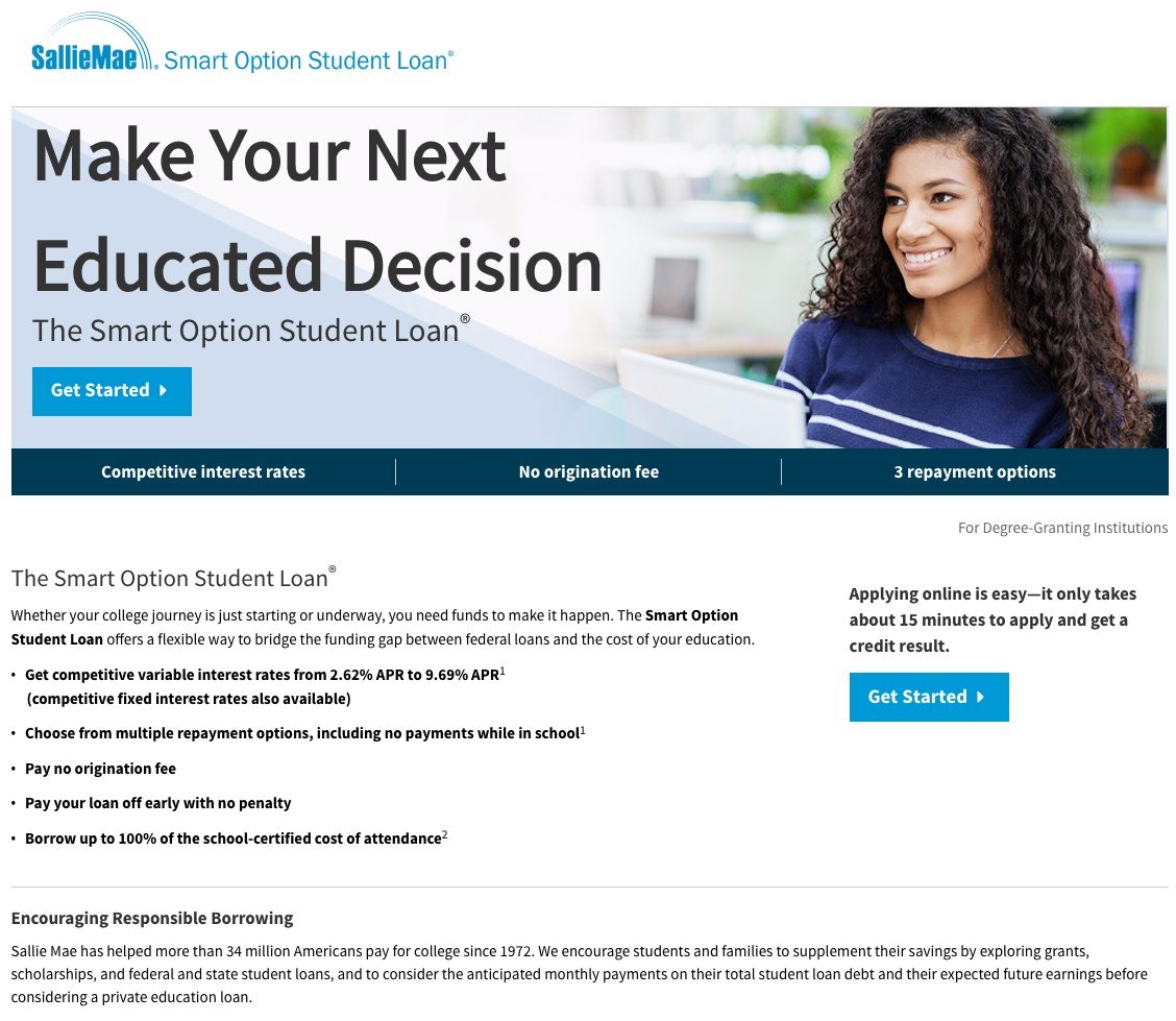
What they did well:
- Bulleted copy makes this education landing page more readable. Plus, it explains the interest rates and other information students need to make an informed decision.
- Copy above the CTA button tells visitors how short of a time they can expect to wait for a credit result.
- Copy underneath the “Encouraging Responsible Borrowing” section explains how Sallie Mae has helped more than 34 million Americans pay for college since 1972. This background information helps visitors trust Sallie Mae and more inclined to click the CTA button.
- The information advertised date in the footer assures visitors that the page is current.
- The BBB badge adds credibility to the page.
- The click-through page doesn’t ask the visitors to give their information prematurely; only committed visitors who click the CTA will see the form.
A/B tests to run:
- Multiple exit links (including both Sallie Mae logos and a text link near the footer) send visitors to the homepage. Remember, it’s important to include your brand’s logo for brand marketing purposes, but there’s no need to give visitors a way off the page before redeeming your offer.
- The headline doesn’t really tell a lot about the service, just hints at the fact Sallie Mae would be a smart education decision.
- The CTA button copy isn’t personalized, something like “I Want to Apply” would be more suited here.
12. College Ave Student Loans
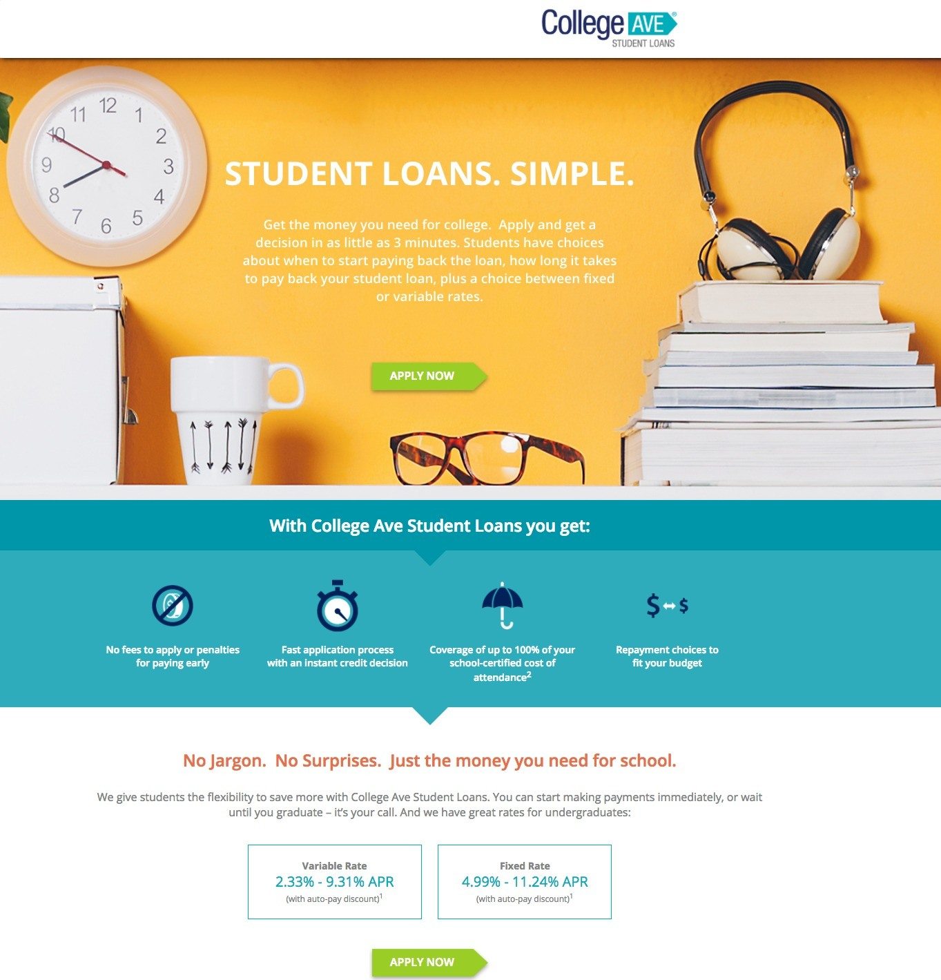
What they did well:
- The headline is clear and explains the offer to the visitors.
- The copy explains how the service works, and describes the payment options available.
- Displaying the fixed and variable interest rates gives students a better idea which rate to choose based on their financial situation and preferred repayment option.
- Including Terms and Conditions and Privacy Policy provides more information to students who may be concerned how their information will be shared.
- The chat window provides an option for students to contact College Ave Student Loans if they have questions about loan applications before going through the application process.
A/B tests to run:
- The clickable logo in the header acts as an exit point and provides an opportunity for visitors to leave the page without applying for a student loan.
- The copy beneath the headline lets students know they can get a loan decision in as little as 3 minutes and they have a choice between fixed and variable interest rates.
- The CTA buttons are too small and don’t attract attention.
- The CTA copy is too generic and doesn’t inspire action. They should include some personalized text that inspires action. “Yes, I Want to Apply” would likely resonate more with students visiting this page.
- The disclaimer section at the bottom of the page could confuse visitors and cause them to worry.
- The social share buttons at the bottom are unnecessary because they allow students to leave that page without first converting.
How does your education landing page measure up?
Does your education landing page have what it takes to get students interested in your offer? If not, you better get to A/B testing!
Create your professional education landing pages with Instapage today, sign up for an Instapage 14-day free trial today.

Try the world's most advanced landing page platform with a risk-free trial.
