Ecommerce websites exist for one reason: to make money. That means everything about the site should be designed to get visitors to purchase. The ticket to more purchase conversions? An ecommerce landing page.
Although nearly 1 in 4 online shoppers begin their customer journey on a product page, about 96% of visitors aren’t yet ready to buy when arriving there. These people are more likely to bounce than those who land on an actual landing page, regardless of the referring channel:
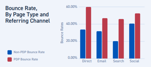
Research also shows that product pages underperform landing pages for ecommerce in other ways too. Don’t believe it?
Ecommerce landing page stats
Data from nearly 2 billion shopping sessions that occurred in the first quarter of 2018 demonstrate how product pages are failing to engage customers:
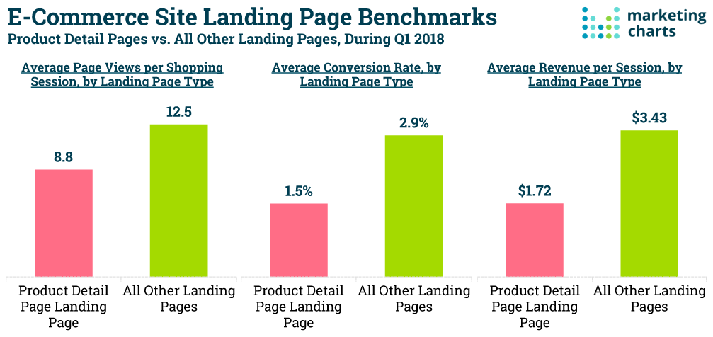
- Visitors who land on a product page view 42% fewer pages (8.8 per shopping session) than those who see a landing page (12.5 per shopping session)
- Product page visitors convert at about half the rate of post-click landing page visitors (1.5% and 2.9%, respectively)
- Revenue per session on product pages ($1.72) is about half that of revenue per session on landing pages ($3.43)
So you see the difference in data, but what about the difference in the page types themselves?
landing pages vs. product pages
The main difference between a landing page and a product page is its purpose.
Despite what many online sources will have you believe, landing pages are not simply “the page you land on.” A landing page is a standalone web page, created for the sole purpose of convincing visitors to take action (sign up, buy, download, etc.). These pages are used to drive targeted traffic to a specific conversion, by focusing on only one message with one goal in mind.
The purpose of a product page, however, is to appeal to the masses and attract browsers. It’s designed to introduce your brand and educate visitors on your product or service. It also often provide links to other places on your website so visitors can navigate the entire site.
Why use ecommerce landing pages?
As businesses become more data-driven, landing pages are becoming the preferred choice of the two because of their ability to drive more conversions, generate more leads, and ultimately, deliver high ROI. In fact, the infamous HubSpot report shows that brands using 40 or more landing pages generate 120% more leads than companies that use less than 5 landing pages.
The reason behind this is that every customer is unique and requires personalized attention and engagement to be persuaded to purchase. The best ecommerce landing pages (aka pre-cart landing pages) allow you to do this — tailor your business to individual customers through specialized digital storefronts, which in turn, increases engagement and boosts sales.
The most desired ecommerce post-click landing page conversions include:
- Subscribing to email updates
- Making a purchase
- Downloading free content
- Upgrading to an improved product or higher level of service
6 Ecommerce post-click landing page examples (with best practices)
Along with explaining the best practices to use on ecommerce post-click landing page templates, this section shows several ecommerce post-click landing page examples to inspire your next design.
1. Eliminate site navigation
Since a post-click landing page is a standalone page from your website, it shouldn’t include a navigation bar anywhere; nor should it include any other click-through opportunities aside from the main CTA. Including any additional links would only allow people to click away from your offer without first converting.
Doodly has the right idea with their post-click landing page:
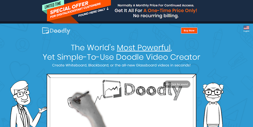
The page omitted all navigation (aside from the few links at the bottom of the page), so visitors are only focused on the post-click landing page offer. There are plenty of anchor links throughout the content that direct visitors to the bottom of the page where they can click-through to purchase. However, removing the footer links would make the focus of the page even stronger.
By removing navigation links and other distractions of a regular web page, ecommerce post-click landing pages focus 100% on the task at hand: getting prospects to engage with your brand.
2. Include an obvious CTA
You can’t assume that everyone will know exactly what to do once they arrive at your page. To avoid any confusion (and higher bounce rates) always include a clear, specific call-to-action, like Grace Lever does on her post-click landing page:
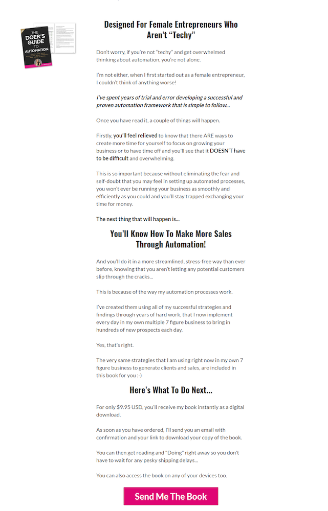
There is no doubt that clicking the pink CTA button on this page will enable visitors to order the book on the following page. Clear, relevant, personalized CTA button copy helps maintain clarity for visitors and allows them to focus on the page goal.
3. Incorporate multiple CTAs
The difference between product page CTAs and post-click landing page CTAs is that the latter should only have one goal. That doesn’t mean only one CTA button, though. Multiple CTA buttons are acceptable on ecommerce post-click landing pages, as long as they cooperate with each other.
Hearst Magazines uses multiple CTA buttons on their post-click landing page — all with the same goal — to increase magazine subscriptions for Eat for Abs:
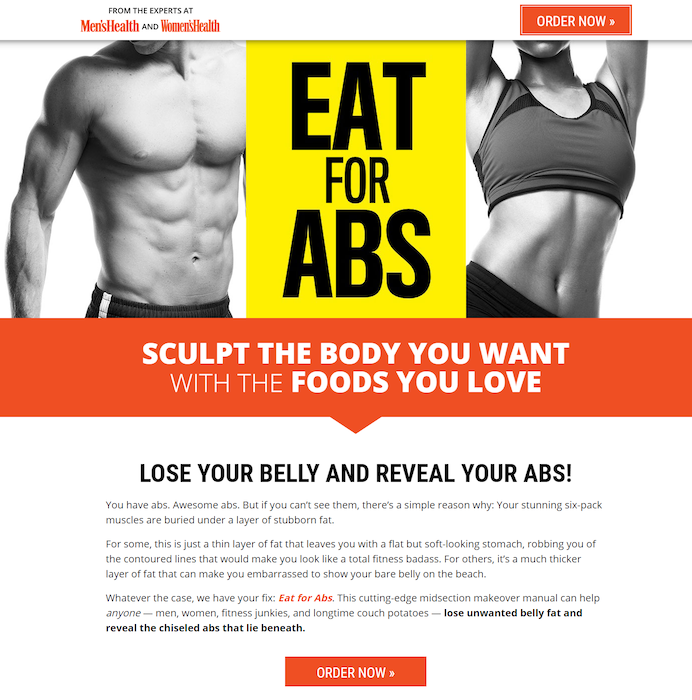
With many opportunities to “Order now” throughout the entire page, visitors are more likely to click one of the buttons and complete the multi-step form.
This is the key to a successful ecommerce landing page — a single purpose without multiple messages. So visitors are sure to complete the desired objective.
4. Add a specific product or service description
While both landing pages and product pages should include descriptive product or service copy. It should be more audience-specific on landing pages, than the more generic copy typically found on product pages.
Rather than making visitors search for your product or service description, ensure that it’s visible — not too small, or hidden at the bottom of the page.
HelloFresh makes its offer description very clear and visible, above the fold and directly above the CTA button:
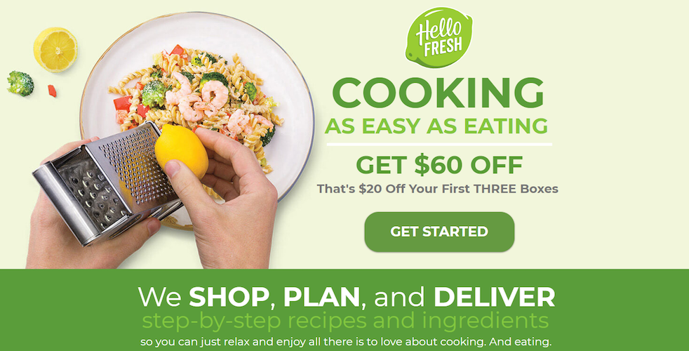
The rest of the click-through page describes how HelloFresh operates, lists the main benefits, and shares top reviews. It also includes a second CTA button at the bottom of the page, aimed at the same conversion goal.
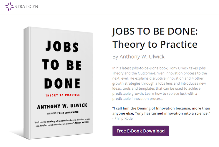
Studies show that conversions can increase by 124% by incorporating images to supplement product descriptions, like Strategyn does:
5. Focus primarily on conversions
Product pages are heavily optimized for SEO since one of their main goals is attracting organic traffic. post-click landing pages can also be optimized for SEO; however, it’s not a necessity because landing pages are ad focused, not organic. So even though landing pages can potentially be made SEO-friendly to rank higher on SERPs and gain more visibility and traffic from search users, they should be primarily conversion-focused.
Consider this banner ad and landing page example from Constant Contact:

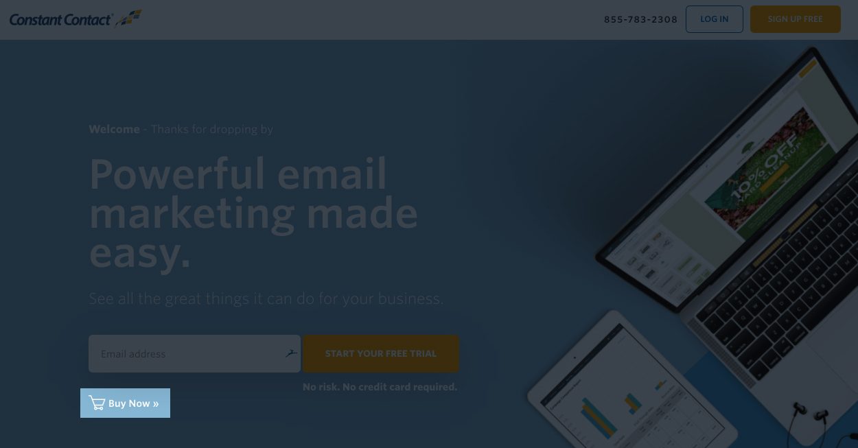
They created this ad and landing page to be conversion-focused, by highlighting the free trial with multiple CTA buttons, and including an additional “Buy Now” link.
6. Optimize for mobile
Having a mobile-responsive pre-cart ecommerce landing page is essential since many of today’s customers do their shopping from mobile devices.
Create vertically aligned pages and forms, format images and videos properly to fit neatly on the device, and include tappable buttons.
The Honest Company checks all of those boxes with their ecommerce post-click landing page:

Mobile-optimizing your post-click landing page elements allow mobile users to comfortably access your content, providing an ideal user experience, and a better chance at conversions.
Make the most from your ecommerce post-click landing pages
As evidenced by the examples above, these pages are a critical part of any ecommerce company’s sales funnel. They’re the bridge between your advertising efforts and a sale, ultimately helping you collect more revenue.
Always connect all your ads to personalized post-click landing pages to lower your cost per customer acquisition. Start creating your dedicated post-click pages by signing up for an Instapage Enterprise demo today.

See the Instapage Enterprise Plan in Action.
Demo includes AdMap™, Personalization, AMP,
Global Blocks, heatmaps & more.

