- What is ecommerce advertising?
- Ecommerce advertising techniques
- Personalization
- Mobile-first
- Landing pgae optimization
- Conversion rate optimization
- Omnichannel
- Artificial intelligence
- Targeting & retargeting on social platforms
- Ecommerce ad examples
- Sprint
- The Ridge
- Verizon
- Nomatic
- Samsung
- Conclusion (& free guide)
In the US, consumers already prefer buying online than in a brick and mortar store. Over half of shoppers say they’d rather purchase with their mouse.
And despite the fact that most shopping dollars are still spent in-store, 96% say they’ve bought something over the internet — 80% in the last month alone.

This year, more than 220 million Americans will shop digitally. Of them, 11% claim they’ll spend more than they did last year.
In other words, ecommerce is only growing — and with it, spending on ecommerce advertising.
What is ecommerce advertising?
Ecommerce advertising is the practice of disseminating paid messages to sell a product online. The advertiser will pay for placement, impressions, clicks, etc. on a publisher like Facebook, YouTube, or TechCrunch, for example.
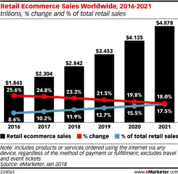
This year, ecommerce sales are expected to account for 13.7% of retail sales worldwide. By 2021, eMarketer predicts that number will grow to 17.5% — reaching a total of nearly $5 trillion in sales.
As the revenue pie grows and getting a piece becomes more difficult, here’s what businesses are doing to draw in more customers with ecommerce advertising.
Ecommerce advertising techniques
When it comes to earning the eye, the click, the sale, it takes a combination of techniques. Here are some of the most powerful that ecommerce advertisers are using today:
1. Personalization
More than 95% of marketers say that personalization advances the customer relationship. If that’s not a testament to its power, consider that bad personalization, in the past, has cost businesses three quarters of a trillion dollars.
That’s why it’s become a staple of ecommerce marketers’ repertoire.
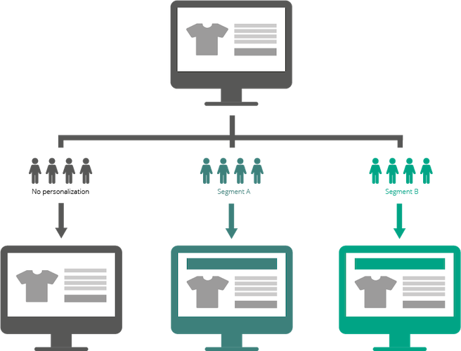
Through personalization, ecommerce advertisers can meet customer expectations with precise targeting at every stage of the marketing funnel. At its core, personalization is about discovering your customers’ needs through data collection, then segmenting based on them. The more you learn, the closer you can get to true 1:1 personalization:
2. Mobile-first
By now, you shouldn’t just have a mobile marketing strategy — it should be a priority. It’s already more likely a shopper visits your store on mobile than anywhere else.
Even when they’re in-store, 80% of shoppers will use their mobile device to find reviews, prices, and even other store locations. By 2021, it’s expected that 73% of ecommerce will happen on a mobile device.
3. Landing page optimization
The problem with most ecommerce ad campaigns is that they focus resources heavily on just one-half. By doing so, they create an imbalanced, suboptimal campaign. What usually happens is this:
Advertisers spend much time, effort, dollars creating and testing countless advertisements, only to drive their traffic to a single landing page — or worse, a homepage.
This creates a personalization gap. The ads are segmented, well-designed because they’ve been tested, etc. However, after they’re clicked, audiences are driven to a generic landing page.
This experience succeeds in providing personalization early on but fails later in the campaign. When this happens, it’s likely to result in page abandonment.
landing page optimization aims to match the ad experience (known as the pre-click experience) with the landing page experience and beyond (known as the landing page.) While it was once impossible to create one landing page experience for every ad, with landing page automation tools that allow for instant page creation and global editing, it’s now as easy to make landing page groups as it is to make ad groups.
4. Conversion rate optimization
Conversion rate refers to the number of people who land on a web page, or see an ad, compared to the number of people who accomplish that page or ad’s primary goal — whether it’s to buy, download, sign up, click through, etc.
Conversion rate optimization refers to the practice of improving that rate through data collection, analysis, hypotheses, and testing. A/B and multivariate testing are commonly used to determine the better of two designs. By starting with a business problem and testing a solution on prospects using sound experimental protocol, you’ll be able to discover methods to improve your conversion rates.
5. Omnichannel
Multi-channel shoppers spend three times more than single-channel shoppers. Facebook, YouTube, Google search and display, Instagram, brick and mortar — these are just a few of the channels that make up “omnichannel” for many brands.
Omnichannel is a strategy that provides the ultimate convenience and relevance for any customer. To offer a great omnichannel experience means to provide seamlessness across every channel at any point in the buyer’s journey. It requires excellent coordination and strategy — specifically the deconstruction of silos around an organization.
An omnichannel experience would allow, for example, someone to buy a shirt in-store, then receive relevant recommendations for pants that go with that shirt the next time they log in to Instagram. When they click through Instagram to the company website, they should be able to see what’s available in stock at nearby stores. In-store, sales associates should be able to provide as much information about the product as the online listing.
Experiences like these are becoming more and more common. And even though ecommerce accounts for 5% of omnichannel spending by marketers, it has driven 40% of the industry’s growth.
6. Artificial intelligence
Your Google Home, Siri, Alexa — they’re not relied on as much as manual methods of search or purchase. However, they’re growing as a resource for shoppers. Research claims that 10% of online shoppers have used a voice home assistant to make a purchase. With smart speaker ownership rising as well — to 53 million Americans — this could make smart speakers a force for ecommerce purchasing.
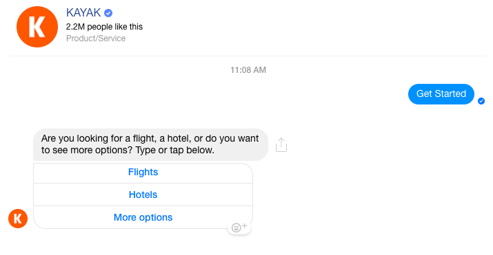
Complementing the smart speakers in the AI service industry are chatbots. While they’re still experiencing growing pains, chatbots are already capable of some powerful things. Consider Kayak’s, for example, which allows you to book a trip without ever speaking to a real person:
Chat apps are already among the most-used in the world. So, when chatbots finally catch up to the popularity of the platforms they’re hosted on, it’s sure to make some noise. Experts predict chatbots will form a $1.3 billion market by 2024.
7. Targeting and retargeting on social platforms
The power of social networks to drive purchasing is commonly known. Nearly three quarters of people speak to their social networks when considering a purchase.
Online, Facebook is still driving ecommerce, with 78% of shoppers 18-34 saying they discovered ecommerce products on Facebook. And 55% of shoppers say they’ve purchased a product online after discovering it on social media.
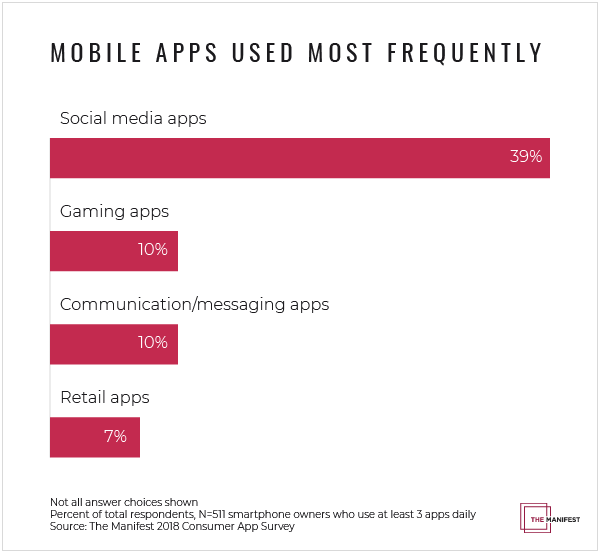
When you consider most time spent on mobile is in a few select apps — the most popular of which is social networking — retargeting on popular social media platforms is a no-brainer:
Examples of ecommerce ads
Where campaign strategies require examining the big picture, designing a click-worthy ecommerce ad calls for close attention to detail. Let’s take a look at some examples to see if they have what it takes to earn attention and a click.
Sprint
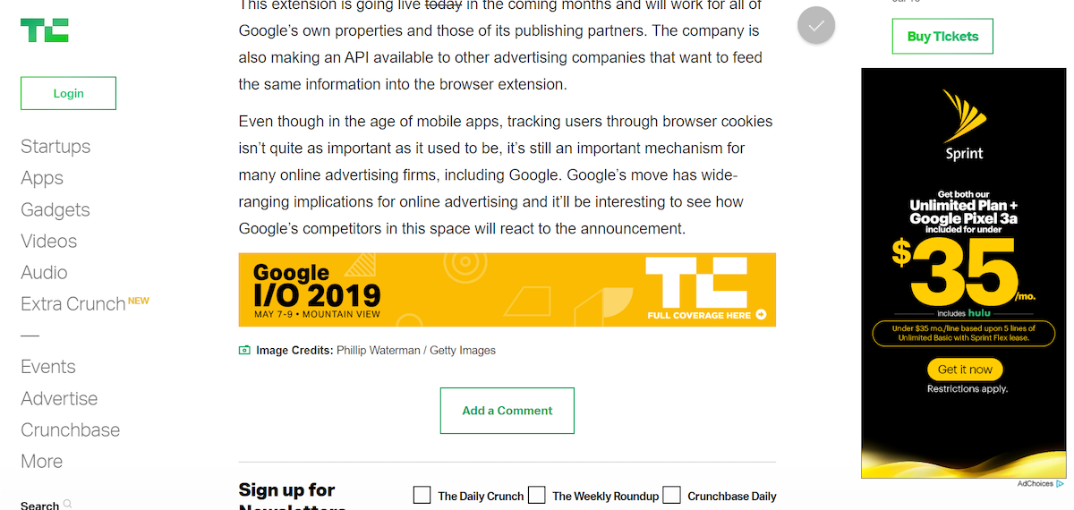
The tall black skyscraper ad on a white background draws your eyes to this Sprint promotion, which appears to be a phone, plan, Hulu bundle for under $35 a month. Not a bad deal. The company logo identifies Sprint at the top — a commonly recognized symbol with a lot of brand equity — and below visual hierarchy does its job.
Your eyes see the $35, which is the biggest selling point of the ad: its low price. Above and below you see what you’re getting for the price — the plan, the phone, and in green letters: Hulu included. Below that, a highlighted call-to-action stands out on the black background, drawing the attention of the skimming eye. The word “now” conveys that you can claim the offer immediately.
The Ridge
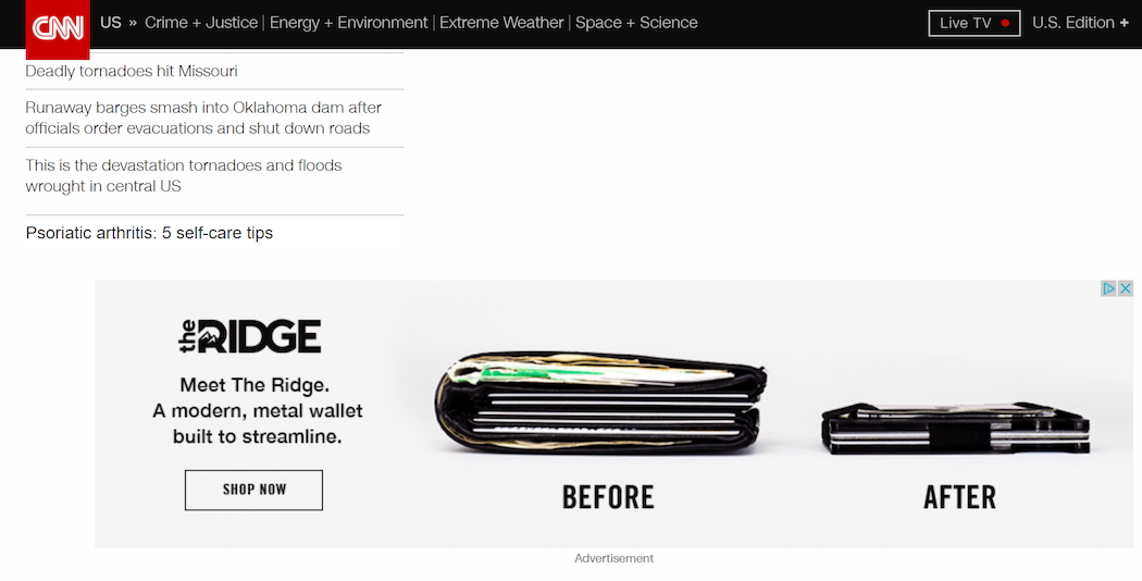
Here’s an ad for the Ridge: A modern, metal wallet built to streamline. It does a good job showing that streamlining, but…how does one streamline with this wallet?
Does Ridge help you streamline by forcing you to throw out old cards you don’t need? Or can you fit it all in your new Ridge wallet more efficiently? It might be useful to see what these look like inside. A hero shot, possibly, of a hand grabbing something out of the metal wallet might give us a better idea of size and capability.
Other than that, the ad is a simple one for a simple product. The big images draw the eye from the content, the button lets us know where to click…
The typeface, though, might look better as something a little slimmer and cleaner with a little more spacing. Currently, it looks as clunky as the “Before” wallet.
Verizon
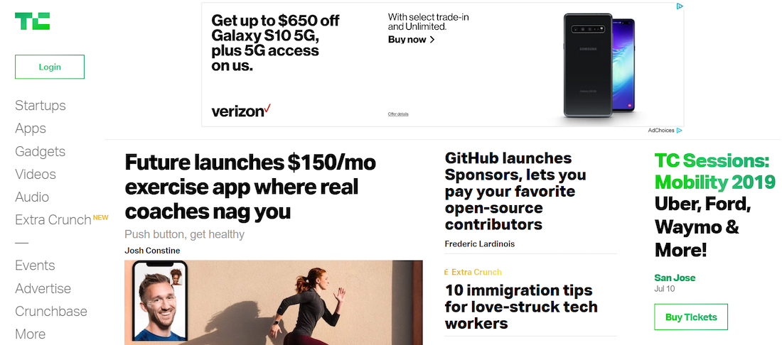
Here’s another phone banner ad, but this time from Verizon. With a white background, it’s not as easily noticed as the Sprint ad. This one, however, features an image of the phone, which is somewhat helpful, although it’s a fairly small image even at full-size. The text on the left offers a discount, then uses the term “on us” to throw in a 5G freebie. The text to its right, however, sounds like jargon. What are select trade-in and unlimited? Below, “Buy now” lets us know where to click to purchase immediately.
Nomatic
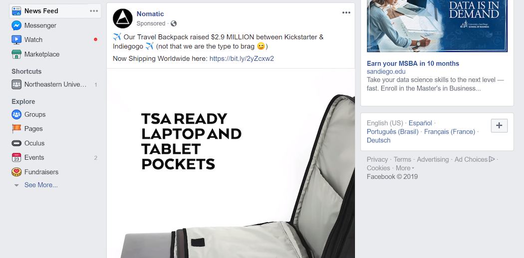
This Nomatic ecommerce ad draws your attention immediately using autoplay video in a big player, right in the middle of your news feed. Each frame is exactly what you want from product images: an informational look at all the ins and outs and angles of the product. Above, copy uses social proof to showcase popularity by claiming the product crowdsourced almost three million dollars, and even gets playful with an emoji. Then, it gives viewers a way to claim it while letting them know it ships worldwide.
Samsung
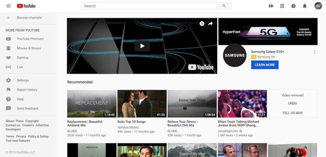
Even though it has a lot to compete with on the page, this Samsung YouTube banner ad draws our eyes with sheer size and autoplay video. Spanning the entire page, this video gives us a close-up look at all the angles of the product. To the right, an image of the phone with “5G” overlaid lets us know it comes complete with the newest “HyperFast” tech, and the copy next to that makes it clear. Below, a blue CTA button — standing out as the only blue element on the page — gives visitors a place to click when they want to learn more.
Conclusion
After both a higher-level and more specific look at ecommerce ads, it’s clear they’re becoming more popular and effective with today’s marketing strategies. With the help of the newest ad techniques and formats, ecommerce sales will grow by one and a half trillion in the next two years. To learn more ways to generate conversions with relevant, personalized ad campaigns. Sign up for a 14-day trial today.
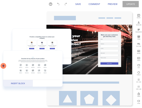
Try the world's most advanced landing page platform with a risk-free trial.
