One of the few elements to survive every stage of the web over the last 30 years, banner ads are still the pillar of many businesses’ display ad strategy. But as the internet gets more cluttered, it gets harder to grab potential customers’ attention.
Display banner ads are getting more creative—and those that aren’t get left behind.
Before we dive into examples of what to do and what to avoid when creating banner ads, let’s run through what exactly banner ads are, and what makes a banner ad strong.
What are banner ads?
A banner ad is a rectangular internet display advertising format which drives visitors to a landing page when clicked. Common web banners and sizes are:
- Full banner: 468×60
- Half banner: 234×60
- Vertical banner: 120×240
- Leaderboard: 728×90
What makes a good banner ad?
Like a good skyscraper ad (and generally any successful ad), a good banner ad is optimized for the four C’s:
- Catchiness: Does it catch the eye?
- Clarity: Is the value proposition clear?
- Creativity: Does it stand out from all the boring ads on the internet?
- Clickability: Does it compel the viewer to click?
- Clarity: Is the value proposition clear?
As one of the most popular ad formats on the web, there are lots of banners to choose from. Let’s see how these 30 examples stack up.
29 Banner ad examples with best practices
1. The New Yorker
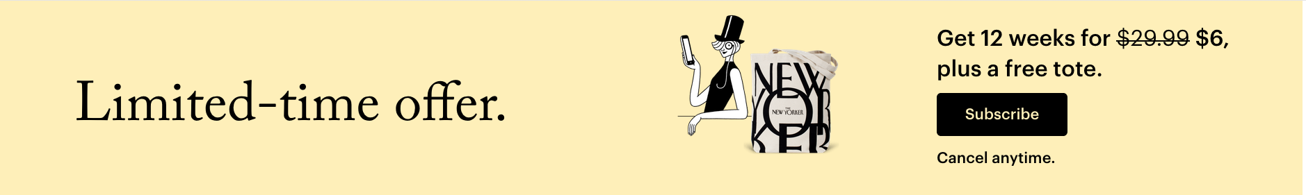
The New Yorker’s banner ad design is simple, on-brand, and clear. It’s easy to see the value of the discount. Prospects know when they click the “Limited time offer” ad they’ll get access to 12 weeks of the New Yorker for $6 and a free tote. “Cancel anytime” lowers the barrier of entry since viewers know there isn’t a long-term contract.
2. ZeroBounce

The ZeroBounce banner ad features a relevant image and a clear offer. In fact, the value proposition is in the brand name. Prospects get something for free, which is a great motivator—the opportunity to clean their list and achieve higher clicks and zero bounces.
3. Audible
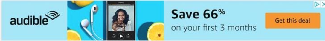
The Audible ad aims to establish credibility by featuring Michelle Obama’s audiobook as the creative. The offer is clear—prospects can save 66% on the first 3 months of their subscription.
4. LivePlan
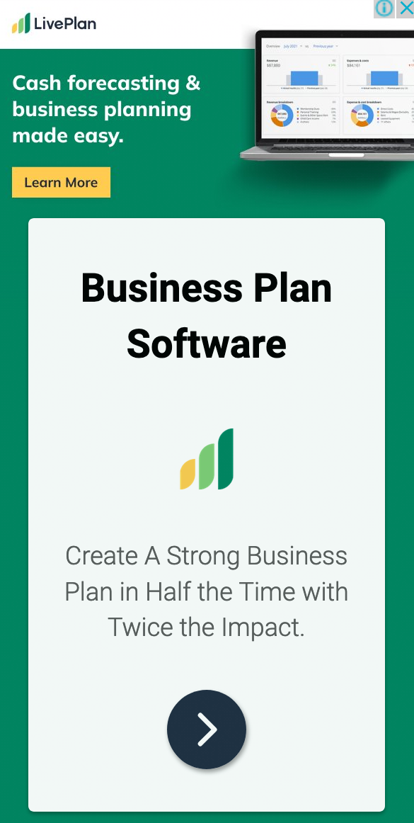
The LivePlan banner ad features an image of the platform’s dashboard. The ad copy is compelling and action-oriented, “Create a strong business plan in half the time with twice the impact.” If prospects are interested, it’s clear that they can click the ad to learn more about the offer and product.
5. CallRail

This CallRail ad has a few things going for it and a few areas of improvement. The button is clearly a CTA button, offering a free 14-day trial, and using an active verb, “start.” The text above the button tells readers what the software does, but it’s small and could be difficult to read on some screens. And the main question left for viewers is, why should we use this service or software? There’s no unique value proposition (UVP) presented.
6. GoToMeeting

The GoToMeeting ad doesn’t give much detail. It takes for granted that viewers know what the product is and are motivated enough to want a trial. In theory, this could be an animated ad, which conveyed the value proposition before landing on this final static image and text. However, you can’t assume that the visitor will see your animation. If you’re going to use an animated ad, ensure the unique selling proposition (USP) is conveyed when the animation stops.
7. Ezoic

If you’re not sure what Ezoic does, you’re not the only one. There’s an outer-space background here, an astronaut-ish character holding a helmet, and copy that is very vague, “Balance visitor experiences & revenue.” As far as what it’s offering, your guess is as good as ours, which is to say, not good at all. Most viewers will not be curious enough to click the CTA and “learn more” if they don’t know what the product does in the first place.
8. Falcon Digital Marketing

The Falcon Digital Marketing ad has a bright CTA that emphasizes an enticing offer: A free audit. The service is clear: PPC management. However, does it make a good case for the service? “Grow Your Business With Online Marketing” is a little vague. Why choose Falcon Digital Marketing and not another PPC agency? In this case, sharing stats from customers could highlight the agency’s efficiency and/or provide social proof to support their claim.
9. Gobble

This ad from Gobble uses curiosity to get prospects to click. The food looks tasty, and the offer of $50 off is enticing, but what exactly is the service? The UVP isn’t totally clear here. Is it a faster way to cook? Is it more nutritious food? Is it similar to or better than other well-known brands such as Blue Apron or HelloFresh? What is Gobble other than new, and why should the modern family use it?
10. Hitachi

The Hitachi ad is futuristic-looking and eye-catching, as is its call-to-action. However, it’s not clear what we’ll get by clicking the ad. “New efficiencies” comes across as vague corporate jargon that won’t compel most viewers to click through. While the Hitachi brand is well known, it’s important not to assume that brand recognition will make people interested enough to click on your ads.
11. Windows10 Pro

This ad shows off a pretty innovative-looking laptop bending in the opposite direction than we’d expect. The CTA is clearly a button, though the white text on light blue is relatively difficult to read. Including two brands in one ad, Lenovo and Windows, may confuse people. Whose website is this ad taking us to? The bold headline, “the No. 1 commercial PC brand” adds some credibility to the ad, but it’s unclear who rated Lenovo number 1.
12. Liquid Web
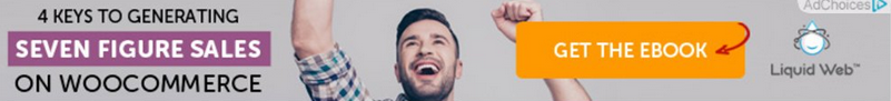
Liquid Web has a clear, straightforward ad. The CTA button is bright—and clickable. The deliverable is clear and low-risk since it’s a download and not a demo or trial. The value proposition is clear here too: Learn the 4 keys to generating seven-figure sales on Woocommerce.
13. equiti

The equiti banner ad offer is not clear. “Trading involves risk” sounds like a warning. Without any sort of CTA or UVP, it is more likely to scare people away than bring them in. There’s no button to click or offer indicated. The size and contrast of the headline and mockups work well. Since there are images of the trading dashboard we can see that equiti is a gold and USD trading platform, but unless someone is actively looking for this product, they are unlikely to be motivated to investigate.
14. Citibank

The Citibank ad is another vague one. There’s no offer promoted in the ad, just text that says Citi is a private bank and viewers can find out more by clicking the ad. Perhaps the minimal color and context are meant to feel “premium” or private? But it seems unlikely to motivate a response from most viewers.
15. TestRail
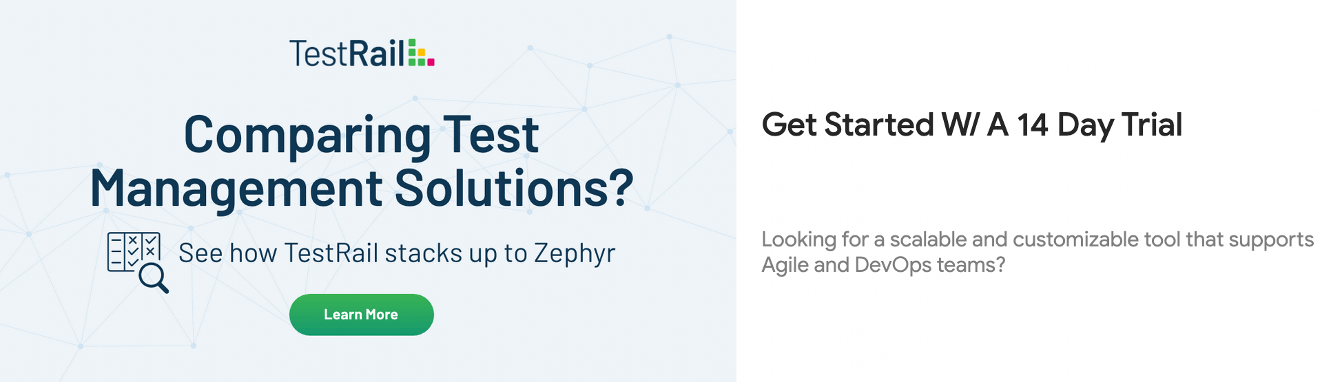
The TestRail ad offers prospects a chance to learn more about how the test management solution compares to Zephyr. This is clearly meant for prospects in the middle or bottom of the funnel, people who would answer yes to the question, “Comparing test management solutions?” For this niche group, a 14-day trial may be a good motivator. However, the visual and messaging hierarchy in this ad is not logical. It almost feels like two separate ads with different UVPs and two competing CTAs, the trial offer and call to “learn more” about the competitor comparison.
16. Brita

The Brita banner ad copy rhymes, “Great Taste, Less Waste,” which will likely stick in viewers’ minds. The complementary colors and white text are bold, eye-catching, and likely to stand out on many different types of pages. However, it’s not clear what Brita is. The water bottle indicates that it’s probably a water filtering system, but, a prospect can’t exactly be sure if they’re not already familiar with the brand.
17. Disney+
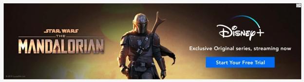
The Dinsey+ ad showcases exclusivity and a very specific series to prospects—if they choose to start the free trial, they’ll get access to the original series, a spinoff from the well-known Star Wars franchise, that will not be streaming on any other platform. It says all it needs to say and uses recognizable branding and imagery that will likely grab viewers’ attention.
18. Amazon

As one of the most well-known brands today, Amazon doesn’t have to say much to draw people in. If they’re looking for a gift card—maybe they forgot it was a colleague’s or friend’s birthday, or want an easy option for a future occasion—this ad reminds them that Amazon is an easy option. The Amazon is generally visually compelling, bringing in physical nods to celebrations such as flags and physical cards, but it doesn’t really communicate the value of celebrating with an Amazon gift card. In other advertising, this value is shown to be: Amazon has something for everyone.
The CTA here, “Shop now,” isn’t designed with conversion in mind as it doesn’t look like a button, and the dark text blends in with the teal background.
19. Samsung

The Samsung banner ad features a minimalist design, there’s an image of a Samsung Galaxy tablet and a compelling headline “Create. Work. Anywhere.” It shows both a stylus and keyboard option, so viewers know there are multiple ways to use the tablet. The one drawback is that there isn’t a clear button or offer, but the small arrow indicates there is more information to be had.
20. Final

The Final banner ad uses humor to establish that their straws are the most innovative straws available. “Sucking” provides a cheeky nod with a similar word that could be used to emphasize the greatness of the product. Prospects can click the Shop Now CTA to buy the “greatest” straws now.
21. Jira

The Jira ad copy promises that Jira service management is “more than a ticketing system” and prospects who want to know more need to “Sign Up” for the service. Jira is a well-known brand in tech, but the name, and the logo of its parent brand, Atlassian, are relatively small. The image references how Jira helps optimize the ticketing experience—problem areas become green checkmarks. If someone is familiar with the product, this may inspire them to sign up, but if they don’t already know they need a solution/different solution, this may not be enough to convince them to click.
22. Gillette

The Gillette ad offer is clear, prospects can get a blade for their razer for less than $2, which speaks to value. The design aesthetics are on brand for Gillette, and the blade images are relevant to the offer. In this case, the banner ad may be less about getting viewers to click and buy online, and more powerful as a brand awareness tool so that the next time they’re at the store and need a razer (or extra blades), they’ll think of Gillette first.
23. Starbucks

The Starbucks ad promotes their breakfast menu, rather than just copy. The headline, “Find your breakfast at Starbucks,” suggests that the coffeehouse has a breakfast option for everyone. The “Learn More” button looks clickable, and the checkboxes on the graphics further emphasize the importance of personalization.
24. UPS

The UPS banner ad fulfills all the requirements of a click-worthy ad:
- A compelling offer, “Save up to 40%”
- Copy that explains how to take advantage of the offer, “Use the promo code…”
- A clear action-oriented CTA button, “Create a Shipment.”
25. Sotheran’s
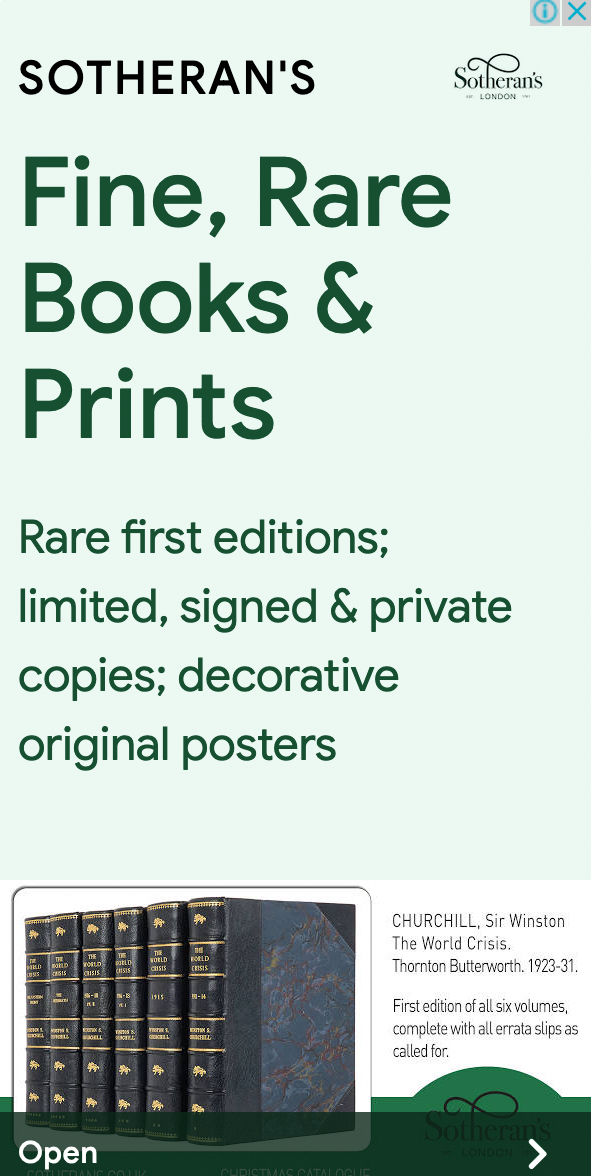
Do you like rare books and first editions? Most people will have a clear “yes” or “no” answer, and hopefully, the audience targeting of this ad corresponds with that response! The Sotheran’s banner ad tells you exactly where to find these rare gems. The copy could be more action-oriented, and the images lack design appeal, but the offer is clear—get fine, book, and prints at Sotheran’s.
26. Ridge

The Ridge banner ad copy introduces the wallet with a short product description, and the imagery shows a stark contrast between the “old” way and the new Ridge wallet, giving prospects a literal picture of why Ridge is better. The “Shop Now” CTA is clear, though the button design would stand out more if it were a filled color instead of an outline.
27. Hapag-Llyod

The Hapag-Llyod ad has just one line of copy that also doubles as the headline: ”Get your 30-second quote now.” But it’s not clear what the service does. The shipping containers point to a shipping company, and the photograph of the person looks like someone professional, surrounded by files, likely indicating they’re overwhelmed by work. However, this is not clear from the ad copy so if someone if not familiar with the brand, they are unlikely to click. The “Get Quote” button would look more intentional if the text was larger, as would the logo.
28. Pluralsight

The Pluralsight banner ad showcases their buy one month, get one free offer. The copy is minimal but gets the point across. Like some of the other ads we’ve seen, the left and right sides don’t look like they were designed together. This may be a case of the company designing a few sizes of the ads (the left half) and then trying to make them fit different dimensions for other banners. This ad would be much stronger with a slight redesign that merged the two messages and kept the background consistent.
29. Allbirds

The Allbirds banner showcases the unique value proposition, “The World’s Most Comfortable Running Shoes.” The “Shop Now” CTA is clear, and the overall aesthetic matches the brand. It’s a simple, clean example that you don’t need to have a complicated design or message to make an impact.
Combine banner ads and landing pages
Even the clearest and most eye-catching, creative, clickable ad will fall short without a message-matched landing page to close the deal.
Banner ads, remember, are only the first half of the campaign (aka the pre-click experience). The landing page—what happens once a visitor clicks through—must be optimized for conversion. Try using some of today’s takeaways to start creating compelling banner ads and landing pages.
Now that you know what you need to do in your ads, Instapage makes it easy to create personalized, relevant landing pages for every ad group and audience with hundreds of templates and easy in-app testing. Sign up for a 14-day trial and start increasing your conversion rates today.

Try the world's most advanced landing page platform with a risk-free trial.
