Most people don’t go out shopping just to shop. They typically have a product in mind with intent to buy. So when faced with an empty store with no signs in the windows, or a well-designed store with a huge sale sign in the window for the exact product they’re looking for–they’re most likely to enter the latter.
First impressions are everything, even in the digital era where sales are transitioning online. Yet, while every customer is unique and requires different offers and engagement, it’s unrealistic to expect brands to create entire websites for every user.
They can, however, create unique digital storefronts for each one.
What is a digital storefront?
In the digital world, your landing page serves as your storefront–your main avenue to making a great first impression, and a vital contact point for a customer, setting the tone for the entire relationship and transaction.
For example, online shoppers often search Google by keywords to find the specific product or service they’re looking for. Searching for exact terms indicates high intent, which helps brands target interested buyers.
The problem: a brand could have the perfect product or service to meet that consumer’s needs, but if it’s not advertised properly, a good relationship won’t form and a transaction will never happen.
Using landing pages as your online storefront offers an opportunity to provide a unique value proposition to highly segmented personas in a professional and credible way. It allows you to present your brand as an authoritative, relevant, and trustworthy source within your industry.
Remember, though, a digital storefront is a direct representation of your business–for better or worse. If your landing page is cluttered, unorganized, and unprofessional, the visitor will likely bounce immediately. If it’s conversion-optimized, you’re more likely to capture their attention and convince them to convert.
It’s important to take a look at your electronic storefront to see what it says about your business. As inspiration, here are four ways brands use various landing pages to attract consumers’ attention, entice them to engage with the page, and pursue the offer.
4 Ways to use landing pages as your digital storefront
Squeeze pages
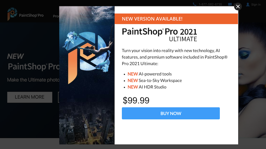
Squeeze pages provide good reason and an irresistible offer to visitors in exchange for their information. Here’s one that PaintShop Pro uses to capture visitors’ attention and show them why they should purchase before they leave the website:

The page serves as a digital storefront because:
- “New version available” let’s visitors know they don’t currently have the best/newest option and entices them to upgrade.
- Bulleted lists and bold copy provide important information in an organized, easily-digestible way.
- Only one offer keeps visitors focused and on track toward conversion.
- No exit links makes it less likely that visitors will bounce, and more likely they’ll redeem the offer.
- The blue CTA button contrasts well with the orange, black, and white page.
- A click-through format makes the form non-intimidating for prospects to complete on the next page.
Sales pages
Sales pages, like the one below from Gardens Illustrated, can also be used as digital storefronts to make a great impression and secure sales for your product:

What makes this page a great digital storefront is:
- A strong headline explaining exactly what the offer is and what visitors are supposed to do.
- The image slideshow showing exactly what the magazines look like.
- A contrasting CTA button so visitors can easily find it and order a subscription.
- 1:1 conversion ratio so visitors are focused only on one goal.
Lead capture pages
Lead capture pages are a third way to use post-click landing pages as a storefront by focusing primarily on the lead capture form like Drip does:

We can tell Drip uses this page as a digital storefront through:
- A straightforward headline that highlights exactly how the company can help prospects.
- A bulleted list expanding on how Drip can improve customers’ email marketing.
- A lead capture form above the fold and surrounded by white space to entice visitors to convert.
- Testimonials to show that other customers have seen success with Drip.
- G2 awards to show credibility and trustworthiness.
Retargeting landing pages
Freshly uses a retargeting landing page with an exclusive offer as their digital storefront, to entice prospects who have already shown interest in starting a subscription and might need a little incentive:

Elements that make this post-click page a great storefront include:
- An attention grabbing headline and subheadline announcing an exclusive discount offer for prospects who may need extra convincing.
- High-quality images of Freshly meals.
- Time and quantity scarcity, letting visitors know they must redeem the offer before meals are sold out, and before the “limited time offer” expires.
- A short form and enticing CTA button, so prospects can quickly and easily claim their discounted meals.
- Numbered benefits of Freshly to persuade visitors why they should convert.
- Ratings and testimonials to prove that others are satisfied with their subscriptions.
Create an attractive digital storefront with every landing page
With online shoppers’ high intent to buy, it’s important you make a great first impression with your digital storefront. By taking a customer-first, hyper-personalized approach to your landing pages, you can turn them into attractive, enticing storefronts to guide traffic in the direction you want and drive higher returns for your business.
Request an Instapage Enterprise Demo and see how our advanced, conversion-focused landing page software can provide your audiences with those unique digital storefronts they deserve.

See the Instapage Enterprise Plan in Action.
Demo includes AdMap™, Personalization, AMP,
Global Blocks, heatmaps & more.
