Since you’re reading this on the internet, I’m going to go out on a limb and guess you’ve come across a fair amount of post-click landing pages within the last hour or so.
You probably see them all the time, right?
But, out of the dozens (maybe hundreds) of post-click landing pages you view week after week, how many are engaging enough to get you to sign up for whatever offer or product is being presented? How many are engaging enough to make you even think about doing so? Probably not that many.
But, every once in awhile, I become captivated by the message being presented on a post-click landing page.
It only takes a few seconds for a post-click landing page to grab my attention. But once I’m intrigued, I almost always sign up to receive additional information from the website in question.
Now, as I said, this doesn’t happen all that often. Most post-click landing pages are somewhat generic and are written in an overly “sales focused” manner – which are huge red flags telling me to stay away from this company.
The post-click landing pages that grab my attention and persuade me to sign up, on the other hand, are written in a way that truly speaks to me as an individual. In these cases, it almost feels like the creator of the post-click landing page somehow knows everything about a personal struggle I’d been going through, and created the page – and their services – just for me.
And if a company can get me feeling that way from just their post-click landing page, I’ll have every reason to believe I’ll get value out of everything else they have to offer, as well.
To put it more plainly: You need to speak your customer’s language when creating post-click landing pages for your website. If not, the vast majority of your visitors are going to end up hitting the “back” button before they even take a second glance at the rest of your site.
The major components of a post-click landing page
Before we dive into how to create post-click landing pages using your customer’s words and way of speaking, let’s look at elements an optimized post-click landing page is comprised of.
Headline and subhead
The headline is perhaps the most essential part of your post-click landing page, as it’s the only part most of your visitors will pay attention to.
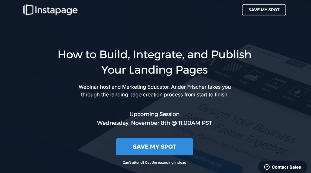
In this case, “Build, Integrate, and Publish Your post-click landing pages” is the heading.
There are some different ways in which to approach writing a headline for your post-click landing page. No matter which you choose, though, make sure your headline:
- Quickly gets to the point you want to make
- Is relevant to your visitor’s purpose for browsing (i.e., it relates in some way to the main page it’s presented on)
- Empathizes with your visitor’s plight
The subhead is essentially a follow-up message that supports the headline. Subheads usually provide an extra “oomph” to the main message, driving home the reason a visitor should engage with a company.
List of benefits (and features)
If you want to have any shot of grabbing your visitor’s attention, your post-click landing page needs to explain exactly what they have to gain by engaging with you.
Now, the debate of whether to focus on features or benefits is ongoing. But it’s entirely possible to include both simultaneously:
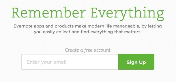
Here, the people at Evernote explain exactly what their product does, and how using it will benefit their customers. And they describe all of this with just a heading and subhead!
You might choose to list your benefits separately on your post-click landing page, which is fine. Just keep the list brief and customer-centric.
Data collection form and call-to-action
Because your post-click landing page’s submission form and its call-to-action go hand-in-hand, we’ll discuss them together.
The data collection form is where your customer inputs their information to be sent to you in exchange for whatever it is you’re offering. There are two main parts to a data collection form:
- The form
- The submission button

The form itself is pretty straightforward, asking you to input your email address. Your visitors don’t want to input a ton of information from the get-go so look for ways to remove as much friction as possible if your goal is to maximize the number of leads that come in.
The action button copy is a bit more nuanced, though. The word “Subscribe” may seem like an obvious choice, but it could just as easily read “Submit.” However, the word “submit” insinuates the visitor is giving away their information, for the company to do whatever they want with it. “Subscribe,” on the other hand, explains that the visitor will be getting something in return for their form submission.
The call-to-action is meant to…call the visitor to take action. Notice in the example above, though, that it’s not just about signing up for a mailing list; it’s about what the visitor will be able to do with the information they receive from the newsletter in question.
And, as we’ll get into, the CTA is written in a conversational, jargon-free manner – a staple of customer-centric copy.
Now, let’s dig into how to use customer-centric copy throughout your post-click landing pages to attract and engage your target audience.
Using customer copy to build high-converting post-click landing pages
As we alluded to earlier, it’s relatively easy to slap together a post-click landing page using company-centric language that explains “what you’re all about” to your visitors in an attempt to sell them something.
The problem with this approach is: your target customers don’t care about you or your company. They care about themselves. And they want the company they give their money to care for them, too.
So, simply put: If you’re not even able to speak your audience’s language, you’re essentially telling them that you don’t care about them and that you just want their money.
In the following sections, we’ll explain what you’ll need to learn about your customers to create customer-centric copy for your post-click landing pages, and how actually to write said copy.
What you need to know about your customers
This might go without saying, but to speak with your customers, you have to know your customers.
But let’s step back even further:
To truly know your customers, you have actually to know who they are. You start by defining who you’re targeting with your post-click landing page.
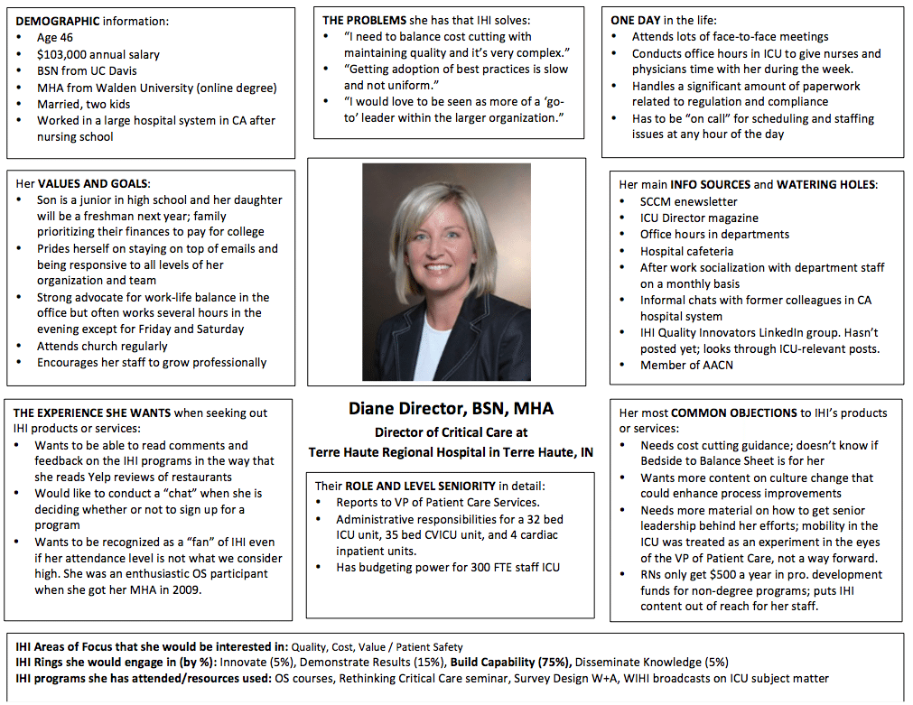
Determining your target persona
You may or may not have already created some personas of ideal customers you intend to provide services to.
If you haven’t, you can do so by thinking of your ideal customer regarding:
- Their demographics (such as age, gender, occupation, etc.) and geographics
- Their psychographics (their personality, lifestyle, and attitudes)
- Their behavioral information (how they act as consumers)
If you’ve already developed customer personas, you still want to narrow down the persona you intend to target with a specific post-click landing page.
Each of your personas wants different things from your company. And each of them speaks a different “language.”
For example, a SaaS company may target both CEOs and project managers – but not at the same time. If developing a post-click landing page to attract CEOs, the company would probably focus on benefits that relate to saving or earning more money – and would likely use more professional language.
On the other hand, a post-click landing page focused on engaging with project managers would probably focus more on streamlining or simplifying processes – and could also use more casual language, as well.
To determine who your next post-click landing page should target, you’ll need to dig into your engagement metrics and data, such as:
- Site analytics (i.e., who’s visiting your site, who’s engaging with your pages, who’s bouncing from your place, etc.)
- Social media mentions
- Comments on recent blog posts (both yours and your competitors)
You also want to consider whether you plan on targeting “easy” or “difficult” customers within a given persona. Some customers will be dying for a solution to their problem and will be open to giving your company a shot. Others might be more hesitant to engage with your brand – or might not even realize they have a problem in the first place. Still, others might currently utilize a competitor’s services – meaning you’ll have to do some convincing to get them to leave the competitive product to try your company.
Once you’ve determined exactly who you want to target with your next post-click landing page, you’ll be ready to go all-in on learning everything you can about them.
Determining your target customer’s “why”
Here’s where things start getting customer-centric.
To create a post-click landing page that resonates with your chosen persona, you have to know why they’re visiting your website (and a specific page on your site) in the first place.
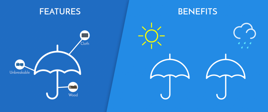
Rather than thinking regarding what you have to offer, you have to think concerning what your audience hopes to receive. As we alluded to earlier, this is the difference between explaining the features of your product or service and explaining the benefits of using said product or service.
For example, a person who’s stuck in the rain doesn’t care about a mahogany shaft; they care about staying dry.
As we discussed, it’s essential that you go where your customers are to learn about their most significant pain points. Comb through social media feeds and blog comments; read customer reviews of products similar to yours on Amazon. You could even grab a tape recorder and listen to what people talk about when browsing department stores.
Not only will this give you a ton of information about your customers’ needs and desires, but it will also help you learn about how they talk in more candid, personal situations.
Another option is to actively reach out to individuals who fall under your target persona, yourself. Rather than passively lurking on social media feeds, web forums, and blog comment sections, dive into the conversation. In doing so, you’ll eventually be able to steer the conversation in a way that elicits the information about your customers you’re looking for.
When engaging with potential customers during this initial research stage, it’s essential to do so as an interested peer, not as a service provider. Promoting your services in a situation in which others don’t want to be sold to, won’t work. Your goal is to learn how your target customers think and speak in a normal situation – not when under the duress of being sold to.
Once you feel like you truly know your customers, you can start working on creating a customer-centric post-click landing page that’s all but guaranteed to pique their interest.
Writing customer-centric copy for your post-click landing pages
You’ve figured out exactly who you want to target with your next post-click landing page. And you’ve dug deep to discover everything you possibly can about their needs and desires.
You’ve collected quotes, comments, complaints, and more, generated in authentic, candid situations. Now, you’re finally ready to begin writing your post-click landing page copy using your customer’s language – and, at some points, their actual words.
Speaking your customer’s language
When we say you need to speak your customer’s language here, we mean it in two ways.
First, you need to use the language your customers use. Not only will doing so catch their eye, but it will also build a sense of camaraderie between the both of you.
Consider the following example:
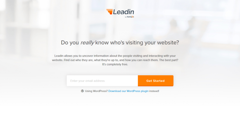
Through this simple post-click landing page, Hubspot proves they know their audience.
Even though the software being offered is a somewhat sophisticated site analytics tool, the post-click landing page copy contains little to no jargon (which would be lost on anyone just getting started in the world of web analytics.)
The copy is also quite laid back but still, explains exactly what those who sign up should expect to receive. Even the promotional part (about the service being free) is written in a way that draws readers in casually (rather than stringing them along for something they don’t want in the first place.)
Another thing to note is how often variations of the word “you” are used throughout the above post-click landing page: “Leadin allows you,” “your website,” “you can reach them.” It isn’t about what the tool can do for Hubspot’s audience – it’s about what the audience can do with the tool.
Here’s another quick example from a section of a post-click landing page from Bills.com:

Presumably, the service being offered is to help people who may have defaulted on their loans. If the copy had read “Are you in default?”, it would seem much more authoritarian – and even a bit scary. Being in insurmountable debt is stressful as it is; using such heavy-handed language would only exacerbate the issue in the audience’s mind.
Also, while banks and financial institutions throw the word “default” around all the time, those actually in default are more likely to say something like “I’m so behind on my bills.” Knowing this, it’s clear that the above copy was written with the customer in mind, not the company.
You also need to “speak their language” in a more metaphorical way. In other words, you need to know how your product or service, and your brand, fit into your customers’ lives.
Let’s revisit Evernote’s post-click landing page from earlier:

Evernote doesn’t gush about how much users can do with their product. This post-click landing page has one message for its users: No matter how much you have on your plate, Evernote makes it easy to recall whatever you need, whenever you need it.
It accomplishes this using language the target audience uses. People don’t say “I wish I could organize my thoughts in a way that makes it easy to recall important information” – they say “I wish I could remember everything I need to remember.” This post-click landing page cuts out all the trivial details about the actual product being offered and tells the user exactly what they want to hear.
As we alluded to at the beginning of this article, that’s exactly what you want: for your customers to see your post-click landing page and say “I was just saying this the other day!”
Using actual quotes from customers
In the last section, we discussed how to mimic your customers’ speech and language when creating your post-click landing page copy.
But there are times in which using actual customer quotes can be incredibly efficient, as well.
You can collect these testimonials through the methods we discussed before, such as social media posts and blog comments, customer interviews, and candid interactions.
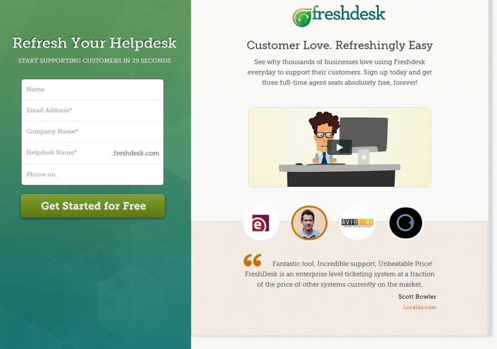
Check out the following example:
Not only is the customer testimonial not the focus of this post-click landing page, but it might even be the least noticeable aspect of it overall. This isn’t to say that these quotes are unimportant or inconsequential.
On the contrary, customer testimonials on a post-click landing page can provide the social proof a visitor may need to get them to engage further with your brand. Furthermore, it allows you to discuss the features of your services without having to mention them yourself!
Revisiting post-click landing page copy
Even after you’ve published a post-click landing page, you can still go back and tweak the copy as need be from time to time.
You should continue to conduct research using the various means we’ve discussed throughout this article.
But, as you begin to collect more and more leads, you can reach out to these new subscribers to get a more accurate sense of who they are, what they want, and how they talk.
In turn, you’ll be in an even better position to create post-click landing page copy that genuinely resonates with your target customer.
How Fieldboom has used customer feedback to fine-tune our post-click landing page copy our product
From the moment Fieldboom (online form and survey software) was conceived, we knew customer feedback would play an enormous role in pretty much everything about our product.
For that reason, we didn’t even start building our product until we had generated a good amount of information from our target customer base.
Here’s what we did:
First, we allowed people to sign up for a free trial through our website. We simply asked for their first name and email address, as well as some necessary information regarding how they planned on using our product.
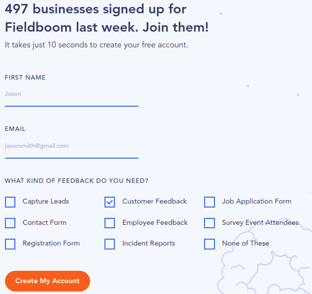
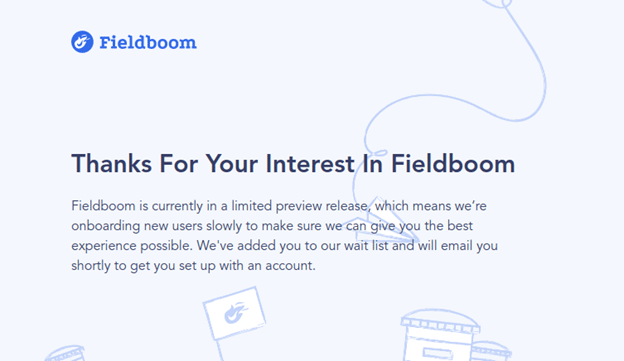
Once an individual created an account, we let them know that they’d been placed on a waitlist and that we’d contact them shortly.
We then sent an auto-response email asking new leads for more information regarding how they planned on using Fieldboom’s survey tools:
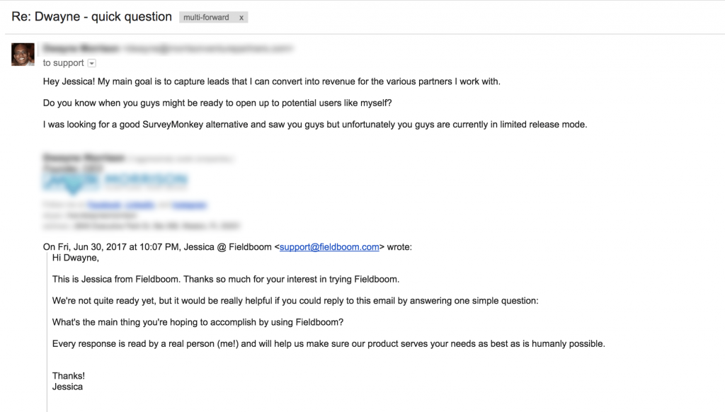
This last step proved to be vital to the creation of our primary product. Through the feedback we collected, we discovered a much more varied target audience than we initially anticipated.
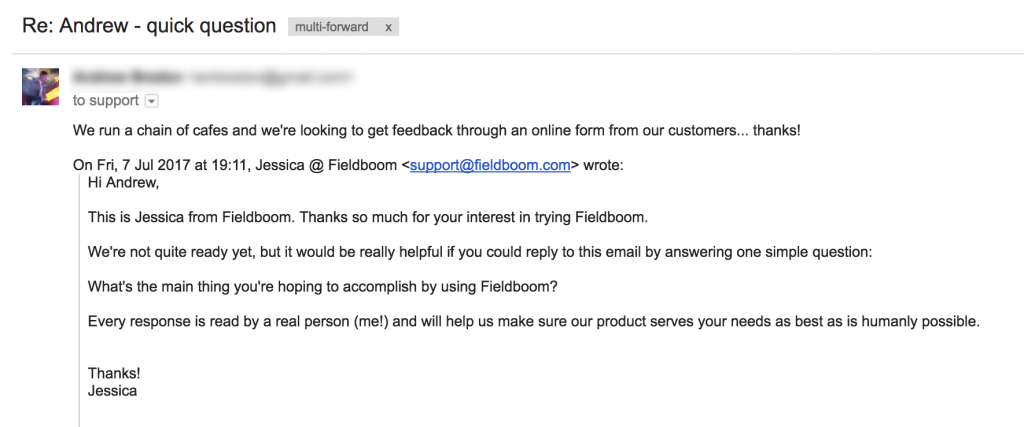
We received feedback from restaurateurs looking to generate input from their patrons:
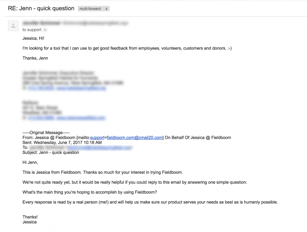
Managers and CEOs who wanted a better way to collect in-house feedback:
As we continued to collect more and more information from potential customers, we were able to take a customer-centric approach to creating our post-click landing page and website copy. This enabled us to strengthen our rapport with the prospects who ended up using our product – and made them more likely to reach out to us in the first place.
For example, our initial hypothesis was that we should launch our product as a solution for just generating more leads from your website (via higher-converting online forms.)
After having thousands of leads sign up for the product and tell us about their problems and challenges, we instead decided to launch as a broad lead capture AND customer feedback product.
This goes against the traditional advice for launching a SaaS company where you should focus on one specific use case and one distinct marketing persona. However, feedback doesn’t lie – and if we didn’t ask for feedback months before we launched, we might have positioned our product to too narrow of an audience and limited our growth potential.
Not only did our (future) customers determine how we positioned and who we positioned it to, they also helped us understand how we should position it via our marketing website.
Specifically, we were able to bucket their problems and challenges into three very distinct use cases:
- Growing their business by creating high-converting lead capture forms for their website, event registration forms, and customer feedback surveys (such as Net Promoter Score).
- Improving their company culture via Employee Net Promoter Score (eNPS) surveys, 360-degree performance reviews and “virtual” suggestion boxes.
- Making customers happier via Net Promoter Score surveys, product feedback surveys and customer service follow-up surveys.
At that point it became really easy to position our product against those use cases on our marketing website, as you can see from our “Examples” page:
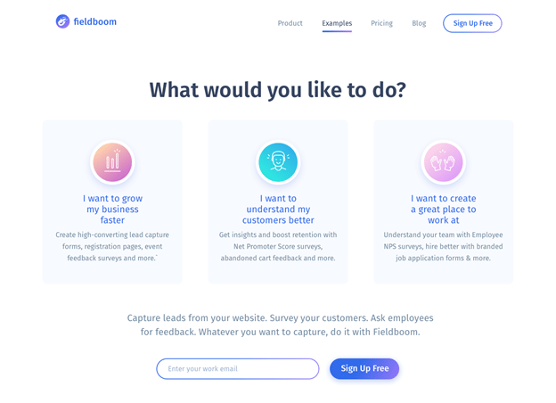
We created a “choose your own adventure” page where prospects can essentially navigate to the part of our site that best describes (and solves) their biggest challenge.
It’s important to note that the actual words we use to describe what Fieldboom can do came directly from the email replies we received before we launched. We didn’t just guess what to put on our marketing website – we took the copy our prospects used and “recycled” that almost verbatim on our site.
That’s why this strategy is so robust – it removes all of the guesswork when it comes to answering these questions:
- Who are we targeting?
- What are their pain points?
- How can we solve them?
Leverage high-converting post-click landing page copy
The next time you set out to build a dedicated post-click landing page or rework your homepage or even your entire website, make sure you lean on your customers using some of the strategies I’ve shown you here. It will make your job as a marketer a lot easier, will dramatically increase your conversion rate and your prospects will feel like you understand their challenges because you’re speaking to them using the same words they would use to describe their problem and their business.
Provide every prospect with a personalized experience from start to finish. Sign up for an Instapage Enterprise Demo today.
About the author
Josh Brown is the Content & Community Manager at Fieldboom, which provides an all-in-one lead capture and customer feedback solution to help with growing your business faster.

See the Instapage Enterprise Plan in Action.
Demo includes AdMap™, Personalization, AMP,
Global Blocks, heatmaps & more.
