Casper — the mattress brand with nearly one million customers, over 20,000 reviews on Google Trusted Stores, and tens of thousands of 5-star reviews — has an ultimate goal to generate more mattress sales. To help achieve this goal, Casper post-click landing pages are frequently used to lead prospects to sales pages, or their “Shop The Mattresses” page.
Before we get ahead of ourselves, though, let’s review the basics and then see how they use ads and post-click landing pages to get people to review their product offers.
What is a post-click landing page?
A post-click landing page is a standalone web page that uses persuasive elements — such as a compelling headline, engaging media, valuable social proof, attention-grabbing CTA buttons, etc. — to convince visitors to take action on a specific offer. That action could be to sign up for a free trial, set up an account, download a guide, register for a webinar, schedule a demo, and more.
Casper post-click landing page campaigns
(For shorter pages, we’ve displayed the entire page. For longer pages, we’ve only shown above the fold, so you’ll need to click through to the page to see some of the points we discuss. Also, keep in mind that some pages may be undergoing A/B testing with an alternate version than is displayed below.)
1. Best-reviewed mattress
A Google search for “buy a mattress online” displayed this Casper ad:
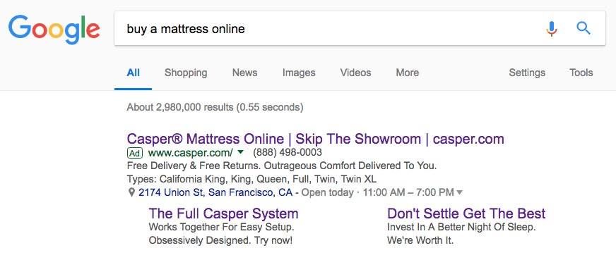
Clicking the “Don’t Settle Get the Best” extension link takes users to this post-click landing page:
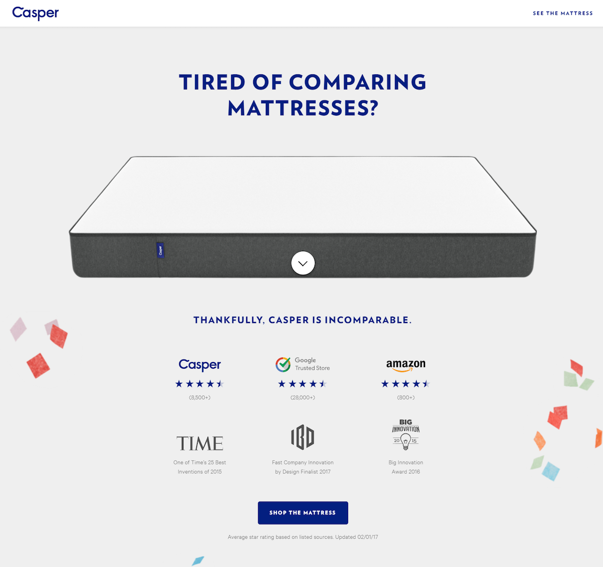
What the page does well:
- Plenty of white space makes the page neat, legible, and easy to navigate.
- The bouncing arrow serves as a directional cue and an anchor tag, pointing down the page, and automatically transporting visitors when they click.
- The headline intrigues prospects with a relatable question (“Tired of comparing mattresses?”), and then answers it (“Thankfully, Casper is incomparable.”) with the help of social proof — company logos, star-ratings, and industry awards.
- Customer testimonials serve as additional social proof, helping persuade visitors that Casper mattresses are worth purchasing.
- Casper’s main benefits are highlighted in the “Ready to snooze?” section and are marked with iconography to draw attention.
- The click-to-call phone number improves user experience by providing visitors with a quick and easy way to contact customer service if needed.
- A minimalistic footer increases the chances of conversion since there is less to be distracted by (no social media account links, no product pages, sitemap, etc.).
What could be A/B tested:
- The hyperlinked Casper logo acts as an easy exit route for visitors as soon as they land on the page.
- An outdated copyright date (2017) might cause visitors to wonder if the page content is still valid.
- The blue CTA buttons blend in with the rest of the page whereas an orange button, for example, would stand out more obvious.
2. Award-winning mattress
In the same Google ad shown above, clicking the ad headline takes search users to this Casper post-click landing page:
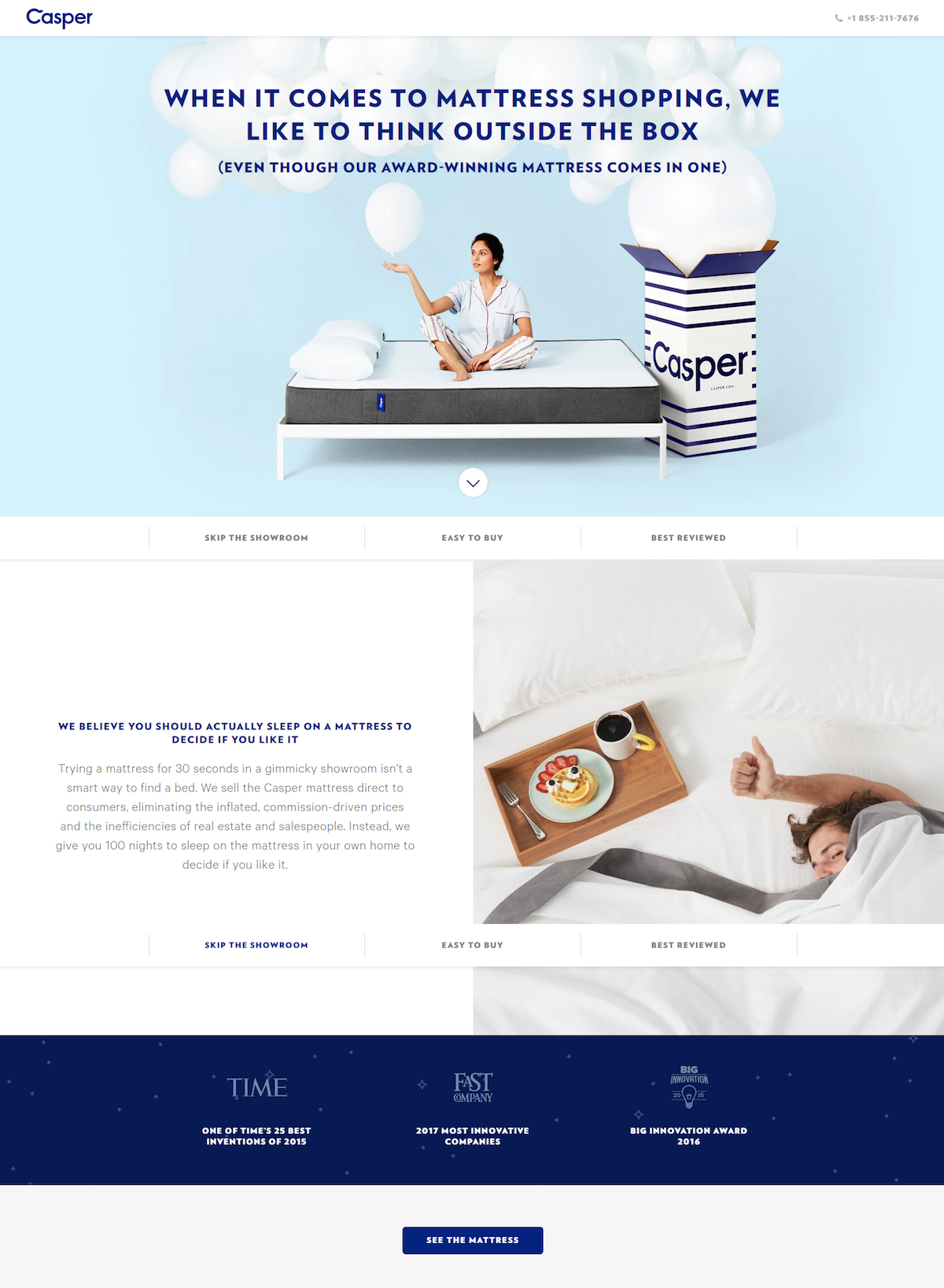
What the page does well:
- A click-to-call phone number allows visitors to quickly and easily contact customer service.
- Anchor tags — the bouncing arrow and the menu directly beneath it — allow visitors to click a button to quickly jump to different sections of the page, instead of having to scroll and search.
- Industry awards with company logos show that Casper has been recognized by well-known brands for their products.
- Casper’s primary benefits (“order online”, “it ships in a box”, etc.) are easy to spot on the page, because they’re highlighted with bold font, iconography, and white space.
- Customer testimonials provide prospects with valuable quotes from real customers. The only thing missing are headshots to make these even more persuasive.
- The minimalistic footer (only a copyright date, privacy policy, and terms link) means visitors won’t be easily distracted, and potentially leave the page, due to exit links.
What could be A/B tested:
- The Casper logo is linked to their homepage, which could remove visitors from the page before converting.
- The CTA buttons would stand out more if they were a contrasting color, like orange.
- The CTA copy size (“Shop the Mattress”) is a little small and could benefit from a larger button, too.
3. Casper The Podcast
This recent post from Casper’s Facebook Page promotes their podcast:
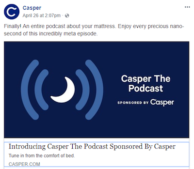
Clicking the post takes users to this post-click landing page, where they can learn more about Casper The Podcast:
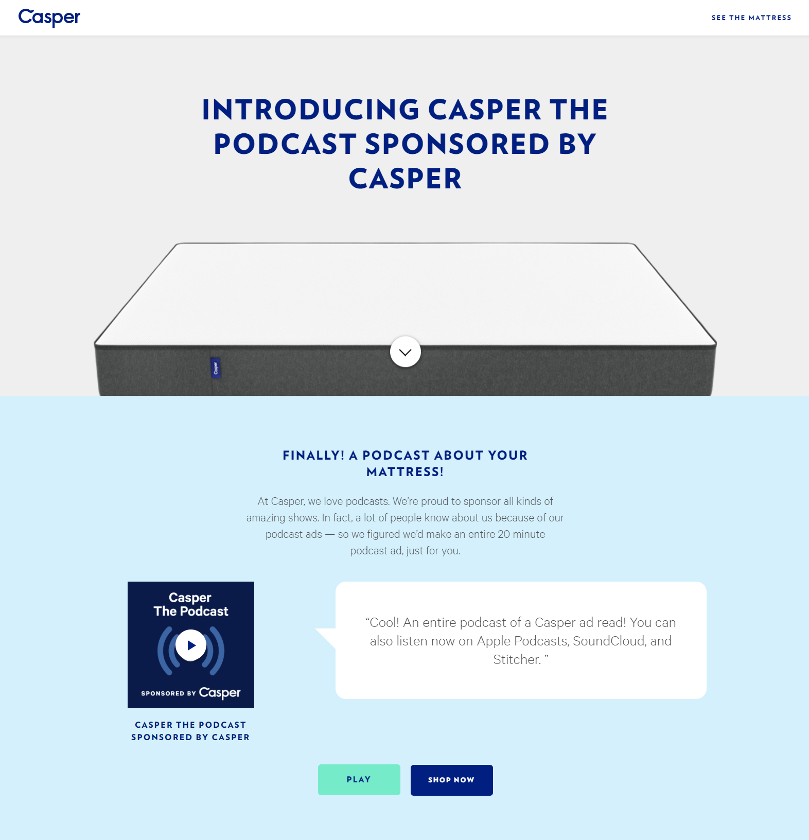
What the page does well:
- The bouncing arrow acts as a visual cue and anchor tag, directing visitors further down the page, and automatically taking them there when clicked.
- Three best-qualities of Casper mattresses are easy to find when scanning the page because they’re marked by iconography and surrounded by white space.
- Star-ratings and industry awards (with company logos included) demonstrate that Casper has been recognized and favored by other reputable brands.
What could be A/B tested:
- The hyperlinked Casper logo serves as an exit link, potentially removing visitors from the page before taking the desired action.
- Adding a lead capture form and requesting an email address to listen to the podcast would provide Casper with contact information to reach out to leads in the future.
- Dedicating the page to the podcast alone, instead of including other CTA buttons (“See the mattress”, “Shop now”, “Learn more”, and “Shop the mattress”) would likely generate more podcast listeners.
- The near 4-minute video is often considered too long for a post-click landing page. Great information contained therein, however cutting it down under a minute could increase on-page engagement.
- The 2017 copyright date might make visitors question the validity podcast content, as well as the credibility of Casper.
- The CTA buttons blend in with the rest of the page because blue is used throughout the whole page. Changing them to orange, for example, would make them stand out more.
4. Affirm financing
From this Google search ad:
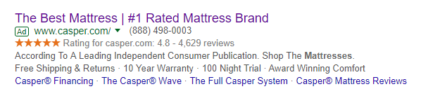
when search users click the “Casper Financing” sitelink extension, they’re directed to this financing post-click landing page:
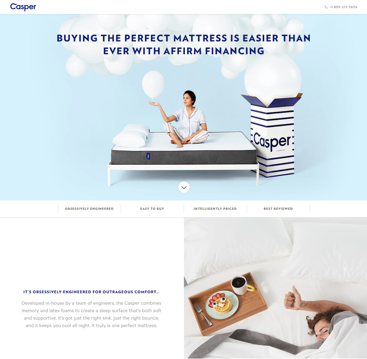
What the page does well:
- The bar graph demonstrating the difference in cost between Casper and other mattress companies is a great selling point.
- A click-to-call contact number enables prospects to conveniently contact customer service.
- Anchor tags — the arrow and page navigation below the arrow — help visitors jump to different sections of the page without having to scroll.
- The main benefits of buying from Casper are highlighted with iconography and bold copy.
- Customer testimonials help tell pieces of Casper’s story through real, relatable people. However, linking them to Twitter profiles makes them exit links.
- A minimalist footer (only a copyright date, privacy link, and terms link) lowers the chances of visitors becoming distracted and leaving the page.
What could be A/B tested:
- No message match is likely to discourage visitors, because they clicked on a “Casper financing” link but there’s actually no information about financing on the post-click landing page.
- The top half of the page is nearly identical to the “award-winning mattress” page in #2 above. This point relates to the lack of message match because with a page that’s supposed to be dedicated to financing, but doesn’t include detailed information about financing or an image related to financing, could cause visitors to bounce before converting.
- The hyperlinked Casper logo takes visitors to Casper’s homepage instead of keeping them on the page to learn about the offer.
- The CTA buttons don’t pop off the page because they fail to have color contrast.
$75 Off discount ad
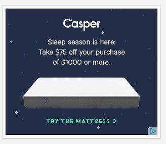
During a separate browsing session on desktop, this retargeting ad appeared because of my previous activity on Casper’s web pages. Unfortunately, clicking the ad takes prospects to Casper’s homepage instead of a dedicated post-click landing page, so for this example, let’s see what the ad does well and what could be changed:
What the ad does well:
- The Casper logo is front and center, letting users know immediately whose ad this is.
- The $75 discount is prominent and explains what customers must do to redeem the offer.
- The copy is easy to read because the font is simple and contrasts well with the background.
- An action-oriented CTA lets prospects know exactly what they’re supposed to do after clicking the ad (“try” the mattress).
- The green arrow is a directional cue, indicating that there’s more information to learn about the offer by clicking the ad.
What could be A/B tested on this ad:
- Eliminating the copy “Sleep season is here” could make the discount offer more noticeable because the ad would get straight to the heart of the offer faster.
- Making the CTA link a button would help it stand out more than simply green text. Even enclosing “Try the Mattress” with a border would make the text stand out more from the rest of the design.
Use post-click landing pages to boost sales like Capser
Delivering a personalized buying experience, from ad to post-click landing page, is key to boosting online sales and retaining customers. Although Casper has one primary goal and directs all of their paid traffic to similar post-click landing pages (and ultimately to a sales page), be sure to create a unique post-click landing page for every one of your offers.
Get an Instapage Enterprise demo and see how our platform allows you access to a suite of tools to significantly improve your advertising ROI and streamline your post-click process.

See the Instapage Enterprise Plan in Action.
Demo includes AdMap™, Personalization, AMP,
Global Blocks, heatmaps & more.
