Mistakes are an unavoidable part of the learning process, but when making them costs your business money, they tend to sting a little more.
While marketers of all experience levels agree – there’s no more reliable way to improve web pages, emails, and ads than by A/B testing – to be effective, those A/B tests need to be conducted the right way. The unfortunate truth is few ever are.
A/B testing mistakes you’re likely to make
It’s very likely that at some point, you’ve wasted resources by A/B testing incorrectly. Maybe you tested something unimportant, or unknowingly made business decisions based on false results. Whatever it was, you’re not alone.
Both marketing newbies and veterans still make the following 9 A/B testing mistakes. If you recognize some of them, great. You have an idea of what to avoid. If you don’t, even better. By the end of this post, you may find that we’ve saved your next campaign.
1. Testing without a reason to
If you’re sitting in your office asking yourself “What should I test next?”, you’re already doomed to fail. You should have a reason to run every test, backed by data. Instead you should be asking yourself, “Why am I testing X?”
For example, don’t A/B test a button’s size just for the heck of it. If, by using heat mapping software you discover that prospects aren’t paying attention to it, then A/B test to see if a more prominent one produces a lift. After that, form an educated hypothesis that looks something like this:
“Using heatmap software I noticed that my call-to-action button wasn’t garnering the attention it should. Because of that, I believe increasing the size of the button bigger make it more noticeable.”
Next, decide how you’ll measure the outcome. For a test like this, new heat map data might show whether or not visitors are paying more attention to it. More click-throughs could also indicate a greater attraction to it.
Repeat this process until you’ve found a solution to whatever problem spurred your test in the first place. Then, use the process to optimize other marketing operations for your business.
2. Testing more than one element
Data might suggest your page could use a new headline and one less form field along with it, but testing both at the same time will result in a whole heap of data that’ll be tough to interpret. This is not an A/B test, but a “multivariate test,” and it’s much more difficult to get right. Here’s why…
In an A/B test you’re determining the effectiveness of one element vs. another – for example, a red button vs a black button:
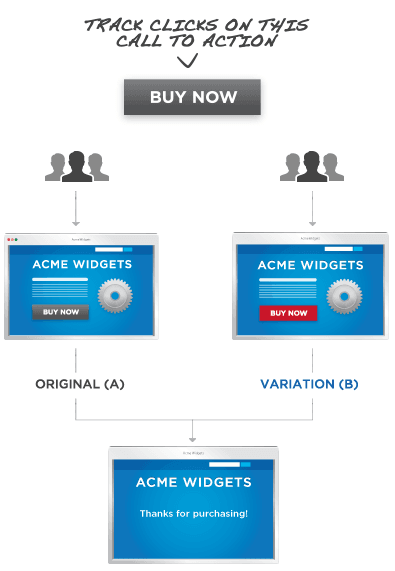
Here, whichever page performs better based on your metric of success is the winner. If your success metric is conversions and the page with the red button produces more, the the red button works better. With a multivariate test, things get a little more complicated.
Let’s look at this second example from Optimizely of a theoretical multivariate test in which two elements, image and headline, are being evaluated:
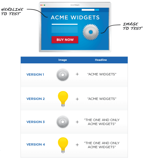
As you can see above, testing just one more element against one variation results in double the outcomes. Results from this test aren’t as clear-cut.
If you’re funneling traffic to the four different pages above and your success metric is conversions, the one that produces the most is the winner. Unlike in an A/B test, however, determining why that page won isn’t as easy.
For example, if a variation headline produces more conversions than a control headline in an A/B test, assuming that test was performed correctly, the variation headline is better. Since it’s the only difference between the two pages, you know definitively that the headline is the reason for the lift in performance.
However, in a multivariate test you’ll have to determine not only which combination of elements produces the most conversions, but the relationship between those elements as well. Regardless of which combination in the headline/image example from Optimizely wins, the tester will need to ask “How do these elements interact with each other to produce maximum conversions?”
Did both pages with the headline “The One And Only Acme Widgets” perform better than the others? It’s possible the headline was most responsible for the lift. Among those two, why did the photo of the gear produce more conversions?
These are questions you’ll have to find answers to through deep research into your data. Additionally, you’ll need much more traffic just to get that data.
A good rule of thumb? Alex Birkett at CXL recommends you stick to stick to A/B testing if you don’t have a ton of traffic.
3. Spending all your time A/B testing
It’s easy to get A/B-test-blinded – to get caught up looking for the perfect combination of elements on your post-click landing page (or ad, email) to the point that you neglect every other part of your campaign. Don’t let this happen to you.
The reason people aren’t converting isn’t always because your post-click landing page isn’t well-put-together. It could be that your traffic is poor or that your lead nurturing campaign isn’t strong.
Don’t waste all your time A/B testing post-click landing page images and ad copy. Remember to think big picture, and optimize the biggest holes in your funnel first. That’s where you’ll see the biggest gains. Then, start perfecting the process through A/B testing.
4. Blindly following A/B testing best practices
As it turns out, best practices aren’t always best for everybody. What worked well for one business may not work well for yours. Case in point:
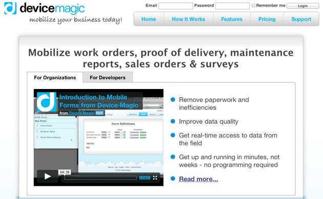
A few years ago, data aggregator Device Magic set out to learn whether an image slider or a video would convert more prospects on their homepage. So they conducted an A/B test.
But why would they?
Numerous studies have already shown that image sliders cause banner blindness, they’re sometimes hard to see, and they rarely get clicked. Additionally, a ton of research has proven the power of video to convert. Some businesses have seen increases in conversion rate as high as 80%. This should be a no-brainer. Video for the win, right?
Not so, said the results of Device Magic’s A/B test. Here’s their control video homepage:
And here’s the variation slider homepage:
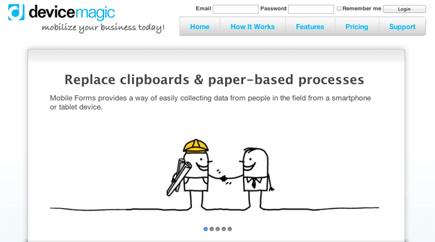
The variation complete with slider resulted in a 35% boost in conversions.
The Device Magic team learned two valuable things from that test. One: don’t trust best practices wholeheartedly, and two: don’t make the following mistake…
5. Ending a test too soon
Here’s how it usually works: A tester reaches what they consider to be a significant number of visitors to prove a page variation is better than a control, or vice-versa. They stop at 100 or 1,000 and then declare a winner.
That’s what the team at Device Magic did, writes Paras Chopra in a blog post for VWO:
Initially their control (with video) was beating variation (with image slider) and they couldn’t understand why. But then they let the test run a while longer until they had a lot more data – much to their surprise, the result inverted to variation outperforming control, which is what they had expected. And this result was statistically significant.
Using too small a sample size is just one mistake that can result in what’s called a “false positive” – an inconclusive test result disguised as a meaningful one. In Device Magic’s test, that false positive was that their homepage was more effective with a video than a slider, even though that wasn’t the case in the long run. It proves that without enough visitors to the pages you’re A/B testing, you won’t have enough data to confidently make any inferences from your results.
Here’s a much simpler example from Benny Blum of what a false positive from using a small sample size might look like:
Consider the null hypothesis: dogs are bigger than cats. If I use a sample of one dog and one cat – for example, a Havanese and a Lion – I would conclude that my hypothesis is incorrect and that cats are bigger than dogs. But, if I used a larger sample size with a wide variety of cats and dogs, the distribution of sizes would normalize, and I’d conclude that, on average, dogs are bigger than cats.
So, how do you combat false positives that come with using too small a sample size? You find one that’s big enough through some serious math, or you can use nifty calculators like this one from Optimizely.
The important thing to remember here is, there’s no set time or amount of visitors you can generate to ever be completely sure about the results of an A/B test. CRO guru Peep Laja describes a time when his software declared his variation a loser:
The variation I built was losing bad — by more than 89% (and no overlap in the margin of error). Some tools would already call it and say statistical significance was 100%. The software I used said Variation 1 has 0% chance to beat Control. My client was ready to call it quits. However since the sample size here was too small (only a little over 100 visits per variation) I persisted and this is what it looked like 10 days later.

The variation that had 0% chance of beating control was now winning with 95% confidence.”
The longer your test runs and the more visitors you get, the closer to ‘sure’ you can be about a result, even if you can never completely get there.
6. Testing elements at different times
Ending a test too soon can happen even after you reach statistical significance. Let’s say your site generates enough visitors to reach statistical significance with 15,000 visitors to each page over the weekend. It’s still not time to call your experiment.
Unsurprisingly, days of the week have a serious impact on traffic and conversions. If you start your test on Saturday, you should end it the following Saturday to reduce the chance that one or two days skew the results, even if you’ve already reached statistical significance. The audience that’s visiting your website on the weekend might be very different from the one that’s visiting it during the week, and it may be impacting your test results.
7. Not eliminating confounding variables
Confounding variables are exactly what they sound like – variables within your A/B test that will mess with the results. Failing to identify them means risking the validity of your data. Here’s an example from Optimize Smart of what confounding variables might look like in your tests:
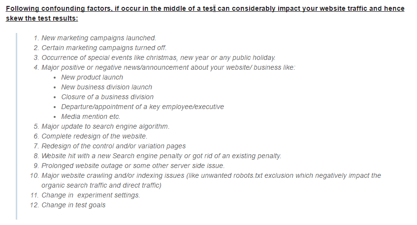
For example, if you change your ad targeting to generate different traffic to your variation in the middle of a test, you’re altering the outcome by changing the people who land on your page. As a completely different demographic, those people might be more receptive to your variation headline or image.
Remember that all things other than the element you’re evaluating should be equal and remain equal throughout the entirety of your A/B tests. This way, you can be confident the difference in performance is a result of the element you’re testing.
8. Testing elements that won’t bring a lift
Yes, color matters in your marketing, but do you really need to test all 41 shades of blue the way Google did a few years ago to determine which has the highest impact on performance?
Absolutely not.
Don’t waste your time with frivolous A/B tests like this. Google has the resources to do it (not that we believe they should’ve used them like this), you don’t. Don’t waste your time testing things that will bring minimal, if any, performance lift.
9. Giving up after one test
Let’s say you’ve A/B tested your page’s featured image, and by doing so produced a sustained conversion lift of 10%. Congratulations! That’s awesome – but does it mean you have the best image? Nope. It means that you have a better image than before.
If we had given up on testing this webinar post-click landing page, satisfied with a 45% lift in conversion rate from variation “B,” we would never have seen the astonishing boost we got from variation “C.”
Here’s the original:
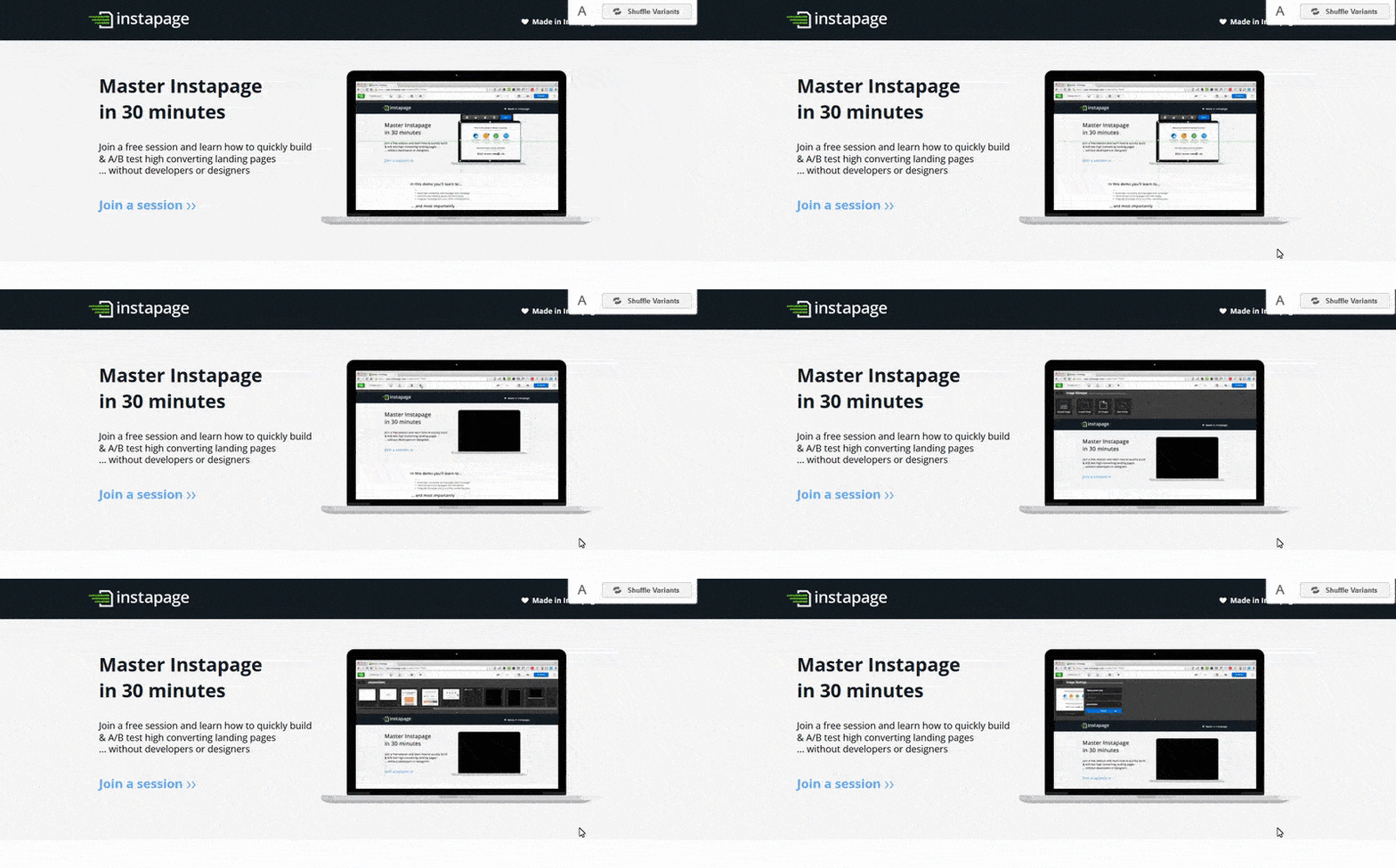
Here’s variation “B,” which produced a 45% lift in conversions:
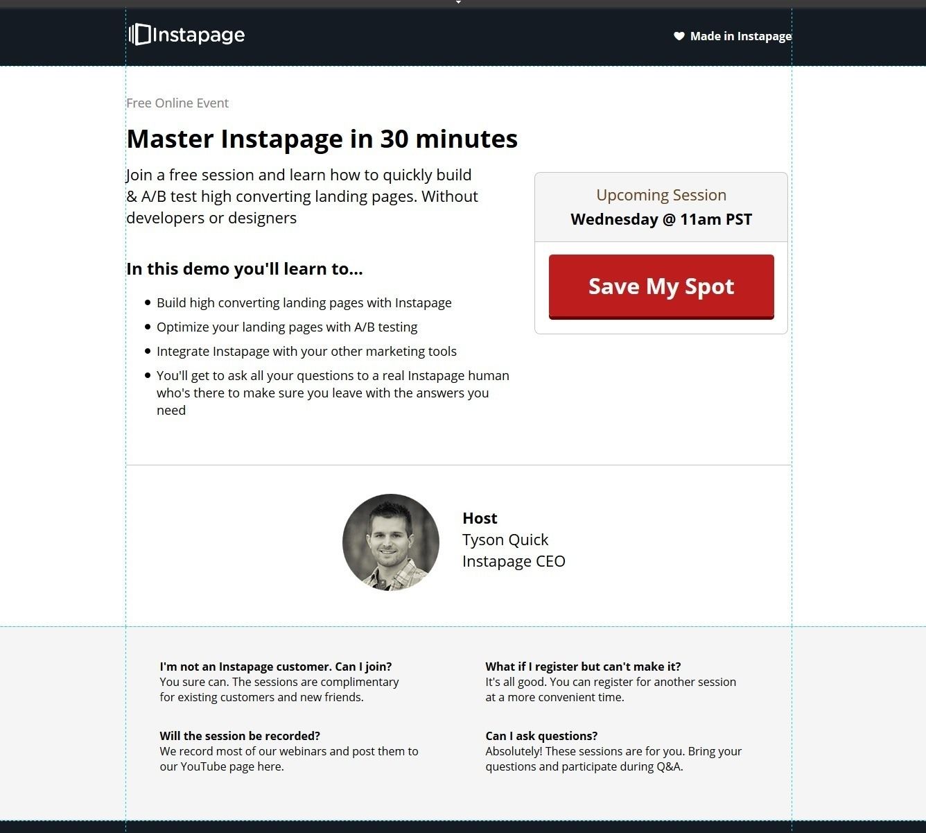
And lastly, here’s variation “C,” which boosted conversions by a shocking 129%!

If at first your tests don’t succeed, try, try again. And even if they do succeed, try, try, again for even better results. But first start creating personalized post-click pages with Instpage, request an Instapage Enterprise demo today.

See the Instapage Enterprise Plan in Action.
Demo includes AdMap™, Personalization, AMP,
Global Blocks, heatmaps & more.
