
What do an image slider, a flashing popup ad, and an auto-play video have in common?
They just need to die.
It might sound harsh, but the effect these fads are having on your conversion rates is more so.
Just like flashing popup ads becoming a feature you only see on disreputable sites, the image slider is ready to go to the internet marketing graveyard.
Before we discuss why image sliders cost you conversions, let’s talk about why marketers started using them in the first place. How did image sliders become so popular?
The 2 Ignorant Reasons Marketers Use Image Sliders
1. Marketers put image sliders on their pages because they give them a chance to feature multiple offers at the same time.
And this is a serious problem. They divide the most important real estate of their website between offers.
So what happens? Nobody goes home happy. You don’t know how to persuade your customer, so they get decision fatigue and don’t make a decision. You failed to solve their problem.
2. With an image slider, marketers get a chance to put multiple CTAs on every offer. This is what Zappos does on its homepage.

The problem on the Zappos site is the CTA button is so discreet, you need to focus to see it. And frankly, your customer won’t because the internet has trained them not to.
Still think using an image carousel on your website looks cool? Wake up and smell the low conversion rates.
6 Reasons Why Image Sliders are Bad for Conversions
1. They Cause Banner Blindness
Yes, banner blindness is a real thing. When the images of your slider look too much like a banner or advertisement (and they almost always do), your visitors ignore them and move on.
Eye tracking studies conducted by Neilson Norman Group found as soon as visitors perceived something to be an advertisement they turned their focus away from it.
No matter how much you brand your images, if they look like ads, there’s a high possibility they will be ignored.
2. They Divide Your User’s Attention
Images on sliders represent different products or offers in the span of a few seconds. Your user has hardly read ONE thing, when whoosh the image changes and they have to refocus their attention.
Guess what? They won’t play your game. Why?
3. The Human Eye Doesn’t Respond Well to Movement

We may not live in the jungle anymore, but we did once. Our brains are wired to react to sudden movement, and this movement is called a saccade. It’s our retina’s uncontrollable response to movement, and the speed of movement during each saccade can’t be controlled. The eyes move as fast as they are able.
The movement might have been prey in prehistoric times, but today, it’s your slider.
Say goodbye to your prospect because your visitors will be too distracted by the image sliders to notice anything else.
4. They Take Away Control from Your Visitors
Visitors like to be in control when they arrive on your website. They don’t want to see something they have no use for, and frankly, the whole point of your website should be to give your visitor what they came for.
When you put an auto-rotating image slider on your homepage, you take control out of your user’s hands and give it to the slider. You know what follows? Disaster. Image sliders keep rotating, which is not only frustrating, but is terrible for usability according to the folks at UX Movement.
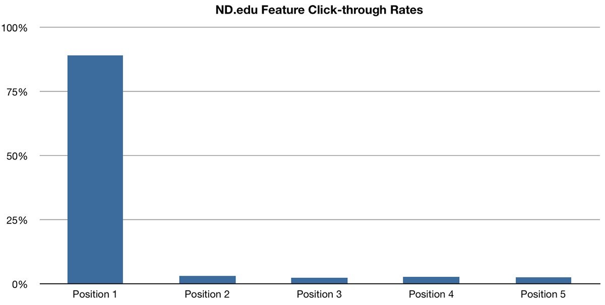
5. They Take Up Space… And Hardly Get Clicked
You already know image sliders are so fast and distracting, visitors tend to ignore them. However, when Erik Runyon ran a study at Notre Dame University pages to test and measure the number of clicks made on the sliders in comparison to homepage visits.
The study revealed a mere 1% of visitors clicked on a feature on the slider. That’s like the unicorn of bad conversions.
6. They Reduce Visibility
The Neilson Norman group ran a usability study, where a user was attempting to search special deals on Siemens washing machines. The user arrived on the Siemens homepage that looked like this.
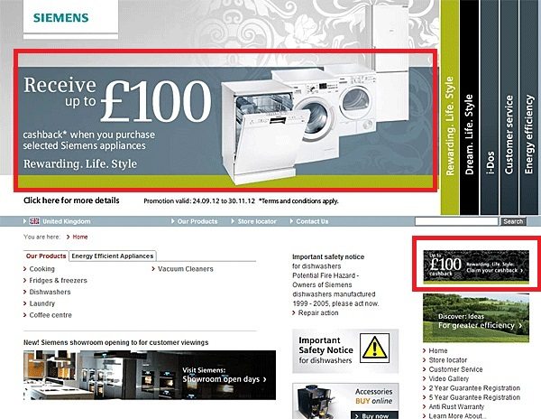
Did you find the deal on washing machines? The user didn’t.
She ignored the offer placed in a small box in the left-hand corner. Then she ignored the big banner splattered on the page, even though it had an image of a washing machine on it. Because the image slider looked so much like an ad, she left the website without buying the machine, costing Siemens an easy sale.
Jakob Nielson also pointed out that international users and users with low literacy get easily distracted and frustrated by the image sliders, as they are unable to read through one offer before another slides into place.
The bottom line is image sliders are ineffective. And to reinforce this idea, here’s a slider by WebAIM.
Enjoy the irony.
What Should You Use Instead of Sliders to Feature Multiple Offers?
Creating different post-click landing pages to target your different audience segments is the single most effective way to reach multiple audiences with targeted offers. This will give you the opportunity to reframe your offer to reach different buyer personas.
Help Scout has created different post-click landing pages for online retailers, software, and online services.
Here is the page for software.

The page for online services.

And finally the page for online retailers.

You can see how they have divided their post-click landing pages by industry to reach their right people, and it’s very effective. If they had chosen to use a carousel on their page, the statistics say they’d be missing out on the majority of business for last two segments.
We hope this is the final word on it. Don’t use image sliders on your homepages. Start crafting unique post-click landing pages for your buyer personas. Sign up for an Instapage Enterprise demo today.

See the Instapage Enterprise Plan in Action.
Demo includes AdMap™, Personalization, AMP,
Global Blocks, heatmaps & more.
