
No matter how hard they tried, my parents could never stop my little brother from crashing his car into the contents of our garage. Growing up, he was a one-man wrecking crew.
For years we lost sports equipment and countless garden tools to his poor depth perception — until our grandfather suggested a genius solution involving an 8-foot string tied to a tennis ball.
“Hang this from the ceiling at the point you want him to stop,” he said. “When the tennis ball makes contact with the windshield, he’ll know to stay put.”
It was a simple and strange idea, but it was also a shockingly effective one. Sometimes, I learned, it takes a new perspective to shed light on solutions we may not have otherwise thought of.
And that’s what we have for you here: A few simple but potentially impactful A/B testing ideas that are a little less obvious than the ones you typically hear of — a.k.a., your very own string and tennis ball.
Before we get into those, though, some words of caution…
What a lot of marketers miss when coming up with A/B testing ideas
You’re a well-informed A/B tester, so when you saw our headline publicizing overlooked testing ideas, you thought, “Those don’t apply to me. My landing page is unique. I need to figure out the flaws in my conversion process before I can start A/B testing to fix them.”
And you’re right — good testing starts with good data. But, by becoming obsessed with this “Find it and fix it” mentality, you could be missing out on some big improvements. An example…
Let’s say you write an ebook packed with information that you’re confident your fans are going to love. You build a persuasive landing page around it chock-full of social proof, benefit-oriented copy, and irresistible psychological principles.
At first, it works like expected. You’re generating some conversions, but like any hungry marketer, you want more. So, you begin hunting for problems with your page.
You alter the CTA button that your visitors aren’t clicking, brighten the “Free” banners they don’t seem to be noticing, and bold the bullet points that their eyes are skimming past.
After weeks of optimization, these tests bump your conversion rate a bit, but not by much. Perplexed, you head back to the drawing board to brainstorm new ways to fix your landing page, when it finally dawns on you:
You were so busy searching for flaws to fix in your original page, that you assumed you were on the right track to begin with.
In other words, maybe your visitors don’t want an ebook. Maybe they’d prefer to watch a video.
Maybe you don’t need to bold your subheadings and brighten your banners to make them more noticeable. Maybe what your content needs is a complete overhaul.
Refining your page will only get you to what’s called the “local maximum” — which, in landing page A/B testing terms, means the highest-converting version of your original page.
Exploring completely different alternatives, on the other hand, can get you to the “global maximum” — meaning, the highest-converting page possible. Here’s a great graphic from Optimizely to illustrate what we mean:
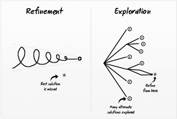
Now, we’re not saying you shouldn’t search for ways to improve your current page. Not at all. Refinement is an effective and necessary method of optimization.
What we’re saying is, don’t put yourself in a box.
Have the courage to explore drastically different variations, but the common sense to know when it’s time to pick one and refine it. Below, you’ll find a few testing ideas to help you do both.
A/B testing ideas for exploration and refinement
1. Test a different way of getting your message across
Every landing page should focus on communicating the benefits of its offer. There’s no question about that.
But how do you best present those benefits?
That question, as MarketingExperiments (ME) showed, is up for debate.
For the most part, people want to quickly find out why they should claim what you’re offering. The exception, of course, is when you’re offering something with the potential to be highly scrutinized — like an expensive or complicated product.
But a trial of Investopedia Advisor was fairly straightforward: Sign up to get monthly “market-beating stock picks.” It was free, too. So a short, basic page highlighting the benefits of the offer should’ve been enough to convince visitors to claim it, right?
For a while it was, but a time came when the Investopedia team wanted more from their page. So, they enlisted the help of ME’s conversion optimizers, who conducted a variable cluster test with the goal of boosting signups.
The variation featured a few testimonials, a different headline, and some new trust indicators. But the most notable change they made was to the actual presentation of the offer. They not only added copy to an already concise page, but they changed the way it was written.
On the original page, pictured below, the content read like it was written by an in-house copywriter or third-party advertiser:
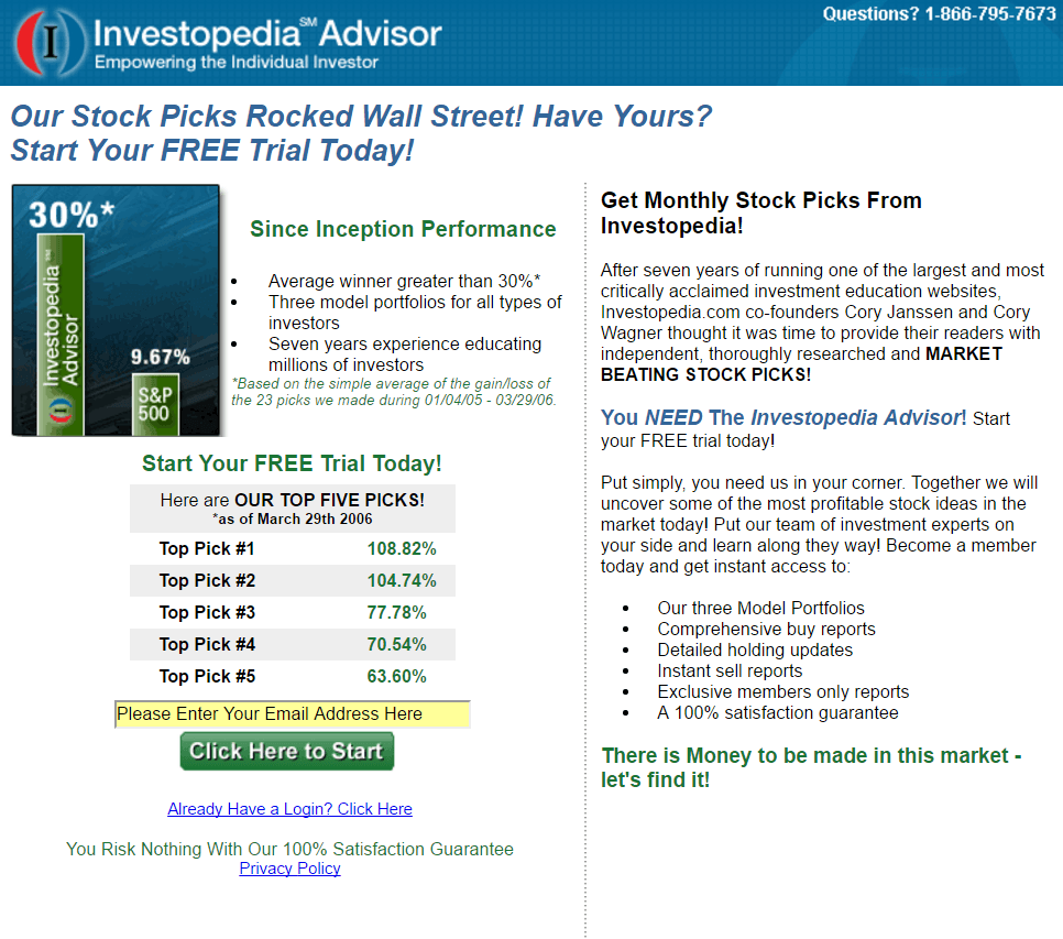
On the new page, though, the copy was adjusted to read like a letter from the co-founder, Cory Janssen. It even closed with his signature.

The new personal touch contributed to an 89.47% lift in conversions.
Before you settle on a short and straightforward page, remember this example. Sometimes getting a message across takes more than bullet points and bolded subheadings.
2. Test the focus of your call-to-action
The traditional landing page call-to-action is somewhat of an odd duck. As in, it doesn’t really fit in with all the other elements around it.
Think about it.
In your copy, you emphasize the benefits of claiming your offer. With a hero shot or an explainer video, you showcase the beneficial outcome of using your product or service. Using testimonials, you let customers boast about the benefits they experienced after converting.
See what we’re getting at here?
If your whole landing page is focused on conveying the benefits of your offer (as it should be), shouldn’t your call-to-action be too?
Many times you’ll see “Order,” or “Request Consultation,” or “Buy Now” written on landing page buttons — but those words sound like work, don’t they? CTAs like these put the emphasis on the action involved in claiming the offer as opposed to the benefits it provides. And that’s all wrong.
Remember, for your prospects, this is the magic button. It’s the button that gets them the beautiful lawn, or the software that will grow their business, or the loan they need to buy a home. To convince them to press it, you have to remind them of that.
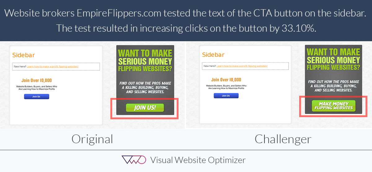
So instead of opting for a traditional call-to-action, test one based on the benefit your offer provides, like Empire Flippers did in the sidebar of their website.
Their original, like most CTAs, invited prospects to join their membership site with unremarkable copy. Their button read “Join Us.”

In the interest of boosting conversions, Empire Flippers A/B tested some new text that played to their prospects’ sense of self-interest. They took “Join Us” one step further and thought, “What’s the real benefit of joining us?”
The answer was clear: Make money.
So, they changed their call-to-action from “Join Us” to “Make Money Flipping Websites.”

The results were impressive. When the test concluded, the variation boasted a conversion rate of 3.84% compared to the control’s 2.88%. At a 96% level of significance, the new call-to-action had improved conversions by 33%.
3. Test a different or more valuable offer
The internet is running out of room for free ebooks, tip sheets, and white papers. And your prospects are running out of patience for ones that don’t fulfill the promise of their landing page.
Headlines that read “Click here to learn the secrets…” or “Get insights from the experts,” convince readers to download content filled with information they already know. They’re tired of being misled, and they’re altogether burnt out.
What they appreciate more than something they can read or watch is something they can use. Templates and blueprints are great, but tools are even better.
Can you offer a headline analyzer like Buffer does? Can you give away a step-by-step blueprint to generating new business?
Chances are your visitors have downloaded their fair share of ebooks and tip sheets. Ask them what kind of resource they want you to create next. Give them options. Give them something that’s actually worth their attention and personal information.
4. Test the size and location of your security badges
If you’re asking for any sensitive information from your visitors, adding security badges to your page seems like a no-brainer. But their location, size, and presence altogether are worth testing — because, according to WiderFunnel, sometimes they can have the opposite of their intended effect.
“A client of ours recently tested adding the McAfee Secure badge to their persistent checkout area (the mini shopping cart area that shows up on all pages) and ran a site-wide A/B test. They found that simply adding the badge actually decreased conversions by 1.6%.”
If software like McAfee is supposed to protect visitors, then how could boasting that your site is secured by it actually decrease conversions?
It’s not completely evident, but it could be that these badges actually reminded visitors that their personal information wasn’t safe in the first place.
So test using security badges, and even try adjusting their size and location if you want. A big and prominently placed badge might force a visitor to confront the possibility of cybertheft, while one subtly included at the bottom of the page won’t immediately call for attention — but it will still be there for the people who wonder, “Is my information safe?”
5. Test potential distractions
Sometimes it’s hard to know how to best highlight the benefits of your offer without stealing attention from your call-to-action.
You want to emphasize that your offer is free, industry-leading, or available at a discounted price — but do it with the wrong color or graphic, and you risk distracting your visitors from converting.
Such was the case for the healthcare website belonging to VVAA. One page in particular, designed to convert visitors to customers, featured a horizontal orange line from which a CTA button reading “Choose your care” spouted:
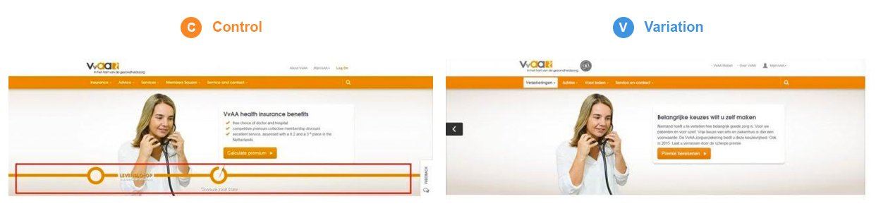
The testers believed that by removing the orange line, they could boost clicks on the button. They arrived at that hypothesis with the help of an analytics tool, which showed that people were drawn to the center of the circle from which the call-to-action was emerging (pictured below).
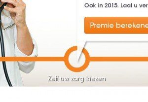
Sure enough, when it was removed, clicks rose by nearly 8%. Visitors no longer thought that little orange circle was a button.
But how do you know when something’s a distraction?
First, look carefully at your page. Is your CTA button the same color as most of your other elements? Does your hero shot feature a model looking away from your form? Do you see a badge that looks like it could be confused for a button?
Ask someone who hasn’t had a hand in creating your page to look at it. Ask them what they notice first. Tell them to convert, then look over their shoulder to see where they click.
And if you can, invest in analytics tools to more accurately determine how your users are behaving and what they’re paying attention to on your page.
6. Test traffic sources
When most DIY testers set out to A/B test, they immediately start making changes to their landing page. They alter the headline or change the featured image in the hopes it brings a big improvement to campaign success.
But, what they forget is that a landing page is only one part of their campaign. Traffic source is arguably the most important factor involved in generating conversions, yet it’s routinely overlooked.
CEO of Disruptive Advertising, Jacob Baadsgaard, found that among his PPC clients, 76% of budget is wasted on traffic.
In a blog post for Kissmetrics he writes:
“I discovered that—on average—all of the conversions in an Google Ads account come from just 9% of the account’s keywords.
Yes, you read that right—all of the conversions.
To put it simply, for every 10 keywords you bid on, 9 of them produce nothing! Absolutely nothing! And here’s the kicker — that useless 91% of your keywords eats up 61% of your ad spend.”
But it’s not just PPC keyword traffic you should pay attention to. A/B test Facebook traffic vs. Twitter traffic, one ad’s creative vs. another ad’s creative, males vs. females, email traffic vs. blog traffic.
Finding out who your ideal visitors are and where they’re coming from is one of the shortest paths to a higher conversion rate.
Turn more of your ad clicks into conversions with the Instapage Advertising Conversion Cloud. With AdMap, 1:1 Personalization, built-in collaboration, pixel-perfect designs & more, no other solution can compare. Sign up for an Instapage 14-day free trial today.

See the Instapage Enterprise Plan in Action.
Demo includes AdMap™, Personalization, AMP,
Global Blocks, heatmaps & more.
