As I begin writing this, there are nearly 2 billion websites live on the internet.
Pretty amazing, right?
It’s even more impressive when you consider that in 1994, there were fewer than 3,000 in existence. That’s about a 33 million percent increase over 20 years.
Back then, if you wanted to build a site, you only really needed to know how to code in hypertext markup language (HTML landing pages). Today there are hundreds of different programming languages, many with their own part to play in the creation of a technically-sound website.
Luckily for us, we don’t need to know them all. Come to think of it, we don’t need to know any of themSoftware like Joomla, Magento, Blogger, and Drupal all help people without vast web design knowledge launch and manage their fully-functioning websites in a matter of hours — sometimes even minutes.
Like programming languages, there are now hundreds of different content management systems (CMS). Despite all the options, one has remained the overwhelming favorite among the majority of DIY website creators for over a decade, that CMS is WordPress.
Of the more than 40% of websites that use content management systems, over half of them are powered by WordPress.
In fact, no other CMS comes close:
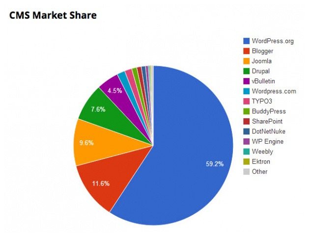
Holding onto about 60% of the CMS market share, WordPress statistically powers about 25% of the entire internet. And it’s easy to see why.
As an open source software, WordPress is routinely updated and improved by developers all over the world. It’s also free to download, dead simple to install, and fully customizable with over 2,600 themes and 31,000 plugins.
So if you own one of the almost 250,000,000 websites currently running WordPress, and you have a promotion that needs a page, there are a few things you need to know.
What is a WordPress landing page?
To be a WordPress landing page, there are three qualifications a web page has to meet:
1. It has to be created or integrated with the WordPress CMS
- You can manually create a landing page within WordPress the same way you would any other page in the CMS
- Or you can build it quickly with a dedicated landing page creator, then publish it to your WordPress site
2. It has to drive user action like:
3. Its only goal is to convert
- Even if your homepage is designed to generate sign-ups, it’s still not a landing page — because its sole purpose isn’t to convert
Who uses WordPress landing pages?
Because of its affordability, ease of use, and versatility, WordPress (WP) is used by a wide range of users. Amateur bloggers prefer the platform to launch a free website, but major news publishers, high-profile entertainers, retail giants, and Fortune 500 companies do as well. That list includes businesses and individuals like:
- Best Buy
- The New York Times
- Jay-Z
- Forbes
- The Rolling Stones
- CNN
- Reuters
- UPS
- Mashable
- And more
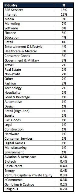
By industry, WordPress tends to be used mostly by B2B service providers; followed by internet and media companies. Here’s the full breakdown:
Why are WordPress landing pages crucial to online marketing?
For most businesses, there are a few obvious draws to using a content management system like WordPress to create a landing page:
- Like most landing page generators, it requires no knowledge of coding languages to create a WP landing page. Pre-designed WordPress themes can be installed with the click of a button.
- It’s easy to assign roles to multiple individuals involved in the design and publishing process.
- It’s an affordable alternative to hiring an outside marketing or web design agency to create your landing page.
For bigger companies like Forbes and CNN, it offers the same benefits, but with a bonus.
As the most widely-used CMS in the world, it has scalability on its side. There are countless WordPress contributors continuously creating new plugins, support solutions, themes, and template designs.
Whether you’re a personal blogger or the owner of a Fortune 500 company, WordPress can be scaled to suit your needs.
When should I create my WordPress landing page?
Whether it’s to capture leads, produce sales, or generate sign-ups, every landing page has the same common goal: to guide your prospect to the next step of the buyer’s journey.
When and how you create your landing page depends on where your prospects are in that three-step journey.
Either they’re in:
- The awareness stage
At this point, your target prospect doesn’t know who you are. So you’ll want to distribute branded content on low-cost channels like social media and cast a wide net to catch as many potential customers you can. Draw them to a social media landing page and make your introductions there. - The retargeting stage
Retargeting is when you’ll use cookies and pixels to target your ads to people who have visited your website. These prospects are more qualified than the people who saw your ad in the previous stage and ignored it. They’ve taken the time to visit your website. This is when you drive potential customers to landing pages that will build their trust in your business.
Now it’s time to hit your prospects with a fully optimized landing page designed to convert them into customers (or leads at the very least).
Whenever your prospects are in these stages (always), a WordPress landing page can help you meet your conversion goals.
How to build a WordPress landing page
When the time comes to finally start creating your WordPress landing page, you have a few options.
You can build your own manually with this step-by-step guide to crafting a page in WordPress.
You can download this WordPress landing page plugin, and try your luck at creating one from scratch.
Or, if you’d rather have your landing page designed and published in less than 15 minutes — like I did my first one you can use Instapage to create it and then publish it to WordPress.
We’ll show you how to do that, but first, let’s learn a few lessons about landing page best practices from some other WordPress users, shall we?
-
Determine the goal of your landing page
What’s the purpose of the landing page you’re creating? Is it to capture leads? To produce sales? To generate newsletter sign-ups?
landing page you create should have a singular focus. Without that, you’ll drive away your customers. Even neuroscientific studies support this idea. When we’re presented with too many options, we have trouble making decisions.
It’s like that feeling you get when you sit down at a restaurant and open up a menu the size of an encyclopedia. It’s overwhelming. And that’s how your prospects will feel when they visit your landing page if you give them too many options.
Here’s a great example from the LA Times of how to present options on your landing page:
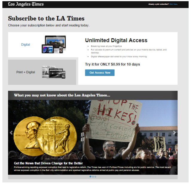
We’re presented with only two choices — one button for each — and a simple, straightforward design that doesn’t overwhelm us.
-
Hook your prospects with a captivating headline
Not long ago, we here at Instapage learned that humans now officially have shorter attention spans than goldfish. Less than 8 seconds, to be exact.
And you won’t have your prospects’ attention for even that long if you plaster some boring old headline on your landing page.
You see, the headline of your landing page serves one major purpose — and that’s to get your prospect to read the body copy below it.
Therefore, your headline should:
- Be unique – Your prospect reads hundreds of headlines daily. Think differently than your competition and make yours stand out.
- Convey scarcity – If your promotion is only available for a limited time, or to a limited number of people, say that on your landing page.
- Highlight a benefit – Convey a clear value proposition. When people land on your page, they immediately want to know: “What’s in it for me?” Will your diet plan make them thinner? Will your newsletter make them smarter? Let them know in the headline.
- Use words like “quick,” “easy,” and “free” and “you” – By using the word “you,” you single out the reader as if you were talking directly to them. As far as the others go, we all want quick and easy solutions to our problems, especially if they’re free. Always use “you,” and fit in the others when you can.
Here’s a great example from Digital Marketer:
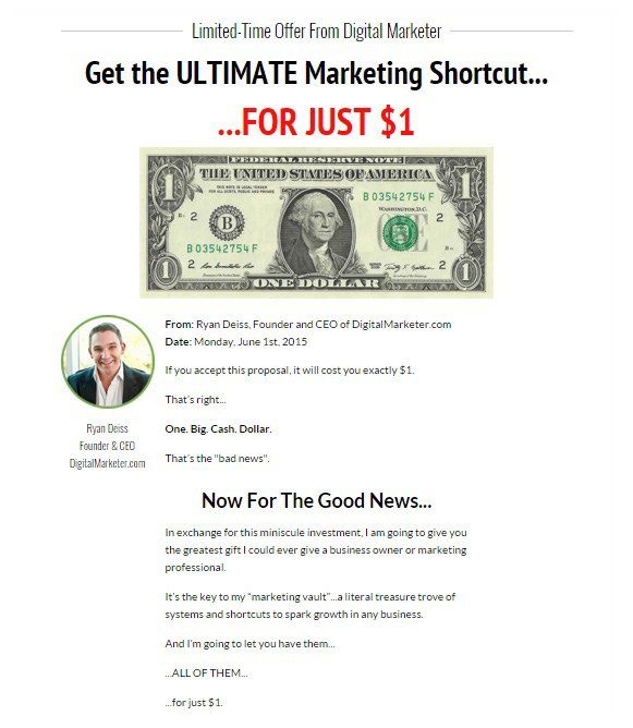
See the big “LIMITED-TIME OFFER” on the top of the page? That creates scarcity in the mind of the reader. They think:
“This is only happening for a short amount of time, so I should at least read on to make sure I’m not missing out on anything…”
Then, BAM. Next comes an offer they can’t refuse. An “ULTIMATE Marketing Shortcut” (remember, we like things to be quick and easy and that’s exactly what a shortcut is) for only a dollar.
Along with some captivating copy, these elements create a persuasive landing page that’s hard to abandon.
3. Maximize readability
Now that you know our attention spans last for less than 8 seconds, how would you say we’d fare reading lengthy landing page filled with block text?
Probably not well, right?
Right.
In 2013, Slate teamed up with analytics vendor Chartbeat to prove just how bad we are at reading online. Turns out most people only scroll through about halfway through an article before they get bored and click away.
The takeaway here?
People don’t want to read that long-winded paragraph you call a landing page.
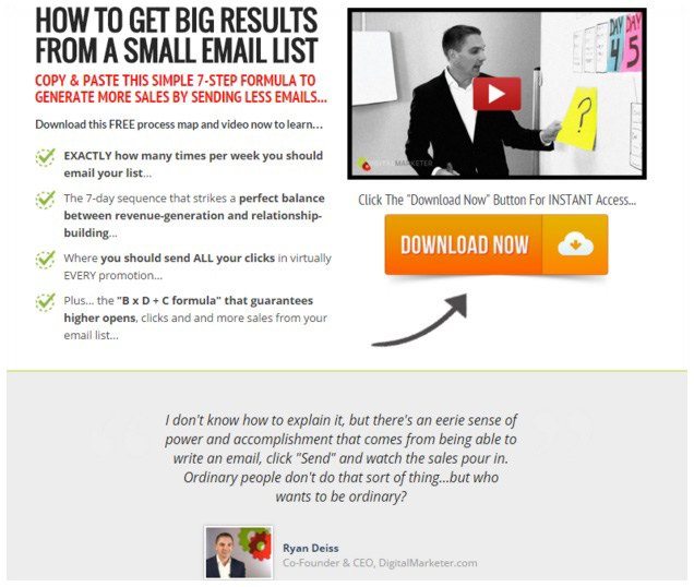
Be concise, and make your copy skimmable with bullet points and subheads. Research has shown that it has the potential to skyrocket your conversions.
Followup Machine landing page hits the nail on the head:
-
Eliminate distractions
There should be absolutely nothing on your landing page that has the potential to direct your user away from performing the action you want them to take. You should:
- Remove your site’s navigation menu from the top of the page
- Get rid of the link to your homepage in your logo
- This one should be obvious, but it’s worth reminding: DON’T RUN ADS FOR OTHER PRODUCTS OR SERVICES ON YOUR landing page!
I wouldn’t have mentioned that last one, but after catching a glimpse of this Forbes landing page, I felt it was necessary:
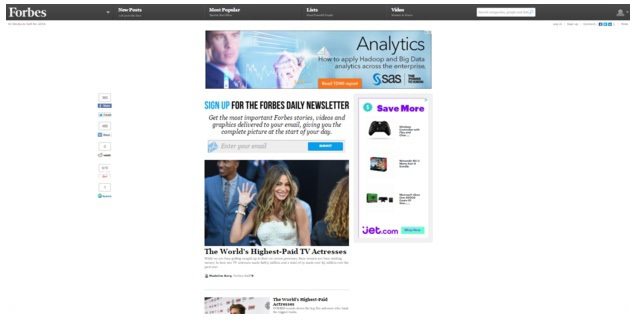
Forget the fact there are ads for other products on the page, but there are several links to articles below the lead capture, as well as a navigation bar with several different points of exit for the prospect.
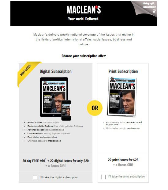
Now this is how you eliminate distractions on a landing page. Great job by the team at Maclean’s:
-
Create a powerful call-to-action
A vital piece of any page, your call-to-action (CTA) is what moves a reader to act. Whether your goal is to get them to download or donate or submit their personal information, you’ll need a creative and powerful call-to-action to make it happen. Craft an insanely effective one by:
- Replacing boring verbs like “See” with strong verbs like “Discover.”
- Getting rid of language that makes people think they need to give something up. Instead of “Sign up for a 30-day free trial,” try “Get 30 days free.”
- Writing it in the first person. Instead of “Melt away your stubborn belly fat,” try “Melt away my stubborn belly fat!” It’s been proven to boost conversions.
- Using the power of color psychology to create a button your target audience wants to click.
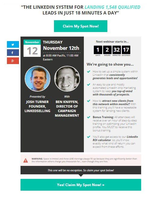
Josh Turner and Ben Kniffen clearly know how to create CTA’s the right way:
-
Supercharge your page with social proof
Around 74% of consumers rely on social media to help them make buying decisions. In fact, 47% of Americans say that Facebook is their number one influencer of purchases.
Can you guess why?
It has nothing to do with the social networks themselves, and everything to do with the people using them.
As it turns out, we take a lot of our cues from others.
Take a personal experience of mine, for instance:
From 2012 to 2014, I lived in the Avondale neighborhood of Chicago. And every day for almost two years, I would walk by this little specialty hot dog joint, called “Hot Doug’s,” on my way to work. Each time I did — rain or shine — I found a line that stretched through the restaurant, out the door, and around the block.
I assumed the food must be good there since people were willing to wait in line for what seemed to be hours – but I didn’t know for sure (I wasn’t about to wait in line for that long!), so I started asking around.
Everyone I talked to raved about it. They said Doug’s hot dogs were the best they’d ever tasted. Naturally I started to grow curious. Maybe waiting in that line was worth it.
But I wasn’t convinced.
All Doug’s glowing reviews prompted me to do some Google research of my own. What I discovered after only a few minutes of searching was national media attention, praise from well-known food critics, and even short clips of cameos on popular foodie shows.
That was when I finally decided I was going to stand in line … at least once.
It was the only time in my life I’ve ever waited two hours to get a hot dog. But, truth be told, it was worth it.
And that’s the power of social proof.
Taking your prospect from “There’s no way that hot dog is worth it” to “I can’t believe I’m waiting two hours for a hot dog” is possible to do on your landing page.
Here’s how:
- Include testimonials from real people, and use their photos if you can
- Install social widgets on your site that count the number of times your content has been liked or shared
- Include badges of popular brands you’ve worked with on your site
Here’s a great example of how to leverage social proof, from Kristen White of Expert Voice Book:
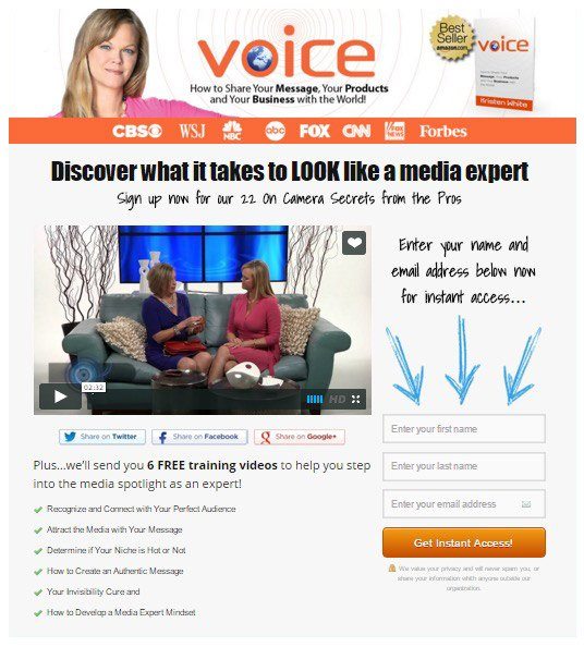
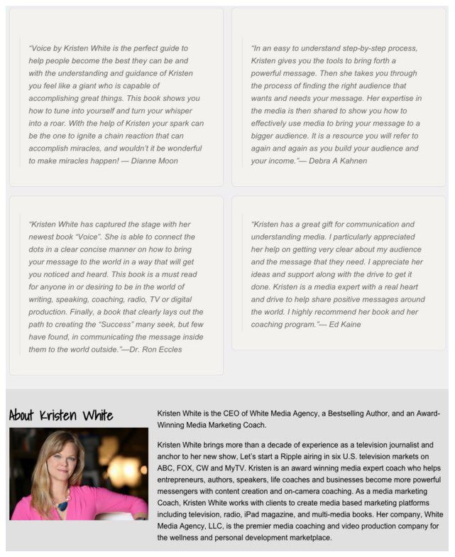
Notice the badges at the top of the site, of recognizable brands such as CBS, the Wall Street Journal, NBC, ABC, Fox, CNN, and Forbes. Then, when you scroll to the bottom of the page, Kristen took it a step further by adding testimonials:
-
Make them come back for seconds with your “thank you” page
I’d like everyone with the desire to completely underwhelm their prospects to please direct their attention right here.
Perfect, I have just the thing for you:

See that? Now you, too, can sour relationships with customers by copying this sorry excuse for a “thank you” page, which I was directed to after signing up for this newsletter.
…
NEWS FLASH: The relationship between you and your customer doesn’t end with the conversion. After they download, or sign-up, or buy, you should be trying to figure out ways to get them back to convert again.
One way to do that is by optimizing your “thank you” page. Make sure you:
- Place social share buttons on your page in case your customer wants to share your content with their friends.
- Explain what will happen next. Will your customer’s ebook be delivered to her inbox? Will she get a confirmation for the webinar? A surefire way to frustrate a prospect is by making them submit their personal information and then not detailing how to claim your offer.
- Be yourself. Show gratitude to your customer in a way that’s authentic to your brand.
Now that you’ve got an idea of WordPress landing page best practices let’s put them to work.
How do I create a WordPress landing page with Instapage?
First, log into your Instapage account. If you don’t have one yet, you can create a free account here.
Next, create your first landing page by clicking on “Create Page”:
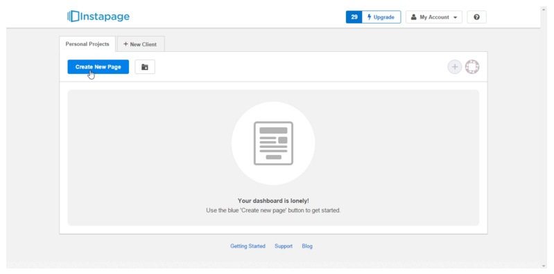
Now a pop-up will appear, and you’ll be given three options to get started:
- If you’ve saved any landing page designs, you can upload a “.instapage” file
- If you have a Premium account, you can scan pages from your website into our editor
- You can use one of our pre-designed templates
For the sake of all the beginners out there, let’s start with one of our templates.
Before you choose one, sort them by the type of page you want to create using the left sidebar menu. Pick from:
- Lead Generation
- Click Through
- Webinar
- Mobile App
- Thank You
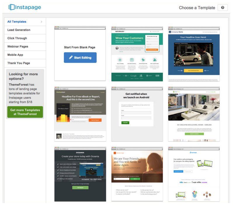
Then decide on a design you like. Here’s what we chose:
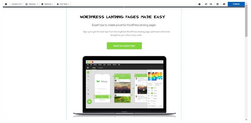
We uploaded a custom image for the headline, edited the button text, spiced up that call-to-action, and voila! We have a basic landing page. To learn more about creating an optimized landing page from scratch, click here.
When you’ve finished making your edits, click “publish” in the upper right-hand corner:
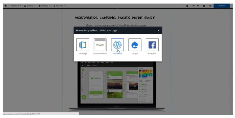
Selecting the WordPress logo in the middle of the pop-up will prompt another pop-up. From here, you’ll need to click “install WordPress plugin.” Then follow these basic instructions to finish publishing your WordPress landing page.
Let’s talk traffic
Woohoo! Congrats! You’ve got your first WordPress landing page published. But don’t get too excited because we’re not done yet.
After all, what good is a landing page without people to land on it?
Let’s talk about some ways you can start generating traffic to your new WordPress landing page.
-
Include a CTA at the end of relevant blog posts
This one’s a no-brainer. All it takes is a few extra keyboard strokes to boost your landing page traffic. Include a short call-to-action at the bottom of blog posts relevant to your landing page, and watch the ‘click counts’ rise.
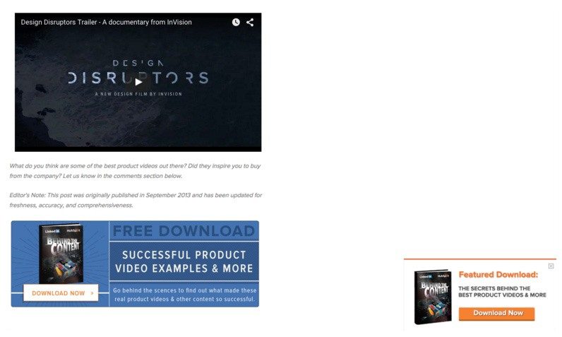
For example — let’s say this blog post was promoting an ebook, and I wanted to boost downloads. All I’d do is direct people to my landing page with a call-to-action at the bottom of every blog post related to WordPress.
Case in point: Look how HubSpot presented me with this offer (in the lower right-hand corner) titled, “The Secrets Behind The Best Product Videos & More,” after I finished reading this blog post about the best promotional product videos ever:
-
Get on social media
Recent research has shown that referrals from the eight biggest social networking platforms are finally starting to overtake search engine referrals. It happened for the first time in June of last year, and then again in December when social drove 31% of all website traffic.
And that’s not all. Just this past summer, Facebook overtook Google as the number one referrer of all traffic to digital publishers.
Clearly we’re starting to see an upward trend in the number of people digesting their content through social media.
For you, that means it’s time to figure out what social media platforms you should have a presence (start with a few, don’t spread yourself too thin), develop a strategy, and follow these best practices for social media.
-
Start guest blogging
If you’re not familiar with guest blogging, it’s the process of writing content on another website’s blog, with the goal of gaining exposure and boosting search engine rankings.
If you are familiar with guest blogging, I already know what you’re thinking:
“But Ted, guest blogging is dead! Google’s head of spam, Matt Cutts, said so last year!”
And you’re partially right – he did say something to that effect. Of course, “Guest blogging is dead” was too catchy of a headline for content writers to ignore, so it got repeated to the point that it became law, and everything else Cutts said got thrown out the window. Here’s the full quote:
“Okay, I’m calling it: if you’re using guest blogging as a way to gain links in 2014, you should probably stop. Why? Because over time it’s become a more and more spammy practice, and if you’re doing a lot of guest blogging, then you’re hanging out with really bad company.”
You see? The whole thing was blown out of proportion.
The takeaway here should’ve been: If you’re distributing spammy, low-quality blog posts strictly to get backlinks to your website, with the goal of boosting your search engine rankings, then … yes, guest blogging is dead for you.
However, if you’re building real relationships with publishers and sending out high-quality content to gain exposure, guest blogging can be a powerful tool to generate traffic.
Just ask marketing influencer Neil Patel, who’s generated countless website visits, along with thousands of dollars’ worth of revenue through the 300 guest posts he’s written.
-
Pay-per-click advertising
With the pay-per-click (commonly known as “PPC”) model of generating traffic, advertisers bid on keywords relevant to their business that are likely searched for by potential customers. When those search queries are entered, depending on numerous factors — that include your bid and keyword competition — your ads may appear in the search results.
Take a look what happens when I search for landscaping services near San Francisco:
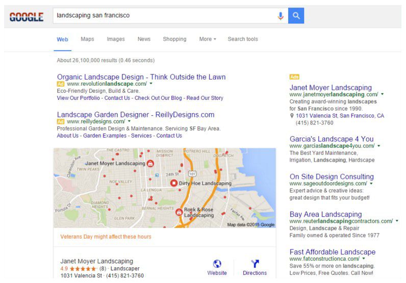 45% of people can’t even tell the difference between a paid ad and an organic search result.
And even when they can, according to research from Zero Gravity marketing, 60% of people shopping for a product click on PPC ads.
And things get better as prospects move further down the funnel. After clicking on your PPC ad, they’re 50% more likely to click your CTA button.
Now it’s your turn
Today you learned a lot about the best way to create a WordPress landing page, how to optimize it, how to publish it quickly, and some great methods to generate traffic to it.
Now it’s time to get out there and put all that knowledge to work. It’s not as overwhelming as it sounds. Sign up for an Instapage Enterprise demo today.

See the Instapage Enterprise Plan in Action.
Demo includes AdMap™, Personalization, AMP,
Global Blocks, heatmaps & more.
