Have you ever been drawn into a store by an advertisement hanging in the window – only to get frustrated you can’t find the sale item – that you walk right out the door?
That’s exactly how your visitors feel when they click through your content on social media and they’re not taken to a post-click landing page. Ask yourself:
- Why would you send your prospects to any old page of your website when you could create one specifically for them?
- Why wouldn’t you take the opportunity to fill it with targeted copy, eye-catching media, and an unbeatable offer?
Sadly, there are still many businesses that don’t take advantage of the power of post-click landing pages, even with all the free tools out there to help create them.
Thankfully, you’re not one of those people.
You’re the type of marketer that wants to gain every last advantage you can get your hands on. So of course you want to know exactly how you can leverage your Twitter traffic to drive all kinds of user action.
Today we’re going to share some hot tips to help you do just that.
Why use a Twitter post-click landing page?
Before we answer that, let’s review why would you use any post-click landing page. You do it because…
- You want to drive user action (generate leads, get webinar sign-ups, etc.)
- It’s more efficient at converting prospects than a general web page
- It’s filled with less distractions than most of the other pages on your site
- It’s more focused than sending them to the homepage of your website
- You’re able to personalize the design to suit your target audience exactly
And in that regard, your reasoning is no different than your reasoning for creating any other type of post-click landing page. The only difference is this:
A Twitter post-click landing page is one that users will click through to, from Twitter.
Who is it useful for?
They are useful for any brand that has a presence on the social network. Whether that brand is personal, a small start-up, or a multinational corporation; Twitter post-click landing page traffic is a vital component of any social media marketing strategy.
Especially now, with Twitter ad spending expected to reach over $2 billion in 2015, and advertisers seeing click-through rates up to 24% higher than Facebook, optimizing your post-click landing page for Twitter traffic is essential if you want to capitalize on those clicks and maximize ROI.
When should you use it?
When you’re running a campaign on Twitter with the intention of driving user action, a dedicate page is essential. It doesn’t matter if that campaign is paid or organic. If you’re tweeting out a link to get your users off the social network to engage with you, that link should direct them to a post-click landing page optimized specifically for Twitter users.
Where should you create it?
The page should be a part of your website, but it shouldn’t be in your navigation for users to get to from the homepage of your website. It should only be accessible via your Twitter campaign.
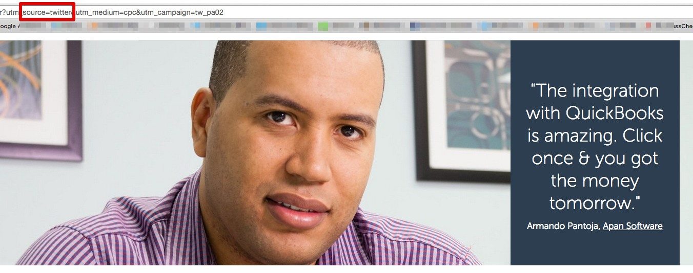
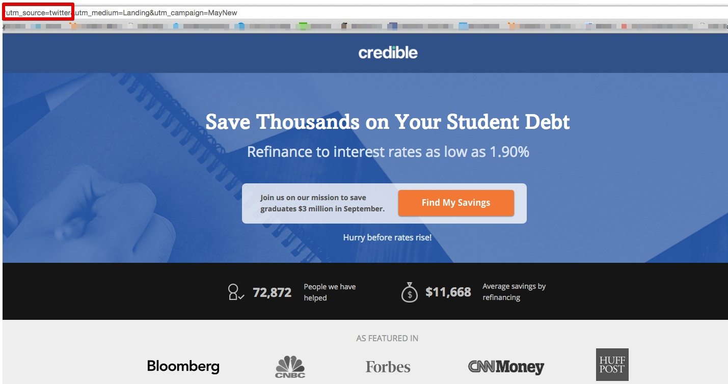
It’s also crucial to make sure you have tracking analytics set up. When setup properly, the URL will identify your visitor came from Twitter. Your visitors may not pay attention to this indicator (or care for that matter) but it is helpful for you. In some examples below, you’ll notice a red box around the area of the URL that identifies the source of the visitor.
How to design your Twitter post-click landing page
1. Make sure your page is shareable
Add social sharing buttons to your post-click landing page. After all, you know the audience you’re catering to is already on social media. That means they’re social – they’re sharing, tweeting, retweeting, and favoriting.
Now, whether or not they’re comfortable sharing your post-click landing page is a completely different issue.
Experienced social media users understand that when they click a social share button, they’ll have the opportunity to edit the message before they send it out to their social network.
Newbies don’t know this.
Inexperienced social media users may feel uncomfortable clicking “share” when they think there’s a chance they might spam their friends and followers. So how do you alleviate that concern? Next to your social buttons, make it clear that the user can edit their message before they tweet it out or share it to Facebook. Write something like, “Click to customize a message and share with your social network!” If they know they can edit their message before it sends, they’ll be more likely to pass it along.
What about these buttons’ location on the page itself? Should they be below your call-to-action? Above your testimonials? Next to your form?
Gotcha! That’s a trick question, they’re all wrong.
You see, something else prospects are wary to do is share your post-click landing page before they read your ebook or download your custom tool. They want to know what you’re offering is actually worthwhile before they recommend it to their friends and fans.
Put your social share buttons on your “thank you” page so that people who claim your offer can review it before they send it out to their network.
2. Use social proof to persuade and boost trust
We as humans make decisions based on social proof more than you’d think. If you’ve ever been drawn to a restaurant because it’s more filled than the one next door, or bought a specific cell phone because everybody in your network has the same one, then you, too, have fallen victim to the effects of social proof.
These effects are present on post-click landing pages as well – especially on social media post-click landing pages. In fact, research has shown that 80-95% of internet users make purchasing decisions based on online reviews, and 79% of people trust online reviews as much as personal recommendations.
Here are a few ways you can leverage social proof on your post-click landing pages.
Testimonials
If I climb to the highest mountaintop and proclaim that my homemade chocolate chip cookies are better than any store brand on the market, are you going to believe me?
Probably not, why would you?
What if someone who has tried my chocolate chip cookies does the same thing?
Now, I’m starting to sound a little more credible.
How about if celebrity chef Rachel Ray comes out and endorses my chocolate chip cookies as the most delicious treat she’s ever tasted? (Similarly, look at what Oprah’s Book Club has done for its authors.)
Ah, I think I hear you knocking at my door…
And that’s the power of a good testimonial to convince prospects to take action. Whenever possible, put a name and face to your testimonials. Get your customers to send in photos of themselves, and record their name and title.
Praise from real people, especially authorities in their field, is one of the most powerful ways to boost conversions. Take a look at how this post-click landing page from Fundbox uses social proof to boost trust:
Incorporate numerical widgets into your page
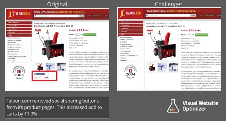
When you roll out your social share buttons, don’t forget to add widgets that show how many times your content has been tweeted, liked, pinned, etc. The higher the number, the more compelled visitors will be to share it with their social network.
By the same token, if that number is low and it’s not going anywhere, you might want to consider removing them altogether. Low number counts on social widgets can actually have the opposite effect, conjuring the thought, “Only 5 people have shared this… how great can it be?” in the mind of the user.
A study done by Visual Optimizer confirmed this, finding that when numerical widgets on a post-click landing page for a snow blower were removed, conversions were boosted by 11.9%:
3. Make every word count
Remember, this is a Twitter audience you’re hosting so they are used to digesting their content in 140 characters or less. Brevity is key on any post-click landing page, but even more so on this one. Research has shown that up to 50 words readership drops off significantly, so it’s important to make every word count.
Remember these four things when crafting content for your page
- Make sure your headline is clear, concise, and answers “what’s in it for me?” for the reader
- Numbers speak louder than words – back up your copy with statistical results if possible
- Create a call-to-action using a powerful verb (bonus points if it’s in first person)
- Break up the text using lists and bullets so that it’s easier to skim
Check out how all these elements come together in an example from student loan service Credible Labs:
4. Make sure your content matches
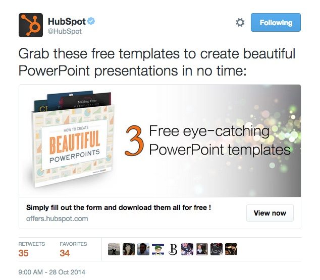
When a user clicks the link in your tweet and they’re taken to a page that doesn’t match your ad, they’re going to feel duped. That’s why you should make sure all the content in your tweet matches the content on your post-click landing page, including…
- Images
- Copy
- Colors
- Logos
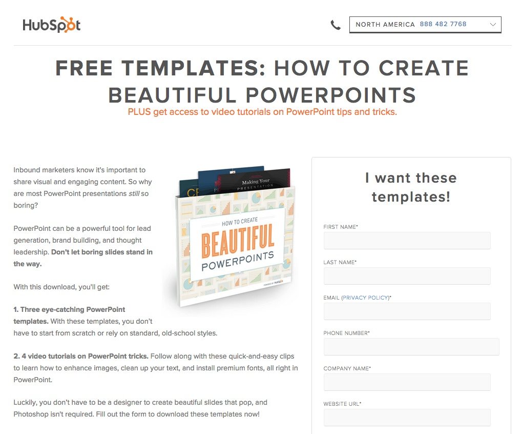
Take a look at how Hubspot makes sure its users know exactly what to expect when they click on a Twitter website card, “message matching” each of the four elements above:
The post-click landing page you’re taken to:
Have you ever used a Twitter post-click landing page with success? Do you plan on incorporating them into your social media marketing strategy?
Sign up for an Instapage Enterprise demo today.

See the Instapage Enterprise Plan in Action.
Demo includes AdMap™, Personalization, AMP,
Global Blocks, heatmaps & more.
